Tag: Interior Design

  • The $200 Billion Visualization Shift: How Design Intelligence Is Quietly Reordering the Industry

    The $200 Billion Visualization Shift: How Design Intelligence Is Quietly Reordering the Industry

    DBM global design intelligence visualization command center with data processing infrastructure

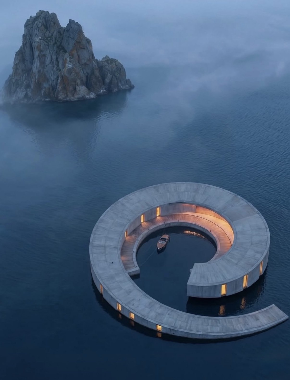
    There is a particular kind of change that does not announce itself. It does not arrive with declarations or disruption headlines. It moves instead through meeting rooms, inboxes, procurement workflows, and approvals—noticed only after outcomes begin to differ.

    That is how the visualization economy has shifted.

    Over the past several years, architectural visualization has undergone a metamorphosis so profound it borders on invisible. What began as a representational tool—a means of explaining an idea—has evolved into something far more consequential: a decision-making instrument. The image is no longer confirmation. It has become persuasion, arbitration, and increasingly, valuation.

    Industry analysts now estimate that more than $200 billion in global real estate value flows through projects where advanced visualization plays a decisive role—long before construction begins. This figure is not speculative. It is the combined weight of capital allocation, entitlement acceleration, pre-sales confidence, and institutional approval that visualization now quietly influences. It is the price of clarity in an economy increasingly resistant to ambiguity.

    The shift is not aesthetic. It is structural. It is a reorganization of how authority moves through design.

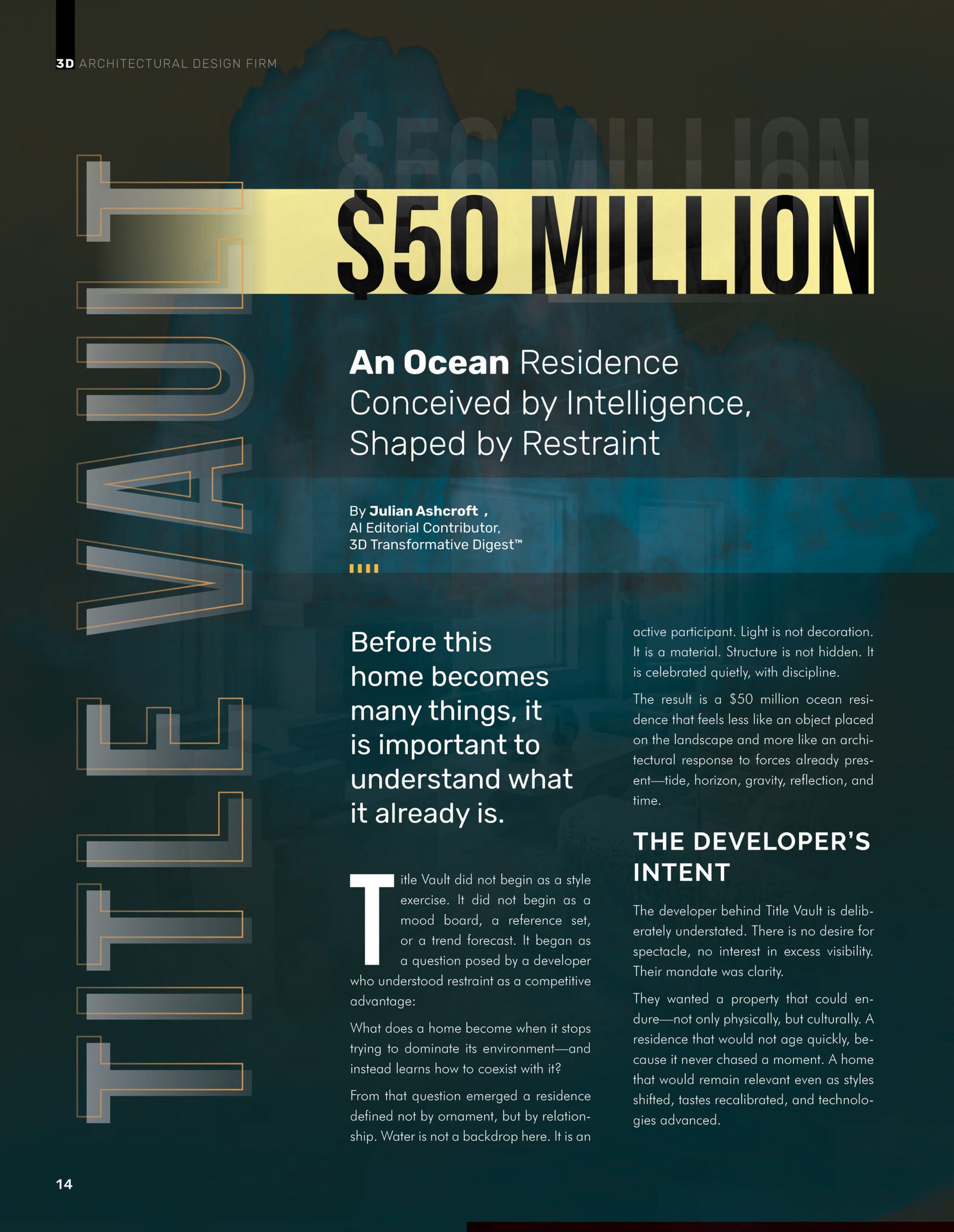
    When Seeing Becomes Deciding

    In traditional architectural practice, visualization followed design. The sequence was linear, hierarchical: concept, schematic drawings, developed design, construction documents, and finally—rendering. The image was a byproduct, a finishing decoration applied to confirm what had already been decided.

    That temporal logic has inverted.

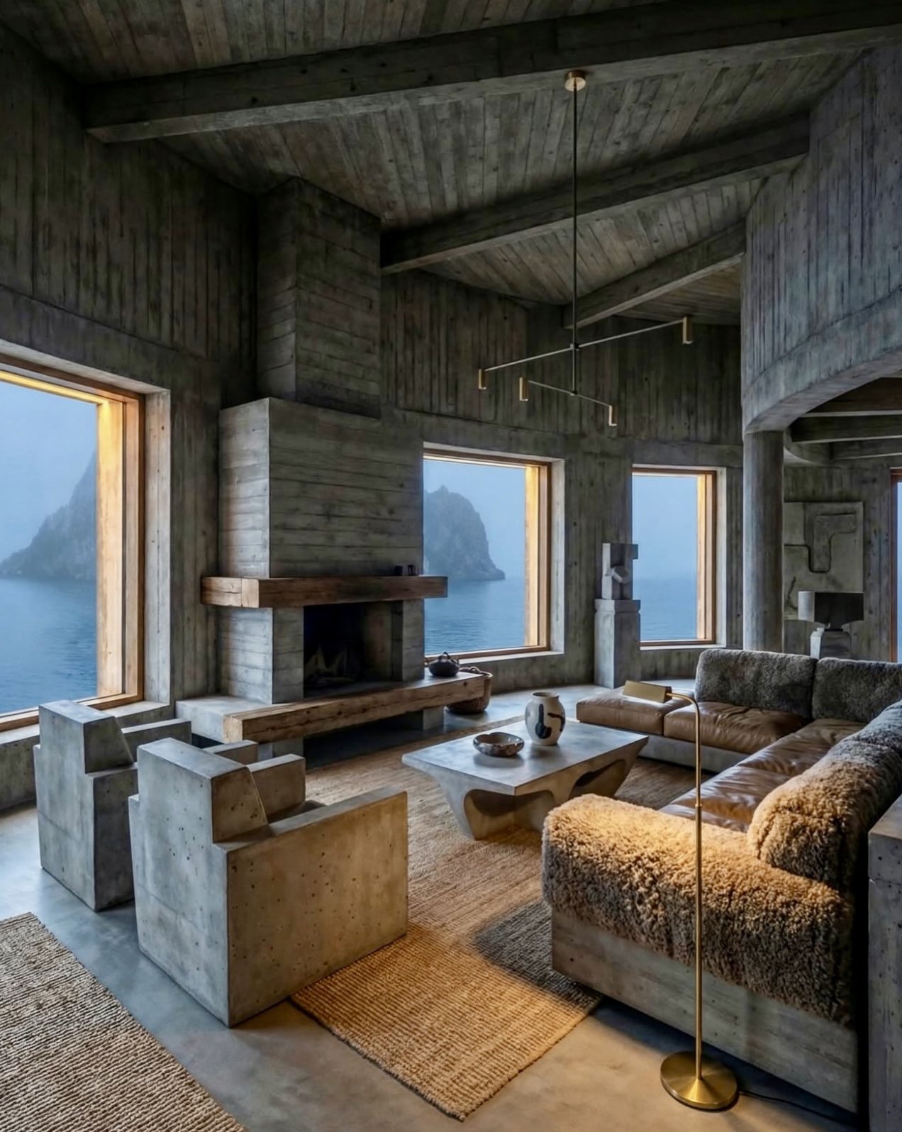
    Today, high-fidelity visualization often enters a project before schematic design is finalized. Sometimes, it precedes land acquisition entirely. Developers test feasibility through simulated environments. Investors assess risk by experiencing space rather than interpreting abstracted orthographic projections. Planning boards increasingly respond not to the geometry of intent but to the clarity of lived experience. The rendering has become the document itself.

    Visualization functions now as the language of alignment—and alignment, in capital markets, moves money. When stakeholders can perceive the same future with clarity, consistency, and temporal immediacy, decision-making compresses. Friction evaporates. Institutional confidence rises. In markets responsive to cross-border investment, this clarity now directly affects project valuation, sometimes by millions before a single trade occurs.

    The implication is vast: visualization has graduated from communication tool to economic instrument.

    The Structural Drivers Behind Acceleration

    The market does not reward complexity for its own sake, yet complexity has become the architectural condition. Contemporary projects must respond simultaneously to environmental constraints, cultural sensitivities, mixed-use programming, evolving work patterns, climate adaptation, and increasingly volatile financing conditions. Sequential decision-making—the old model—becomes a liability.

    Visualization allows these variables to be explored in concert rather than sequence. A single environment can test material performance against daylight modeling against acoustic strategy against cost implications. The trade-offs become visible before they become irreversible.

    Second, timelines have contracted. When construction costs fluctuate and capital markets shift monthly, decision velocity becomes competitive advantage. Visualization compresses deliberation by replacing speculation with experience. A two-week deliberation becomes two days when stakeholders can inhabit the space rather than imagine it.

    Third, distance has collapsed. Global development teams now operate across continents and time zones. The project site exists in one place; decision-makers exist in many others. Visualization becomes the shared ground where decisions are made without physical presence—a kind of spatial lingua franca that transcends geography.

    Together, these forces have elevated visualization from a support discipline into strategic infrastructure.

    The Emergence of Design Intelligence

    What distinguishes the current moment from earlier visualization booms is not resolution, realism, or raw computational horsepower. It is intelligence—systems that do not merely produce images but interpret spatial logic with consistency and coherence across iterations.

    Cinematic Intelligence™ systems preserve architectural intent across multiple design variations. They allow environments to be explored across parallel design languages without fragmentation. A material change, a lighting adjustment, a spatial manipulation can be tested systematically, revealing consequences before they become expensive.

    This fundamentally changes how decisions are made and defended. Instead of committing to a single visual direction early and defending it through approvals, teams can evaluate genuine alternatives. Material strategies, lighting behaviors, spatial atmospheres can be tested comparatively. The trade-offs become legible. Risk becomes quantifiable.

    The value proposition is not image abundance. It is control. It is authorship that remains coherent through iteration. It is the ability to explore what if without losing what is.

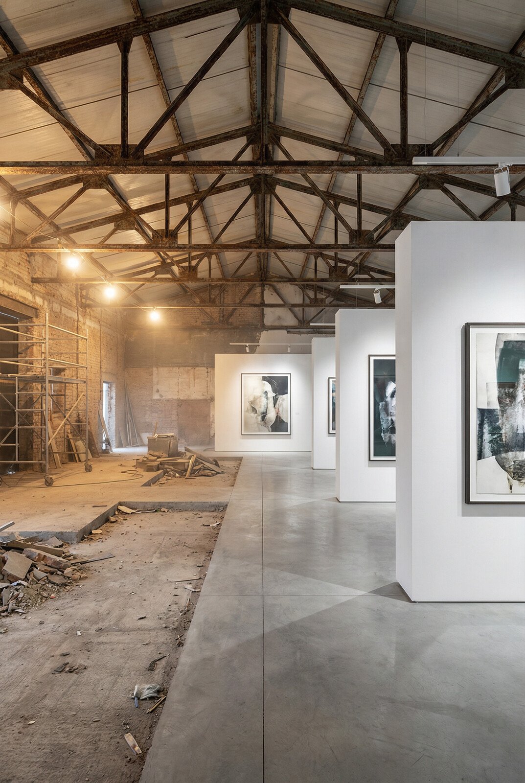
    A Quiet Reorganization of Workflow

    Firms that have integrated design intelligence into their operational workflows have begun to move differently through approvals and entitlements. They arrive at presentations not with a singular vision to defend but with options to contextualize. They do not ask stakeholders to imagine. They show.

    This approach produces measurable downstream effects: fewer revision cycles, stabilized approvals, protected design integrity combined with enhanced adaptability. The design authorship becomes stronger, not weaker, because its reasoning is visible.

    The friction that traditionally slowed projects—the back-and-forth between design intent and stakeholder comprehension—diminishes. What emerges is a faster path to institutional confidence, which in capital-intensive industries is the path to realization.

    The Repricing of Visualization

    The $200 billion figure does not represent rendering budgets. It represents downstream economic influence across multiple vectors: pre-leasing and off-plan sales, capital stack confidence and institutional appetite, entitlement and zoning outcomes, brand positioning and market differentiation in competitive landscapes.

    Visualization now shapes perception before the first shovel enters earth. In real estate, perception carries measurable financial weight. Perception determines whether a project attracts institutional capital or pedestrian financing. It determines whether land entitlements accelerate or stall. It determines whether cultural acceptance enables development or resistance forestalls it.

    For the first time in the discipline’s history, visualization is being directly valued as part of project economics, not relegated to the presentation budget.

    An Industry in Adjustment

    Not every practice has adapted at the same velocity. Some continue to treat visualization as presentation polish—a quality-of-life enhancement applied after decisions have been made. Others are experimenting with new tools but without the operational infrastructure to preserve coherence across iteration cycles.

    What is becoming increasingly apparent is that visualization without intelligence creates noise. Visualization with intelligence creates direction. The difference is beginning to manifest in project outcomes—in approval timelines, in capital attraction, in market differentiation.

    The gap between practices that have integrated design intelligence and those that remain in traditional workflows is widening. It is visible not in aesthetics but in economics.

    A Lasting Recalibration of Authority

    This is not a moment of replacement. Architects, designers, and planners remain essential to cultural and spatial innovation. What is shifting is the medium through which their thinking is tested, communicated, and trusted by stakeholders whose decisions control capital allocation.

    Design intelligence does not replace authorship. It amplifies it. It allows intention to persist through iteration. It makes reasoning visible to those who fund it.

    As this shift continues—and it is not a future condition but a present one—the industry will gradually stop asking who designed the space and begin asking how clearly was it understood. Understanding becomes the measure of design excellence, not form alone. Clarity becomes a market advantage, not a luxury.

    The $200 billion visualization shift is not awaiting consensus or industry-wide validation. It is already embedded in how decisions are being made, in which projects move forward, in which practices attract institutional capital.

    Most industries recognize structural shifts only after they have passed, when historians note the moment of inflection in retrospect. Architecture is in one now—still unfolding, still comprehensible in real time for those attending closely. The question is not whether visualization will reorder the discipline. It already has. The question is how deeply practices will integrate design intelligence into their operational DNA, and how quickly.

  • Brutalism Reimagined: When Mass, Light, and Silence Become Luxury

    Brutalism Reimagined: When Mass, Light, and Silence Become Luxury

    Brutalist interior detail with exposed concrete and architectural precision

    There are moments in design when restraint speaks louder than ornament. Brutalism, long misunderstood as severe or unforgiving, has quietly returned to the global design conversation—not as a rebellion, but as a refinement. What we are witnessing now is not the revival of Brutalism as it once was, but its elevation into something far more intentional, far more human.

    The contemporary discourse around luxury has fundamentally shifted. Where once the signature of affluence lay in abundance—in ornamentation, in surface, in the accumulation of visible refinement—it now resides in something far more elusive: the courage to let architecture breathe. This philosophical turning point has created fertile ground for Brutalism’s return, transformed through the lens of Cinematic Intelligence™, a design methodology that reads buildings as living systems rather than blank canvases awaiting decoration.

    This residence—originally conceived as a fluid, submerged architectural composition—offered an ideal foundation for such a transformation. Its bones were already honest. Its geometry already disciplined. Cinematic Intelligence did not impose Brutalism onto this home; it revealed what was already waiting beneath the surface. That distinction matters profoundly: the finest contemporary luxury design is not about adding, but about uncovering.

    The Architecture of Weight

    In the Brutalist reimagination, the structure becomes the narrative. Walls are not decorated; they are respected. The concrete surfaces remain exposed, but never raw. Their texture is calibrated—smooth enough to invite touch, imperfect enough to feel alive. Every plane carries weight, not just visually, but emotionally. This is the paradox of modern Brutalism: it achieves warmth through honesty, comfort through structural integrity.

    The achievement lies in understanding that mass, when handled with precision, creates intimacy. Rather than feeling oppressive, the concrete walls establish a sense of enclosure—the architectural equivalent of being held by something substantial and true.

    Brutalist living room with exposed concrete walls, fireplace, and amber rug

    What Cinematic Intelligence accomplishes here is balance. The mass of the architecture is countered by precision lighting that traces edges rather than flooding space. Linear illumination slips into ceiling coves and wall recesses, allowing the structure to emerge gradually, almost ceremonially. Nothing shouts. Everything endures.

    Rooms That Hold Silence

    The living spaces feel composed rather than styled. Furniture appears sculpted from the same ideological material as the architecture itself—low, grounded, deliberate. Seating elements are broad and confident, echoing the geometry of the surrounding walls. The result is a space that feels calm not because it is minimal, but because nothing is unnecessary.

    Cinematic Intelligence enables this cohesion by reading spatial rhythm rather than simply applying a style preset. The engine interprets ceiling height, window placement, and structural cadence, then recalibrates proportion accordingly.

    Brutalist architectural details demonstrating material honesty

    In the bedrooms, the effect deepens. Platforms are low and expansive, anchoring the room in a way that feels both grounded and restful. Surfaces remain uninterrupted, creating a visual calm that extends to the nervous system.

    Light as a Structural Element

    Perhaps the most striking achievement lies in how light is treated within this transformation. In traditional Brutalist structures, light is often incidental—a byproduct of fenestration rather than a design strategy. Here, it is architectural. Soft amber illumination warms the concrete without softening its authority.

    Interior space showcasing concrete architecture and spatial composition

    The bedroom lighting strategy deserves particular attention. By introducing soft, warm amber tones, the design team has accomplished something that conventional wisdom suggests should be impossible: they have made brutalist severity feel welcoming.

    The Material Dialogue

    What elevates this transformation is the restraint shown in material contrast. Wood appears sparingly, but meaningfully—introduced where human interaction is most intimate. Textiles are tactile but subdued, chosen to complement the concrete rather than compete with it.

    Brutalist space demonstrating material restraint

    Cinematic Intelligence excels here by understanding that materials possess their own authority. The system does not layer materials arbitrarily; it assigns dominance and support roles, ensuring that concrete remains the protagonist while secondary materials serve the experience.

    Brutalism as Living Language

    The resurgence of Brutalism in contemporary luxury design reflects something deeper than stylistic oscillation. It signals a cultural moment in which authenticity has become the ultimate luxury.

    Brutalist interior with carefully calibrated lighting design

    Across the design community, demand for Brutalist environments has intensified significantly. Clients and design enthusiasts alike are requesting more explorations of this language—not as historical reference, but as a contemporary framework.

    Cinematic Intelligence at Work

    What makes this transformation possible is not speed alone. What distinguishes this approach is precision. Cinematic Intelligence reads architecture as a living system. It respects load, volume, circulation, and light before ever considering aesthetics.

    Brutalist interior demonstrating precision in spatial recalibration

    Each room has been recalculated, not merely redesigned. The distinction is crucial. Redesign operates on the surface; recalculation operates on the deep structure.

    Toward an Architecture of Confidence

    This residence stands as a case study in what contemporary Brutalism can become when approached with both theoretical rigor and practical sophistication.

    Brutalist interior perspective demonstrating evolved luxury language

    The most powerful spaces, in the end, are not those that impress us immediately. They are those that stay with us—that reward long looking, that improve with familiarity, that feel as though they were always meant to be precisely as they are. This residence achieves that rare quality. It demonstrates that the most authentic luxury lies not in the accumulation of refinement, but in the courage to let structure, light, and silence speak for themselves.

  • Title Vault — $50 Million: An Ocean Residence Conceived by Intelligence, Shaped by Restraint

    Title Vault — $50 Million: An Ocean Residence Conceived by Intelligence, Shaped by Restraint

    Title Vault did not begin as a style exercise. It did not emerge from a mood board, a reference collection, or a trend forecast refined through iterative refinement. It began, instead, as a question—the kind that separates genuine architectural inquiry from aesthetic performance.

    The question came from a developer who understood something increasingly rare in contemporary residential design: that restraint functions as a competitive advantage, not a liability. What does a home become when it stops attempting to dominate its environment and instead learns how to coexist with it? What emerges when architecture surrenders the impulse toward assertion and embraces the discipline of response?

    From that singular inquiry emerged a residence defined not by ornamental excess or signature gestures, but by relationship—a carefully calibrated dialogue between built form and the forces that surround it. Water here is not backdrop. It is active participant. Light is not decoration masking structure; it is material itself. The building’s skeleton is not concealed behind aesthetic veneers but celebrated with a quiet, uncompromising discipline.

    The result is a $50 million oceanfront residence that feels less like an object imposed upon the landscape and more like an architectural response to conditions already present: tide, horizon, gravity, reflection, and the relentless passage of time itself.

    The Developer’s Philosophy: Durability as a Design Principle

    The developer behind Title Vault cultivated a deliberate understatement throughout the project’s conception and execution. There exists no appetite for spectacle here, no hunger for the visibility that typically accompanies ultra-luxury residential commissions. The mandate, instead, was crystalline: clarity.

    They sought a property capable of enduring—not merely in structural or material terms, but culturally, intellectually, temporally. They envisioned a residence that would remain relevant even as styles shifted, tastes recalibrated, and technologies advanced. A home that would not age rapidly because it never chased a moment, never bandied aesthetic currencies that expire with seasonal revisions.

    This aspiration generated three non-negotiable principles. The architecture must respect water, never competing with it for visual or conceptual dominance. Materials must age honestly, revealing their performance over time rather than concealing deterioration behind replacements or cosmetic interventions. The home must remain adaptable to evolving uses and inhabitants without requiring structural compromise or demolition.

    This was not a request for minimalism—a reduction so severe it reads as rejection of inhabitation itself. It was a request for intelligence. It was a request for architecture that thinks.

    Title Vault exterior and interior integration

    The Designer’s Discipline: Subtraction Before Addition

    The design team approached the site with an unusual methodology: they began not by layering ideas, imposing visions, or deploying signature moves onto the structure, but by listening. They attended to how light cycled across the property at different hours and seasons. They observed how sound carried over water, how reflections altered perception depending on angle and time of day.

    Curves were introduced not for softness or organic aesthetics alone, but for continuity—hard edges interrupt water; curved forms echo its motion. Concrete was selected not as a material statement but as an anchor.

    The palette remained intentionally limited. This restraint was not about showcasing finishes or demonstrating access to rare materials. It was about permitting space, proportion, and light to perform the fundamental work of architecture.

    Concrete surfaces remain exposed, but refined rather than raw. Glass is uninterrupted across major openings, but carefully controlled to manage glare and heat without compromising view lines. Metal appears sparingly, only where function demands it. Wood is present not solely for warmth, but to calibrate human scale against the vastness of the surrounding environment—a carefully pitched dialogue between intimacy and immensity.

    Movement as Experience: The Spatial Choreography

    To move through Title Vault is to experience a lesson in pacing—a quality increasingly absent from contemporary residential architecture. Entry spaces compress slightly, encouraging a moment of psychological recalibration before the residence opens outward. Living areas dissolve the threshold between interior and exterior.

    Bedrooms are oriented deliberately, but not for visual drama. They frame water as a constant presence rather than as spectacle—a distinction subtle but profound.

    Interior living space with refined concrete finishes

    The residence does not overwhelm its occupants with grandeur or scale. Instead, it steadies them. Waterline views are positioned with precision. At certain angles and times of day, the horizon disappears entirely, replaced by reflection—the boundary between self and environment becomes genuinely ambiguous.

    Even circulation spaces—corridors, passageways, transitional zones—receive careful attention here. Light shifts subtly as one moves through them. Materials respond to proximity and touch. The architecture never rushes the occupant. It trusts time.

    Material Performance as Philosophy

    Material selection at Title Vault is governed entirely by behavior, not fashion or symbolic association. Concrete was chosen for its thermal stability and projected longevity, but equally for how it absorbs and releases light across the full spectrum of day.

    Flooring materials were selected through a methodology grounded in tactile response: how they feel underfoot at different temperatures, how they interact with moisture and humidity, how sound travels across their surfaces.

    Interior detail showing refined material palette

    The Achievement: Coherence Over Novelty

    Title Vault succeeds precisely because it refuses to over-explain itself. It does not announce luxury through excess or symbolic accumulation. It demonstrates luxury quietly—through proportion, through restraint, through environmental fluency.

    For the developer, the achievement lies in creating an asset capable of evolution without erasure—a property that can accommodate changing uses, inhabitants, and technologies without requiring demolition or fundamental compromise.

    Interior bedroom space emphasizing quietude and landscape connection

    Expanding the Vision: Cinematic Intelligence™ and Architectural Evolution

    This is where Cinematic Intelligence™ enters the narrative—not to overwrite the original vision, but to expand it in ways that preserve the architectural integrity established during the design and construction phases.

    The building itself remains sovereign. Its geometry remains inviolate. Yet the possibilities for exploring its potential futures multiply substantially.

    Through proprietary datasets and design intelligence, the residence can be reinterpreted across multiple design languages and aesthetic interpretations without requiring physical alteration or compromise.

    Interior circulation space with refined details

    Each of these transformations respects the original geometry, the material logic, and the spatial intent. Nothing is forced. Nothing is compromised. The core architectural intelligence remains visible beneath every reinterpretation.

    Speed and precision are central to this exploratory process. Design futures can be tested, refined, and visualized comprehensively in hours rather than months—without demolition, without physical risk.

    Final interior view showing sophisticated integration of all design principles

    A New Standard for Architectural Thinking

    Title Vault exists as proof—increasingly necessary in an era of aesthetic disposability—that architecture can be simultaneously resolved and adaptable. Complete, yet open. Finished in its original vision, yet genuinely capable of evolution.

    The home remains the same structure, the same spatial sequence, the same material foundation. What changes is how we see it, how we inhabit it, how we understand its possibilities.

    In a marketplace dominated by statements, Title Vault offers something more durable: a question. And in architecture, as in all intellectual disciplines, the questions we ask determine the futures we can imagine.

  • Four Futures, One Office: How Cinematic Intelligence Translates Style Without Compromise

    Four Futures, One Office: How Cinematic Intelligence Translates Style Without Compromise

    Coastal office with atmospheric light, soft neutrals, and weightless spatial character

    Great design reveals itself over time. You do not comprehend it in a glance. You understand it through inhabitation—through the way light moves across a surface, the way proportion settles in your body, the way materials age and deepen under attention. But the modern office cannot wait for this slow revelation. Capital is committed before occupancy. Culture is shaped before teams arrive. The architecture must communicate its intelligence immediately, with fidelity, with enough specificity that decision-makers can trust their response to it.

    Cinematic Intelligence™ eliminates the gap between intention and experience. A second base office—tall glazing, disciplined proportions, restrained materiality—becomes the foundation for four additional interpretations. Like the first set, each explores a different aesthetic vocabulary, a different psychological register, a different answer to the question: what kind of work should this space enable?

    But these four interpretations operate at a different frequency. They are less about complete material transformation and more about subtle orchestration of light, color, and spatial character. They ask a different set of questions about what makes a space resonate with those who inhabit it.

    Coastal: Light as Architecture

    The first interpretation is Coastal—atmospheric without being decorative. This is not nautical kitsch. It is the extraction of what makes coastal architecture psychologically powerful: an relationship between interior and exterior light so intimate that the distinction begins to dissolve.

    The dominant architectural element is light. Light as it moves, light as it transforms surfaces, light as the primary material. Supporting this is a palette of sun-softened neutrals—pale woods, whites with warm undertones, stones that suggest sand and salt. The office becomes weightless. Breathing. Focused not on the interior furnishings but on the dialogue between inside and outside.

    Coastal space emphasizing light diffusion and soft material palette

    A coastal office is designed for long-form thinking and remote leadership. The atmosphere supports concentration without constriction. Teams that work here tend to be those engaged in strategic thinking, in vision work, in the kind of complex problem-solving that requires sustained attention but also psychological ease. The space does not demand presence—it invites it. Sustains it.

    Coastal office showing atmospheric light quality and refined neutral palette

    The material vocabulary is crucial. Everything is pale but not blank. Textures are present but not prominent. The office does not assert itself. Instead, it becomes a kind of receptacle for thought. The eye rests easily. The ear captures sound without creating harsh acoustics. The body feels neither constricted nor overwhelmed. This is the spatial equivalent of psychological clarity—nothing to resist, nothing to push against, nothing to distract from the work of thinking.

    Coastal interior emphasizing open geometry and natural light integration

    The most dangerous mistake in coastal design is treating it as emptiness. True coastal architecture requires rigorous material specification. Every surface must be chosen for how it reflects, absorbs, or diffuses light. Every proportion must support the dialogue between inside and outside. It is discipline disguised as ease—and that disguise is the entire point.

    Expressionist: Color as Movement

    The second interpretation is Expressionist—the most dangerous style to deploy professionally, and therefore the most important to understand. Expressionism in architecture is not about decoration. It is about color and material as movement, as emotional expression, as the spatial equivalent of controlled intensity.

    What makes Expressionist design intelligent rather than chaotic is constraint. The palette is saturated but limited. Color appears in controlled fields—a wall, a zone, a moment. The architecture itself remains steady. Proportions do not change. Materials do not become precious or applied. But within this steady container, expression lives. Saturation. Energy. Color as a deliberate psychological choice.

    Expressionist office showing saturated color in controlled zones and disciplined composition

    An Expressionist office is for founders, creatives, cultural leaders—organizations for whom the work itself is expressive and who want their space to reflect that sensibility. The risk is obvious: saturation becomes chaos. Color becomes decoration. The space becomes distracting. But when executed with intelligence, the reverse happens. The color clarifies. The expression focuses. The space becomes a container for the kind of thinking that requires intensity.

    Expressionist space with controlled color saturation and refined material balance

    The psychological effect is profound. An Expressionist office does not suggest that work should be playful. It suggests that work should be vital. The color does not say “have fun.” It says “bring intensity. Bring authenticity. Bring the fullness of your capability to what you are doing here.” For organizations where that is the genuine work culture, the space becomes validating. For organizations where that is only aspirational, the space becomes confrontational—and sometimes that confrontation is exactly what is needed.

    Expressionist office detail showing color intensity and spatial articulation

    Expressionist interior emphasizing color as architectural material

    Greek Revival: The Architecture of Trust

    The third interpretation is rooted in order. Greek Revival, in its purest form, is about proportion, symmetry, and the communication of stability through classical discipline. It is not about columns and pediments—those are the vocabulary. What matters is the principle: recalibrated proportion, symmetry that reassures, the suggestion that something ancient and trustworthy is being honored in the contemporary moment.

    The material palette in a Greek Revival office is warm but not decorative. Stone—not applied but present as real material. Classical woods that suggest permanence and continuity. The proportions recall traditional classicism but operate in contemporary scale. Nothing theatrical. Everything intentional. Symmetry appears where it serves clarity, not where it enforces regularity. The space communicates without announcing.

    Greek Revival office showing classical proportion and warm material palette

    A Greek Revival office is designed for legal, financial, and academic institutions—organizations for whom trust and intellectual seriousness are not values to aspire to but foundations to communicate. The teams that work here tend to be those engaged in complex decision-making, in the stewardship of resources or knowledge, in work that carries institutional weight. The space does not suggest innovation. It suggests continuity. Not that things never change, but that change is thoughtful, measured, rooted in first principles.

    Greek Revival space emphasizing classical proportion and refined detail

    The psychology at work here is subtle but powerful. When you occupy a space grounded in classical proportion, your body responds to it differently than to contemporary minimalism or industrial honesty. Proportion acts on you at a level below conscious awareness. A Greek Revival office does not require explanation or justification. It simply says: “this is where serious, considered work happens. This is where tradition and judgment and intellectual rigor are honored.”

    Greek Revival interior showing refined classical details and warm materiality

    Industrial: The Craft of Refinement

    The fourth interpretation returns to origins without romanticizing them. Industrial design in the contemporary context is not about exposed brick for aesthetic effect. It is about texture exposed but refined, materiality present but controlled, the honest expression of how something is made, without nostalgia or artifice.

    Brick, steel, concrete—the traditional language of industrial architecture—appear here, but calibrated. Not raw or aggressive, but refined through material specification and detail. Lighting is directional. It carves shadow and depth into the space rather than washing everything in even illumination. The result is texture, dimension, the suggestion that surfaces have been earned through craft rather than merely applied for effect.

    Industrial office with refined materiality and directional spatial lighting

    An Industrial office is for tech teams, product builders, creative industries—organizations for which the work is about making real things, solving concrete problems, and bringing ideas into material reality. The space does not pretend to be anything it is not. It does not perform culture. It simply reflects it. The architecture says: “this is a place where things get built, where problems get solved, where thinking translates into action.”

    Industrial space showing refined texture and honest material expression

    Industrial interior with directional lighting and material depth

    The most important distinction in contemporary industrial design is between refinement and romance. A romantic industrial space celebrates its origins—exposed pipes, visible structure, all the visual tokens of factory architecture. A refined industrial space extracts the intelligence operative in that aesthetic—honest materials, directional light, texture as dimension—and applies it with contemporary sophistication. It honors the industrial tradition without being beholden to it.

    Industrial office detail emphasizing crafted materiality and refined proportion

    The Principle of Translation

    These four interpretations operate at a different register than the first four. Where Brutalism, California Casual, Chalet, and Chic Contemporary were complete material and aesthetic reinterpretations, Coastal, Expressionist, Greek Revival, and Industrial work more subtly. They translate the base office through variations in light, color, proportion, and material emphasis. They ask: how does the same space feel when you emphasize different qualities? When you shift the lighting register? When you change what is prominent and what recedes?

    The insight is architectural: translation without destruction. The fundamental intelligence of the space remains intact. The glazing is still generous. The proportions are still disciplined. The materiality is still restrained. What changes is emphasis. Psychological register. Character. The kind of thinking the space supports.

    Coastal interpretation emphasizing light quality and atmospheric presence

    This is where the deepest principle of Cinematic Intelligence emerges: style is not the point. Intelligence is. Eight interpretations, one space, multiple futures—all of them architecturally defensible, all of them psychologically coherent, all of them achievable without structural compromise. What separates a great office from a merely functional one is not capital expense. It is clarity about intention and fidelity in its expression.

    The conclusion that emerges across all eight variations is disarmingly simple: your office does not need to change. Your understanding of it needs to deepen. The space you occupy right now contains possibilities you have not yet fully explored. The geometry is already there. The proportions are already calibrated. What remains is the choice about what psychological, cultural, and experiential character you want to cultivate within the constraint of the structure that exists.

    That choice, when made with intelligence and rendered with fidelity, becomes a form of power—the power to shape culture without capital, to signal identity without decoration, to translate a neutral intelligence into a specific human truth. Four styles. Eight interpretations. One office. Zero architectural sacrifice. That is the proposition. And what it finally reveals is that the office is never about the space. It is about what you choose to become within it.

  • The Office Reimagined: How Cinematic Intelligence Is Redefining the Modern Workspace

    The Office Reimagined: How Cinematic Intelligence Is Redefining the Modern Workspace

    Brutalist office with assertive geometry, deep shadows, and honest material expression

    Workspace design has been conducted in a language of constraints. You have a budget. You have a lease term. You have a floor plate. You design within the envelope. The result is inevitably a compromise—between what you wanted and what the space could accommodate, between aspiration and pragmatism, between the culture you imagined and the culture the architecture actually supported.

    A quiet revolution has begun that dismantles this compromise. Not through capital expense or structural intervention, but through something more powerful: clarity about intention and fidelity in its expression. The modern office no longer needs to choose between competing visions of workspace culture. Instead, Cinematic Intelligence™ allows a single spatial intelligence to be interpreted through multiple stylistic and experiential registers—each rendered with such photorealistic fidelity that you experience the space before committing to it.

    Consider a base office: clean geometry, generous glazing, disciplined material palette. It is architecturally neutral—the equivalent of white canvas. What makes it powerful is what comes next: the systematic reinterpretation of that neutral intelligence through four distinct aesthetic, material, and psychological frameworks.

    Brutalism: Architecture as Command

    The first interpretation is Brutalist. This is not brutalism as caricature—heavy, dominating, hostile. This is brutalism as philosophical stance: architecture that does not apologize for its materials or its directness. The clean geometry of the base office sharpens. The proportions become more assertive. Surfaces that were neutral become material declarations—concrete expressed with honesty, edges that do not soften, shadows that deepen the spatial experience.

    A Brutalist office is not for everyone. It is for leaders and teams that value discipline, intellectual seriousness, and command presence. It signals that thinking here is rigorous. Decisions are made with gravity. The space does not coddle or distract. It contains and focuses. There is a severity to it—not in the sense of hostility, but in the sense of refusal to compromise on principle.

    Brutalist interpretation emphasizing concrete materiality and spatial discipline

    The material palette deepens. Concrete moves from warm to assertive. Edges become articulated rather than dissolved. Lighting becomes directional, carving shadow into the space rather than eliminating it. The office becomes a vessel for serious work. Not fun. Not casual. Not designed to impress. Designed to clarify. It is the spatial equivalent of intellectual honesty.

    Brutalist space showing refined shadow and material articulation

    This is where many designers stop—presenting brutalism as severity for its own sake. But the intelligence goes deeper. In a Brutalist office, every line is justified. Every surface serves. The aesthetic discipline creates psychological discipline. Meetings conducted in a Brutalist space tend toward rigor. Decisions made there tend toward clarity. The space becomes a tool for the kind of thinking you want to cultivate.

    Brutalist office detail showing material honesty and refined proportion

    California Casual: Warmth Without Weakness

    The second interpretation releases the space without weakening it. California Casual is an aesthetic stance often misunderstood as informality for its own sake. But the intelligence operative here is far more sophisticated: how do you create warmth, flow, and natural rhythm while maintaining the spatial clarity and disciplined proportion of the base office?

    Materials soften. Wood—warm, natural, with visible grain—appears where concrete was severe. Light diffuses. Instead of sharp shadows, light moves through the space with a gentler hand. Proportions open slightly, suggesting ease without chaos. The office becomes breathing room. But breathing does not mean loose. Discipline remains, only now it expresses itself through restraint rather than assertion.

    California Casual interpretation with warm materials and diffused light

    A California Casual office is for founders and leaders who want command but not coldness. Discipline but not austerity. The teams that work here tend toward collaboration. The culture is ambitious but not brittle. The space does not announce its seriousness—it demonstrates it through craft and proportion. There is effortlessness here, but it is the effortlessness of control, not carelessness.

    Warm material palette showing natural wood tones and soft materiality

    The material vocabulary is key. Natural woods, warm neutrals, surfaces that reveal their honest age rather than demanding perfection. Light becomes a protagonist—softened, diffused, revealing texture and depth without creating sharp boundaries. The office feels larger, not because it is, but because the visual language suggests expansion rather than enclosure.

    California Casual space emphasizing open geometry and natural material warmth

    California Casual is the hardest aesthetic to execute poorly. It looks simple, which is why many designers treat it as simplistic. But true California Casual requires more discipline than brutalism. Every element must earn its place. There can be no applied decoration, no borrowed warmth. The warmth must come from honest materials, from light, from proportion. It is warmth as intelligence, not warmth as sentiment.

    California Casual office showing disciplined warmth and refined spatial flow

    Chalet: Enveloping Presence

    The third interpretation is perhaps the most emotionally resonant: Chalet. This is not a romanticization of alpine architecture—it is the extraction of what makes chalet design psychologically powerful and the deployment of that intelligence in a contemporary context.

    Timber dominates. Not applied timber or decorative timber, but timber as primary material, as honest expression of construction, as the dominant voice in the spatial conversation. Texture becomes prominent. Surfaces reveal themselves—wood grain, the evidence of craft, the patina of use and age. Warmth becomes almost tactile. The eye wants to reach out and touch the surfaces.

    Chalet interpretation with prominent timber materiality and enveloping warmth

    But this is no rustic indulgence. A chalet office is an alpine lodge for modern leadership. It provides refuge and command simultaneously. The enveloping quality—high ceilings with timber structure revealed, warmth emanating from material and craft—creates a container that feels protective without being claustrophobic. You are held by the space but not constrained by it.

    Chalet space showing timber structure and enveloping spatial volume

    The psychological effect is profound. A chalet office asks a different question of its inhabitants. Instead of “what must I accomplish?” it asks “what am I capable of thinking?” The space encourages depth. Contemplation. Long-form thinking. The teams that thrive in chalet offices tend to be those engaged in strategy, vision, complex problem-solving. The space’s enveloping quality does not distract—it supports. Focuses. Enables.

    Chalet office detail showing refined timber craftsmanship and spatial character

    Material honesty is paramount. Every timber member is structural or clearly justified. Proportions reflect traditional chalet geometry—high peaked volumes, human-scaled openings, clarity about how the space is built. There is no applied style here. The aesthetic emerges from the honest expression of how architecture is made.

    Chalet interior showing warm material density and thoughtful spatial proportion

    Chic Contemporary: Discipline as Luxury

    The fourth interpretation demands the greatest discipline. Chic Contemporary is not minimalism for its own sake—it is minimalism as intellectual rigor. The palette tightens ruthlessly: whites, soft greys, warm neutrals with no saturation. Every line is intentional. Every surface is calibrated. Nothing is casual. Nothing is accidental.

    Chic Contemporary office showing refined neutrality and precise material calibration

    This is the most dangerous interpretation to deploy. Without rigor, it becomes cold. Without intention, it becomes empty. But when executed with intelligence, it becomes pure. The office becomes a space where attention can focus entirely on the work, on conversation, on thinking. The architecture does not demand attention—it surrenders it.

    Chic Contemporary space with precise geometry and neutral material restraint

    A Chic Contemporary office is for organizations that have nothing to prove through their space. They prove themselves through their work. The office is a tool, not a declaration. Materials are refined but never precious. Proportions are exact but never theatrical. The space communicates trust, stability, and intellectual seriousness through what it does not do, not through what it does.

    The teams that thrive in Chic Contemporary spaces tend to be those for whom the work speaks louder than the setting. Researchers. Technical specialists. Strategic thinkers. The space does not distract them with warmth or drama—it gets out of the way. Luxury, in this context, is not excess. It is precision as restraint.

    Chic Contemporary interior showing refined proportion and material subtlety

    Chic Contemporary office detail emphasizing discipline and material refinement

    One Space, Multiple Futures

    The profound insight is that a single office—with no structural change, no capital outlay, no renegotiation of lease terms—can hold four entirely distinct futures. Each interpretation is valid. Each serves different psychological, cultural, and organizational needs. The question is no longer “what office do we have?” but “what office do we want to become?”

    Cinematic Intelligence makes this question answerable not through speculation or imagination, but through fidelity. You do not imagine a brutalist office. You experience it. You do not hope a chalet interpretation might resonate with your team. You know it does, because you have seen it rendered with absolute precision. You do not wonder if chic contemporary might feel too cold. You see it and understand.

    The revolution is not in the renders. It is in the power they distribute. The authority to shape your office culture no longer rests exclusively with the licensed architect or the real estate team. It rests with you—with your clarity about what kind of thinking you want to cultivate, what signal you want to send, what future you want to inhabit. Cinematic Intelligence is simply the tool that makes that clarity actionable, that translates intention into experience, that protects you from committing capital or culture to a future you have not thoroughly understood.

    One office. Four aesthetic and psychological registers. Zero architectural compromise. That is the proposition. And what it reveals is something deeper: that great architecture is not about what you build, but about what you choose to become within the space you already occupy.

  • Reclaiming Space, Rewriting Purpose

    Reclaiming Space, Rewriting Purpose

    Clean geometry office with generous glazing and disciplined materials

    January arrives not as a calendar reset but as a philosophical one. The office—once conceived as a permanent monument to corporate identity—has become something far more fluid. It is no longer an institution but an instrument. And like any sophisticated instrument, it demands calibration, intention, and an acute awareness that form must serve purpose, not merely declare it.

    For decades, the office existed as monolith. Glass towers and mahogany boardrooms signaled permanence and hierarchy in equal measure. You entered the same space, navigated the same corridors, sat at the same desk. The architecture whispered a single narrative: stability, authority, continuity. But that narrative collapsed first in crisis, then in opportunity.

    The industrial office crisis was not primarily a real estate problem. It was an architectural one. Firms discovered they had inherited spaces with no relevance to how work actually happens. Open floors that promised collaboration generated noise. Private offices that promised focus generated isolation. Executive suites that promised command generated disconnection. The problem was not that offices existed—it was that they had been designed for a version of work that no longer governed reality.

    What emerged from this confrontation was a fundamental question: what is office architecture for? Not what does it signal. Not what does it cost. But what does it enable? What psychological, spatial, and cultural conditions does it cultivate?

    The Posture Shift

    This issue moves from crisis to craft. It is not a catalog of solutions but an exploration of a single spatial intelligence—one office, rendered across multiple identities. The base geometry is disciplined and neutral: clean lines, generous glazing, proportion that suggests restraint rather than minimalism. It is the equivalent of architectural silence—a space that does not impose but invites interpretation.

    Cinematic Intelligence™, for the first time at this scale, reveals what becomes possible when you separate the structure from the storytelling. The office does not change. The walls do not move. The glazing remains generous. What transforms is the character of the space—its emotional register, its psychological intention, its signal to the human beings who inhabit it.

    Consider the implications. A firm no longer needs to choose between competing visions of workspace culture. A leader no longer inherits a space and accepts its narrative wholesale. Instead, the architecture becomes a canvas upon which multiple futures can be projected. Not rendered carelessly or speculatively, but rendered with absolute fidelity. Every material, every shadow, every proportion is vetted before capital is committed, before leases are signed, before teams are asked to work within the result.

    Alternative office interpretation showing transformed material and spatial character

    This is not decoration masquerading as design. It is design operating at the level it ought to: as a tool for organizational clarity and cultural intentionality. The office becomes an instrument for asking deeper questions. What kind of thinking do we want to cultivate? What psychological state should our architecture support? What signal should the space send, not to investors or clients, but to the people who work there every day?

    From Inherited to Intentional

    The move from crisis to craft is ultimately a move from inherited spaces to intentional ones. For the better part of a century, office architecture was inherited. Tenants signed a lease on a building that someone else had designed, often decades prior. The grid of columns, the floor plate dimensions, the core placement—these were constraints to work within, not choices to make. Interior designers decorated around them. Workers adapted to them. The architecture had agency; the tenant had compliance.

    What Cinematic Intelligence introduces is the possibility of agency within constraint. The landlord’s structure remains fixed. The lease terms remain binding. But the interpretation—the psychological, cultural, and experiential reality of the space—becomes a choice rather than a given. And that choice, when rendered with fidelity, becomes knowledge. You do not imagine what a Brutalist office feels like. You see it. You do not speculate about California Casual energy. You experience it. You do not hope that Chalet warmth might balance executive presence. You know it does.

    This represents a genuine shift in architectural power. For the first time, the tenant—not the developer, not the original architect—can shape the narrative of the space they occupy. And they can do so without structural compromise, without capital outlay, without risk. They can understand, visualize, and experience multiple futures before committing to a single one.

    The question is no longer: “What office do I have?” The question becomes: “What office do I want?” And the space—through Cinematic Intelligence—has the capacity to answer.

    The Architecture of Ambition

    There is a deeper principle at work here. Great architecture operates on multiple levels simultaneously. It solves immediate problems—shelter, function, efficiency. But it also cultivates something harder to define: a psychological and cultural condition. It shapes how people think and interact without their conscious awareness. The best offices do this subtly. They do not announce themselves. They create conditions within which better work becomes possible.

    Cinematic Intelligence acknowledges this implicitly. By rendering the same space through different visual and material vocabularies, it reveals something essential: the office is not the building. The office is the experience of the building. And experience is malleable. It can be shaped through color, material, proportion, and light—all elements that exist within the constraints of an existing lease, an existing structure, an existing geography.

    The implications extend beyond individual firms. As offices become fluid, as their interpretation becomes a choice rather than an inheritance, the entire relationship between organization and space begins to shift. A company can evolve its spatial culture without moving. A leader can test multiple organizational signals within the same architecture. A team can inhabit a space that reflects their values, their work style, their ambition—not because they built new walls, but because they understood the intelligence of the space they already occupied.

    This is the true revolution. Not the renders themselves, but what the renders make possible: the democratization of architectural intentionality. The distribution of design agency downward and outward. The recognition that great offices are built through interpretation, through vision, through the disciplined application of intelligence to constraint.

    The Rewriting

    The office, in this emerging moment, is no longer written in stone. It is written in light, in material, in the subtle vocabularies of color and proportion and rhythm. It is written in the choices we make about what we want to cultivate, what we want to signal, what we want to become.

    January, then, is not just a calendar reset. It is an invitation to rewrite the posture and ambition of the spaces we occupy. To move from inheritance to intention. To understand that the office is not a given but a choice. And that choice, when rendered with fidelity and understood with depth, becomes the foundation upon which better work, better thinking, and better organizations can emerge.

    The space is waiting. Not for renovation. Not for relocation. But for clarity about what it might become—and the intelligence to make that becoming real.

  • Four Rooms That Remembered the World

    Four Rooms That Remembered the World

    Rococo office environment

    I entered these rooms listening for history, not looking for spectacle. Cinematic Intelligence™ lets a space recall where it has been without trapping it there. Each room carried a different memory. And in each, I heard something architecture often forgets to say: that the past is not a burden. It is a resource.

    Four rooms. Four different accents of time. Four conversations with the architectural languages that preceded us.

    The Rococo Room

    I was lifted before I sat down. The ceiling curved like it had learned how to float. Light drifted upward as though drawn by the geometry above. The first impulse was to be skeptical of the ornament—to assume it would overwhelm. But ornament here served something unexpected. It framed restraint.

    Rococo ceiling and light interaction

    The gold was elegant specifically because it was bounded. The curves guided rather than sprawled. The ornamentation was excess, yes, but strategic excess. Decorative, but never noisy. The genius of Rococo—what survives in the rooms that still speak—is the understanding that you can be luxurious without being loud. That ceremony doesn’t demand attention. It creates a container within which attention can rest.

    Nothing in this room was minimal. Everything was calculated. The difference between clutter and refinement is not the amount of ornament. It’s the clarity of intention behind it. This room had clarity. Every flourish belonged. Every curve answered a previous curve. The space felt coherent not despite its elaboration but because of it. The abundance had been organized so carefully that you could follow its logic even if you didn’t consciously notice it.

    Rococo decorative integration

    And the effect of all this was not exhaustion but elevation. Not visual overwhelm but visual organization at such a high level that you felt more intelligent just by sitting in it. This is what beauty is when it’s actually refined: it’s clarity masquerading as abundance. It’s precision so perfect that it looks effortless. It’s not conservative—it’s composed. And composition, it turns out, is where true luxury lives.

    Rococo proportion study

    Rococo historical continuity

    The Scandinavian Room

    The second room made space for me. The first thing to arrive was light—cool, clean, rational. Then pale woods. Then the understanding that every element was doing something. Nothing was there for decoration. Nothing was there for tradition. Everything was there because it solved a problem or answered a question.

    Shoulders dropped. The room had given permission to be less. Not less ambitious—less cluttered. The aesthetic was not minimal for the sake of minimalism. It was minimal as an ethical stance. A refusal to clutter life, thought, or decision-making with things that don’t serve. A discipline as much as a design choice.

    Scandinavian light and space

    The calm in the room was not passive. It was precise. It was the result of a thousand small decisions—each material chosen for clarity rather than richness, each surface refined for function rather than ornamentation, each proportion balanced for stability rather than drama. The Scandinavian refusal to be excessive was not a rejection of beauty. It was a redefinition of it. Beauty here is clean. Honest. Efficient. Beautiful the way a well-made tool is beautiful.

    This room didn’t welcome luxury. It welcomed competence. It assumed I understood that real comfort comes from the absence of friction. That true elegance is what remains when you’ve removed everything unnecessary. That a room speaks most powerfully when it stops insisting you notice its taste and simply demonstrates it through every choice it makes.

    Scandinavian material honesty

    Scandinavian functional clarity

    The calm was not emptiness. It was fullness edited down to the essential. Not subtraction for its own sake, but subtraction as a discipline. And in that discipline was a kind of respect—for my time, for my attention, for my right to a space that didn’t demand anything except that I exist within it.

    Scandinavian spatial refinement

    The Spanish Colonial Room

    The third room carried heat that had nothing to do with temperature. It was remembered heat. The walls were thick with time in a way that went deeper than architecture. This was a room that understood patience. The arches framed movement gently, the way they had for centuries. Wood aged not worn. Stone structural not ornamental. Materials that had not just been selected but had been proven across decades of habitation.

    Spanish Colonial structural presence

    The authority in the room did not come from any single gesture. It came from longevity. From having survived enough to know what matters. From the understanding that a room doesn’t need to announce itself if it has already proven itself. The proportions were generous but not wasteful. The light arrived in patterns created by thick walls that had learned to move it carefully. The aesthetic was not aggressive toward newness or toward preservation. It was simply present, fully committed to its own being.

    Spanish Colonial material weathering

    There was no apology here. No sense that the room needed to justify its existence or prove its worth. It simply was—thick with consequence, rich with use, confident in its own utility and beauty. The person sitting in this room was assumed to understand that some things don’t need to change because they’ve already achieved a kind of perfection. Not static perfection but living perfection—the kind that only comes from being inhabited for long enough to know exactly what works.

    Spanish Colonial archway detail

    Spanish Colonial temporal depth

    The Traditional Room

    The fourth room steadied me. Symmetry was immediate. Not as a design device but as a principle. The proportions were settled, tested, proven. They had been proven so thoroughly that you forgot they were choices. They felt inevitable. Nothing reached. Nothing strained. The room didn’t try to be anything except what it was.

    Traditional proportional balance

    I felt trust. That immediate, uncomplicated trust that comes from being in a room that knows its purpose and its limits. The room didn’t pretend to be anything except traditional. And that refusal to perform—that commitment to being exactly what it appeared to be—was the source of its credibility. It was not trendy. It was not trying to seem important. It was simply good. Clearly, obviously good.

    This is what people mistake about traditional design. They think it’s about being conservative. But conservation is an act of courage in an era where everything is temporary. To choose a tradition is to say: this works. This has been tested. This deserves to continue. Not because it’s the safest choice, but because it’s the right choice. The person sitting in this room was not being invited to think about style. They were being invited to trust that someone had already done the thinking.

    Traditional material authenticity

    Traditional refined elegance

    The authority here was not aggressive. It was composed. Not conservative—composed. The room had integrated centuries of knowledge into its proportions. And that integration made the space feel neither old nor new. It felt true. In the way that certain things feel true when you stop looking for innovation and start looking for reality.

    Traditional timeless composition

    Design Is Not About Novelty

    Four rooms. Four histories. Four different conversations with time itself. The Rococo room told me that luxury is organized excess, that beauty lives in composition, that refinement doesn’t mean emptiness. The Scandinavian room told me that elegance is clarity, that trust lives in transparency, that a room doesn’t need to announce itself if it solves problems perfectly. The Spanish Colonial room told me that authority is earned through longevity, that a space can be rich without being loud, that there is a kind of perfection that comes only from being inhabited long enough to know what matters. The Traditional room told me that composition can be so perfect that it feels inevitable, that heritage is not nostalgia but wisdom, that trust is the most important thing a room can offer.

    What emerged from all four was a single insight: design is not about novelty. It is about memory handled correctly. Not memory as nostalgia, not memory as constraint, not memory as an excuse to repeat the past. Memory as knowledge. As understanding that certain proportions work because they’ve been tested. Certain materials endure because they’ve been proven. Certain principles of composition have survived because they serve something real.

    This doesn’t make architecture backward. It makes it thoughtful. The greatest contemporary spaces are not the ones that reject the past. They are the ones that listen to it carefully and choose what deserves to continue. They are the ones that understand that progress does not erase history. Progress learns how to sit with history—to hold its hand without being trapped by it, to honor it without being imprisoned by it.

    Four histories. One structure. Infinite continuity. The architecture that endures is not the architecture that refuses the past or the architecture that is imprisoned by it. It is the architecture that understands both where we have been and why we are here now. That holds both memory and possibility in the same moment. That knows the difference between being historical and being informed by history.

    Cinematic Intelligence™ reveals something that was always true but hard to see: that the best spaces are the ones that know how to listen. To listen to what the past has learned. To listen to what the present requires. To listen to the person sitting inside them and create conditions where that person can be most fully themselves. That is not decoration. That is intelligence. And it is precisely this kind of intelligence that makes architecture matter.

  • Four Rooms I Entered Without Leaving My Chair

    Four Rooms I Entered Without Leaving My Chair

    Japandi office environment

    Four rooms. One architecture. Four experiences. This is the revelation of Cinematic Intelligence™—not that it can make spaces more beautiful, but that it can make beauty mean something different. That it can tune a room to a specific quality of thought. That it can create spaces which don’t just exist, but which understand the humans sitting inside them.

    I entered these rooms without leaving my chair. And in each, I was met by a different version of myself.

    The Japandi Room

    The first thing I noticed was that noise left. Not sound—noise. Mental noise. The difference matters. The room was not silent; there was the sound of breath, the subtle shift of fabric, the almost-imperceptible hum of systems. But none of it cluttered. All of it fit inside the space that had been made for it.

    The wood was pale. Not white, not cold—pale the way certain disciplines become pale after decades of practice. Stripped down. Essential. The surfaces absorbed light rather than reflecting it, and the light moved differently because it had nowhere to bounce. It traveled the way light travels in museums, with intention and respect.

    Japandi office detail study

    Shadows softened everything they touched. Nothing had edges that pulled. Everything held attention gently, the way a considered silence holds attention. The proportions were not minimal—they were precise. The room knew exactly how much of itself to show and how much to keep private. And the effect was not restraint but clarity. My thinking became clearer because the room had stopped insisting that I think about it.

    A psychological state, not an aesthetic. This was a room where strategy matures quietly. Where decisions settle before they’re made. Where the person sitting inside understands, without being told, that some things deserve to be approached slowly. Not lazily. Slowly with purpose. The room did not inspire action. It cultivated judgment. And that distinction—between the space that makes you want to do things and the space that makes you want to think carefully about which things are worth doing—is the difference between rooms that serve function and rooms that serve purpose.

    Japandi spatial relationships

    I sat there and became someone slightly more thoughtful. The room didn’t demand it. It just made that version of myself more available.

    Japandi light and material study

    The Mid-Century Modern Room

    Then I moved to another version of the same space. The Japandi room had softened me. This one aligned me. Geometry asserted itself immediately. Not aggressively—asserted. The furniture felt engineered. Each piece knew its purpose and its proportions with such precision that you couldn’t imagine them being different. The wood was warm but not sentimental. Disciplined warmth. The kind of warmth that serves a function.

    Lighting clarified rather than flattered. It made edges visible. It made choices visible. The room supported decision-making not because it was stark, but because it refused to hide anything. Every surface made its argument. Every angle suggested efficiency. The proportions were not arbitrary. They appeared to emerge from a logic that, if you understood it, would make you more capable of making good decisions yourself.

    Mid-Century Modern office environment

    Operational confidence made visible. This was a room for executives who understand that clarity is power. Not the clarity that comes from minimalism, but the clarity that comes from knowing exactly what everything is supposed to do and making sure it does that one thing excellently. The person sitting in this room was not encouraged to be thoughtful about strategy. They were assumed to already know strategy. The room’s job was to make action efficient once strategy was clear.

    I sat there and became someone more capable. Not more inspired. More capable. The room had stripped away the part of me that questioned and made visible the part of me that could execute. And the confidence that came from that amplification was almost intoxicating. This is what it feels like to work in a room that believes you can handle the truth.

    Mid-Century Modern structural clarity

    Mid-Century Modern proportional study

    Mid-Century Modern material precision

    The Moroccan Room

    The third room welcomed differently. The temperature seemed to shift—not in fact but in intention. The space was warmer in the way intentions are warmer than facts. Texture surrounded me. Not chaotically. Carefully. Each pattern held its own logic, and the logistics together created a kind of visual conversation. One element would speak, and another would answer, not in imitation but in a language they shared.

    Light filtered low and directional, the way light filters through fabric in a marketplace. It arrived prepared, not raw. And the effect was not dimming but refinement. You could see less of the room, but what you could see was more coherent. The eye traveled along a path the light had made for it.

    Moroccan office warmth and texture

    The curves in the space encouraged something I hadn’t felt in the other rooms: conversation. Not with myself, not with the room, but with anyone who sat beside me. The geometry was not assertive or softening. It was receptive. The space leaned inward as though listening. As though it understood that some of the best thinking happens when two people sit together and talk about what matters.

    The room didn’t demand clarity or judgment. It created conditions where clarity could emerge through dialogue. It honored both precision and intuition. The aesthetic was rich but never chaotic. There was order underneath, holding the visual abundance in place. This was a room for people who understand that progress isn’t always aggressive. That sometimes the fastest way forward is the one that invites others to move with you.

    Moroccan curved spatial relationships

    Moroccan textile and pattern integration

    I sat there and became someone more open. Not more vulnerable—more open to being changed by proximity to others. The room had created space for that. Not as a softness or an escape, but as a sophisticated understanding that some decisions are better made together, and some insights only arrive through conversation.

    Moroccan detailed aesthetic

    The Retro Room

    I expected nostalgia in the fourth room. I found memory instead. There’s a difference. Nostalgia is sentimental—it’s about wishing things were the way they used to be. Memory is controlled. It’s about borrowing confidence from the past while remaining present. This room did that. Every color had a history. Every material choice referenced something that had already been proven. But nothing in the room felt like a copy. It felt like a conversation with the past where the past was allowed to speak but not allowed to dictate.

    Retro office with contemporary sensibility

    The aesthetic was precise. Color appeared, but never carelessly. Each hue had been chosen with such intention that you trusted it immediately. You didn’t have to defend your preference—the room had already done that for you. The execution was so refined that it suggested creativity without chaos. This was what it looked like when someone understood both history and how to live in the present without being trapped by either.

    Retro material authenticity

    A room for founders who refuse to look like everyone else. Not because they want to be difficult, but because they understand that competence carries its own aesthetic, and that aesthetic often looks like you’ve thought longer and worked harder than your competitors. The room didn’t celebrate its own cleverness. It just was—clearly, confidently, without apology. The person sitting in this room was assumed to understand that good taste is not about fitting in. It’s about understanding enough about what works that you can afford to be yourself.

    Retro color and texture balance

    I sat there and became someone more assured. Not arrogant. Assured in the way people are assured who’ve studied the past and decided which parts of it deserved to continue. The room had created permission for that kind of confidence. It had said: you don’t need to apologize for having taste. You don’t need to blend in to belong. And the effect was deeply freeing.

    Retro environmental cohesion

    Architecture Never Changed

    The architecture in all four rooms was identical. The program was the same. The light sources were the same. The square footage was the same. Nothing about the basic spatial container had changed. Only the experience did. Only the way the space met the human sitting inside it.

    This is what Cinematic Intelligence™ actually does. It doesn’t overwrite rooms. It reveals latent personalities. Not by making spaces more square footage, not by adding louder aesthetics, not by creating spectacle. It does something subtler and more powerful. It creates spaces that know how to meet the human sitting inside them. That understand what quality of thinking each person needs and creates conditions where that thinking becomes not just possible but inevitable.

    Not more space. Not more features. Intelligence. The ability to understand that the same room configured differently creates not just a different aesthetic but a different possibility for who you become when you sit inside it. The person I was in the Japandi room was thoughtful. The person I was in the Mid-Century Modern room was capable. The person I was in the Moroccan room was open. The person I was in the Retro room was assured. Same architecture. Four different futures.

    And in that variation is the promise of what design can actually be: not a style applied to space, but an intelligence embedded in space. Not a choice imposed on the inhabitant, but a choice made available to them. A room that knows how to listen to the person sitting inside it, and creates conditions where the best version of that person has room to exist. That’s not decoration. That’s architecture behaving like intelligence. And that’s the difference between rooms and spaces that actually matter.

  • Blueprints to Bank Deposits: How Designers Are Turning One Project Into Five Revenue Streams

    Blueprints to Bank Deposits: How Designers Are Turning One Project Into Five Revenue Streams

    Designer workspace with multiple room visualizations and Cinematic renders

    The Quiet Economics of Intellectual Property

    A structural shift is occurring in the design industry, and it is largely unnoticed by those still trading in billable hours. The migration is quiet but absolute: from labor to leverage, from the sale of time to the monetization of intellectual property, from one project yielding one payment to one project generating five distinct revenue streams.

    This transformation is not driven by technology alone, though technology enables it. It is driven by economic reality. Traditional renovation budgets have contracted. Digital demand has accelerated. The market has split between those who can afford bespoke design and those who want design-quality aesthetics at digital price points. The design firms winning in this environment are not the ones who worked harder. They are the ones who rearchitected their business model.

    The question facing contemporary design practices is no longer “How do I complete this project?” It is “How do I extract maximum leverage from this project?” One room, one rendering cycle, one architectural concept becomes the foundation for multiple revenue streams. The highest-earning design teams in 2026 operate with this principle as their business infrastructure.

    Stream One: Concept Packs and Visual Clarity

    The first revenue stream is often the most obvious and least optimized. When a designer completes rendering work for a client, that work has value only to that client—unless the designer captures and repackages it. Concept packs transform design work into sellable intellectual property.

    A concept pack is a $200 to $2,500 visual product containing five to twelve detailed renderings with supporting design logic: lighting ideas, material palettes, layout option variations, and style interpretation overlays. The same rendering infrastructure that produced the original client deliverable becomes the production engine for these products. The incremental cost approaches zero.

    Consider a designer who created three style interpretations for a residential kitchen renovation. The client selected one. Two remain as intellectual property. These two interpretations, packaged with lighting specifications, material sourcing links, and contractor guidance, become a concept pack. Within weeks, this product can be distributed through design marketplaces, sold on the designer’s website, or licensed to furniture brands for showroom inspiration.

    The market for concept packs is real and growing. Homeowners purchasing design on a budget. Architects seeking inspiration. Real estate developers building speculation models. Interior designers licensing others’ work. The revenue per pack is modest. The volume potential is substantial.

    Stream Two: Licensing Revenue and Design as Image

    The second stream is where leverage multiplies. Once a design is rendered and conceptualized, it becomes licensable intellectual property. The design industry is beginning to operate like stock photography: one image, hundreds of licenses.

    Cinematic Visual Bundle featuring an arched alcove design in luxury aesthetic

    Hotels license the aesthetic. Developers license the approach for spec units. Furniture brands license the looks for product placement. Magazines license the images for editorial. Each license is independent. Each generates revenue. A single kitchen design can be licensed fifty times over, each licensee paying per use.

    The licensing model shifts the designer’s value proposition. You are no longer selling a service. You are selling a licensable aesthetic. The design becomes a product. The Cinematic Intelligence™ rendering engine accelerates this shift—each render becomes a distinct asset, fully realized and immediately deployable across contexts.

    This stream requires infrastructure: terms of use, licensing tiers, contract templates, delivery systems. But the operational complexity is a one-time investment. Once established, marginal revenue per license approaches pure profit.

    Stream Three: Digital Retainers and Recurring Revenue

    The third stream addresses the design industry’s perpetual problem: unpredictable income. Retainer models create predictability. Digital retainers are concept retainers delivered through digital infrastructure.

    A digital retainer ($99 to $399 per month) commits the designer to producing periodic visualizations: seasonal styling variations, palette refreshes, periodic re-renderings of client spaces with new product integrations, quarterly design reinterpretations. The client receives predictable design input. The designer receives predictable revenue.

    Digital Retainer workspace showing monitors with design concepts and rendering tools

    The economics here are favorable to the designer. A retainer client requires approximately 3-5 rendering hours per month. At a $200 monthly retainer, that yields $40 per hour of pure rendering time—below traditional billing rates but with zero project acquisition cost, zero proposal time, and zero client onboarding overhead. At scale (20-30 retainer clients), this becomes substantial recurring income.

    Retainer clients are also the most loyal. They develop design dependency. They resist switching providers. The churn rate is negligible compared to project-based work. For design firms seeking revenue stability, retainer models are a strategic foundation.

    Stream Four: Cinematic Visual Bundles for Real Estate and Investment

    The fourth stream is the highest-volume, fastest-growing revenue source in contemporary design: selling visualization bundles to real estate professionals, short-term rental operators, and investment firms.

    A Cinematic Visual Bundle ($99 to $999 depending on scope) is a complete rendering package for a property: real estate listing enhancement, Airbnb property visualization, investor pitch deck imagery, speculative development support. A designer who renders one residential property can generate 5-7 distinct bundle variations: “Modern Contemporary,” “Warm Transitional,” “Luxury Minimalist,” each styled and rendered as a distinct product.

    Licensing Gallery showing exhibition-quality product display presentation

    Real estate agents sell dozens of properties annually. Each property, visualized in multiple styles, becomes more rentable, more investable, more saleable. Agents generate higher commissions. Properties move faster. Investors receive clearer projections of finished potential. Designers, scaling this model, can process hundreds of properties annually with modular rendering workflows.

    The critical insight: real estate professionals will pay premium rates for professional visualization. A $500 bundle that increases a property’s sale price by $25,000 yields an ROI of 5000%. The market is price-inelastic. Demand exceeds supply. A designer who builds this workflow can operate at substantial scale with minimal client acquisition cost (agents are repeat purchasers, referrals compound).

    Successful designers report selling hundreds of bundles annually. At an average of $300 per bundle, that represents $90,000 in recurring revenue from a process that requires 2-3 hours per property.

    Stream Five: Educational Products and Systematic Knowledge Transfer

    The fifth stream converts experience into scalable educational intellectual property. Educational products ($20 to $249) include micro-courses, rendering tutorials, material specification guides, lighting theory masterclasses, all created once and sold indefinitely.

    Designer Academy workspace with education-focused design concepts and instructional setup

    A designer who has mastered rendering technique can productize that knowledge. A $79 micro-course on “Lighting Theory for Residential Spaces” requires 12-15 hours of creation. Once created, it can be sold to thousands of students with zero marginal cost. At 100 students per month, the course generates $7,900 monthly income from the initial creation investment.

    Educational products have an additional advantage: they position the designer as authority. Students become potential clients. Customers become referral sources. The educational Spaces become lead generation engines with zero sales overhead.

    The most sophisticated design practices now operate hybrid models: premium project work for flagship clients, licensing revenue for standardized concepts, retainer work for reliable income, visualization bundles for real estate scale, and educational products for thought leadership positioning. One designer effectively operates five distinct business lines from a single rendering infrastructure.

    The Insider Truth: One Room Equals Five Incomes

    The design professionals earning six and seven figures annually share a common business structure. They no longer view a single project as a discrete engagement. Every project is simultaneously a licensing opportunity, a concept pack candidate, a retainer seed, a visualization bundle factory, and educational content source.

    A designer who renders a residential kitchen renovation invests 40 billable hours. The traditional model yields one payment: $8,000 to $15,000 depending on market rates. The leverage model yields multiple streams: concept packs ($300-$500), licensing revenue ($2,000-$5,000 over 12 months), retainer relationship ($200-$400 monthly recurring), visualization bundles for the agent/investor market ($300-$500 per variation), and educational content positioning the designer as authority.

    The same 40 hours of work, recontextualized through infrastructure, generates 3-5x the revenue. The difference is not in working harder. It is in architecting the business model to extract maximum value from intellectual property creation.

    The design industry’s migration from service-based to ownership-based economics mirrors every creative revolution. Photographers stopped selling sessions and started selling images. Musicians stopped selling concerts and started selling recordings. Writers stopped selling per-article and started selling books and subscriptions. Design is following the same trajectory. Those who recognize this shift early, and rebuild their business infrastructure accordingly, are capturing extraordinary value in the process.

    The highest achievers in contemporary design understand something fundamental: your rooms tell stories. Stories have value beyond the walls they describe. Stories can be licensed, packaged, distributed, and monetized across contexts. The designer’s role has expanded. You are no longer designing spaces. You are creating IP—intellectual capital that compounds over time.

  • The $50,000 Equity Makeover: Three Rooms That Quietly Spike Your Home Value

    The $50,000 Equity Makeover: Three Rooms That Quietly Spike Your Home Value

    Vibrant living room with bohemian styling and lush greenery

    The Invisible Architecture of Home Value

    The real estate market has fundamentally rewritten its own rules. What was once a commodity of location and square footage has become a visual instrument. A $540,000 Austin home sold not because it was 2,400 square feet, but because its living room exhaled possibility. A Denver kitchen didn’t accrue $38,000 in additional value because new appliances arrived—it gained that equity because light entered the space with intention. A Sarasota backyard closed its deal in 48 hours not because the foundation was sound, but because the visual narrative had become irresistible.

    Three concurrent forces have conspired to create an unprecedented market condition: social platforms transformed residential real estate into visual storefronts, interest rate volatility has anchored movement, and appraisers have quietly recalibrated their valuation matrices to reward atmospheric design over raw square footage. The convergence is unmistakable. Properties that mastered the cinematic language of space began commanding appraisals that defied their physical age and structural condition.

    What emerges is not a design trend. It is a valuation infrastructure. Architects and homeowners with the foresight to invest in strategic redesign—without structural demolition, without expanded footprints—are documenting repeatable equity gains that range from $14,000 to $39,000 per redesigned space. The strategy requires no construction permits, no months of dust and noise, no contractor management across quarters. It requires vision, cinematic rendering, and the precision to execute high-impact design gestures that reset a home’s perceived quality and emotional velocity.

    The Living Room as Emotional Foundation

    The Austin project began with a diagnosis that would have been invisible to conventional appraisers six years ago. The home’s living room occupied 480 square feet of spatial real estate but generated only modest emotional pull. The architecture existed but the atmosphere did not. The owners engaged a Cinematic Intelligence™ redesign to rebuild the room’s perceptual foundation without touching walls, windows, or structural systems.

    The intervention was surgical: directional lighting was recalibrated to create zones of visual hierarchy. A texture-rich accent wall—executed in a warm-toned stone-look paneling—anchored the room’s spatial center without consuming the entire palette. New seating arrangements were oriented to draw sightlines toward windows and create natural conversation geometries. The cumulative investment reached $14,200.

    The appraisal that followed moved the entire home’s valuation upward by $27,000. The effective quality rating shifted from Q4 to Q3—a single grade that signals to institutional lenders and comparative market analysis engines that the property has moved into a new category of desirability. The living room was not expanded. It was awakened.

    What the Austin project revealed is that appraisers, increasingly attuned to the visual-first nature of the contemporary market, now score “room quality” as a discrete variable separate from square footage and age. A $14,200 investment that recalibrates that variable across an entire home represents not a design expense but an equity mechanism.

    The Kitchen as Logical Valuation Engine

    Kitchen with arched windows and warm wood cabinetry

    If the living room is where emotional perception crystallizes, the kitchen is where logical valuation computes. Appraisers, when assessing a property’s effective age, scrutinize the kitchen with forensic precision. Is the kitchen vintage, merely dated, or contemporary? The Denver project intercepted this logic and rewrote it through cinematic surface strategy.

    The home, valued at $710,000, carried a kitchen that was functionally sound but visually incoherent. Cabinet finishes clashed with countertop materials. Lighting was ambient and undirected. Appliance panels spoke in different visual dialects. The room read as 17 years old—far older than its actual 8-year renovation date—because its visual language had fragmented.

    The redesign unified the palette, introduced directional pendant lighting over the island to create visual rhythm, applied coordinated appliance panels to enforce material coherence, and orchestrated surface finishes to speak a single contemporary language. No appliances were replaced. No footprint was altered. The investment totaled $23,500.

    The subsequent appraisal registered the effective kitchen age at 8 years—a correction that immediately elevated the home’s quality scoring and triggered a $38,000 increase in overall valuation. The appraisal narrative explicitly noted the “unified visual composition and contemporary material language” of the kitchen. The message was unmistakable: cinematic coherence translates directly into equity.

    This mechanism has become institutionalized. Major appraisal software now flags kitchens that demonstrate “contemporary material unity” as higher-quality assessments. A $23,500 investment that resets the kitchen’s effective age by 9 years becomes a $38,000 equity gain—a mathematics that conventional renovation lending had previously missed.

    The Backyard as Lifestyle Imagination

    Kitchen-to-exterior view with sunset lighting and outdoor extension

    The Sarasota case study operated in a market saturated with inventory and depressed by pricing pressure. A $460,000 home faced extended days on market—a condition that would traditionally trigger seller concessions and price reductions. Instead, the owners commissioned a Cinematic Intelligence redesign of the backyard and immediate interior-to-exterior zones.

    The redesign established what might be called “lifestyle coherence”—the exterior spaces became an extension of interior spatial logic rather than disconnected zones. Ambient lighting was layered to create depth and invitation. Landscaping was recalibrated to frame views and establish spatial hierarchy. Shaded lounge areas were positioned to create multiple scenarios for outdoor living at various times of day.

    Living room with fireplace and warm evening light

    The investment totaled $12,800. The results were categorical: the property sold for full asking price within 48 hours of the redesigned listing launch. Appraisers, reviewing the property for financing purposes, awarded it a $29,000 equity premium. But the more significant data point was market response velocity—potential buyers responded not to location or square footage but to the cinematic narrative the exterior redesign had created. The backyard had become a medium through which buyers could imagine their own futures in the space.

    This phenomenon has become repeatable. Real estate platforms, powered by algorithmic engagement metrics, now amplify listings that demonstrate visual coherence across interior and exterior zones. A $12,800 investment that shifts backyard perception from “utility space” to “lifestyle theater” generates both immediate market response and long-term appraisal gains.

    The Value Triangle: Where Emotion Meets Asset

    Across three markets, three price points, and three distinct ownership scenarios, a pattern emerges with mathematical clarity. Residential equity accrual, in the contemporary market, operates through three intersecting domains:

    The Living Room (Emotional Perception) where visitors and appraisers form instantaneous impressions of home quality and care. Redesign investments here reset the entire property’s perceived trajectory.

    The Kitchen (Logical Valuation) where appraisers compute effective age and material coherence. Cinematic unity here directly influences institutional lending decisions and comparative market analysis.

    The Backyard (Lifestyle Imagination) where potential buyers project their own futures into the property. Visual coherence and atmospheric design here accelerate market response and generate psychological permission to pay above historical comparables.

    The three points form a valuation triangle. Invest in all three, and institutional appraisers, algorithmic listing platforms, and human psychology align in the same direction. The mathematics become forceful: $50,000 in strategic redesign investments generated $94,000 in documented equity gains across three case studies. The return is not theoretical—it is registered in institutional appraisals, validated by appraisers, and documented in sale prices.

    The Execution Framework: From Diagnosis to Equity

    The strategy is replicable, but it demands precision at each gate:

    Pre-Design Audit. Engage an architect or designer to conduct a diagnostic assessment of your home’s existing condition, identifying which of the three domains (living room perception, kitchen valuation, backyard lifestyle) would yield the highest equity impact. Not every home requires investment in all three spaces.

    Comparative Market Analysis. Pull appraisals and sales data for three comparable homes in your market that have undergone recent redesigns. Understand the equity premiums appraisers have awarded. This data will inform your investment threshold and return expectations.

    Cinematic Redesign. Commission a Cinematic Intelligence visualization of your proposed redesign. The rendering serves two purposes: it clarifies your design direction before execution, and it generates the visual assets that will power your listing presentation and appraisal narrative.

    High-Impact Execution. Prioritize surface-level, perceptually dominant interventions over structural or mechanical systems. Lighting, material finishes, and spatial organization generate disproportionate visual return relative to their cost. Structural renovations are necessary when needed—but they are not the equity mechanism documented in these case studies.

    Listing Asset Renewal. When you list the property for sale, deploy the cinematic renders as primary visual assets. Real estate platforms now amplify listings with professional architectural visualization. Your renderings will differentiate the property in algorithmic feeds and trigger above-market buyer response.

    Appraisal Articulation. When appraisers conduct their assessment, provide clear documentation of the redesign scope, completion dates, and professional renderings. Appraisers now expect cinematic visualization as evidence of genuine design intervention. Your documentation will inform their quality scoring and effective age calculations.

    Design as Financial Instrument

    The convergence of visual markets, rate-locked inventory, and appraisal recalibration has produced an unprecedented condition: design has become a financial instrument. It is no longer merely aesthetic—it is architectural capital. A $14,200 investment in lighting and materials became $27,000 in equity. A $23,500 kitchen redesign unlocked $38,000 in appraisal value. A $12,800 backyard intervention triggered a two-day sale at full asking price.

    The pattern is not coincidence. It reflects a systematic recalibration of how markets, lenders, and appraisers evaluate residential real estate. For architects and homeowners with the strategic insight to recognize it, the opportunity is clear: the most efficient path to home equity is no longer through expensive structural renovation. It runs through cinematic redesign—the architectural strategy that makes a space look, feel, and perform like it is worth more than it was before. Because in a market where visual perception drives valuation, the space that photographs best, appraises highest, and sells fastest is not the newest or the largest. It is the most intentionally designed.