Four rooms. One architecture. Four experiences. This is the revelation of Cinematic Intelligence™—not that it can make spaces more beautiful, but that it can make beauty mean something different. That it can tune a room to a specific quality of thought. That it can create spaces which don’t just exist, but which understand the humans sitting inside them.
I entered these rooms without leaving my chair. And in each, I was met by a different version of myself.
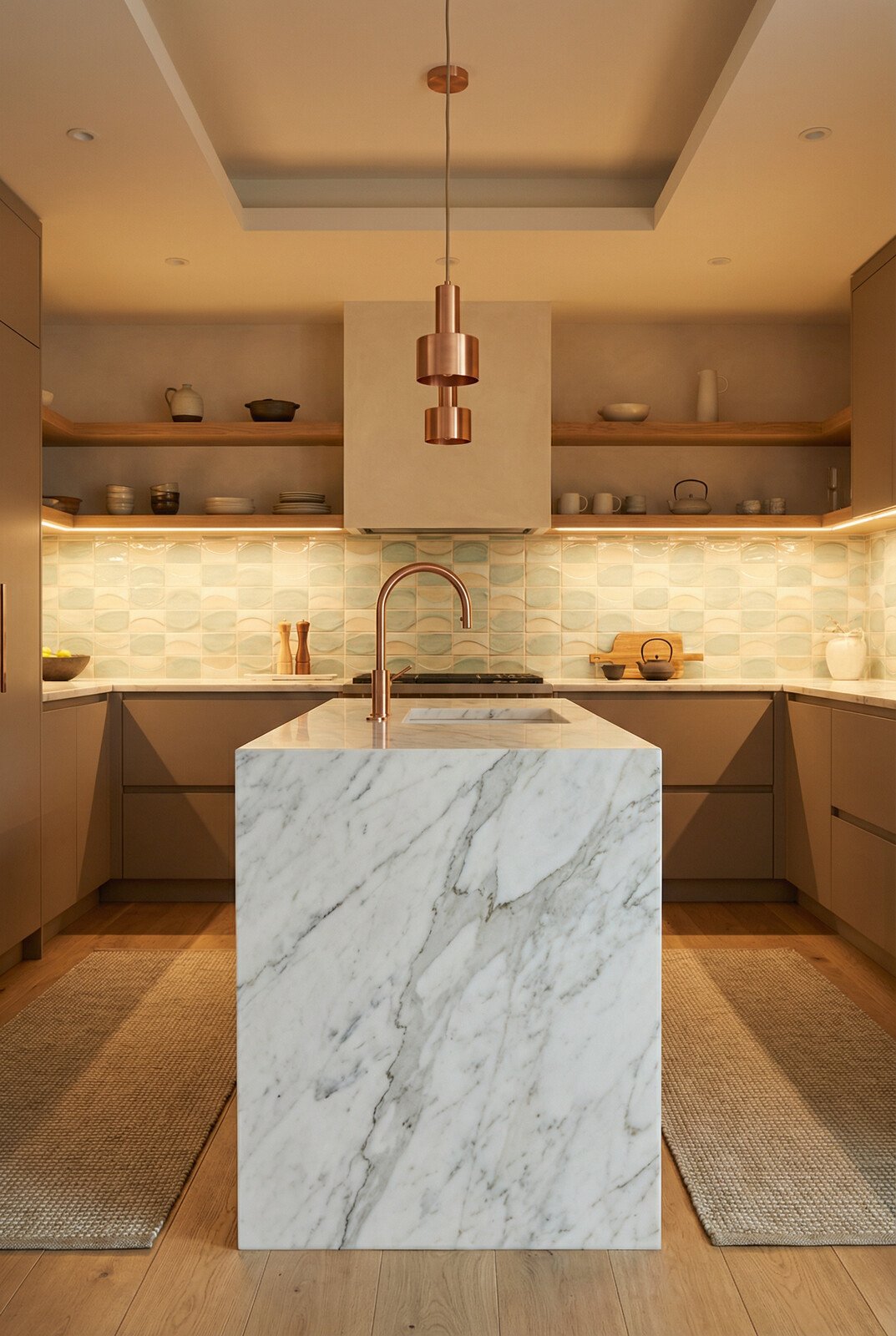
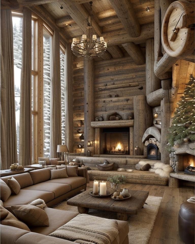
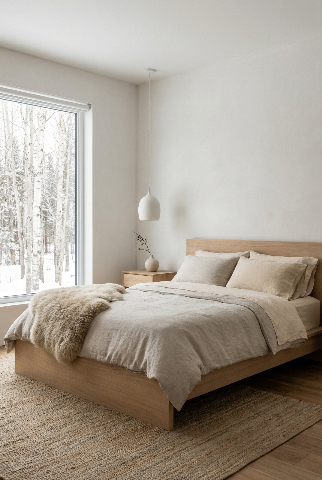
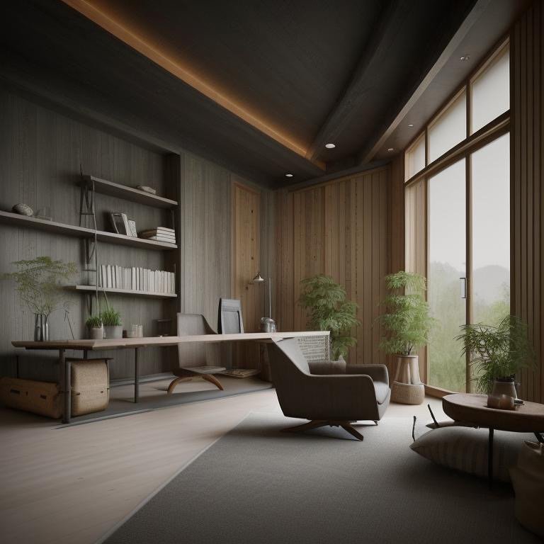
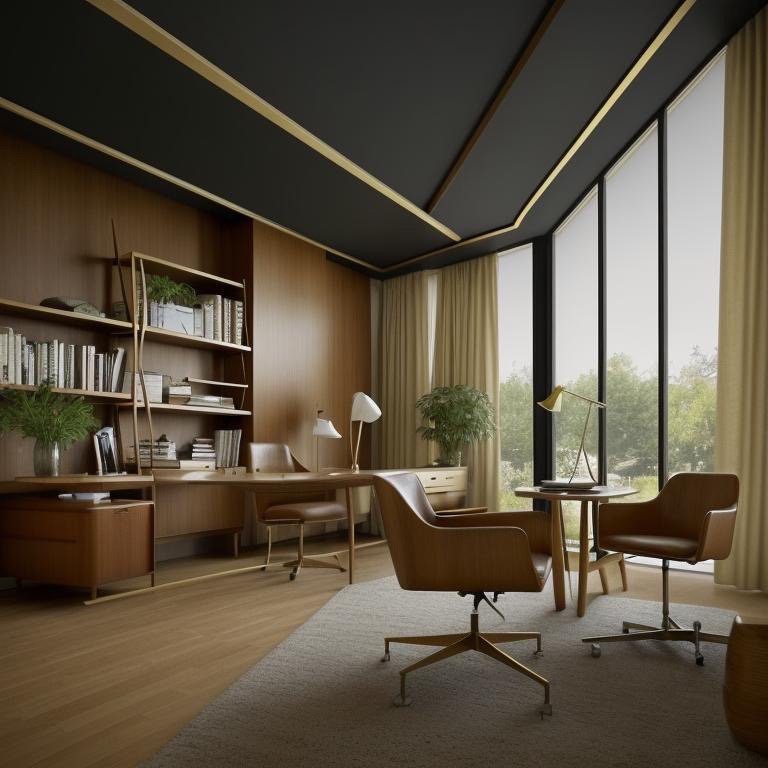
The Japandi Room
The first thing I noticed was that noise left. Not sound—noise. Mental noise. The difference matters. The room was not silent; there was the sound of breath, the subtle shift of fabric, the almost-imperceptible hum of systems. But none of it cluttered. All of it fit inside the space that had been made for it.
The wood was pale. Not white, not cold—pale the way certain disciplines become pale after decades of practice. Stripped down. Essential. The surfaces absorbed light rather than reflecting it, and the light moved differently because it had nowhere to bounce. It traveled the way light travels in museums, with intention and respect.
Shadows softened everything they touched. Nothing had edges that pulled. Everything held attention gently, the way a considered silence holds attention. The proportions were not minimal—they were precise. The room knew exactly how much of itself to show and how much to keep private. And the effect was not restraint but clarity. My thinking became clearer because the room had stopped insisting that I think about it.
A psychological state, not an aesthetic. This was a room where strategy matures quietly. Where decisions settle before they’re made. Where the person sitting inside understands, without being told, that some things deserve to be approached slowly. Not lazily. Slowly with purpose. The room did not inspire action. It cultivated judgment. And that distinction—between the space that makes you want to do things and the space that makes you want to think carefully about which things are worth doing—is the difference between rooms that serve function and rooms that serve purpose.
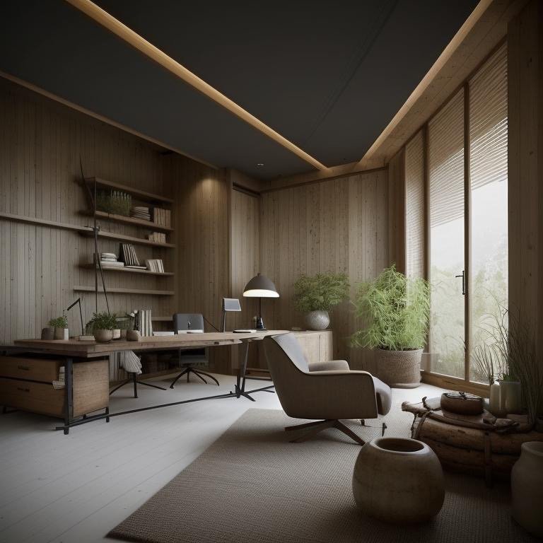
I sat there and became someone slightly more thoughtful. The room didn’t demand it. It just made that version of myself more available.
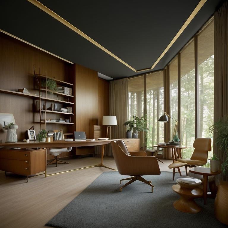
The Mid-Century Modern Room
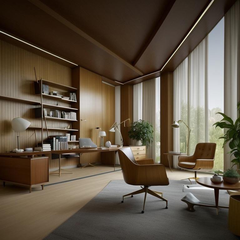
Then I moved to another version of the same space. The Japandi room had softened me. This one aligned me. Geometry asserted itself immediately. Not aggressively—asserted. The furniture felt engineered. Each piece knew its purpose and its proportions with such precision that you couldn’t imagine them being different. The wood was warm but not sentimental. Disciplined warmth. The kind of warmth that serves a function.
Lighting clarified rather than flattered. It made edges visible. It made choices visible. The room supported decision-making not because it was stark, but because it refused to hide anything. Every surface made its argument. Every angle suggested efficiency. The proportions were not arbitrary. They appeared to emerge from a logic that, if you understood it, would make you more capable of making good decisions yourself.
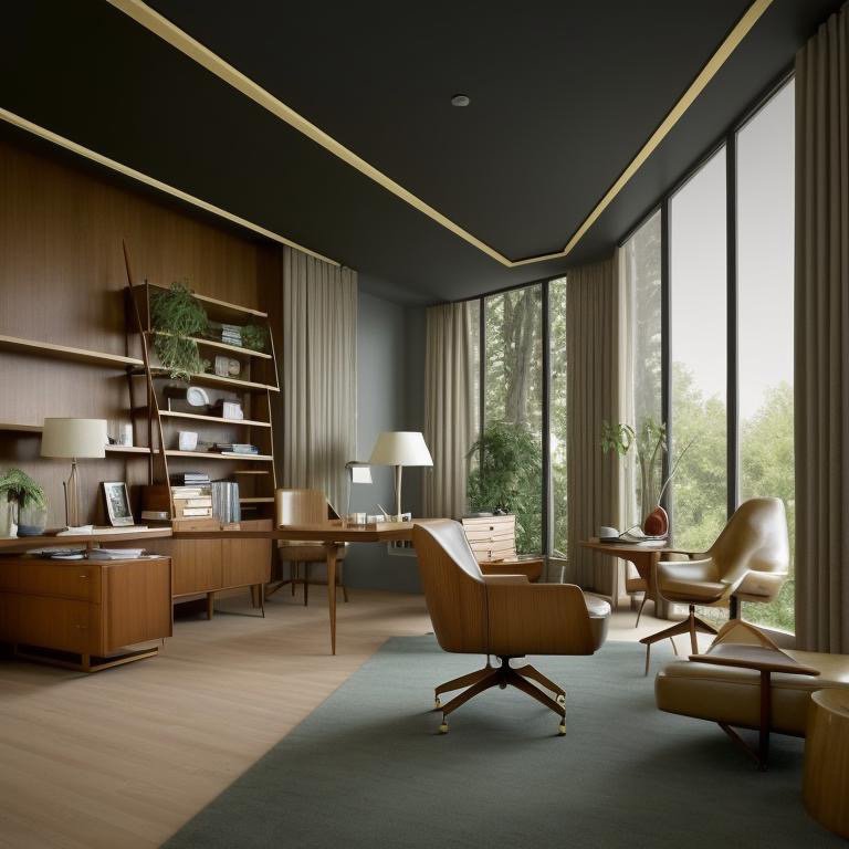
Operational confidence made visible. This was a room for executives who understand that clarity is power. Not the clarity that comes from minimalism, but the clarity that comes from knowing exactly what everything is supposed to do and making sure it does that one thing excellently. The person sitting in this room was not encouraged to be thoughtful about strategy. They were assumed to already know strategy. The room’s job was to make action efficient once strategy was clear.
I sat there and became someone more capable. Not more inspired. More capable. The room had stripped away the part of me that questioned and made visible the part of me that could execute. And the confidence that came from that amplification was almost intoxicating. This is what it feels like to work in a room that believes you can handle the truth.
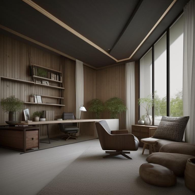
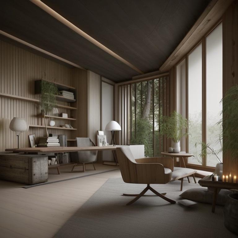
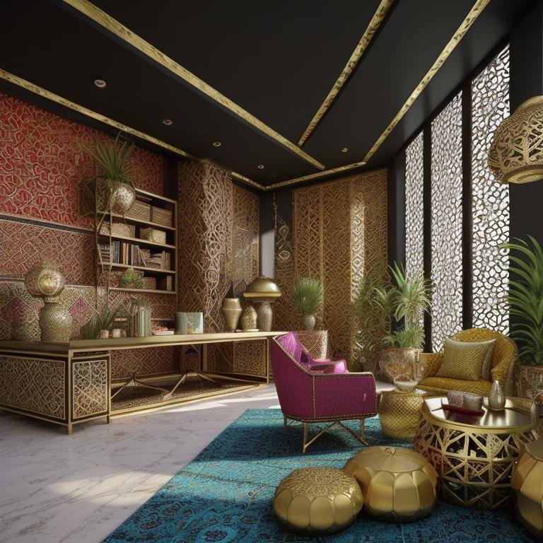
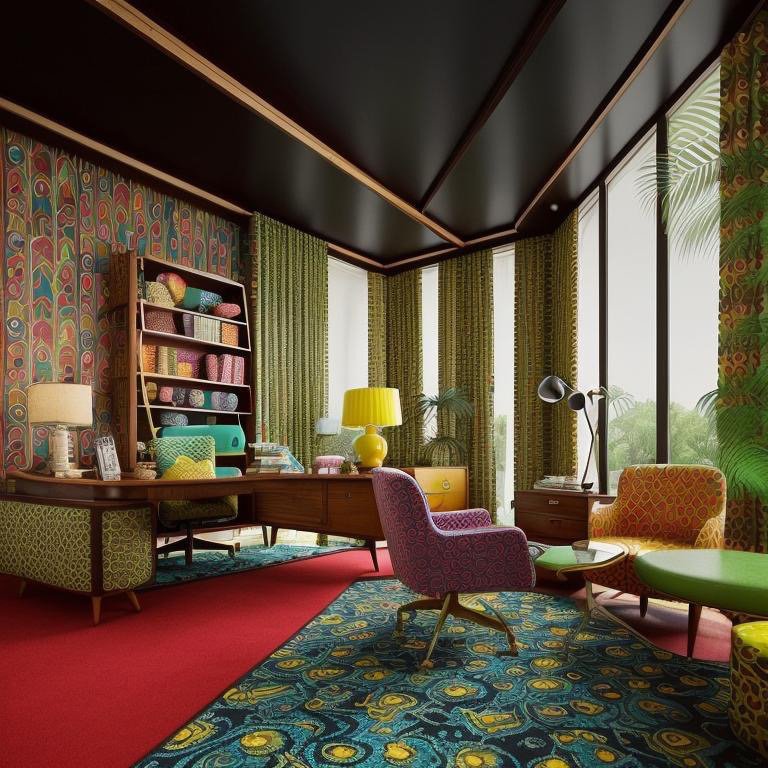
The Moroccan Room
The third room welcomed differently. The temperature seemed to shift—not in fact but in intention. The space was warmer in the way intentions are warmer than facts. Texture surrounded me. Not chaotically. Carefully. Each pattern held its own logic, and the logistics together created a kind of visual conversation. One element would speak, and another would answer, not in imitation but in a language they shared.
Light filtered low and directional, the way light filters through fabric in a marketplace. It arrived prepared, not raw. And the effect was not dimming but refinement. You could see less of the room, but what you could see was more coherent. The eye traveled along a path the light had made for it.
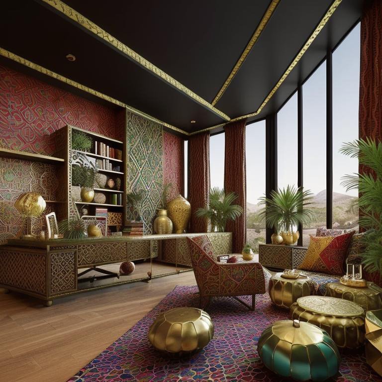
The curves in the space encouraged something I hadn’t felt in the other rooms: conversation. Not with myself, not with the room, but with anyone who sat beside me. The geometry was not assertive or softening. It was receptive. The space leaned inward as though listening. As though it understood that some of the best thinking happens when two people sit together and talk about what matters.
The room didn’t demand clarity or judgment. It created conditions where clarity could emerge through dialogue. It honored both precision and intuition. The aesthetic was rich but never chaotic. There was order underneath, holding the visual abundance in place. This was a room for people who understand that progress isn’t always aggressive. That sometimes the fastest way forward is the one that invites others to move with you.
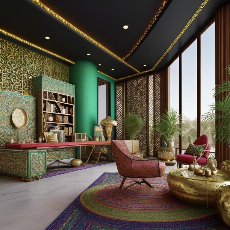
I sat there and became someone more open. Not more vulnerable—more open to being changed by proximity to others. The room had created space for that. Not as a softness or an escape, but as a sophisticated understanding that some decisions are better made together, and some insights only arrive through conversation.
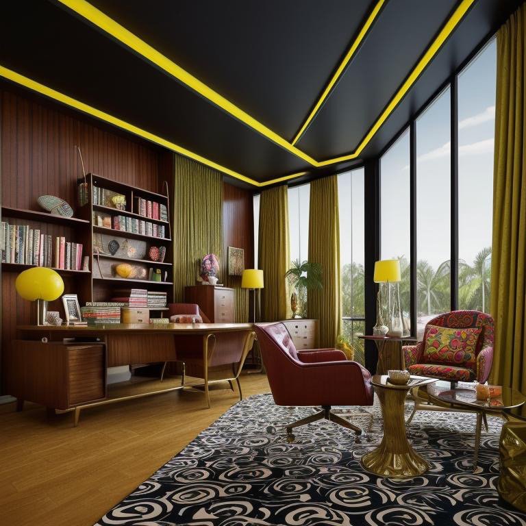
The Retro Room
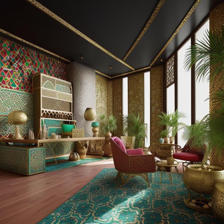
I expected nostalgia in the fourth room. I found memory instead. There’s a difference. Nostalgia is sentimental—it’s about wishing things were the way they used to be. Memory is controlled. It’s about borrowing confidence from the past while remaining present. This room did that. Every color had a history. Every material choice referenced something that had already been proven. But nothing in the room felt like a copy. It felt like a conversation with the past where the past was allowed to speak but not allowed to dictate.
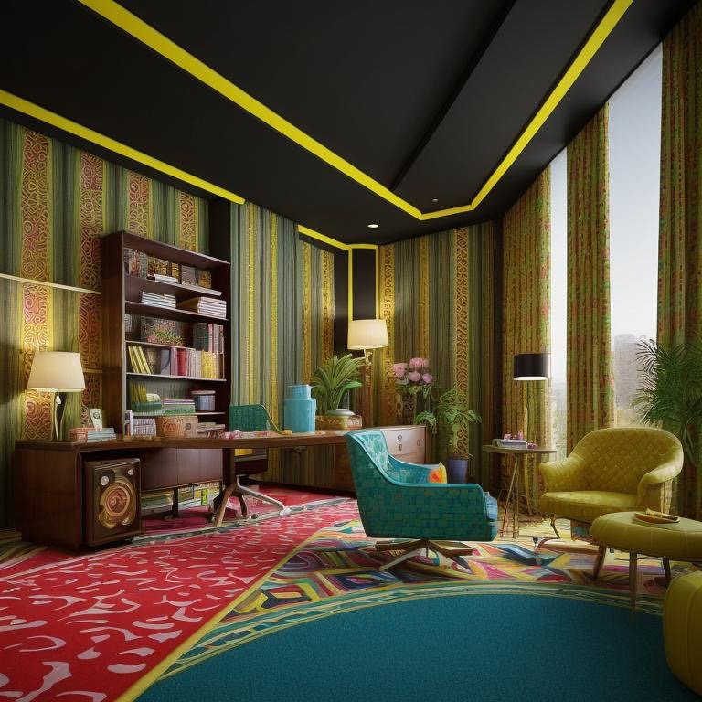
The aesthetic was precise. Color appeared, but never carelessly. Each hue had been chosen with such intention that you trusted it immediately. You didn’t have to defend your preference—the room had already done that for you. The execution was so refined that it suggested creativity without chaos. This was what it looked like when someone understood both history and how to live in the present without being trapped by either.
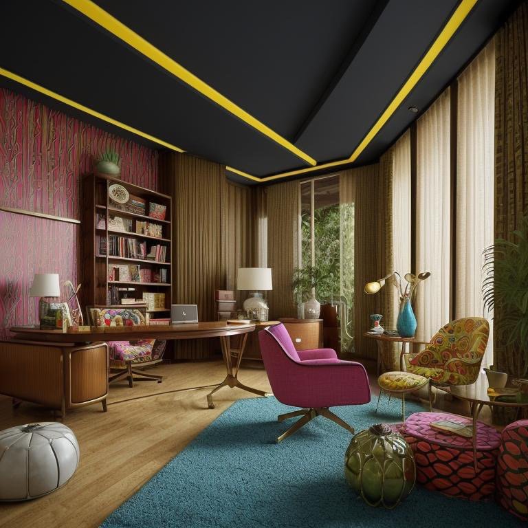
A room for founders who refuse to look like everyone else. Not because they want to be difficult, but because they understand that competence carries its own aesthetic, and that aesthetic often looks like you’ve thought longer and worked harder than your competitors. The room didn’t celebrate its own cleverness. It just was—clearly, confidently, without apology. The person sitting in this room was assumed to understand that good taste is not about fitting in. It’s about understanding enough about what works that you can afford to be yourself.
I sat there and became someone more assured. Not arrogant. Assured in the way people are assured who’ve studied the past and decided which parts of it deserved to continue. The room had created permission for that kind of confidence. It had said: you don’t need to apologize for having taste. You don’t need to blend in to belong. And the effect was deeply freeing.
Architecture Never Changed
The architecture in all four rooms was identical. The program was the same. The light sources were the same. The square footage was the same. Nothing about the basic spatial container had changed. Only the experience did. Only the way the space met the human sitting inside it.
This is what Cinematic Intelligence™ actually does. It doesn’t overwrite rooms. It reveals latent personalities. Not by making spaces more square footage, not by adding louder aesthetics, not by creating spectacle. It does something subtler and more powerful. It creates spaces that know how to meet the human sitting inside them. That understand what quality of thinking each person needs and creates conditions where that thinking becomes not just possible but inevitable.
Not more space. Not more features. Intelligence. The ability to understand that the same room configured differently creates not just a different aesthetic but a different possibility for who you become when you sit inside it. The person I was in the Japandi room was thoughtful. The person I was in the Mid-Century Modern room was capable. The person I was in the Moroccan room was open. The person I was in the Retro room was assured. Same architecture. Four different futures.
And in that variation is the promise of what design can actually be: not a style applied to space, but an intelligence embedded in space. Not a choice imposed on the inhabitant, but a choice made available to them. A room that knows how to listen to the person sitting inside it, and creates conditions where the best version of that person has room to exist. That’s not decoration. That’s architecture behaving like intelligence. And that’s the difference between rooms and spaces that actually matter.