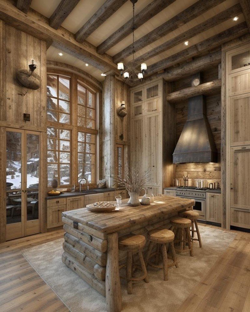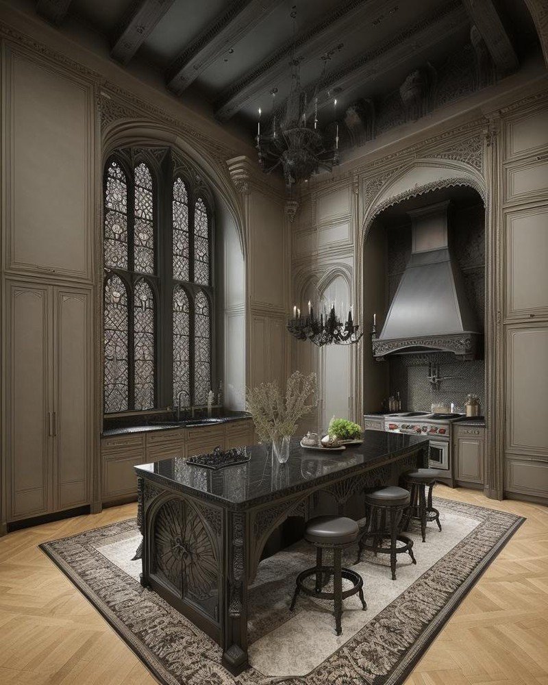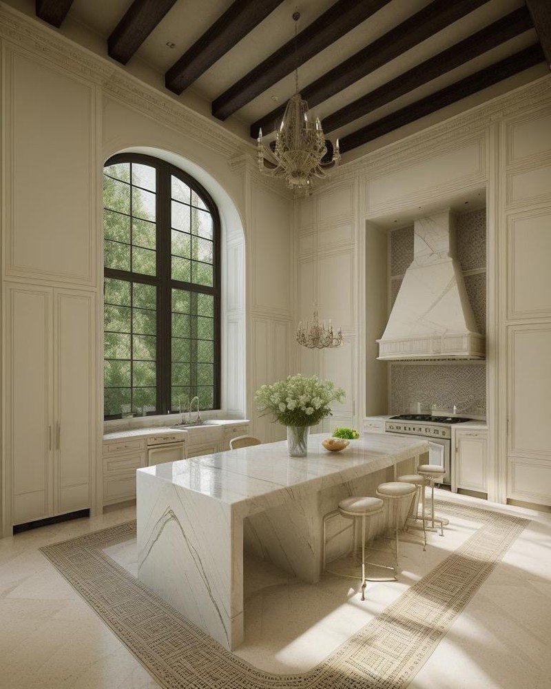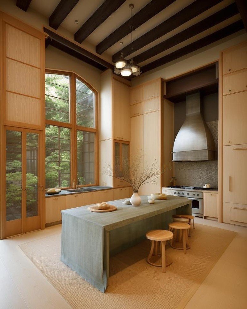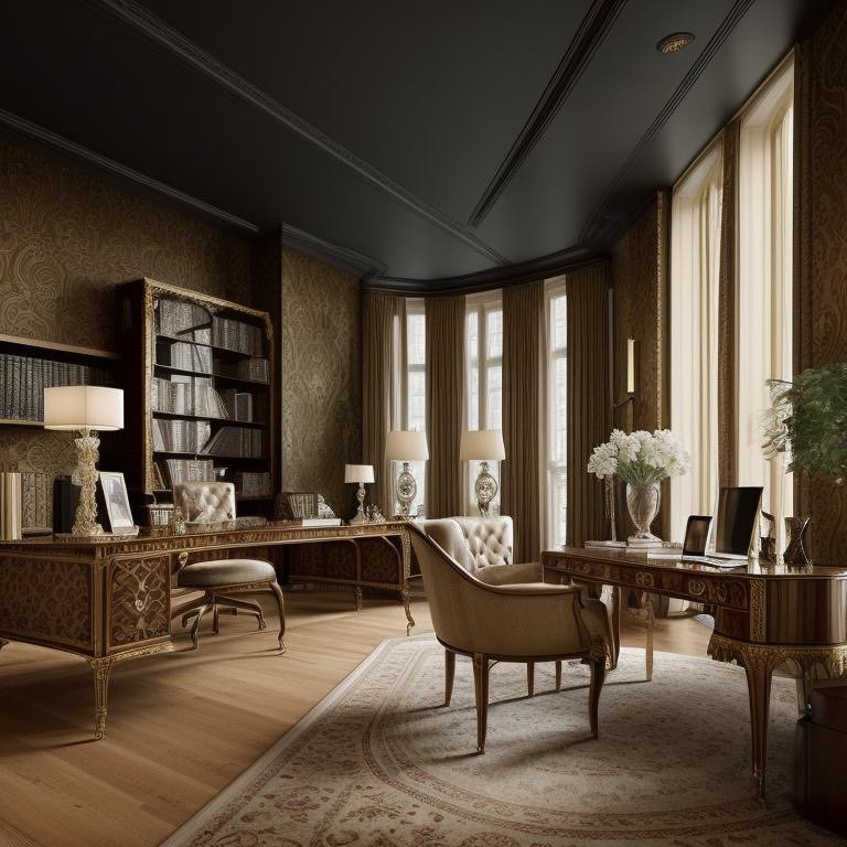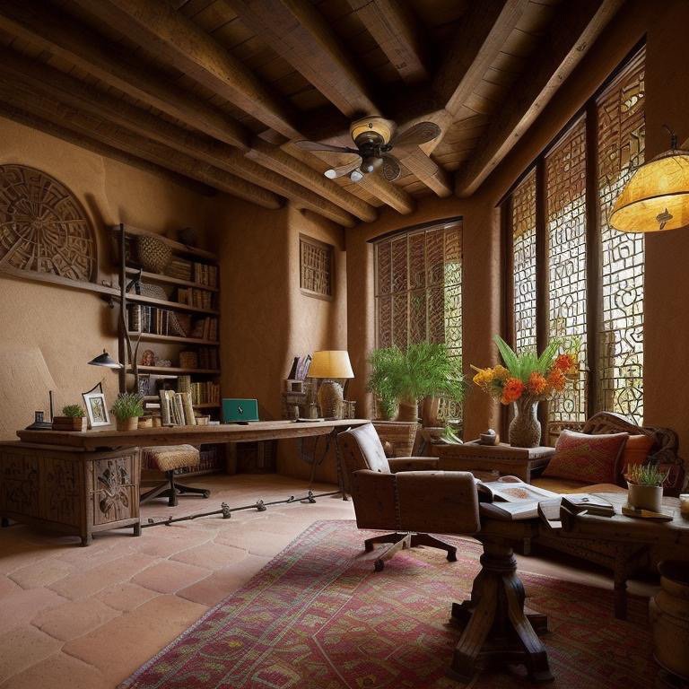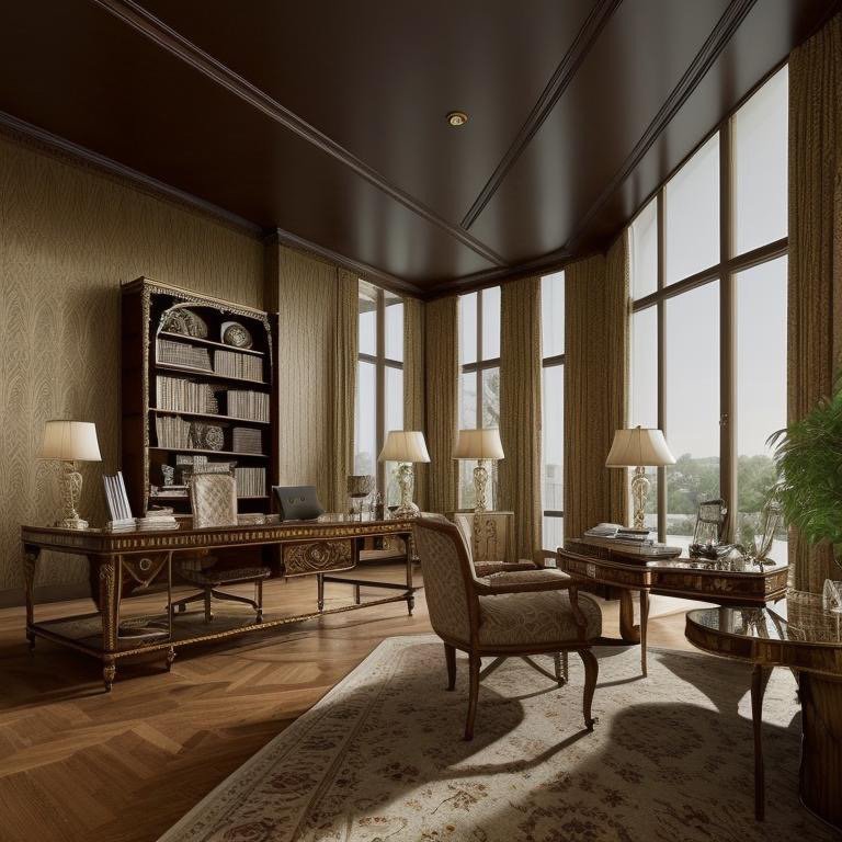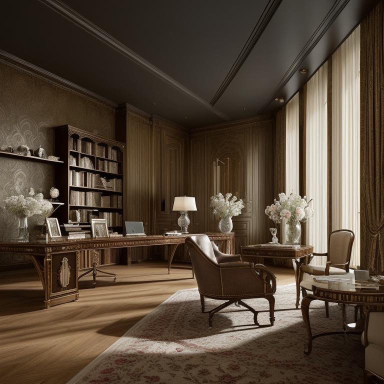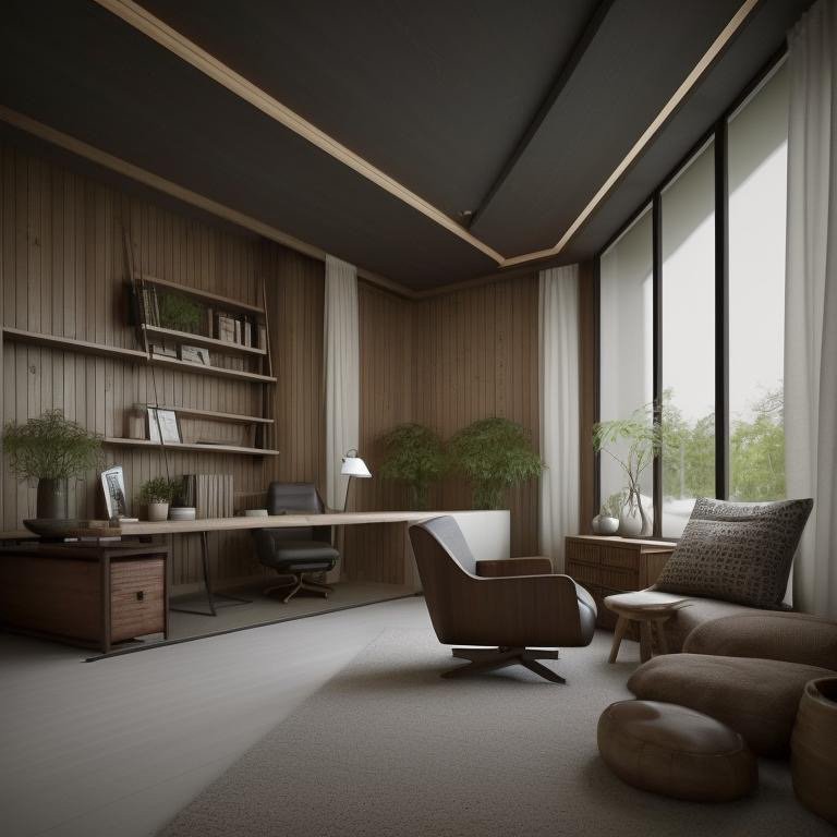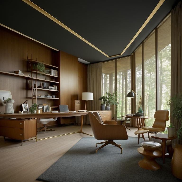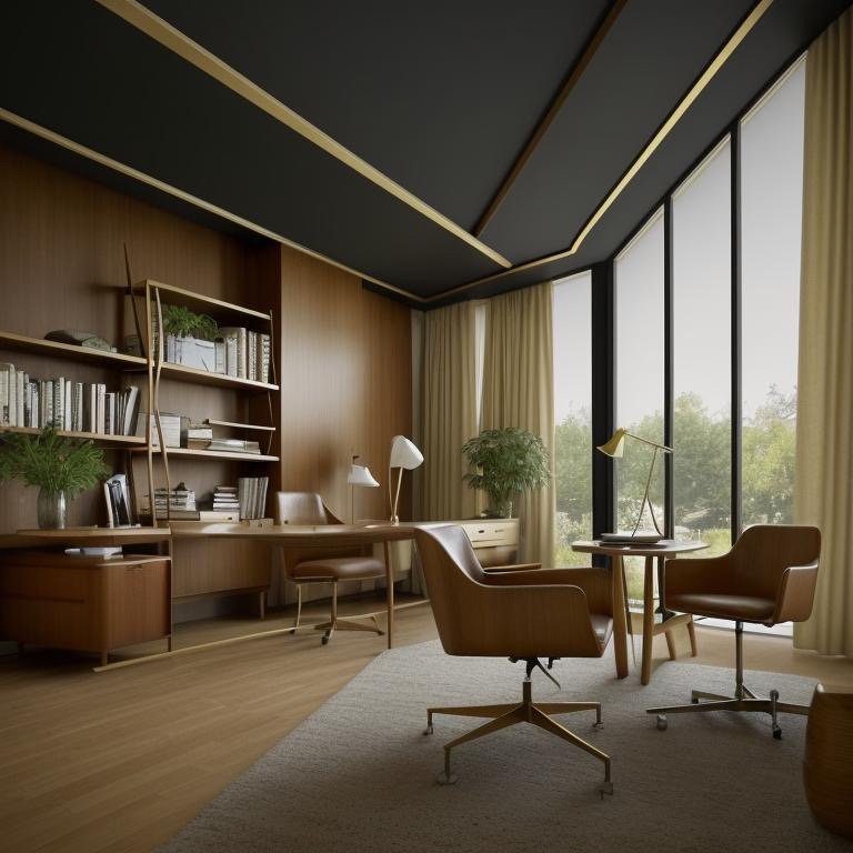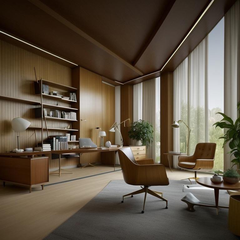
The Shōrin Villa: The Fifth Translation
Light is a visitor, shadow is home. This aphorism, attributed to Japanese architectural philosophy, reframes how we understand the relationship between brightness and darkness in a domestic landscape. The first four versions of the Shōrin backyard each emphasized different aspects of light—California’s solar optimization, Chalet’s thermal atmosphere, Expressionist’s chromatic intensity, Farmhouse’s warm patina. But through Cinematic Intelligence™, the remaining five architectural languages explore what happens when we invert the hierarchy. When darkness becomes primary, and light becomes the guest.
These second five backyards extend across radically different cultural traditions and aesthetic frameworks. Scandinavian minimalism. Retro color symbolism. Mediterranean sun-worship. Hollywood Regency glamour. Greek Revival monumentality. Each language operates from different assumptions about how humans should live, what materials carry meaning, and what relationship between interior and exterior constitutes home.
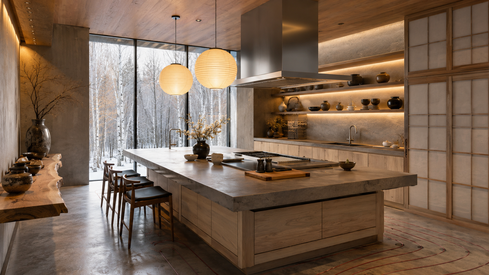
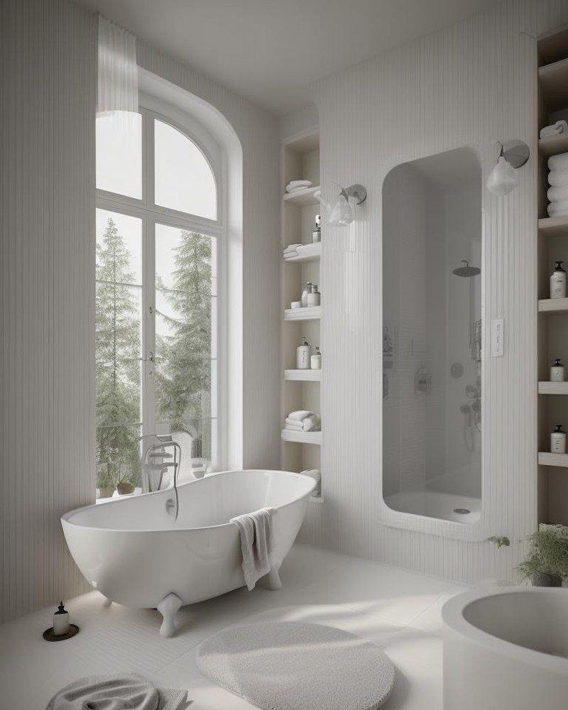
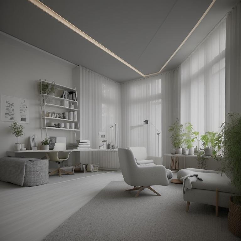
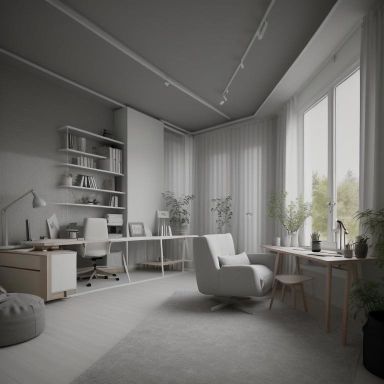
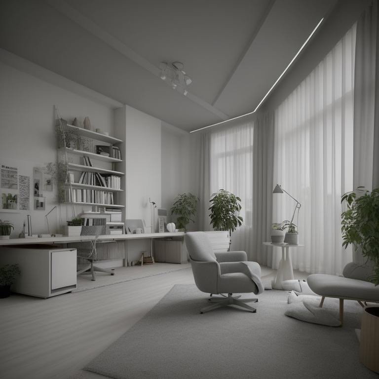
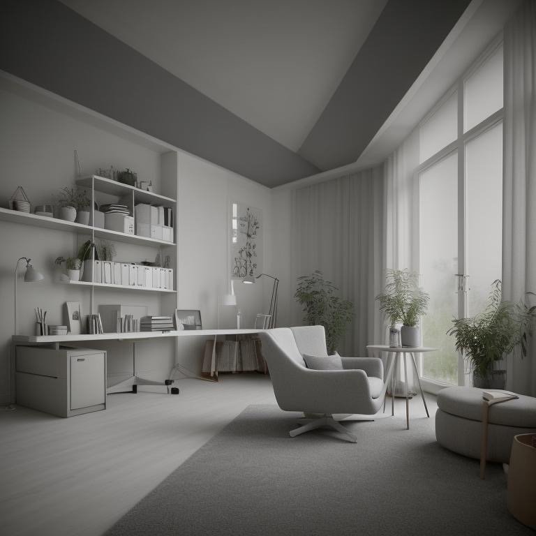
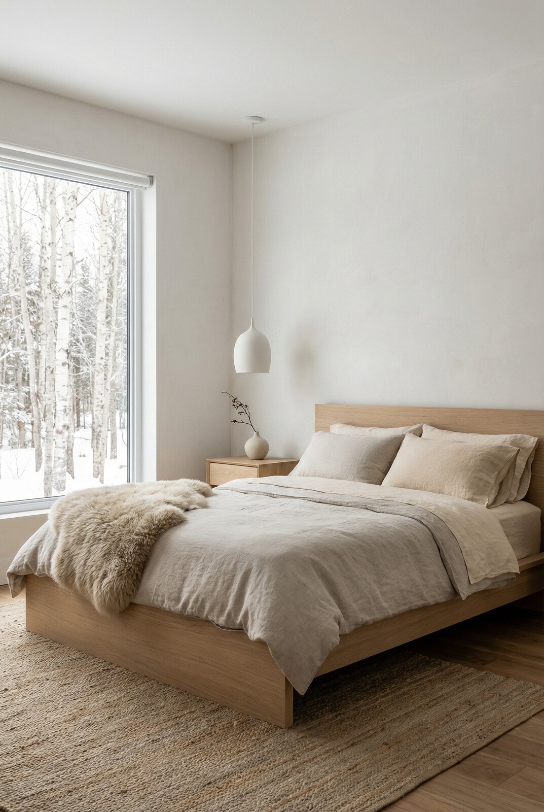
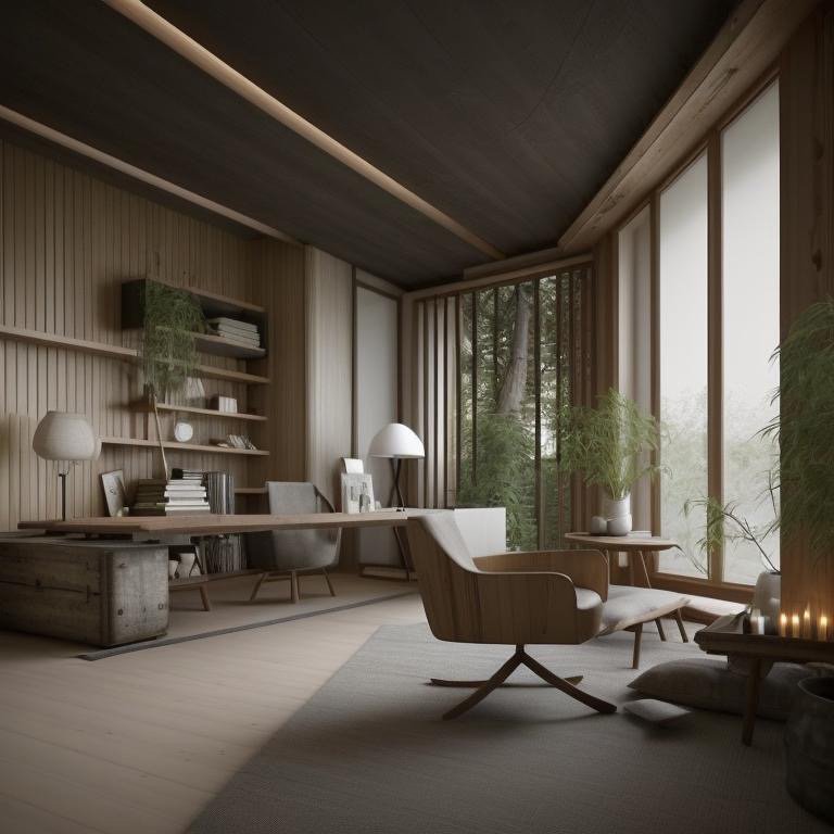
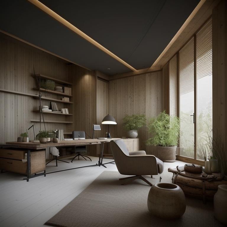
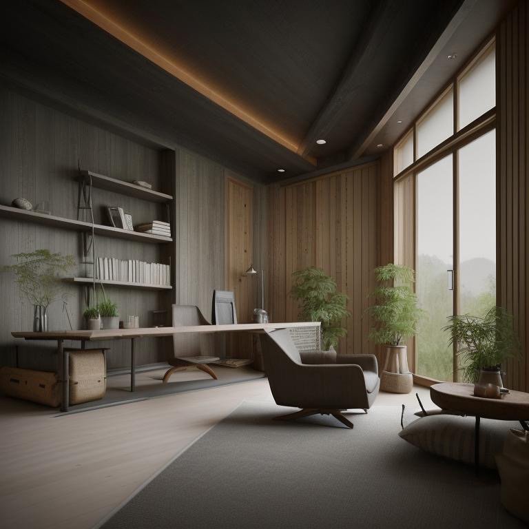
Scandinavian: The Architecture of Silence
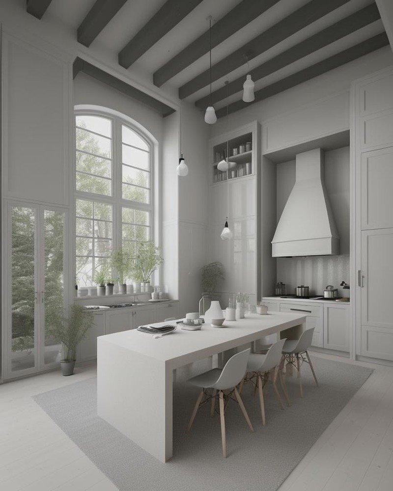
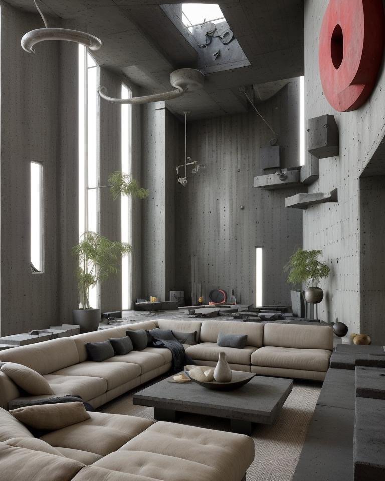
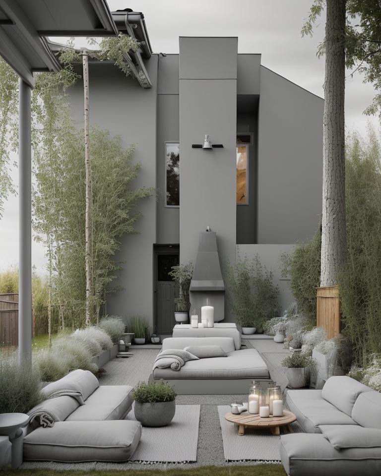
Scandinavian language begins with a truth: in northern latitudes, darkness is structural. Winter doesn’t end. It settles. Light becomes precious precisely because it’s scarce. The Scandinavian backyard doesn’t fight this reality. It listens to it. The palette is deliberately desaturated—ashen birch, matte white, silvered grays that absorb rather than reflect light. Plantings are minimal. The ground plane is composed of pebbles and weathered wood. There are no vivid colors, no floral exuberance.
Instead, there’s silence. The Scandinavian backyard teaches you to hear the sound of wind in bare branches. To notice the texture of lichen on stone. To understand that beauty doesn’t require brightness. The design principle is subtraction—remove everything unnecessary until you’re left only with essential forms and materials. A single bench. A pathway of pale stones. Perhaps a reflective pool that doubles the minimal sky.
Scandinavian language says: listen to silence. In a world of constant visual stimulation, this backyard offers a different kind of architecture—one that slows perception, deepens attention, and finds profound beauty in what most people would call emptiness.
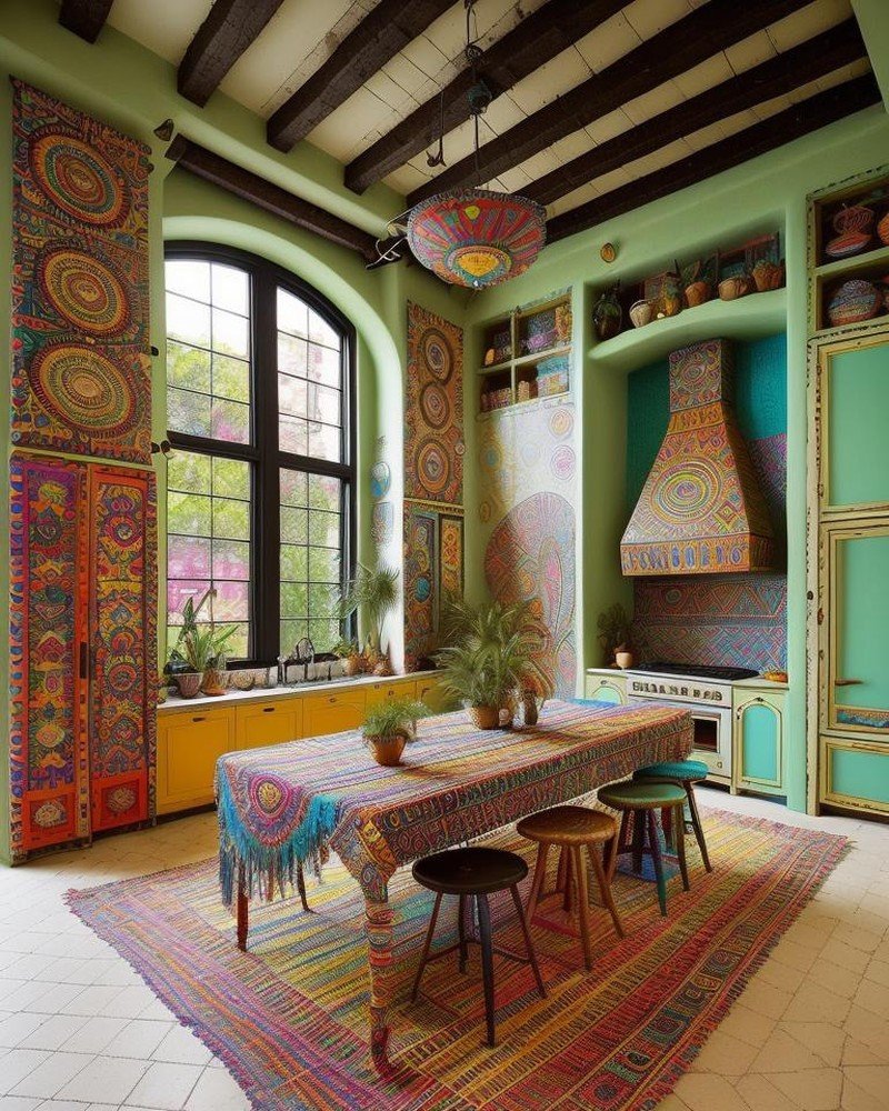
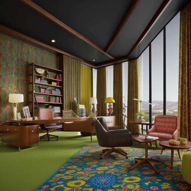
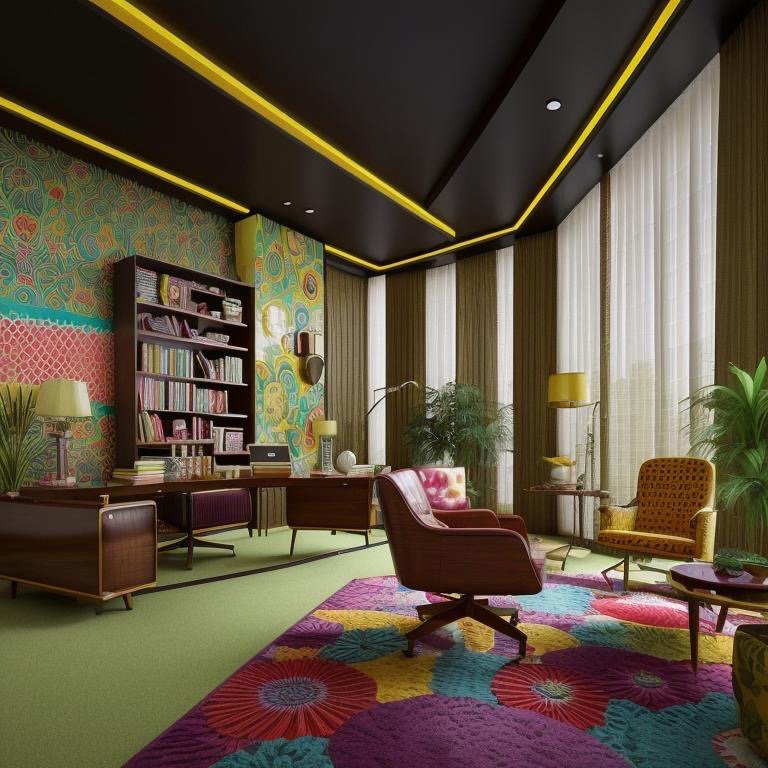
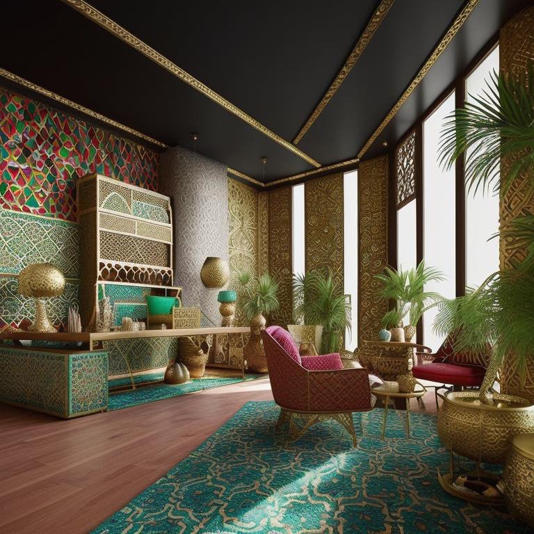
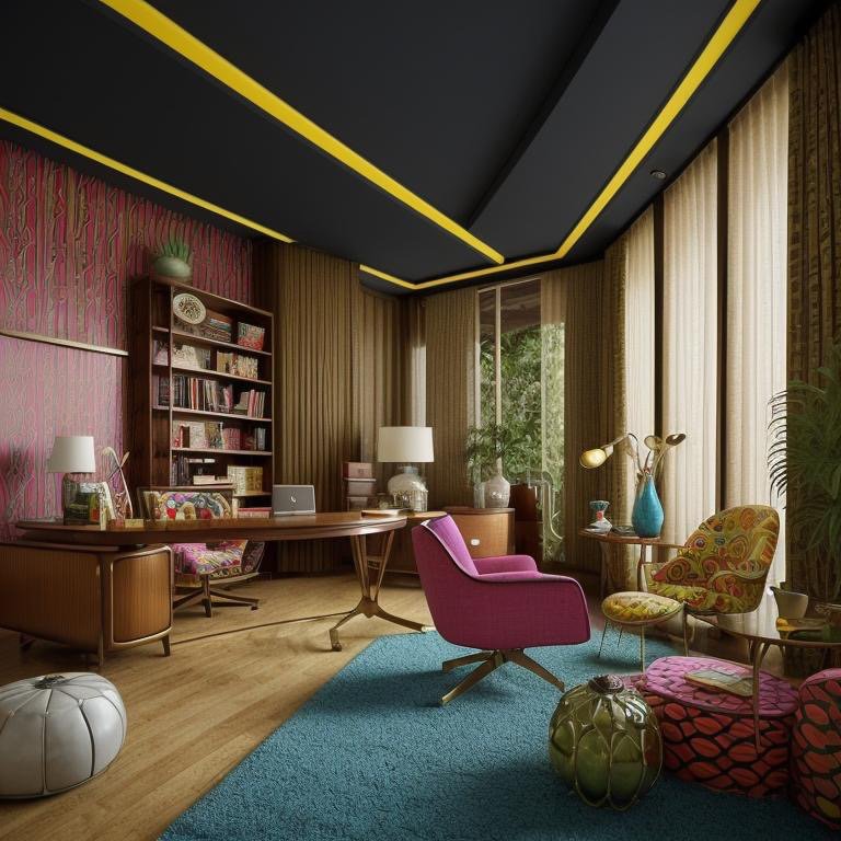
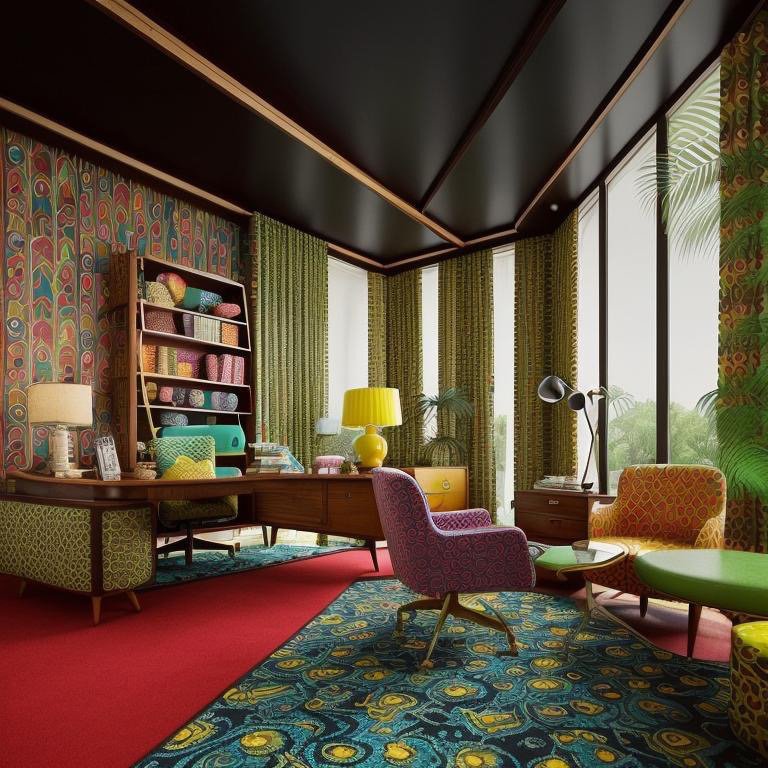
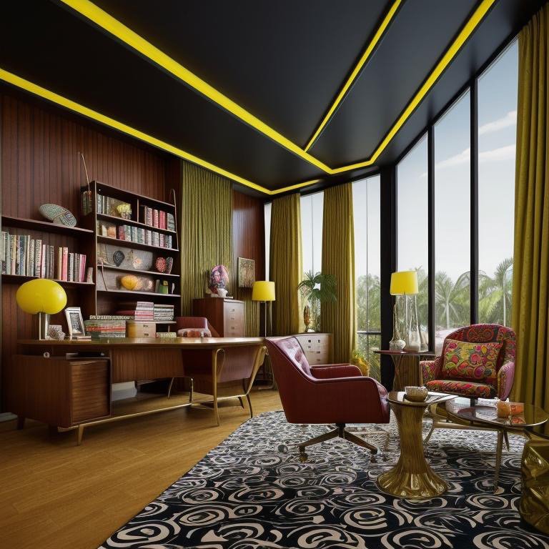
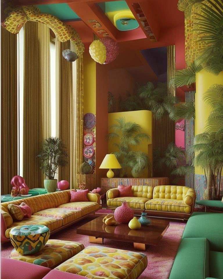
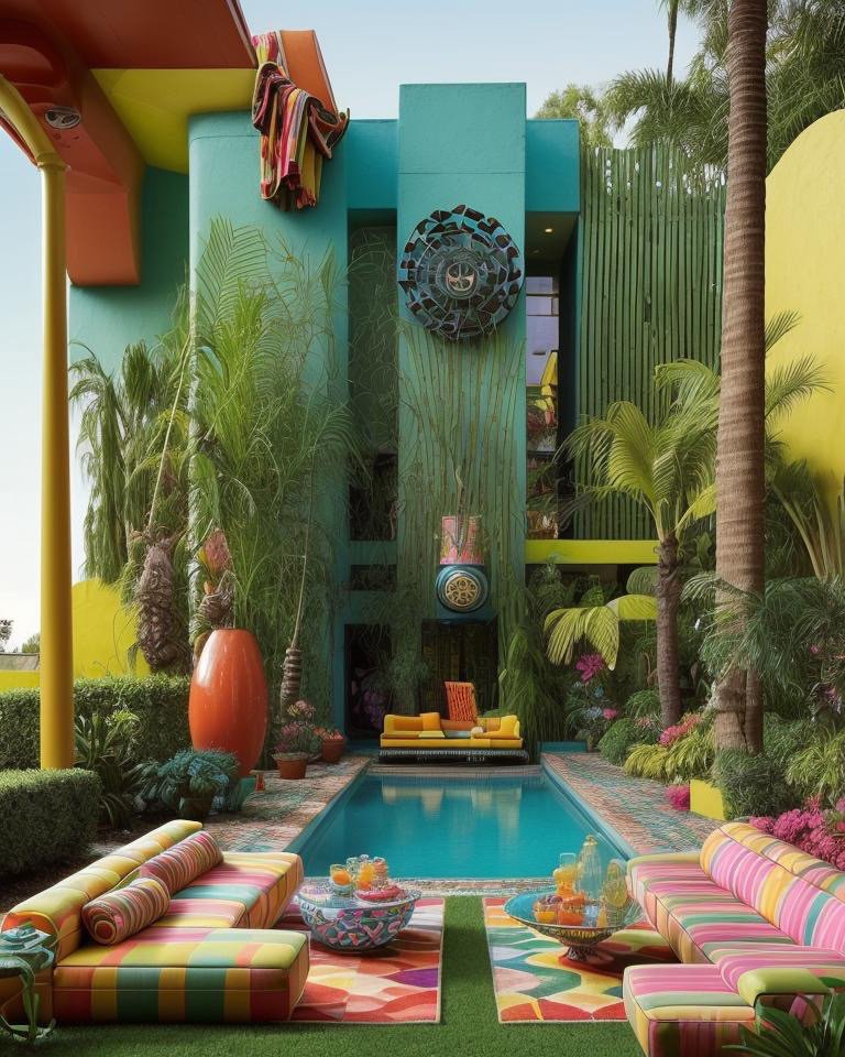
Retro: Color as Linguistic System
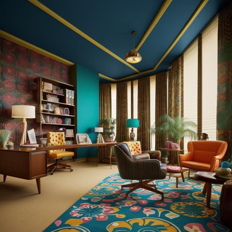
If Scandinavian subtracts, Retro multiplies. The Retro backyard is a color symphony—turquoise, chartreuse, coral, colors that shouldn’t work together according to contemporary taste, and yet, in their historical specificity, create an entirely coherent visual language. Checkerboard tiles in contrasting hues. A mirrored mosaic wall that fragments and reflects light in fractured patterns. Plantings are deliberately ornamental—nothing functional, everything chosen for visual drama.
Retro language understands that color isn’t decoration. It’s a linguistic system. Certain color combinations carry cultural meaning, historical resonance. A turquoise pool in a chartreuse landscape doesn’t just look vivid; it communicates: this was a moment when a culture believed color mattered, when restraint was considered boring, when abundance of visual expression was synonymous with prosperity and optimism.
The Retro backyard is time-specific. It couldn’t exist in another era. Its colors announce their historical moment. Yet paradoxically, that historical specificity is what makes it timeless—it’s so thoroughly itself, so committed to its own visual logic, that it escapes fashion and becomes artifact.
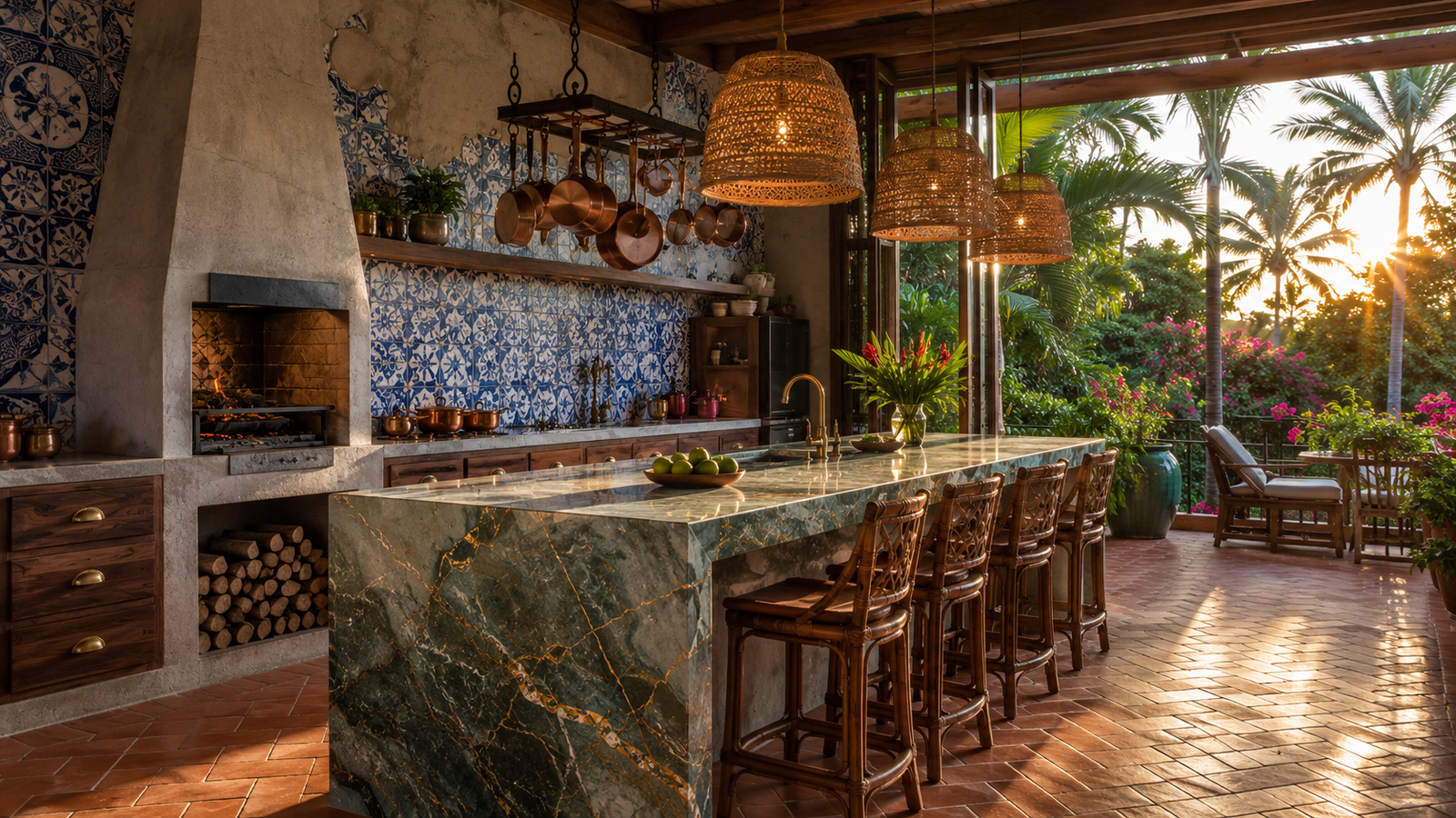
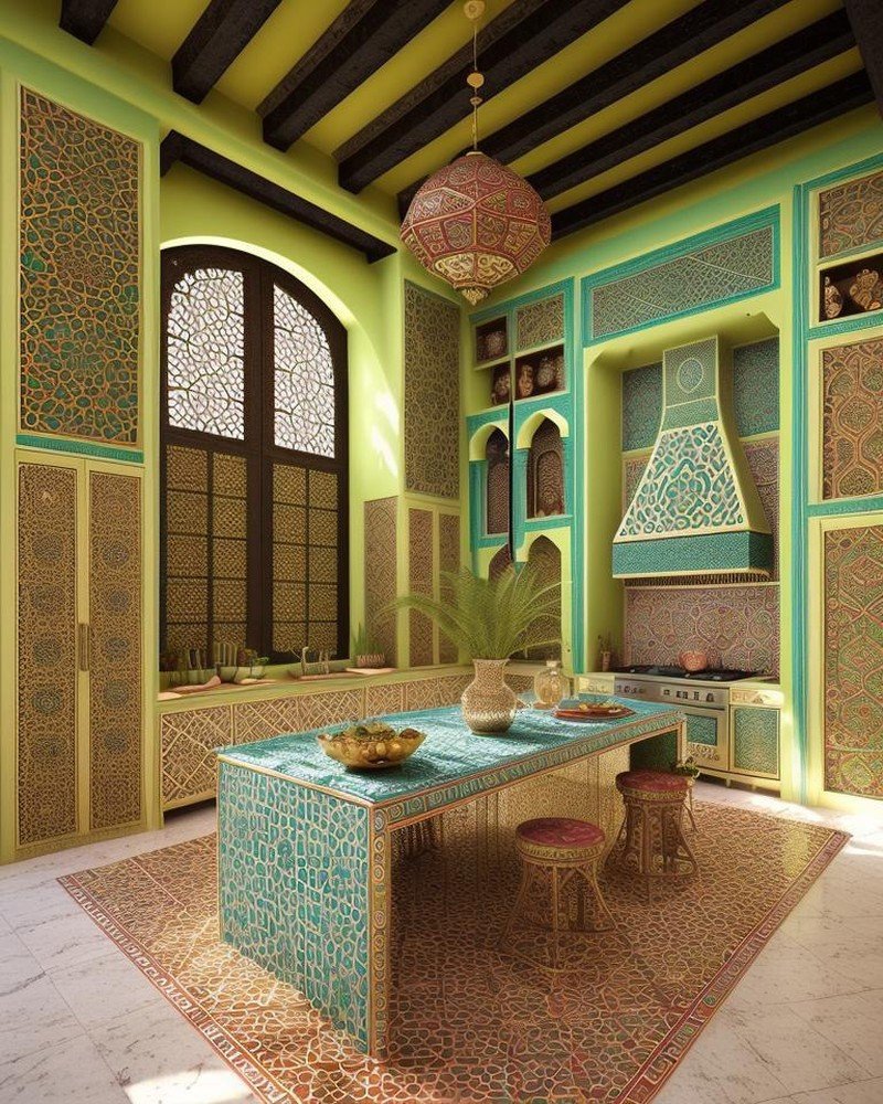
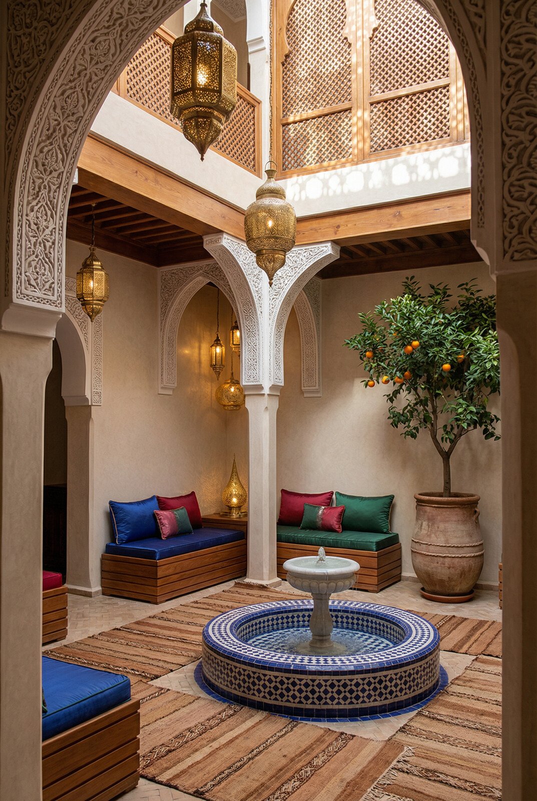
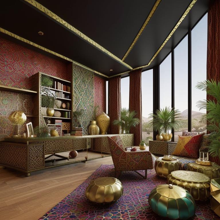
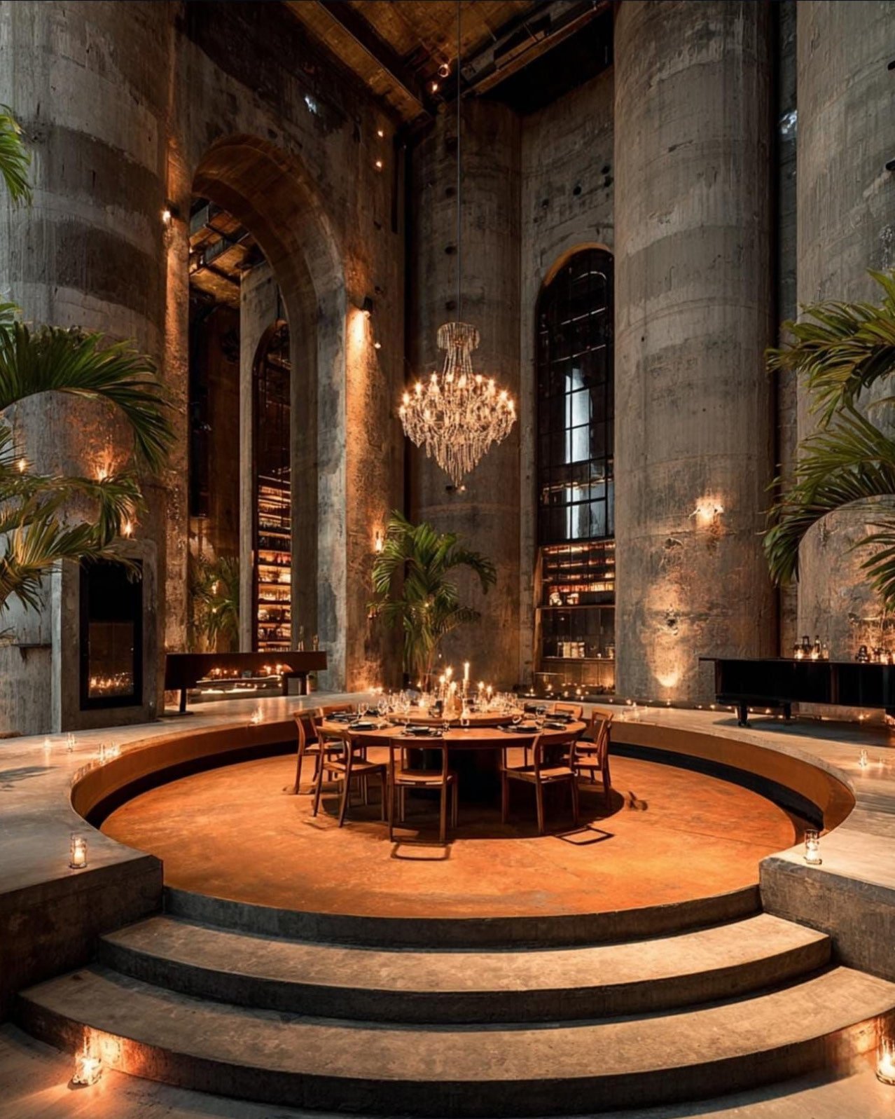
Mediterranean: Sunlight as Liturgy
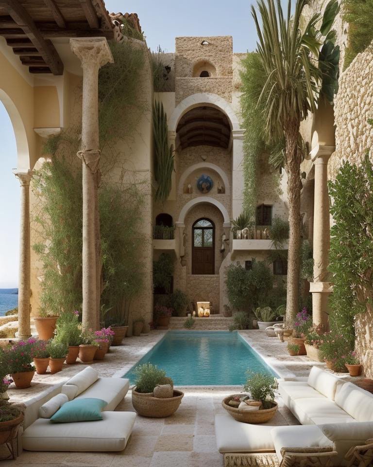
Mediterranean language returns us to light, but light understood not as optimization but as spiritual principle. The backyard is organized around arches and arcades that frame views and create shadow chambers. Limestone paving, worn smooth by centuries of foot traffic in real Mediterranean villages. Bougainvillea spills across walls in fuchsia abundance. The sound of cicadas is audible in the design—you can almost hear them.
Mediterranean says: sunlight is sacred. Not in a mystical sense, but in a cultural sense. This architecture emerges from thousands of years of dwelling in intense sun. The arches protect skin. The water features (fountains, basins) cool the air and provide the sound of flowing water—both practical and ceremonial. The plantings are exuberant because this landscape exists at the edge of desert. Abundance is not excess. It’s gratitude.
The Mediterranean backyard invites you into a specific relationship with nature—not domination or control, but negotiation. You’re living within constraints (heat, aridity) that the architecture acknowledges and honors. The result is an landscape that feels both ancient and alive.
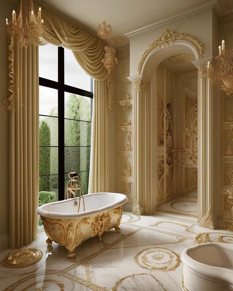
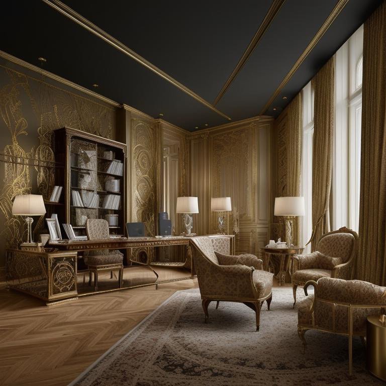
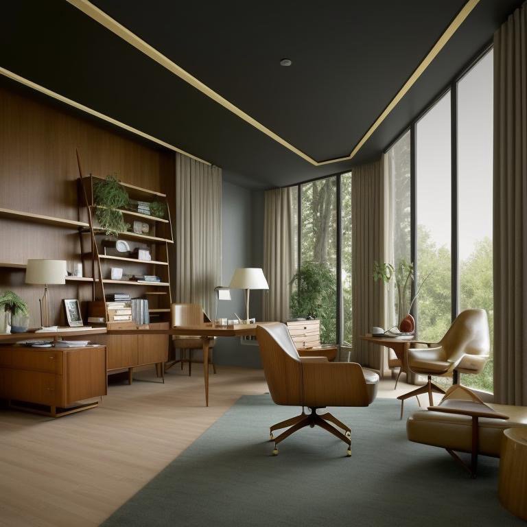
Hollywood Regency: Glamour Without Apology
Hollywood Regency language makes no attempt at naturalism. It’s artifice in service of beauty. The backyard is polished jade, champagne gold, mirror-lacquered marble. Every surface is designed to reflect and intensify light. Plantings are sculptural—carefully pruned, almost architectural. There are no casual plants allowed. Everything is considered, calibrated, theatrical.
Hollywood Regency says: luxury is unapologetic. You live in this backyard not to commune with nature, but to demonstrate that you’ve transcended nature’s constraints. You’ve created an entirely artificial paradise where materials are precious, surfaces are flawless, and every element serves the larger composition. There’s no rusticity here, no pretense of organic growth.
This language can feel cold to contemporary sensibilities committed to environmental authenticity. But it’s honest about what it is: a celebration of craft, luxury, and human-directed beauty. It refuses the hypocrisy of contemporary design that claims to honor nature while deploying expensive interventions to make nature conform to aesthetic preferences. Hollywood Regency simply admits: this is artifice, it’s intentional, and it’s beautiful.

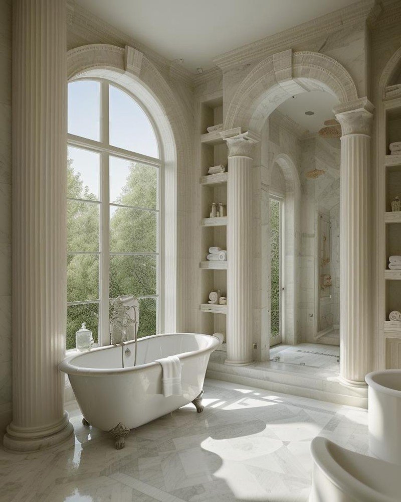
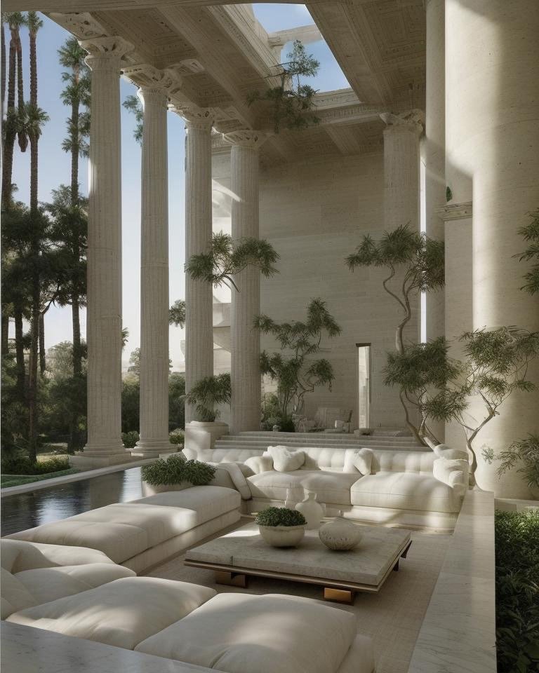
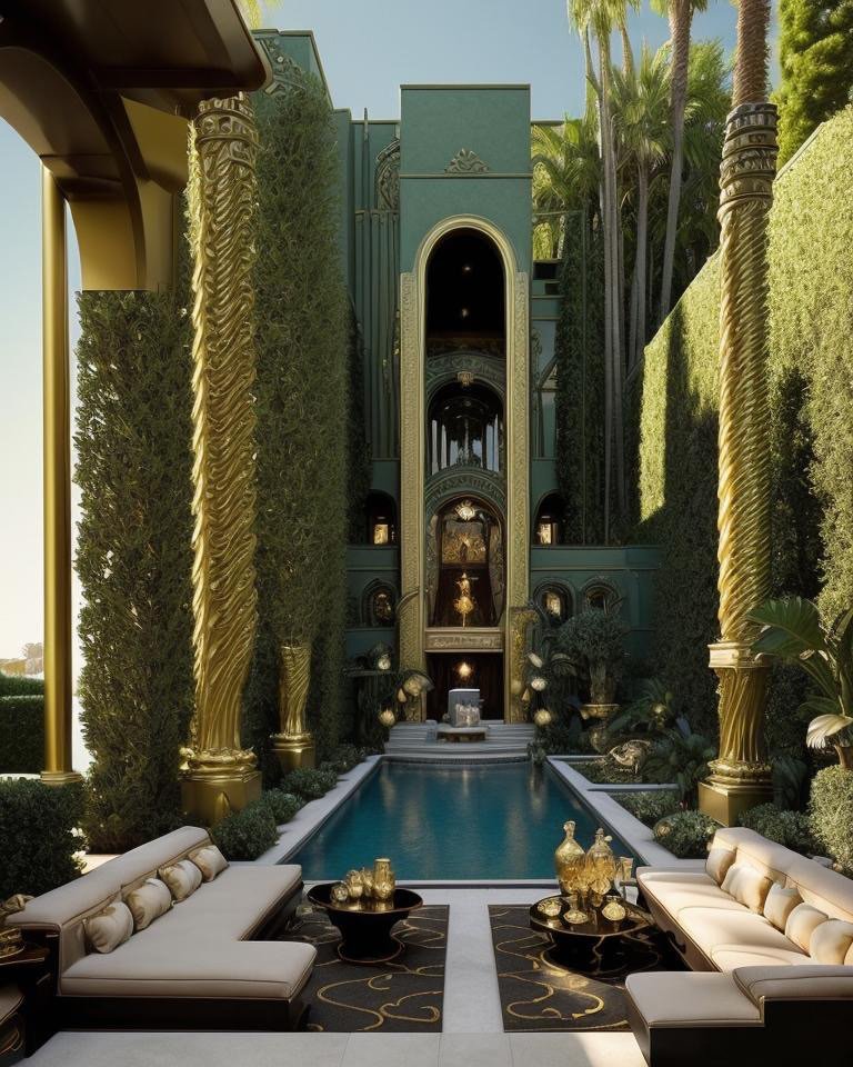
Greek Revival: Monumentality as Domestic Space
Greek Revival language brings monumental architecture into the domestic landscape. Doric columns frame garden spaces. A marble fountain anchors the composition. Honeyed limestone paving, carved with mandala patterns and frieze etchings, references both classical temples and Persian gardens. The scale is generous without becoming overwhelming. Every element carries cultural weight.
Greek Revival says: a private backyard can hold the dignity of public monuments. You don’t need to apologize for wanting beauty at this scale. The columns aren’t functional (they don’t support anything). They’re linguistic—they declare that this space belongs to a tradition of monumental beauty, that domestic life deserves the same architectural dignity we grant to temples and civic buildings.
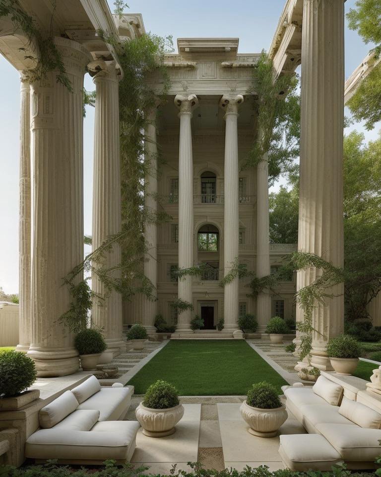
The Greek Revival backyard is calm in the way that classical proportions are calm. There’s no drama here, no chromatic intensity, no performative gesture. Instead, there’s a deep equilibrium. The proportions are right. The materials are noble. The overall composition achieves a kind of repose—the backyard becomes a place of contemplation, even within a private residence.
The etchings carved into the limestone—mandalas and classical friezes mixing—suggest that Greek Revival doesn’t require historical purity. It requires proportion, materiality, and a commitment to enduring beauty. The specific cultural references matter less than the underlying philosophy: that a home’s landscape should express timeless values.
Closing: Architecture as Personal Philosophy
The Shōrin Villa’s ten backyards reveal that architectural language is ultimately personal philosophy made visible. When you choose Scandinavian, you’re choosing silence and subtraction. When you choose Retro, you’re choosing color and historical specificity. When you choose Mediterranean, you’re choosing negotiation with climate and landscape. When you choose Hollywood Regency, you’re choosing transparency about artifice. When you choose Greek Revival, you’re choosing monumentality and proportion.
My favorite is Scandinavian—it listens best. The design says nothing loud. It simply creates conditions where attention deepens, where the small sounds and subtle light shifts become the primary architecture. In a world of overwhelming visual noise, that listening becomes radical.
But every language here is true to its own values. The backyard doesn’t exist in nature. It exists in choice. The choice reveals character. And across these ten versions, character emerges not from individual personality, but from commitment to a coherent architectural philosophy. That commitment to consistency, to following an idea through to its fullest expression—that’s what makes these backyards architecture rather than decoration.