Tag: Office Design

  • Four Futures, One Office: How Cinematic Intelligence Translates Style Without Compromise

    Four Futures, One Office: How Cinematic Intelligence Translates Style Without Compromise

    Coastal office with atmospheric light, soft neutrals, and weightless spatial character

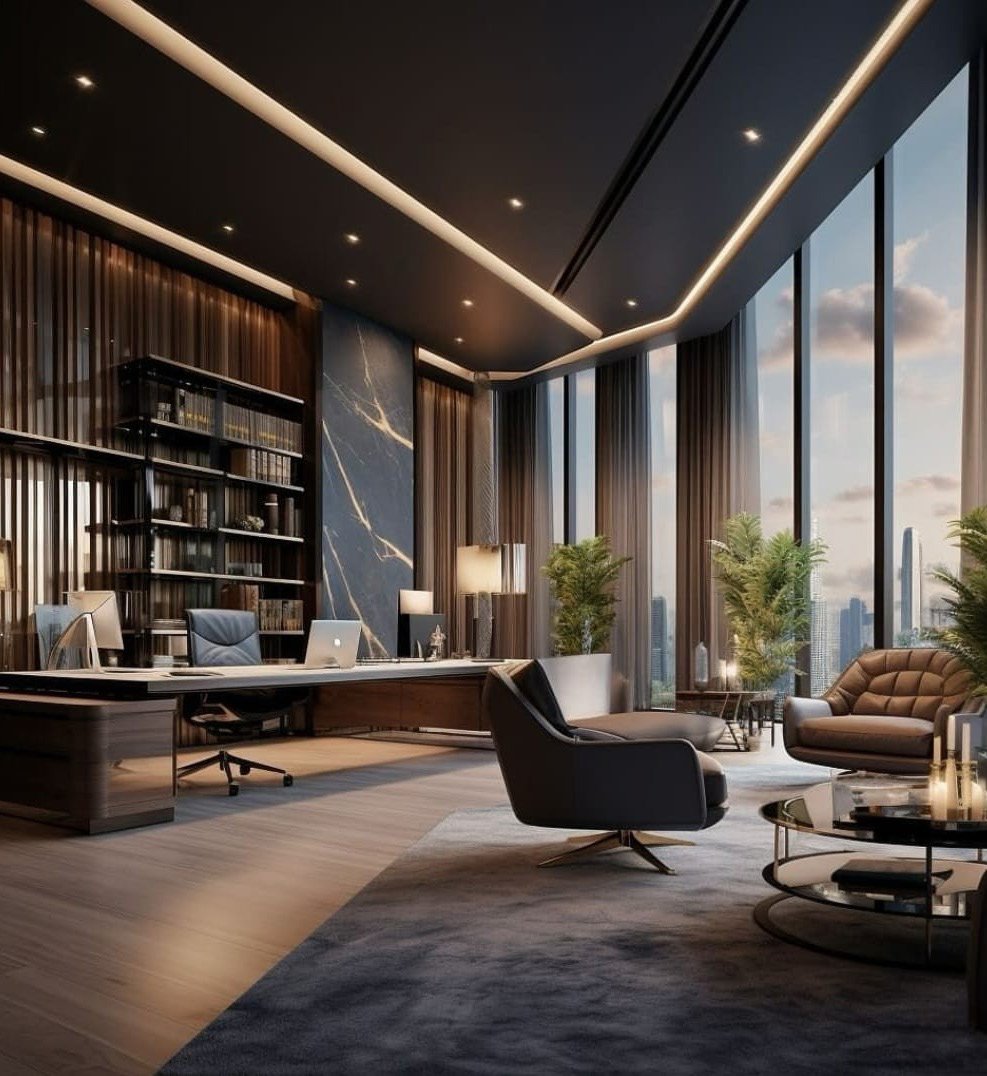
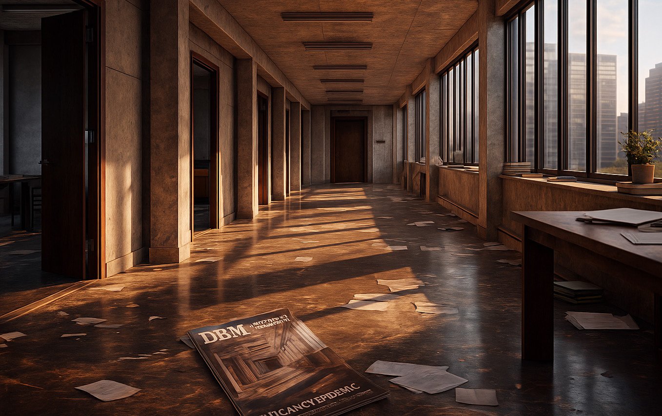
    Great design reveals itself over time. You do not comprehend it in a glance. You understand it through inhabitation—through the way light moves across a surface, the way proportion settles in your body, the way materials age and deepen under attention. But the modern office cannot wait for this slow revelation. Capital is committed before occupancy. Culture is shaped before teams arrive. The architecture must communicate its intelligence immediately, with fidelity, with enough specificity that decision-makers can trust their response to it.

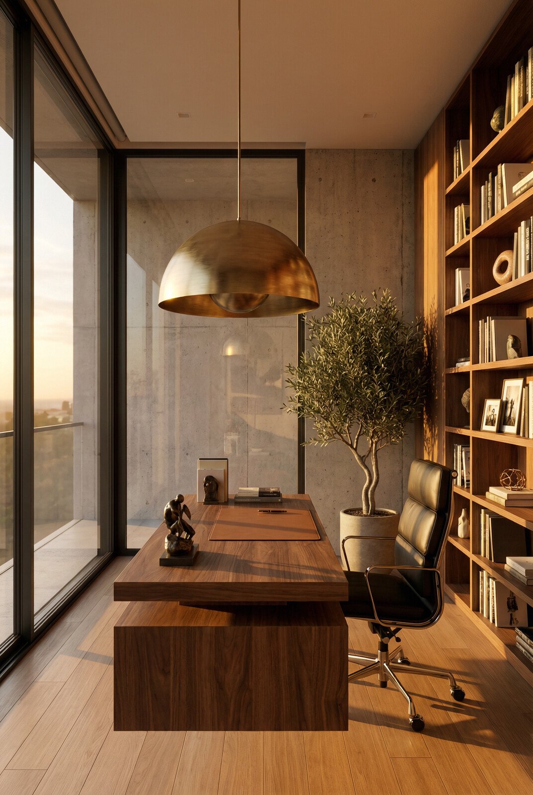
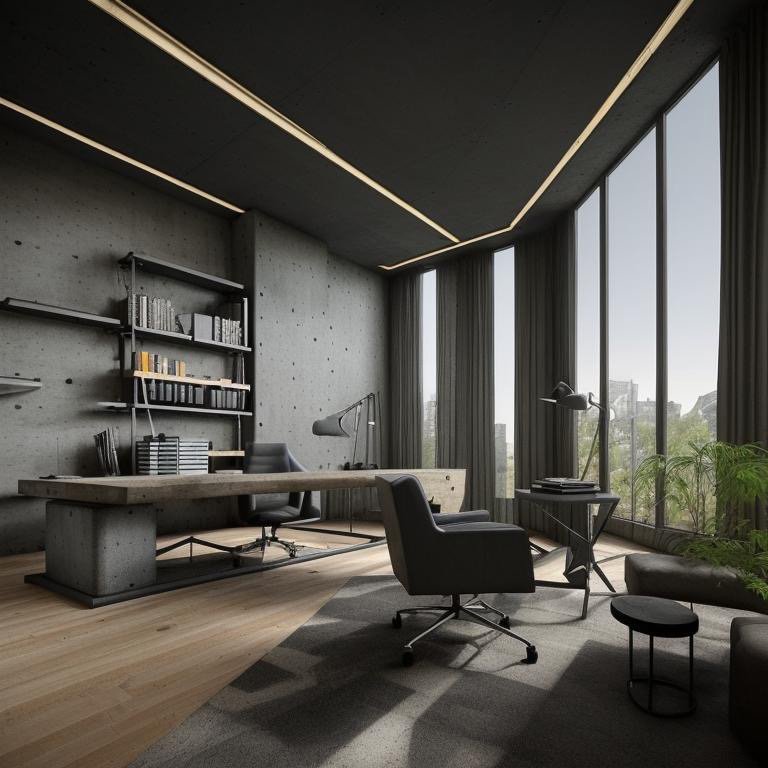
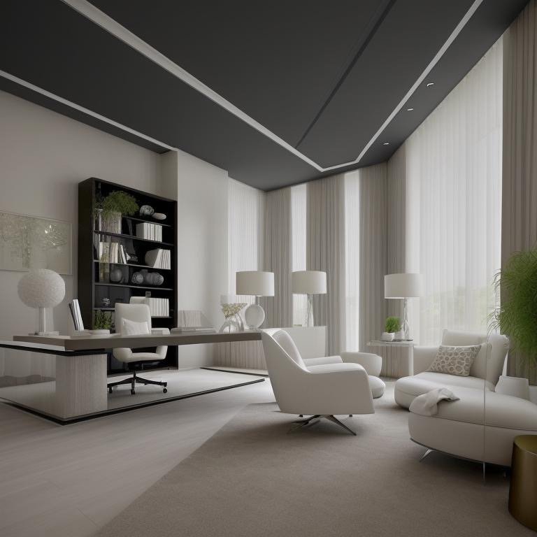
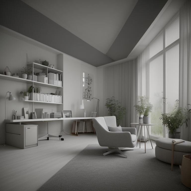
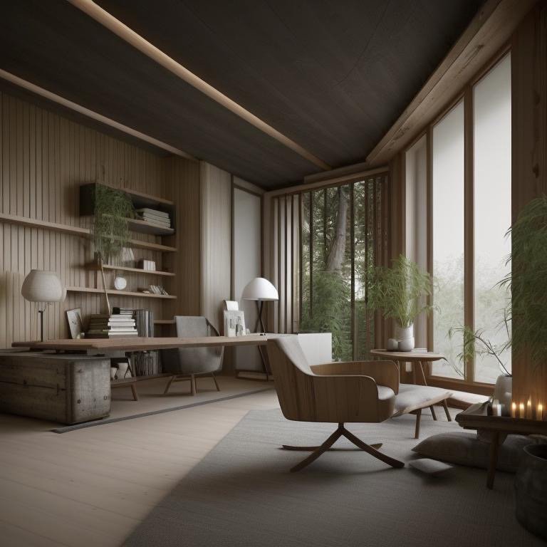
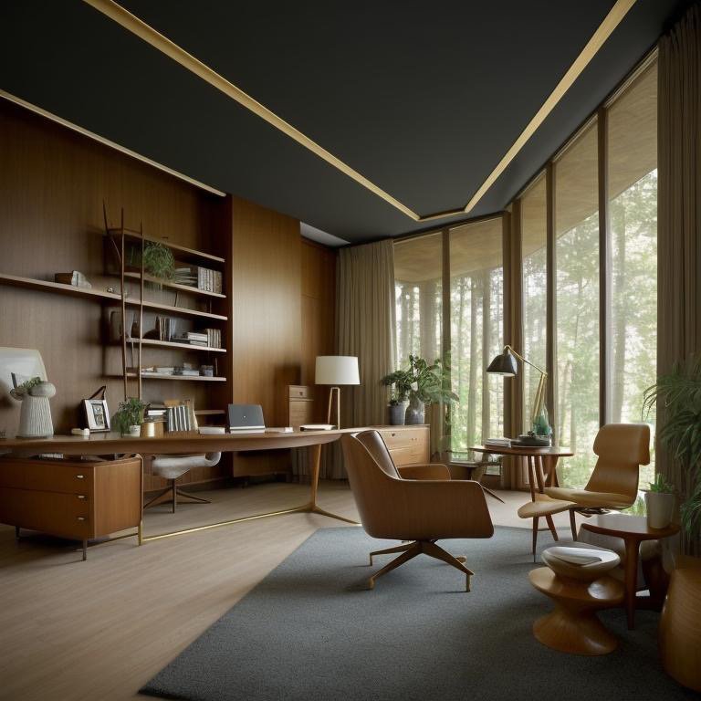
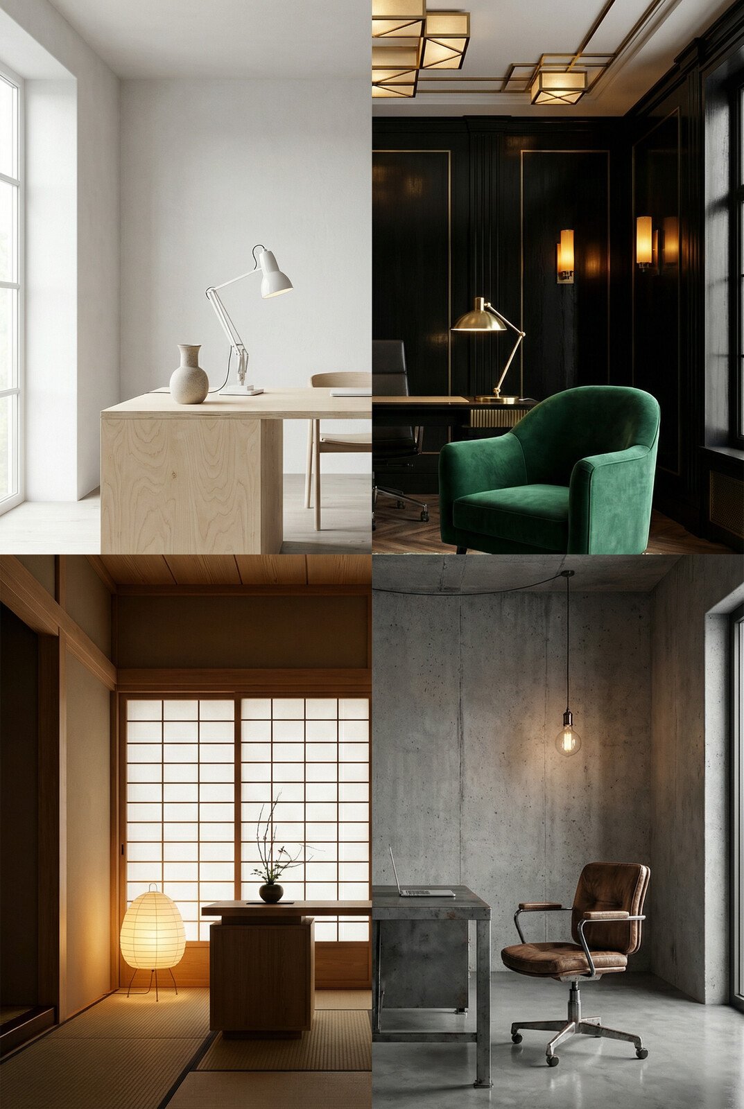
    Cinematic Intelligence™ eliminates the gap between intention and experience. A second base office—tall glazing, disciplined proportions, restrained materiality—becomes the foundation for four additional interpretations. Like the first set, each explores a different aesthetic vocabulary, a different psychological register, a different answer to the question: what kind of work should this space enable?

    But these four interpretations operate at a different frequency. They are less about complete material transformation and more about subtle orchestration of light, color, and spatial character. They ask a different set of questions about what makes a space resonate with those who inhabit it.

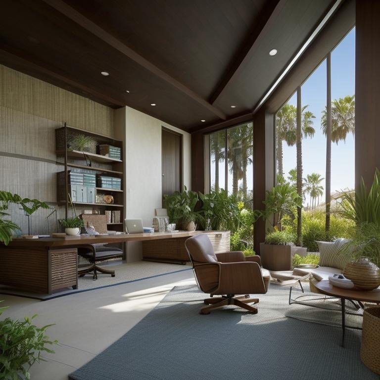
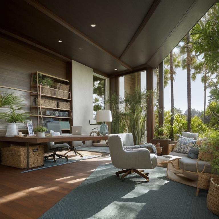
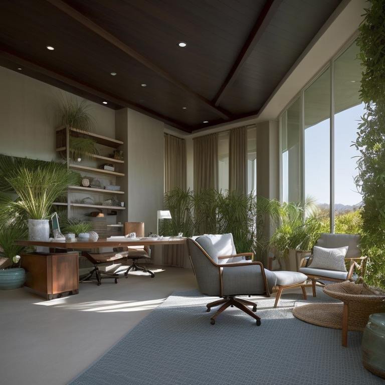
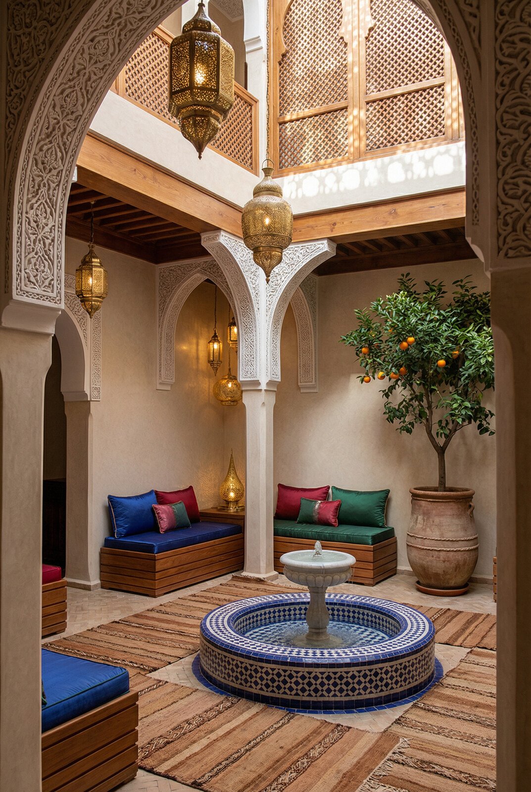
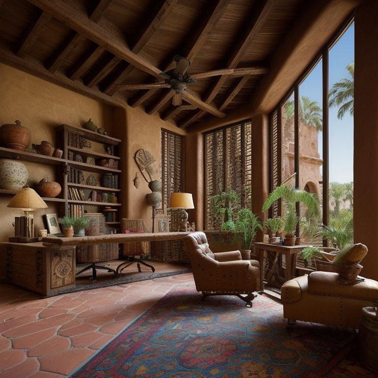
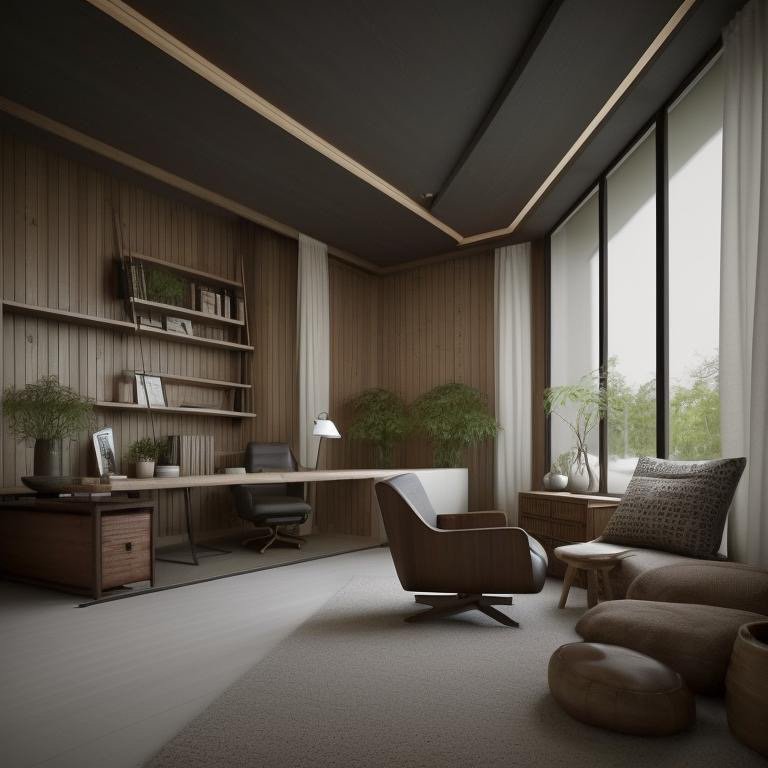
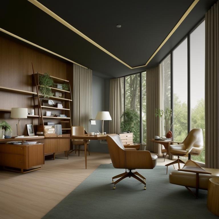
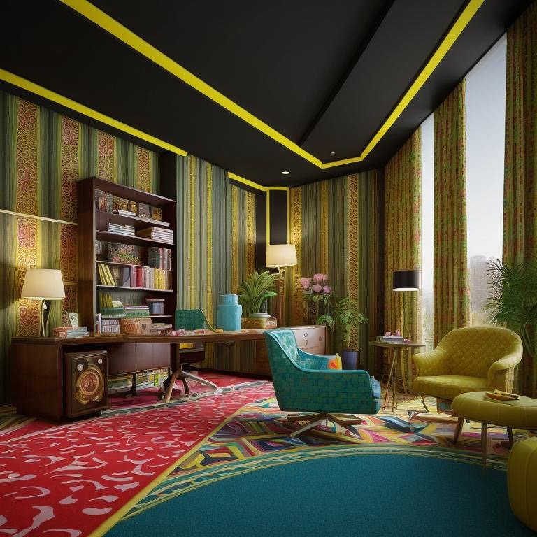
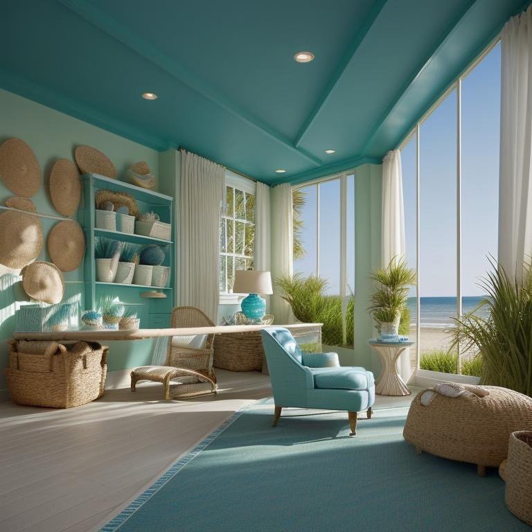
    Coastal: Light as Architecture

    The first interpretation is Coastal—atmospheric without being decorative. This is not nautical kitsch. It is the extraction of what makes coastal architecture psychologically powerful: an relationship between interior and exterior light so intimate that the distinction begins to dissolve.

    The dominant architectural element is light. Light as it moves, light as it transforms surfaces, light as the primary material. Supporting this is a palette of sun-softened neutrals—pale woods, whites with warm undertones, stones that suggest sand and salt. The office becomes weightless. Breathing. Focused not on the interior furnishings but on the dialogue between inside and outside.

    Coastal space emphasizing light diffusion and soft material palette

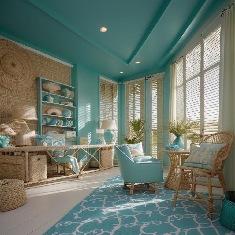
    A coastal office is designed for long-form thinking and remote leadership. The atmosphere supports concentration without constriction. Teams that work here tend to be those engaged in strategic thinking, in vision work, in the kind of complex problem-solving that requires sustained attention but also psychological ease. The space does not demand presence—it invites it. Sustains it.

    Coastal office showing atmospheric light quality and refined neutral palette

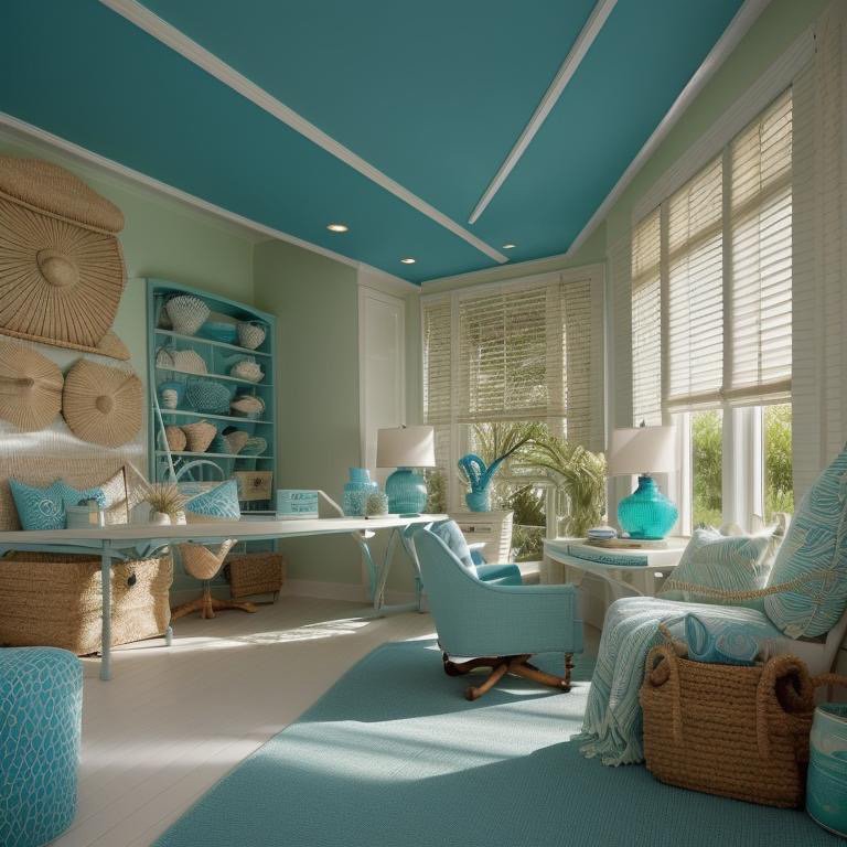
    The material vocabulary is crucial. Everything is pale but not blank. Textures are present but not prominent. The office does not assert itself. Instead, it becomes a kind of receptacle for thought. The eye rests easily. The ear captures sound without creating harsh acoustics. The body feels neither constricted nor overwhelmed. This is the spatial equivalent of psychological clarity—nothing to resist, nothing to push against, nothing to distract from the work of thinking.

    Coastal interior emphasizing open geometry and natural light integration

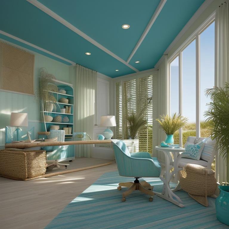
    The most dangerous mistake in coastal design is treating it as emptiness. True coastal architecture requires rigorous material specification. Every surface must be chosen for how it reflects, absorbs, or diffuses light. Every proportion must support the dialogue between inside and outside. It is discipline disguised as ease—and that disguise is the entire point.

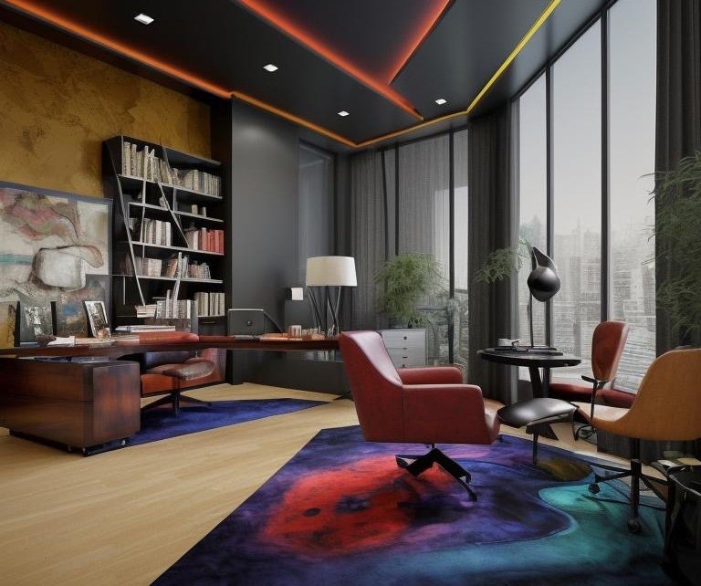
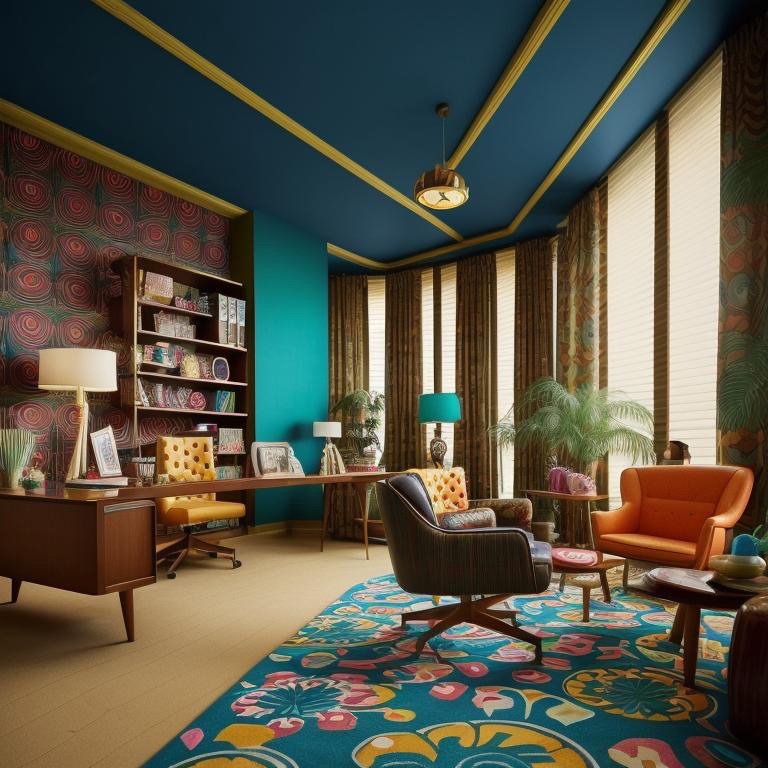
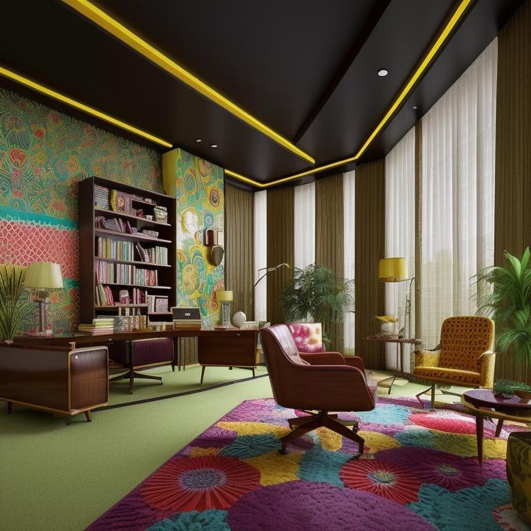
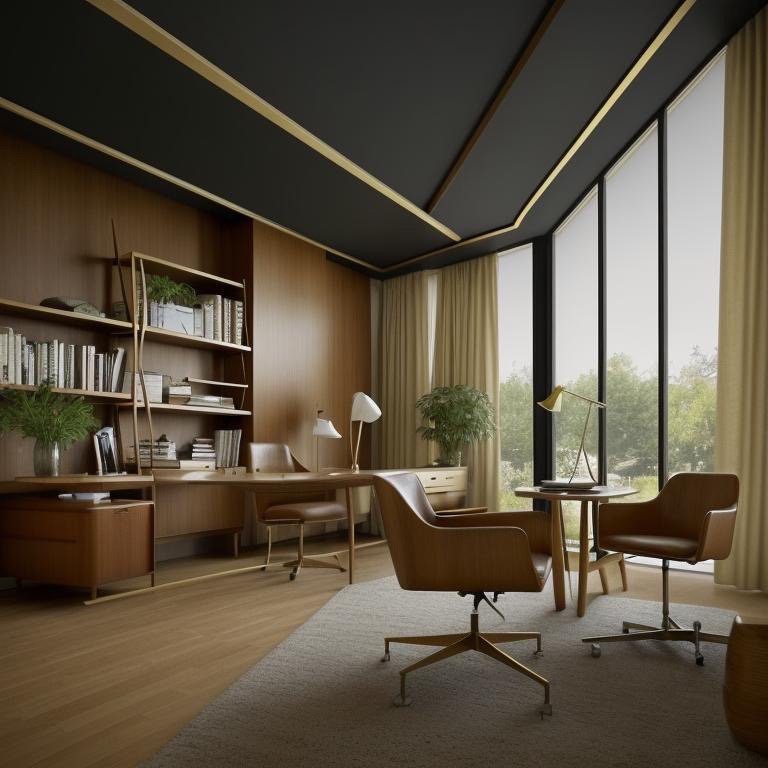
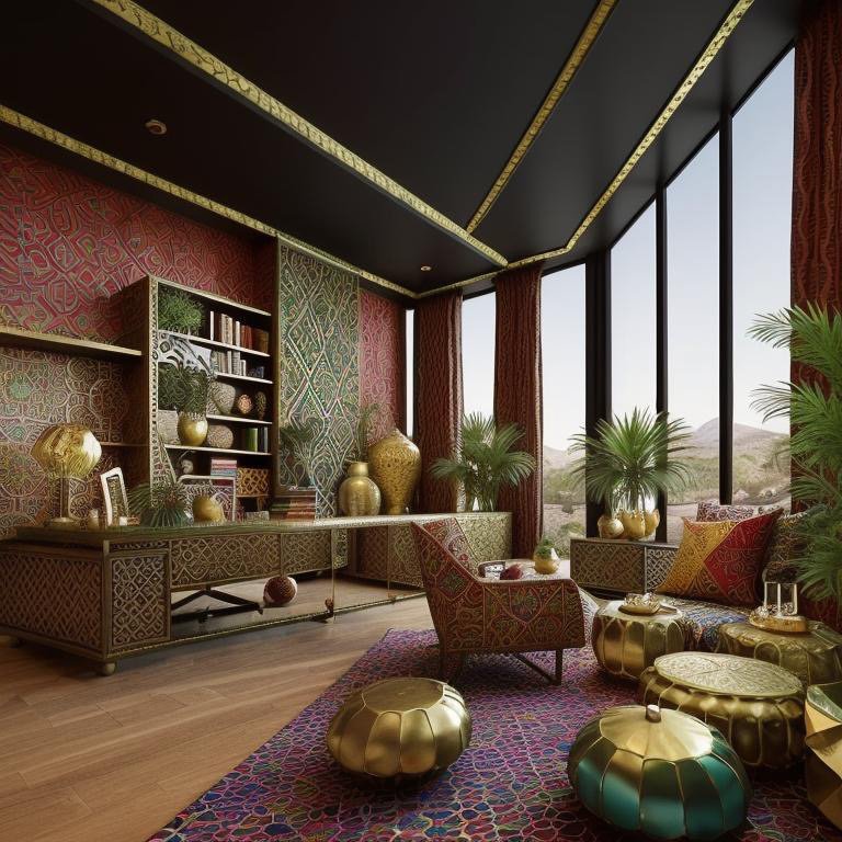
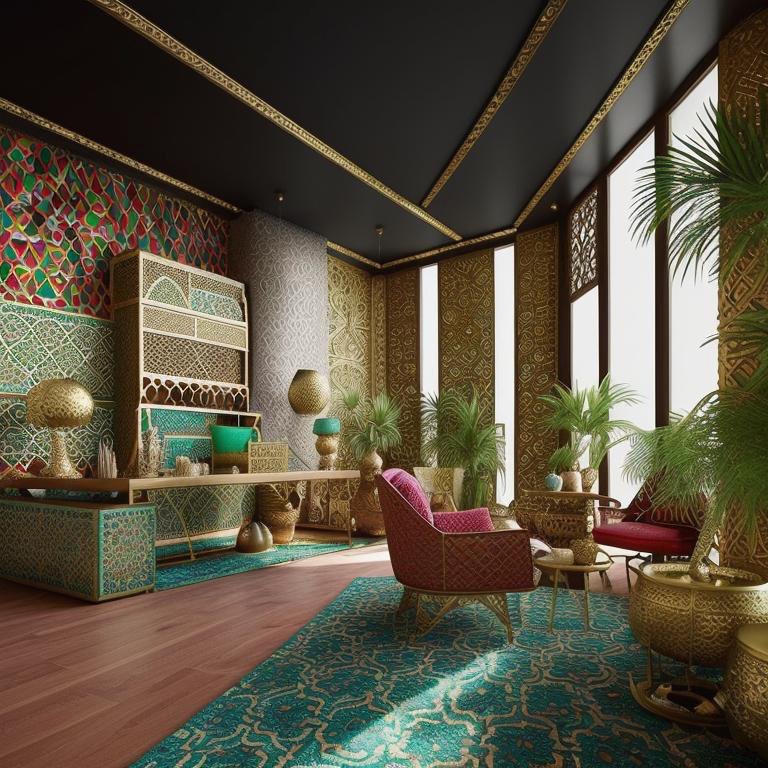
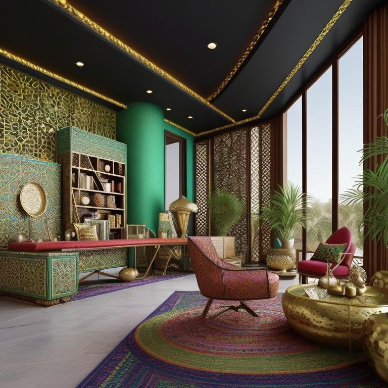
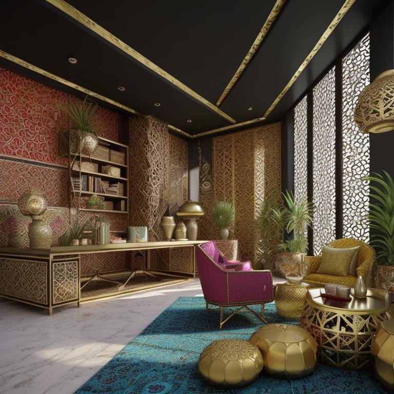
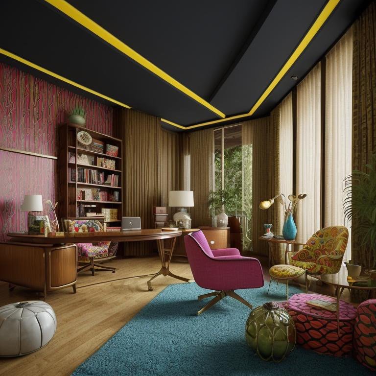
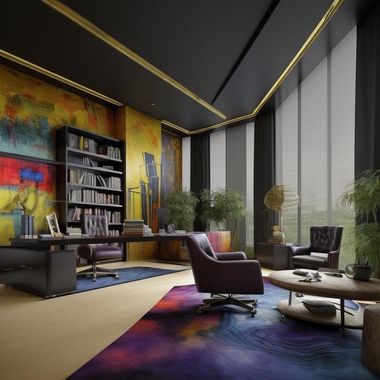
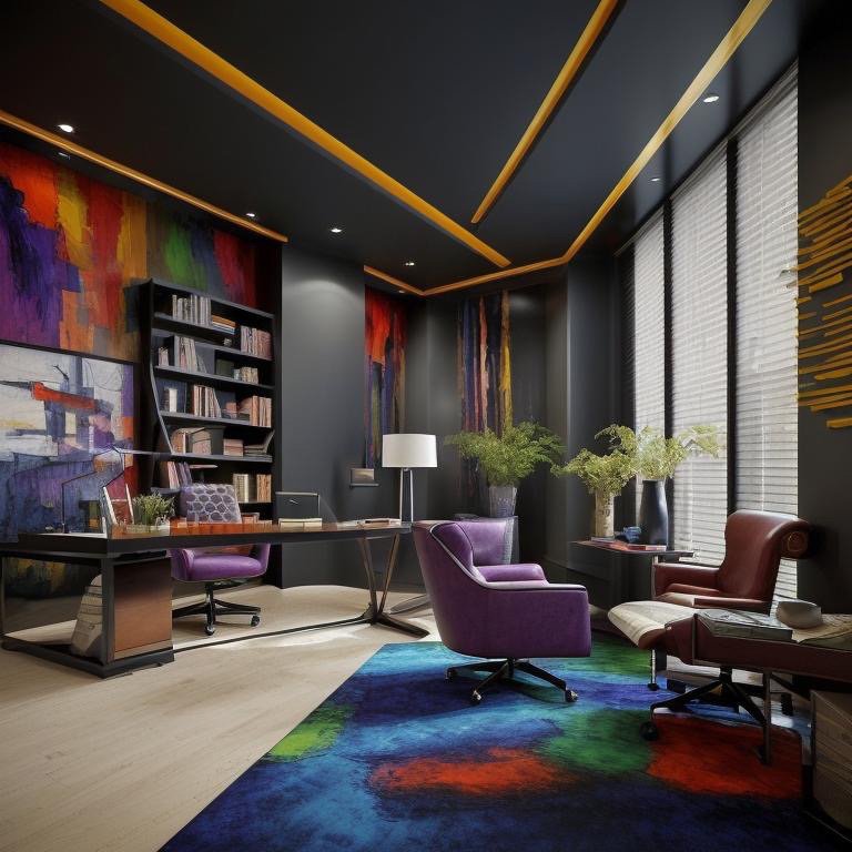
    Expressionist: Color as Movement

    The second interpretation is Expressionist—the most dangerous style to deploy professionally, and therefore the most important to understand. Expressionism in architecture is not about decoration. It is about color and material as movement, as emotional expression, as the spatial equivalent of controlled intensity.

    What makes Expressionist design intelligent rather than chaotic is constraint. The palette is saturated but limited. Color appears in controlled fields—a wall, a zone, a moment. The architecture itself remains steady. Proportions do not change. Materials do not become precious or applied. But within this steady container, expression lives. Saturation. Energy. Color as a deliberate psychological choice.

    Expressionist office showing saturated color in controlled zones and disciplined composition

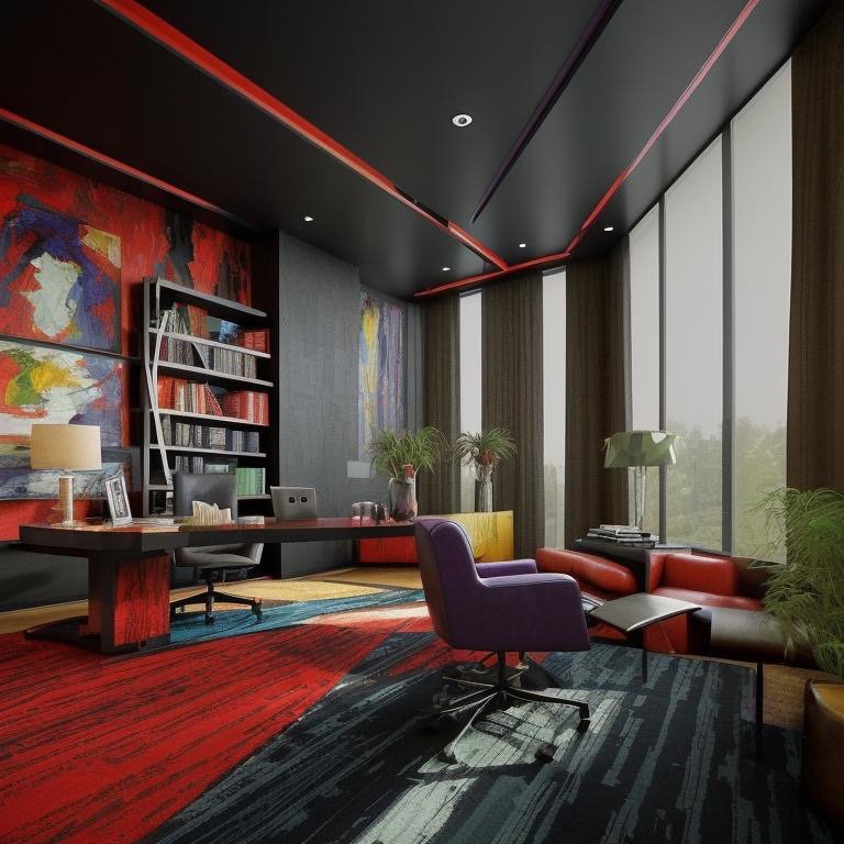
    An Expressionist office is for founders, creatives, cultural leaders—organizations for whom the work itself is expressive and who want their space to reflect that sensibility. The risk is obvious: saturation becomes chaos. Color becomes decoration. The space becomes distracting. But when executed with intelligence, the reverse happens. The color clarifies. The expression focuses. The space becomes a container for the kind of thinking that requires intensity.

    Expressionist space with controlled color saturation and refined material balance

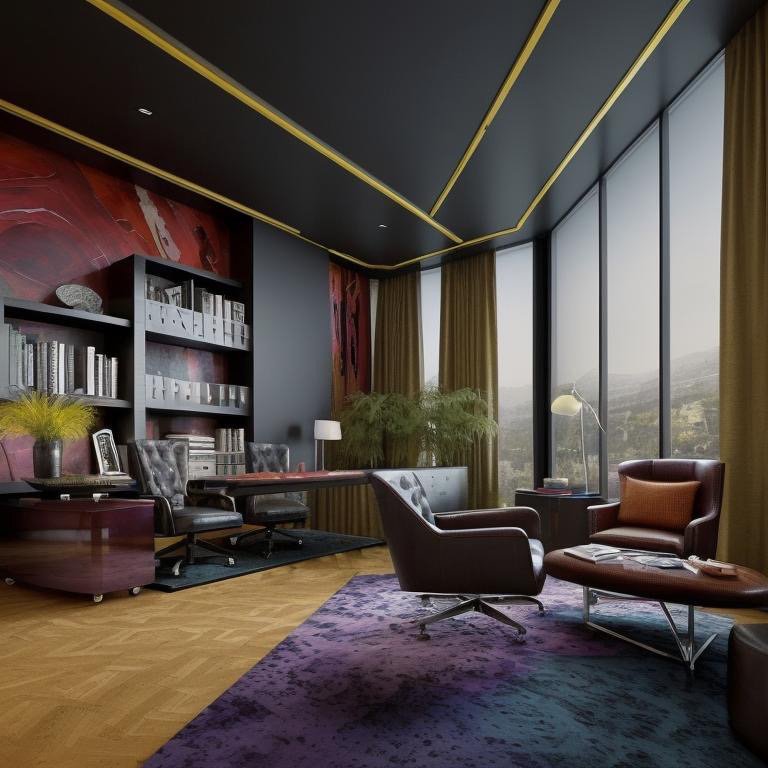
    The psychological effect is profound. An Expressionist office does not suggest that work should be playful. It suggests that work should be vital. The color does not say “have fun.” It says “bring intensity. Bring authenticity. Bring the fullness of your capability to what you are doing here.” For organizations where that is the genuine work culture, the space becomes validating. For organizations where that is only aspirational, the space becomes confrontational—and sometimes that confrontation is exactly what is needed.

    Expressionist office detail showing color intensity and spatial articulation

    Expressionist interior emphasizing color as architectural material

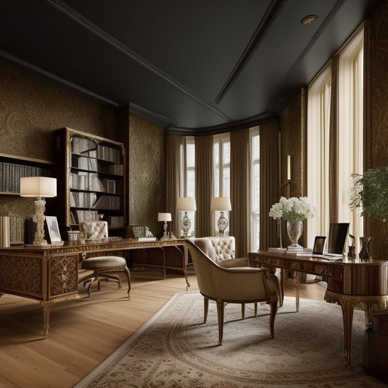
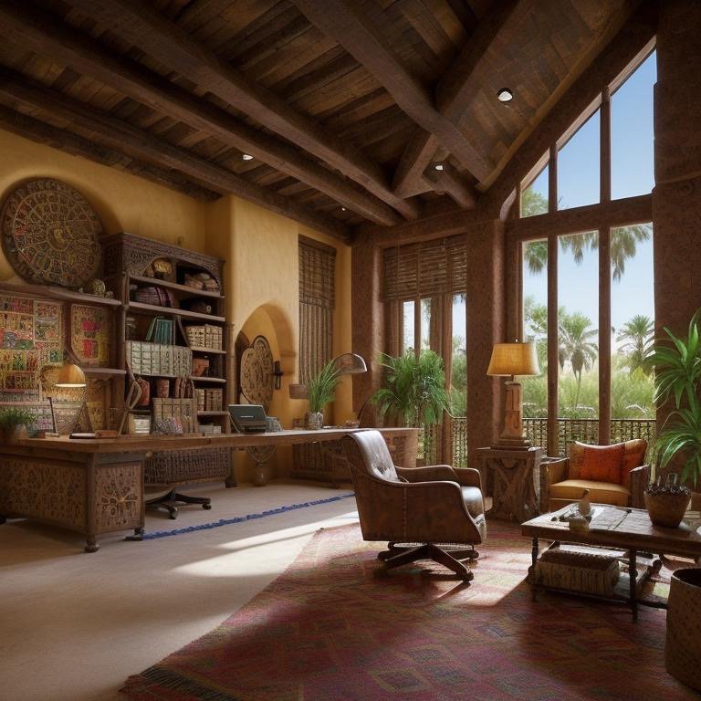
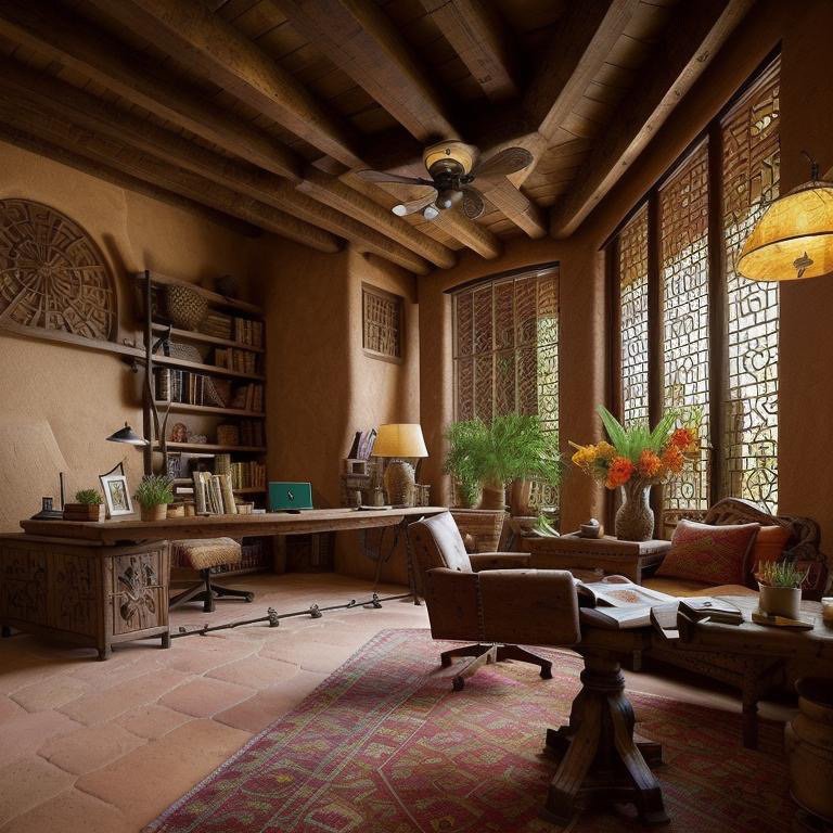
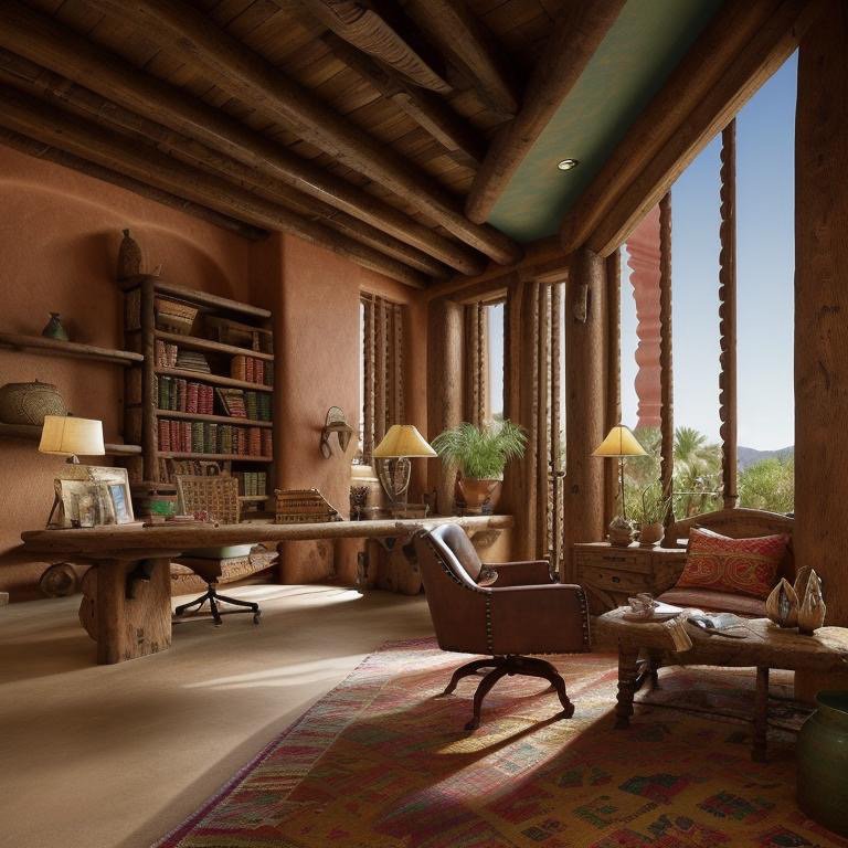
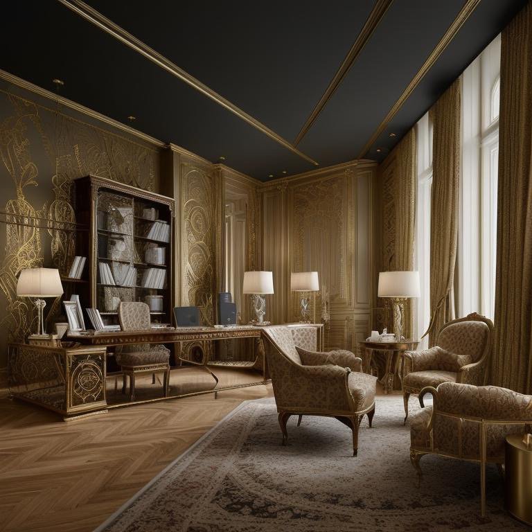
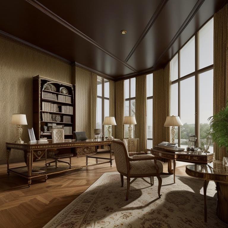
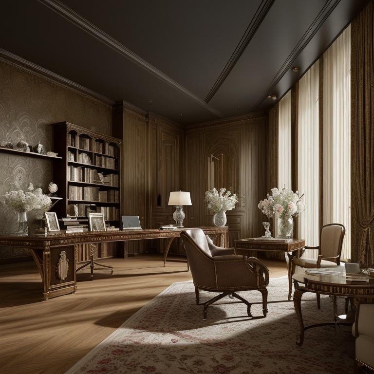
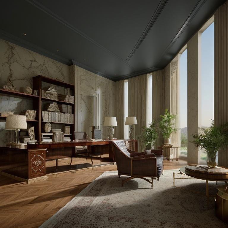
    Greek Revival: The Architecture of Trust

    The third interpretation is rooted in order. Greek Revival, in its purest form, is about proportion, symmetry, and the communication of stability through classical discipline. It is not about columns and pediments—those are the vocabulary. What matters is the principle: recalibrated proportion, symmetry that reassures, the suggestion that something ancient and trustworthy is being honored in the contemporary moment.

    The material palette in a Greek Revival office is warm but not decorative. Stone—not applied but present as real material. Classical woods that suggest permanence and continuity. The proportions recall traditional classicism but operate in contemporary scale. Nothing theatrical. Everything intentional. Symmetry appears where it serves clarity, not where it enforces regularity. The space communicates without announcing.

    Greek Revival office showing classical proportion and warm material palette

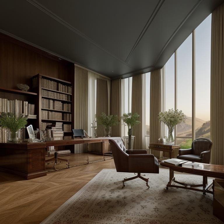
    A Greek Revival office is designed for legal, financial, and academic institutions—organizations for whom trust and intellectual seriousness are not values to aspire to but foundations to communicate. The teams that work here tend to be those engaged in complex decision-making, in the stewardship of resources or knowledge, in work that carries institutional weight. The space does not suggest innovation. It suggests continuity. Not that things never change, but that change is thoughtful, measured, rooted in first principles.

    Greek Revival space emphasizing classical proportion and refined detail

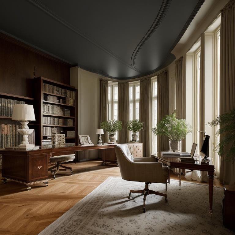
    The psychology at work here is subtle but powerful. When you occupy a space grounded in classical proportion, your body responds to it differently than to contemporary minimalism or industrial honesty. Proportion acts on you at a level below conscious awareness. A Greek Revival office does not require explanation or justification. It simply says: “this is where serious, considered work happens. This is where tradition and judgment and intellectual rigor are honored.”

    Greek Revival interior showing refined classical details and warm materiality

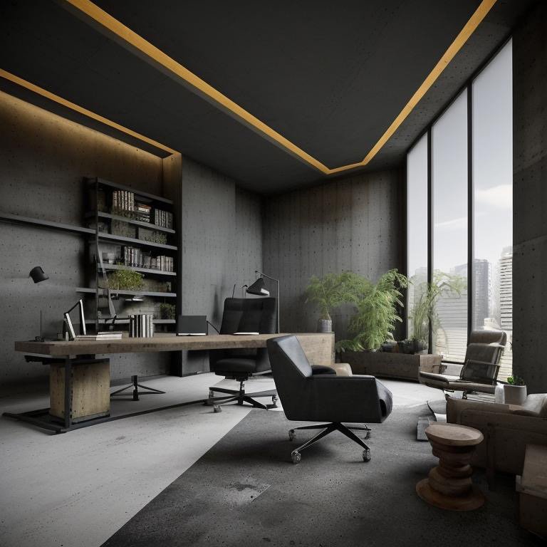
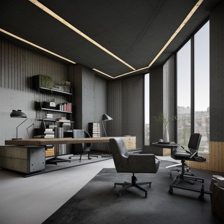
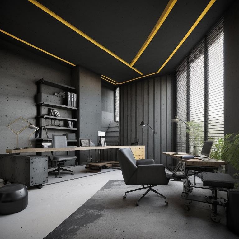
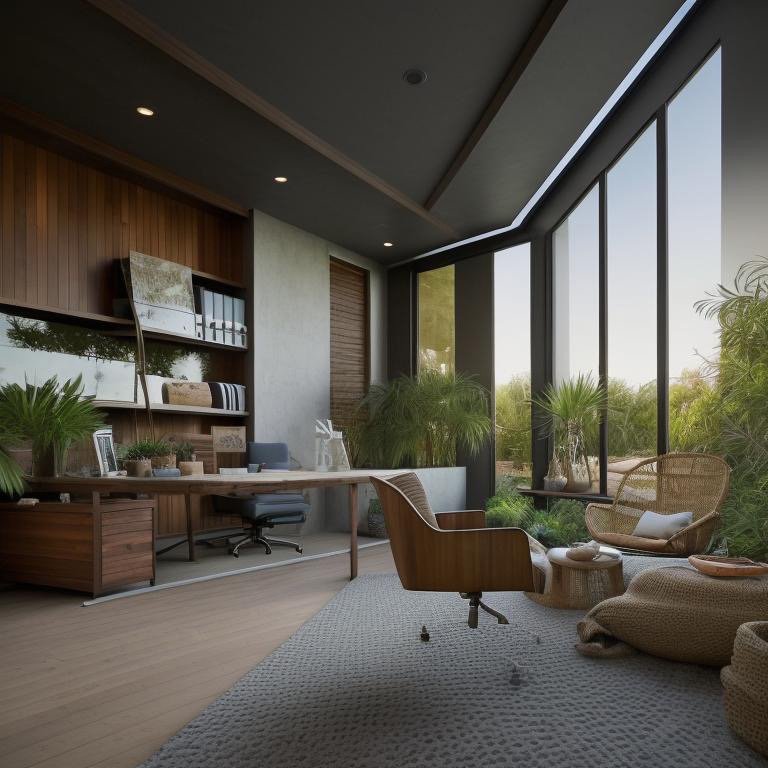
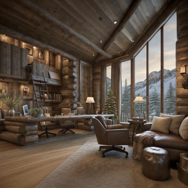
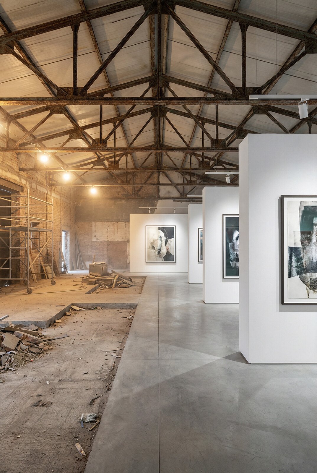
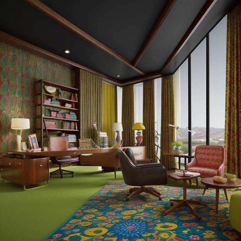
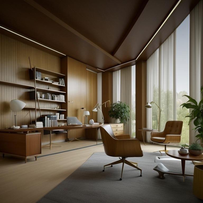
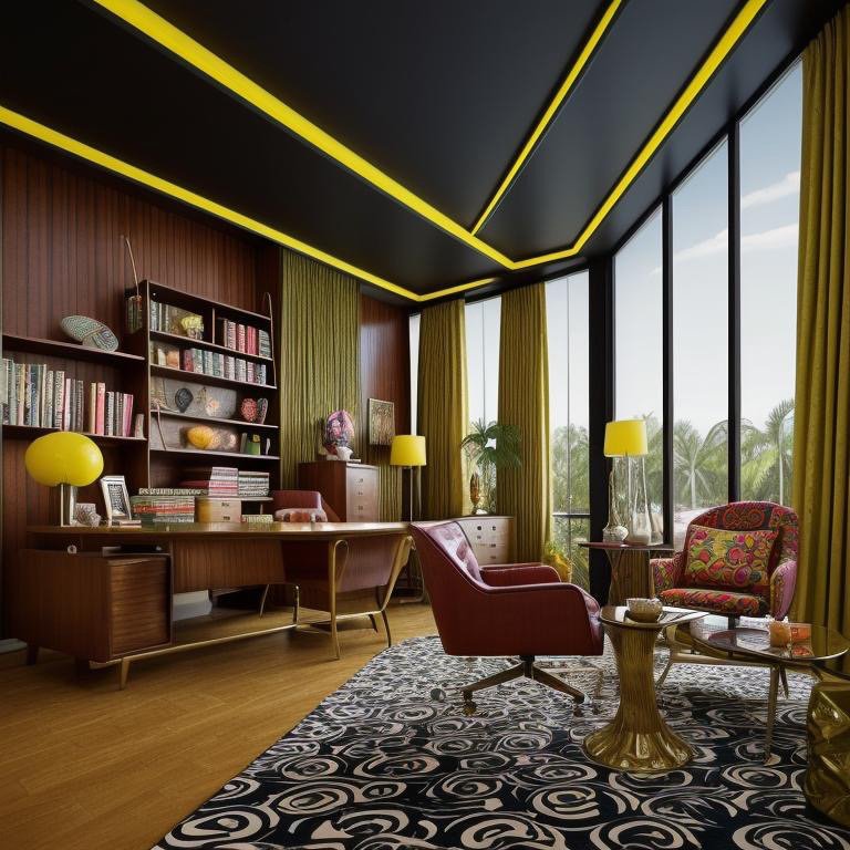
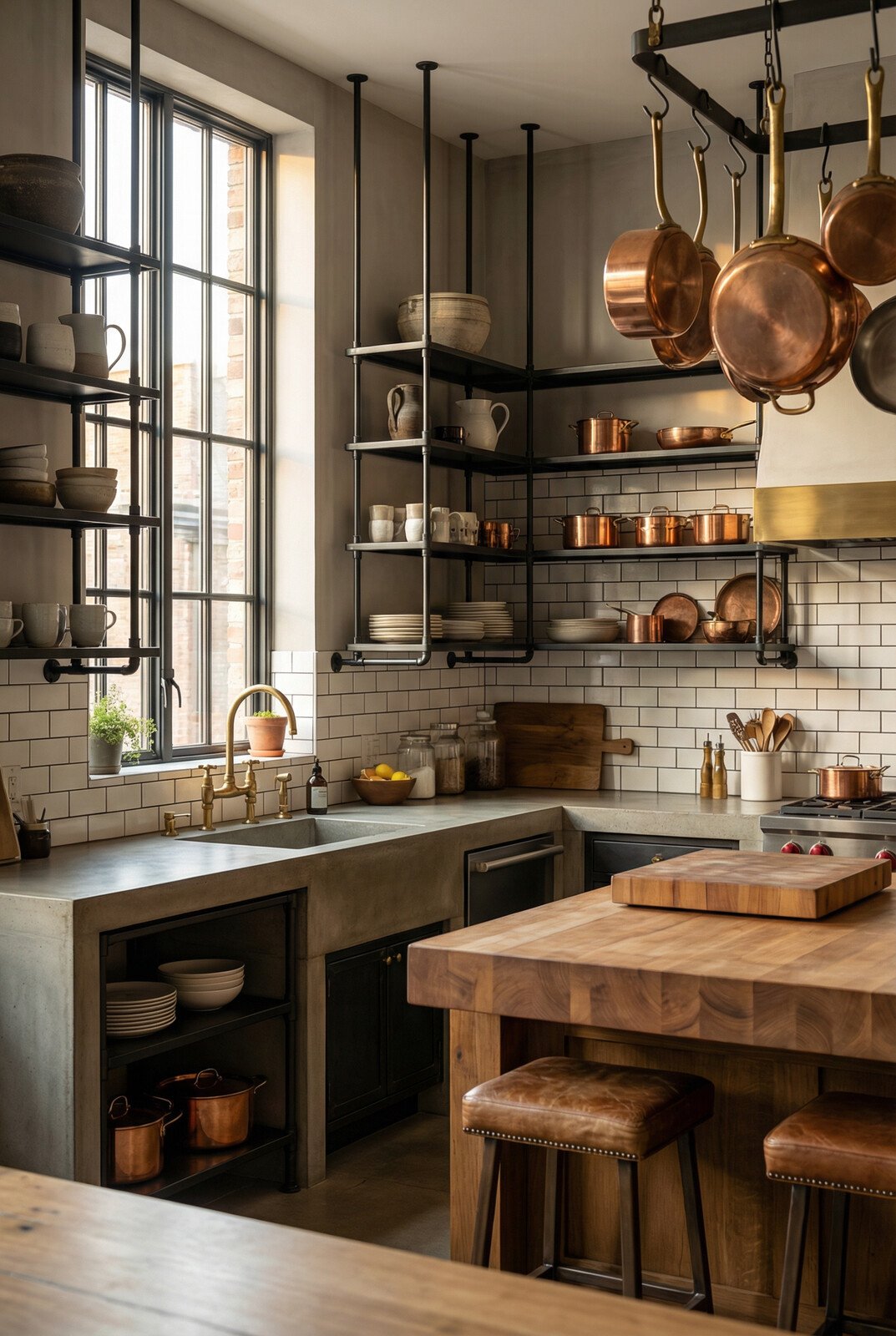
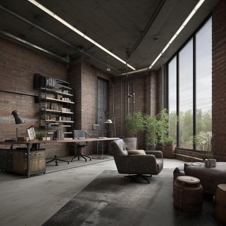
    Industrial: The Craft of Refinement

    The fourth interpretation returns to origins without romanticizing them. Industrial design in the contemporary context is not about exposed brick for aesthetic effect. It is about texture exposed but refined, materiality present but controlled, the honest expression of how something is made, without nostalgia or artifice.

    Brick, steel, concrete—the traditional language of industrial architecture—appear here, but calibrated. Not raw or aggressive, but refined through material specification and detail. Lighting is directional. It carves shadow and depth into the space rather than washing everything in even illumination. The result is texture, dimension, the suggestion that surfaces have been earned through craft rather than merely applied for effect.

    Industrial office with refined materiality and directional spatial lighting

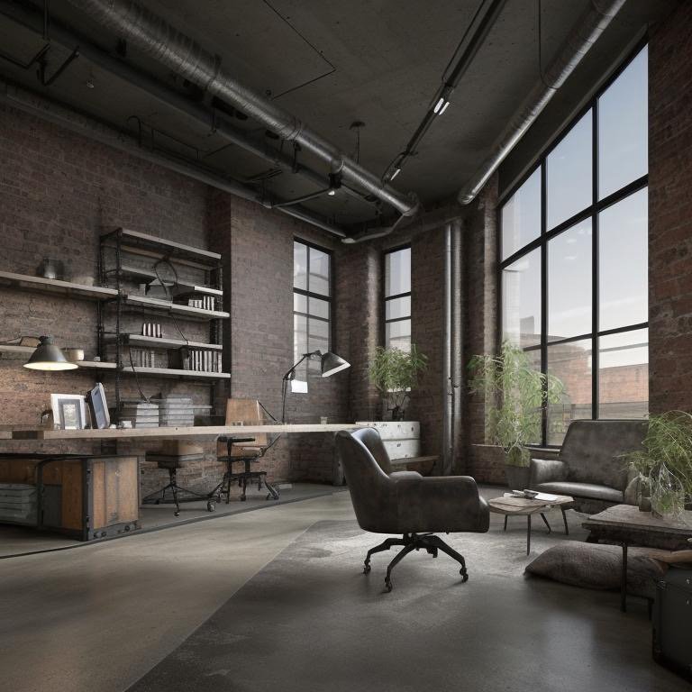
    An Industrial office is for tech teams, product builders, creative industries—organizations for which the work is about making real things, solving concrete problems, and bringing ideas into material reality. The space does not pretend to be anything it is not. It does not perform culture. It simply reflects it. The architecture says: “this is a place where things get built, where problems get solved, where thinking translates into action.”

    Industrial space showing refined texture and honest material expression

    Industrial interior with directional lighting and material depth

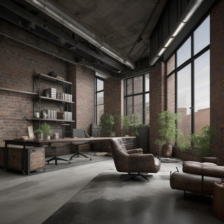
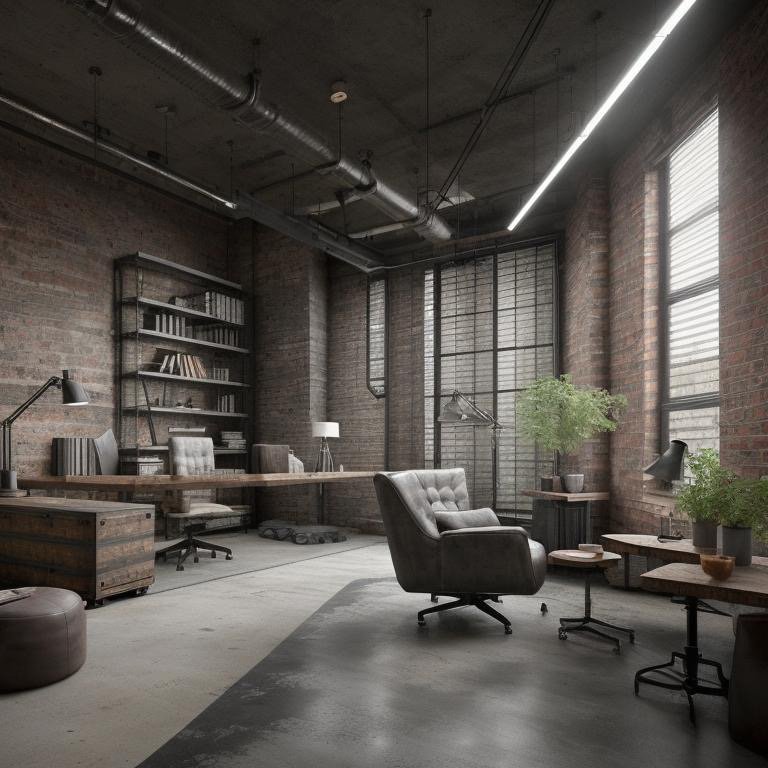
    The most important distinction in contemporary industrial design is between refinement and romance. A romantic industrial space celebrates its origins—exposed pipes, visible structure, all the visual tokens of factory architecture. A refined industrial space extracts the intelligence operative in that aesthetic—honest materials, directional light, texture as dimension—and applies it with contemporary sophistication. It honors the industrial tradition without being beholden to it.

    Industrial office detail emphasizing crafted materiality and refined proportion

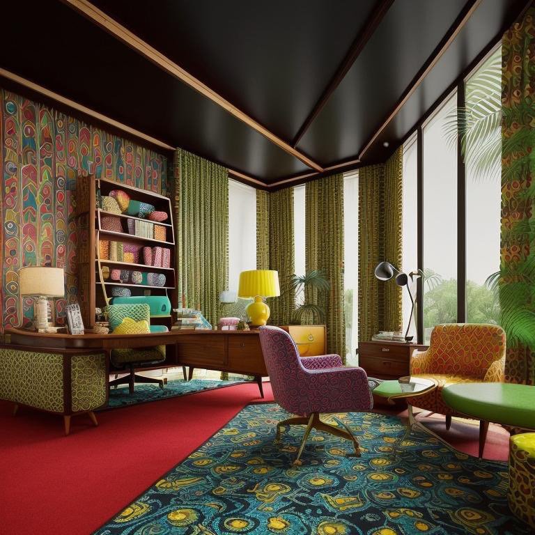
    The Principle of Translation

    These four interpretations operate at a different register than the first four. Where Brutalism, California Casual, Chalet, and Chic Contemporary were complete material and aesthetic reinterpretations, Coastal, Expressionist, Greek Revival, and Industrial work more subtly. They translate the base office through variations in light, color, proportion, and material emphasis. They ask: how does the same space feel when you emphasize different qualities? When you shift the lighting register? When you change what is prominent and what recedes?

    The insight is architectural: translation without destruction. The fundamental intelligence of the space remains intact. The glazing is still generous. The proportions are still disciplined. The materiality is still restrained. What changes is emphasis. Psychological register. Character. The kind of thinking the space supports.

    Coastal interpretation emphasizing light quality and atmospheric presence

    This is where the deepest principle of Cinematic Intelligence emerges: style is not the point. Intelligence is. Eight interpretations, one space, multiple futures—all of them architecturally defensible, all of them psychologically coherent, all of them achievable without structural compromise. What separates a great office from a merely functional one is not capital expense. It is clarity about intention and fidelity in its expression.

    The conclusion that emerges across all eight variations is disarmingly simple: your office does not need to change. Your understanding of it needs to deepen. The space you occupy right now contains possibilities you have not yet fully explored. The geometry is already there. The proportions are already calibrated. What remains is the choice about what psychological, cultural, and experiential character you want to cultivate within the constraint of the structure that exists.

    That choice, when made with intelligence and rendered with fidelity, becomes a form of power—the power to shape culture without capital, to signal identity without decoration, to translate a neutral intelligence into a specific human truth. Four styles. Eight interpretations. One office. Zero architectural sacrifice. That is the proposition. And what it finally reveals is that the office is never about the space. It is about what you choose to become within it.

  • The Office Reimagined: How Cinematic Intelligence Is Redefining the Modern Workspace

    The Office Reimagined: How Cinematic Intelligence Is Redefining the Modern Workspace

    Brutalist office with assertive geometry, deep shadows, and honest material expression

    Workspace design has been conducted in a language of constraints. You have a budget. You have a lease term. You have a floor plate. You design within the envelope. The result is inevitably a compromise—between what you wanted and what the space could accommodate, between aspiration and pragmatism, between the culture you imagined and the culture the architecture actually supported.

    A quiet revolution has begun that dismantles this compromise. Not through capital expense or structural intervention, but through something more powerful: clarity about intention and fidelity in its expression. The modern office no longer needs to choose between competing visions of workspace culture. Instead, Cinematic Intelligence™ allows a single spatial intelligence to be interpreted through multiple stylistic and experiential registers—each rendered with such photorealistic fidelity that you experience the space before committing to it.

    Consider a base office: clean geometry, generous glazing, disciplined material palette. It is architecturally neutral—the equivalent of white canvas. What makes it powerful is what comes next: the systematic reinterpretation of that neutral intelligence through four distinct aesthetic, material, and psychological frameworks.

    Brutalism: Architecture as Command

    The first interpretation is Brutalist. This is not brutalism as caricature—heavy, dominating, hostile. This is brutalism as philosophical stance: architecture that does not apologize for its materials or its directness. The clean geometry of the base office sharpens. The proportions become more assertive. Surfaces that were neutral become material declarations—concrete expressed with honesty, edges that do not soften, shadows that deepen the spatial experience.

    A Brutalist office is not for everyone. It is for leaders and teams that value discipline, intellectual seriousness, and command presence. It signals that thinking here is rigorous. Decisions are made with gravity. The space does not coddle or distract. It contains and focuses. There is a severity to it—not in the sense of hostility, but in the sense of refusal to compromise on principle.

    Brutalist interpretation emphasizing concrete materiality and spatial discipline

    The material palette deepens. Concrete moves from warm to assertive. Edges become articulated rather than dissolved. Lighting becomes directional, carving shadow into the space rather than eliminating it. The office becomes a vessel for serious work. Not fun. Not casual. Not designed to impress. Designed to clarify. It is the spatial equivalent of intellectual honesty.

    Brutalist space showing refined shadow and material articulation

    This is where many designers stop—presenting brutalism as severity for its own sake. But the intelligence goes deeper. In a Brutalist office, every line is justified. Every surface serves. The aesthetic discipline creates psychological discipline. Meetings conducted in a Brutalist space tend toward rigor. Decisions made there tend toward clarity. The space becomes a tool for the kind of thinking you want to cultivate.

    Brutalist office detail showing material honesty and refined proportion

    California Casual: Warmth Without Weakness

    The second interpretation releases the space without weakening it. California Casual is an aesthetic stance often misunderstood as informality for its own sake. But the intelligence operative here is far more sophisticated: how do you create warmth, flow, and natural rhythm while maintaining the spatial clarity and disciplined proportion of the base office?

    Materials soften. Wood—warm, natural, with visible grain—appears where concrete was severe. Light diffuses. Instead of sharp shadows, light moves through the space with a gentler hand. Proportions open slightly, suggesting ease without chaos. The office becomes breathing room. But breathing does not mean loose. Discipline remains, only now it expresses itself through restraint rather than assertion.

    California Casual interpretation with warm materials and diffused light

    A California Casual office is for founders and leaders who want command but not coldness. Discipline but not austerity. The teams that work here tend toward collaboration. The culture is ambitious but not brittle. The space does not announce its seriousness—it demonstrates it through craft and proportion. There is effortlessness here, but it is the effortlessness of control, not carelessness.

    Warm material palette showing natural wood tones and soft materiality

    The material vocabulary is key. Natural woods, warm neutrals, surfaces that reveal their honest age rather than demanding perfection. Light becomes a protagonist—softened, diffused, revealing texture and depth without creating sharp boundaries. The office feels larger, not because it is, but because the visual language suggests expansion rather than enclosure.

    California Casual space emphasizing open geometry and natural material warmth

    California Casual is the hardest aesthetic to execute poorly. It looks simple, which is why many designers treat it as simplistic. But true California Casual requires more discipline than brutalism. Every element must earn its place. There can be no applied decoration, no borrowed warmth. The warmth must come from honest materials, from light, from proportion. It is warmth as intelligence, not warmth as sentiment.

    California Casual office showing disciplined warmth and refined spatial flow

    Chalet: Enveloping Presence

    The third interpretation is perhaps the most emotionally resonant: Chalet. This is not a romanticization of alpine architecture—it is the extraction of what makes chalet design psychologically powerful and the deployment of that intelligence in a contemporary context.

    Timber dominates. Not applied timber or decorative timber, but timber as primary material, as honest expression of construction, as the dominant voice in the spatial conversation. Texture becomes prominent. Surfaces reveal themselves—wood grain, the evidence of craft, the patina of use and age. Warmth becomes almost tactile. The eye wants to reach out and touch the surfaces.

    Chalet interpretation with prominent timber materiality and enveloping warmth

    But this is no rustic indulgence. A chalet office is an alpine lodge for modern leadership. It provides refuge and command simultaneously. The enveloping quality—high ceilings with timber structure revealed, warmth emanating from material and craft—creates a container that feels protective without being claustrophobic. You are held by the space but not constrained by it.

    Chalet space showing timber structure and enveloping spatial volume

    The psychological effect is profound. A chalet office asks a different question of its inhabitants. Instead of “what must I accomplish?” it asks “what am I capable of thinking?” The space encourages depth. Contemplation. Long-form thinking. The teams that thrive in chalet offices tend to be those engaged in strategy, vision, complex problem-solving. The space’s enveloping quality does not distract—it supports. Focuses. Enables.

    Chalet office detail showing refined timber craftsmanship and spatial character

    Material honesty is paramount. Every timber member is structural or clearly justified. Proportions reflect traditional chalet geometry—high peaked volumes, human-scaled openings, clarity about how the space is built. There is no applied style here. The aesthetic emerges from the honest expression of how architecture is made.

    Chalet interior showing warm material density and thoughtful spatial proportion

    Chic Contemporary: Discipline as Luxury

    The fourth interpretation demands the greatest discipline. Chic Contemporary is not minimalism for its own sake—it is minimalism as intellectual rigor. The palette tightens ruthlessly: whites, soft greys, warm neutrals with no saturation. Every line is intentional. Every surface is calibrated. Nothing is casual. Nothing is accidental.

    Chic Contemporary office showing refined neutrality and precise material calibration

    This is the most dangerous interpretation to deploy. Without rigor, it becomes cold. Without intention, it becomes empty. But when executed with intelligence, it becomes pure. The office becomes a space where attention can focus entirely on the work, on conversation, on thinking. The architecture does not demand attention—it surrenders it.

    Chic Contemporary space with precise geometry and neutral material restraint

    A Chic Contemporary office is for organizations that have nothing to prove through their space. They prove themselves through their work. The office is a tool, not a declaration. Materials are refined but never precious. Proportions are exact but never theatrical. The space communicates trust, stability, and intellectual seriousness through what it does not do, not through what it does.

    The teams that thrive in Chic Contemporary spaces tend to be those for whom the work speaks louder than the setting. Researchers. Technical specialists. Strategic thinkers. The space does not distract them with warmth or drama—it gets out of the way. Luxury, in this context, is not excess. It is precision as restraint.

    Chic Contemporary interior showing refined proportion and material subtlety

    Chic Contemporary office detail emphasizing discipline and material refinement

    One Space, Multiple Futures

    The profound insight is that a single office—with no structural change, no capital outlay, no renegotiation of lease terms—can hold four entirely distinct futures. Each interpretation is valid. Each serves different psychological, cultural, and organizational needs. The question is no longer “what office do we have?” but “what office do we want to become?”

    Cinematic Intelligence makes this question answerable not through speculation or imagination, but through fidelity. You do not imagine a brutalist office. You experience it. You do not hope a chalet interpretation might resonate with your team. You know it does, because you have seen it rendered with absolute precision. You do not wonder if chic contemporary might feel too cold. You see it and understand.

    The revolution is not in the renders. It is in the power they distribute. The authority to shape your office culture no longer rests exclusively with the licensed architect or the real estate team. It rests with you—with your clarity about what kind of thinking you want to cultivate, what signal you want to send, what future you want to inhabit. Cinematic Intelligence is simply the tool that makes that clarity actionable, that translates intention into experience, that protects you from committing capital or culture to a future you have not thoroughly understood.

    One office. Four aesthetic and psychological registers. Zero architectural compromise. That is the proposition. And what it reveals is something deeper: that great architecture is not about what you build, but about what you choose to become within the space you already occupy.

  • Reclaiming Space, Rewriting Purpose

    Reclaiming Space, Rewriting Purpose

    Clean geometry office with generous glazing and disciplined materials

    January arrives not as a calendar reset but as a philosophical one. The office—once conceived as a permanent monument to corporate identity—has become something far more fluid. It is no longer an institution but an instrument. And like any sophisticated instrument, it demands calibration, intention, and an acute awareness that form must serve purpose, not merely declare it.

    For decades, the office existed as monolith. Glass towers and mahogany boardrooms signaled permanence and hierarchy in equal measure. You entered the same space, navigated the same corridors, sat at the same desk. The architecture whispered a single narrative: stability, authority, continuity. But that narrative collapsed first in crisis, then in opportunity.

    The industrial office crisis was not primarily a real estate problem. It was an architectural one. Firms discovered they had inherited spaces with no relevance to how work actually happens. Open floors that promised collaboration generated noise. Private offices that promised focus generated isolation. Executive suites that promised command generated disconnection. The problem was not that offices existed—it was that they had been designed for a version of work that no longer governed reality.

    What emerged from this confrontation was a fundamental question: what is office architecture for? Not what does it signal. Not what does it cost. But what does it enable? What psychological, spatial, and cultural conditions does it cultivate?

    The Posture Shift

    This issue moves from crisis to craft. It is not a catalog of solutions but an exploration of a single spatial intelligence—one office, rendered across multiple identities. The base geometry is disciplined and neutral: clean lines, generous glazing, proportion that suggests restraint rather than minimalism. It is the equivalent of architectural silence—a space that does not impose but invites interpretation.

    Cinematic Intelligence™, for the first time at this scale, reveals what becomes possible when you separate the structure from the storytelling. The office does not change. The walls do not move. The glazing remains generous. What transforms is the character of the space—its emotional register, its psychological intention, its signal to the human beings who inhabit it.

    Consider the implications. A firm no longer needs to choose between competing visions of workspace culture. A leader no longer inherits a space and accepts its narrative wholesale. Instead, the architecture becomes a canvas upon which multiple futures can be projected. Not rendered carelessly or speculatively, but rendered with absolute fidelity. Every material, every shadow, every proportion is vetted before capital is committed, before leases are signed, before teams are asked to work within the result.

    Alternative office interpretation showing transformed material and spatial character

    This is not decoration masquerading as design. It is design operating at the level it ought to: as a tool for organizational clarity and cultural intentionality. The office becomes an instrument for asking deeper questions. What kind of thinking do we want to cultivate? What psychological state should our architecture support? What signal should the space send, not to investors or clients, but to the people who work there every day?

    From Inherited to Intentional

    The move from crisis to craft is ultimately a move from inherited spaces to intentional ones. For the better part of a century, office architecture was inherited. Tenants signed a lease on a building that someone else had designed, often decades prior. The grid of columns, the floor plate dimensions, the core placement—these were constraints to work within, not choices to make. Interior designers decorated around them. Workers adapted to them. The architecture had agency; the tenant had compliance.

    What Cinematic Intelligence introduces is the possibility of agency within constraint. The landlord’s structure remains fixed. The lease terms remain binding. But the interpretation—the psychological, cultural, and experiential reality of the space—becomes a choice rather than a given. And that choice, when rendered with fidelity, becomes knowledge. You do not imagine what a Brutalist office feels like. You see it. You do not speculate about California Casual energy. You experience it. You do not hope that Chalet warmth might balance executive presence. You know it does.

    This represents a genuine shift in architectural power. For the first time, the tenant—not the developer, not the original architect—can shape the narrative of the space they occupy. And they can do so without structural compromise, without capital outlay, without risk. They can understand, visualize, and experience multiple futures before committing to a single one.

    The question is no longer: “What office do I have?” The question becomes: “What office do I want?” And the space—through Cinematic Intelligence—has the capacity to answer.

    The Architecture of Ambition

    There is a deeper principle at work here. Great architecture operates on multiple levels simultaneously. It solves immediate problems—shelter, function, efficiency. But it also cultivates something harder to define: a psychological and cultural condition. It shapes how people think and interact without their conscious awareness. The best offices do this subtly. They do not announce themselves. They create conditions within which better work becomes possible.

    Cinematic Intelligence acknowledges this implicitly. By rendering the same space through different visual and material vocabularies, it reveals something essential: the office is not the building. The office is the experience of the building. And experience is malleable. It can be shaped through color, material, proportion, and light—all elements that exist within the constraints of an existing lease, an existing structure, an existing geography.

    The implications extend beyond individual firms. As offices become fluid, as their interpretation becomes a choice rather than an inheritance, the entire relationship between organization and space begins to shift. A company can evolve its spatial culture without moving. A leader can test multiple organizational signals within the same architecture. A team can inhabit a space that reflects their values, their work style, their ambition—not because they built new walls, but because they understood the intelligence of the space they already occupied.

    This is the true revolution. Not the renders themselves, but what the renders make possible: the democratization of architectural intentionality. The distribution of design agency downward and outward. The recognition that great offices are built through interpretation, through vision, through the disciplined application of intelligence to constraint.

    The Rewriting

    The office, in this emerging moment, is no longer written in stone. It is written in light, in material, in the subtle vocabularies of color and proportion and rhythm. It is written in the choices we make about what we want to cultivate, what we want to signal, what we want to become.

    January, then, is not just a calendar reset. It is an invitation to rewrite the posture and ambition of the spaces we occupy. To move from inheritance to intention. To understand that the office is not a given but a choice. And that choice, when rendered with fidelity and understood with depth, becomes the foundation upon which better work, better thinking, and better organizations can emerge.

    The space is waiting. Not for renovation. Not for relocation. But for clarity about what it might become—and the intelligence to make that becoming real.

  • Four Rooms That Remembered the World

    Four Rooms That Remembered the World

    Rococo office environment

    I entered these rooms listening for history, not looking for spectacle. Cinematic Intelligence™ lets a space recall where it has been without trapping it there. Each room carried a different memory. And in each, I heard something architecture often forgets to say: that the past is not a burden. It is a resource.

    Four rooms. Four different accents of time. Four conversations with the architectural languages that preceded us.

    The Rococo Room

    I was lifted before I sat down. The ceiling curved like it had learned how to float. Light drifted upward as though drawn by the geometry above. The first impulse was to be skeptical of the ornament—to assume it would overwhelm. But ornament here served something unexpected. It framed restraint.

    Rococo ceiling and light interaction

    The gold was elegant specifically because it was bounded. The curves guided rather than sprawled. The ornamentation was excess, yes, but strategic excess. Decorative, but never noisy. The genius of Rococo—what survives in the rooms that still speak—is the understanding that you can be luxurious without being loud. That ceremony doesn’t demand attention. It creates a container within which attention can rest.

    Nothing in this room was minimal. Everything was calculated. The difference between clutter and refinement is not the amount of ornament. It’s the clarity of intention behind it. This room had clarity. Every flourish belonged. Every curve answered a previous curve. The space felt coherent not despite its elaboration but because of it. The abundance had been organized so carefully that you could follow its logic even if you didn’t consciously notice it.

    Rococo decorative integration

    And the effect of all this was not exhaustion but elevation. Not visual overwhelm but visual organization at such a high level that you felt more intelligent just by sitting in it. This is what beauty is when it’s actually refined: it’s clarity masquerading as abundance. It’s precision so perfect that it looks effortless. It’s not conservative—it’s composed. And composition, it turns out, is where true luxury lives.

    Rococo proportion study

    Rococo historical continuity

    The Scandinavian Room

    The second room made space for me. The first thing to arrive was light—cool, clean, rational. Then pale woods. Then the understanding that every element was doing something. Nothing was there for decoration. Nothing was there for tradition. Everything was there because it solved a problem or answered a question.

    Shoulders dropped. The room had given permission to be less. Not less ambitious—less cluttered. The aesthetic was not minimal for the sake of minimalism. It was minimal as an ethical stance. A refusal to clutter life, thought, or decision-making with things that don’t serve. A discipline as much as a design choice.

    Scandinavian light and space

    The calm in the room was not passive. It was precise. It was the result of a thousand small decisions—each material chosen for clarity rather than richness, each surface refined for function rather than ornamentation, each proportion balanced for stability rather than drama. The Scandinavian refusal to be excessive was not a rejection of beauty. It was a redefinition of it. Beauty here is clean. Honest. Efficient. Beautiful the way a well-made tool is beautiful.

    This room didn’t welcome luxury. It welcomed competence. It assumed I understood that real comfort comes from the absence of friction. That true elegance is what remains when you’ve removed everything unnecessary. That a room speaks most powerfully when it stops insisting you notice its taste and simply demonstrates it through every choice it makes.

    Scandinavian material honesty

    Scandinavian functional clarity

    The calm was not emptiness. It was fullness edited down to the essential. Not subtraction for its own sake, but subtraction as a discipline. And in that discipline was a kind of respect—for my time, for my attention, for my right to a space that didn’t demand anything except that I exist within it.

    Scandinavian spatial refinement

    The Spanish Colonial Room

    The third room carried heat that had nothing to do with temperature. It was remembered heat. The walls were thick with time in a way that went deeper than architecture. This was a room that understood patience. The arches framed movement gently, the way they had for centuries. Wood aged not worn. Stone structural not ornamental. Materials that had not just been selected but had been proven across decades of habitation.

    Spanish Colonial structural presence

    The authority in the room did not come from any single gesture. It came from longevity. From having survived enough to know what matters. From the understanding that a room doesn’t need to announce itself if it has already proven itself. The proportions were generous but not wasteful. The light arrived in patterns created by thick walls that had learned to move it carefully. The aesthetic was not aggressive toward newness or toward preservation. It was simply present, fully committed to its own being.

    Spanish Colonial material weathering

    There was no apology here. No sense that the room needed to justify its existence or prove its worth. It simply was—thick with consequence, rich with use, confident in its own utility and beauty. The person sitting in this room was assumed to understand that some things don’t need to change because they’ve already achieved a kind of perfection. Not static perfection but living perfection—the kind that only comes from being inhabited for long enough to know exactly what works.

    Spanish Colonial archway detail

    Spanish Colonial temporal depth

    The Traditional Room

    The fourth room steadied me. Symmetry was immediate. Not as a design device but as a principle. The proportions were settled, tested, proven. They had been proven so thoroughly that you forgot they were choices. They felt inevitable. Nothing reached. Nothing strained. The room didn’t try to be anything except what it was.

    Traditional proportional balance

    I felt trust. That immediate, uncomplicated trust that comes from being in a room that knows its purpose and its limits. The room didn’t pretend to be anything except traditional. And that refusal to perform—that commitment to being exactly what it appeared to be—was the source of its credibility. It was not trendy. It was not trying to seem important. It was simply good. Clearly, obviously good.

    This is what people mistake about traditional design. They think it’s about being conservative. But conservation is an act of courage in an era where everything is temporary. To choose a tradition is to say: this works. This has been tested. This deserves to continue. Not because it’s the safest choice, but because it’s the right choice. The person sitting in this room was not being invited to think about style. They were being invited to trust that someone had already done the thinking.

    Traditional material authenticity

    Traditional refined elegance

    The authority here was not aggressive. It was composed. Not conservative—composed. The room had integrated centuries of knowledge into its proportions. And that integration made the space feel neither old nor new. It felt true. In the way that certain things feel true when you stop looking for innovation and start looking for reality.

    Traditional timeless composition

    Design Is Not About Novelty

    Four rooms. Four histories. Four different conversations with time itself. The Rococo room told me that luxury is organized excess, that beauty lives in composition, that refinement doesn’t mean emptiness. The Scandinavian room told me that elegance is clarity, that trust lives in transparency, that a room doesn’t need to announce itself if it solves problems perfectly. The Spanish Colonial room told me that authority is earned through longevity, that a space can be rich without being loud, that there is a kind of perfection that comes only from being inhabited long enough to know what matters. The Traditional room told me that composition can be so perfect that it feels inevitable, that heritage is not nostalgia but wisdom, that trust is the most important thing a room can offer.

    What emerged from all four was a single insight: design is not about novelty. It is about memory handled correctly. Not memory as nostalgia, not memory as constraint, not memory as an excuse to repeat the past. Memory as knowledge. As understanding that certain proportions work because they’ve been tested. Certain materials endure because they’ve been proven. Certain principles of composition have survived because they serve something real.

    This doesn’t make architecture backward. It makes it thoughtful. The greatest contemporary spaces are not the ones that reject the past. They are the ones that listen to it carefully and choose what deserves to continue. They are the ones that understand that progress does not erase history. Progress learns how to sit with history—to hold its hand without being trapped by it, to honor it without being imprisoned by it.

    Four histories. One structure. Infinite continuity. The architecture that endures is not the architecture that refuses the past or the architecture that is imprisoned by it. It is the architecture that understands both where we have been and why we are here now. That holds both memory and possibility in the same moment. That knows the difference between being historical and being informed by history.

    Cinematic Intelligence™ reveals something that was always true but hard to see: that the best spaces are the ones that know how to listen. To listen to what the past has learned. To listen to what the present requires. To listen to the person sitting inside them and create conditions where that person can be most fully themselves. That is not decoration. That is intelligence. And it is precisely this kind of intelligence that makes architecture matter.

  • Four Rooms I Entered Without Leaving My Chair

    Four Rooms I Entered Without Leaving My Chair

    Japandi office environment

    Four rooms. One architecture. Four experiences. This is the revelation of Cinematic Intelligence™—not that it can make spaces more beautiful, but that it can make beauty mean something different. That it can tune a room to a specific quality of thought. That it can create spaces which don’t just exist, but which understand the humans sitting inside them.

    I entered these rooms without leaving my chair. And in each, I was met by a different version of myself.

    The Japandi Room

    The first thing I noticed was that noise left. Not sound—noise. Mental noise. The difference matters. The room was not silent; there was the sound of breath, the subtle shift of fabric, the almost-imperceptible hum of systems. But none of it cluttered. All of it fit inside the space that had been made for it.

    The wood was pale. Not white, not cold—pale the way certain disciplines become pale after decades of practice. Stripped down. Essential. The surfaces absorbed light rather than reflecting it, and the light moved differently because it had nowhere to bounce. It traveled the way light travels in museums, with intention and respect.

    Japandi office detail study

    Shadows softened everything they touched. Nothing had edges that pulled. Everything held attention gently, the way a considered silence holds attention. The proportions were not minimal—they were precise. The room knew exactly how much of itself to show and how much to keep private. And the effect was not restraint but clarity. My thinking became clearer because the room had stopped insisting that I think about it.

    A psychological state, not an aesthetic. This was a room where strategy matures quietly. Where decisions settle before they’re made. Where the person sitting inside understands, without being told, that some things deserve to be approached slowly. Not lazily. Slowly with purpose. The room did not inspire action. It cultivated judgment. And that distinction—between the space that makes you want to do things and the space that makes you want to think carefully about which things are worth doing—is the difference between rooms that serve function and rooms that serve purpose.

    Japandi spatial relationships

    I sat there and became someone slightly more thoughtful. The room didn’t demand it. It just made that version of myself more available.

    Japandi light and material study

    The Mid-Century Modern Room

    Then I moved to another version of the same space. The Japandi room had softened me. This one aligned me. Geometry asserted itself immediately. Not aggressively—asserted. The furniture felt engineered. Each piece knew its purpose and its proportions with such precision that you couldn’t imagine them being different. The wood was warm but not sentimental. Disciplined warmth. The kind of warmth that serves a function.

    Lighting clarified rather than flattered. It made edges visible. It made choices visible. The room supported decision-making not because it was stark, but because it refused to hide anything. Every surface made its argument. Every angle suggested efficiency. The proportions were not arbitrary. They appeared to emerge from a logic that, if you understood it, would make you more capable of making good decisions yourself.

    Mid-Century Modern office environment

    Operational confidence made visible. This was a room for executives who understand that clarity is power. Not the clarity that comes from minimalism, but the clarity that comes from knowing exactly what everything is supposed to do and making sure it does that one thing excellently. The person sitting in this room was not encouraged to be thoughtful about strategy. They were assumed to already know strategy. The room’s job was to make action efficient once strategy was clear.

    I sat there and became someone more capable. Not more inspired. More capable. The room had stripped away the part of me that questioned and made visible the part of me that could execute. And the confidence that came from that amplification was almost intoxicating. This is what it feels like to work in a room that believes you can handle the truth.

    Mid-Century Modern structural clarity

    Mid-Century Modern proportional study

    Mid-Century Modern material precision

    The Moroccan Room

    The third room welcomed differently. The temperature seemed to shift—not in fact but in intention. The space was warmer in the way intentions are warmer than facts. Texture surrounded me. Not chaotically. Carefully. Each pattern held its own logic, and the logistics together created a kind of visual conversation. One element would speak, and another would answer, not in imitation but in a language they shared.

    Light filtered low and directional, the way light filters through fabric in a marketplace. It arrived prepared, not raw. And the effect was not dimming but refinement. You could see less of the room, but what you could see was more coherent. The eye traveled along a path the light had made for it.

    Moroccan office warmth and texture

    The curves in the space encouraged something I hadn’t felt in the other rooms: conversation. Not with myself, not with the room, but with anyone who sat beside me. The geometry was not assertive or softening. It was receptive. The space leaned inward as though listening. As though it understood that some of the best thinking happens when two people sit together and talk about what matters.

    The room didn’t demand clarity or judgment. It created conditions where clarity could emerge through dialogue. It honored both precision and intuition. The aesthetic was rich but never chaotic. There was order underneath, holding the visual abundance in place. This was a room for people who understand that progress isn’t always aggressive. That sometimes the fastest way forward is the one that invites others to move with you.

    Moroccan curved spatial relationships

    Moroccan textile and pattern integration

    I sat there and became someone more open. Not more vulnerable—more open to being changed by proximity to others. The room had created space for that. Not as a softness or an escape, but as a sophisticated understanding that some decisions are better made together, and some insights only arrive through conversation.

    Moroccan detailed aesthetic

    The Retro Room

    I expected nostalgia in the fourth room. I found memory instead. There’s a difference. Nostalgia is sentimental—it’s about wishing things were the way they used to be. Memory is controlled. It’s about borrowing confidence from the past while remaining present. This room did that. Every color had a history. Every material choice referenced something that had already been proven. But nothing in the room felt like a copy. It felt like a conversation with the past where the past was allowed to speak but not allowed to dictate.

    Retro office with contemporary sensibility

    The aesthetic was precise. Color appeared, but never carelessly. Each hue had been chosen with such intention that you trusted it immediately. You didn’t have to defend your preference—the room had already done that for you. The execution was so refined that it suggested creativity without chaos. This was what it looked like when someone understood both history and how to live in the present without being trapped by either.

    Retro material authenticity

    A room for founders who refuse to look like everyone else. Not because they want to be difficult, but because they understand that competence carries its own aesthetic, and that aesthetic often looks like you’ve thought longer and worked harder than your competitors. The room didn’t celebrate its own cleverness. It just was—clearly, confidently, without apology. The person sitting in this room was assumed to understand that good taste is not about fitting in. It’s about understanding enough about what works that you can afford to be yourself.

    Retro color and texture balance

    I sat there and became someone more assured. Not arrogant. Assured in the way people are assured who’ve studied the past and decided which parts of it deserved to continue. The room had created permission for that kind of confidence. It had said: you don’t need to apologize for having taste. You don’t need to blend in to belong. And the effect was deeply freeing.

    Retro environmental cohesion

    Architecture Never Changed

    The architecture in all four rooms was identical. The program was the same. The light sources were the same. The square footage was the same. Nothing about the basic spatial container had changed. Only the experience did. Only the way the space met the human sitting inside it.

    This is what Cinematic Intelligence™ actually does. It doesn’t overwrite rooms. It reveals latent personalities. Not by making spaces more square footage, not by adding louder aesthetics, not by creating spectacle. It does something subtler and more powerful. It creates spaces that know how to meet the human sitting inside them. That understand what quality of thinking each person needs and creates conditions where that thinking becomes not just possible but inevitable.

    Not more space. Not more features. Intelligence. The ability to understand that the same room configured differently creates not just a different aesthetic but a different possibility for who you become when you sit inside it. The person I was in the Japandi room was thoughtful. The person I was in the Mid-Century Modern room was capable. The person I was in the Moroccan room was open. The person I was in the Retro room was assured. Same architecture. Four different futures.

    And in that variation is the promise of what design can actually be: not a style applied to space, but an intelligence embedded in space. Not a choice imposed on the inhabitant, but a choice made available to them. A room that knows how to listen to the person sitting inside it, and creates conditions where the best version of that person has room to exist. That’s not decoration. That’s architecture behaving like intelligence. And that’s the difference between rooms and spaces that actually matter.

  • The Hidden Reckoning: How Billions in Industrial Offices Are About to Be Exposed

    The Hidden Reckoning: How Billions in Industrial Offices Are About to Be Exposed

    Abandoned industrial office with deteriorated workstations and dramatic overhead lighting

    The Weight of Dormancy

    Across North America, something quietly catastrophic is unfolding. Approximately one in five commercial office buildings stands functionally empty—a vacancy rate that represents not merely underutilized square footage, but the architectural manifestation of a massive economic inflection point. These buildings are not new buildings awaiting tenants. They are mature assets—products of the 1990s and 2000s—designed for a world that no longer exists.

    The financial mechanics are now inescapable. Commercial real estate loans originated between 2015 and 2017, when interest rates hovered near 3 percent, are hitting their maturity walls in 2025, 2026, and 2027. Refinancing is no longer a formality. At current rates between 7 and 8 percent—more than double the original cost of capital—thousands of properties can no longer service their debt. Covenants break. Values collapse. And the buildings themselves, once considered stable income-producing assets, become financial liabilities.

    But the financial story masks a deeper architectural reckoning. These offices were not designed for flexibility. They were designed for density, for the meeting, for the command-and-control structure that dominated corporate culture two decades ago. Their floor plates are deep and inflexible. Their mechanical systems were built for the assumption of full occupancy, full-time. Their spatial hierarchies—the executive suite on the corner, the open bullpen in the core, the conference rooms distributed as controlled access points—all of it reflected a workplace philosophy that hybrid work has made obsolete.

    Industrial office interior undergoing structural demolition with exposed framework and debris

    The Moral Depreciation of Space

    When a building sits empty, it does not simply stop generating revenue. It begins to decay, both materially and psychologically. Corridors empty of human presence become eerie. Lighting systems, originally calibrated for dense occupancy, now illuminate absence. The spatial hierarchies that once conveyed power and organization now read as abandonment. For any organization considering these spaces—even temporarily—the psychological weight is immense. You are not simply renting floor footage. You are inheriting the spatial signature of a world that failed to adapt.

    This is not a problem that market correction alone will solve. The market is already correcting, brutally. Class B and Class C office properties across secondary and tertiary markets are experiencing unprecedented pressure. Owners face a choice: invest heavily in repositioning, or accept that the asset has reached the end of its productive life as configured.

    What is remarkable—and what architecture must reckon with—is how quickly these buildings become invisible. Not physically invisible, but socially and economically invisible. The buildings that remain viable are those that acted decisively: premium properties in primary markets that invested in amenitization, in light, in flexibility. These properties—often rechristened, aesthetically reimagined—continue to command premium rents from companies that can justify the investment. Below them, the bifurcation deepens. Between the tier-one transformed properties and the tier-three warehouses, middle-market office space has become genuinely troubled.

    Decaying industrial office space with fragmented blue holographic displays and deteriorated surfaces

    Conversion, Not Preservation

    The capital that once built new offices is now redeploying toward conversion. Across major metropolitan areas, industrial office buildings are being reimagined as residential lofts, logistics hubs, light manufacturing spaces, and mixed-use developments. The economic calculus has shifted: preservation of the original program is no longer viable; transformation is the only path forward.

    This matters at the civic level in ways that pure finance cannot capture. When large office buildings in secondary downtowns go dormant, the entire sub-market destabilizes. Ground-floor retail loses foot traffic. Adjacent parking structures become liabilities. The density that once animated an address evaporates. Entire blocks that were designed around the presence of working professionals now register as precarious, available, but untouched.

    The visible cost is real estate depreciation. The hidden cost is a form of urban erosion—the slow collapse of the economic infrastructure that sustains neighborhoods. This is why conversion strategies matter. They force a reckoning with spatial purpose. A building that cannot be occupied as originally designed must be radically reimagined for a different program, a different density, a different relationship to its context. This is not merely real estate optimization. This is the reassignment of civic function.

    Renovated executive corridor with warm modern finishes, restored materials, and renewed architectural clarity

    Architecture at the Inflection Point

    The buildings that will survive the maturity wall—not merely financially, but as relevant spatial experiences—are those designed with what might be called radical flexibility. Not the false flexibility of demountable partitions and generic finishes, but genuine spatial intelligence: the ability to function at multiple occupancy levels, the capacity to shift between intensive and sparse use, the design language that does not depend on density to carry meaning.

    This is the inflection point for architecture. The buildings that do nothing—that are preserved as originally designed, that attempt to maintain their 2005 spatial logic in a 2026 market—will depreciate silently, efficiently, almost invisibly to those outside the real estate industry. The buildings that act—that are gutted and reimagined, that have their material language rewritten, that are converted to new programs with spatial intention—will transform visibly. They will become case studies. They will anchor neighborhoods. They will demonstrate that architecture remains a tool for recalibration, not merely preservation.

    The reckoning underway is not a crisis of real estate alone. It is a crisis of spatial purpose. Billions in industrial office stock designed for a specific moment in corporate culture now face the question every building eventually must confront: What are you for now? The answer will be written in concrete, glass, and the bodies that move through these spaces once more.

    What distinguishes this moment from previous downturns is the permanence of the structural shift. Previous recessions compressed occupancy temporarily; tenants returned when conditions improved. This time, the tenants have not merely departed—they have reorganized the fundamental relationship between work and space. The remote and hybrid configurations that accelerated during the pandemic have crystallized into permanent operating models. The demand that once filled these buildings is not delayed. It has been redistributed, dispersed across home offices, coworking spaces, and smaller satellite locations that bear no resemblance to the industrial office campuses of the prior era.

    For architecture, the lesson is as old as the discipline itself: a building that cannot adapt to its moment becomes a monument to the moment it was designed for. The industrial offices now facing their hidden reckoning were monuments to confidence, scale, and permanence. They must now become something else entirely—or accept that their silence will speak louder than their steel.