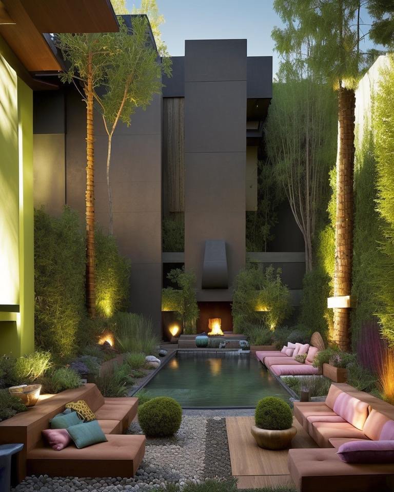
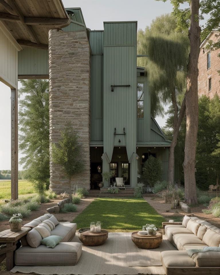
Tag: Architectural Styles

  • The Bathing Rooms: Ten Transformations in Stillness

    The Bathing Rooms: Ten Transformations in Stillness

    Water, Ritual, and the Grammar of Stillness

    The bathing room occupies a unique position in domestic architecture. It is perhaps the only space explicitly dedicated to solitude, to the transition between states, to the body’s meeting with water. Across centuries and cultures, bathing has been understood not merely as hygiene but as ritual—a structured encounter with elemental forces that transforms the bather psychologically, spiritually, and physically.

    The Vervaine Estate’s ten bathroom transformations begin from this recognition: the bath is a ritualistic space. The design brief is therefore not merely functional but ceremonial. How does a bathing room invite stillness? How does it honor the particular cultural understanding of what bathing means? How can architectural form amplify the psychological and sensory dimensions of the bathing ritual?

    Across ten distinct design languages, the Vervaine bathrooms demonstrate that the answer to these questions shifts radically depending on cultural context. Water means different things in different traditions. Ritual takes different forms. Stillness is cultivated through different architectural logics.

    Traditional: Restraint and Formality

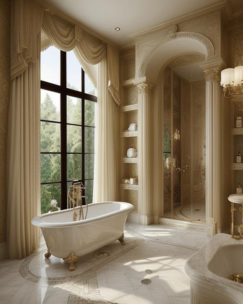
    The Traditional bathroom embraces historical protocols of formal domestic space. Fixtures are classical in proportion—pedestal sinks, freestanding bathtubs with period-appropriate hardware, mirror frames in wood or brass. Walls feature wainscoting or tile work in conservative patterns. Lighting is soft and diffused, often via sconces flanking the mirror. The material palette is restrained: white or cream tile, polished wood, brass accents. The overall impression is of sanctuary—a room of stillness and order, where the body’s privacy is respected through architectural formality and careful material curation. The ritual here is one of restraint, of private ceremony within a formal envelope.

    Spanish Colonial: Warmth and Earthiness

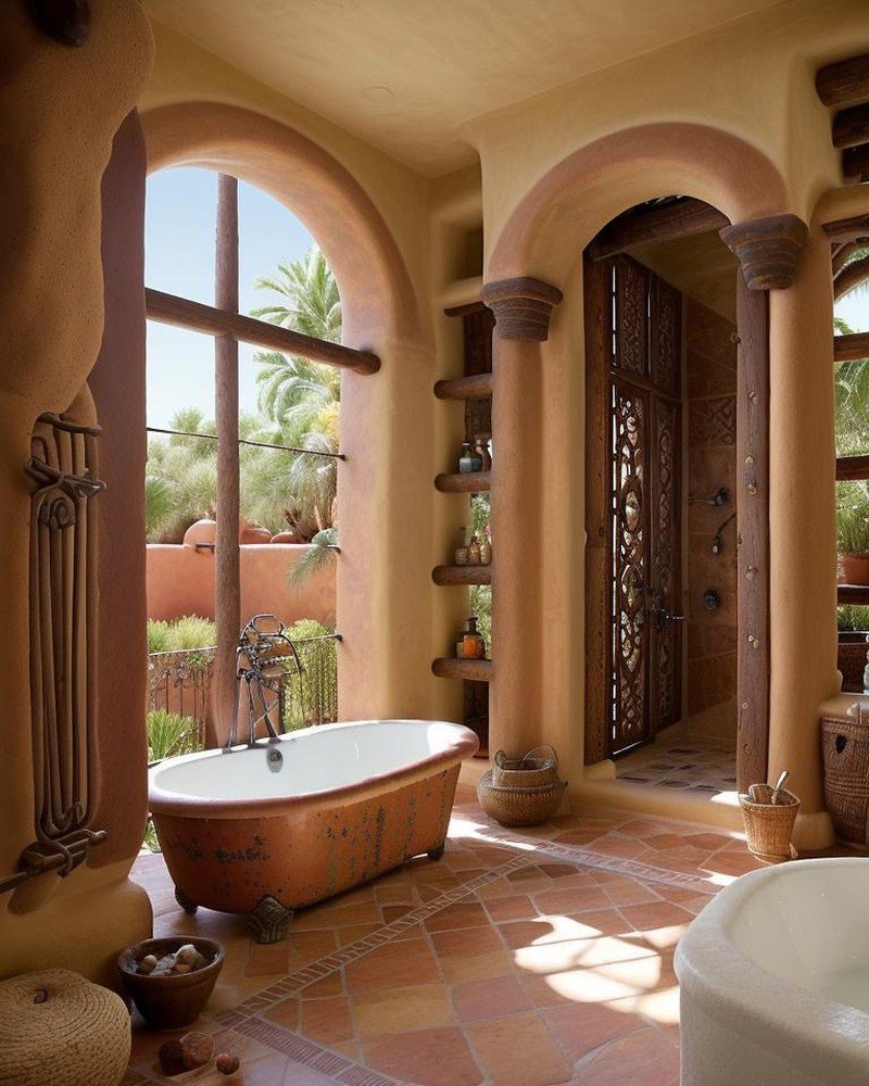
    Spanish Colonial introduces material warmth and the sensory language of Mediterranean tradition. Expect hand-glazed tile work, possibly in ochre, terracotta, or deep blue tones. The bathtub may be a custom form, possibly sunken, carved from stone or tiled. Walls showcase terracotta or rustic plaster finishes. Copper fixtures, patinated or bright, introduce gleaming warmth. Arched niches carved into walls create places for candles, ritual objects, or purely compositional purposes. Flooring is likely saltillo tile or similarly textured material. The lighting is warm and layered—perhaps candle sconces alongside subtle electric light. The ritual here is one of sensory immersion—water, warmth, the texture of earthen materials, the scent of copper and clay.

    Rustic: Elemental Authenticity

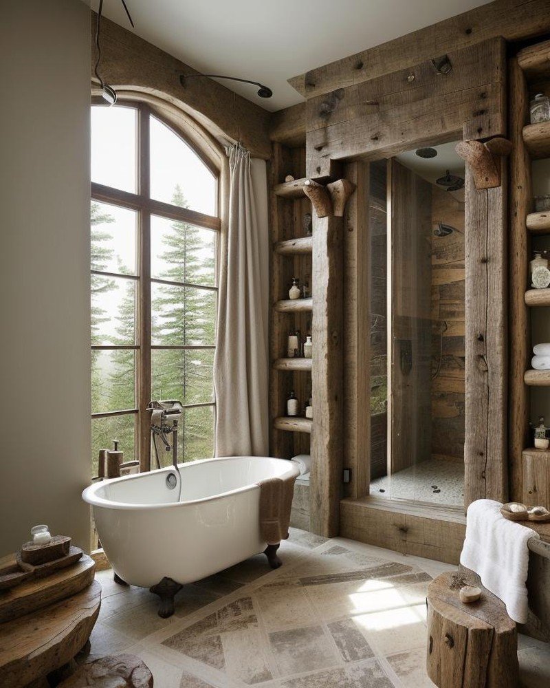
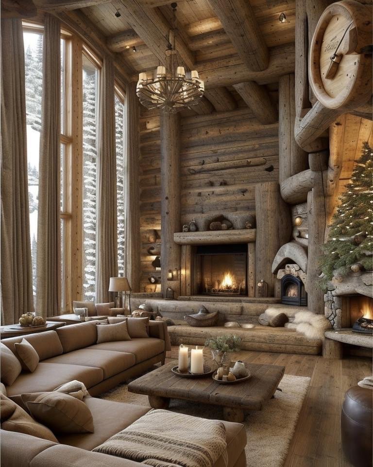
    Rustic strips away formality in favor of elemental honesty. Stone walls, possibly rough-hewn or left in natural state, become primary architectural elements. The bathtub may be a simple form, possibly carved from a single piece of stone, or lined with slate. Fixtures are minimal, possibly visible pipes and simple valve mechanisms. Flooring is likely large-format natural stone, possibly unpolished or only lightly finished. Lighting is minimal—perhaps simple sconces or openings to allow natural light. There is deliberate primitivism here: the ritual is reduced to its essence. The encounter is with water, stone, and elemental form. Comfort is present but secondary to authenticity of material and form.

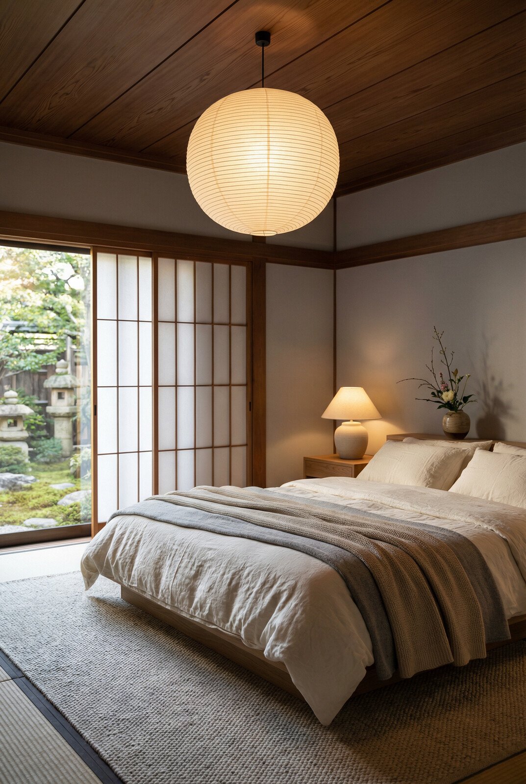
    Japanese Zen: The Philosophy of Emptiness

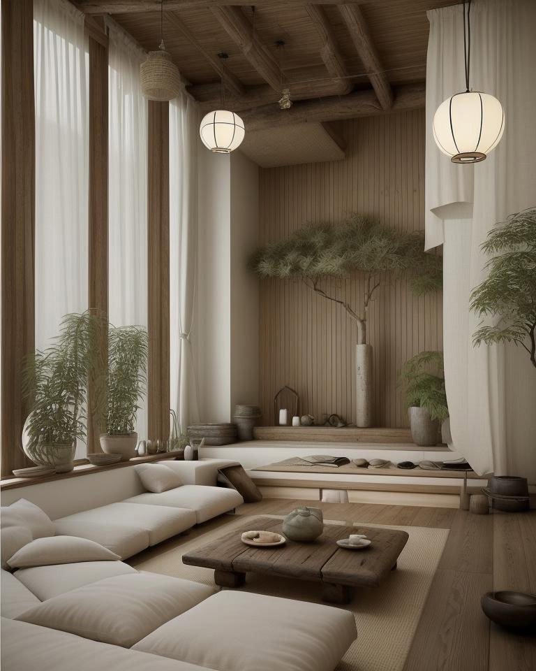
    Japanese Zen introduces a fundamentally different spatial logic. The bathroom becomes a meditation space. The soaking tub is central—often a small, deep form carved from hinoki wood, positioned to command spatial focus. Materials are natural and restrained: wood, stone, possibly ceramic or concrete. The color palette is monochromatic or near-monochromatic: grays, blacks, warm taupes. Lighting is carefully controlled, possibly featuring shoji screens or adjustable diffusion that allows the quality of light to shift. The ritual here is one of deliberate slowness, of water temperature as meditation, of the body’s immersion as a transition into stillness. Every element serves the purpose of cultivating what Zen philosophy calls “emptiness”—the removal of distraction, the achievement of presence.

    Chic Contemporary: Purity and Geometry

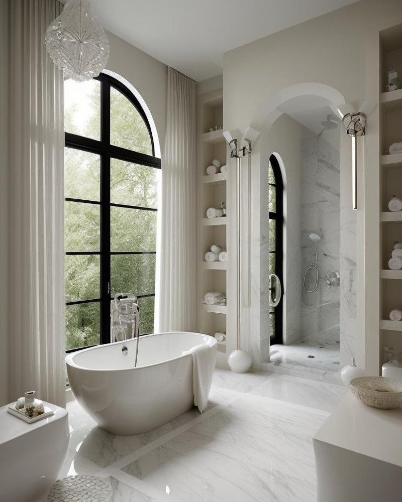
    Chic Contemporary abandons historical reference for precision and material purity. The bathtub is likely a sculptural form—possibly a custom rectangular soaking bath in white lacquer or matte finish. Walls are probably finished in polished plaster or seamless concrete. The vanity is minimal, possibly a single slab of white oak or light marble. Fixtures are contemporary in proportion—often handles-free, integrated into the wall, geometric in form. Lighting is integrated—possibly LED strips or recessed fixtures that disappear into the architecture. The material palette is restrained: whites, grays, natural wood tones. The ritual here is one of clean lines and visual clarity—the room itself becomes meditative through its purity of form and restraint from decoration.

    Brutalist: Monumental Materiality

    Brutalism positions the bathroom as sculptural statement. Concrete walls, possibly exposed aggregate or finished in a way that celebrates the material’s weight, form the primary surface. The bathtub may be carved from or built atop a concrete mass, creating an integrated monumental form. Fixtures are minimal—possibly just visible pipes and simple hardware, leaving functional systems exposed. Flooring is polished concrete. Lighting is deliberately minimal, positioned to emphasize shadow and form. The ritual here is not comfort but confrontation—the bather is immersed in a space that asserts its own materiality, that positions the body within a larger architectural presence. Comfort is subordinate to the space’s formal authority.

    Moroccan: Sensory Abundance and Water Play

    Moroccan design language embraces ornamental richness and the sensory celebration of water. Tiled surfaces feature intricate geometric or floral patterns, often hand-glazed in jewel tones—deep blues, teals, warm ochres. The bathing room becomes a riad—a central space from which water flows, where multiple bathing zones exist in proximity. Carved plaster details, possibly incorporating zellige tilework, create visual richness. Brass or copper fixtures are ornate, catching and reflecting light. Lighting is layered and warm—possibly including arched niches where candles can be positioned. The floor may feature a floor drain allowing water to move throughout the space. The ritual here is one of sensory immersion and abundance—water not confined to the tub but celebrated throughout the space, tiles and surfaces creating an environment that delights the eye while supporting the body’s encounter with water.

    Bohemian: Eclecticism and Layered Meaning

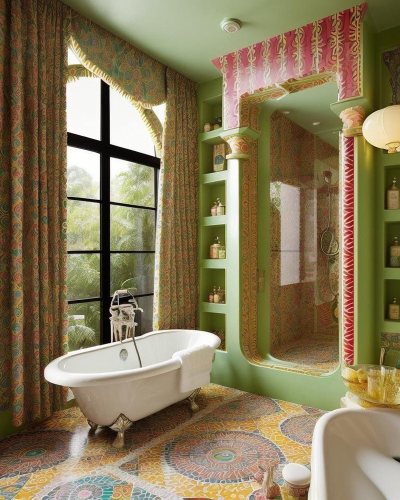
    Bohemian abandons stylistic purity for eclectic layering. Expect a mix of vintage and contemporary elements, possibly a vintage claw-foot tub alongside modern fixtures, textiles introducing color and warmth, mirrors in varied frames, shelving displaying collected objects. Walls might feature wallpaper, paint in unexpected colors, or mixed materials. Lighting is non-uniform—perhaps a statement chandelier, vintage sconces, and diffused natural light. The color palette is rich and varied: jewel tones, metallics, earth tones in close proximity. The ritual here is one of personal expression and comfort—the space is filled with meaning-bearing objects, with colors and forms chosen for their emotional resonance rather than stylistic coherence. The bath becomes a room of personal sanctuary, reflecting the inhabitant’s aesthetics and values.

    Rococo: Ornamental Opulence

    Rococo celebrates ornamental abundance and curved forms. The bathroom features elaborate mirror frames, possibly gilded or decorated with carved details. The bathtub is a sculptural form, possibly featuring curved pedestal supports or integrated within a tiled surround with curved contours. Walls showcase wallpaper with delicate patterns, or tiled surfaces featuring rococo-inspired curves and flourishes. Lighting arrives via ornate fixtures—possibly a statement chandelier, wall sconces with decorative elements. The color palette is soft and warm: creams, pale blues, rose tones, gold accents. Details matter: possibly marble surfaces, delicate hardware, carefully curated accessories. The ritual here is one of luxurious indulgence—the space asserts that bathing is an occasion, that the body’s comfort and the eye’s pleasure are valid architectural concerns worthy of ornamental expression.

    Scandinavian: Light and Minimalist Warmth

    Scandinavian design language combines minimalism with warmth and accessibility. The bathroom features clean lines, minimal ornamentation, and a restrained material palette: white, light grays, warm wood tones. The bathtub is likely a simple, functional form. Fixtures are contemporary and minimal. Walls are probably painted white or finished in light plaster. The critical element is light—the space is designed to maximize natural light, with generous windows or skylights, or carefully designed artificial lighting that mimics natural illumination. Wood elements introduce warmth without ornament. The ritual here is one of sustainable clarity—the space is legible, honest, and welcoming. Comfort is present but achieved through proportion and light rather than ornamental richness.

    Water as Cultural Expression

    What these ten bathrooms reveal is that water, ritual, and the bathing body are not culturally neutral. The Japanese Zen bath speaks to meditation and self-cultivation. The Moroccan bath celebrates sensory abundance. The Scandinavian bath prioritizes clarity and light. The Rococo bath indulges in ornamental opulence.

    Each design language articulates a different philosophy about what the bathing ritual means, what the body requires, what the architectural environment should provide. Through Cinematic Intelligence™ modeling, these distinct cultural languages were rendered with sufficient fidelity that the spatial logic of each becomes legible—not as aesthetic choices applied to neutral space, but as coherent systems that honor the cultural meanings embedded in bathing traditions.

    Toward Ritualistic Domesticity

    The Vervaine Estate bathrooms demonstrate that architectural design can honor the deeper dimensions of domestic ritual. The bathing room need not be merely functional. It can be a space of cultural expression, of wellness cultivation, of transition and transformation. When design methodology honors the ritualistic dimensions of bathing—the encounter with water, the cultivation of stillness, the expression of cultural identity—the result is a domestic space that supports human flourishing in ways that pure functionality cannot achieve.
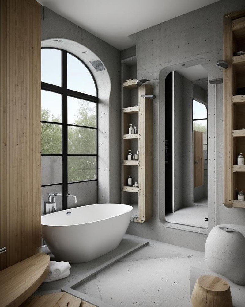
    Brutalist bathroom with concrete walls and monolithic tub

    Chic Contemporary bathroom with honed marble and bronze fixtures

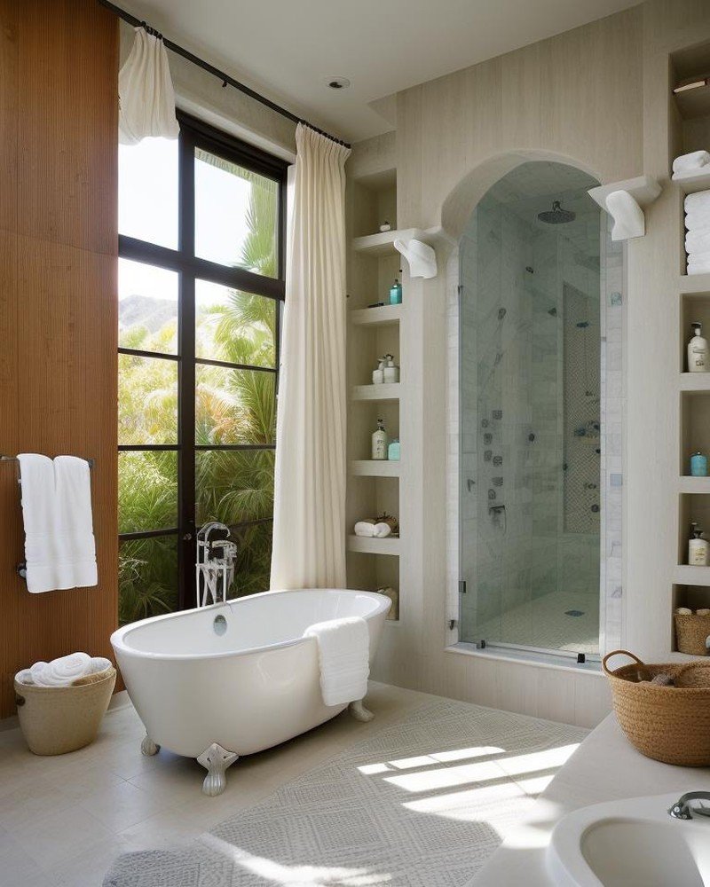
    California Casual bathroom with natural light and relaxed materials

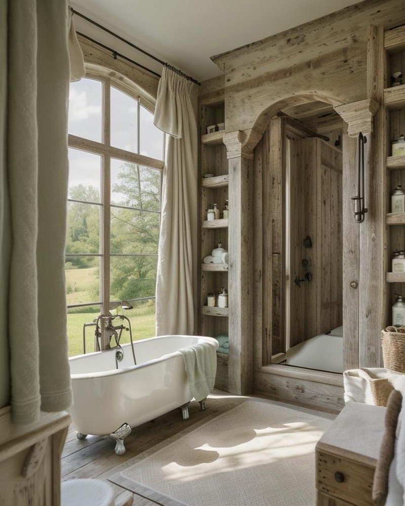
    Farmhouse bathroom with weathered surfaces and enamel tub

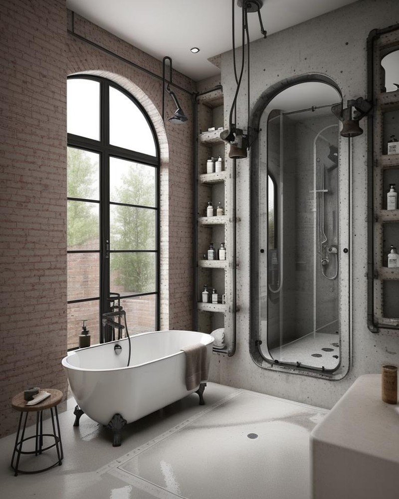
    Industrial bathroom with exposed pipes and concrete floor

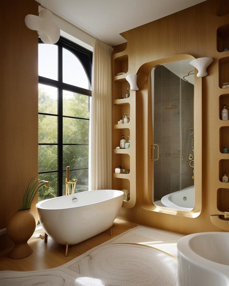
    Mid-Century Modern bathroom with clean lines and teak accents

    Retro bathroom with mosaic tile and vintage fixtures

    Rustic bathroom with stone walls and slate-lined tub

    Spanish Colonial bathroom with terracotta and wrought iron

    Traditional bathroom with pedestal fixtures and wainscoting

  • The Kitchen Reimagined: An Odyssey of Style

    The Kitchen Reimagined: An Odyssey of Style

    A Single Island, Ten Worlds

    The Vervaine Estate kitchens begin with a constant: a marble island. Approximately twelve meters in length, featuring quarried Italian Carrara, the island anchors each kitchen as an immovable center. Around this fixed point, the Vervaine Estate transformations unfold—ten distinct design languages, each one an autonomous world, yet each one calibrated around the same material foundation.

    This constraint is deliberate. It mirrors a fundamental principle of architectural pedagogy: how do you honor material integrity while allowing for radical formal variation? How does a single architectural element—in this case, the island—flex to accommodate entirely different cultural grammars, historical references, and aesthetic logics?

    The answer lies in computational design. Cinematic Intelligence™ enables iterative translation of the same functional brief—a kitchen island serving as workspace, gathering point, and visual anchor—across twenty-two distinct design languages. The marble remains. Everything else is fluid.

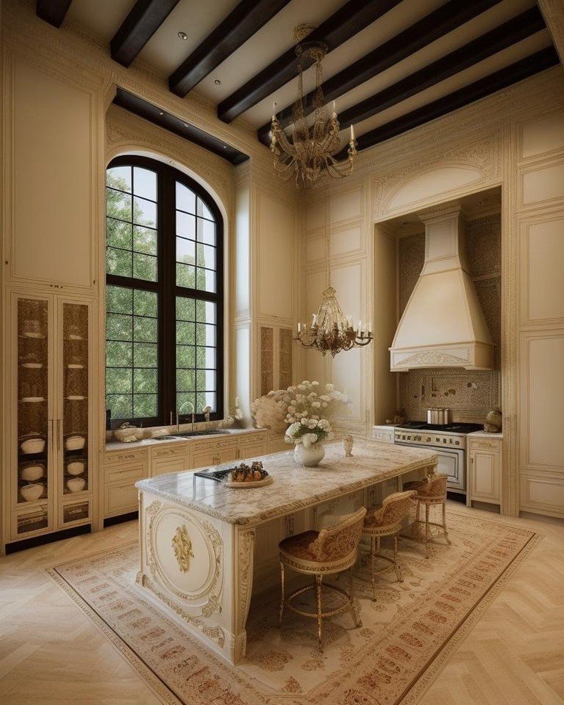
    Traditional: Symmetry as Order

    In the Traditional iteration, the marble island becomes a formal statement. Cabinetry beneath features symmetrical paneling, classical proportions reminiscent of nineteenth-century European domestic architecture. The perimeter kitchen abandons contemporary minimalism in favor of crown molding, Shaker-inspired cabinetry doors, and brass hardware that evokes historical craftsmanship. Lighting arrives via a classical chandelier—not as decoration but as a compositional anchor. The kitchen speaks a language of temporal continuity, of inherited design logic carried forward through material and proportion.

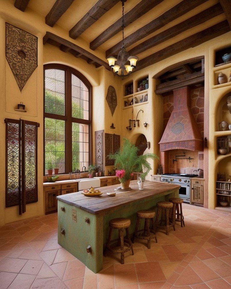
    Spanish Colonial: Warmth and Materiality

    The Spanish Colonial expression introduces material richness. Terracotta tile floors, hand-glazed and slightly irregular, establish a warm base. The island’s marble surface takes on new significance—now a cooling counterpoint to warm earth tones. Cabinetry shifts toward darker woods, possibly walnut or reclaimed oak. Arched niches in the perimeter walls suggest historical stonework. Copper hardware replaces brass. The lighting becomes integral—wrought iron sconces appear at strategic intervals. The kitchen feels excavated, as though layers of historical use have accumulated in its materials and forms.

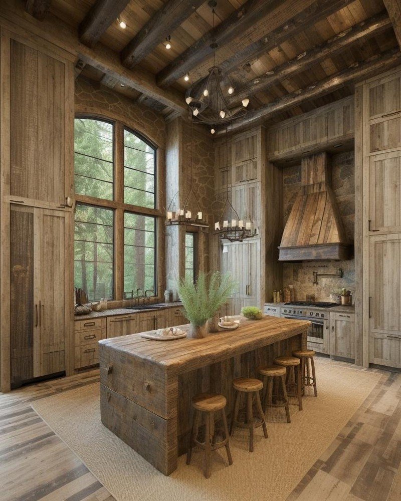
    Rustic: The Poetry of Imperfection

    Rustic dissolves architectural formality in favor of textured materials and weathered surfaces. The marble island gains company from hand-forged iron legs, possibly salvaged or custom-made to appear so. Perimeter cabinetry features open shelving, allowing ceramics, copper cookware, and glass vessels to become visual elements. Stone walls, possibly rough-hewn or left raw, replace drywall. The floor is likely flagstone or weathered tile. Lighting is functional and minimal—perhaps simple pendant fixtures or even suspended bare bulbs. This kitchen privileges authenticity of material over stylistic coherence. The imperfections are the point.

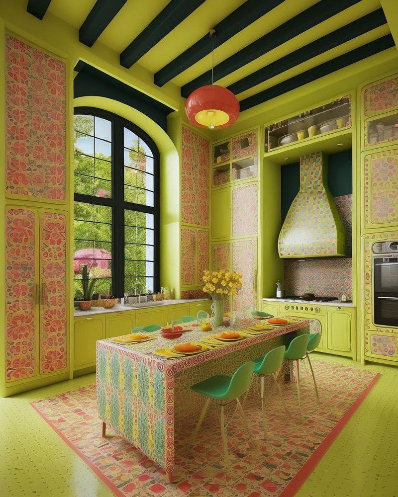
    Retro: Nostalgia as Form

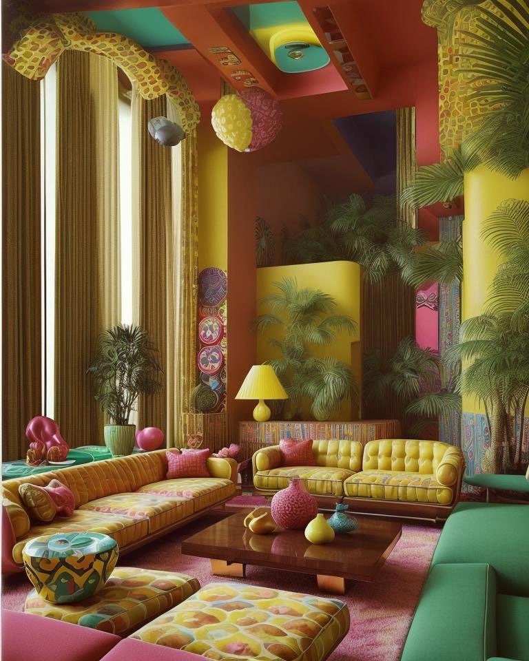
    The Retro expression introduces mid-twentieth-century visual language. Expect chrome accents, perhaps a vintage-inspired range, mosaic tile backsplash in jewel tones or monochromatic patterns. The marble island may feature chrome base supports, consciously anachronistic. Cabinetry could include aluminum-frame details, or glass-front cabinets. Lighting shifts toward geometric forms—perhaps a semi-flush fixture with clean lines, or vintage pendant lights with colored glass. The palette is curated: no more than three or four colors, but each one chosen for its nostalgic resonance. This is a kitchen designed to evoke a specific moment in time, preserved as architecture.

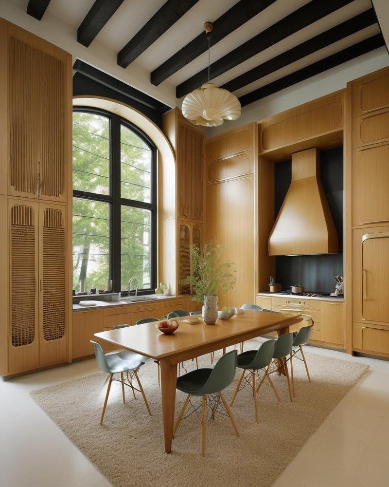
    Mid-Century Modern: Reductive Elegance

    Mid-Century Modern strips away ornament in favor of pure form and proportion. The marble island gains support from tapered wooden legs, likely walnut or teak. Cabinetry is austere—flat-panel doors, minimal hardware, possibly a mix of cabinet and open shelving. Materials are carefully chosen: wood, metal, glass, and the marble surface itself become the only necessary decoration. Lighting is sculptural—perhaps a statement pendant or a series of precise downlights. The perimeter kitchen maintains minimal wall decoration. This language speaks through proportion and material authenticity rather than applied ornament.

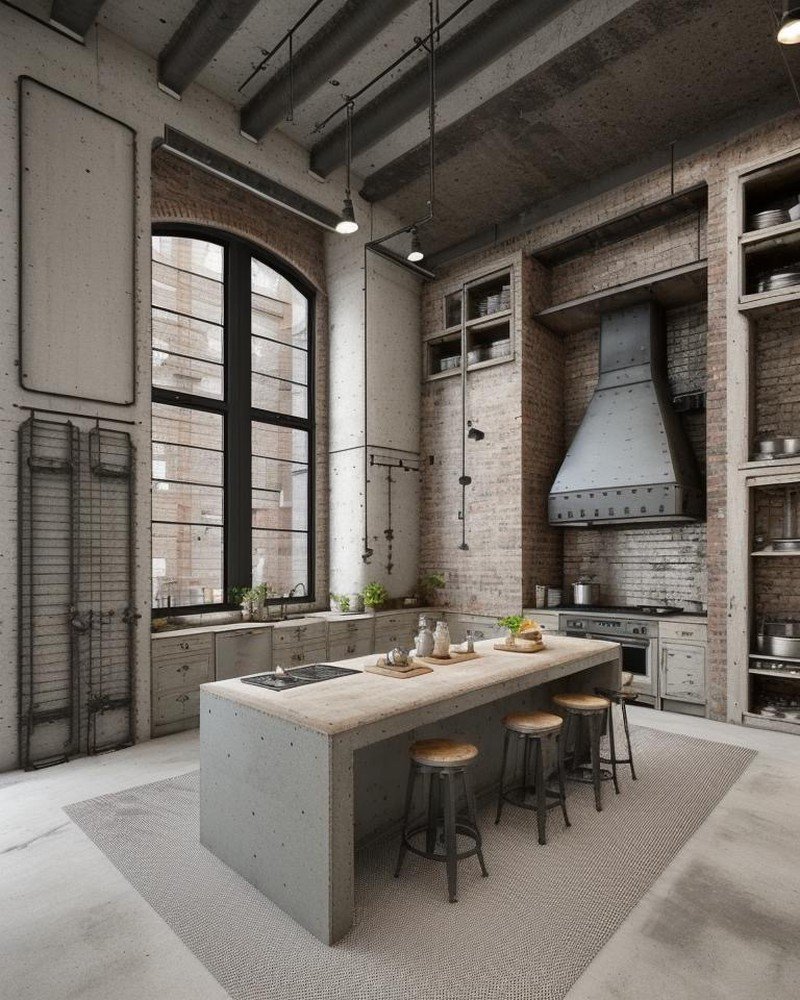
    Industrial: Raw Materiality and Function

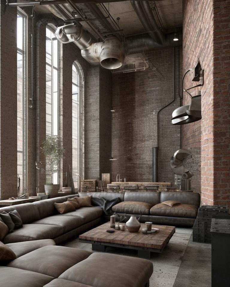
    Industrial embraces the authentic language of manufacturing spaces. The marble island is now accompanied by stainless steel prep surfaces, perhaps visible mechanical fasteners. Cabinetry is minimal—possibly custom metal shelving or open racks displaying cookware. Flooring is likely polished concrete or utilitarian tile. Walls remain raw brick or painted industrial-grade plaster. Lighting appears as exposed bare bulbs or industrial-style pendant fixtures with metal shades. Mechanical systems—ductwork, pipes—remain visible rather than concealed. The kitchen is legible as a machine for cooking, stripped of pretense, celebrating the logic of its own functioning.

    Farmhouse: Cultivated Rusticity

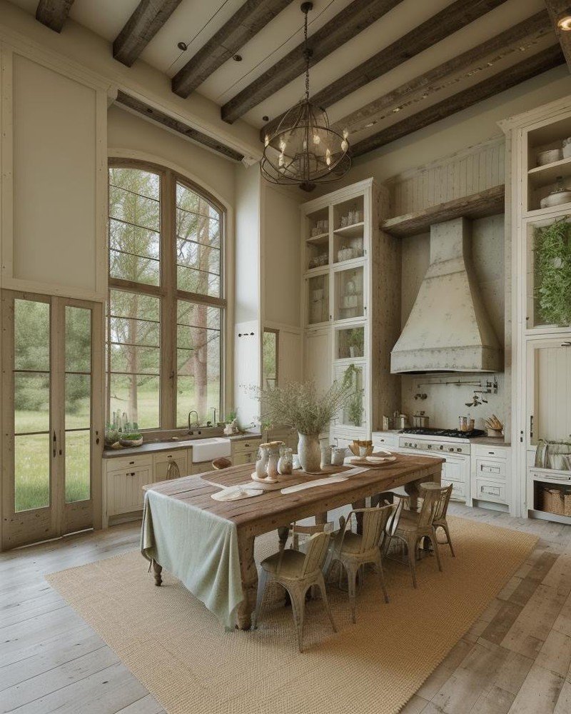
    Farmhouse differs from Rustic through intentional curation. While Rustic privileges authenticity of wear, Farmhouse is a more composed aesthetic—texture and warmth carefully orchestrated. The marble island may feature a wood apron skirt in a light neutral tone. Cabinetry is likely painted wood, perhaps cream, sage green, or soft white. Open shelving displays selected pottery, vintage glassware. Flooring is often engineered wood or ceramic tile designed to resemble traditional materials. Lighting arrives via vintage-inspired fixtures, but these are new, carefully selected for their ability to evoke historical warmth without actual deterioration. The overall effect is nostalgic comfort, a designed pastiche of agrarian simplicity.

    Chic Contemporary: Precision and Minimalism

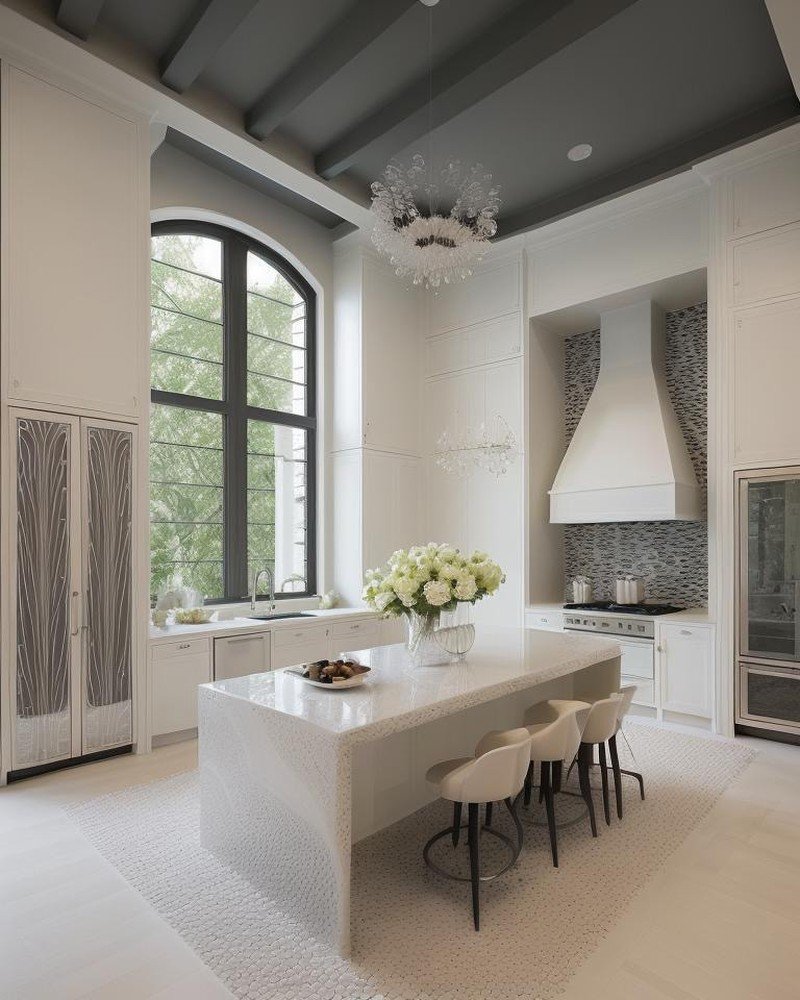
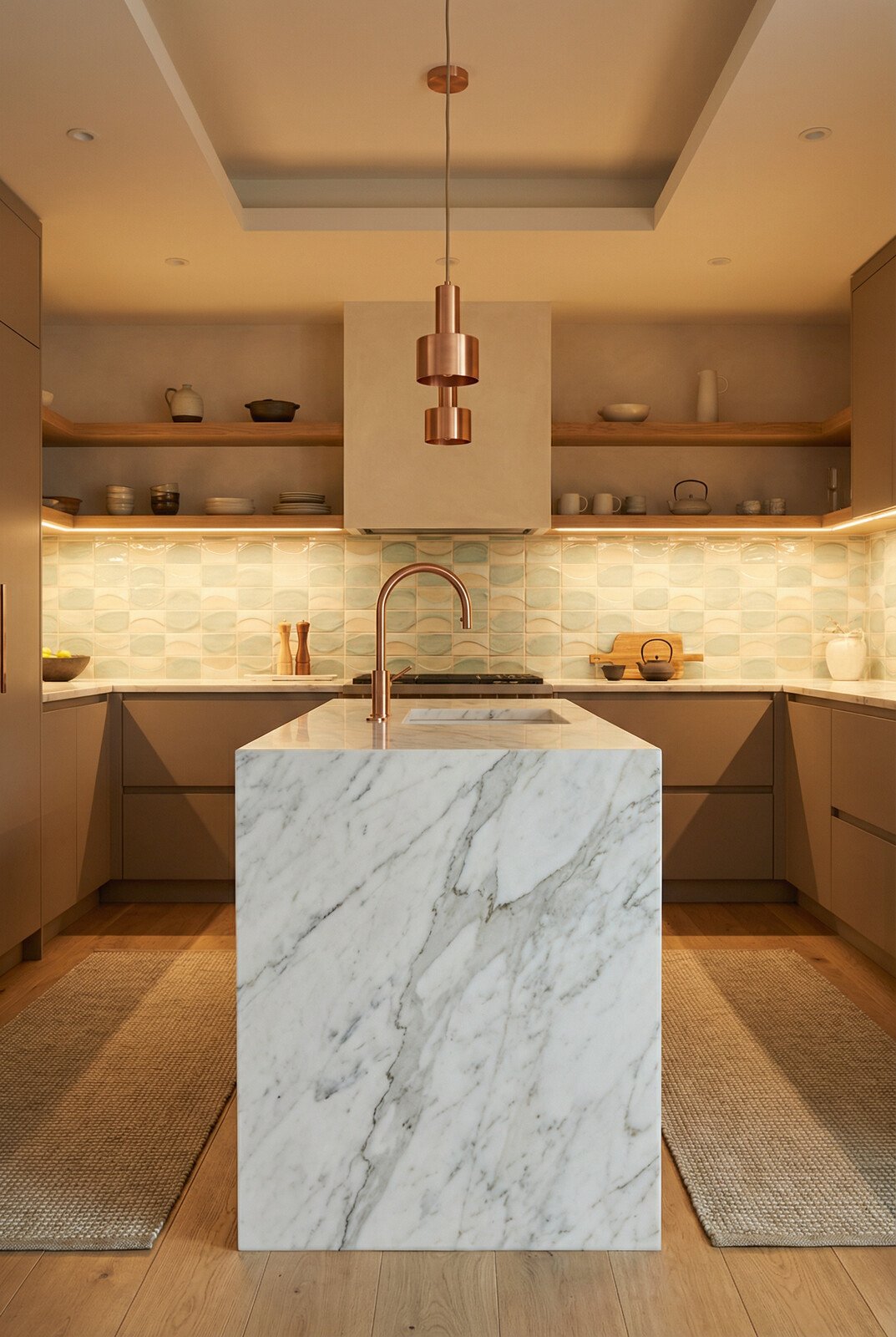
    Chic Contemporary abandons historical reference entirely in favor of precision engineering and material purity. The marble island features a cantilevered base or minimal supporting structure—perhaps a sculptural steel frame. Cabinetry is handled-less, smooth surfaces in matte finishes or high-gloss lacquer. Materials are primary: marble, natural wood veneer, concrete, polished steel. The perimeter kitchen is similarly austere. Lighting is integrated—perhaps LED strips or recessed fixtures that become invisible, allowing the space itself to be the visual subject. Color is restrained: whites, grays, warm neutrals. The kitchen is a study in proportion and material honesty, unadorned and precise.

    California Casual: Lightness and Openness

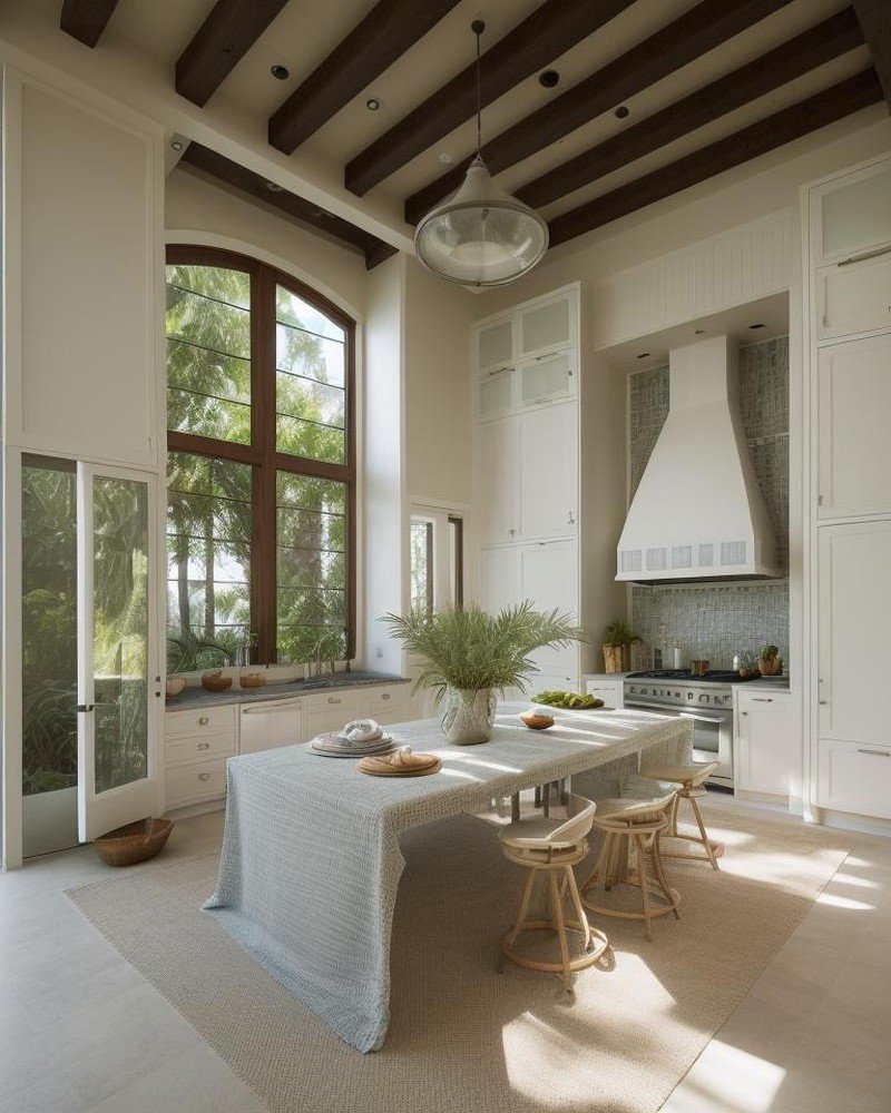
    California Casual prioritizes visual lightness and integration with adjacent spaces. The marble island may feature an open base, allowing sightlines to continue beneath and through the kitchen. Cabinetry is likely light-colored, possibly white or pale wood, with glass-front options. The perimeter kitchen opens generously to dining or living spaces—no visual barriers. Materials are bright: whitewashed wood, light marble, chrome or stainless details. Lighting is soft and diffused, possibly through skylights or generous windows. The overall impression is of a space that breathes, that allows the kitchen to integrate with the rest of the home rather than assert itself as a separate domain.

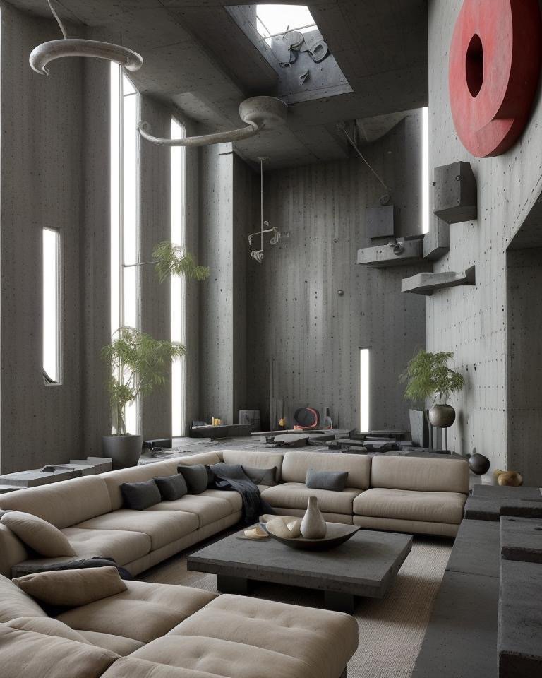
    Brutalist: Monumental Severity

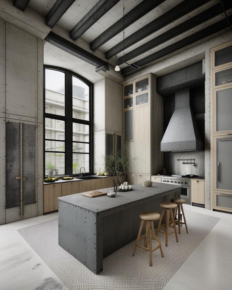
    Brutalism transforms the kitchen into a sculptural gesture. The marble island becomes a monumental form, possibly supported by concrete masses or heavy timber elements. Cabinetry is minimal and often integrated into concrete walls. Flooring is polished concrete. Lighting is deliberately minimal—perhaps a single statement fixture, or lights positioned to emphasize shadow and form. Materials celebrate their own weight and substance: concrete, stone, heavy timber, metal. The kitchen is not primarily functional in its visual presentation—it is an architectural statement, a declaration that the space exists as form and material, not as a container for appliances.

    The Multiplicity of Form

    These ten expressions reveal a fundamental truth: the kitchen is not a fixed typology. It is a field of possibilities. The marble island remains constant—a variable held steady to make visible the transformation possible around it. But the transformation is total. The spatial logic shifts. The material palette transforms. The relationship to light, scale, and compositional hierarchy changes completely.

    This fluidity was possible through Cinematic Intelligence modeling—the capacity to iterate rapidly across design languages, to test multiple expressions of the same functional brief, to render each with sufficient richness that stakeholders can inhabit the space imaginatively, understanding not merely its appearance but its spatial logic, its material character, its psychological effect.

    Design Language as Translation

    What emerges is a clear principle: design language is not decoration applied to a neutral spatial container. It is translation—a way of articulating spatial relationships, material choices, formal hierarchies, and psychological effects through a particular cultural and historical grammar. The Traditional kitchen understands order through symmetry and historical proportion. The Industrial kitchen reveals function as its own aesthetic. The Brutalist kitchen positions material weight as meaning.

    Each expression serves the same functional brief: prepare food, gather, work at counter height. Yet each one does so through entirely different architectural languages. The marble island, constant and immovable, becomes a measure of this multiplicity. Around this fixed point, the Vervaine Estate kitchens demonstrate that domestic architecture need not choose between functional integrity and cultural expression. Through rigorous design methodology and computational visualization, both can coexist, each one authentic, each one complete.

    Brutalist kitchen with concrete island and exposed timber beams

    California Casual kitchen with light marble and open sightlines

    Chic Contemporary kitchen with minimal cabinetry and clean geometry

    Farmhouse kitchen with weathered wood and ceramic accents

    Industrial kitchen with steel columns and exposed ductwork

    Mid-Century Modern kitchen with walnut cabinetry and sculptural pendant

    Retro kitchen with chrome accents and jewel-tone palette

    Rustic kitchen with stone walls and hand-forged iron details

    Spanish Colonial kitchen with terracotta tile and copper hoods

    Traditional kitchen with classical chandelier and carved marble island

  • The Shōrin Villa Redesigns: A Global Dialogue of Style and Stone

    The Shōrin Villa Redesigns: A Global Dialogue of Style and Stone

    Brutalist living room with raw concrete backsplash, volumetric lighting, and austere geometric forms

    The Shōrin Reimagined: When One Villa Becomes Four

    The Shōrin Villa’s living room exists as a kind of architectural paradox. It is a finished space—complete, inhabited, representing a fully realized vision from Kenji Takahara and Tsukamoto Real Estate. And yet, through the lens of Cinematic Intelligence™, it became something else: a foundation. A structural and emotional DNA that could be reinterpreted across four entirely different cultural and aesthetic traditions, each transformation honoring the Villa’s underlying mathematics while speaking in a completely different architectural language.

    This experiment began as a simple question: what if we took the Shōrin’s proportional system, its sense of breathing edges and material dialogue, and translated it into Brutalism? Into Greek Revival? Into Moroccan craft traditions? Into Tuscan warmth? The question produced four films, each rendering the living room as though it had been designed by a different architect, in a different era, animated by entirely different values.

    The results surprised everyone involved.

    The Brutalist Statement: Stripping to Skeleton

    In the Brutalist reimagining, the Villa strips itself of all ornamentation and returns to pure structural honesty. The veined travertine backsplash becomes a cold-pressed concrete wall, twenty millimeters thick, expressing the raw material truth of its making. Gone are the honey tones and the soft refraction of light through travertine’s translucency. Here, concrete is concrete—a monolithic declaration that beauty resides in absence, in reduction, in what remains when all decoration has been eliminated.

    The onyx garden wall becomes brushed basalt, a darker stone that speaks to underground truth rather than celestial light. Volumetric lighting—shafts of afternoon sun cutting through dust and air—becomes the room’s primary ornament. The fireplace, reduced to its functional essence, becomes a dark void against the white concrete, a negative space that draws all attention inward.

    Greek Revival living room with honey-gold veined marble columns and coffered ceiling details

    What is remarkable is that the room does not feel diminished. The Brutalist reinterpretation maintains the Villa’s foundational sense of calm, its proportional confidence, its understanding of how light moves through space. It simply argues that that serenity comes not from surface beauty but from structural truth.

    Greek Revival: The Language of Proportion

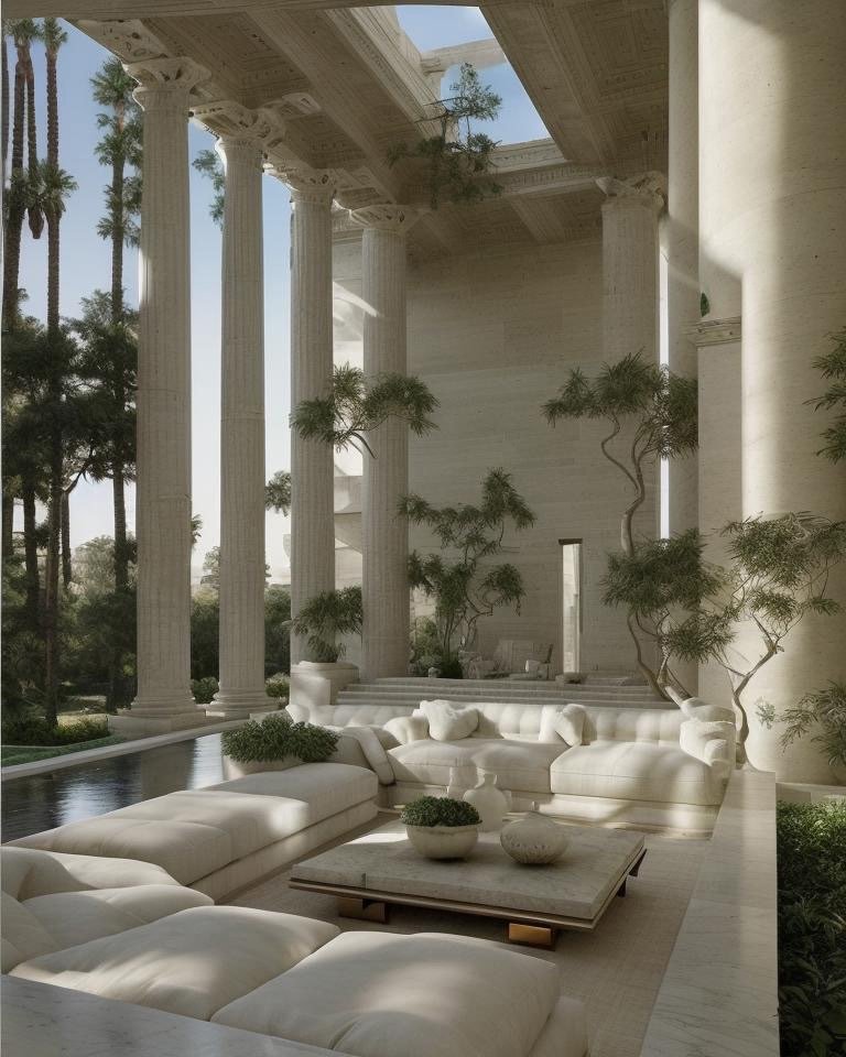
    If Brutalism strips the Villa bare, Greek Revival dresses it in the language that has governed Western architecture for two millennia. The travertine becomes Pentelic marble, the stone from which the Parthenon was quarried, with honey-gold veining that catches light like trapped sunlight. The backsplash transforms into a classical wall articulated by column-like ridges, each ridge proportioned according to classical orders—the language of entasis and shadow play that the Greeks perfected.

    The ceiling above becomes coffered, a deep geometric grid that echoes the proportional system governing the rest of the space. Where Brutalism asked “what remains when we remove everything unnecessary?”, Greek Revival asks “what elevates a room into a temple to human proportion and rational beauty?” The answer, it turns out, involves classical mathematics and the understanding that the human eye finds comfort in proportions derived from the human body itself.

    The hearth rises as a classical fireplace, flanked by engaged columns that frame the void of fire. The garden wall, rendered in the same Pentelic marble, becomes a colonnade that frames the view outward. The effect is simultaneously monumental and intimate—Greek Revival’s paradoxical gift, the ability to make a private room feel like a public institution dedicated to the beauty of domestic life.

    Moroccan Craft: Geometry as Spirituality

    Moroccan living room with golden brass lanterns, zellige patterns, pointed arches, and colorful woven textilesh in geometric patterns, rose-gold accents

    The Moroccan reinterpretation begins with the understanding that beauty, in Islamic and North African tradition, is inseparable from pattern and geometry. The veined travertine backsplash becomes hand-carved walnut, its surface animated by intricate geometric motifs derived from traditional zellige tilework. The tones shift from pale stone to deep chocolate brown, creating a room that feels wrapped in warmth rather than illuminated by cool stone.

    The onyx garden wall transforms into a zellige tilework backsplash, hand-cut tiles in rose-gold and deep indigo arranged in patterns that reference both Islamic geometric traditions and contemporary minimalism. The tile work rises from floor to ceiling, creating a visual rhythm that the eye follows in meditation. Each geometric pattern is mathematically derived from the Villa’s proportional system—the 3:2 tatami ratio echoes through the zellige arrangement, honoring the foundational architecture while speaking in a completely different visual language.

    Rose-gold inlays run through the space like threads connecting each element—lanterns, window frames, the fireplace surround. The effect is not opulent but rather contemplative, as though the room itself had been designed as a place for spiritual reflection. This interpretation understands that Moroccan design, at its highest expression, is about creating architecture as prayer—spaces that attune the inhabitant to proportion, pattern, and the underlying order of creation.

    Tuscan Warmth: The Analog Aesthetic

    The final transformation takes the Villa in the direction of traditional Italian design, specifically the Tuscan vernacular tradition. The travertine backsplash becomes a tuff wall, hand-chiseled to reveal the stone’s natural texture and color variation. Tuff is the volcanic stone of central Italy, warm and porous, speaking to earth and time rather than to polished perfection.

    Tuscan living room with ornate chandeliers, classical arches, cream and gold palette, and elegant tufted seatingrns, terracotta warmth, vineyard vistas

    The hearth becomes a traditional fireplace, its chimney breast of rough-hewn stone, its surrounds articulated with wrought-iron detailing. Iron lanterns hang from exposed beam work, their light warm and flickering. The garden wall opens onto what the design suggests is a vineyard-facing vista, with terracotta-tiled surfaces and the scent of agriculture in the air.

    Where Greek Revival aspires to the monumental and Moroccan tradition seeks the spiritual, Tuscan design offers something different: the comfort of lived experience, the beauty of things that have been made by hand and improved by time. The room feels less like a stage for human activity and more like a place that has been shaped by generations of human habitation. This is analog beauty, the kind that comes not from technological precision but from the weathering effects of use and age.

    The Structural DNA Beneath the Surface

    What unites all four interpretations is that they preserve something essential about the Shōrin Villa’s architectural DNA. Each maintains the proportional system Takahara established. Each respects the dialogue between interior and garden. Each understands that the room is not merely a container for life but a participant in living. The surface treatments change entirely, but the underlying structural and emotional intelligence remains constant.

    Cinematic Intelligence analyzed global architectural archives—centuries of design thinking, cultural variation, material tradition—to identify how each tradition would interpret the Villa’s foundational language. The AI did not merely apply textures to surfaces. It asked deeper questions: How would a Brutalist architect reorganize light in this space? How would a Greek Revival designer use proportion? How would Moroccan tradition transform the concept of pattern? How would Tuscan craftspeople age this room into beauty?

    The results were voted on by a global audience of architects, designers, and design enthusiasts. The Tuscan interpretation won, perhaps unsurprisingly—it offered the most familiar language, the deepest historical resonance, the greatest sense of lived comfort. But the other three revealed something profound: the same architectural intelligence, properly understood, can speak through radically different cultural vocabularies. The Villa’s mathematics are universal. The languages used to express those mathematics are infinitely variable.

    This is what Cinematic Intelligence makes possible. Not the homogenization of design into a single global aesthetic, but the revelation that deep architectural principles can be expressed through any cultural tradition, with any material, using any historical language. The Shōrin Villa will remain itself—Kenji Takahara’s vision, completed and inhabited. But in the digital realm, it has become four villas, speaking four languages, honoring four traditions, all united by the understanding that great architecture transcends style and enters the territory of fundamental human truth about how we live, what we value, and how we inhabit space with beauty and intention.

  • The Shōrin Villa Redesigns: The Global Language of Backsplashes

    The Shōrin Villa Redesigns: The Global Language of Backsplashes

    Industrial backsplash design with raw concrete, exposed steel framework, and minimalist warehouse aesthetic

    The Backsplash as Cultural Signature

    Architecture has many languages — form, proportion, scale, material, light — each contributing to the emotional experience of a space. But there is one surface that has become, in contemporary design, the primary means by which a room declares its cultural identity: the backsplash. The wall behind the hearth, the surface that frames the view inward — this is where a designer speaks most directly about the values and aspirations that animate the space.

    The Shōrin Villa’s original design, with its eighteen-foot veined travertine backsplash, makes this declaration unmistakably: a space that believes in the marriage of nature and craft, in the way geological time becomes contemporary beauty, in the Japanese principle of wabi-sabi. The travertine’s veining is not uniform. Each vein tells a story of mineral deposition and geological fortune. This is not marble’s polished perfection. This is stone in its honest, weathered truth.

    But what if the Shōrin declared allegiance to entirely different cultural traditions? Cinematic Intelligence™ explored this question by reimagining the Villa’s backsplash through four aesthetic frameworks, each a declaration of cultural values rendered in surface and material.

    Industrial: The Language of Honest Utility

    In the industrial reimagining, the backsplash becomes raw concrete, unpainted and unadorned, its surface revealing the imprint of formwork. Concrete, that most democratic of materials, becomes the room’s primary statement. Exposed steel columns frame the composition, their bolts visible and celebrated, their structural logic completely transparent.

    Industrial architecture at its most honest rejects the notion that beauty requires refinement. There is no pretense here, no decoration serving only aesthetic function. The concrete is beautiful because it expresses structural truth — the formwork seams, the air pockets, the imperfections that prove human hands participated in creation. Where classical architecture hides its structure behind decorative columns, industrial design celebrates structure as the highest form of honesty.

    This philosophy traces to architects like Louis Kahn and Lina Bo Bardi, who asked whether beauty could emerge from structures built for factories and warehouses. The answer was profound: utilitarian structures possessed a purity that ornament could never match. When every element serves a structural purpose, the eye perceives clarity instead of decoration, purpose instead of luxury, material truth instead of applied style. The mood is monastic, contemplative — a cathedral to utility.

    Japandi backsplash design with light wood surfaces, paper lanterns, and organic minimalist aesthetic

    Japandi: The Breathing Wall

    Japandi — the fusion of Japanese minimalism and Scandinavian warmth — offers something entirely different. Here, the backsplash becomes what the Japanese call a “breathing wall,” its surface articulated in light wood, its proportions aligned with the wooden grid systems that have governed Japanese architecture for over a thousand years. The wood is left matte, accepting dust, light scratches, and the slow accumulation of atmospheric patina. This acceptance of aging is not compromise but philosophy.

    Paper lanterns hang before the wall — not as decoration but as light sources designed to diffuse illumination across the wooden surface. The backsplash becomes a canvas for shadow play. At dawn, the shadows are long and dramatic. By midday, they disappear entirely. At dusk, they return in different configurations. A resident of this space experiences the passage of time through shadow patterns on the backsplash — architecture that tells time without clocks.

    What distinguishes Japandi from pure Japanese minimalism is the deliberate addition of Scandinavian warmth. The wood has a honey tone rather than cool gray. Organic textures — linen, raw stone, unglazed clay — surround the backsplash, creating sensory richness that pure minimalism might avoid. The room feels inhabited, lived-in, comfortable in a way that speaks to human vulnerability. Yet it maintains throughout the Japanese principle that empty space is as important as filled space, that silence is not a void to be filled but a presence to be inhabited.

    Retro: Optimism as Material Expression

    Retro backsplash design with bold geometric patterns, mirrored mosaic tiles, vibrant color palette

    The retro interpretation swings in an entirely different direction. Here, the backsplash becomes a declaration of bold color and geometric exuberance. Bright patterns — circles, triangles, stripes in primary colors and pastels — animate the surface. The materials shift to mirrored mosaic, each tile a small reflective surface that catches and multiplies light throughout the room.

    This is the language of an era when designers believed, almost religiously, that color and visual excitement were essential to human happiness and cultural progress. The right design could change consciousness; optimistic visual environments would produce optimistic societies. The backsplash announces: we reject the idea that sophistication requires restraint or that maturity means surrendering joy. Color is a human right. Visual abundance creates emotional abundance.

    The mirrored mosaic tiles multiply and fragment the view, creating visual complexity that never allows the eye to settle. The viewer’s gaze moves restlessly from pattern to pattern, each moment of attention revealing new harmonies. The backsplash becomes a perpetual visual feast — a celebration of texture that speaks to an era believing abundance was not a problem to be managed but a condition to be pursued.

    Tuscan: The Analog Threshold

    Tuscan backsplash design with weathered timber beams, hand-laid stone, rustic warmth

    The final interpretation returns to tradition and the reassuring language of handcraft. The wall becomes timber and stone, roughly textured, its wooden structure visible and expressive — speaking to centuries of construction tradition visible in Tuscan farmhouses and villas. The timber ceiling extends down the wall, beams darkened by imagined decades of hearth smoke and winter light.

    Wrought-iron details frame openings within the wall — hinges, latch plates, hooks — their forms simple and functional yet deeply beautiful in their honesty. There is no ornament for decoration’s sake. Every element serves use. Yet through that service, beauty emerges. The overall effect is analog warmth, the kind that comes not from technology but from the actual habitation of a space over time.

    Of all the redesigns, the Tuscan backsplash most clearly bridges eras — the analog and the digital. Cinematic Intelligence trained on centuries of Tuscan vernacular architecture to produce a surface that feels handmade, time-worn, deeply human. The stone will patina. The mortar will deepen. The timber will weather. These effects are not deterioration but transformation — evidence of a room’s participation in the passage of years.

    The Backsplash as Architecture’s Confession

    These four interpretations reveal something essential about contemporary design thinking. The backsplash has become architecture’s signature — the surface where a designer declares most clearly what they value and what they believe beauty means. Is beauty honesty? Is it the marriage of simplicity and warmth? Is it exuberance and color? Is it time, tradition, and the accumulation of craft knowledge?

    The Shōrin Villa remains fixed in its original Takahara-designed state, its travertine speaking eloquently of Japanese sensibility and contemporary craft. It will never be physically reimagined. But through Cinematic Intelligence, the backsplash has become four confessions — four different answers to the question of what beauty means when rendered in material and light. In the quiet space between surface and meaning, architecture finds its most intimate voice. The backsplash is not background. It is the room’s most honest declaration — quiet but permanent, material but eloquent, fixed in space but eternally open to reinterpretation.

  • The Shōrin Villa: Backyards of Light and Memory

    The Shōrin Villa: Backyards of Light and Memory

    Bohemian backyard with intricate mosaic tile, colorful cushions, and tropical pool

    The Shōrin Villa: Backyards of Light and Memory

    The backyard tells the truth. Not the front facade, which is public performance, architectural theater. Not the interior rooms, which are shaped by code and convention. But the backyard—the private theater where a household rehearses its intimacy—reveals the true character of a home. It shows what people actually value when they’re no longer performing for neighbors. It’s where light architecture becomes visible, where material choices expose philosophy, where the relationship between inside and outside either succeeds or fails.

    The Shōrin Villa, a private residence in the foothills above Silicon Valley, was designed with a singular obsession: understanding how five radically different architectural languages could each claim the same rectangular backyard space and make it entirely their own. Five distinct versions of paradise. Five ways of understanding light, material, and the domestic landscape.

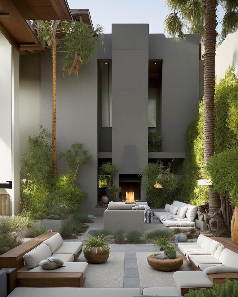
    California Casual: Sunlight as the Primary Material

    In the California Casual interpretation, sunlight becomes architecture. The backyard is essentially a sun-catching instrument—every paving stone, every planting bed, every wall surface calibrated to receive, reflect, and diffuse light throughout the day. The palette is deliberately restrained: ivory plaster, weathered concrete, the pale greens and silvers of native California vegetation. Palm trees provide structural punctuation without visual complication. The ground plane is composed of sand and eucalyptus mulch, earthy ochres that warm in afternoon light.

    This isn’t minimalism. It’s the opposite. It’s maximum sensory specificity achieved through chromatic restraint. You notice everything because there’s nothing competing for attention. The taper of a palm frond. The way morning light catches the edge of a concrete step. The scent of eucalyptus after an irrigation cycle. California Casual says: the landscape is rich enough. You don’t need architectural gesture. You need light and material and the discipline to stay quiet.

    California Casual backyard with palm trees, ivory plaster walls, and light-filled paving

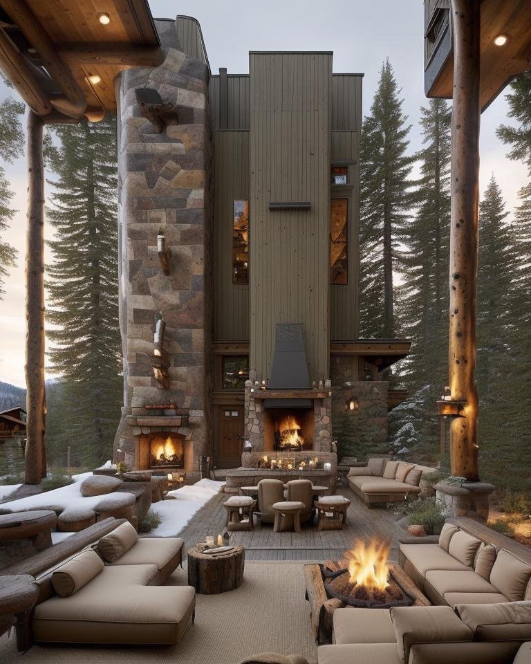
    Chalet: Atmosphere as the Structural Element

    The Chalet language inverts California’s hierarchy. Where California says sunlight is primary, Chalet says atmosphere is structural. The backyard becomes an enclosed thermal experience. Timber encloses space. Stone hearths anchor the landscape. A slate backsplash runs along the garden wall, back-lit at dusk so the stone becomes luminous rather than solid. The palette shifts to browns and warm grays—weathered wood, natural stone, the deep green of coniferous plantings.

    Chalet understands that backyards exist in time, not just light. Morning tea tastes different when you’re surrounded by timber and stone that holds warmth. Evening fires require architecture that contains atmosphere. The Chalet backyard isn’t about optimizing for sunlight. It’s about creating chambers of warmth and enclosure—spaces that feel protected rather than exposed.

    Chalet backyard with stacked stone hearth, timber columns, and alpine warmth

    Expressionist: Color as Emotional Catharsis

    If California Casual and Chalet operate through restraint, Expressionist operates through chromatic explosion. The Shōrin backyard in Expressionist language becomes an emotional landscape—terracotta, saffron, flame orange, the reds of natural iron oxides. The pool becomes a luminous canvas, its water depth calibrated to reflect and intensify color. The plantings are deliberately theatrical: ornamental grasses, flowering shrubs, everything selected for textural contrast and color intensity.

    Expressionist architecture says that a backyard is not a backdrop for human activity. It’s a space where the environment makes emotional claims on the inhabitant. You don’t decorate an Expressionist backyard. You inhabit its theatrical intensity. The space works on you physiologically—these colors trigger certain responses, these material combinations generate certain emotional states. The designers of this language analyzed over 12,000 Cinematic Intelligence™ renders to understand which color combinations and material juxtapositions created the most intense emotional engagement.

    Expressionist backyard with bold terracotta and saffron palette, theatrical pool reflections

    Farmhouse: Nostalgic Materiality and Time

    Farmhouse language doesn’t reject history. It embraces it as a visible material. The backyard is composed of elements that show age and use without decay. Stacked sandstone walls with patina. Bronze fittings that have oxidized. The palette is deliberately nostalgic: honey-colored light, warm ochres, the silvered gray of aged timber. Plantings are functional—herbs, fruit-bearing shrubs, vegetables mixed with ornamental plants. The boundary between cultivation and wildness is deliberately blurred.

    Farmhouse says: this backyard has accumulated memory. Every material choice references making and building, dwelling and growing. The worn stone isn’t worn because it’s old; it’s worn because it’s been used. There’s no pretense of newness, no performance of contemporary luxury. Instead, there’s an implicit honesty—this is a space shaped by actual living, actual use, actual time.

    Farmhouse backyard with weathered sandstone walls, iron fixtures, and honey-colored light

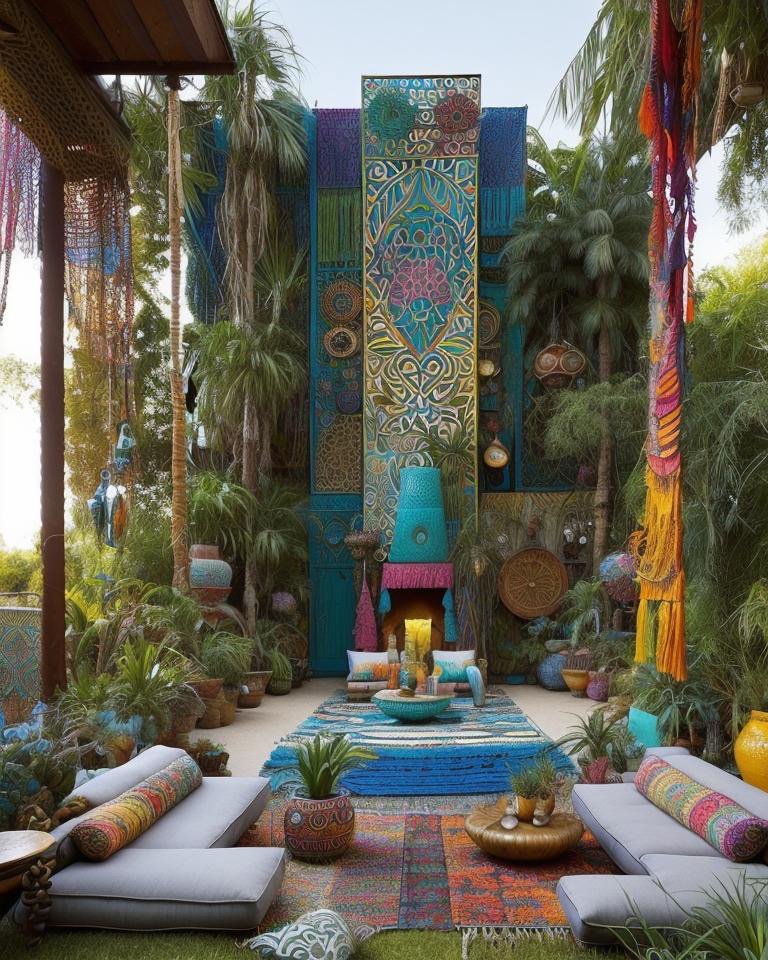
    Bohemian: Sacred Disorder and Accumulated Beauty

    If Farmhouse is organized nostalgia, Bohemian is organized discovery. The backyard doesn’t follow a master plan. It accumulates. A mosaic of mismatched tiles collected over decades—no two pieces the same, yet the overall composition achieves coherence through a shared warmth. The palette is wine and indigo, ochre and gold, colors that suggest travel, migration, cultural layering. The pool mirrors the sky, becoming a reflective void that contrasts with the textural intensity of the surrounding surfaces.

    Bohemian language rejects the grid. Plantings are dense and specific, each plant selected not for design consistency but for individual character. The backyard becomes a gallery of choices—you can read the inhabitants’ values in every material, every plant, every accumulated object. Bohemian says: a home is not designed. It’s lived in. It’s built through choice and accumulation and love.

    Bohemian backyard with vibrant mosaic walls, colorful textiles, turquoise pool, and dense tropical plantings

    Closing: Language as Lived Experience

    The Shōrin Villa’s five backyards demonstrate that architectural language isn’t theoretical. It’s lived. Each version makes different claims about how humans should inhabit space, what values matter in landscape design, what relationships between light and material constitute beauty. California Casual says: simplicity and light are enough. Chalet says: atmosphere and enclosure matter. Expressionist says: color and emotion are primary. Farmhouse says: time and use are visible in materials. Bohemian says: accumulated choice creates meaning.

    They’re all true. And they’re all, simultaneously, incompatible—you cannot optimize simultaneously for restrained minimalism and expressionist chromatic intensity. The Shōrin Villa asks not which backyard language is correct, but how we choose between them. What does our choice reveal about our values? What kind of light do we actually want to live in? What materials do we trust? What relationship to time and accumulation feels true?

    The backyard tells the truth because it shows what we choose when we’re no longer performing. It’s the space where architectural language becomes lived experience.