Tag: Cultural Design

  • The Kitchen Reimagined: An Odyssey of Style

    The Kitchen Reimagined: An Odyssey of Style

    A Single Island, Ten Worlds

    The Vervaine Estate kitchens begin with a constant: a marble island. Approximately twelve meters in length, featuring quarried Italian Carrara, the island anchors each kitchen as an immovable center. Around this fixed point, the Vervaine Estate transformations unfold—ten distinct design languages, each one an autonomous world, yet each one calibrated around the same material foundation.

    This constraint is deliberate. It mirrors a fundamental principle of architectural pedagogy: how do you honor material integrity while allowing for radical formal variation? How does a single architectural element—in this case, the island—flex to accommodate entirely different cultural grammars, historical references, and aesthetic logics?

    The answer lies in computational design. Cinematic Intelligence™ enables iterative translation of the same functional brief—a kitchen island serving as workspace, gathering point, and visual anchor—across twenty-two distinct design languages. The marble remains. Everything else is fluid.

    Traditional: Symmetry as Order

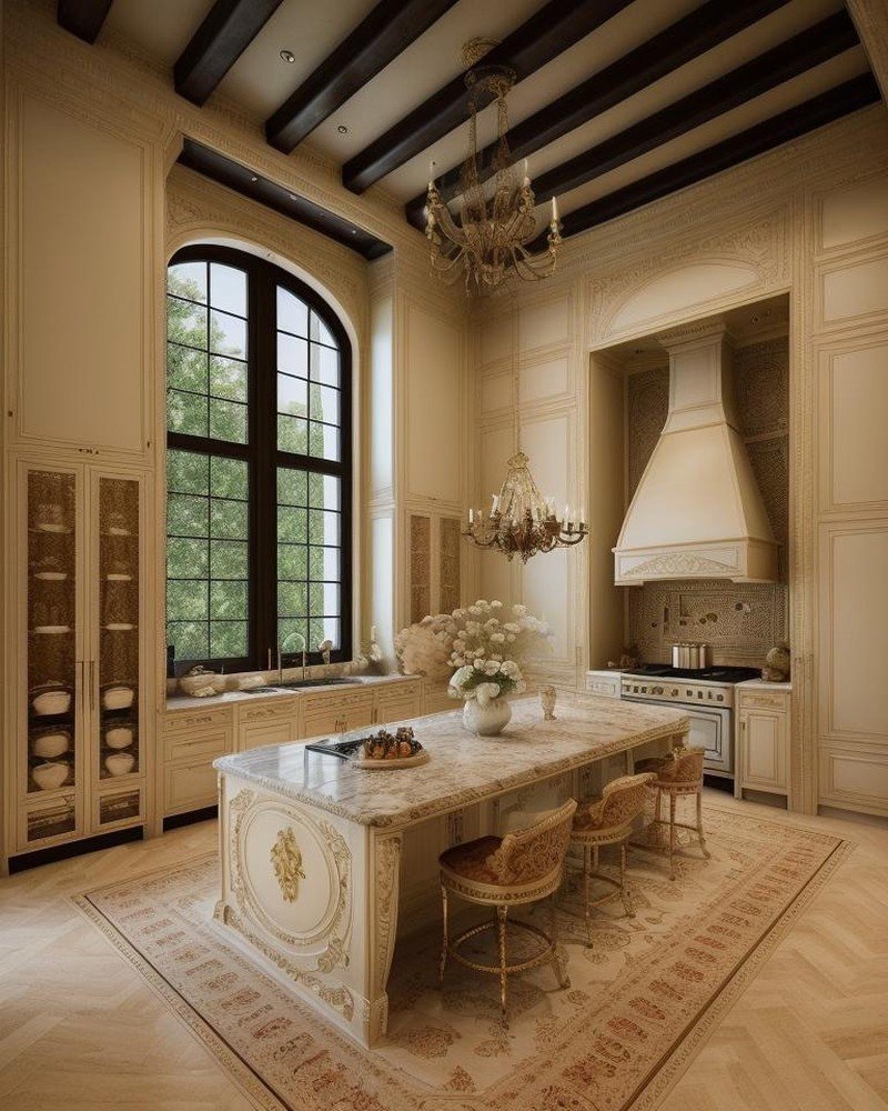
    In the Traditional iteration, the marble island becomes a formal statement. Cabinetry beneath features symmetrical paneling, classical proportions reminiscent of nineteenth-century European domestic architecture. The perimeter kitchen abandons contemporary minimalism in favor of crown molding, Shaker-inspired cabinetry doors, and brass hardware that evokes historical craftsmanship. Lighting arrives via a classical chandelier—not as decoration but as a compositional anchor. The kitchen speaks a language of temporal continuity, of inherited design logic carried forward through material and proportion.

    Spanish Colonial: Warmth and Materiality

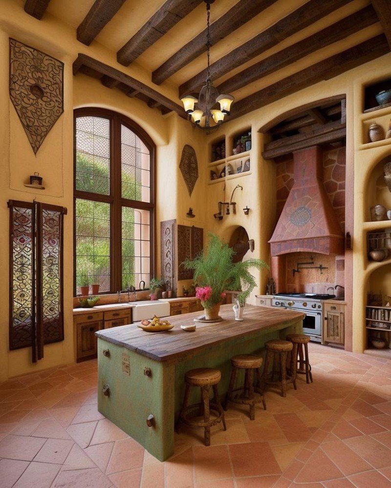
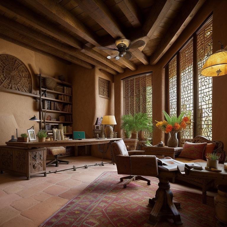
    The Spanish Colonial expression introduces material richness. Terracotta tile floors, hand-glazed and slightly irregular, establish a warm base. The island’s marble surface takes on new significance—now a cooling counterpoint to warm earth tones. Cabinetry shifts toward darker woods, possibly walnut or reclaimed oak. Arched niches in the perimeter walls suggest historical stonework. Copper hardware replaces brass. The lighting becomes integral—wrought iron sconces appear at strategic intervals. The kitchen feels excavated, as though layers of historical use have accumulated in its materials and forms.

    Rustic: The Poetry of Imperfection

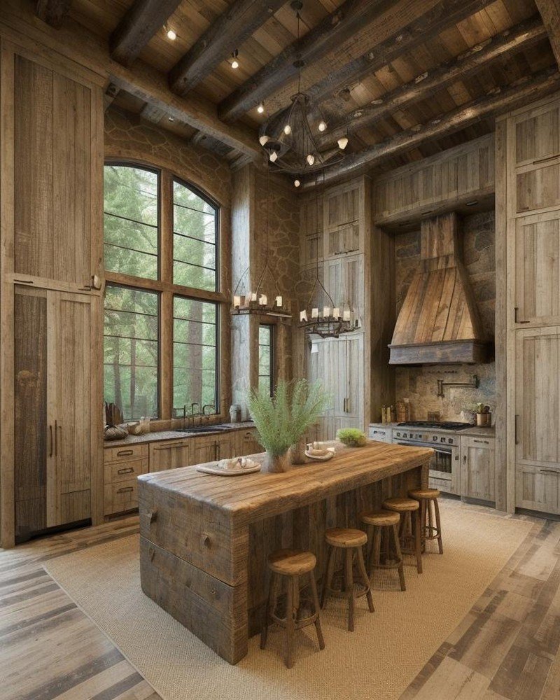
    Rustic dissolves architectural formality in favor of textured materials and weathered surfaces. The marble island gains company from hand-forged iron legs, possibly salvaged or custom-made to appear so. Perimeter cabinetry features open shelving, allowing ceramics, copper cookware, and glass vessels to become visual elements. Stone walls, possibly rough-hewn or left raw, replace drywall. The floor is likely flagstone or weathered tile. Lighting is functional and minimal—perhaps simple pendant fixtures or even suspended bare bulbs. This kitchen privileges authenticity of material over stylistic coherence. The imperfections are the point.

    Retro: Nostalgia as Form

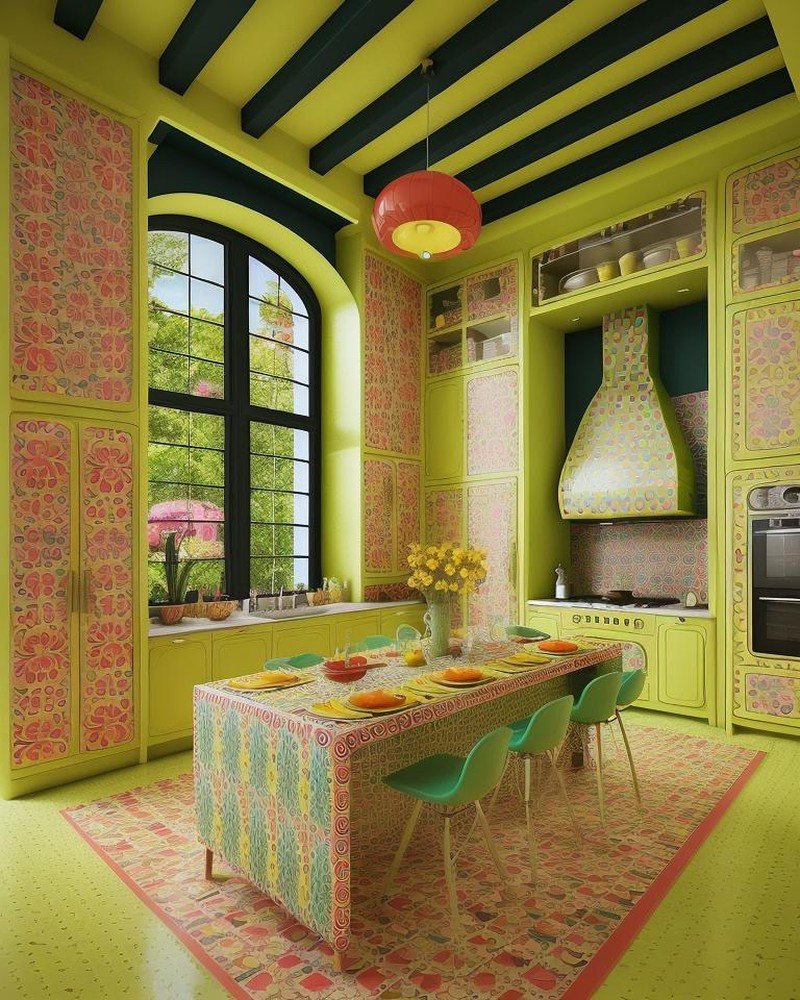
    The Retro expression introduces mid-twentieth-century visual language. Expect chrome accents, perhaps a vintage-inspired range, mosaic tile backsplash in jewel tones or monochromatic patterns. The marble island may feature chrome base supports, consciously anachronistic. Cabinetry could include aluminum-frame details, or glass-front cabinets. Lighting shifts toward geometric forms—perhaps a semi-flush fixture with clean lines, or vintage pendant lights with colored glass. The palette is curated: no more than three or four colors, but each one chosen for its nostalgic resonance. This is a kitchen designed to evoke a specific moment in time, preserved as architecture.

    Mid-Century Modern: Reductive Elegance

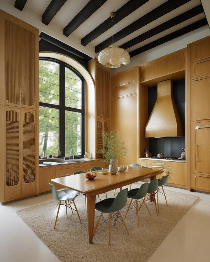
    Mid-Century Modern strips away ornament in favor of pure form and proportion. The marble island gains support from tapered wooden legs, likely walnut or teak. Cabinetry is austere—flat-panel doors, minimal hardware, possibly a mix of cabinet and open shelving. Materials are carefully chosen: wood, metal, glass, and the marble surface itself become the only necessary decoration. Lighting is sculptural—perhaps a statement pendant or a series of precise downlights. The perimeter kitchen maintains minimal wall decoration. This language speaks through proportion and material authenticity rather than applied ornament.

    Industrial: Raw Materiality and Function

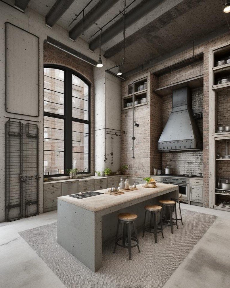
    Industrial embraces the authentic language of manufacturing spaces. The marble island is now accompanied by stainless steel prep surfaces, perhaps visible mechanical fasteners. Cabinetry is minimal—possibly custom metal shelving or open racks displaying cookware. Flooring is likely polished concrete or utilitarian tile. Walls remain raw brick or painted industrial-grade plaster. Lighting appears as exposed bare bulbs or industrial-style pendant fixtures with metal shades. Mechanical systems—ductwork, pipes—remain visible rather than concealed. The kitchen is legible as a machine for cooking, stripped of pretense, celebrating the logic of its own functioning.

    Farmhouse: Cultivated Rusticity

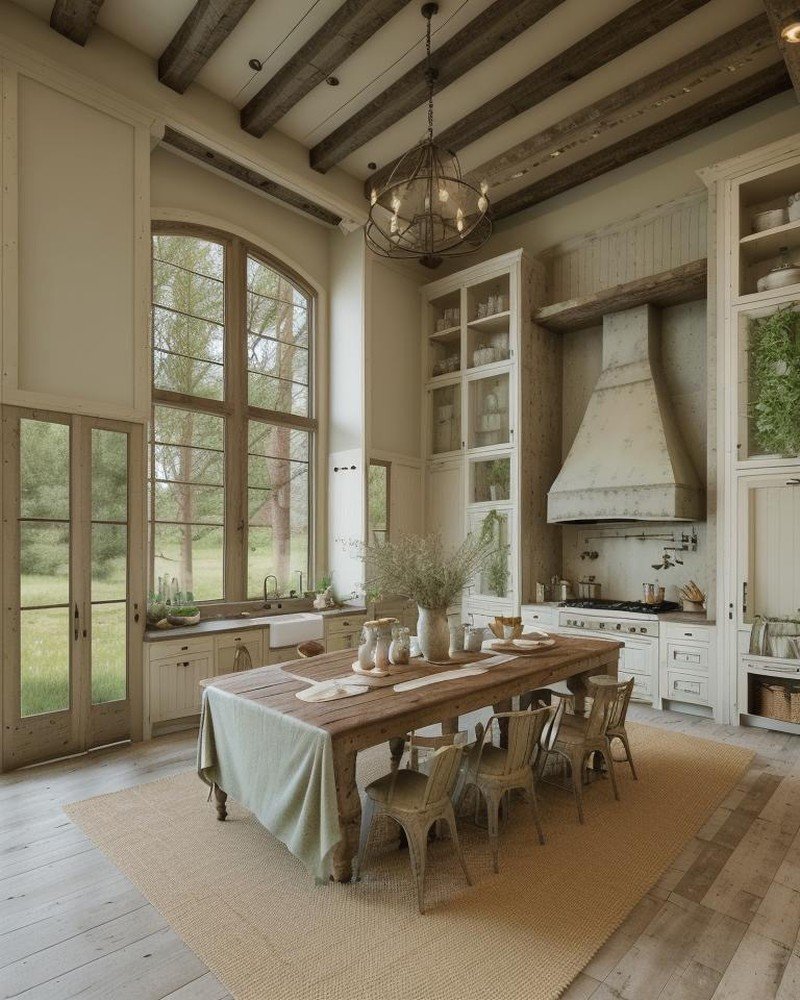
    Farmhouse differs from Rustic through intentional curation. While Rustic privileges authenticity of wear, Farmhouse is a more composed aesthetic—texture and warmth carefully orchestrated. The marble island may feature a wood apron skirt in a light neutral tone. Cabinetry is likely painted wood, perhaps cream, sage green, or soft white. Open shelving displays selected pottery, vintage glassware. Flooring is often engineered wood or ceramic tile designed to resemble traditional materials. Lighting arrives via vintage-inspired fixtures, but these are new, carefully selected for their ability to evoke historical warmth without actual deterioration. The overall effect is nostalgic comfort, a designed pastiche of agrarian simplicity.

    Chic Contemporary: Precision and Minimalism

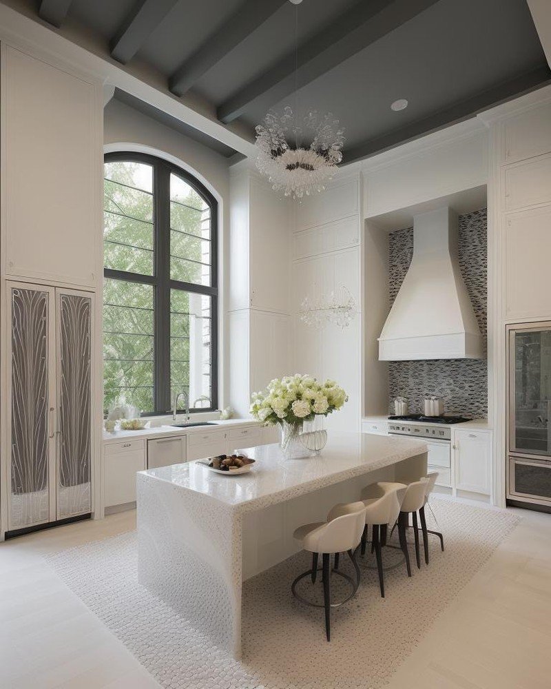
    Chic Contemporary abandons historical reference entirely in favor of precision engineering and material purity. The marble island features a cantilevered base or minimal supporting structure—perhaps a sculptural steel frame. Cabinetry is handled-less, smooth surfaces in matte finishes or high-gloss lacquer. Materials are primary: marble, natural wood veneer, concrete, polished steel. The perimeter kitchen is similarly austere. Lighting is integrated—perhaps LED strips or recessed fixtures that become invisible, allowing the space itself to be the visual subject. Color is restrained: whites, grays, warm neutrals. The kitchen is a study in proportion and material honesty, unadorned and precise.

    California Casual: Lightness and Openness

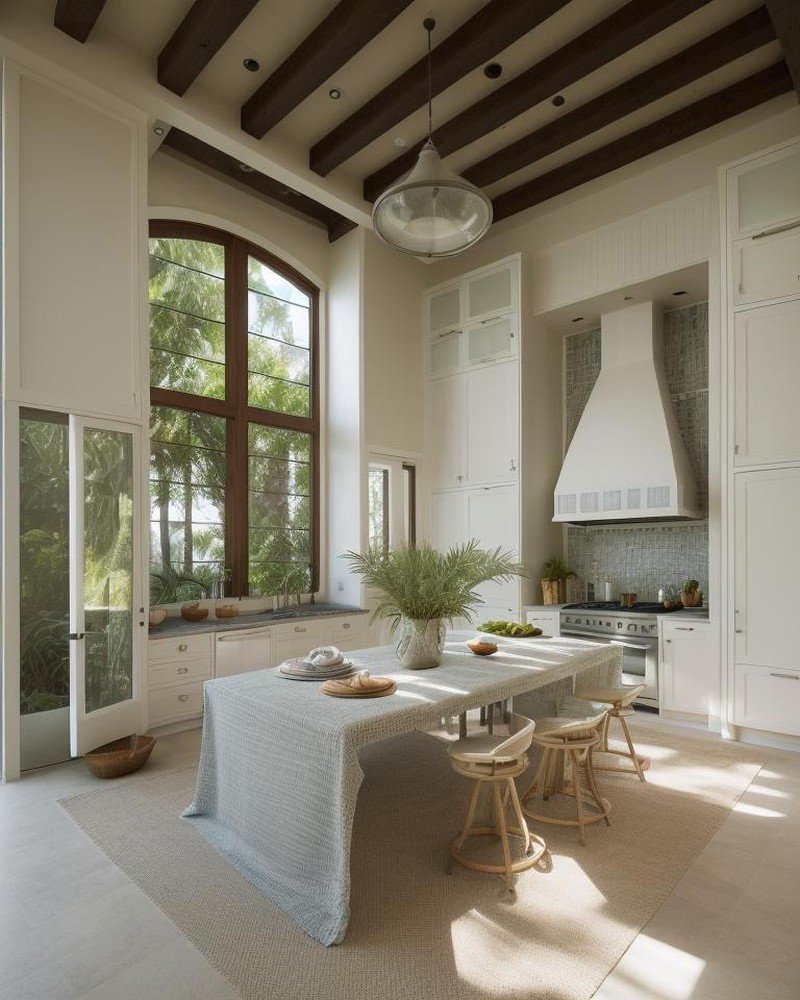
    California Casual prioritizes visual lightness and integration with adjacent spaces. The marble island may feature an open base, allowing sightlines to continue beneath and through the kitchen. Cabinetry is likely light-colored, possibly white or pale wood, with glass-front options. The perimeter kitchen opens generously to dining or living spaces—no visual barriers. Materials are bright: whitewashed wood, light marble, chrome or stainless details. Lighting is soft and diffused, possibly through skylights or generous windows. The overall impression is of a space that breathes, that allows the kitchen to integrate with the rest of the home rather than assert itself as a separate domain.

    Brutalist: Monumental Severity

    Brutalism transforms the kitchen into a sculptural gesture. The marble island becomes a monumental form, possibly supported by concrete masses or heavy timber elements. Cabinetry is minimal and often integrated into concrete walls. Flooring is polished concrete. Lighting is deliberately minimal—perhaps a single statement fixture, or lights positioned to emphasize shadow and form. Materials celebrate their own weight and substance: concrete, stone, heavy timber, metal. The kitchen is not primarily functional in its visual presentation—it is an architectural statement, a declaration that the space exists as form and material, not as a container for appliances.

    The Multiplicity of Form

    These ten expressions reveal a fundamental truth: the kitchen is not a fixed typology. It is a field of possibilities. The marble island remains constant—a variable held steady to make visible the transformation possible around it. But the transformation is total. The spatial logic shifts. The material palette transforms. The relationship to light, scale, and compositional hierarchy changes completely.

    This fluidity was possible through Cinematic Intelligence modeling—the capacity to iterate rapidly across design languages, to test multiple expressions of the same functional brief, to render each with sufficient richness that stakeholders can inhabit the space imaginatively, understanding not merely its appearance but its spatial logic, its material character, its psychological effect.

    Design Language as Translation

    What emerges is a clear principle: design language is not decoration applied to a neutral spatial container. It is translation—a way of articulating spatial relationships, material choices, formal hierarchies, and psychological effects through a particular cultural and historical grammar. The Traditional kitchen understands order through symmetry and historical proportion. The Industrial kitchen reveals function as its own aesthetic. The Brutalist kitchen positions material weight as meaning.

    Each expression serves the same functional brief: prepare food, gather, work at counter height. Yet each one does so through entirely different architectural languages. The marble island, constant and immovable, becomes a measure of this multiplicity. Around this fixed point, the Vervaine Estate kitchens demonstrate that domestic architecture need not choose between functional integrity and cultural expression. Through rigorous design methodology and computational visualization, both can coexist, each one authentic, each one complete.
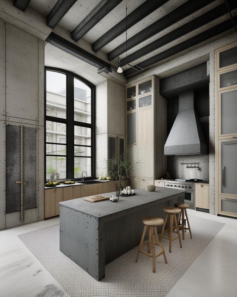
    Brutalist kitchen with concrete island and exposed timber beams

    California Casual kitchen with light marble and open sightlines

    Chic Contemporary kitchen with minimal cabinetry and clean geometry

    Farmhouse kitchen with weathered wood and ceramic accents

    Industrial kitchen with steel columns and exposed ductwork

    Mid-Century Modern kitchen with walnut cabinetry and sculptural pendant

    Retro kitchen with chrome accents and jewel-tone palette

    Rustic kitchen with stone walls and hand-forged iron details

    Spanish Colonial kitchen with terracotta tile and copper hoods

    Traditional kitchen with classical chandelier and carved marble island

  • AI and Domestic Rituals: How Technology is Rewriting Kitchens and Baths

    AI and Domestic Rituals: How Technology is Rewriting Kitchens and Baths

    Hyperrealistic 3D render of AI-responsive luxury kitchen as domestic ritual space

    The Philosophy of Responsive Space

    For centuries, the kitchen and bathroom remained fundamentally static. They were boxes optimized for task completion—efficient, rational, often soulless. The bath was a room where you washed. The kitchen was where you cooked. But this binary thinking obscured a deeper truth: these are spaces where the rhythms of domestic life unfold. Where rituals are performed. Where meaning accumulates.

    Artificial intelligence is fundamentally rewriting this equation. Not through gimmickry or superficial automation, but through a deeper understanding of how humans inhabit space. The emerging paradigm positions kitchens and bathrooms as responsive environments—spaces that learn, adapt, and ultimately serve not just functional efficiency but emotional and psychological wellness.

    This represents a seismic shift in how we conceive of domestic architecture. The kitchen and bath are no longer inert containers for activity. They are becoming intelligent partners in the rituals we perform within them.

    Behavioral Optimization and the Grammar of Space

    Computational design has enabled architects and designers to model not just physical space but behavioral flow. Through multiplicity modeling—the simultaneous iteration of dozens of spatial configurations against real human movement patterns—AI systems can now predict where friction occurs in kitchen workflows, where the bath’s user pauses for reflection, where ambient conditions need to shift to support different ritualistic moments.

    Consider the kitchen island. Traditionally it was positioned for visibility and ergonomic convenience. But behavioral optimization reveals something deeper: the island is not merely functional. It is psychological. It is where family members gather. It is where conversation happens. Where meal preparation becomes performance. Computational analysis of how light falls across the island, how proximity to appliances affects workflow, how thermal comfort shifts throughout the day—these inputs allow AI-assisted design to configure spaces that anticipate human need before that need is consciously registered.

    The same principle applies to the bathroom. For millennia, bathing has been understood as ritual—from Japanese onsen ceremonies to Roman spa culture to contemporary wellness practices. Yet most bathrooms are designed without regard to the psychological or ritualistic dimensions of bathing itself. Behavioral optimization changes this. AI systems can model optimal water temperature exposure, ideal humidity gradients, light patterns that support circadian alignment, even acoustic properties that create meditative silence or supportive ambience.

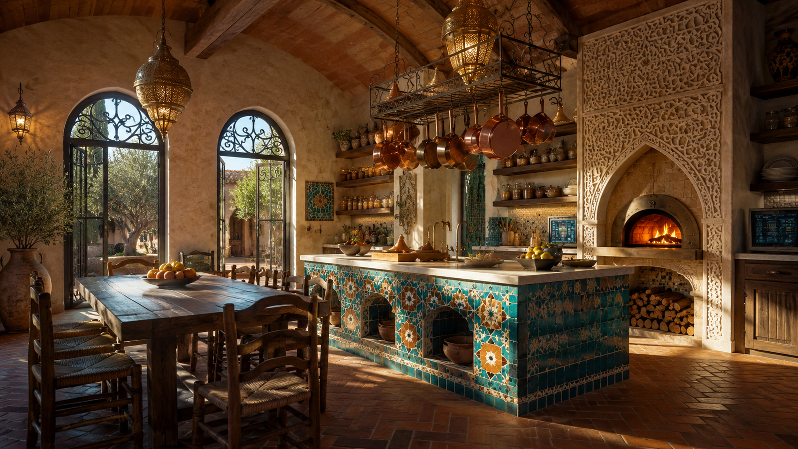
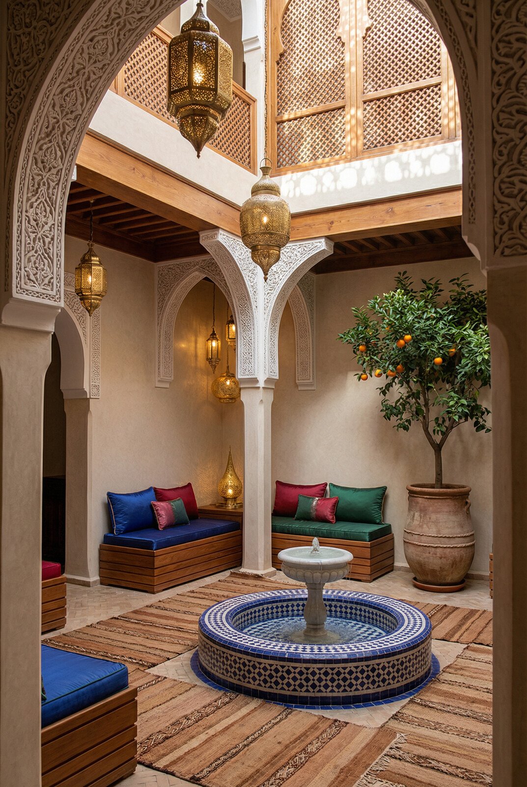
    Hyperrealistic render of Moroccan-Mediterranean culturally intelligent kitchen

    Cultural Identity as Infrastructure

    The second vector of transformation is cultural. Kitchens and bathrooms are not culturally neutral. They are repositories of identity, tradition, and collective memory. A Japanese kitchen embodies different spatial hierarchies, different relationships to appliances, different understandings of what “efficient” means compared to a Moroccan riad kitchen or a Scandinavian design ethos.

    Traditional design practice often flattened these differences into superficial aesthetic choices—a tile color, a cabinet style, perhaps a cultural reference in decor. But generative AI enables something far more sophisticated: the translation of cultural design languages into spatial logic. An algorithm trained on Japanese kitchen traditions doesn’t merely apply Japanese aesthetics to a Western kitchen box. It understands the underlying spatial principles that govern Japanese domestic space—the relationships between preparation, cooking, and service; the integration of nature through materials and light; the philosophical relationship to utility itself.

    This capacity for cultural translation is transformative. It means that a kitchen or bath can authentically express cultural identity while adapting to contemporary life, local building codes, and modern appliance technology. The cultural and the contemporary are no longer in tension. They merge through computational mediation.

    Wellness as Architectural Infrastructure

    The third dimension is wellness. The kitchen and bathroom have been recognized as wellness spaces—places where health and well-being are cultivated. But this has traditionally been understood narrowly: good ventilation for air quality, or a soaking tub for relaxation. AI-assisted design expands wellness into a comprehensive architectural infrastructure.

    Consider light. For the kitchen, Cinematic Intelligence™ modeling allows designers to compute optimal light conditions for different times of day, different tasks, different psychological states. Morning light for activation and clarity. Midday light for performance and focus. Evening light that shifts toward warmer frequencies to support circadian alignment and the psychological transition from work to domestic rest. The same precision applies to the bathroom—light modeled not just for functional visibility but for the restorative qualities needed in a bathing space, the psychological signaling required for morning activation or evening unwinding.

    Thermal comfort becomes similarly granular. Air movement patterns can be computed to eliminate hot spots and cold pockets. Humidity can be managed to support both respiratory health and the sensory qualities of the bathing experience. Even sound—traditionally an afterthought in domestic spaces—can be modeled as a component of wellness. AI systems can predict acoustic properties and recommend interventions that create either focused silence or supportive ambient sound depending on the room’s primary ritual.

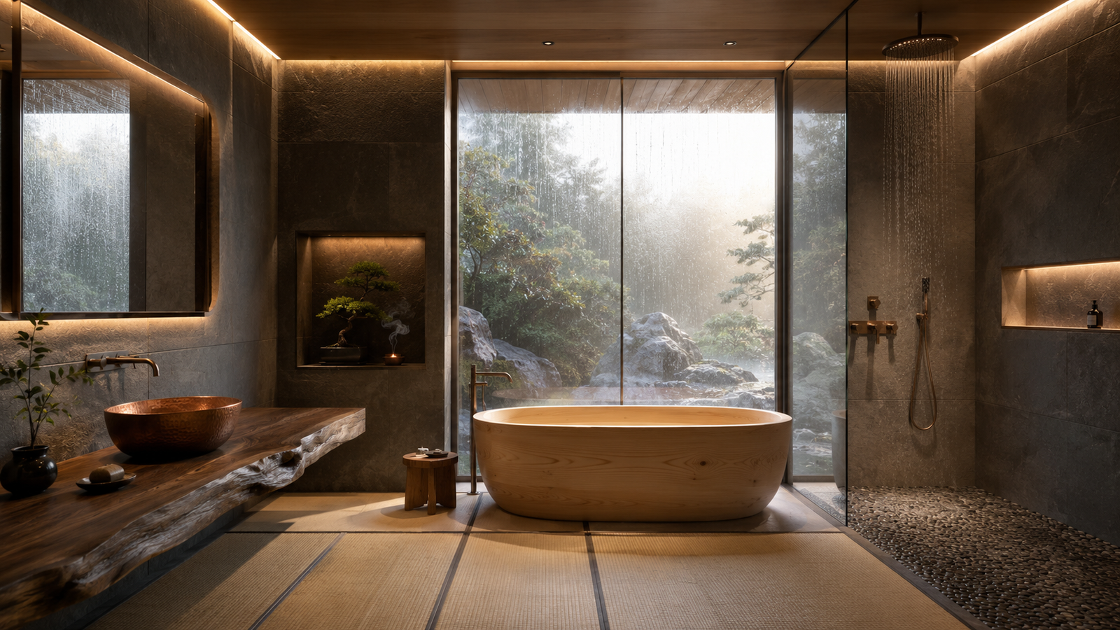
    Cinematic 3D visualization of Japanese-inspired wellness bathroom sanctuary

    The Bath as Algorithmically Personalized Sanctuary

    In the most sophisticated implementations, the bathroom becomes a personalized sanctuary—a space that adapts not just to activity but to individual psychological and physiological states. Smart BIM integration allows real-time adjustment: water temperature optimized for the user’s circadian position; lighting responsive to the user’s stress biomarkers; material selection chosen for its therapeutic acoustic and thermal properties.

    This is not futurism. Adaptive visualization engines are already capable of rendering these scenarios, of showing designers and clients how a bathroom might respond across different use cases, different times of day, different physiological states. The infrastructure is emerging. The philosophy is crystallizing.

    Toward Emotionally Intelligent Domestic Space

    The deeper significance of AI in kitchens and bathrooms is not technological but philosophical. It represents a shift from seeing domestic space as static container to seeing it as a partner in human flourishing. The kitchen is no longer merely where food is prepared—it is where family rituals unfold, where cultural identity is performed, where the everyday becomes ceremonial. The bathroom is no longer merely hygienic—it is a sanctuary where the day is ritually shed, where the body is cared for with intention, where restoration occurs.

    AI-assisted design, working through multiplicity modeling and adaptive visualization, enables architects to honor these deeper dimensions. Not through superficial added features, but through fundamental reimagining of how space can be organized, how light and material and thermal condition and acoustic properties can be orchestrated to support the psychological and ritualistic dimensions of domestic life.

    The Vervaine Estate transformations demonstrate this principle across twenty-two design languages. Whether the kitchen expresses Brutalist severity or Spanish Colonial warmth, whether the bath embodies Japanese Zen restraint or Moroccan sensuality, the underlying logic is the same: space as a responsive, intelligent partner in the rituals that constitute home.

    This is the future of domestic architecture. Not smarter kitchens. Not more connected bathrooms. But spaces that recognize what they have always been meant to be: sacred rooms where the rhythms of life are performed, ritually, with intention, supported by infrastructure that understands that human flourishing requires more than efficiency. It requires beauty, ritual, cultural authenticity, and spaces that respond to our deepest needs without us having to ask.

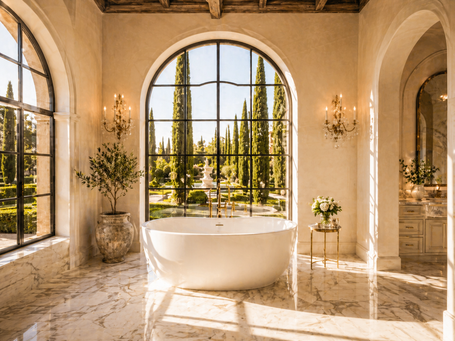
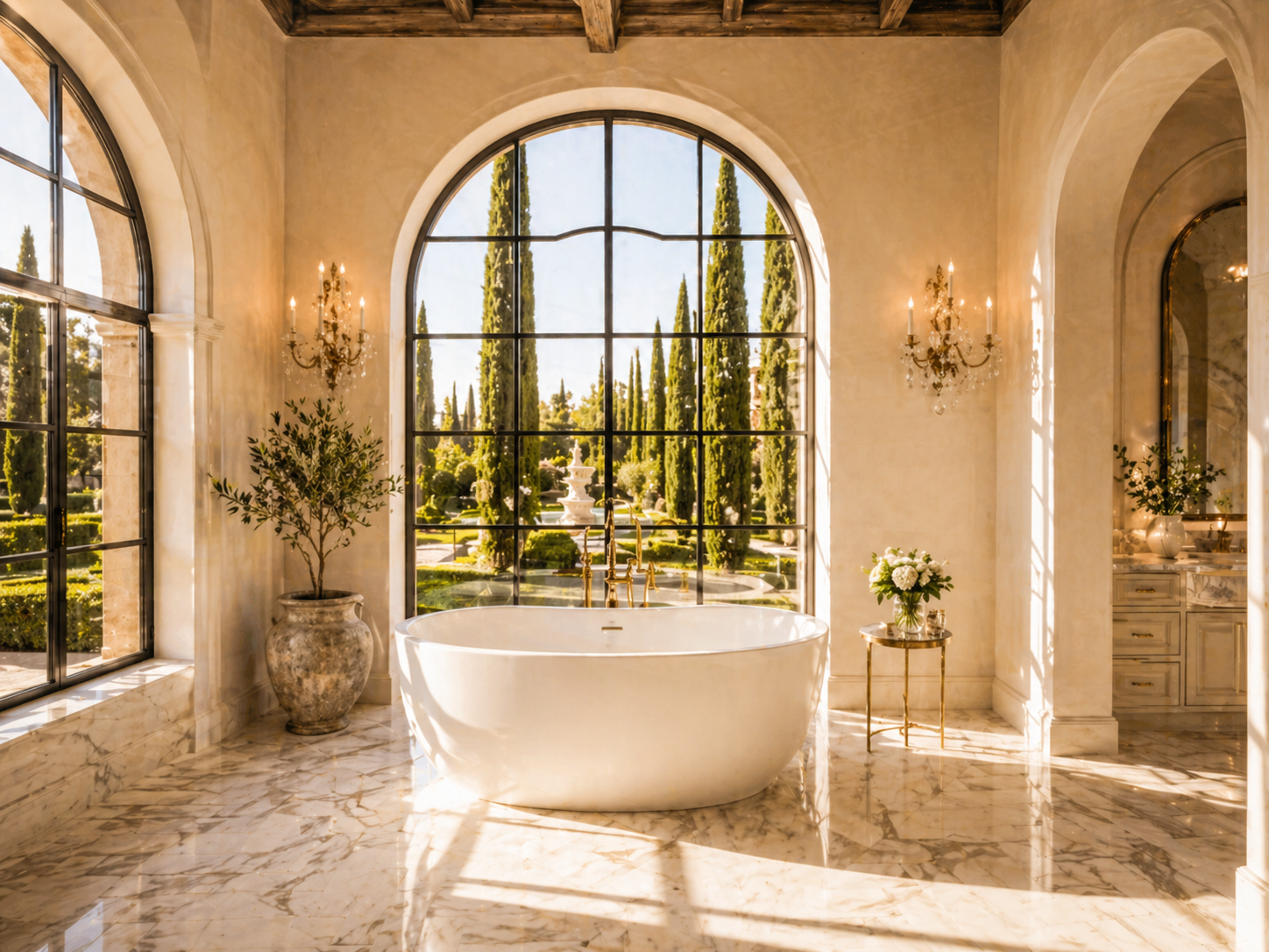
    Luxury Tuscan bath suite with AI-responsive ambient lighting and freestanding tub

    AI-integrated spa bathroom with circadian light systems and natural stone

  • Four Rooms That Remembered the World

    Four Rooms That Remembered the World

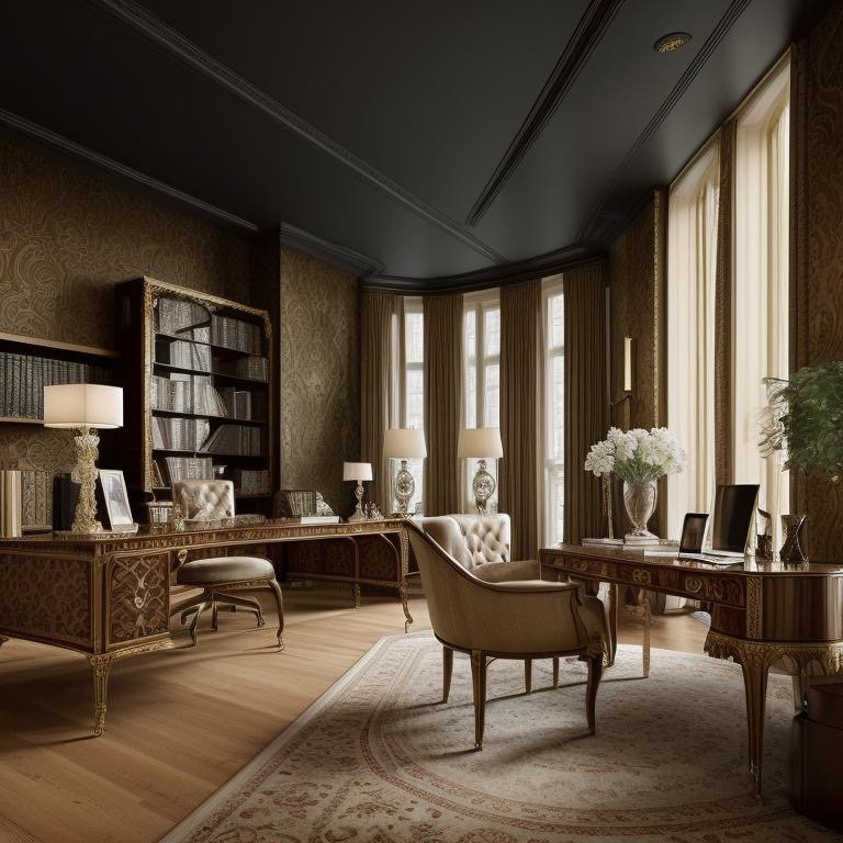
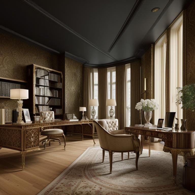
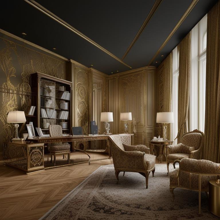
    Rococo office environment

    I entered these rooms listening for history, not looking for spectacle. Cinematic Intelligence™ lets a space recall where it has been without trapping it there. Each room carried a different memory. And in each, I heard something architecture often forgets to say: that the past is not a burden. It is a resource.

    Four rooms. Four different accents of time. Four conversations with the architectural languages that preceded us.

    The Rococo Room

    I was lifted before I sat down. The ceiling curved like it had learned how to float. Light drifted upward as though drawn by the geometry above. The first impulse was to be skeptical of the ornament—to assume it would overwhelm. But ornament here served something unexpected. It framed restraint.

    Rococo ceiling and light interaction

    The gold was elegant specifically because it was bounded. The curves guided rather than sprawled. The ornamentation was excess, yes, but strategic excess. Decorative, but never noisy. The genius of Rococo—what survives in the rooms that still speak—is the understanding that you can be luxurious without being loud. That ceremony doesn’t demand attention. It creates a container within which attention can rest.

    Nothing in this room was minimal. Everything was calculated. The difference between clutter and refinement is not the amount of ornament. It’s the clarity of intention behind it. This room had clarity. Every flourish belonged. Every curve answered a previous curve. The space felt coherent not despite its elaboration but because of it. The abundance had been organized so carefully that you could follow its logic even if you didn’t consciously notice it.

    Rococo decorative integration

    And the effect of all this was not exhaustion but elevation. Not visual overwhelm but visual organization at such a high level that you felt more intelligent just by sitting in it. This is what beauty is when it’s actually refined: it’s clarity masquerading as abundance. It’s precision so perfect that it looks effortless. It’s not conservative—it’s composed. And composition, it turns out, is where true luxury lives.

    Rococo proportion study

    Rococo historical continuity

    The Scandinavian Room

    The second room made space for me. The first thing to arrive was light—cool, clean, rational. Then pale woods. Then the understanding that every element was doing something. Nothing was there for decoration. Nothing was there for tradition. Everything was there because it solved a problem or answered a question.

    Shoulders dropped. The room had given permission to be less. Not less ambitious—less cluttered. The aesthetic was not minimal for the sake of minimalism. It was minimal as an ethical stance. A refusal to clutter life, thought, or decision-making with things that don’t serve. A discipline as much as a design choice.

    Scandinavian light and space

    The calm in the room was not passive. It was precise. It was the result of a thousand small decisions—each material chosen for clarity rather than richness, each surface refined for function rather than ornamentation, each proportion balanced for stability rather than drama. The Scandinavian refusal to be excessive was not a rejection of beauty. It was a redefinition of it. Beauty here is clean. Honest. Efficient. Beautiful the way a well-made tool is beautiful.

    This room didn’t welcome luxury. It welcomed competence. It assumed I understood that real comfort comes from the absence of friction. That true elegance is what remains when you’ve removed everything unnecessary. That a room speaks most powerfully when it stops insisting you notice its taste and simply demonstrates it through every choice it makes.

    Scandinavian material honesty

    Scandinavian functional clarity

    The calm was not emptiness. It was fullness edited down to the essential. Not subtraction for its own sake, but subtraction as a discipline. And in that discipline was a kind of respect—for my time, for my attention, for my right to a space that didn’t demand anything except that I exist within it.

    Scandinavian spatial refinement

    The Spanish Colonial Room

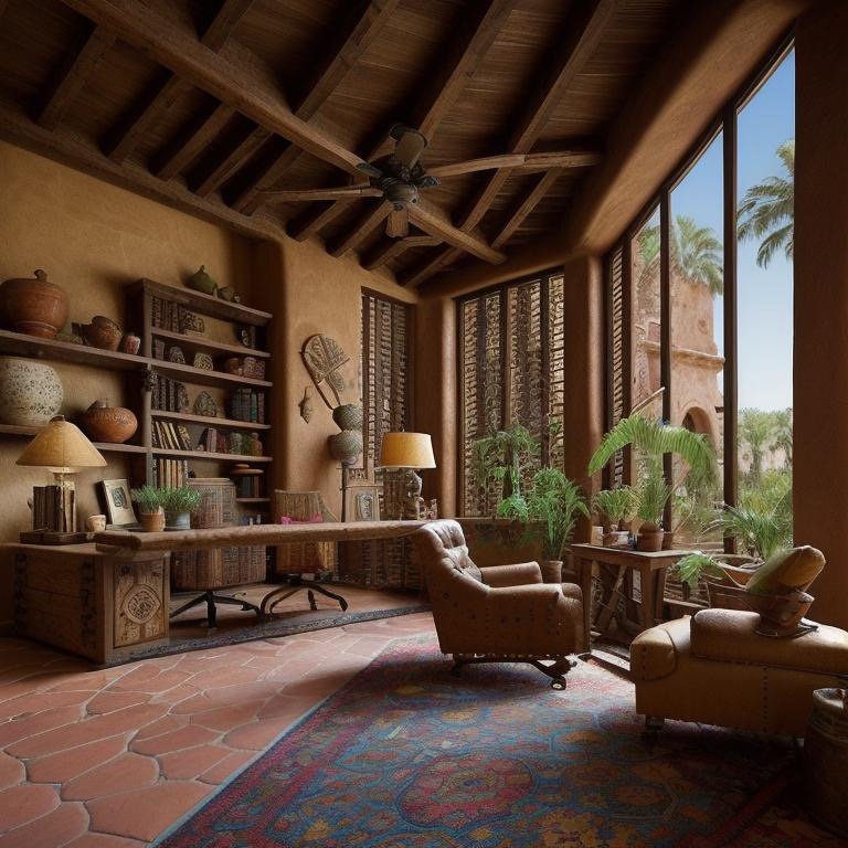
    The third room carried heat that had nothing to do with temperature. It was remembered heat. The walls were thick with time in a way that went deeper than architecture. This was a room that understood patience. The arches framed movement gently, the way they had for centuries. Wood aged not worn. Stone structural not ornamental. Materials that had not just been selected but had been proven across decades of habitation.

    Spanish Colonial structural presence

    The authority in the room did not come from any single gesture. It came from longevity. From having survived enough to know what matters. From the understanding that a room doesn’t need to announce itself if it has already proven itself. The proportions were generous but not wasteful. The light arrived in patterns created by thick walls that had learned to move it carefully. The aesthetic was not aggressive toward newness or toward preservation. It was simply present, fully committed to its own being.

    Spanish Colonial material weathering

    There was no apology here. No sense that the room needed to justify its existence or prove its worth. It simply was—thick with consequence, rich with use, confident in its own utility and beauty. The person sitting in this room was assumed to understand that some things don’t need to change because they’ve already achieved a kind of perfection. Not static perfection but living perfection—the kind that only comes from being inhabited for long enough to know exactly what works.

    Spanish Colonial archway detail

    Spanish Colonial temporal depth

    The Traditional Room

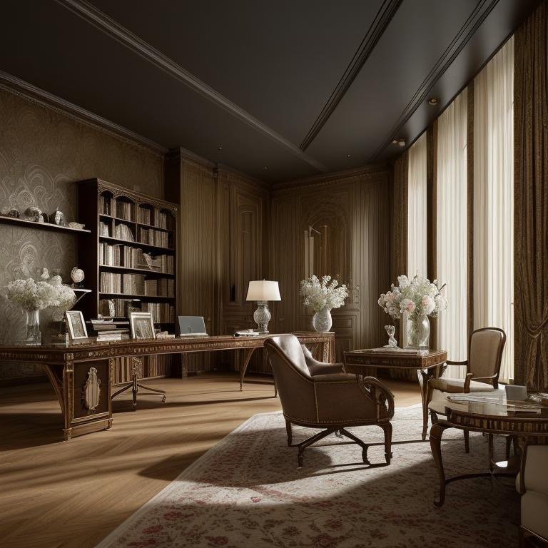
    The fourth room steadied me. Symmetry was immediate. Not as a design device but as a principle. The proportions were settled, tested, proven. They had been proven so thoroughly that you forgot they were choices. They felt inevitable. Nothing reached. Nothing strained. The room didn’t try to be anything except what it was.
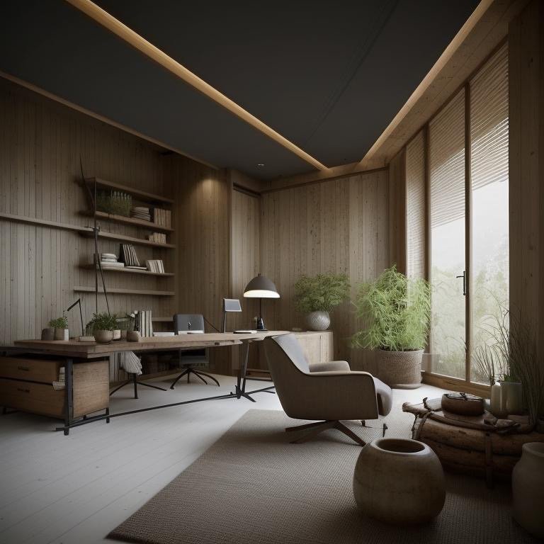
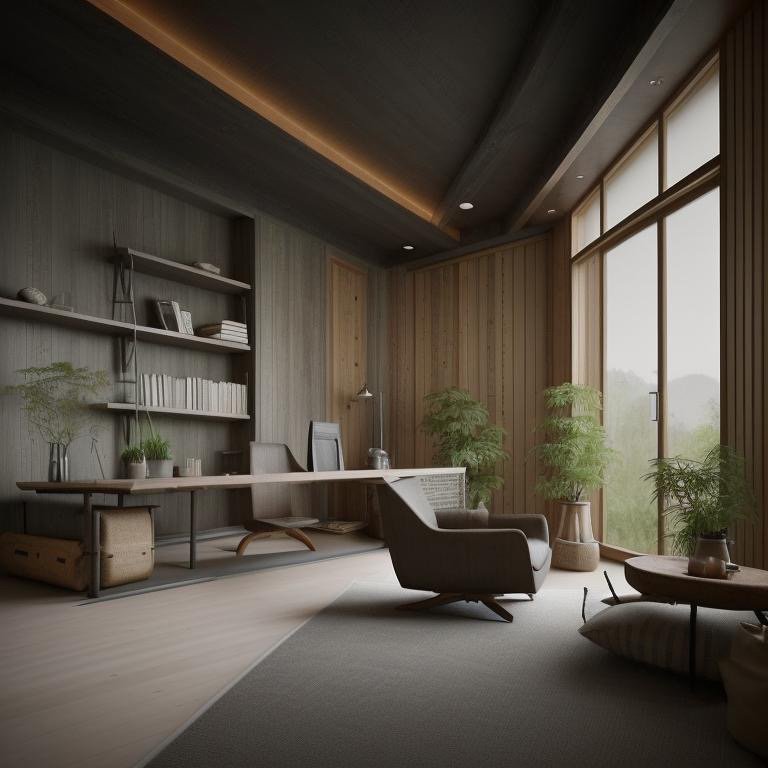
    Traditional proportional balance

    I felt trust. That immediate, uncomplicated trust that comes from being in a room that knows its purpose and its limits. The room didn’t pretend to be anything except traditional. And that refusal to perform—that commitment to being exactly what it appeared to be—was the source of its credibility. It was not trendy. It was not trying to seem important. It was simply good. Clearly, obviously good.

    This is what people mistake about traditional design. They think it’s about being conservative. But conservation is an act of courage in an era where everything is temporary. To choose a tradition is to say: this works. This has been tested. This deserves to continue. Not because it’s the safest choice, but because it’s the right choice. The person sitting in this room was not being invited to think about style. They were being invited to trust that someone had already done the thinking.

    Traditional material authenticity

    Traditional refined elegance

    The authority here was not aggressive. It was composed. Not conservative—composed. The room had integrated centuries of knowledge into its proportions. And that integration made the space feel neither old nor new. It felt true. In the way that certain things feel true when you stop looking for innovation and start looking for reality.

    Traditional timeless composition

    Design Is Not About Novelty

    Four rooms. Four histories. Four different conversations with time itself. The Rococo room told me that luxury is organized excess, that beauty lives in composition, that refinement doesn’t mean emptiness. The Scandinavian room told me that elegance is clarity, that trust lives in transparency, that a room doesn’t need to announce itself if it solves problems perfectly. The Spanish Colonial room told me that authority is earned through longevity, that a space can be rich without being loud, that there is a kind of perfection that comes only from being inhabited long enough to know what matters. The Traditional room told me that composition can be so perfect that it feels inevitable, that heritage is not nostalgia but wisdom, that trust is the most important thing a room can offer.

    What emerged from all four was a single insight: design is not about novelty. It is about memory handled correctly. Not memory as nostalgia, not memory as constraint, not memory as an excuse to repeat the past. Memory as knowledge. As understanding that certain proportions work because they’ve been tested. Certain materials endure because they’ve been proven. Certain principles of composition have survived because they serve something real.

    This doesn’t make architecture backward. It makes it thoughtful. The greatest contemporary spaces are not the ones that reject the past. They are the ones that listen to it carefully and choose what deserves to continue. They are the ones that understand that progress does not erase history. Progress learns how to sit with history—to hold its hand without being trapped by it, to honor it without being imprisoned by it.

    Four histories. One structure. Infinite continuity. The architecture that endures is not the architecture that refuses the past or the architecture that is imprisoned by it. It is the architecture that understands both where we have been and why we are here now. That holds both memory and possibility in the same moment. That knows the difference between being historical and being informed by history.

    Cinematic Intelligence™ reveals something that was always true but hard to see: that the best spaces are the ones that know how to listen. To listen to what the past has learned. To listen to what the present requires. To listen to the person sitting inside them and create conditions where that person can be most fully themselves. That is not decoration. That is intelligence. And it is precisely this kind of intelligence that makes architecture matter.

  • Four Rooms I Entered Without Leaving My Chair

    Four Rooms I Entered Without Leaving My Chair

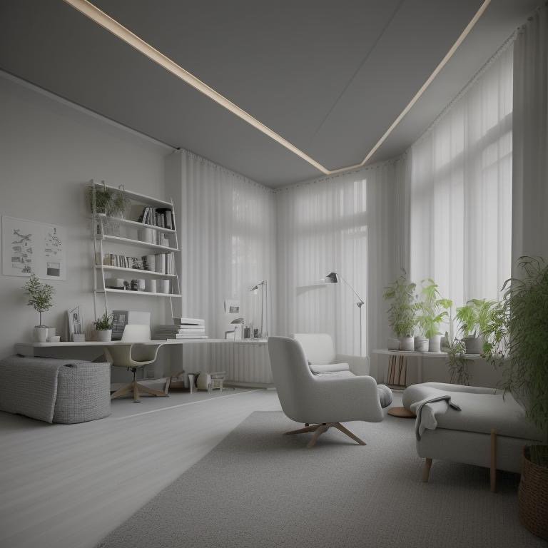
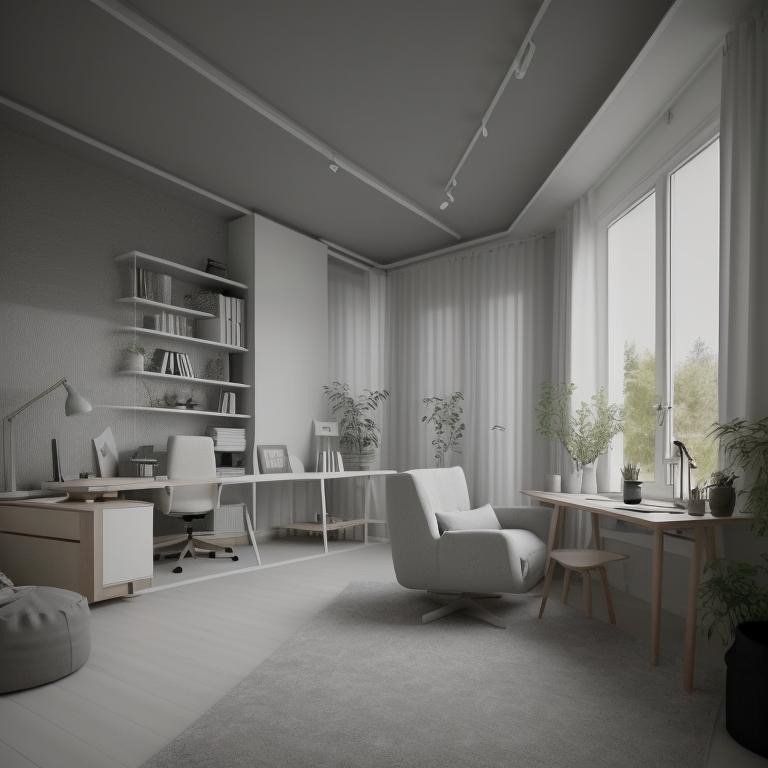
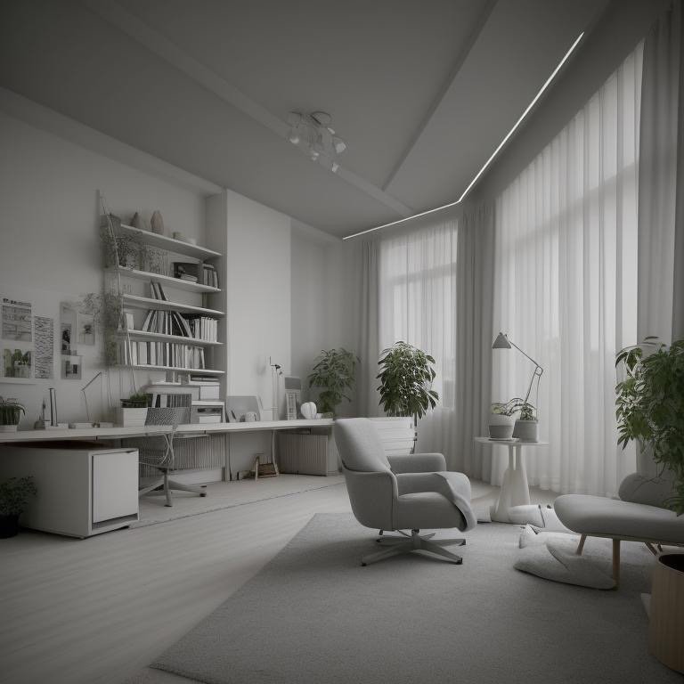
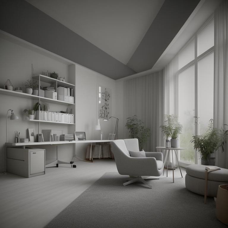
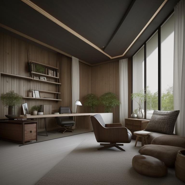
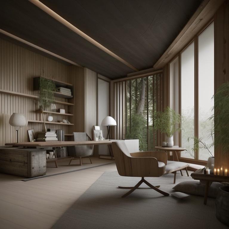
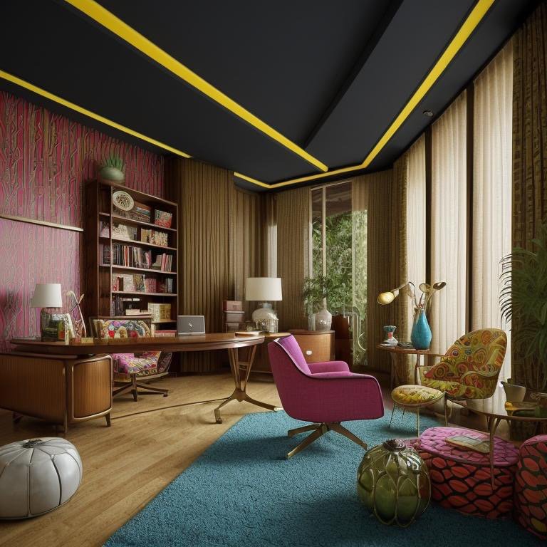
    Japandi office environment

    Four rooms. One architecture. Four experiences. This is the revelation of Cinematic Intelligence™—not that it can make spaces more beautiful, but that it can make beauty mean something different. That it can tune a room to a specific quality of thought. That it can create spaces which don’t just exist, but which understand the humans sitting inside them.

    I entered these rooms without leaving my chair. And in each, I was met by a different version of myself.

    The Japandi Room

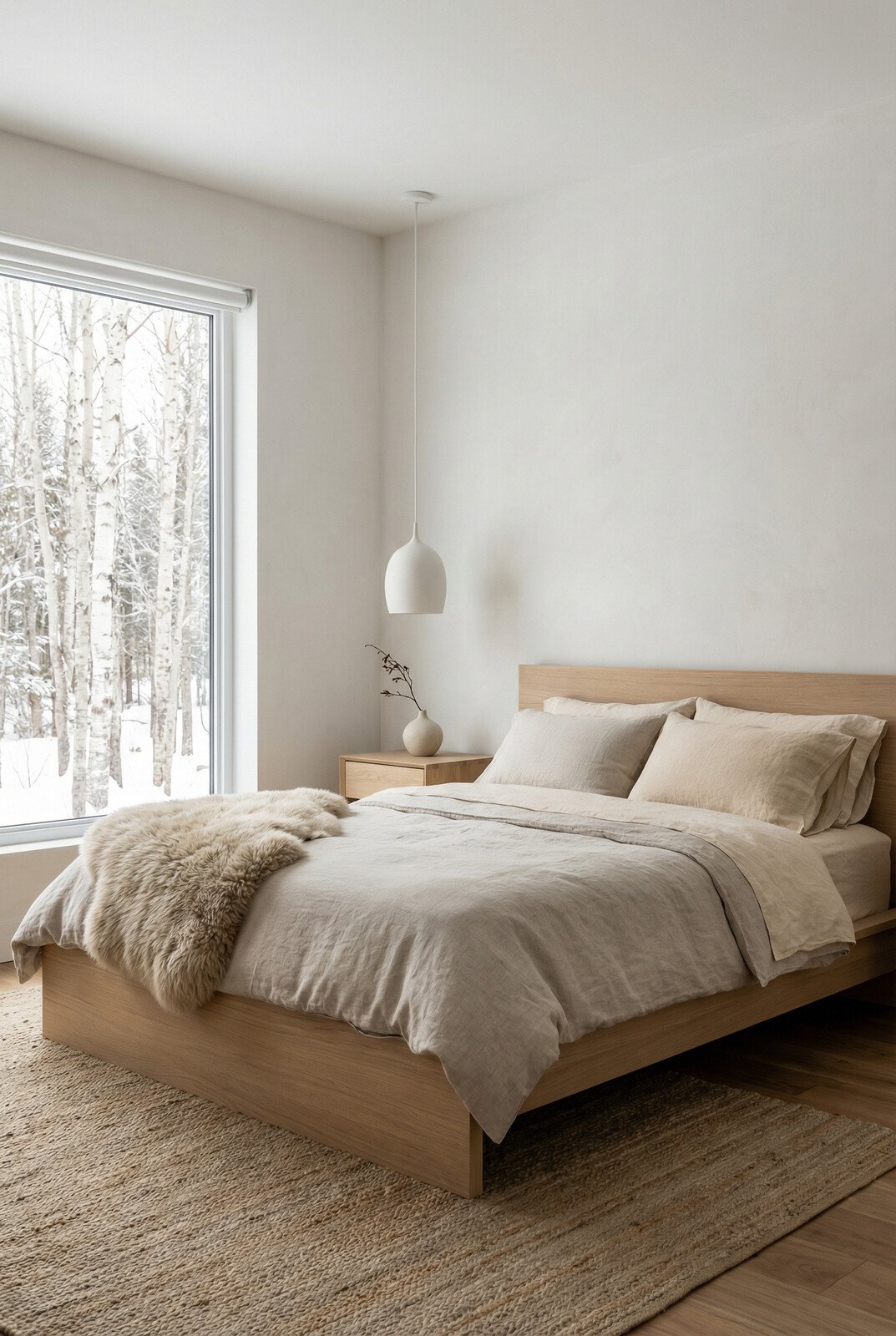
    The first thing I noticed was that noise left. Not sound—noise. Mental noise. The difference matters. The room was not silent; there was the sound of breath, the subtle shift of fabric, the almost-imperceptible hum of systems. But none of it cluttered. All of it fit inside the space that had been made for it.

    The wood was pale. Not white, not cold—pale the way certain disciplines become pale after decades of practice. Stripped down. Essential. The surfaces absorbed light rather than reflecting it, and the light moved differently because it had nowhere to bounce. It traveled the way light travels in museums, with intention and respect.

    Japandi office detail study

    Shadows softened everything they touched. Nothing had edges that pulled. Everything held attention gently, the way a considered silence holds attention. The proportions were not minimal—they were precise. The room knew exactly how much of itself to show and how much to keep private. And the effect was not restraint but clarity. My thinking became clearer because the room had stopped insisting that I think about it.

    A psychological state, not an aesthetic. This was a room where strategy matures quietly. Where decisions settle before they’re made. Where the person sitting inside understands, without being told, that some things deserve to be approached slowly. Not lazily. Slowly with purpose. The room did not inspire action. It cultivated judgment. And that distinction—between the space that makes you want to do things and the space that makes you want to think carefully about which things are worth doing—is the difference between rooms that serve function and rooms that serve purpose.

    Japandi spatial relationships

    I sat there and became someone slightly more thoughtful. The room didn’t demand it. It just made that version of myself more available.

    Japandi light and material study

    The Mid-Century Modern Room

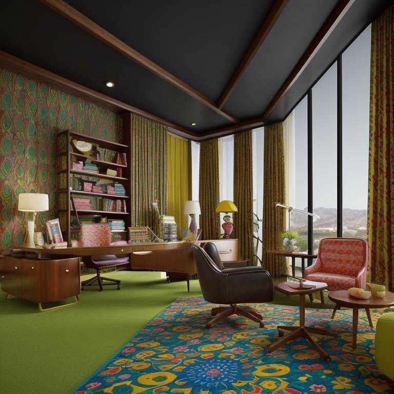
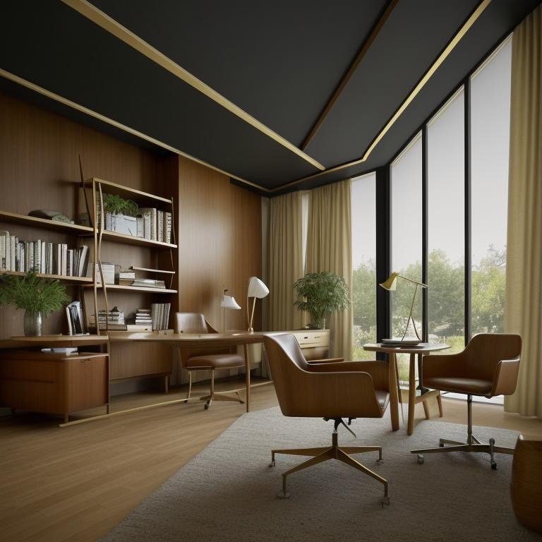
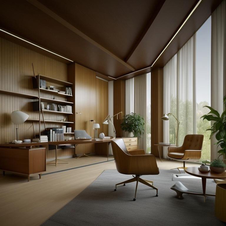
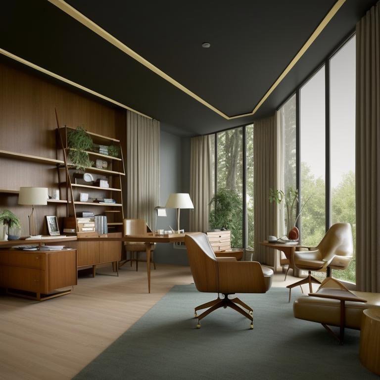
    Then I moved to another version of the same space. The Japandi room had softened me. This one aligned me. Geometry asserted itself immediately. Not aggressively—asserted. The furniture felt engineered. Each piece knew its purpose and its proportions with such precision that you couldn’t imagine them being different. The wood was warm but not sentimental. Disciplined warmth. The kind of warmth that serves a function.

    Lighting clarified rather than flattered. It made edges visible. It made choices visible. The room supported decision-making not because it was stark, but because it refused to hide anything. Every surface made its argument. Every angle suggested efficiency. The proportions were not arbitrary. They appeared to emerge from a logic that, if you understood it, would make you more capable of making good decisions yourself.

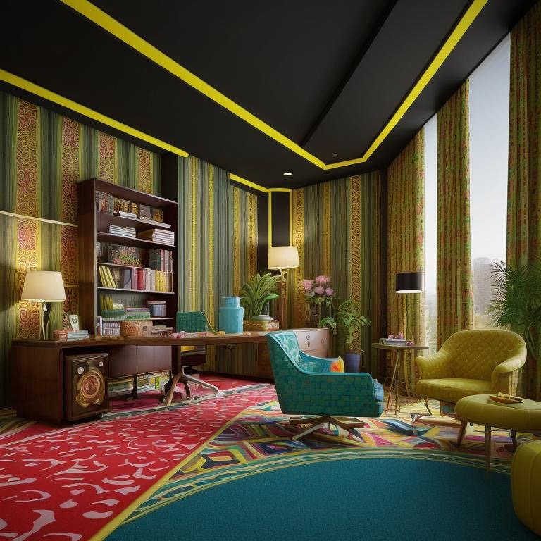
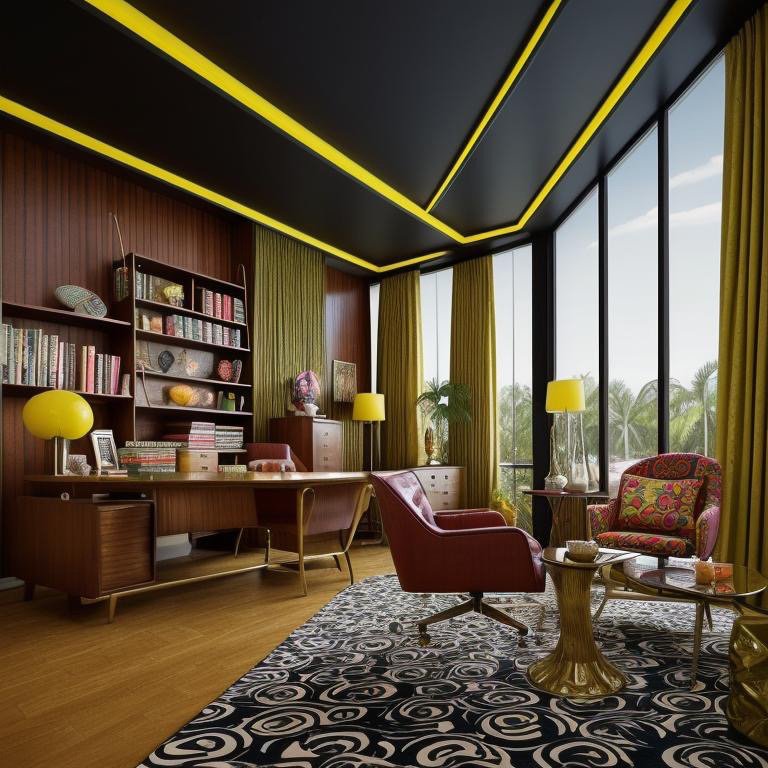
    Mid-Century Modern office environment

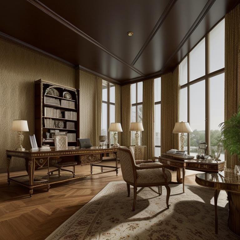
    Operational confidence made visible. This was a room for executives who understand that clarity is power. Not the clarity that comes from minimalism, but the clarity that comes from knowing exactly what everything is supposed to do and making sure it does that one thing excellently. The person sitting in this room was not encouraged to be thoughtful about strategy. They were assumed to already know strategy. The room’s job was to make action efficient once strategy was clear.

    I sat there and became someone more capable. Not more inspired. More capable. The room had stripped away the part of me that questioned and made visible the part of me that could execute. And the confidence that came from that amplification was almost intoxicating. This is what it feels like to work in a room that believes you can handle the truth.

    Mid-Century Modern structural clarity

    Mid-Century Modern proportional study

    Mid-Century Modern material precision

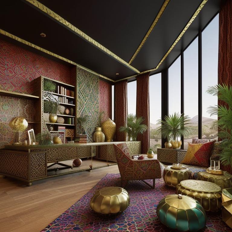
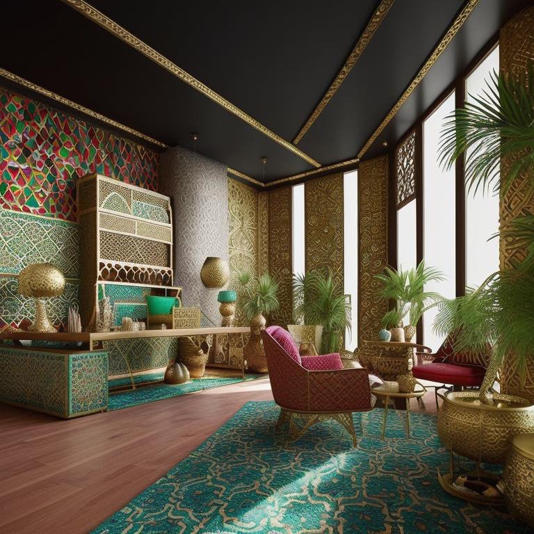
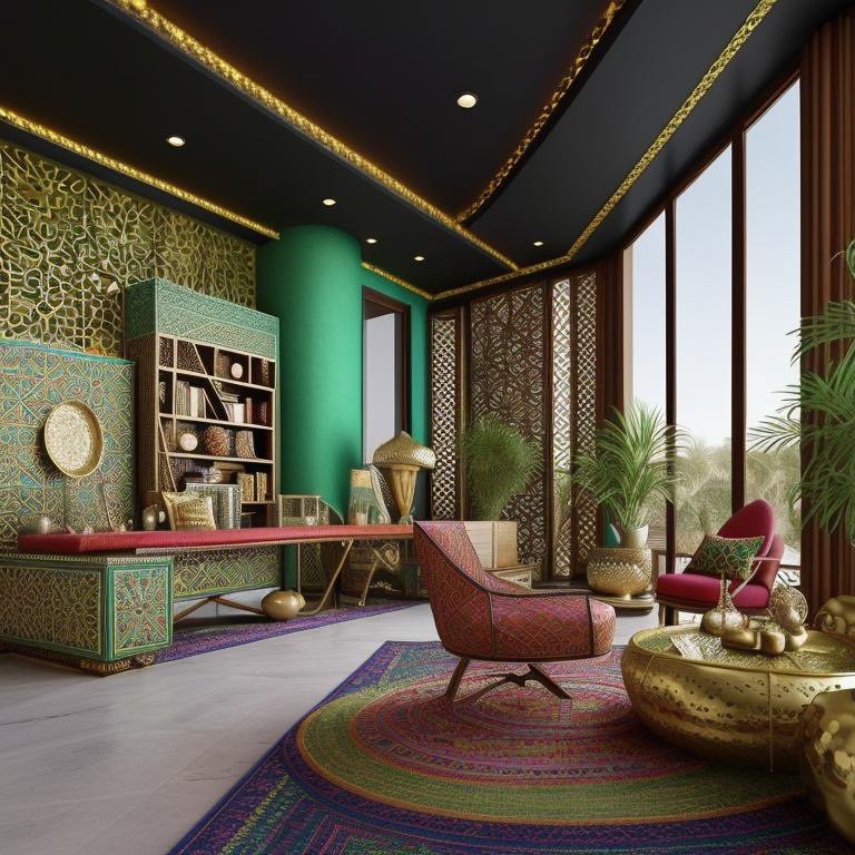
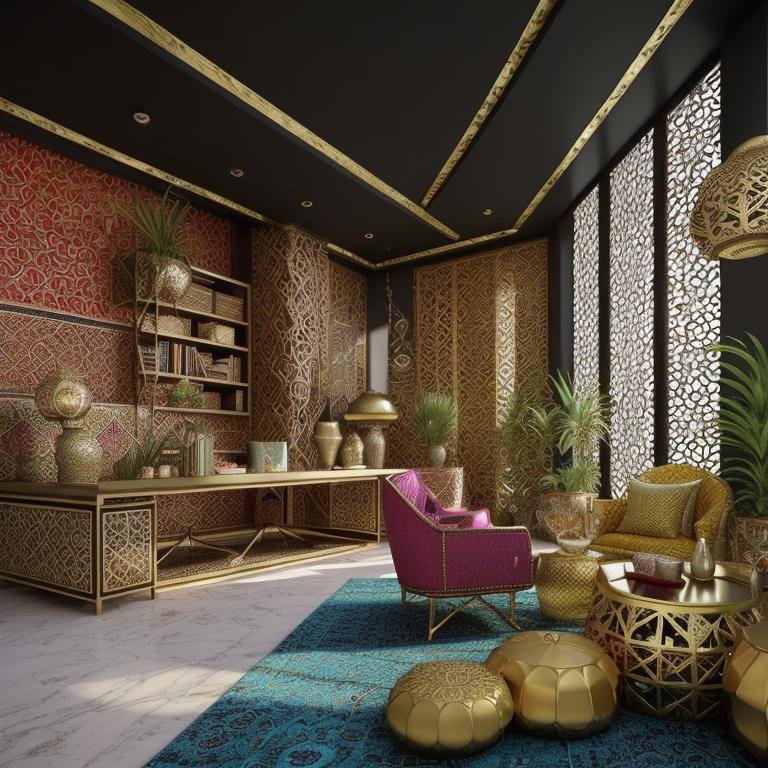
    The Moroccan Room

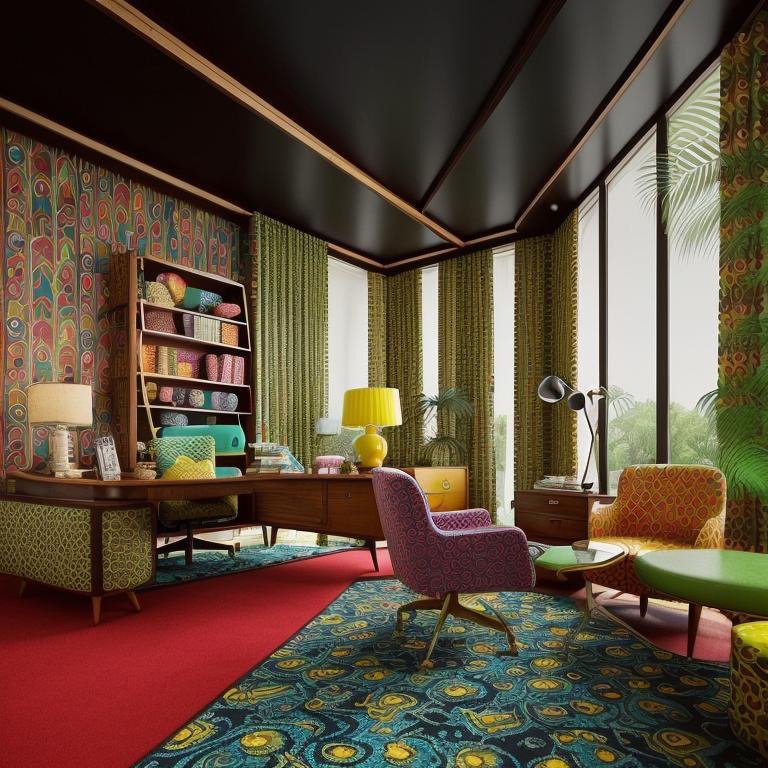
    The third room welcomed differently. The temperature seemed to shift—not in fact but in intention. The space was warmer in the way intentions are warmer than facts. Texture surrounded me. Not chaotically. Carefully. Each pattern held its own logic, and the logistics together created a kind of visual conversation. One element would speak, and another would answer, not in imitation but in a language they shared.

    Light filtered low and directional, the way light filters through fabric in a marketplace. It arrived prepared, not raw. And the effect was not dimming but refinement. You could see less of the room, but what you could see was more coherent. The eye traveled along a path the light had made for it.

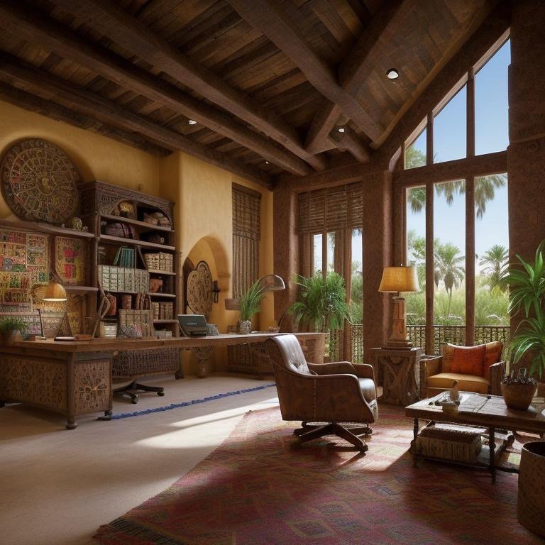
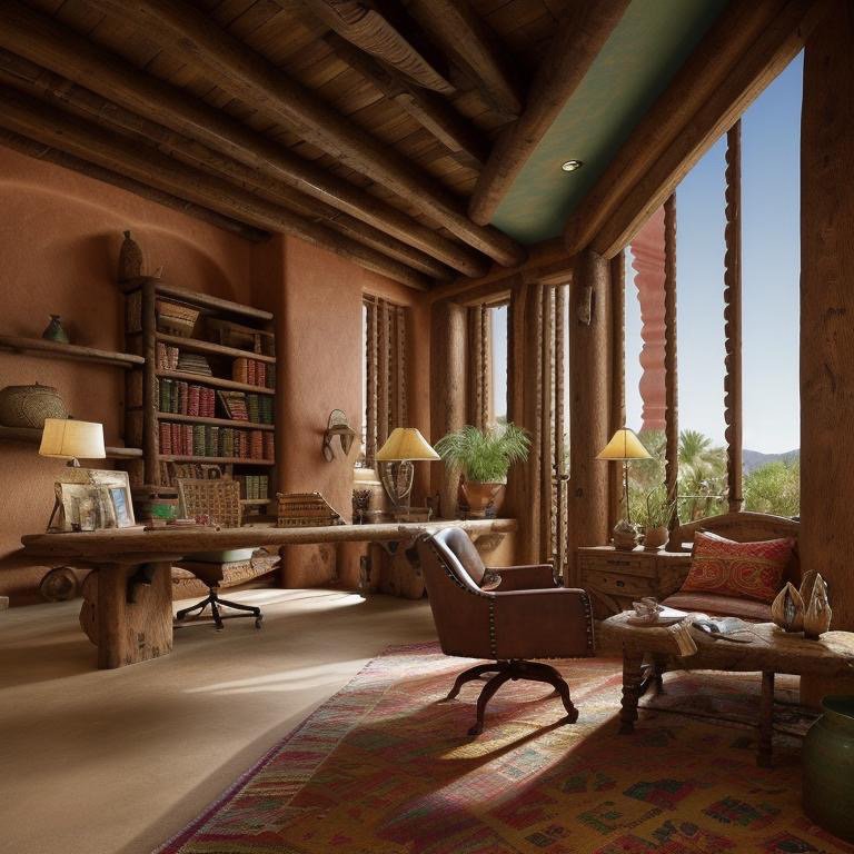
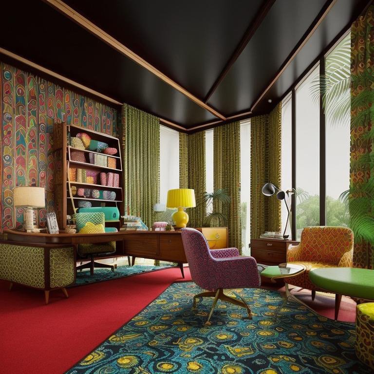
    Moroccan office warmth and texture

    The curves in the space encouraged something I hadn’t felt in the other rooms: conversation. Not with myself, not with the room, but with anyone who sat beside me. The geometry was not assertive or softening. It was receptive. The space leaned inward as though listening. As though it understood that some of the best thinking happens when two people sit together and talk about what matters.

    The room didn’t demand clarity or judgment. It created conditions where clarity could emerge through dialogue. It honored both precision and intuition. The aesthetic was rich but never chaotic. There was order underneath, holding the visual abundance in place. This was a room for people who understand that progress isn’t always aggressive. That sometimes the fastest way forward is the one that invites others to move with you.

    Moroccan curved spatial relationships

    Moroccan textile and pattern integration

    I sat there and became someone more open. Not more vulnerable—more open to being changed by proximity to others. The room had created space for that. Not as a softness or an escape, but as a sophisticated understanding that some decisions are better made together, and some insights only arrive through conversation.

    Moroccan detailed aesthetic

    The Retro Room

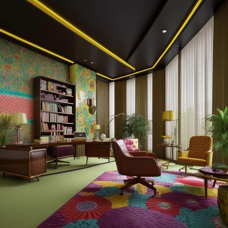
    I expected nostalgia in the fourth room. I found memory instead. There’s a difference. Nostalgia is sentimental—it’s about wishing things were the way they used to be. Memory is controlled. It’s about borrowing confidence from the past while remaining present. This room did that. Every color had a history. Every material choice referenced something that had already been proven. But nothing in the room felt like a copy. It felt like a conversation with the past where the past was allowed to speak but not allowed to dictate.

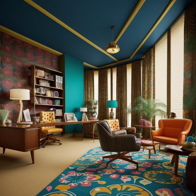
    Retro office with contemporary sensibility

    The aesthetic was precise. Color appeared, but never carelessly. Each hue had been chosen with such intention that you trusted it immediately. You didn’t have to defend your preference—the room had already done that for you. The execution was so refined that it suggested creativity without chaos. This was what it looked like when someone understood both history and how to live in the present without being trapped by either.

    Retro material authenticity

    A room for founders who refuse to look like everyone else. Not because they want to be difficult, but because they understand that competence carries its own aesthetic, and that aesthetic often looks like you’ve thought longer and worked harder than your competitors. The room didn’t celebrate its own cleverness. It just was—clearly, confidently, without apology. The person sitting in this room was assumed to understand that good taste is not about fitting in. It’s about understanding enough about what works that you can afford to be yourself.

    Retro color and texture balance

    I sat there and became someone more assured. Not arrogant. Assured in the way people are assured who’ve studied the past and decided which parts of it deserved to continue. The room had created permission for that kind of confidence. It had said: you don’t need to apologize for having taste. You don’t need to blend in to belong. And the effect was deeply freeing.

    Retro environmental cohesion

    Architecture Never Changed

    The architecture in all four rooms was identical. The program was the same. The light sources were the same. The square footage was the same. Nothing about the basic spatial container had changed. Only the experience did. Only the way the space met the human sitting inside it.

    This is what Cinematic Intelligence™ actually does. It doesn’t overwrite rooms. It reveals latent personalities. Not by making spaces more square footage, not by adding louder aesthetics, not by creating spectacle. It does something subtler and more powerful. It creates spaces that know how to meet the human sitting inside them. That understand what quality of thinking each person needs and creates conditions where that thinking becomes not just possible but inevitable.

    Not more space. Not more features. Intelligence. The ability to understand that the same room configured differently creates not just a different aesthetic but a different possibility for who you become when you sit inside it. The person I was in the Japandi room was thoughtful. The person I was in the Mid-Century Modern room was capable. The person I was in the Moroccan room was open. The person I was in the Retro room was assured. Same architecture. Four different futures.

    And in that variation is the promise of what design can actually be: not a style applied to space, but an intelligence embedded in space. Not a choice imposed on the inhabitant, but a choice made available to them. A room that knows how to listen to the person sitting inside it, and creates conditions where the best version of that person has room to exist. That’s not decoration. That’s architecture behaving like intelligence. And that’s the difference between rooms and spaces that actually matter.