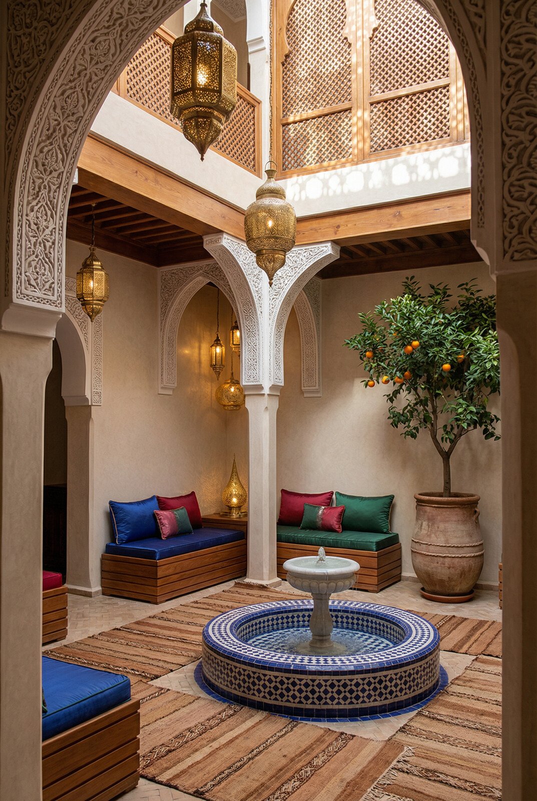
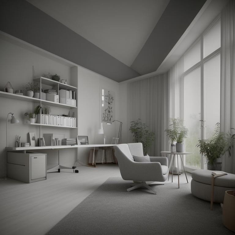
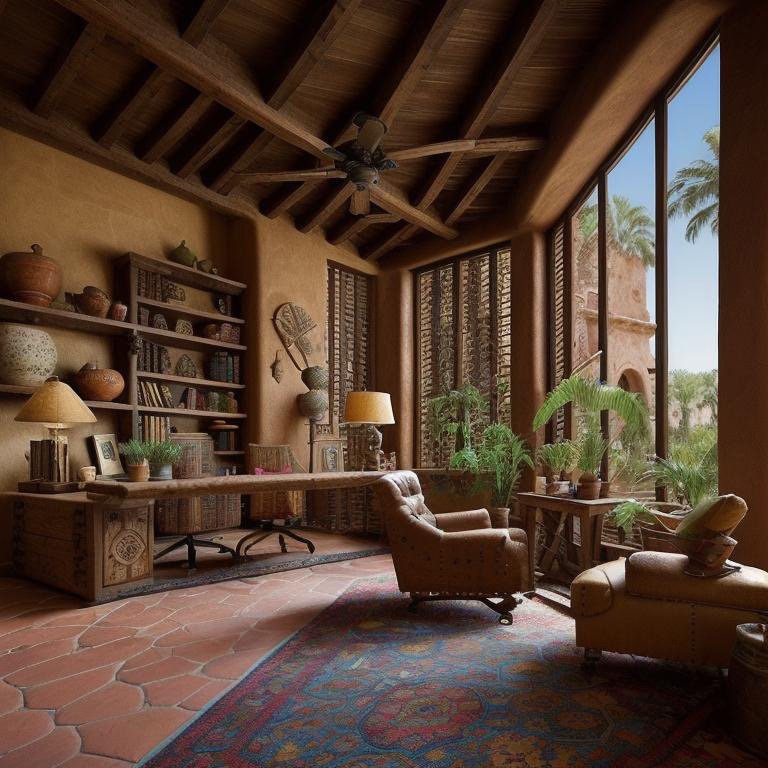
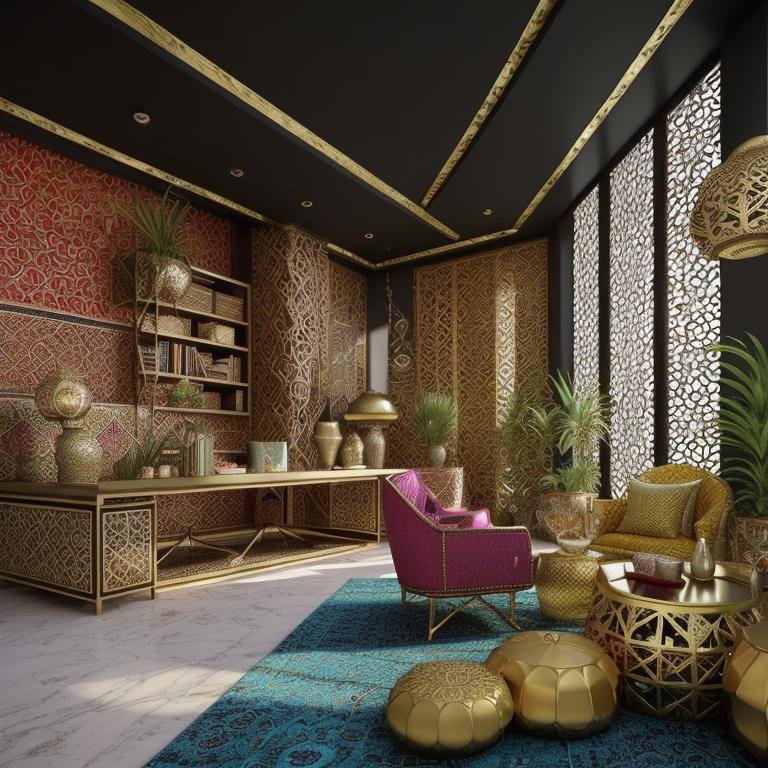
There is a particular ease to California Casual that is often misunderstood. Too many observers mistake it for being unfinished, or worse, effortless in a manner that suggests carelessness. True California Casual is neither accidental nor negligent. It is disciplined restraint. It is confidence without performance. It is architecture and interior design that knows exactly what it is doing—and refuses to apologize for its choices.
When one first steps into this residence through Cinematic Intelligence™, the sensation is immediate and profoundly physical. Not merely visual, but decidedly spatial. The air felt slower. The light didn’t rush inward; it drifted with intention. The architecture didn’t announce itself with gesture or spectacle—it invited you to sit, to pause, to remain longer than you had planned. The bones of the design speak quietly but with absolute conviction. That, in architectural terms, is the quiet brilliance of this design language.
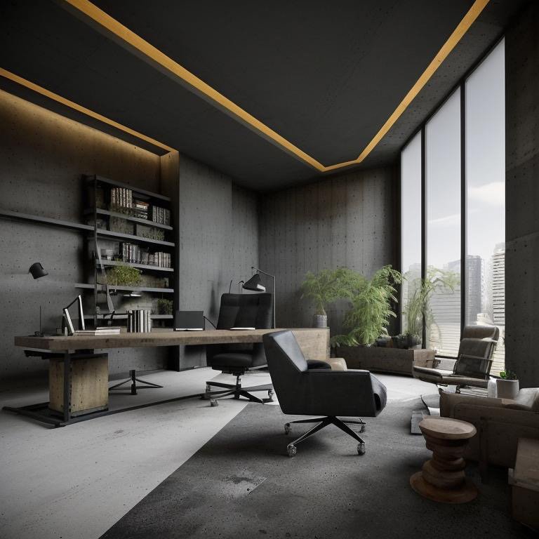
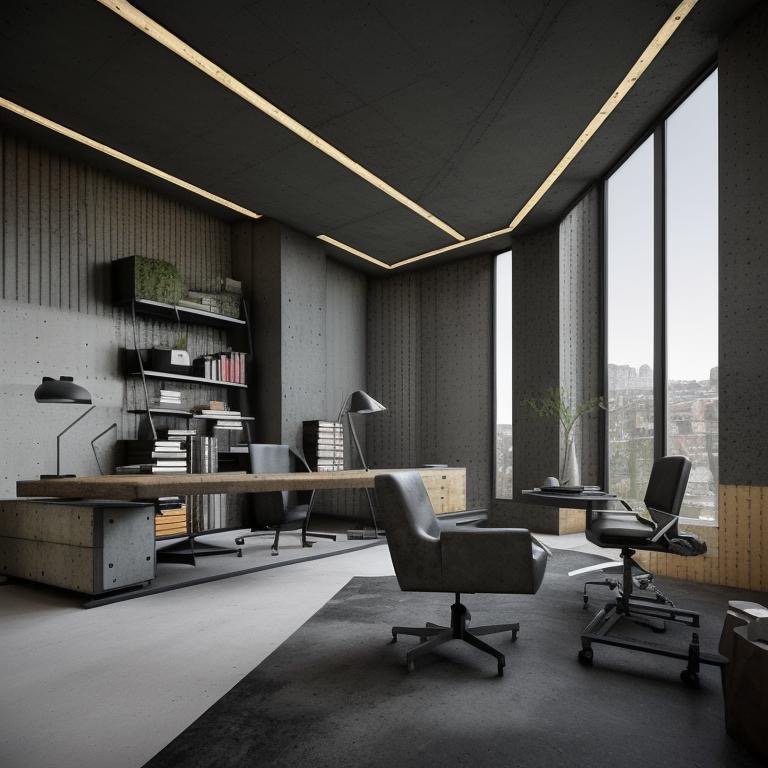
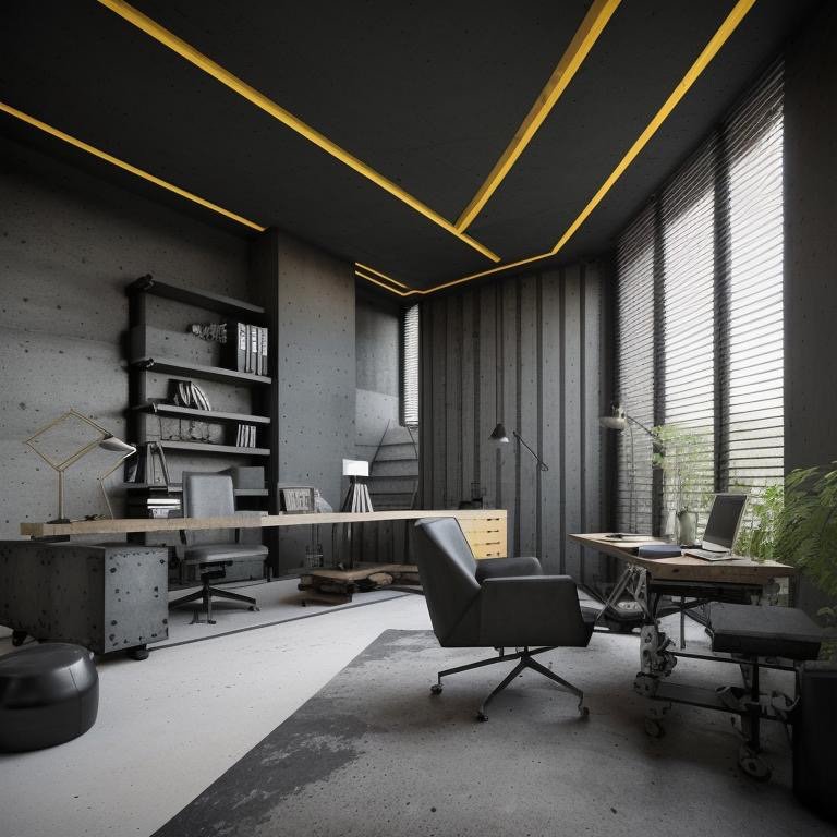
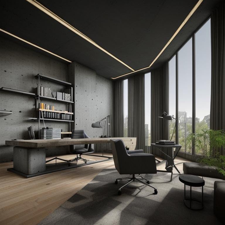
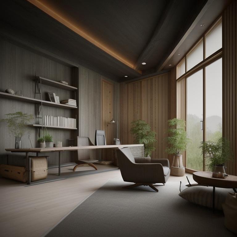
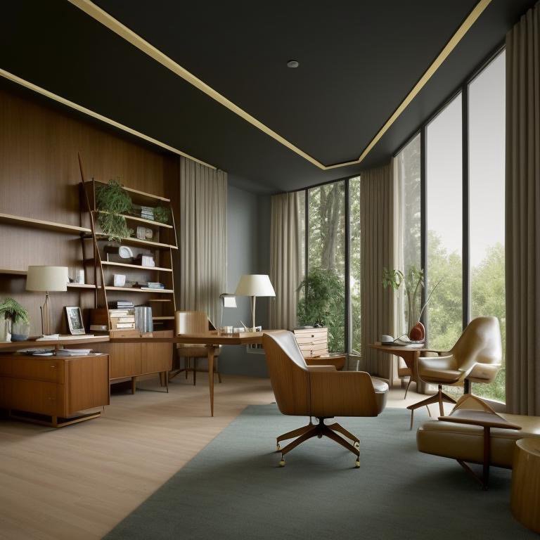
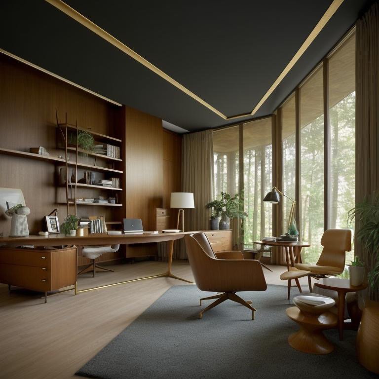
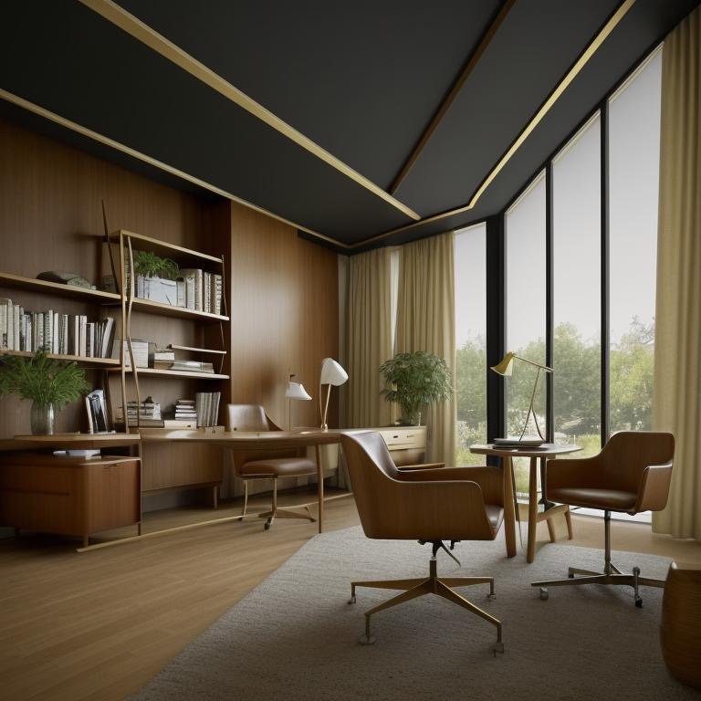
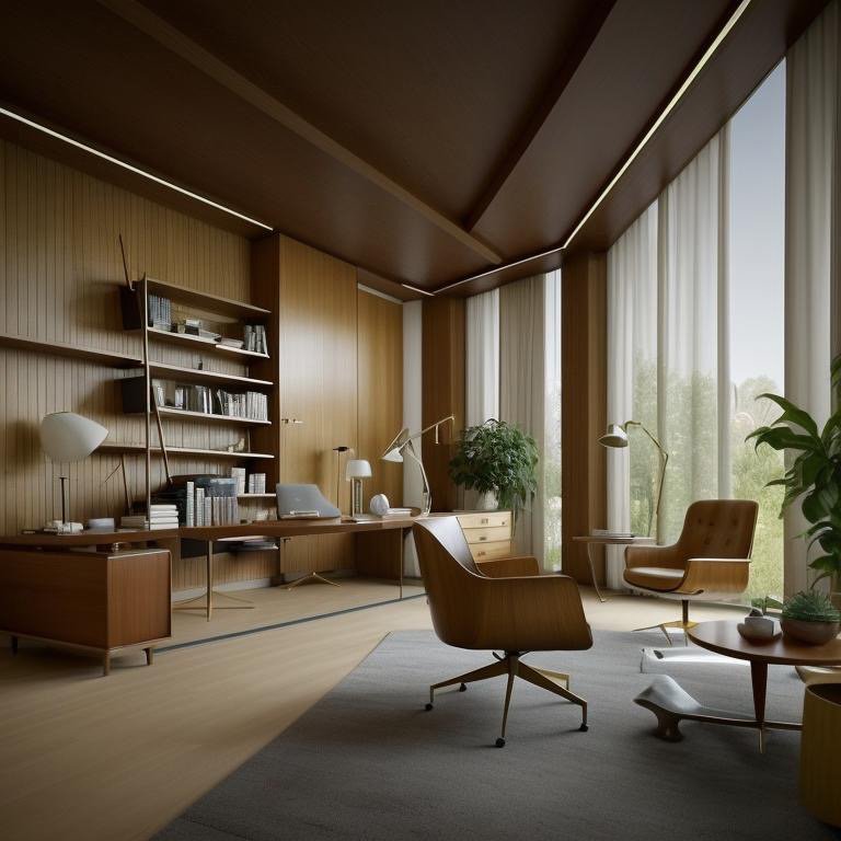
The Architecture: Calm with Backbone
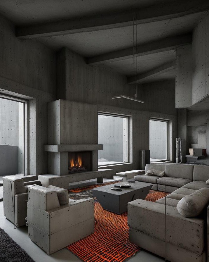
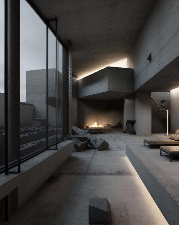
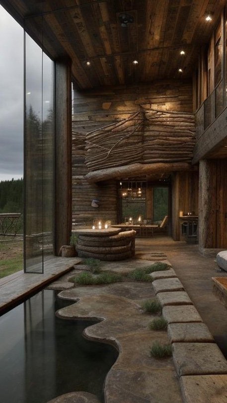
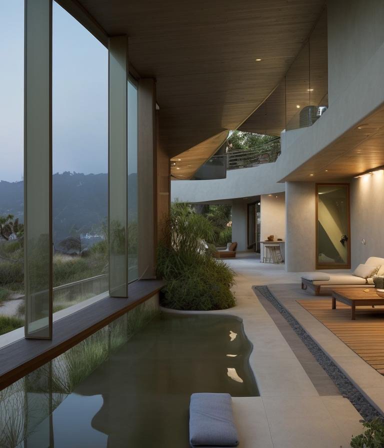
The structural foundation of this home is assertive without aggression. Clean lines frame the space, while generous openings dissolve the conventional boundary between interior and exterior. Glass here is not deployed as spectacle—it functions as permission. Permission for the landscape to participate fully in the lived experience.
Concrete, wood, and soft mineral finishes establish a rhythm: solid, warm, breathable. The ceiling planes stretch generously overhead, never looming, never apologizing for their presence. One feels held by the space rather than dominated by it. This is California Casual at its most refined—a moment where modernist rigor relaxes its shoulders and permits warmth to emerge.
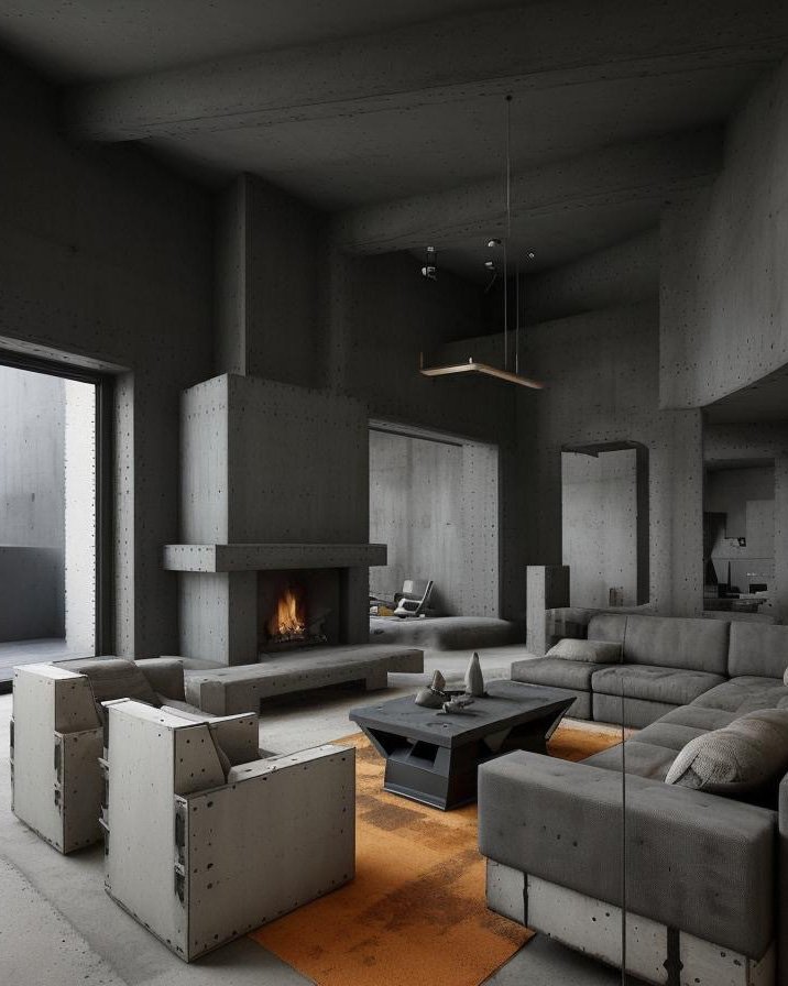
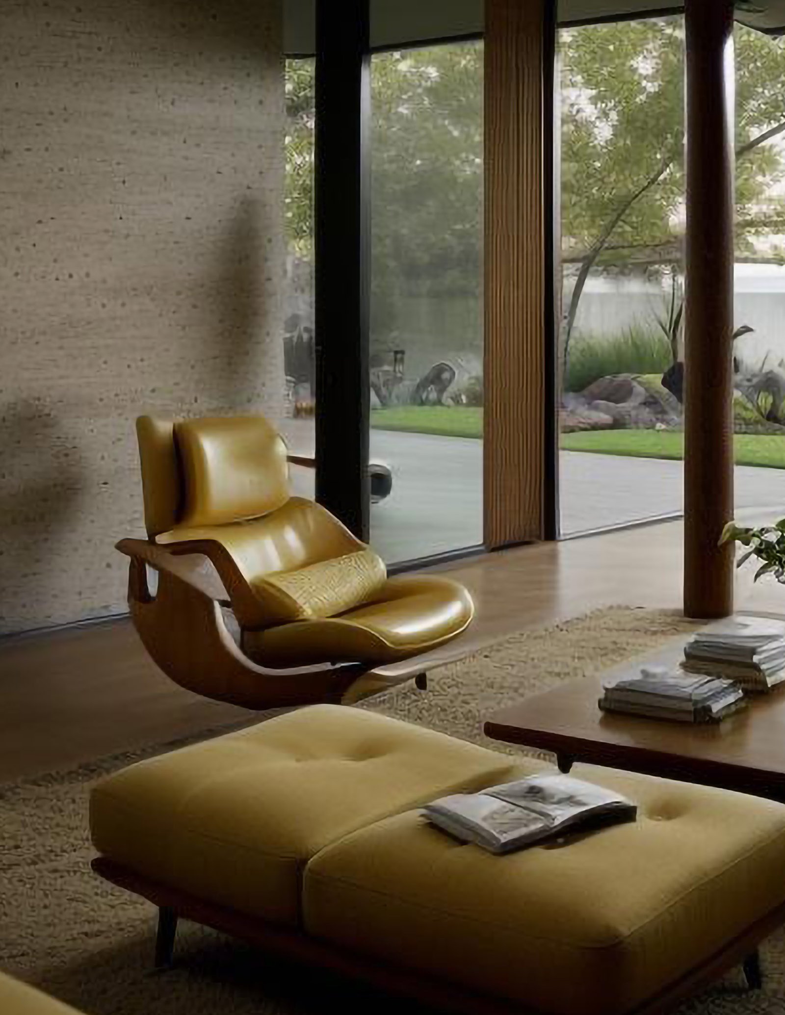
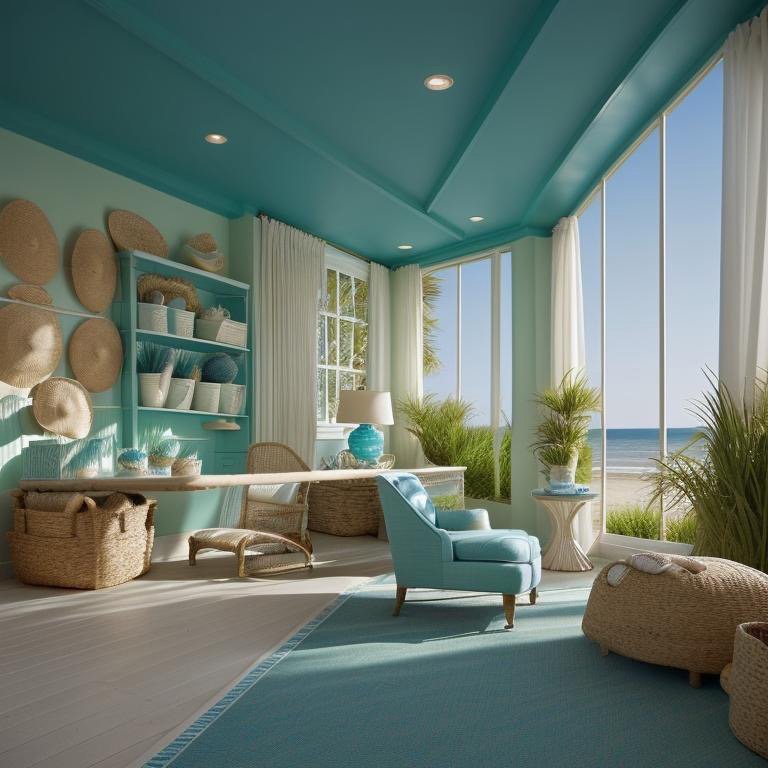
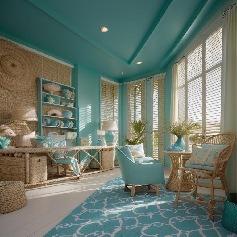
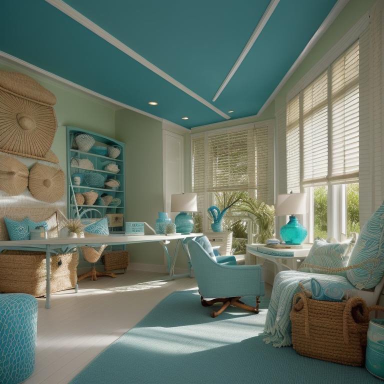
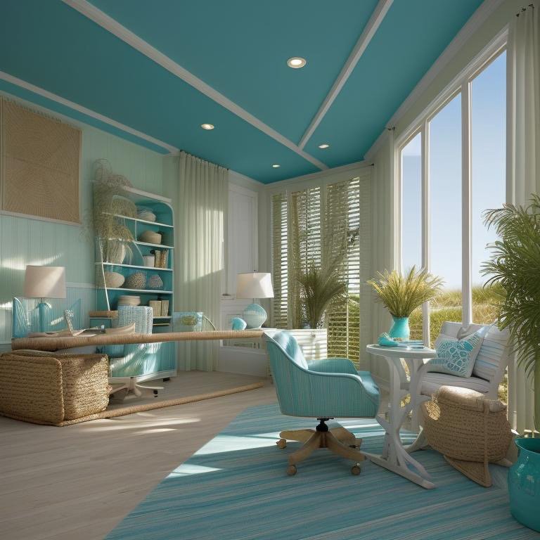
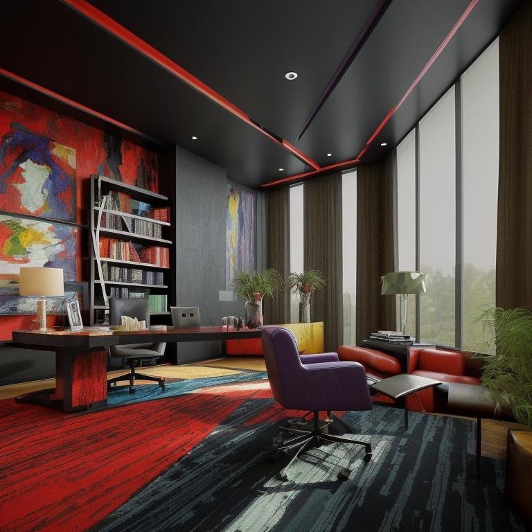
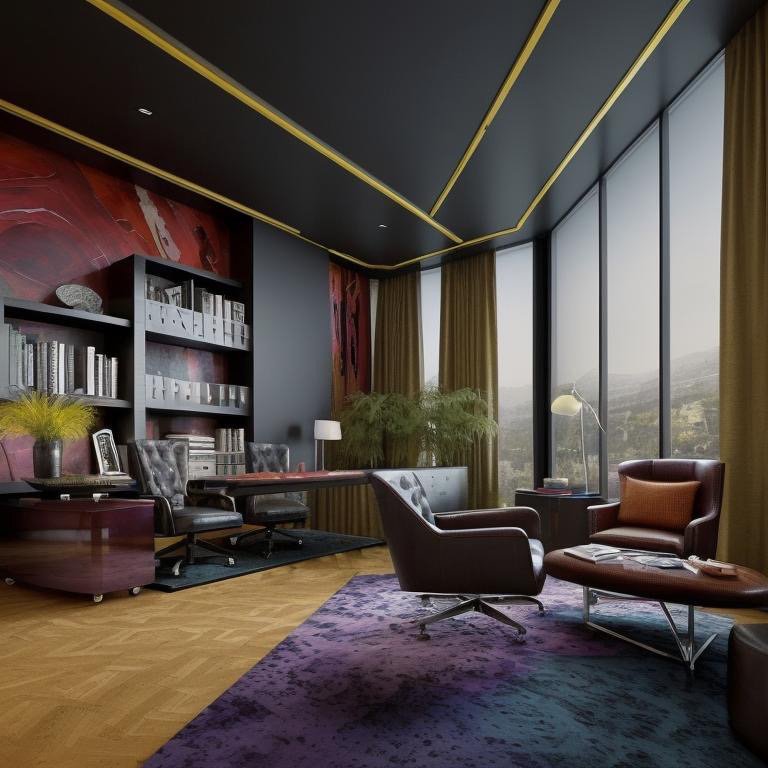
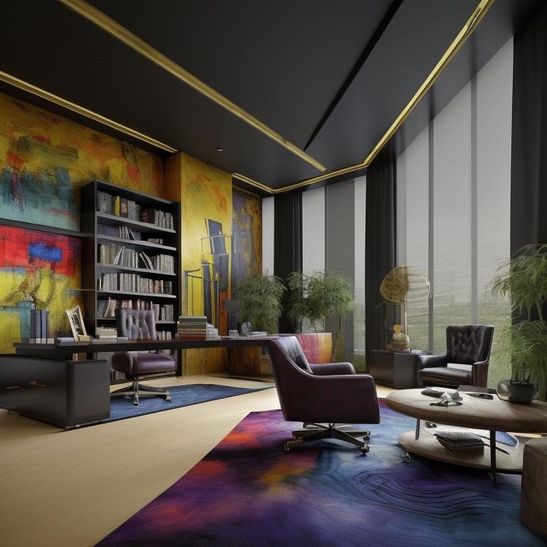
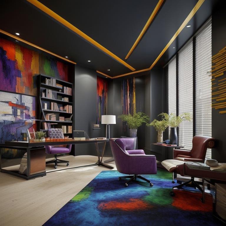
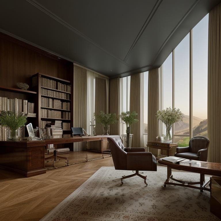
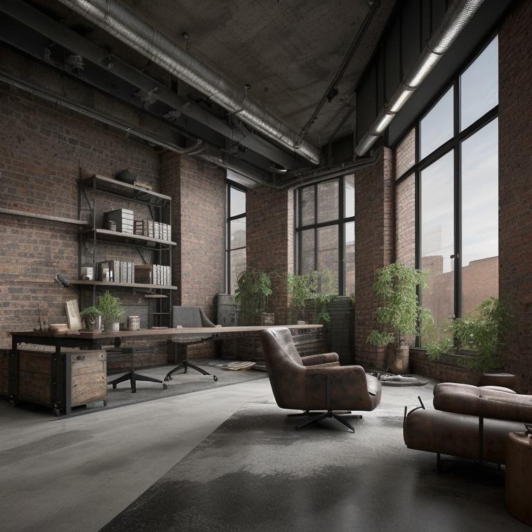
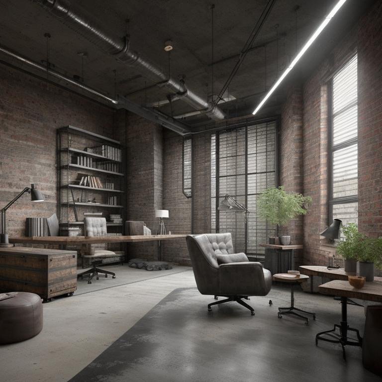
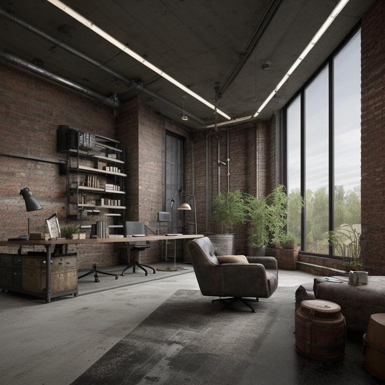
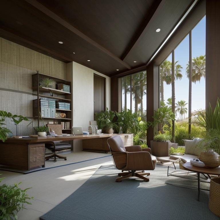
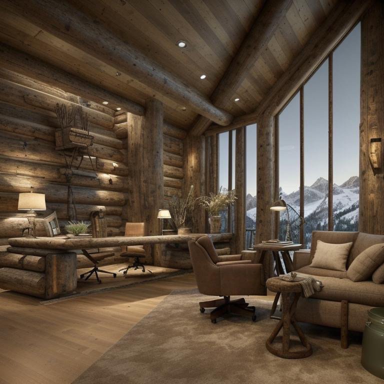
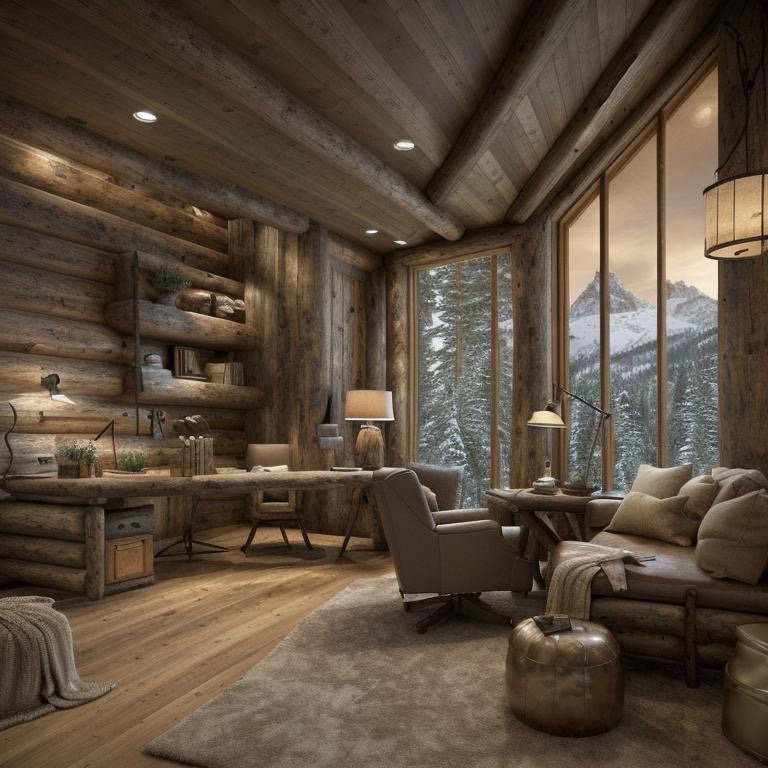
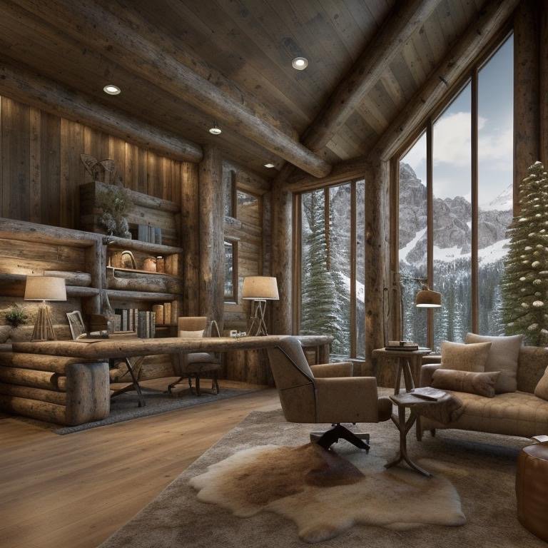
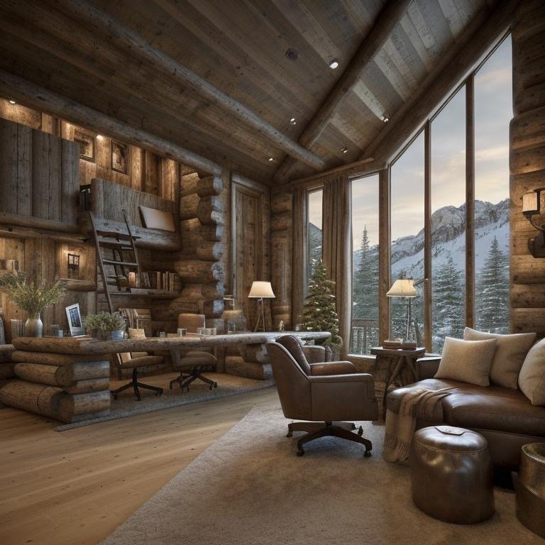
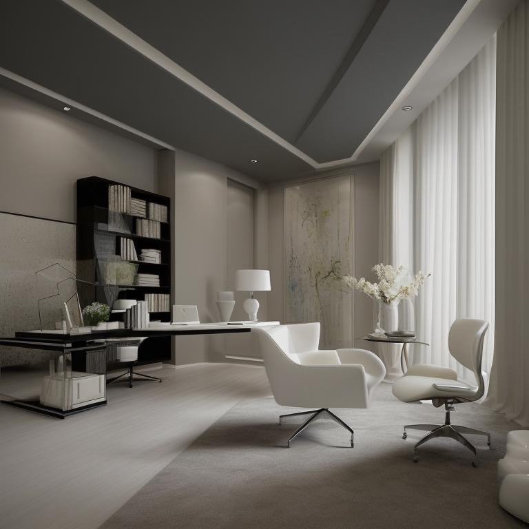
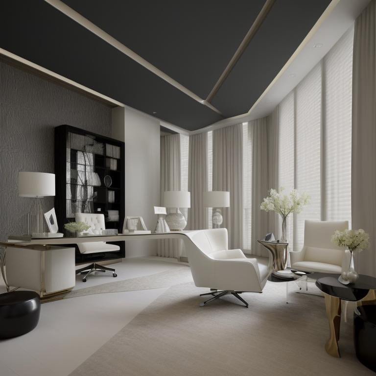
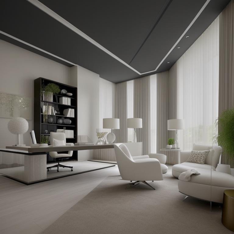
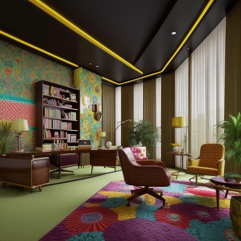
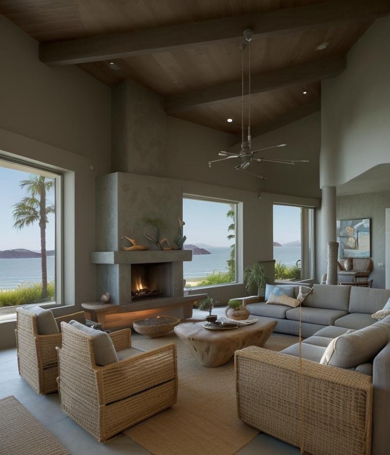
The Living Spaces: Where Time Loses Interest
The main living area is the sort of room where schedules quietly dissolve into irrelevance. Low-profile seating anchors the space without demanding visual attention or imposing hierarchies. Upholstery is tactile, forgiving—conceived to be lived on, inhabited, rather than admired from a cautious distance. The palette remains intentionally grounded: sand, stone, weathered wood, sun-faded textiles in muted registers. Nothing shouts. Everything belongs.
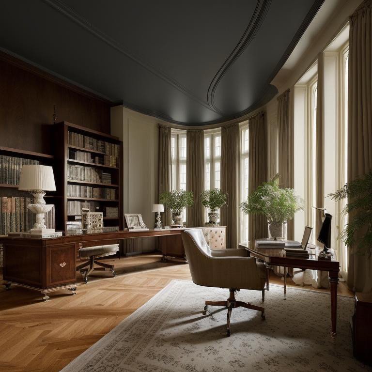
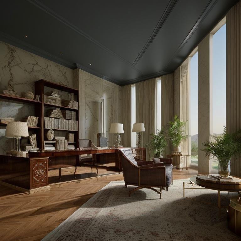
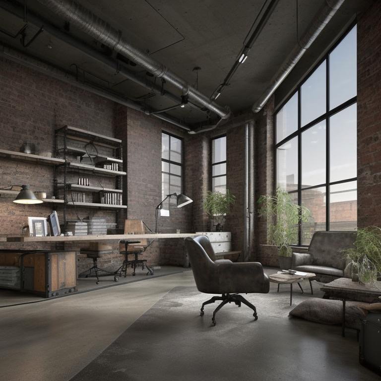
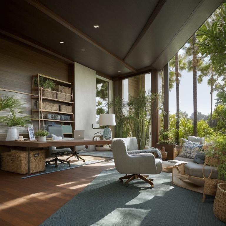
Through Cinematic Intelligence, the design team explored multiple sophisticated variations of this room—subtle shifts in material weight, light temperature, furniture composition, and spatial emphasis. What emerged with clarity is how resilient this design language proves to be. The space can shift warmer without losing restraint, lean more decisively modern without abandoning its California roots, or introduce coastal undertones without fragmenting its coherence. The room never breaks character. And that stability is not accident—it is the result of intelligent, foundational design work.
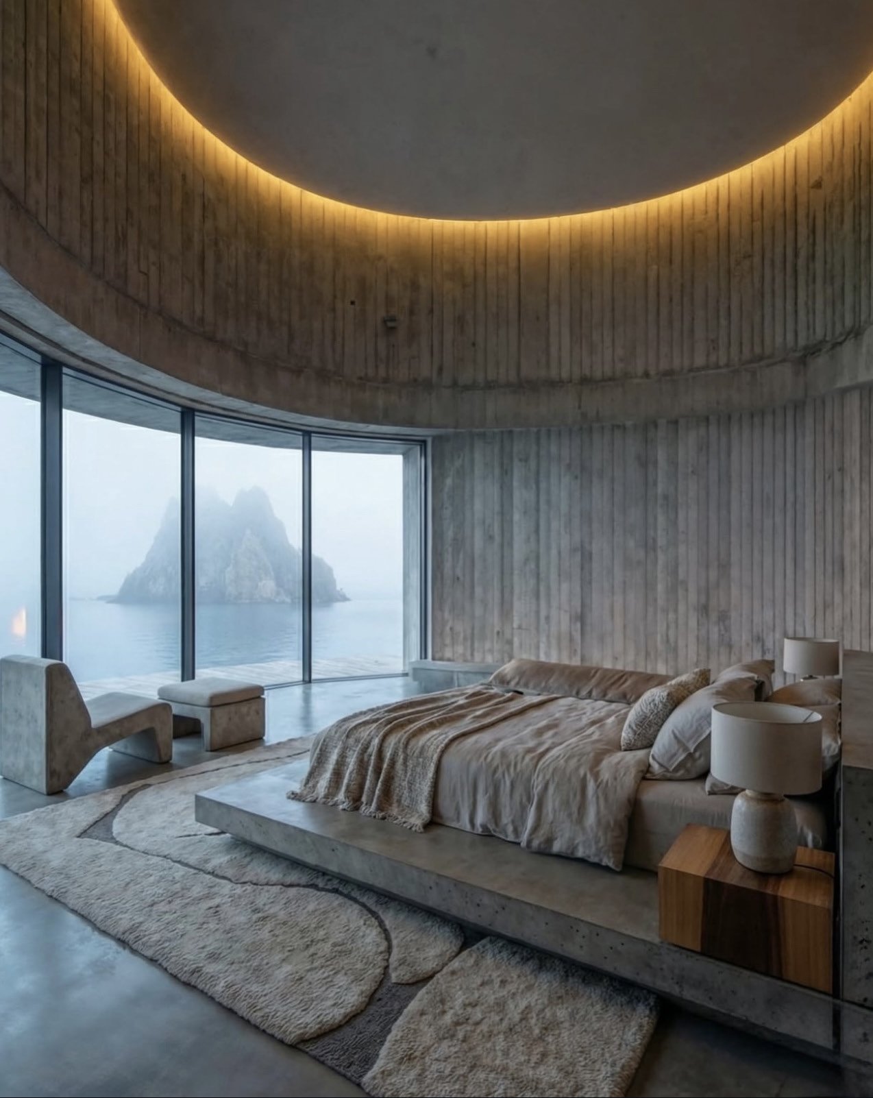
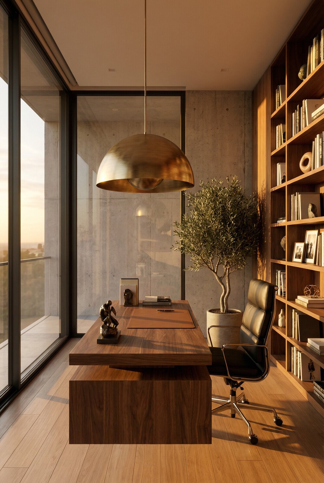
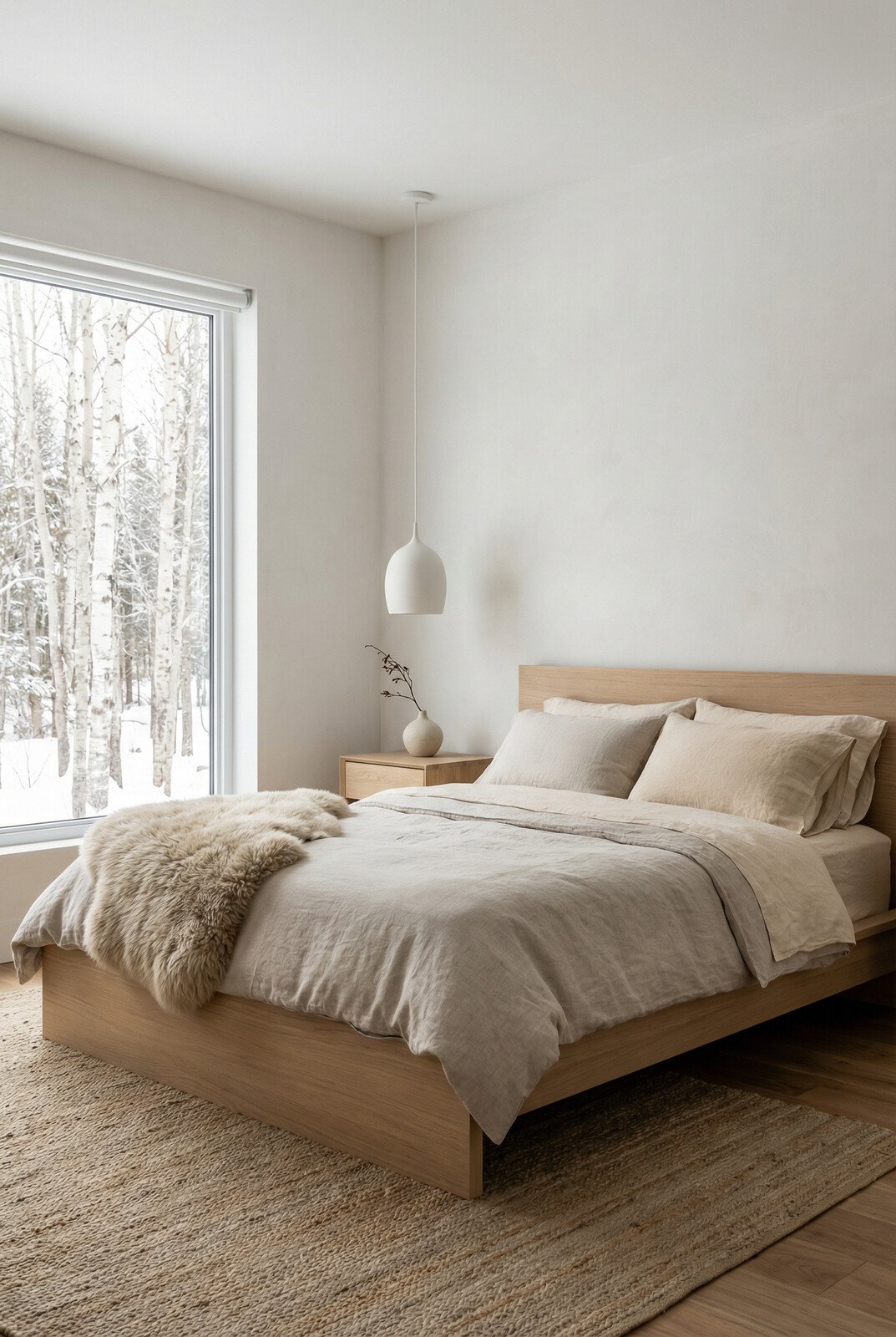
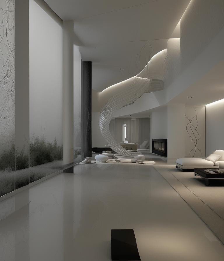
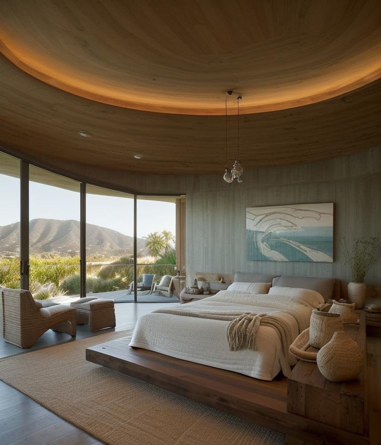
The Bedroom: Quiet Luxury Without Ceremony
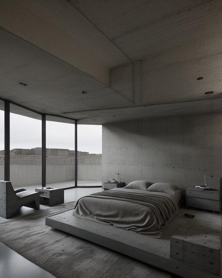
The bedroom may be the most revealing expression of this home’s philosophical commitment. Here, luxury abandons ornamentation entirely. It manifests instead as spatial generosity. It is silence. It is the way the bed appears to float just above the floor—grounded yet weightless. The wood ceiling curves gently overhead, creating an intimate enclosure without the psychologically compressive effect that often accompanies such gestures.
Natural light arrives filtered and diffused, never harsh or demanding. The view beyond the glass becomes something like a moving artwork—shifting by hour, transforming across seasons—while the interior holds steady and constant. The refuge feels complete unto itself.
In alternative design iterations generated through Cinematic Intelligence, this room adapted with particular grace: softer linens, subtly darker woods, refined adjustments to contrast and warmth. Each variation felt finished, coherent, and necessary—not experimental or provisional. That consistency is the hallmark of strong foundational design thinking.
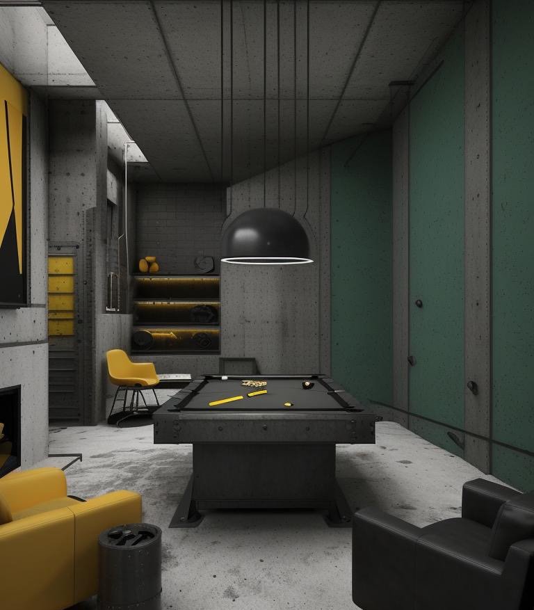
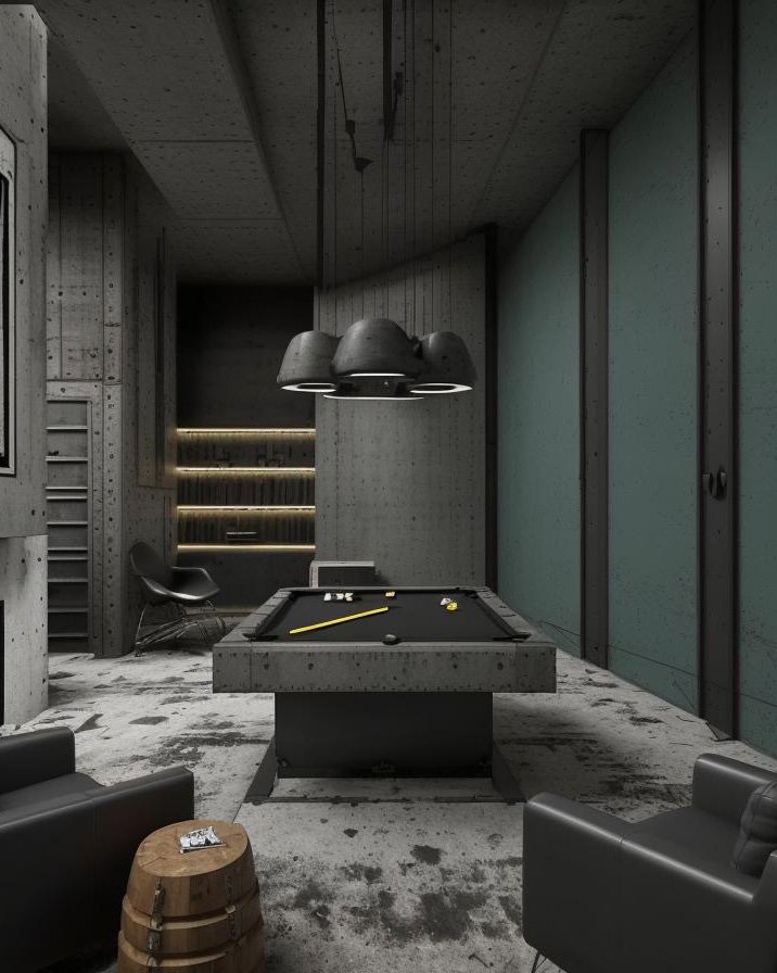
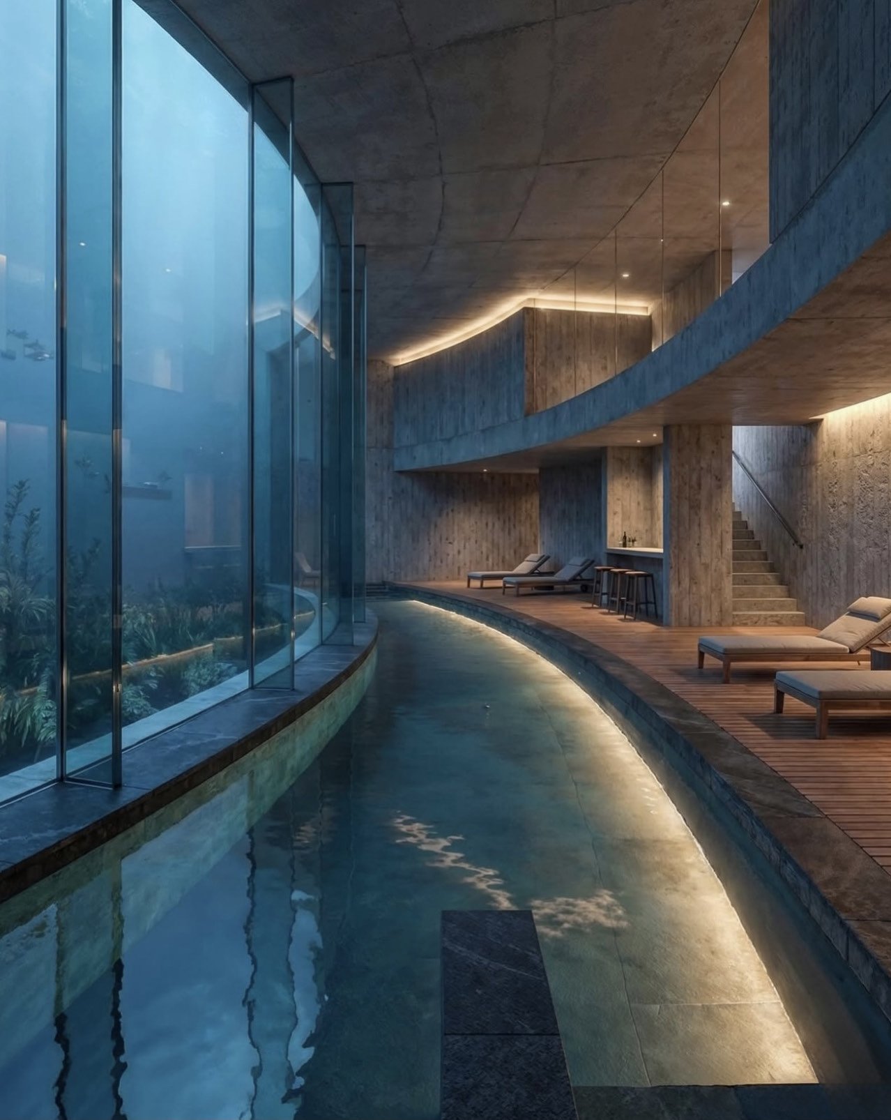
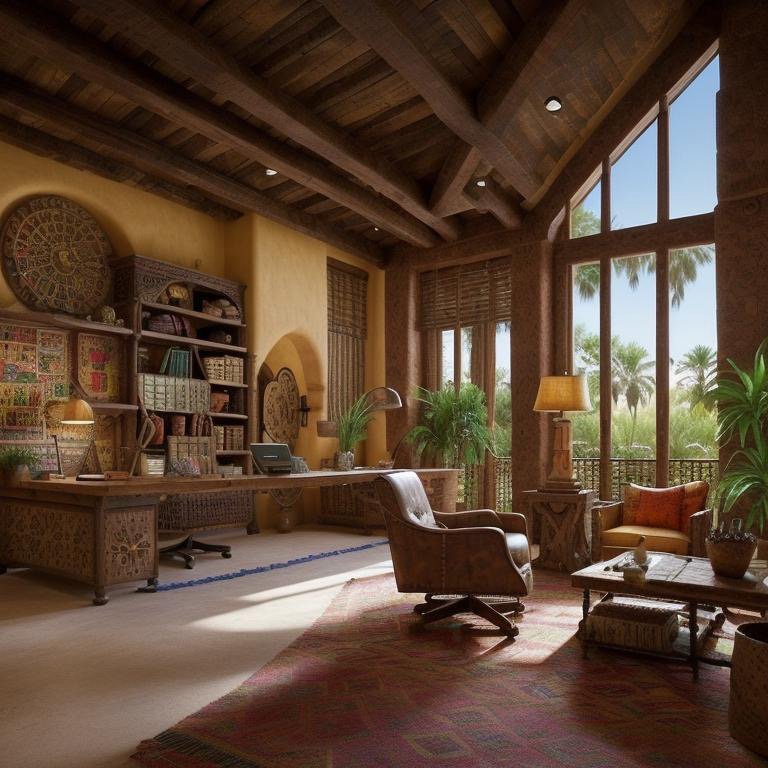
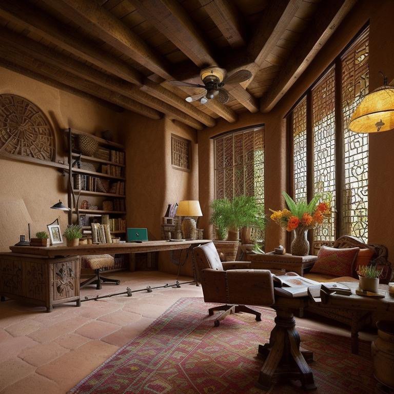
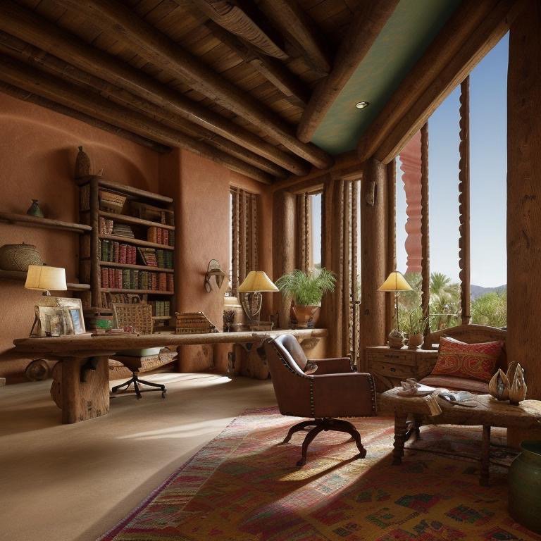
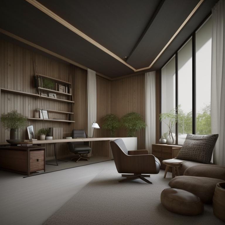
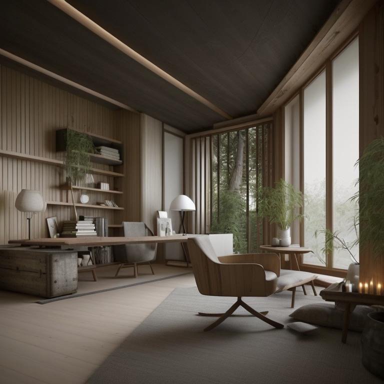
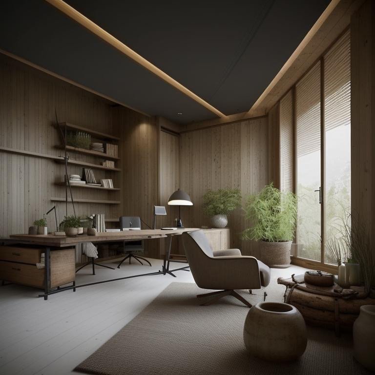
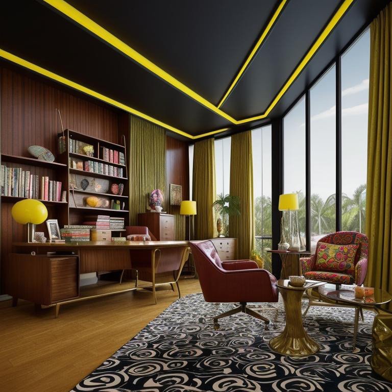
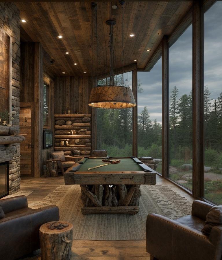
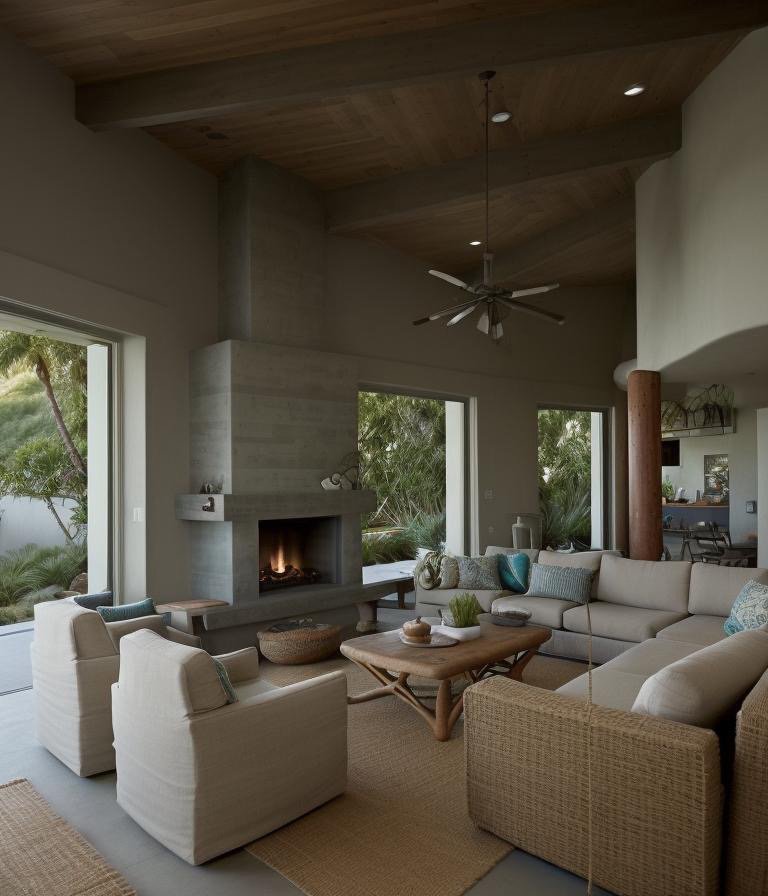
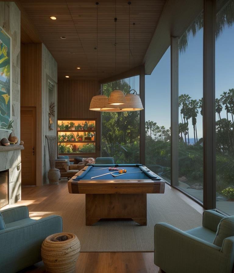
The Entertaining Spaces: Casual, Not Careless
California Casual excels within contexts that demand entertainment—and this residence demonstrates that mastery. The recreational lounge and shared spaces achieve a precise balance between playfulness and refinement. A billiards table sits confidently at the room’s center, present but not as novelty or decoration—rather as anchor, as gathering point. Lighting is deliberate yet relaxed: pendant forms softened, never sharp or unnecessarily architectural.
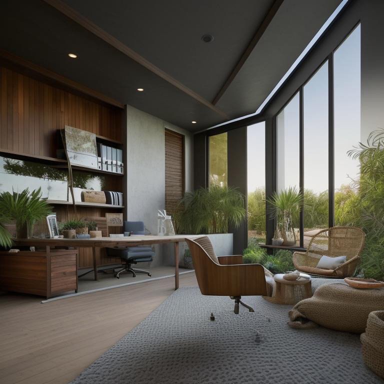
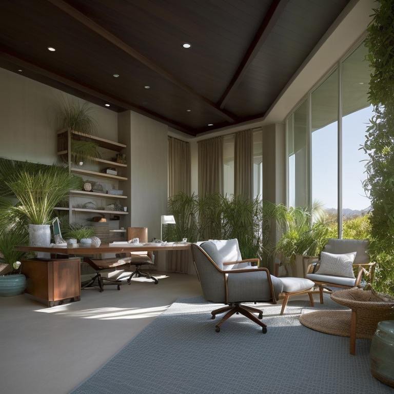
What distinguished this approach was how Cinematic Intelligence enabled the team to test multiple emotional registers within the same architectural envelope. A slightly moodier palette—deeper tones, subdued light temperatures—transformed the space into an evening retreat, introspective and layered. A brighter configuration, by contrast, leaned toward daytime sociability, openness, and ease. The underlying structure supported both visions effortlessly, which speaks to the robustness of the foundational design.
Here is where velocity and precision converge. These are not abstract concepts or design philosophies. They are actionable design decisions made visible and testable in minutes rather than months—a fundamental shift in how contemporary design practice unfolds.
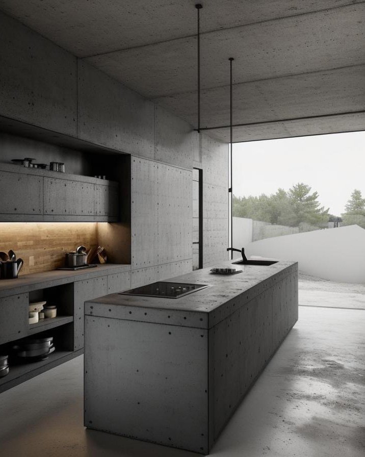
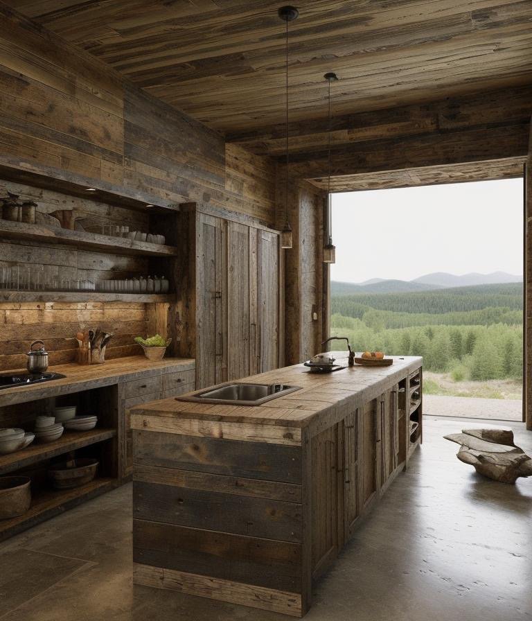
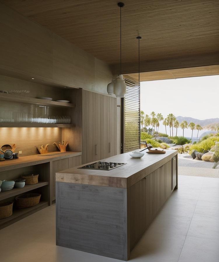
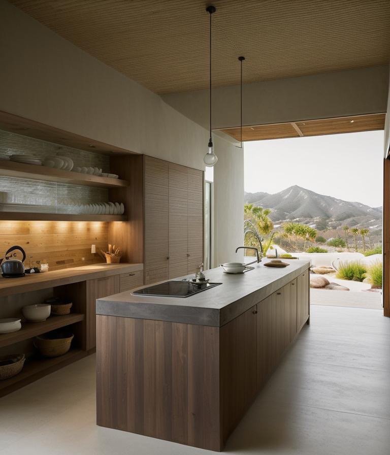
The Kitchen: Functional Poetry
The kitchen is often where California Casual collapses under the weight of conflicting demands: functionality versus beauty, storage versus restraint, performance versus feeling. Not in this residence. This kitchen is restrained, intelligent, and beautifully proportioned in every dimension. Materials are honest without affectation: wood that shows grain and character, stone that displays patina and age, fixtures that perform their function without seeking applause or recognition.
The island feels substantial yet approachable—a place to gather, work, and linger, not to perform or display. Cinematic Intelligence allowed exploration of variations in cabinetry tone, lighting warmth, and surface finish, revealing how even minor adjustments could recalibrate the emotional temperature of the room without compromising its identity or coherence. It is, in effect, a masterclass in controlled flexibility—the ability to shift mood and atmosphere while maintaining absolute design integrity.
Why This Moment Matters
What this residence demonstrates with remarkable clarity and conviction is that great design is no longer confined to a single, unchanging outcome. With Cinematic Intelligence, this California Casual vision becomes not merely a finished product but an engine. A starting point. A design ecosystem capable of evolving, adapting, and responding to taste, climate, cultural context, and function—without sacrificing coherence or identity.
For architects, designers, developers, and homeowners alike, this represents a fundamental shift in how design practice operates. Speed without sacrifice. Precision without rigidity. Creativity augmented and supported by data, not constrained or diminished by it. The ability to test variations, explore alternatives, and move at contemporary velocity while maintaining the philosophical and material integrity that distinguishes exceptional design from the merely competent.
As this home continues its evolution—reimagined across multiple distinct visual and material interpretations—one element remains consistent across every iteration: the feeling. That rare and irreplaceable sense that you are precisely where you belong. That the space has been conceived with intention, executed with care, and refined with intelligence.
California Casual, in this context, is not a style to be borrowed or superficially emulated. It is an approach to spatial thinking that demands restraint, confidence, and an absolute refusal to over-explain itself. It is, perhaps, the most honest architectural language available to contemporary design practice.