Rustic design is the easiest style to fake and the hardest one to get right. Anyone can slap reclaimed planks on a wall and call it “warm.” But real rustic—the kind that feels earned—comes from proportion, mass, texture, and the quiet discipline of knowing when to stop. It requires a language, not a palette. It demands restraint more than abundance.
That’s why this redesign is worth your attention.
The original home, as presented in the base renders, carried a modern clarity that was architecturally unassailable: wide glazing, clean volumes, smooth planes, open sightlines. Beautiful—crystalline, even. Just not rustic. But here’s what matters: Cinematic Intelligence™ didn’t fight the structure. It re-authored the interior language so the same architectural vessel could speak in timber, stone, iron, and atmosphere. The building didn’t change. The dialogue did.
Below is exactly what shifted—space by space—and the architectural reasoning behind each decision. This is how a modernist shell becomes a place that feels earned.
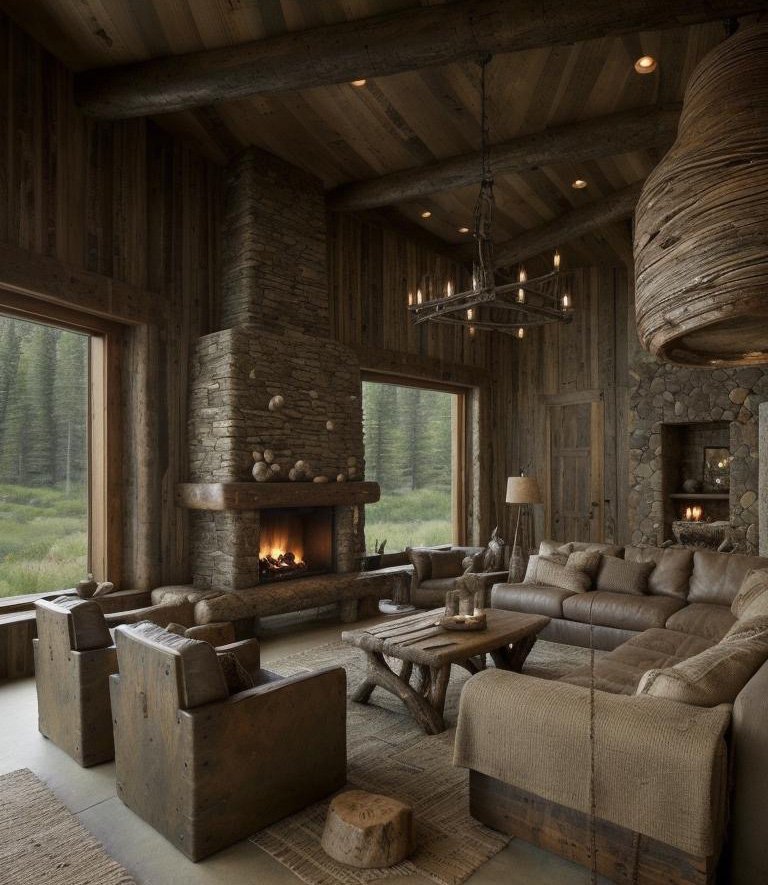
The Great Room: From Gallery-Luxury to Anchored Living
Original condition: The space read as modern openness incarnate. Light walls, minimal interruption, floating furniture arrangements, the kind of geometric purity that photographs brilliantly but sometimes feels like a gallery rather than a home.
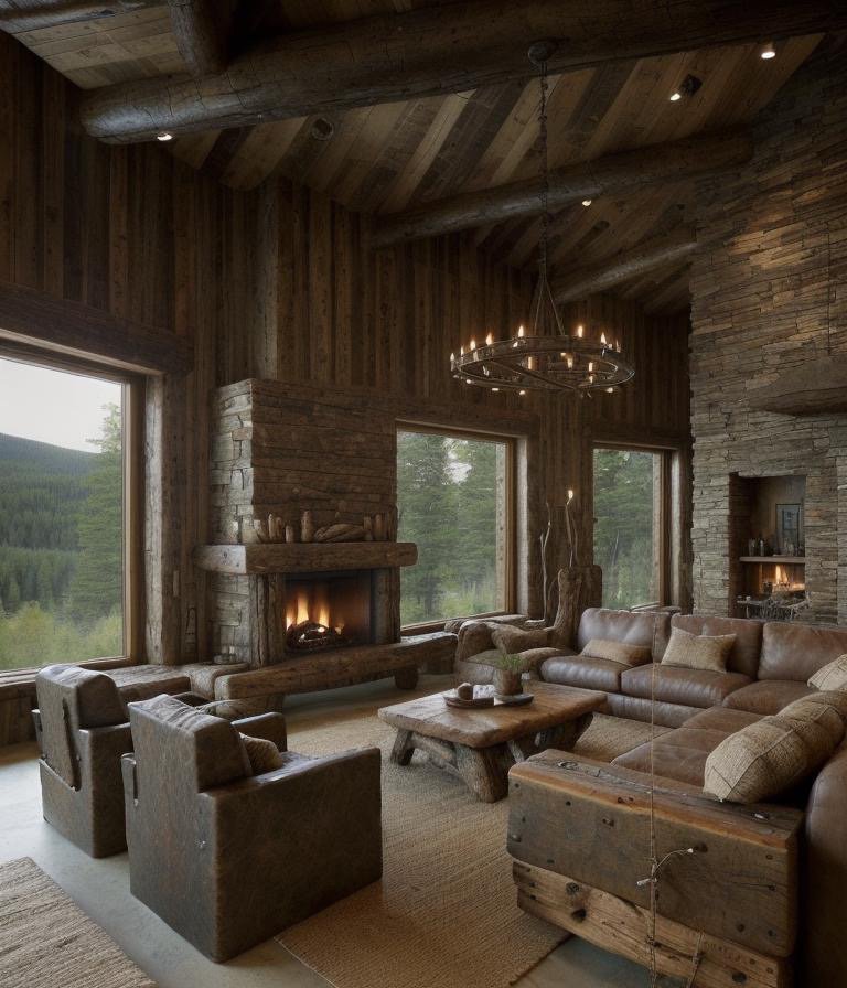
The transformation: Cinematic Intelligence anchored this room—and we mean that literally and visually. Mass and gravity became the design drivers.
The fireplace wall became the room’s new center of gravity. Instead of a sleek insert that reads as a technical amenity, the hearth was conceived as stonework with genuine weight and presence. Rustic architecture isn’t decoration applied to a space; it’s structure you can feel in your bones. The stone doesn’t whisper—it speaks. It gives the room a spine, and every other element now defers to that geometry.
The ceiling shifted into heavy timber language. Not “wood as surface,” but wood as a load-bearing architectural gesture. Planks run with intention, anchored by posts that read purposeful. The overhead warmth—that saturated amber—offsets the coolness of the extensive glazing. Without this, the room would remain a modernist gallery. With it, the room becomes protective.
Furniture behavior changed radically. Seating stopped floating and started settling. Lower profiles, chunkier silhouettes, textiles that absorb light rather than reflect it. The object-based design logic of minimalism gave way to a textural, massed approach. That’s how rustic becomes genuinely comfortable without tipping into sloppy informality.
Texture distribution followed a principle of restraint. The system didn’t over-texture everything—that’s how you get “ski lodge aesthetic.” Instead, character concentrated where the eye naturally rests: fireplace treatment, ceiling detail, key joinery moments. Secondary planes stayed quiet, allowing those focal moments to read with authority. That discipline is what separates a private estate from a themed interior.
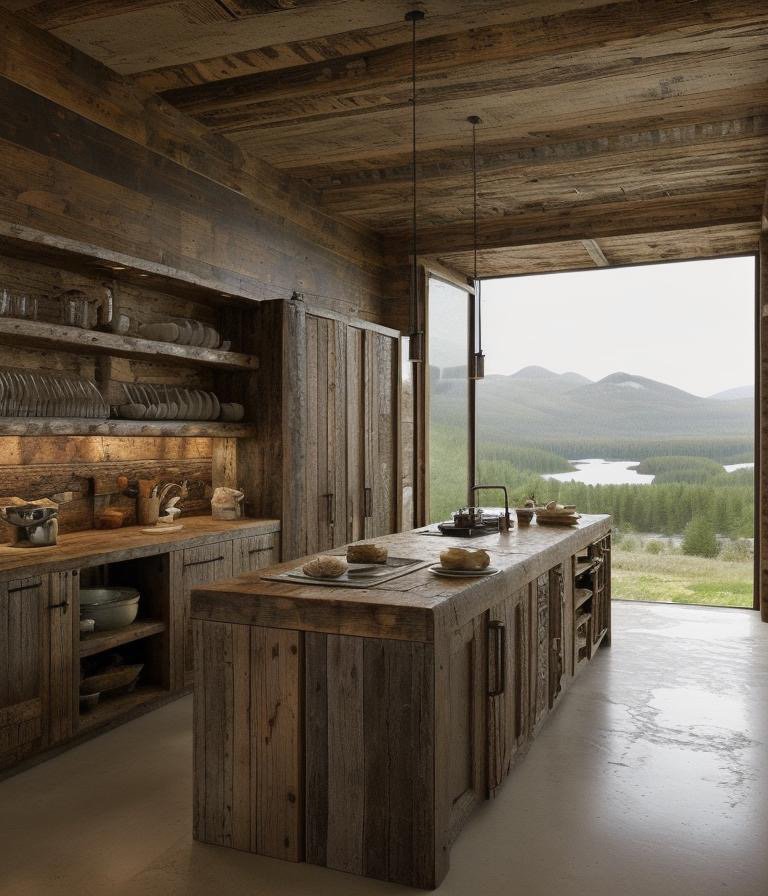
The Kitchen: Workshop-Heart Without Losing Refinement
Original condition: Minimal luxury was on full display. Smooth cabinetry, integrated appliances, an island that read as a clean monolith. Technically perfect. Spatially inert.
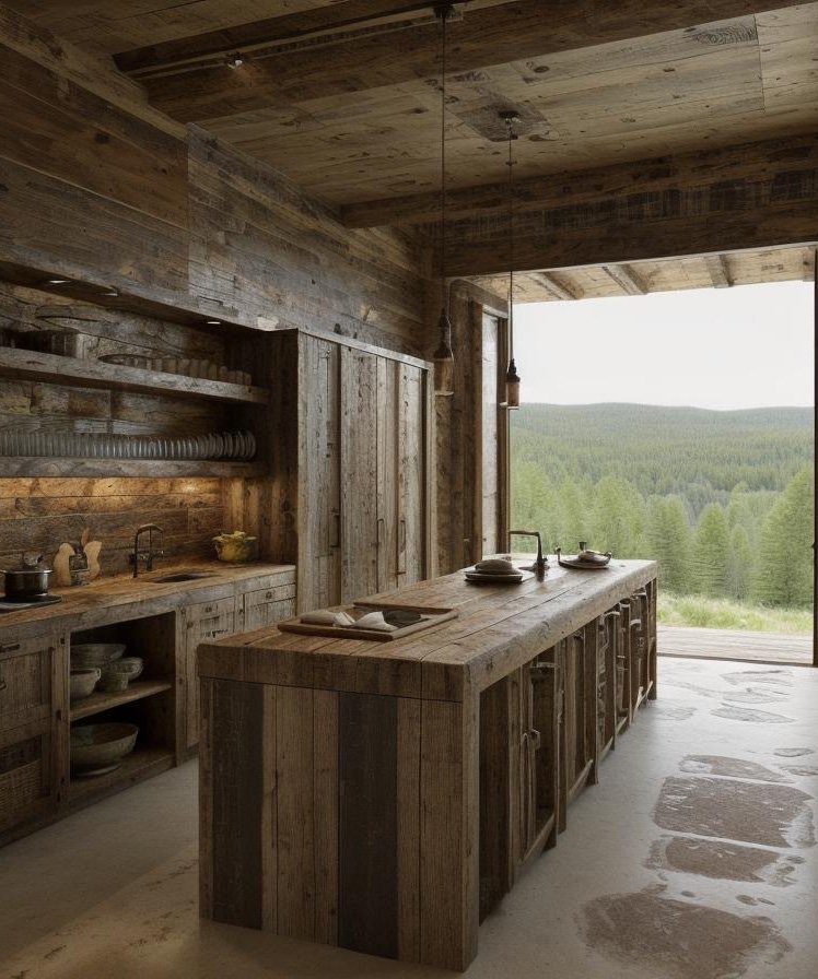
The transformation: The kitchen was reconceived as the workshop-heart of the home—without surrendering architectural refinement.
The island underwent radical translation. It traded slick minimalism for thick timber volume—a block that reads milled, not manufactured. The edges are squared and strong, not softened. The form communicates honesty. This is a work surface that’s been earned through use, not designed to look used.
Cabinet behavior evolved. Upper storage became more grounded—less high-gloss sheen, more visible grain and texture. Open shelving appeared where it made functional sense, but deployed as a narrative of daily rituals rather than a trend gesture. The dish, the glass, the vessel—these become visual elements because they’re honest to how the house actually operates.
Lighting logic avoided the most dangerous trap of rustic design: the wagon-wheel pendant. Fixtures remained warm and architectural—subtle pendant presence, enough to define zones without declaring “theme restaurant.” The warmth came from the color temperature and positioning, not from novelty.
Surface temperature became a critical variable. Countertops read cooler than the surrounding timber, creating contrast. This prevented the room from becoming a monolithic brown-on-brown cave. That temperature dialogue is what keeps the space estate-grade rather than period-authentic to the point of darkness.
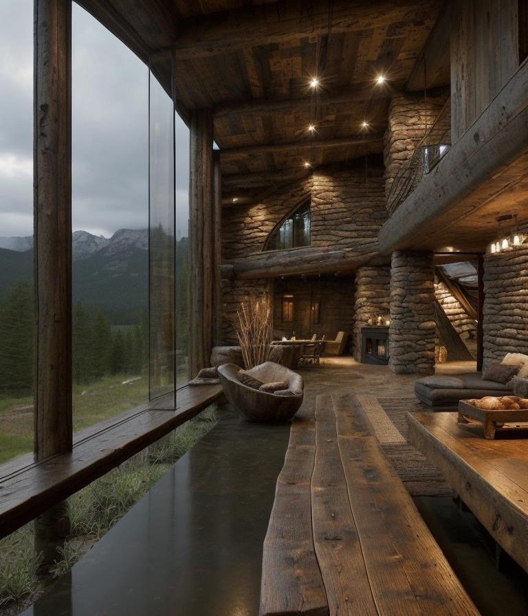
The Game Lounge: Rec Room Becomes Legacy Lounge
Original condition: A polished, quiet modern leisure room. Almost hotel-like in its anonymity—comfortable, but without specific character or memory.
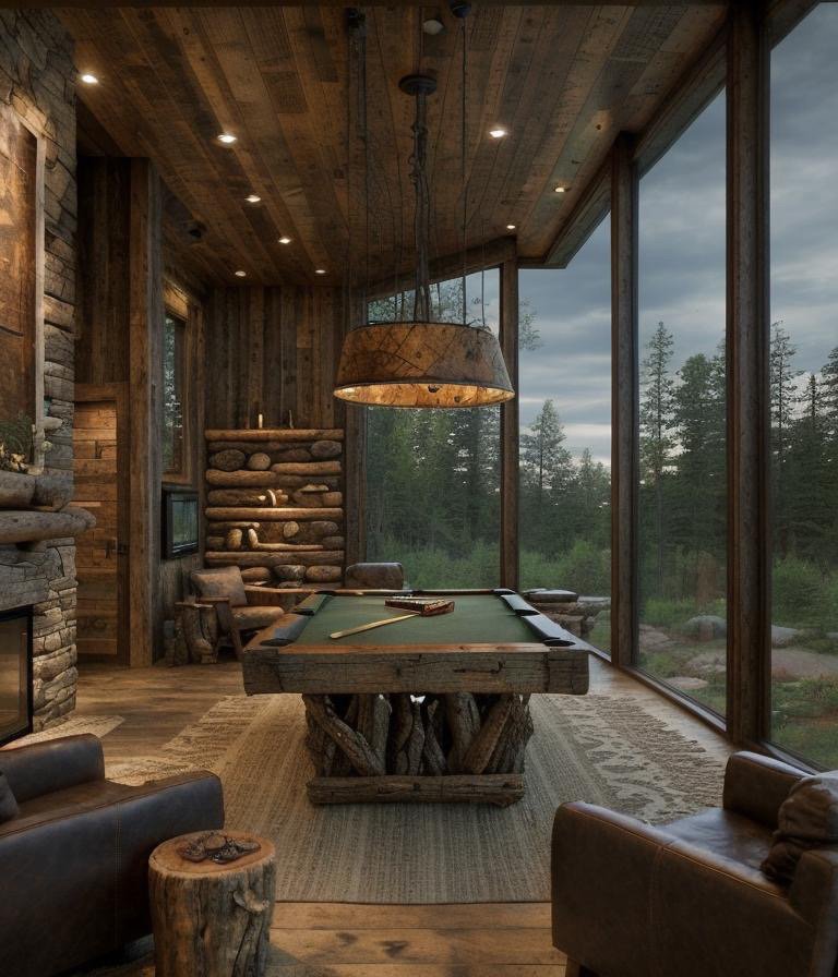
The transformation: This space underwent the most conceptual shift. From “rec room” to “lodge-level lounge,” but tailored rather than theatrical.
The ceiling plane deepened and warmed. That shift changes the acoustics of the room visually—it feels quieter, more intimate, more protective. Lower ceilings don’t just change proportion; they change how sound and light behave, which changes how the body experiences being in that space.
Material cadence became rhythmic. Stone, timber, and leather formed a repeating pattern. Wood slats, stone segments, and metal accents created a visual pulse. This repetition gives the room coherence without monotony. Each material earns its presence through that dialogue.
Furniture weight shifted fundamentally. Seating moved to heavier forms with softer textures—less showroom, more “stay awhile.” The objects in the room invite extended occupation rather than polite viewing. This is where the difference between contemporary design and rustic comfort becomes architectural rather than stylistic.
The windows remained—glazing stayed extensive—but the interior now frames the landscape like a viewing gallery. Rustic architecture, when done with intelligence, doesn’t hide or diminish the natural world beyond the glass. It honors it. It makes the view part of the interior composition.
The Primary Bedroom: Creating Sanctuary Through Enclosure
Original condition: Minimal calm was the organizing principle. Smooth walls, a bed positioned as a platform object, a room conceived more like a spa than a sanctuary. Serene, but detached.
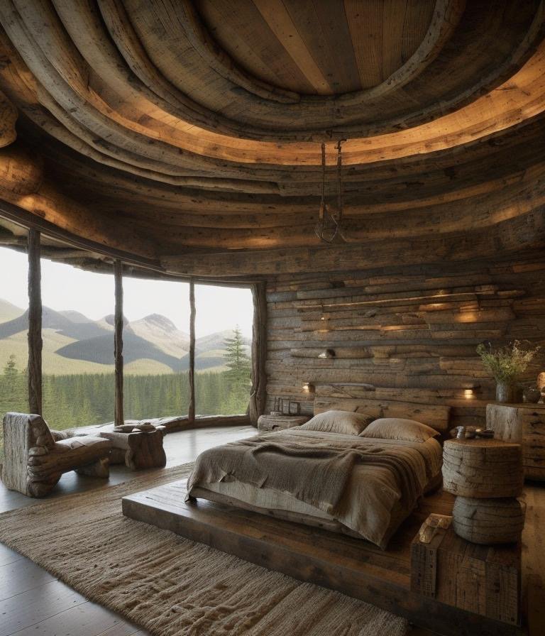
The transformation: This is where Cinematic Intelligence engaged in genuine spatial psychology. A bedroom isn’t a gallery. It’s a place where vulnerability happens.
The ceiling became a signature moment—curving, layered timber that reads hand-formed rather than installed. It’s not random texture or decorative flourish; it’s a crafted canopy. The overhead geometry changes how you feel when lying in bed looking up. That matters architecturally, not just aesthetically.
The bed integration shifted from floating-sculpture positioning to anchored placement. Rustic bedrooms should feel held—as though the room is protecting the inhabitant, not displaying them. The bed became part of the spatial story rather than an object within it.
Light management deployed warmth strategically. Pools of light appeared at the perimeter and in key corners. Rustic comfort doesn’t come from uniform brightness; it comes from shadow and glow, from the understanding that darkness and warmth together create genuine rest.
The textile palette turned quieter and thicker—creams, taupes, softened browns without artificial “log cabin red.” These are the colors of earth and linen, not the colors of a period room. The cumulative effect makes the space feel protected rather than performed.
The Long Glass Corridor: Museum Mode to Garden Walk
Original condition: A sleek modern gallery corridor—linear, bright, architecturally pure. An uninterrupted runway of minimalist clarity.
The transformation: Cinematic Intelligence warmed the runway and made it feel lived rather than traversed.
Timber overhead changed everything in a single move. Wood pulled the corridor out of museum mode into domestic architecture. The material language shifted from “transit space” to “passage through a dwelling.”
Stone articulation replaced uniform flooring. Instead of one uninterrupted surface, the floor story broke into zones—a sequence rather than a tunnel. These material breaks create pauses in movement. They slow the eye. They make the corridor feel intentional rather than obligatory.
Strategic greenery softened the transition between indoor and outdoor. The corridor became a garden walk rather than a gallery march. These planted moments blur the boundary between structure and landscape in a way that feels earned, not themed.
The Principle Behind the Practice
What makes this redesign architecturally coherent isn’t that it applied a style to a structure. It’s that it identified the potential within the existing bones and re-authored the spatial language to unlock it. The modernist shell—with its clean volumes, its spatial generosity, its relationship to light and landscape—didn’t need to be destroyed. It needed to be spoken to in a different dialect.
Rustic design, at its best, isn’t about materials. It’s about mass, restraint, and the honest expression of how spaces are actually inhabited. It’s about understanding that warmth comes not from color alone but from proportion, texture distribution, and the careful placement of focal points that make a room feel held rather than displayed.
This redesign demonstrates what happens when a contemporary structural language meets rustic spatial thinking. The result isn’t a period room or a themed interior. It’s a mountain house that feels like it was built for living—deliberate, proportioned, and utterly grounded. The kind of space you don’t want to leave, not because it’s pretty, but because it feels like it knows who you are and makes room for that.
That’s the difference between rustic surfaces and rustic architecture. And it’s the difference that makes a home.
Leave a Reply