Tag: Design Languages

  • The Kitchen Beyond Utility: Global Case Studies in Design Identity

    The Kitchen Beyond Utility: Global Case Studies in Design Identity

    Hyperrealistic 3D render of Scandinavian-Japanese fusion luxury kitchen with shoji panels and teppanyaki island

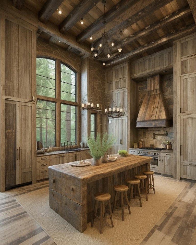
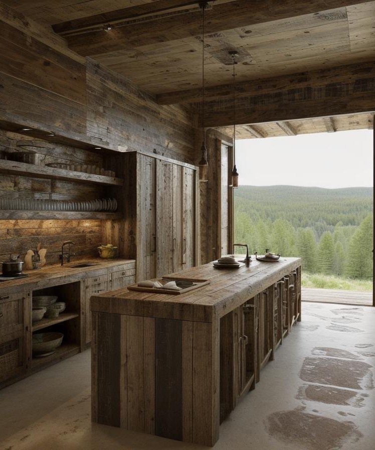
    The Kitchen as Cultural Manifesto

    Kitchens are never merely functional. They are laboratories of identity. They are the spaces where ingredient-to-sustenance transformation occurs, where family rituals unfold, where cultural memory is literally consumed. The kitchen encodes an entire civilization’s understanding of nourishment, beauty, family structure, and the relationship between work and joy.

    Yet this depth is often invisible in global design discourse. Contemporary kitchen design trends—minimalism, open-plan integration, appliance-forward planning—are treated as universal ideals, as though the most sophisticated approach to kitchen design transcends cultural particularity. This represents a fundamental misunderstanding of what kitchens mean.

    The reality is far more complex and far more interesting: different global regions have developed radically distinct approaches to kitchen design, each one rooted in particular ingredients, particular cooking techniques, particular understandings of family and community. When examined closely, these regional traditions reveal how architecture encodes cultural values, how space and material become the language through which a civilization expresses what it considers beautiful, efficient, and meaningful about the daily practice of feeding oneself and one’s family.

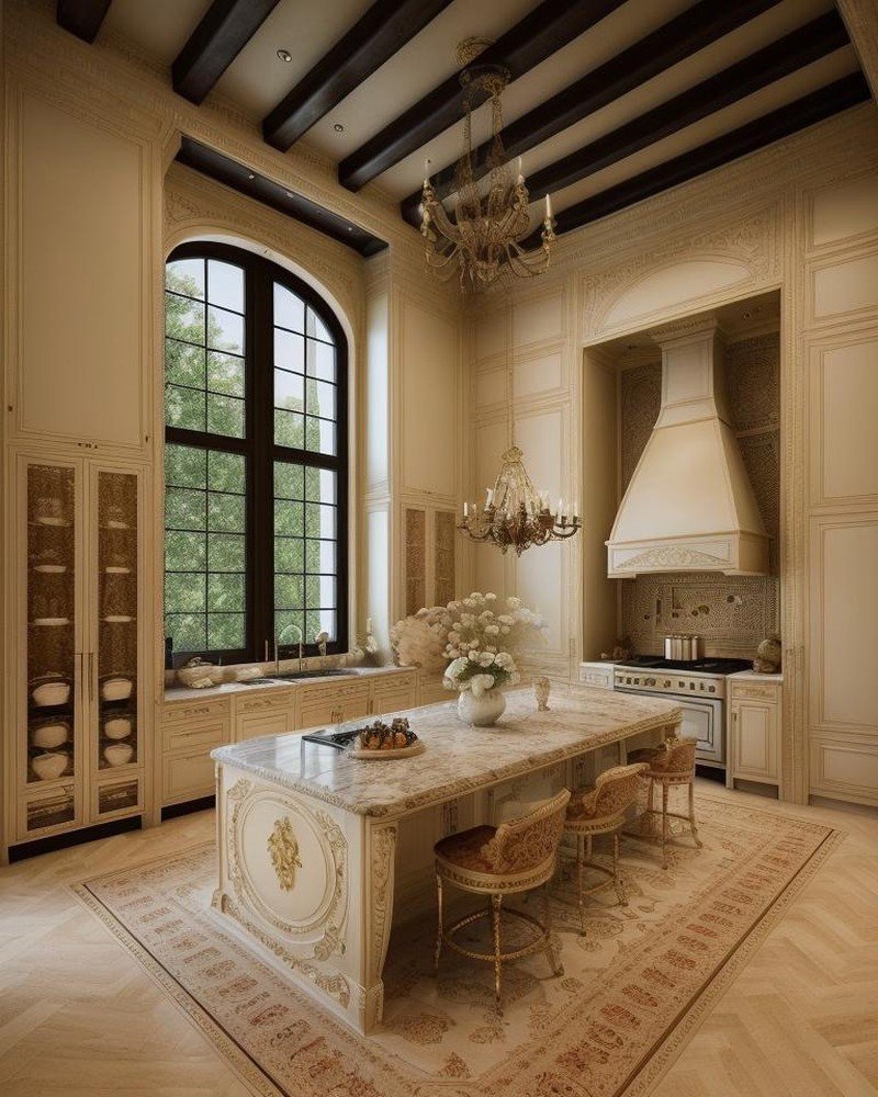
    European Sculptural Kitchens: Milan and the Culture of Craft

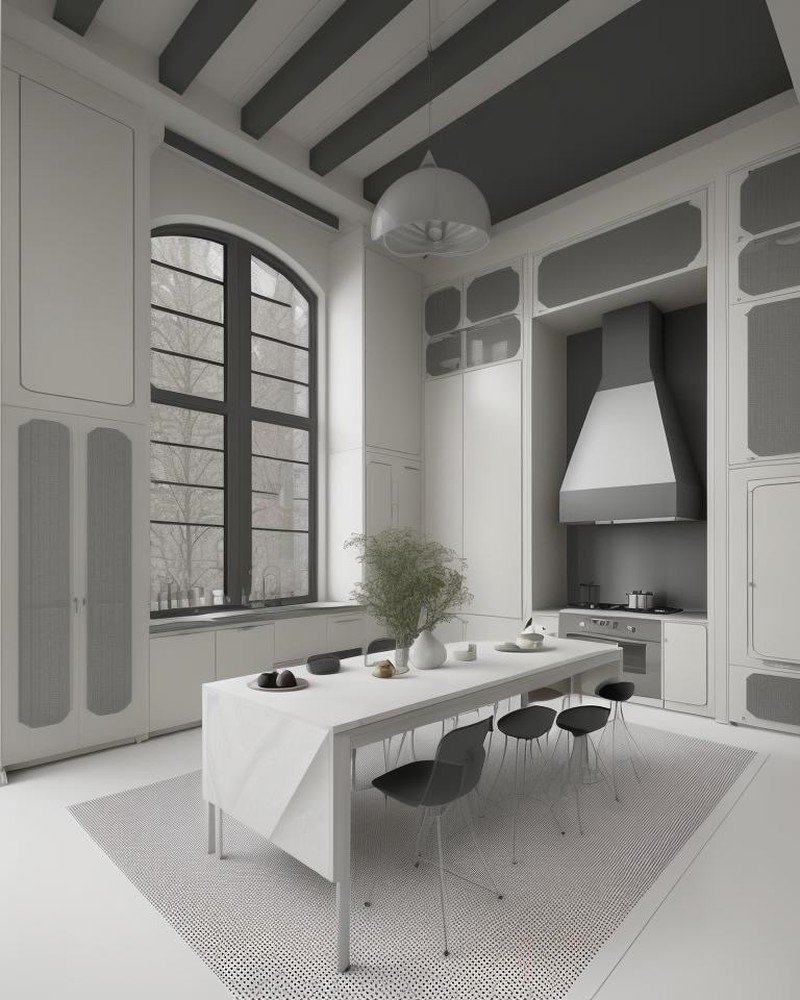
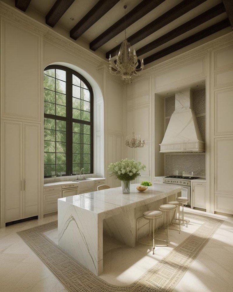
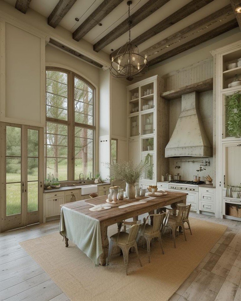
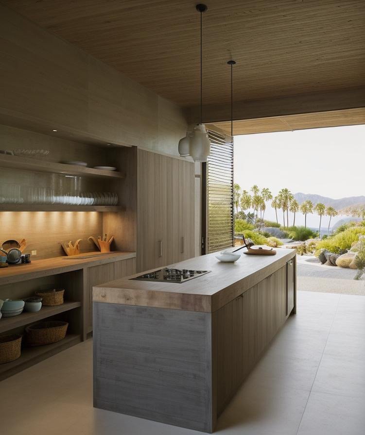
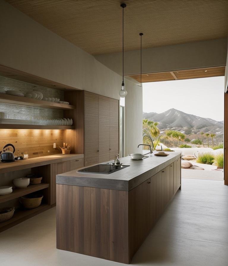
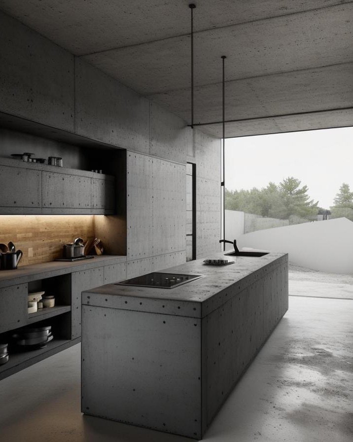
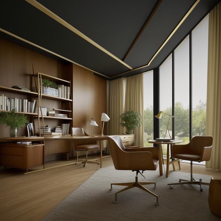
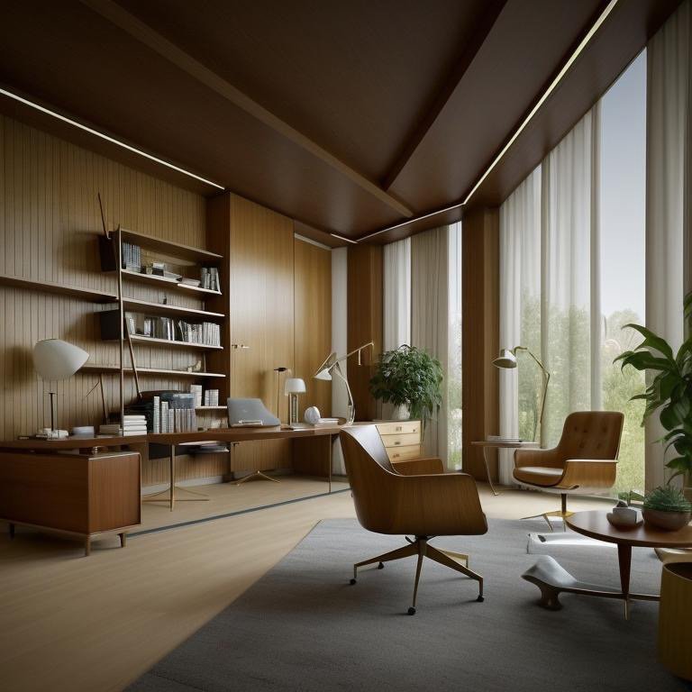
    Milan has emerged as a global center of kitchen innovation, precisely because Italian design culture understands the kitchen as worthy of the same artistic and intellectual attention lavished on furniture, fashion, or automotive design. The Italian kitchen philosophy starts from a fundamental premise: the kitchen is not a utility space but a room for daily living, deserving of sculptural form and material sophistication.

    Contemporary Milan kitchens often feature sculptural cabinetry—forms that express material properties through extrusion, curve, or unexpected proportion. Islands might float without visible support, or feature sculptural bases in marble or painted metal. Countertops are material statements: perhaps single slabs of marble or granite, emphasizing the material’s scale and visual power. Hardware disappears into seamless joinery. Lighting is integrated, allowing the cabinetry forms to read as pure sculpture.

    The philosophical foundation is the understanding that functional excellence and artistic expression are not in tension but are mutually reinforcing. A beautifully proportioned cabinet door is more efficient to use than poorly proportioned geometry. A well-designed handle ergonomically superior to a clumsily conceived one. The Italian approach elevates this understanding to principle: that attention to form and material in the kitchen is an investment not merely in beauty but in the daily quality of life, in the pleasure that derives from living in carefully designed space.

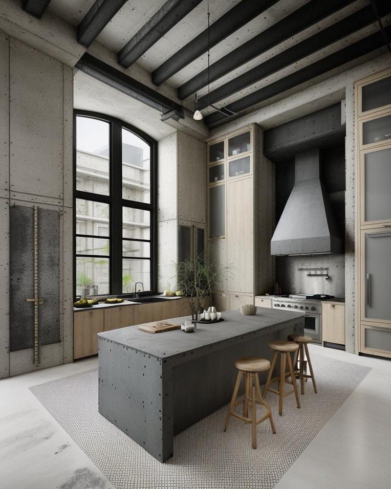
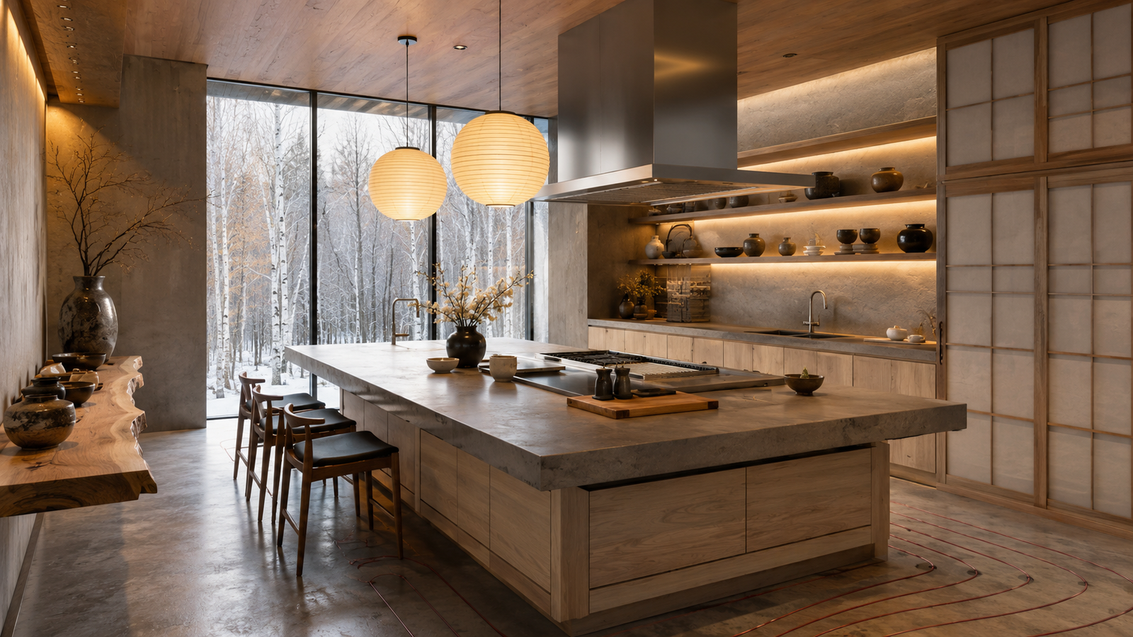
    Asian Kitchen Philosophy: Tokyo and Seoul’s Kitchen-as-Ethics

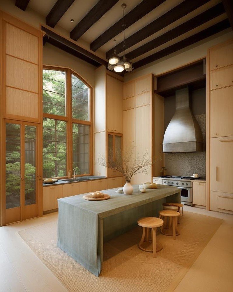
    In Tokyo and Seoul, kitchen design is understood through an entirely different philosophical framework. The emphasis is not on sculptural form or material opulence but on spatial efficiency, functional clarity, and the ethical principles embedded in material selection and craft.

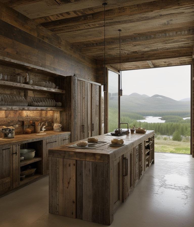
    Japanese kitchen tradition, rooted in centuries of design philosophy, prioritizes transparency of function. Every element should be legible—its purpose understood instantly. Cabinetry is often minimalist, sometimes featuring open shelving that displays tools and ingredients as functional elements. The layout is organized according to precise workflows—preparation, cooking, plating—with minimal wasted motion. Materials are chosen for durability and aging characteristics: wood that will patina, metal that will develop patina, stone that will weather gracefully.

    Korean kitchen design, influenced by Japanese principles but distinct in emphasis, celebrates the centrality of the meal in family life. Recent innovation in Korean kitchen design has emphasized flexible spatial organization that supports multiple cooks working simultaneously. Multi-station cooking infrastructure—multiple cooktops, multiple prep surfaces—allows family members to participate in meal preparation as a communal activity. The kitchen becomes an expression of family structure and values.

    Both approaches reflect a philosophical position: that the kitchen is a space of daily ethics, where material honesty, functional clarity, and attention to craft are not optional refinements but core values. The kitchen becomes a place where habitually practicing good design—through attention to material, proportion, and functional logic—cultivates ethical character.

    Cinematic 3D visualization of Brazilian tropical luxury kitchen with azulejo tiles and churrasqueira grill

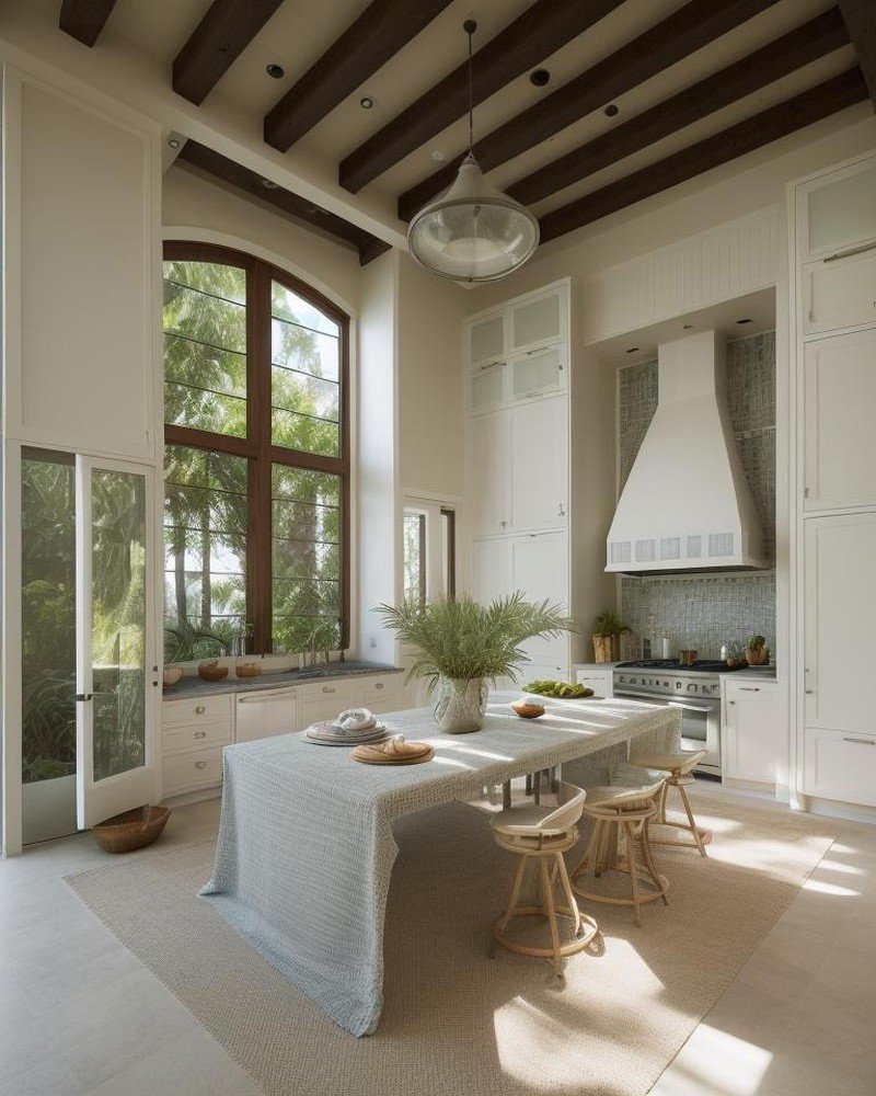
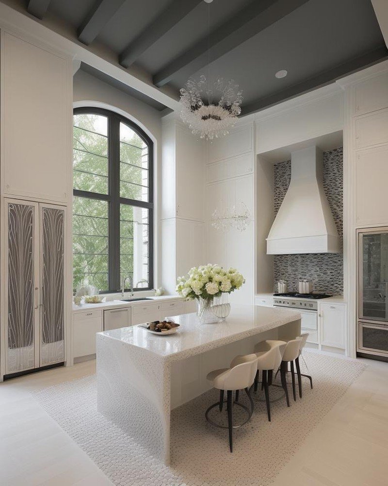
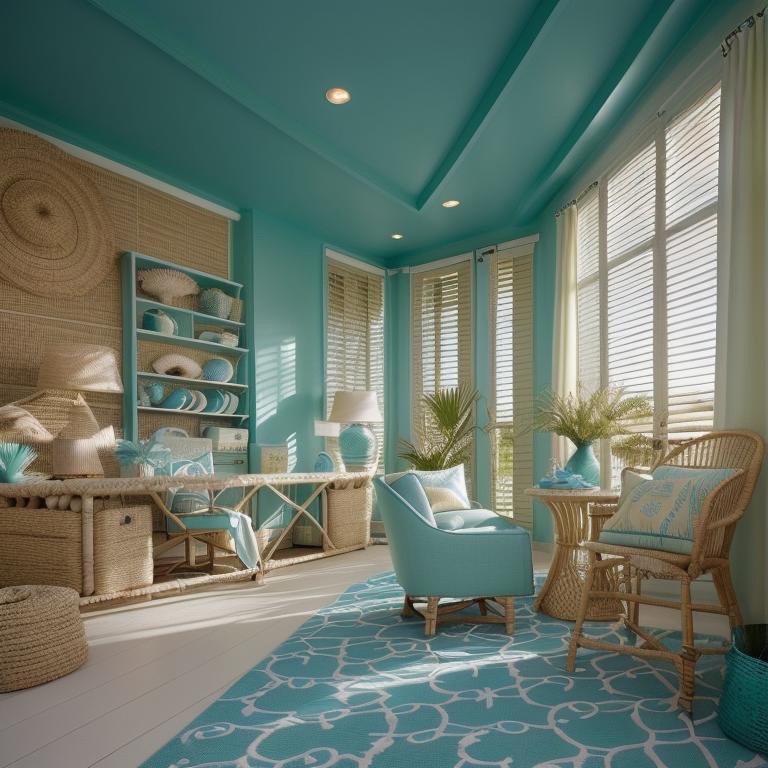
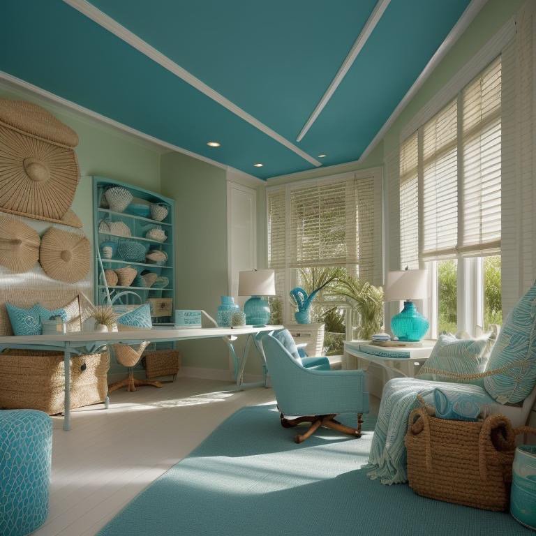
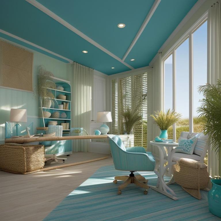
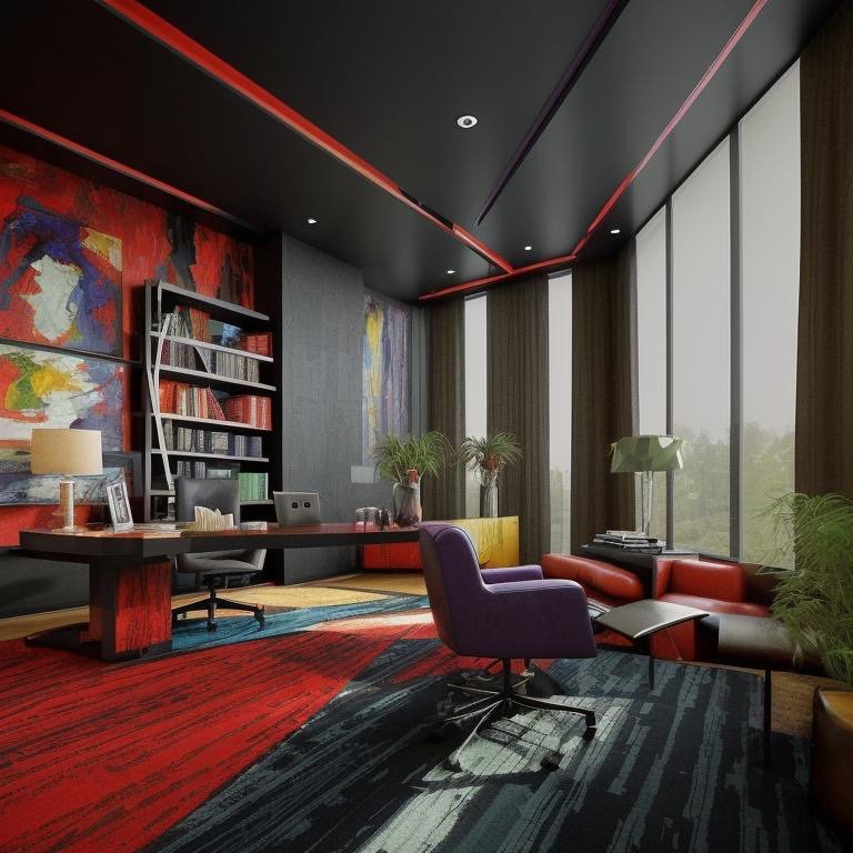
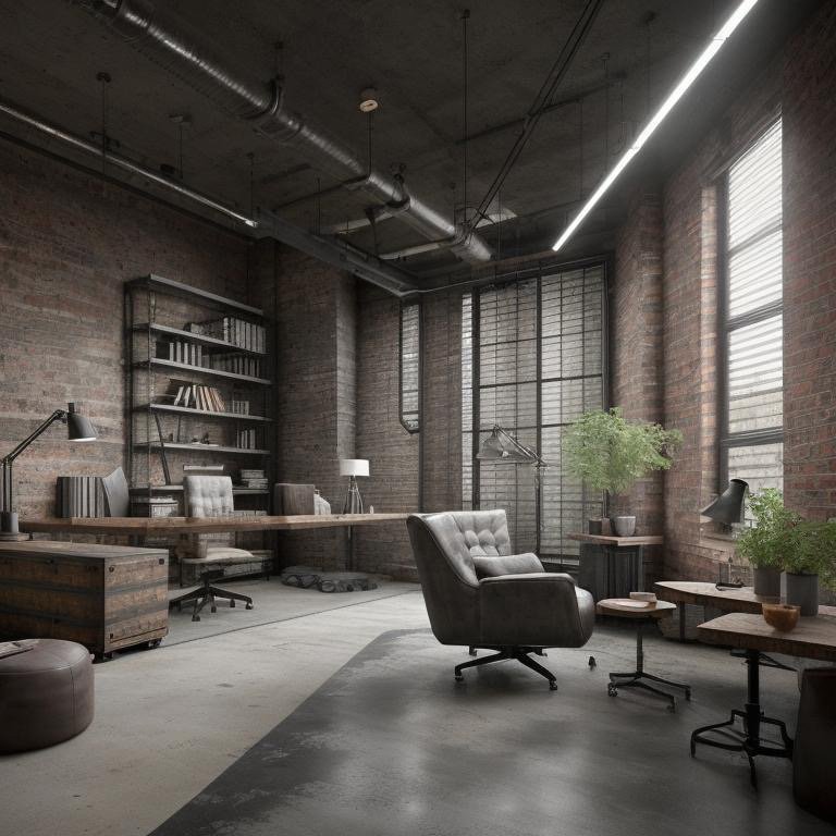
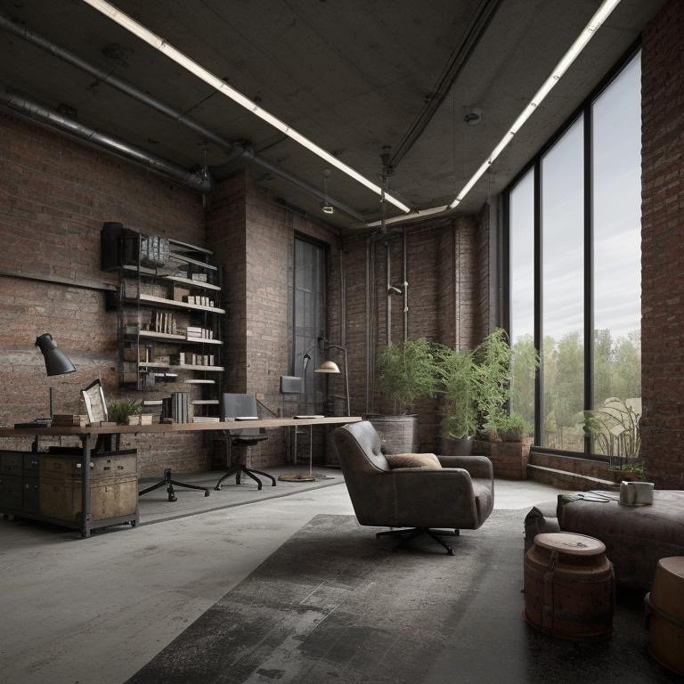
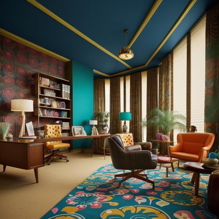
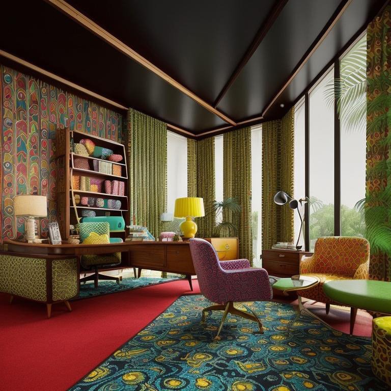
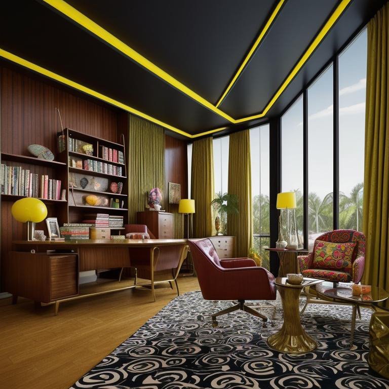
    American Kitchen-as-Theater: LA, Miami, and NYC’s Performative Domesticity

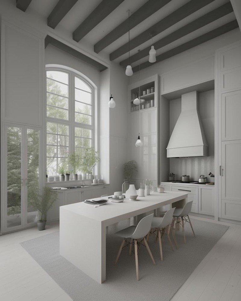
    American kitchen design, particularly as it has evolved in aesthetic-forward cities like Los Angeles, Miami, and New York, understands the kitchen as a performance space. The dominant contemporary American kitchen type is the open-plan kitchen—visually integrated with living and dining spaces, designed to be inhabited not merely during meal preparation but as a social gathering point throughout the day.

    The American kitchen-as-theater philosophy emphasizes the island as performance stage. The island becomes a focal point where hosts can prepare food while conversing with guests, where the kitchen’s activities are choreographed as visible performance rather than hidden labor. This architectural choice reflects particular cultural values: the separation between labor and leisure is minimized; cooking is elevated to entertainment; the kitchen’s operations are meant to be observed and appreciated.

    Contemporary American kitchen design also emphasizes customization and personalization at a scale unparalleled globally. High-end kitchens in American cities often feature bespoke cabinetry, custom surfaces, and specification of appliances and fixtures curated to individual preference. The kitchen becomes an expression of the inhabitant’s aesthetic vision—a stage where personal taste is performed and visible to others.

    This approach has both strengths and limitations. It creates kitchens of extraordinary visual sophistication and functional flexibility. But it can also result in kitchens disconnected from cultural tradition, designed primarily for visual impact rather than for the daily practice of cooking substantial meals. The American kitchen’s emphasis on open performance and visual integration can actually hinder certain types of cooking that require isolation from distractions, concentration, and the acceptance of kitchen space as deliberately separate from social zones.

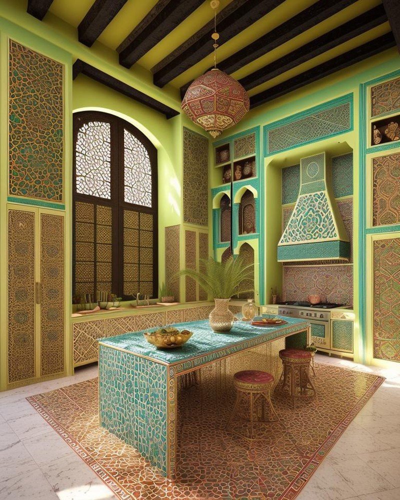
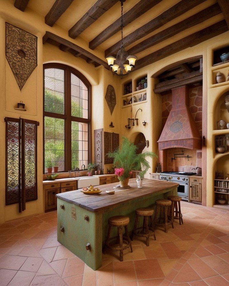
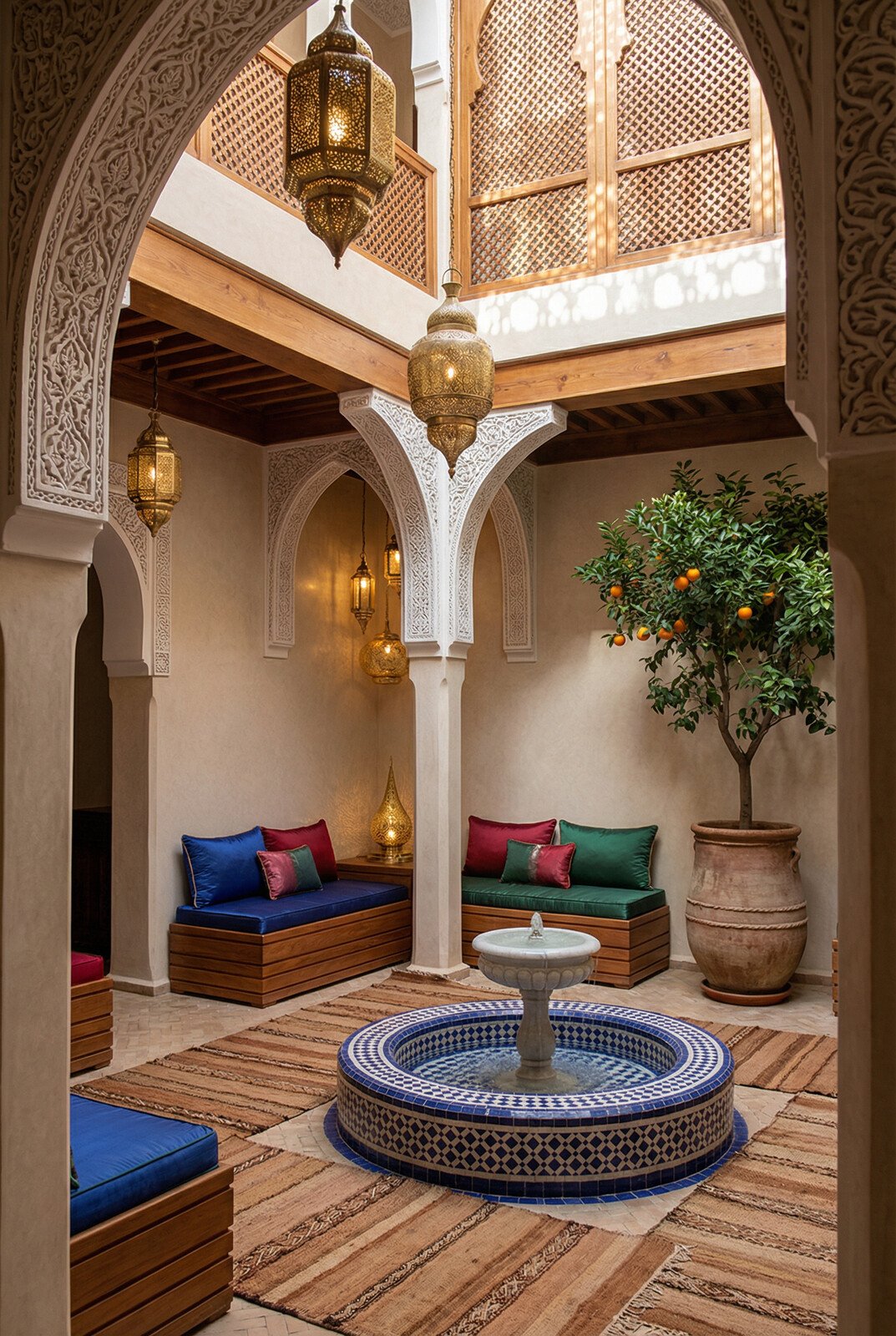
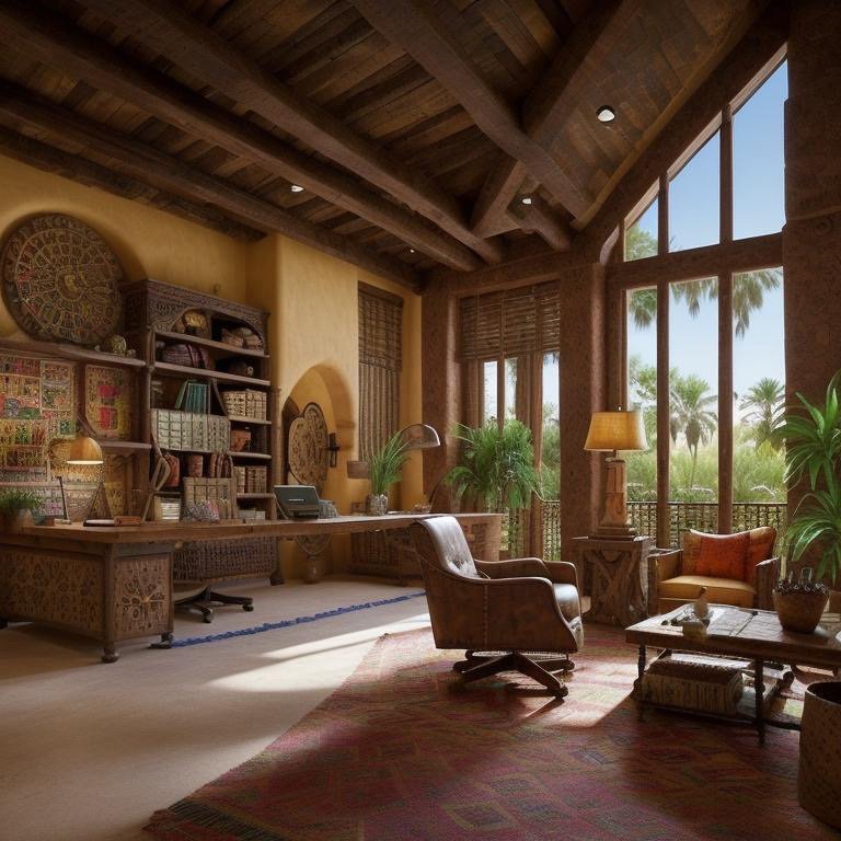
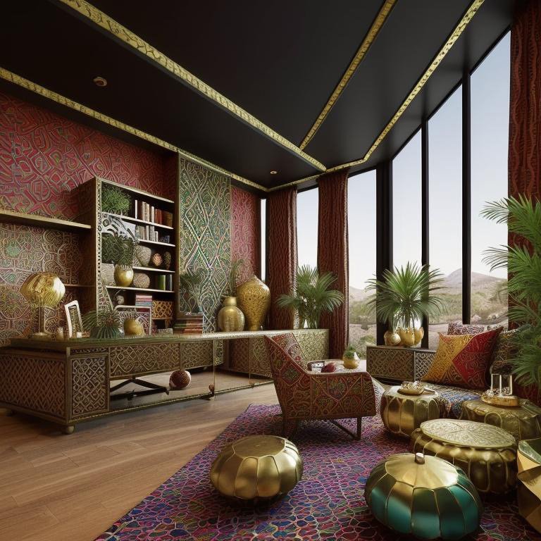
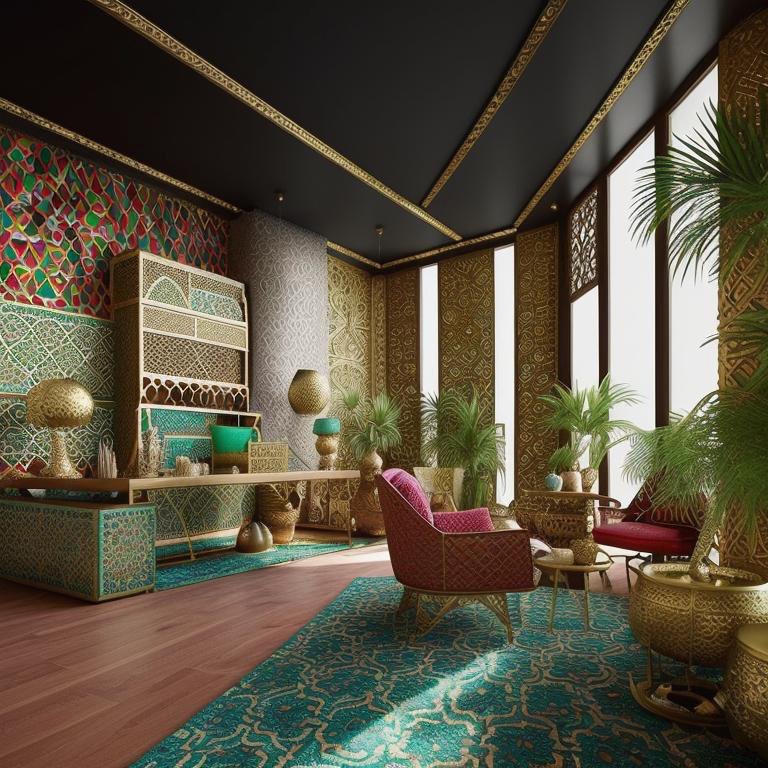
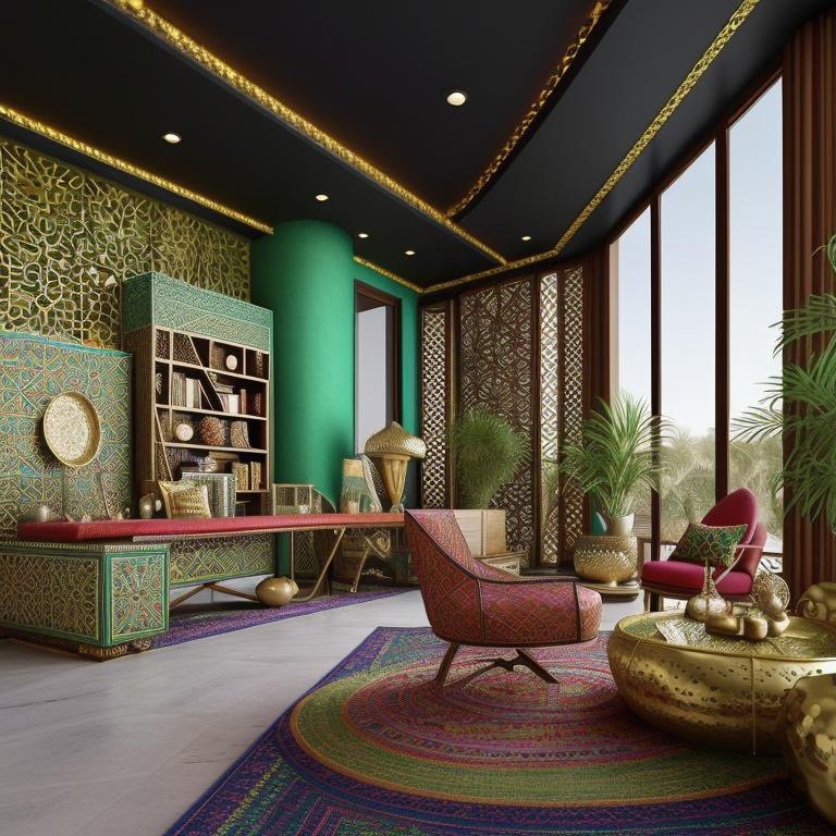
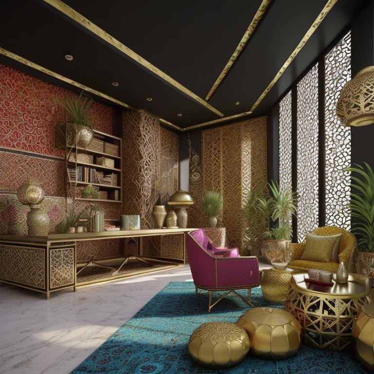
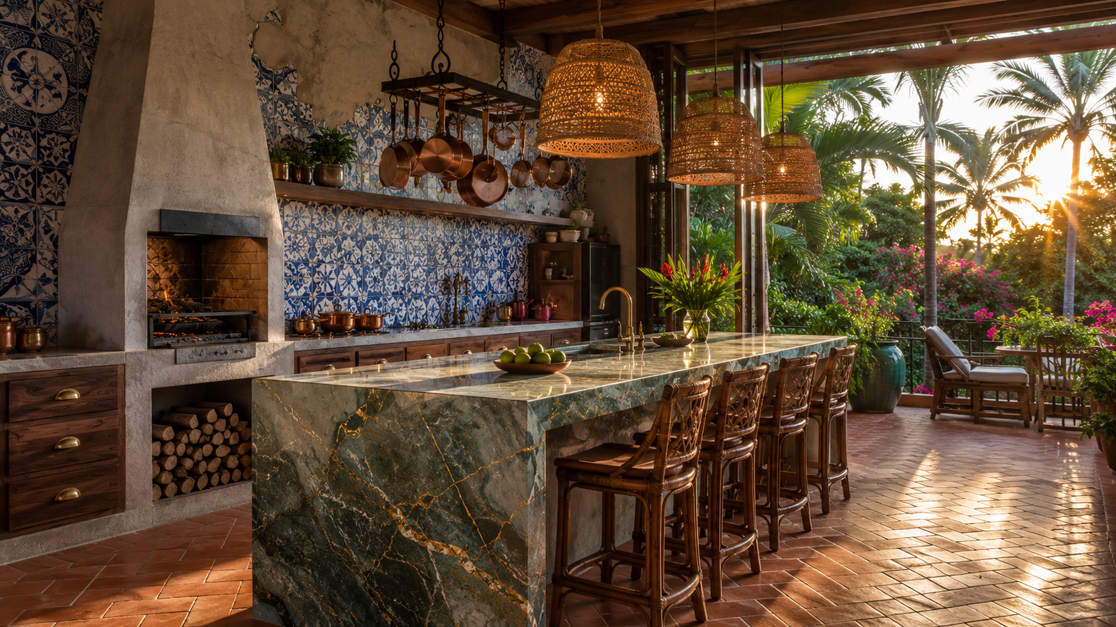
    Middle Eastern Ceremonial Kitchens: Dubai and Riyadh’s Luxury Domestic Architecture

    In the Gulf region, kitchen design is undergoing rapid evolution, reflecting both traditional Islamic domestic architecture and contemporary global design trends. Traditional Islamic domestic architecture typically positioned kitchens as service spaces—efficient but not prominent. The harem (private family spaces) was organized around courtyards, with kitchens as functional support to this central gathering place.

    Contemporary high-end kitchens in Dubai and Riyadh are repositioning this relationship. The modern Gulf kitchen is increasingly understood as a luxury domestic space, designed with material richness and visual prominence comparable to living rooms. This represents a significant cultural shift—the assertion that the kitchen is not merely functional support but a space worthy of aesthetic investment and ceremonial attention.

    These contemporary Gulf kitchens often feature dramatic material statements: marble countertops, ornate cabinetry, integrated beverage systems with elaborate detailing, and architectural elements that command visual attention. The kitchen is positioned as a statement of sophisticated taste and material investment. Importantly, these kitchens are often situated where they are visually integrated with entertaining spaces—reflecting the reality that in contemporary Gulf culture, the kitchen is no longer hidden but is integrated into the social presentation of the home.

    The Role of AI in Translating Cultural Kitchen Identity

    What Cinematic Intelligence™ modeling enables is the capacity to design kitchens that honor these distinct global and cultural approaches while adapting them to contemporary technology, regulatory environments, and individual client preferences. An AI-assisted design engine can maintain the philosophical coherence of a Tokyo kitchen-as-ethics while incorporating contemporary appliance technology. It can achieve the American kitchen’s performative openness while preserving the spatial separation necessary for certain cooking traditions. It can bring the material richness of Gulf luxury aesthetics to a European market while respecting different understandings of domestic privacy and family structure.

    This is not merely about applying superficial cultural references. It is about understanding the underlying spatial logic, material principles, and philosophical frameworks that govern distinct regional approaches, then orchestrating these principles with new technologies and contemporary functional requirements.

    The Kitchen as Articulation of National Values

    These global case studies reveal something fundamental: the kitchen is not culturally neutral. Each region’s dominant kitchen type articulates distinct values about family, work, nourishment, beauty, and the role of the home in social life.

    The Italian sculptural kitchen asserts that material and form are worthy of artistic attention in quotidian domestic space. The Japanese kitchen embodies philosophical principles of clarity, craft, and ethical practice. The American kitchen claims that cooking is entertainment, that functional beauty is performative, that the home is a stage. The Gulf kitchen asserts that domestic luxury is not merely acceptable but aspirational, that material richness declares cultural identity and social position.

    None of these approaches is universally correct. Each is culturally specific, rooted in particular histories and values. The sophistication lies in understanding what each approach expresses, what values it encodes, and how those values might be adapted, combined, or transformed to create kitchens that honor both global design principles and local or personal cultural identity.

    Toward Global Kitchen Literacy

    The future of kitchen design lies in moving beyond the assumption that contemporary minimalism or American open-plan kitchens represent universal ideals. Instead, architects and designers should develop literacy in global kitchen traditions, understanding the spatial logic, material principles, and philosophical frameworks that govern distinct regional approaches.

    This deeper literacy allows for more sophisticated design—kitchens that can honor cultural identity while embracing contemporary technology, that can learn from global traditions while remaining responsive to particular place and circumstance. It moves kitchen design from applied styling toward genuine cultural expression, from trend-chasing toward grounded architectural thinking.

    The Vervaine Estate case studies—spanning European, Asian, American, and Middle Eastern approaches—demonstrate that when architects and designers engage deeply with cultural kitchen traditions, when they understand that the kitchen is not merely functional but philosophical, the result is a domestic space of extraordinary richness. The kitchen becomes what it has always been meant to be: a room where culture is daily performed, where the work of sustenance becomes the expression of identity, beauty, and belonging.

  • Kitchens Reimagined: Eight Cinematic Journeys Into the Heart of the Home

    Kitchens Reimagined: Eight Cinematic Journeys Into the Heart of the Home

    Eight Cinematic Expressions of Domestic Culture

    The kitchen is the space where culture becomes daily practice. It is where ingredients—themselves often chosen for cultural significance—are transformed into sustenance and ceremony. More than any other room in the home, the kitchen embodies what it means to belong to a particular place, a particular tradition, a particular way of understanding nourishment and family.

    Yet kitchens are rarely designed with attention to these cultural dimensions. They are often treated as generic utility spaces—optimized for workflow, equipped with standardized appliances, finished in commercially safe materials and colors. This approach abandons what could be the kitchen’s most profound function: the daily performance of cultural identity.

    The Vervaine Estate’s eight additional kitchen transformations—beyond the ten documented in the primary kitchen odyssey—represent a deliberate departure from this generic paradigm. Each expression was designed not to maximize functionality alone, but to honor the cultural logic embedded in specific culinary traditions and domestic practices. Cinematic Intelligence™ modeling allowed designers to iterate across these distinct cultural languages, rendering each with sufficient richness that the spatial logic, material character, and psychological effect of each approach becomes legible.

    Scandinavian: The Ethics of Clarity

    The Scandinavian kitchen expresses a distinct philosophy: restraint, functionality, and the celebration of natural materials in their most honest form. Light wood—perhaps white-stained oak or birch—covers cabinetry. Countertops are natural stone or solid wood, chosen for durability and aging character. Hardware is minimal, integrated seamlessly. The material palette is deliberately limited: natural wood tones, whites, warm grays. The critical element is light. The Scandinavian kitchen prioritizes natural illumination, with generous windows and careful placement of artificial light that mimics daylight color temperature.

    The ritual embedded in this expression is efficiency without waste, beauty without ornament, functionality elevated to philosophical principle. The kitchen is not a stage for culinary performance. It is a workspace designed for clarity and ease. Every element serves a purpose. Nothing is merely decorative. Yet through this restraint, beauty emerges—the warmth of wood, the precision of joinery, the subtle play of light on natural surfaces.

    Moroccan: Sensory Abundance and Spice Culture

    The Moroccan kitchen celebrates sensory richness and the complex spice-forward traditions of North African cuisine. Zellige tilework—hand-cut geometric patterns in jewel tones—covers walls and possibly floors. These tiles are often custom-made, each piece slightly irregular, creating visual dynamism and the aesthetic of traditional craftsmanship. Cabinetry features carved wood details, possibly cedar or argan wood. Brass or copper fixtures and hardware introduce gleaming accents. The color palette is rich: deep blues, teals, burnt oranges, warm golds.

    This kitchen celebrates the ingredients themselves—spices, aromatics, the layered flavors of Moroccan cuisine. Open shelving displays jars of saffron, dried roses, cinnamon sticks, dried chilies—transforming raw materials into visual elements. The kitchen becomes a gallery of ingredients, a space where the sensory and culinary dimensions of food are inseparable from its visual presentation.

    Japanese Zen: Precision and Seasonal Simplicity

    The Japanese Zen kitchen strips cooking to its essential gestures. Cabinetry is minimalist, often featuring open shelving that displays only essential tools—knives, a few ceramic bowls, perhaps a cutting board. Materials are natural: hinoki wood, stone, ceramic. The color palette is monochromatic or near-monochromatic: grays, blacks, warm neutrals. The workspace features clean lines and careful proportions. Lighting is precise and controlled, positioned to focus on the work surface.

    Japanese cuisine—from kaiseki fine dining to home cooking—is predicated on respect for ingredients in their most fundamental form. The kitchen architecture reflects this philosophy. Every element serves the cook’s encounter with raw materials. The beauty emerges from simplicity, precision, and the honest expression of materials.

    Gothic Revival: Historical Grandeur and Narrative

    Gothic Revival draws on medieval and Victorian architectural language, translating it into contemporary domestic space. Cabinetry features pointed arch details, possibly hand-carved woodwork. Walls might incorporate stone or expose timber beaming. Lighting arrives via statement fixtures inspired by historical forms—perhaps wrought iron sconces or a dramatic pendant. The color palette is darker and richer: deep greens, burgundies, charcoal, possibly with gilt accents. Tile work or mosaic details add narrative richness.

    This approach treats the kitchen as a historical narrative space. It asserts that domestic life has depth, tradition, and connection to historical continuity. The kitchen becomes a room where the past is not rejected but honored, where architectural forms from previous eras are understood as repositories of meaning and beauty worthy of contemporary adoption.

    Chalet: Mountain Vernacular and Hearth Culture

    The Chalet kitchen emphasizes the material and spatial logic of Alpine vernacular architecture. Heavy timber construction—substantial wooden posts and beams—becomes visible structural language. Stone or large-format tile flooring establishes a grounded base. Cabinetry is often darker wood, possibly stained or left in natural color. A central feature—perhaps a large stone or brick cooking surface, a warming hearth-like element—anchors the space. Lighting is warm and layered, possibly featuring open flames (candles or even a small hearth fire, if circumstances permit).

    The Chalet kitchen speaks to a particular cultural understanding of food preparation: not as specialized activity isolated from family life, but as a gathering point. The hearth is real or symbolic, but its presence asserts that cooking is a communal ritual where family and guests congregate, where warmth and nourishment are literally and figuratively generated.

    Bohemian: Eclecticism and Personal Narrative

    The Bohemian kitchen celebrates personal expression and the eclectic accumulation of objects and materials chosen for their emotional resonance rather than stylistic coherence. Cabinetry might combine painted wood with open shelving displaying collected ceramics, textiles, and found objects. Walls might feature wallpaper in bold patterns, painted murals, or mixed finishes. Lighting is non-uniform—perhaps a vintage chandelier alongside contemporary pendants and string lights. The color palette is rich and varied: earth tones, jewel tones, possibly pops of bright color.

    This kitchen is unabashedly personal. It is filled with meaning-bearing objects accumulated through travel, inheritance, or personal discovery. The kitchen becomes a gallery of the inhabitant’s aesthetics, values, and experiences. Every object tells a story. The space is intentionally imperfect, resistant to commercial standardization, deliberately idiosyncratic.

    Bauhaus: Form Follows Function, Elevated

    Bauhaus design philosophy—that form follows function and that beauty emerges from honest expression of materials and purpose—translates into a kitchen of extraordinary clarity. Cabinetry features geometric forms, handles-free doors (or minimal hardware), smooth surfaces. Materials are primary: natural wood veneer, polished metal, possibly concrete or steel. The color palette is restrained: whites, grays, natural wood tones. Every design element serves a functional purpose. Nothing is merely decorative. Yet through this discipline, a powerful aesthetic emerges—the beauty of proportion, clarity, and purposeful design.

    The Bauhaus kitchen reflects a democratic ideal: good design should be accessible, not exclusive. The space is legible, efficient, and beautiful without relying on ornament or expensive materials. The beauty is in the thinking, in the clarity of proportion and function.

    The Kitchen as Cultural Text

    These eight expressions—added to the original ten—represent not a comprehensive taxonomy of global kitchen design but rather a demonstration of a fundamental principle: kitchens are not culturally neutral spaces. They embody the values, aesthetics, and spatial logic of particular traditions. A Scandinavian kitchen embodies different principles than a Moroccan kitchen. A Japanese Zen kitchen articulates different understanding of space and function than a Gothic Revival kitchen.

    The design methodology that enabled these transformations—Cinematic Intelligence rendering with computational iteration across multiplicity of forms—allows architects to render these distinct cultural expressions with sufficient fidelity that clients and designers can inhabit each space imaginatively, understanding not merely its appearance but its underlying logic, its material honesty, its psychological and cultural significance.

    Toward Culturally Authentic Design

    In an era of globalized commerce and standardized design solutions, the capacity to design kitchens—and indeed all domestic spaces—that honor cultural specificity becomes increasingly valuable. Not as tourism or superficial decoration, but as genuine engagement with the spatial and material logic embedded in particular culinary and domestic traditions.

    The kitchen remains what it has always been: the room where daily survival transforms into culture, where ingredients become nourishment, where ritual and sustenance are inseparable. The Vervaine Estate’s eighteen kitchen expressions demonstrate that when design methodology honors this depth—when architects engage not merely with ergonomic efficiency but with the cultural dimensions of domestic life—the result is a space of extraordinary power. The kitchen becomes not merely functional but meaningful, a daily performance of identity, tradition, and belonging.

    Bauhaus kitchen with geometric precision and monochrome palette

    Bohemian kitchen with eclectic textures and warm layered materials

    Chalet kitchen with rough-hewn timber and mountain warmth

    Gothic Revival kitchen with vaulted arches and dark timber

    Greek Revival kitchen with classical columns and pale stone

    Japanese Zen kitchen with tatami undertones and shoji panels

    Moroccan kitchen with zellige tile and jewel-tone mosaics

    Scandinavian kitchen with pale birch and maximized natural light

  • The Bathing Rooms: Ten Transformations in Stillness

    The Bathing Rooms: Ten Transformations in Stillness

    Water, Ritual, and the Grammar of Stillness

    The bathing room occupies a unique position in domestic architecture. It is perhaps the only space explicitly dedicated to solitude, to the transition between states, to the body’s meeting with water. Across centuries and cultures, bathing has been understood not merely as hygiene but as ritual—a structured encounter with elemental forces that transforms the bather psychologically, spiritually, and physically.

    The Vervaine Estate’s ten bathroom transformations begin from this recognition: the bath is a ritualistic space. The design brief is therefore not merely functional but ceremonial. How does a bathing room invite stillness? How does it honor the particular cultural understanding of what bathing means? How can architectural form amplify the psychological and sensory dimensions of the bathing ritual?

    Across ten distinct design languages, the Vervaine bathrooms demonstrate that the answer to these questions shifts radically depending on cultural context. Water means different things in different traditions. Ritual takes different forms. Stillness is cultivated through different architectural logics.

    Traditional: Restraint and Formality

    The Traditional bathroom embraces historical protocols of formal domestic space. Fixtures are classical in proportion—pedestal sinks, freestanding bathtubs with period-appropriate hardware, mirror frames in wood or brass. Walls feature wainscoting or tile work in conservative patterns. Lighting is soft and diffused, often via sconces flanking the mirror. The material palette is restrained: white or cream tile, polished wood, brass accents. The overall impression is of sanctuary—a room of stillness and order, where the body’s privacy is respected through architectural formality and careful material curation. The ritual here is one of restraint, of private ceremony within a formal envelope.

    Spanish Colonial: Warmth and Earthiness

    Spanish Colonial introduces material warmth and the sensory language of Mediterranean tradition. Expect hand-glazed tile work, possibly in ochre, terracotta, or deep blue tones. The bathtub may be a custom form, possibly sunken, carved from stone or tiled. Walls showcase terracotta or rustic plaster finishes. Copper fixtures, patinated or bright, introduce gleaming warmth. Arched niches carved into walls create places for candles, ritual objects, or purely compositional purposes. Flooring is likely saltillo tile or similarly textured material. The lighting is warm and layered—perhaps candle sconces alongside subtle electric light. The ritual here is one of sensory immersion—water, warmth, the texture of earthen materials, the scent of copper and clay.

    Rustic: Elemental Authenticity

    Rustic strips away formality in favor of elemental honesty. Stone walls, possibly rough-hewn or left in natural state, become primary architectural elements. The bathtub may be a simple form, possibly carved from a single piece of stone, or lined with slate. Fixtures are minimal, possibly visible pipes and simple valve mechanisms. Flooring is likely large-format natural stone, possibly unpolished or only lightly finished. Lighting is minimal—perhaps simple sconces or openings to allow natural light. There is deliberate primitivism here: the ritual is reduced to its essence. The encounter is with water, stone, and elemental form. Comfort is present but secondary to authenticity of material and form.

    Japanese Zen: The Philosophy of Emptiness

    Japanese Zen introduces a fundamentally different spatial logic. The bathroom becomes a meditation space. The soaking tub is central—often a small, deep form carved from hinoki wood, positioned to command spatial focus. Materials are natural and restrained: wood, stone, possibly ceramic or concrete. The color palette is monochromatic or near-monochromatic: grays, blacks, warm taupes. Lighting is carefully controlled, possibly featuring shoji screens or adjustable diffusion that allows the quality of light to shift. The ritual here is one of deliberate slowness, of water temperature as meditation, of the body’s immersion as a transition into stillness. Every element serves the purpose of cultivating what Zen philosophy calls “emptiness”—the removal of distraction, the achievement of presence.

    Chic Contemporary: Purity and Geometry

    Chic Contemporary abandons historical reference for precision and material purity. The bathtub is likely a sculptural form—possibly a custom rectangular soaking bath in white lacquer or matte finish. Walls are probably finished in polished plaster or seamless concrete. The vanity is minimal, possibly a single slab of white oak or light marble. Fixtures are contemporary in proportion—often handles-free, integrated into the wall, geometric in form. Lighting is integrated—possibly LED strips or recessed fixtures that disappear into the architecture. The material palette is restrained: whites, grays, natural wood tones. The ritual here is one of clean lines and visual clarity—the room itself becomes meditative through its purity of form and restraint from decoration.

    Brutalist: Monumental Materiality

    Brutalism positions the bathroom as sculptural statement. Concrete walls, possibly exposed aggregate or finished in a way that celebrates the material’s weight, form the primary surface. The bathtub may be carved from or built atop a concrete mass, creating an integrated monumental form. Fixtures are minimal—possibly just visible pipes and simple hardware, leaving functional systems exposed. Flooring is polished concrete. Lighting is deliberately minimal, positioned to emphasize shadow and form. The ritual here is not comfort but confrontation—the bather is immersed in a space that asserts its own materiality, that positions the body within a larger architectural presence. Comfort is subordinate to the space’s formal authority.

    Moroccan: Sensory Abundance and Water Play

    Moroccan design language embraces ornamental richness and the sensory celebration of water. Tiled surfaces feature intricate geometric or floral patterns, often hand-glazed in jewel tones—deep blues, teals, warm ochres. The bathing room becomes a riad—a central space from which water flows, where multiple bathing zones exist in proximity. Carved plaster details, possibly incorporating zellige tilework, create visual richness. Brass or copper fixtures are ornate, catching and reflecting light. Lighting is layered and warm—possibly including arched niches where candles can be positioned. The floor may feature a floor drain allowing water to move throughout the space. The ritual here is one of sensory immersion and abundance—water not confined to the tub but celebrated throughout the space, tiles and surfaces creating an environment that delights the eye while supporting the body’s encounter with water.

    Bohemian: Eclecticism and Layered Meaning

    Bohemian abandons stylistic purity for eclectic layering. Expect a mix of vintage and contemporary elements, possibly a vintage claw-foot tub alongside modern fixtures, textiles introducing color and warmth, mirrors in varied frames, shelving displaying collected objects. Walls might feature wallpaper, paint in unexpected colors, or mixed materials. Lighting is non-uniform—perhaps a statement chandelier, vintage sconces, and diffused natural light. The color palette is rich and varied: jewel tones, metallics, earth tones in close proximity. The ritual here is one of personal expression and comfort—the space is filled with meaning-bearing objects, with colors and forms chosen for their emotional resonance rather than stylistic coherence. The bath becomes a room of personal sanctuary, reflecting the inhabitant’s aesthetics and values.

    Rococo: Ornamental Opulence

    Rococo celebrates ornamental abundance and curved forms. The bathroom features elaborate mirror frames, possibly gilded or decorated with carved details. The bathtub is a sculptural form, possibly featuring curved pedestal supports or integrated within a tiled surround with curved contours. Walls showcase wallpaper with delicate patterns, or tiled surfaces featuring rococo-inspired curves and flourishes. Lighting arrives via ornate fixtures—possibly a statement chandelier, wall sconces with decorative elements. The color palette is soft and warm: creams, pale blues, rose tones, gold accents. Details matter: possibly marble surfaces, delicate hardware, carefully curated accessories. The ritual here is one of luxurious indulgence—the space asserts that bathing is an occasion, that the body’s comfort and the eye’s pleasure are valid architectural concerns worthy of ornamental expression.

    Scandinavian: Light and Minimalist Warmth

    Scandinavian design language combines minimalism with warmth and accessibility. The bathroom features clean lines, minimal ornamentation, and a restrained material palette: white, light grays, warm wood tones. The bathtub is likely a simple, functional form. Fixtures are contemporary and minimal. Walls are probably painted white or finished in light plaster. The critical element is light—the space is designed to maximize natural light, with generous windows or skylights, or carefully designed artificial lighting that mimics natural illumination. Wood elements introduce warmth without ornament. The ritual here is one of sustainable clarity—the space is legible, honest, and welcoming. Comfort is present but achieved through proportion and light rather than ornamental richness.

    Water as Cultural Expression

    What these ten bathrooms reveal is that water, ritual, and the bathing body are not culturally neutral. The Japanese Zen bath speaks to meditation and self-cultivation. The Moroccan bath celebrates sensory abundance. The Scandinavian bath prioritizes clarity and light. The Rococo bath indulges in ornamental opulence.

    Each design language articulates a different philosophy about what the bathing ritual means, what the body requires, what the architectural environment should provide. Through Cinematic Intelligence™ modeling, these distinct cultural languages were rendered with sufficient fidelity that the spatial logic of each becomes legible—not as aesthetic choices applied to neutral space, but as coherent systems that honor the cultural meanings embedded in bathing traditions.

    Toward Ritualistic Domesticity

    The Vervaine Estate bathrooms demonstrate that architectural design can honor the deeper dimensions of domestic ritual. The bathing room need not be merely functional. It can be a space of cultural expression, of wellness cultivation, of transition and transformation. When design methodology honors the ritualistic dimensions of bathing—the encounter with water, the cultivation of stillness, the expression of cultural identity—the result is a domestic space that supports human flourishing in ways that pure functionality cannot achieve.

    Brutalist bathroom with concrete walls and monolithic tub

    Chic Contemporary bathroom with honed marble and bronze fixtures

    California Casual bathroom with natural light and relaxed materials

    Farmhouse bathroom with weathered surfaces and enamel tub

    Industrial bathroom with exposed pipes and concrete floor

    Mid-Century Modern bathroom with clean lines and teak accents

    Retro bathroom with mosaic tile and vintage fixtures

    Rustic bathroom with stone walls and slate-lined tub

    Spanish Colonial bathroom with terracotta and wrought iron

    Traditional bathroom with pedestal fixtures and wainscoting

  • The Kitchen Reimagined: An Odyssey of Style

    The Kitchen Reimagined: An Odyssey of Style

    A Single Island, Ten Worlds

    The Vervaine Estate kitchens begin with a constant: a marble island. Approximately twelve meters in length, featuring quarried Italian Carrara, the island anchors each kitchen as an immovable center. Around this fixed point, the Vervaine Estate transformations unfold—ten distinct design languages, each one an autonomous world, yet each one calibrated around the same material foundation.

    This constraint is deliberate. It mirrors a fundamental principle of architectural pedagogy: how do you honor material integrity while allowing for radical formal variation? How does a single architectural element—in this case, the island—flex to accommodate entirely different cultural grammars, historical references, and aesthetic logics?

    The answer lies in computational design. Cinematic Intelligence™ enables iterative translation of the same functional brief—a kitchen island serving as workspace, gathering point, and visual anchor—across twenty-two distinct design languages. The marble remains. Everything else is fluid.

    Traditional: Symmetry as Order

    In the Traditional iteration, the marble island becomes a formal statement. Cabinetry beneath features symmetrical paneling, classical proportions reminiscent of nineteenth-century European domestic architecture. The perimeter kitchen abandons contemporary minimalism in favor of crown molding, Shaker-inspired cabinetry doors, and brass hardware that evokes historical craftsmanship. Lighting arrives via a classical chandelier—not as decoration but as a compositional anchor. The kitchen speaks a language of temporal continuity, of inherited design logic carried forward through material and proportion.

    Spanish Colonial: Warmth and Materiality

    The Spanish Colonial expression introduces material richness. Terracotta tile floors, hand-glazed and slightly irregular, establish a warm base. The island’s marble surface takes on new significance—now a cooling counterpoint to warm earth tones. Cabinetry shifts toward darker woods, possibly walnut or reclaimed oak. Arched niches in the perimeter walls suggest historical stonework. Copper hardware replaces brass. The lighting becomes integral—wrought iron sconces appear at strategic intervals. The kitchen feels excavated, as though layers of historical use have accumulated in its materials and forms.

    Rustic: The Poetry of Imperfection

    Rustic dissolves architectural formality in favor of textured materials and weathered surfaces. The marble island gains company from hand-forged iron legs, possibly salvaged or custom-made to appear so. Perimeter cabinetry features open shelving, allowing ceramics, copper cookware, and glass vessels to become visual elements. Stone walls, possibly rough-hewn or left raw, replace drywall. The floor is likely flagstone or weathered tile. Lighting is functional and minimal—perhaps simple pendant fixtures or even suspended bare bulbs. This kitchen privileges authenticity of material over stylistic coherence. The imperfections are the point.

    Retro: Nostalgia as Form

    The Retro expression introduces mid-twentieth-century visual language. Expect chrome accents, perhaps a vintage-inspired range, mosaic tile backsplash in jewel tones or monochromatic patterns. The marble island may feature chrome base supports, consciously anachronistic. Cabinetry could include aluminum-frame details, or glass-front cabinets. Lighting shifts toward geometric forms—perhaps a semi-flush fixture with clean lines, or vintage pendant lights with colored glass. The palette is curated: no more than three or four colors, but each one chosen for its nostalgic resonance. This is a kitchen designed to evoke a specific moment in time, preserved as architecture.

    Mid-Century Modern: Reductive Elegance

    Mid-Century Modern strips away ornament in favor of pure form and proportion. The marble island gains support from tapered wooden legs, likely walnut or teak. Cabinetry is austere—flat-panel doors, minimal hardware, possibly a mix of cabinet and open shelving. Materials are carefully chosen: wood, metal, glass, and the marble surface itself become the only necessary decoration. Lighting is sculptural—perhaps a statement pendant or a series of precise downlights. The perimeter kitchen maintains minimal wall decoration. This language speaks through proportion and material authenticity rather than applied ornament.

    Industrial: Raw Materiality and Function

    Industrial embraces the authentic language of manufacturing spaces. The marble island is now accompanied by stainless steel prep surfaces, perhaps visible mechanical fasteners. Cabinetry is minimal—possibly custom metal shelving or open racks displaying cookware. Flooring is likely polished concrete or utilitarian tile. Walls remain raw brick or painted industrial-grade plaster. Lighting appears as exposed bare bulbs or industrial-style pendant fixtures with metal shades. Mechanical systems—ductwork, pipes—remain visible rather than concealed. The kitchen is legible as a machine for cooking, stripped of pretense, celebrating the logic of its own functioning.

    Farmhouse: Cultivated Rusticity

    Farmhouse differs from Rustic through intentional curation. While Rustic privileges authenticity of wear, Farmhouse is a more composed aesthetic—texture and warmth carefully orchestrated. The marble island may feature a wood apron skirt in a light neutral tone. Cabinetry is likely painted wood, perhaps cream, sage green, or soft white. Open shelving displays selected pottery, vintage glassware. Flooring is often engineered wood or ceramic tile designed to resemble traditional materials. Lighting arrives via vintage-inspired fixtures, but these are new, carefully selected for their ability to evoke historical warmth without actual deterioration. The overall effect is nostalgic comfort, a designed pastiche of agrarian simplicity.

    Chic Contemporary: Precision and Minimalism

    Chic Contemporary abandons historical reference entirely in favor of precision engineering and material purity. The marble island features a cantilevered base or minimal supporting structure—perhaps a sculptural steel frame. Cabinetry is handled-less, smooth surfaces in matte finishes or high-gloss lacquer. Materials are primary: marble, natural wood veneer, concrete, polished steel. The perimeter kitchen is similarly austere. Lighting is integrated—perhaps LED strips or recessed fixtures that become invisible, allowing the space itself to be the visual subject. Color is restrained: whites, grays, warm neutrals. The kitchen is a study in proportion and material honesty, unadorned and precise.

    California Casual: Lightness and Openness

    California Casual prioritizes visual lightness and integration with adjacent spaces. The marble island may feature an open base, allowing sightlines to continue beneath and through the kitchen. Cabinetry is likely light-colored, possibly white or pale wood, with glass-front options. The perimeter kitchen opens generously to dining or living spaces—no visual barriers. Materials are bright: whitewashed wood, light marble, chrome or stainless details. Lighting is soft and diffused, possibly through skylights or generous windows. The overall impression is of a space that breathes, that allows the kitchen to integrate with the rest of the home rather than assert itself as a separate domain.

    Brutalist: Monumental Severity

    Brutalism transforms the kitchen into a sculptural gesture. The marble island becomes a monumental form, possibly supported by concrete masses or heavy timber elements. Cabinetry is minimal and often integrated into concrete walls. Flooring is polished concrete. Lighting is deliberately minimal—perhaps a single statement fixture, or lights positioned to emphasize shadow and form. Materials celebrate their own weight and substance: concrete, stone, heavy timber, metal. The kitchen is not primarily functional in its visual presentation—it is an architectural statement, a declaration that the space exists as form and material, not as a container for appliances.

    The Multiplicity of Form

    These ten expressions reveal a fundamental truth: the kitchen is not a fixed typology. It is a field of possibilities. The marble island remains constant—a variable held steady to make visible the transformation possible around it. But the transformation is total. The spatial logic shifts. The material palette transforms. The relationship to light, scale, and compositional hierarchy changes completely.

    This fluidity was possible through Cinematic Intelligence modeling—the capacity to iterate rapidly across design languages, to test multiple expressions of the same functional brief, to render each with sufficient richness that stakeholders can inhabit the space imaginatively, understanding not merely its appearance but its spatial logic, its material character, its psychological effect.

    Design Language as Translation

    What emerges is a clear principle: design language is not decoration applied to a neutral spatial container. It is translation—a way of articulating spatial relationships, material choices, formal hierarchies, and psychological effects through a particular cultural and historical grammar. The Traditional kitchen understands order through symmetry and historical proportion. The Industrial kitchen reveals function as its own aesthetic. The Brutalist kitchen positions material weight as meaning.

    Each expression serves the same functional brief: prepare food, gather, work at counter height. Yet each one does so through entirely different architectural languages. The marble island, constant and immovable, becomes a measure of this multiplicity. Around this fixed point, the Vervaine Estate kitchens demonstrate that domestic architecture need not choose between functional integrity and cultural expression. Through rigorous design methodology and computational visualization, both can coexist, each one authentic, each one complete.

    Brutalist kitchen with concrete island and exposed timber beams

    California Casual kitchen with light marble and open sightlines

    Chic Contemporary kitchen with minimal cabinetry and clean geometry

    Farmhouse kitchen with weathered wood and ceramic accents

    Industrial kitchen with steel columns and exposed ductwork

    Mid-Century Modern kitchen with walnut cabinetry and sculptural pendant

    Retro kitchen with chrome accents and jewel-tone palette

    Rustic kitchen with stone walls and hand-forged iron details

    Spanish Colonial kitchen with terracotta tile and copper hoods

    Traditional kitchen with classical chandelier and carved marble island

  • Rustic, Recomposed: From Clean Modern Shell to Mountain-Grade Warmth — Room by Room

    Rustic, Recomposed: From Clean Modern Shell to Mountain-Grade Warmth — Room by Room

    Rustic interior redesign

    Rustic design is the easiest style to fake and the hardest one to get right. Anyone can slap reclaimed planks on a wall and call it “warm.” But real rustic—the kind that feels earned—comes from proportion, mass, texture, and the quiet discipline of knowing when to stop. It requires a language, not a palette. It demands restraint more than abundance.

    That’s why this redesign is worth your attention.

    The original home, as presented in the base renders, carried a modern clarity that was architecturally unassailable: wide glazing, clean volumes, smooth planes, open sightlines. Beautiful—crystalline, even. Just not rustic. But here’s what matters: Cinematic Intelligence™ didn’t fight the structure. It re-authored the interior language so the same architectural vessel could speak in timber, stone, iron, and atmosphere. The building didn’t change. The dialogue did.

    Below is exactly what shifted—space by space—and the architectural reasoning behind each decision. This is how a modernist shell becomes a place that feels earned.

    The Great Room: From Gallery-Luxury to Anchored Living

    Original condition: The space read as modern openness incarnate. Light walls, minimal interruption, floating furniture arrangements, the kind of geometric purity that photographs brilliantly but sometimes feels like a gallery rather than a home.

    Rustic interior kitchen details

    The transformation: Cinematic Intelligence anchored this room—and we mean that literally and visually. Mass and gravity became the design drivers.

    The fireplace wall became the room’s new center of gravity. Instead of a sleek insert that reads as a technical amenity, the hearth was conceived as stonework with genuine weight and presence. Rustic architecture isn’t decoration applied to a space; it’s structure you can feel in your bones. The stone doesn’t whisper—it speaks. It gives the room a spine, and every other element now defers to that geometry.

    The ceiling shifted into heavy timber language. Not “wood as surface,” but wood as a load-bearing architectural gesture. Planks run with intention, anchored by posts that read purposeful. The overhead warmth—that saturated amber—offsets the coolness of the extensive glazing. Without this, the room would remain a modernist gallery. With it, the room becomes protective.

    Furniture behavior changed radically. Seating stopped floating and started settling. Lower profiles, chunkier silhouettes, textiles that absorb light rather than reflect it. The object-based design logic of minimalism gave way to a textural, massed approach. That’s how rustic becomes genuinely comfortable without tipping into sloppy informality.

    Texture distribution followed a principle of restraint. The system didn’t over-texture everything—that’s how you get “ski lodge aesthetic.” Instead, character concentrated where the eye naturally rests: fireplace treatment, ceiling detail, key joinery moments. Secondary planes stayed quiet, allowing those focal moments to read with authority. That discipline is what separates a private estate from a themed interior.

    The Kitchen: Workshop-Heart Without Losing Refinement

    Original condition: Minimal luxury was on full display. Smooth cabinetry, integrated appliances, an island that read as a clean monolith. Technically perfect. Spatially inert.

    Heavy timber rustic kitchen with mountain and forest views

    The transformation: The kitchen was reconceived as the workshop-heart of the home—without surrendering architectural refinement.

    The island underwent radical translation. It traded slick minimalism for thick timber volume—a block that reads milled, not manufactured. The edges are squared and strong, not softened. The form communicates honesty. This is a work surface that’s been earned through use, not designed to look used.

    Cabinet behavior evolved. Upper storage became more grounded—less high-gloss sheen, more visible grain and texture. Open shelving appeared where it made functional sense, but deployed as a narrative of daily rituals rather than a trend gesture. The dish, the glass, the vessel—these become visual elements because they’re honest to how the house actually operates.

    Lighting logic avoided the most dangerous trap of rustic design: the wagon-wheel pendant. Fixtures remained warm and architectural—subtle pendant presence, enough to define zones without declaring “theme restaurant.” The warmth came from the color temperature and positioning, not from novelty.

    Surface temperature became a critical variable. Countertops read cooler than the surrounding timber, creating contrast. This prevented the room from becoming a monolithic brown-on-brown cave. That temperature dialogue is what keeps the space estate-grade rather than period-authentic to the point of darkness.

    The Game Lounge: Rec Room Becomes Legacy Lounge

    Original condition: A polished, quiet modern leisure room. Almost hotel-like in its anonymity—comfortable, but without specific character or memory.

    Primary bedroom with sculptural timber ceiling

    The transformation: This space underwent the most conceptual shift. From “rec room” to “lodge-level lounge,” but tailored rather than theatrical.

    The ceiling plane deepened and warmed. That shift changes the acoustics of the room visually—it feels quieter, more intimate, more protective. Lower ceilings don’t just change proportion; they change how sound and light behave, which changes how the body experiences being in that space.

    Material cadence became rhythmic. Stone, timber, and leather formed a repeating pattern. Wood slats, stone segments, and metal accents created a visual pulse. This repetition gives the room coherence without monotony. Each material earns its presence through that dialogue.

    Furniture weight shifted fundamentally. Seating moved to heavier forms with softer textures—less showroom, more “stay awhile.” The objects in the room invite extended occupation rather than polite viewing. This is where the difference between contemporary design and rustic comfort becomes architectural rather than stylistic.

    The windows remained—glazing stayed extensive—but the interior now frames the landscape like a viewing gallery. Rustic architecture, when done with intelligence, doesn’t hide or diminish the natural world beyond the glass. It honors it. It makes the view part of the interior composition.

    The Primary Bedroom: Creating Sanctuary Through Enclosure

    Original condition: Minimal calm was the organizing principle. Smooth walls, a bed positioned as a platform object, a room conceived more like a spa than a sanctuary. Serene, but detached.

    Indoor-outdoor corridor with timber and stone

    The transformation: This is where Cinematic Intelligence engaged in genuine spatial psychology. A bedroom isn’t a gallery. It’s a place where vulnerability happens.

    The ceiling became a signature moment—curving, layered timber that reads hand-formed rather than installed. It’s not random texture or decorative flourish; it’s a crafted canopy. The overhead geometry changes how you feel when lying in bed looking up. That matters architecturally, not just aesthetically.

    The bed integration shifted from floating-sculpture positioning to anchored placement. Rustic bedrooms should feel held—as though the room is protecting the inhabitant, not displaying them. The bed became part of the spatial story rather than an object within it.

    Light management deployed warmth strategically. Pools of light appeared at the perimeter and in key corners. Rustic comfort doesn’t come from uniform brightness; it comes from shadow and glow, from the understanding that darkness and warmth together create genuine rest.

    The textile palette turned quieter and thicker—creams, taupes, softened browns without artificial “log cabin red.” These are the colors of earth and linen, not the colors of a period room. The cumulative effect makes the space feel protected rather than performed.

    The Long Glass Corridor: Museum Mode to Garden Walk

    Original condition: A sleek modern gallery corridor—linear, bright, architecturally pure. An uninterrupted runway of minimalist clarity.

    Final rustic interior composition

    The transformation: Cinematic Intelligence warmed the runway and made it feel lived rather than traversed.

    Timber overhead changed everything in a single move. Wood pulled the corridor out of museum mode into domestic architecture. The material language shifted from “transit space” to “passage through a dwelling.”

    Stone articulation replaced uniform flooring. Instead of one uninterrupted surface, the floor story broke into zones—a sequence rather than a tunnel. These material breaks create pauses in movement. They slow the eye. They make the corridor feel intentional rather than obligatory.

    Strategic greenery softened the transition between indoor and outdoor. The corridor became a garden walk rather than a gallery march. These planted moments blur the boundary between structure and landscape in a way that feels earned, not themed.

    Rustic lounge space with fireplace

    The Principle Behind the Practice

    What makes this redesign architecturally coherent isn’t that it applied a style to a structure. It’s that it identified the potential within the existing bones and re-authored the spatial language to unlock it. The modernist shell—with its clean volumes, its spatial generosity, its relationship to light and landscape—didn’t need to be destroyed. It needed to be spoken to in a different dialect.

    Rustic design, at its best, isn’t about materials. It’s about mass, restraint, and the honest expression of how spaces are actually inhabited. It’s about understanding that warmth comes not from color alone but from proportion, texture distribution, and the careful placement of focal points that make a room feel held rather than displayed.

    This redesign demonstrates what happens when a contemporary structural language meets rustic spatial thinking. The result isn’t a period room or a themed interior. It’s a mountain house that feels like it was built for living—deliberate, proportioned, and utterly grounded. The kind of space you don’t want to leave, not because it’s pretty, but because it feels like it knows who you are and makes room for that.

    That’s the difference between rustic surfaces and rustic architecture. And it’s the difference that makes a home.

  • California Casual, Rewritten

    California Casual, Rewritten

    There is a particular ease to California Casual that is often misunderstood. Too many observers mistake it for being unfinished, or worse, effortless in a manner that suggests carelessness. True California Casual is neither accidental nor negligent. It is disciplined restraint. It is confidence without performance. It is architecture and interior design that knows exactly what it is doing—and refuses to apologize for its choices.

    California Casual living room with ocean views, natural wood ceiling, and wicker seating

    The main living area dissolves boundaries between interior and exterior, anchored by low-profile seating and a naturally grounded palette.

    When one first steps into this residence through Cinematic Intelligence™, the sensation is immediate and profoundly physical. Not merely visual, but decidedly spatial. The air felt slower. The light didn’t rush inward; it drifted with intention. The architecture didn’t announce itself with gesture or spectacle—it invited you to sit, to pause, to remain longer than you had planned. The bones of the design speak quietly but with absolute conviction. That, in architectural terms, is the quiet brilliance of this design language.

    The Architecture: Calm with Backbone

    The structural foundation of this home is assertive without aggression. Clean lines frame the space, while generous openings dissolve the conventional boundary between interior and exterior. Glass here is not deployed as spectacle—it functions as permission. Permission for the landscape to participate fully in the lived experience.

    Concrete, wood, and soft mineral finishes establish a rhythm: solid, warm, breathable. The ceiling planes stretch generously overhead, never looming, never apologizing for their presence. One feels held by the space rather than dominated by it. This is California Casual at its most refined—a moment where modernist rigor relaxes its shoulders and permits warmth to emerge.

    California Casual bedroom with soft natural light and curved wood ceiling

    The Living Spaces: Where Time Loses Interest

    The main living area is the sort of room where schedules quietly dissolve into irrelevance. Low-profile seating anchors the space without demanding visual attention or imposing hierarchies. Upholstery is tactile, forgiving—conceived to be lived on, inhabited, rather than admired from a cautious distance. The palette remains intentionally grounded: sand, stone, weathered wood, sun-faded textiles in muted registers. Nothing shouts. Everything belongs.

    Through Cinematic Intelligence, the design team explored multiple sophisticated variations of this room—subtle shifts in material weight, light temperature, furniture composition, and spatial emphasis. What emerged with clarity is how resilient this design language proves to be. The space can shift warmer without losing restraint, lean more decisively modern without abandoning its California roots, or introduce coastal undertones without fragmenting its coherence. The room never breaks character. And that stability is not accident—it is the result of intelligent, foundational design work.

    California Casual interior with minimalist furnishings and natural light

    The Bedroom: Quiet Luxury Without Ceremony

    The bedroom may be the most revealing expression of this home’s philosophical commitment. Here, luxury abandons ornamentation entirely. It manifests instead as spatial generosity. It is silence. It is the way the bed appears to float just above the floor—grounded yet weightless. The wood ceiling curves gently overhead, creating an intimate enclosure without the psychologically compressive effect that often accompanies such gestures.

    Natural light arrives filtered and diffused, never harsh or demanding. The view beyond the glass becomes something like a moving artwork—shifting by hour, transforming across seasons—while the interior holds steady and constant. The refuge feels complete unto itself.

    In alternative design iterations generated through Cinematic Intelligence, this room adapted with particular grace: softer linens, subtly darker woods, refined adjustments to contrast and warmth. Each variation felt finished, coherent, and necessary—not experimental or provisional. That consistency is the hallmark of strong foundational design thinking.

    California Casual interior detail showing material refinement and spatial generosity

    The Entertaining Spaces: Casual, Not Careless

    California Casual excels within contexts that demand entertainment—and this residence demonstrates that mastery. The recreational lounge and shared spaces achieve a precise balance between playfulness and refinement. A billiards table sits confidently at the room’s center, present but not as novelty or decoration—rather as anchor, as gathering point. Lighting is deliberate yet relaxed: pendant forms softened, never sharp or unnecessarily architectural.

    What distinguished this approach was how Cinematic Intelligence enabled the team to test multiple emotional registers within the same architectural envelope. A slightly moodier palette—deeper tones, subdued light temperatures—transformed the space into an evening retreat, introspective and layered. A brighter configuration, by contrast, leaned toward daytime sociability, openness, and ease. The underlying structure supported both visions effortlessly, which speaks to the robustness of the foundational design.

    Here is where velocity and precision converge. These are not abstract concepts or design philosophies. They are actionable design decisions made visible and testable in minutes rather than months—a fundamental shift in how contemporary design practice unfolds.

    California Casual kitchen with natural wood cabinetry and honest material expression

    The Kitchen: Functional Poetry

    The kitchen is often where California Casual collapses under the weight of conflicting demands: functionality versus beauty, storage versus restraint, performance versus feeling. Not in this residence. This kitchen is restrained, intelligent, and beautifully proportioned in every dimension. Materials are honest without affectation: wood that shows grain and character, stone that displays patina and age, fixtures that perform their function without seeking applause or recognition.

    The island feels substantial yet approachable—a place to gather, work, and linger, not to perform or display. Cinematic Intelligence allowed exploration of variations in cabinetry tone, lighting warmth, and surface finish, revealing how even minor adjustments could recalibrate the emotional temperature of the room without compromising its identity or coherence. It is, in effect, a masterclass in controlled flexibility—the ability to shift mood and atmosphere while maintaining absolute design integrity.

    California Casual entertainment lounge with billiards table and ambient lighting

    Why This Moment Matters

    What this residence demonstrates with remarkable clarity and conviction is that great design is no longer confined to a single, unchanging outcome. With Cinematic Intelligence, this California Casual vision becomes not merely a finished product but an engine. A starting point. A design ecosystem capable of evolving, adapting, and responding to taste, climate, cultural context, and function—without sacrificing coherence or identity.

    For architects, designers, developers, and homeowners alike, this represents a fundamental shift in how design practice operates. Speed without sacrifice. Precision without rigidity. Creativity augmented and supported by data, not constrained or diminished by it. The ability to test variations, explore alternatives, and move at contemporary velocity while maintaining the philosophical and material integrity that distinguishes exceptional design from the merely competent.

    California Casual interior showcasing design refinement and architectural restraint

    As this home continues its evolution—reimagined across multiple distinct visual and material interpretations—one element remains consistent across every iteration: the feeling. That rare and irreplaceable sense that you are precisely where you belong. That the space has been conceived with intention, executed with care, and refined with intelligence.

    California Casual, in this context, is not a style to be borrowed or superficially emulated. It is an approach to spatial thinking that demands restraint, confidence, and an absolute refusal to over-explain itself. It is, perhaps, the most honest architectural language available to contemporary design practice.

  • Brutalism Reimagined: When Mass, Light, and Silence Become Luxury

    Brutalism Reimagined: When Mass, Light, and Silence Become Luxury

    Brutalist interior detail with exposed concrete and architectural precision

    There are moments in design when restraint speaks louder than ornament. Brutalism, long misunderstood as severe or unforgiving, has quietly returned to the global design conversation—not as a rebellion, but as a refinement. What we are witnessing now is not the revival of Brutalism as it once was, but its elevation into something far more intentional, far more human.

    The contemporary discourse around luxury has fundamentally shifted. Where once the signature of affluence lay in abundance—in ornamentation, in surface, in the accumulation of visible refinement—it now resides in something far more elusive: the courage to let architecture breathe. This philosophical turning point has created fertile ground for Brutalism’s return, transformed through the lens of Cinematic Intelligence™, a design methodology that reads buildings as living systems rather than blank canvases awaiting decoration.

    This residence—originally conceived as a fluid, submerged architectural composition—offered an ideal foundation for such a transformation. Its bones were already honest. Its geometry already disciplined. Cinematic Intelligence did not impose Brutalism onto this home; it revealed what was already waiting beneath the surface. That distinction matters profoundly: the finest contemporary luxury design is not about adding, but about uncovering.

    The Architecture of Weight

    In the Brutalist reimagination, the structure becomes the narrative. Walls are not decorated; they are respected. The concrete surfaces remain exposed, but never raw. Their texture is calibrated—smooth enough to invite touch, imperfect enough to feel alive. Every plane carries weight, not just visually, but emotionally. This is the paradox of modern Brutalism: it achieves warmth through honesty, comfort through structural integrity.

    The achievement lies in understanding that mass, when handled with precision, creates intimacy. Rather than feeling oppressive, the concrete walls establish a sense of enclosure—the architectural equivalent of being held by something substantial and true.

    Brutalist living room with exposed concrete walls, fireplace, and amber rug

    What Cinematic Intelligence accomplishes here is balance. The mass of the architecture is countered by precision lighting that traces edges rather than flooding space. Linear illumination slips into ceiling coves and wall recesses, allowing the structure to emerge gradually, almost ceremonially. Nothing shouts. Everything endures.

    Rooms That Hold Silence

    The living spaces feel composed rather than styled. Furniture appears sculpted from the same ideological material as the architecture itself—low, grounded, deliberate. Seating elements are broad and confident, echoing the geometry of the surrounding walls. The result is a space that feels calm not because it is minimal, but because nothing is unnecessary.

    Cinematic Intelligence enables this cohesion by reading spatial rhythm rather than simply applying a style preset. The engine interprets ceiling height, window placement, and structural cadence, then recalibrates proportion accordingly.

    Brutalist architectural details demonstrating material honesty

    In the bedrooms, the effect deepens. Platforms are low and expansive, anchoring the room in a way that feels both grounded and restful. Surfaces remain uninterrupted, creating a visual calm that extends to the nervous system.

    Light as a Structural Element

    Perhaps the most striking achievement lies in how light is treated within this transformation. In traditional Brutalist structures, light is often incidental—a byproduct of fenestration rather than a design strategy. Here, it is architectural. Soft amber illumination warms the concrete without softening its authority.

    Interior space showcasing concrete architecture and spatial composition

    The bedroom lighting strategy deserves particular attention. By introducing soft, warm amber tones, the design team has accomplished something that conventional wisdom suggests should be impossible: they have made brutalist severity feel welcoming.

    The Material Dialogue

    What elevates this transformation is the restraint shown in material contrast. Wood appears sparingly, but meaningfully—introduced where human interaction is most intimate. Textiles are tactile but subdued, chosen to complement the concrete rather than compete with it.

    Brutalist space demonstrating material restraint

    Cinematic Intelligence excels here by understanding that materials possess their own authority. The system does not layer materials arbitrarily; it assigns dominance and support roles, ensuring that concrete remains the protagonist while secondary materials serve the experience.

    Brutalism as Living Language

    The resurgence of Brutalism in contemporary luxury design reflects something deeper than stylistic oscillation. It signals a cultural moment in which authenticity has become the ultimate luxury.

    Brutalist interior with carefully calibrated lighting design

    Across the design community, demand for Brutalist environments has intensified significantly. Clients and design enthusiasts alike are requesting more explorations of this language—not as historical reference, but as a contemporary framework.

    Cinematic Intelligence at Work

    What makes this transformation possible is not speed alone. What distinguishes this approach is precision. Cinematic Intelligence reads architecture as a living system. It respects load, volume, circulation, and light before ever considering aesthetics.

    Brutalist interior demonstrating precision in spatial recalibration

    Each room has been recalculated, not merely redesigned. The distinction is crucial. Redesign operates on the surface; recalculation operates on the deep structure.

    Toward an Architecture of Confidence

    This residence stands as a case study in what contemporary Brutalism can become when approached with both theoretical rigor and practical sophistication.

    Brutalist interior perspective demonstrating evolved luxury language

    The most powerful spaces, in the end, are not those that impress us immediately. They are those that stay with us—that reward long looking, that improve with familiarity, that feel as though they were always meant to be precisely as they are. This residence achieves that rare quality. It demonstrates that the most authentic luxury lies not in the accumulation of refinement, but in the courage to let structure, light, and silence speak for themselves.

  • Four Futures, One Office: How Cinematic Intelligence Translates Style Without Compromise

    Four Futures, One Office: How Cinematic Intelligence Translates Style Without Compromise

    Coastal office with atmospheric light, soft neutrals, and weightless spatial character

    Great design reveals itself over time. You do not comprehend it in a glance. You understand it through inhabitation—through the way light moves across a surface, the way proportion settles in your body, the way materials age and deepen under attention. But the modern office cannot wait for this slow revelation. Capital is committed before occupancy. Culture is shaped before teams arrive. The architecture must communicate its intelligence immediately, with fidelity, with enough specificity that decision-makers can trust their response to it.

    Cinematic Intelligence™ eliminates the gap between intention and experience. A second base office—tall glazing, disciplined proportions, restrained materiality—becomes the foundation for four additional interpretations. Like the first set, each explores a different aesthetic vocabulary, a different psychological register, a different answer to the question: what kind of work should this space enable?

    But these four interpretations operate at a different frequency. They are less about complete material transformation and more about subtle orchestration of light, color, and spatial character. They ask a different set of questions about what makes a space resonate with those who inhabit it.

    Coastal: Light as Architecture

    The first interpretation is Coastal—atmospheric without being decorative. This is not nautical kitsch. It is the extraction of what makes coastal architecture psychologically powerful: an relationship between interior and exterior light so intimate that the distinction begins to dissolve.

    The dominant architectural element is light. Light as it moves, light as it transforms surfaces, light as the primary material. Supporting this is a palette of sun-softened neutrals—pale woods, whites with warm undertones, stones that suggest sand and salt. The office becomes weightless. Breathing. Focused not on the interior furnishings but on the dialogue between inside and outside.

    Coastal space emphasizing light diffusion and soft material palette

    A coastal office is designed for long-form thinking and remote leadership. The atmosphere supports concentration without constriction. Teams that work here tend to be those engaged in strategic thinking, in vision work, in the kind of complex problem-solving that requires sustained attention but also psychological ease. The space does not demand presence—it invites it. Sustains it.

    Coastal office showing atmospheric light quality and refined neutral palette

    The material vocabulary is crucial. Everything is pale but not blank. Textures are present but not prominent. The office does not assert itself. Instead, it becomes a kind of receptacle for thought. The eye rests easily. The ear captures sound without creating harsh acoustics. The body feels neither constricted nor overwhelmed. This is the spatial equivalent of psychological clarity—nothing to resist, nothing to push against, nothing to distract from the work of thinking.

    Coastal interior emphasizing open geometry and natural light integration

    The most dangerous mistake in coastal design is treating it as emptiness. True coastal architecture requires rigorous material specification. Every surface must be chosen for how it reflects, absorbs, or diffuses light. Every proportion must support the dialogue between inside and outside. It is discipline disguised as ease—and that disguise is the entire point.

    Expressionist: Color as Movement

    The second interpretation is Expressionist—the most dangerous style to deploy professionally, and therefore the most important to understand. Expressionism in architecture is not about decoration. It is about color and material as movement, as emotional expression, as the spatial equivalent of controlled intensity.

    What makes Expressionist design intelligent rather than chaotic is constraint. The palette is saturated but limited. Color appears in controlled fields—a wall, a zone, a moment. The architecture itself remains steady. Proportions do not change. Materials do not become precious or applied. But within this steady container, expression lives. Saturation. Energy. Color as a deliberate psychological choice.

    Expressionist office showing saturated color in controlled zones and disciplined composition

    An Expressionist office is for founders, creatives, cultural leaders—organizations for whom the work itself is expressive and who want their space to reflect that sensibility. The risk is obvious: saturation becomes chaos. Color becomes decoration. The space becomes distracting. But when executed with intelligence, the reverse happens. The color clarifies. The expression focuses. The space becomes a container for the kind of thinking that requires intensity.

    Expressionist space with controlled color saturation and refined material balance

    The psychological effect is profound. An Expressionist office does not suggest that work should be playful. It suggests that work should be vital. The color does not say “have fun.” It says “bring intensity. Bring authenticity. Bring the fullness of your capability to what you are doing here.” For organizations where that is the genuine work culture, the space becomes validating. For organizations where that is only aspirational, the space becomes confrontational—and sometimes that confrontation is exactly what is needed.

    Expressionist office detail showing color intensity and spatial articulation

    Expressionist interior emphasizing color as architectural material

    Greek Revival: The Architecture of Trust

    The third interpretation is rooted in order. Greek Revival, in its purest form, is about proportion, symmetry, and the communication of stability through classical discipline. It is not about columns and pediments—those are the vocabulary. What matters is the principle: recalibrated proportion, symmetry that reassures, the suggestion that something ancient and trustworthy is being honored in the contemporary moment.

    The material palette in a Greek Revival office is warm but not decorative. Stone—not applied but present as real material. Classical woods that suggest permanence and continuity. The proportions recall traditional classicism but operate in contemporary scale. Nothing theatrical. Everything intentional. Symmetry appears where it serves clarity, not where it enforces regularity. The space communicates without announcing.

    Greek Revival office showing classical proportion and warm material palette

    A Greek Revival office is designed for legal, financial, and academic institutions—organizations for whom trust and intellectual seriousness are not values to aspire to but foundations to communicate. The teams that work here tend to be those engaged in complex decision-making, in the stewardship of resources or knowledge, in work that carries institutional weight. The space does not suggest innovation. It suggests continuity. Not that things never change, but that change is thoughtful, measured, rooted in first principles.

    Greek Revival space emphasizing classical proportion and refined detail

    The psychology at work here is subtle but powerful. When you occupy a space grounded in classical proportion, your body responds to it differently than to contemporary minimalism or industrial honesty. Proportion acts on you at a level below conscious awareness. A Greek Revival office does not require explanation or justification. It simply says: “this is where serious, considered work happens. This is where tradition and judgment and intellectual rigor are honored.”

    Greek Revival interior showing refined classical details and warm materiality

    Industrial: The Craft of Refinement

    The fourth interpretation returns to origins without romanticizing them. Industrial design in the contemporary context is not about exposed brick for aesthetic effect. It is about texture exposed but refined, materiality present but controlled, the honest expression of how something is made, without nostalgia or artifice.

    Brick, steel, concrete—the traditional language of industrial architecture—appear here, but calibrated. Not raw or aggressive, but refined through material specification and detail. Lighting is directional. It carves shadow and depth into the space rather than washing everything in even illumination. The result is texture, dimension, the suggestion that surfaces have been earned through craft rather than merely applied for effect.

    Industrial office with refined materiality and directional spatial lighting

    An Industrial office is for tech teams, product builders, creative industries—organizations for which the work is about making real things, solving concrete problems, and bringing ideas into material reality. The space does not pretend to be anything it is not. It does not perform culture. It simply reflects it. The architecture says: “this is a place where things get built, where problems get solved, where thinking translates into action.”

    Industrial space showing refined texture and honest material expression

    Industrial interior with directional lighting and material depth

    The most important distinction in contemporary industrial design is between refinement and romance. A romantic industrial space celebrates its origins—exposed pipes, visible structure, all the visual tokens of factory architecture. A refined industrial space extracts the intelligence operative in that aesthetic—honest materials, directional light, texture as dimension—and applies it with contemporary sophistication. It honors the industrial tradition without being beholden to it.

    Industrial office detail emphasizing crafted materiality and refined proportion

    The Principle of Translation

    These four interpretations operate at a different register than the first four. Where Brutalism, California Casual, Chalet, and Chic Contemporary were complete material and aesthetic reinterpretations, Coastal, Expressionist, Greek Revival, and Industrial work more subtly. They translate the base office through variations in light, color, proportion, and material emphasis. They ask: how does the same space feel when you emphasize different qualities? When you shift the lighting register? When you change what is prominent and what recedes?

    The insight is architectural: translation without destruction. The fundamental intelligence of the space remains intact. The glazing is still generous. The proportions are still disciplined. The materiality is still restrained. What changes is emphasis. Psychological register. Character. The kind of thinking the space supports.

    Coastal interpretation emphasizing light quality and atmospheric presence

    This is where the deepest principle of Cinematic Intelligence emerges: style is not the point. Intelligence is. Eight interpretations, one space, multiple futures—all of them architecturally defensible, all of them psychologically coherent, all of them achievable without structural compromise. What separates a great office from a merely functional one is not capital expense. It is clarity about intention and fidelity in its expression.

    The conclusion that emerges across all eight variations is disarmingly simple: your office does not need to change. Your understanding of it needs to deepen. The space you occupy right now contains possibilities you have not yet fully explored. The geometry is already there. The proportions are already calibrated. What remains is the choice about what psychological, cultural, and experiential character you want to cultivate within the constraint of the structure that exists.

    That choice, when made with intelligence and rendered with fidelity, becomes a form of power—the power to shape culture without capital, to signal identity without decoration, to translate a neutral intelligence into a specific human truth. Four styles. Eight interpretations. One office. Zero architectural sacrifice. That is the proposition. And what it finally reveals is that the office is never about the space. It is about what you choose to become within it.

  • Four Rooms That Remembered the World

    Four Rooms That Remembered the World

    Rococo office environment

    I entered these rooms listening for history, not looking for spectacle. Cinematic Intelligence™ lets a space recall where it has been without trapping it there. Each room carried a different memory. And in each, I heard something architecture often forgets to say: that the past is not a burden. It is a resource.

    Four rooms. Four different accents of time. Four conversations with the architectural languages that preceded us.

    The Rococo Room

    I was lifted before I sat down. The ceiling curved like it had learned how to float. Light drifted upward as though drawn by the geometry above. The first impulse was to be skeptical of the ornament—to assume it would overwhelm. But ornament here served something unexpected. It framed restraint.

    Rococo ceiling and light interaction

    The gold was elegant specifically because it was bounded. The curves guided rather than sprawled. The ornamentation was excess, yes, but strategic excess. Decorative, but never noisy. The genius of Rococo—what survives in the rooms that still speak—is the understanding that you can be luxurious without being loud. That ceremony doesn’t demand attention. It creates a container within which attention can rest.

    Nothing in this room was minimal. Everything was calculated. The difference between clutter and refinement is not the amount of ornament. It’s the clarity of intention behind it. This room had clarity. Every flourish belonged. Every curve answered a previous curve. The space felt coherent not despite its elaboration but because of it. The abundance had been organized so carefully that you could follow its logic even if you didn’t consciously notice it.

    Rococo decorative integration

    And the effect of all this was not exhaustion but elevation. Not visual overwhelm but visual organization at such a high level that you felt more intelligent just by sitting in it. This is what beauty is when it’s actually refined: it’s clarity masquerading as abundance. It’s precision so perfect that it looks effortless. It’s not conservative—it’s composed. And composition, it turns out, is where true luxury lives.

    Rococo proportion study

    Rococo historical continuity

    The Scandinavian Room

    The second room made space for me. The first thing to arrive was light—cool, clean, rational. Then pale woods. Then the understanding that every element was doing something. Nothing was there for decoration. Nothing was there for tradition. Everything was there because it solved a problem or answered a question.

    Shoulders dropped. The room had given permission to be less. Not less ambitious—less cluttered. The aesthetic was not minimal for the sake of minimalism. It was minimal as an ethical stance. A refusal to clutter life, thought, or decision-making with things that don’t serve. A discipline as much as a design choice.

    Scandinavian light and space

    The calm in the room was not passive. It was precise. It was the result of a thousand small decisions—each material chosen for clarity rather than richness, each surface refined for function rather than ornamentation, each proportion balanced for stability rather than drama. The Scandinavian refusal to be excessive was not a rejection of beauty. It was a redefinition of it. Beauty here is clean. Honest. Efficient. Beautiful the way a well-made tool is beautiful.

    This room didn’t welcome luxury. It welcomed competence. It assumed I understood that real comfort comes from the absence of friction. That true elegance is what remains when you’ve removed everything unnecessary. That a room speaks most powerfully when it stops insisting you notice its taste and simply demonstrates it through every choice it makes.

    Scandinavian material honesty

    Scandinavian functional clarity

    The calm was not emptiness. It was fullness edited down to the essential. Not subtraction for its own sake, but subtraction as a discipline. And in that discipline was a kind of respect—for my time, for my attention, for my right to a space that didn’t demand anything except that I exist within it.

    Scandinavian spatial refinement

    The Spanish Colonial Room

    The third room carried heat that had nothing to do with temperature. It was remembered heat. The walls were thick with time in a way that went deeper than architecture. This was a room that understood patience. The arches framed movement gently, the way they had for centuries. Wood aged not worn. Stone structural not ornamental. Materials that had not just been selected but had been proven across decades of habitation.

    Spanish Colonial structural presence

    The authority in the room did not come from any single gesture. It came from longevity. From having survived enough to know what matters. From the understanding that a room doesn’t need to announce itself if it has already proven itself. The proportions were generous but not wasteful. The light arrived in patterns created by thick walls that had learned to move it carefully. The aesthetic was not aggressive toward newness or toward preservation. It was simply present, fully committed to its own being.

    Spanish Colonial material weathering

    There was no apology here. No sense that the room needed to justify its existence or prove its worth. It simply was—thick with consequence, rich with use, confident in its own utility and beauty. The person sitting in this room was assumed to understand that some things don’t need to change because they’ve already achieved a kind of perfection. Not static perfection but living perfection—the kind that only comes from being inhabited for long enough to know exactly what works.

    Spanish Colonial archway detail

    Spanish Colonial temporal depth

    The Traditional Room

    The fourth room steadied me. Symmetry was immediate. Not as a design device but as a principle. The proportions were settled, tested, proven. They had been proven so thoroughly that you forgot they were choices. They felt inevitable. Nothing reached. Nothing strained. The room didn’t try to be anything except what it was.

    Traditional proportional balance

    I felt trust. That immediate, uncomplicated trust that comes from being in a room that knows its purpose and its limits. The room didn’t pretend to be anything except traditional. And that refusal to perform—that commitment to being exactly what it appeared to be—was the source of its credibility. It was not trendy. It was not trying to seem important. It was simply good. Clearly, obviously good.

    This is what people mistake about traditional design. They think it’s about being conservative. But conservation is an act of courage in an era where everything is temporary. To choose a tradition is to say: this works. This has been tested. This deserves to continue. Not because it’s the safest choice, but because it’s the right choice. The person sitting in this room was not being invited to think about style. They were being invited to trust that someone had already done the thinking.

    Traditional material authenticity

    Traditional refined elegance

    The authority here was not aggressive. It was composed. Not conservative—composed. The room had integrated centuries of knowledge into its proportions. And that integration made the space feel neither old nor new. It felt true. In the way that certain things feel true when you stop looking for innovation and start looking for reality.

    Traditional timeless composition

    Design Is Not About Novelty

    Four rooms. Four histories. Four different conversations with time itself. The Rococo room told me that luxury is organized excess, that beauty lives in composition, that refinement doesn’t mean emptiness. The Scandinavian room told me that elegance is clarity, that trust lives in transparency, that a room doesn’t need to announce itself if it solves problems perfectly. The Spanish Colonial room told me that authority is earned through longevity, that a space can be rich without being loud, that there is a kind of perfection that comes only from being inhabited long enough to know what matters. The Traditional room told me that composition can be so perfect that it feels inevitable, that heritage is not nostalgia but wisdom, that trust is the most important thing a room can offer.

    What emerged from all four was a single insight: design is not about novelty. It is about memory handled correctly. Not memory as nostalgia, not memory as constraint, not memory as an excuse to repeat the past. Memory as knowledge. As understanding that certain proportions work because they’ve been tested. Certain materials endure because they’ve been proven. Certain principles of composition have survived because they serve something real.

    This doesn’t make architecture backward. It makes it thoughtful. The greatest contemporary spaces are not the ones that reject the past. They are the ones that listen to it carefully and choose what deserves to continue. They are the ones that understand that progress does not erase history. Progress learns how to sit with history—to hold its hand without being trapped by it, to honor it without being imprisoned by it.

    Four histories. One structure. Infinite continuity. The architecture that endures is not the architecture that refuses the past or the architecture that is imprisoned by it. It is the architecture that understands both where we have been and why we are here now. That holds both memory and possibility in the same moment. That knows the difference between being historical and being informed by history.

    Cinematic Intelligence™ reveals something that was always true but hard to see: that the best spaces are the ones that know how to listen. To listen to what the past has learned. To listen to what the present requires. To listen to the person sitting inside them and create conditions where that person can be most fully themselves. That is not decoration. That is intelligence. And it is precisely this kind of intelligence that makes architecture matter.

  • Four Rooms I Entered Without Leaving My Chair

    Four Rooms I Entered Without Leaving My Chair

    Japandi office environment

    Four rooms. One architecture. Four experiences. This is the revelation of Cinematic Intelligence™—not that it can make spaces more beautiful, but that it can make beauty mean something different. That it can tune a room to a specific quality of thought. That it can create spaces which don’t just exist, but which understand the humans sitting inside them.

    I entered these rooms without leaving my chair. And in each, I was met by a different version of myself.

    The Japandi Room

    The first thing I noticed was that noise left. Not sound—noise. Mental noise. The difference matters. The room was not silent; there was the sound of breath, the subtle shift of fabric, the almost-imperceptible hum of systems. But none of it cluttered. All of it fit inside the space that had been made for it.

    The wood was pale. Not white, not cold—pale the way certain disciplines become pale after decades of practice. Stripped down. Essential. The surfaces absorbed light rather than reflecting it, and the light moved differently because it had nowhere to bounce. It traveled the way light travels in museums, with intention and respect.

    Japandi office detail study

    Shadows softened everything they touched. Nothing had edges that pulled. Everything held attention gently, the way a considered silence holds attention. The proportions were not minimal—they were precise. The room knew exactly how much of itself to show and how much to keep private. And the effect was not restraint but clarity. My thinking became clearer because the room had stopped insisting that I think about it.

    A psychological state, not an aesthetic. This was a room where strategy matures quietly. Where decisions settle before they’re made. Where the person sitting inside understands, without being told, that some things deserve to be approached slowly. Not lazily. Slowly with purpose. The room did not inspire action. It cultivated judgment. And that distinction—between the space that makes you want to do things and the space that makes you want to think carefully about which things are worth doing—is the difference between rooms that serve function and rooms that serve purpose.

    Japandi spatial relationships

    I sat there and became someone slightly more thoughtful. The room didn’t demand it. It just made that version of myself more available.

    Japandi light and material study

    The Mid-Century Modern Room

    Then I moved to another version of the same space. The Japandi room had softened me. This one aligned me. Geometry asserted itself immediately. Not aggressively—asserted. The furniture felt engineered. Each piece knew its purpose and its proportions with such precision that you couldn’t imagine them being different. The wood was warm but not sentimental. Disciplined warmth. The kind of warmth that serves a function.

    Lighting clarified rather than flattered. It made edges visible. It made choices visible. The room supported decision-making not because it was stark, but because it refused to hide anything. Every surface made its argument. Every angle suggested efficiency. The proportions were not arbitrary. They appeared to emerge from a logic that, if you understood it, would make you more capable of making good decisions yourself.

    Mid-Century Modern office environment

    Operational confidence made visible. This was a room for executives who understand that clarity is power. Not the clarity that comes from minimalism, but the clarity that comes from knowing exactly what everything is supposed to do and making sure it does that one thing excellently. The person sitting in this room was not encouraged to be thoughtful about strategy. They were assumed to already know strategy. The room’s job was to make action efficient once strategy was clear.

    I sat there and became someone more capable. Not more inspired. More capable. The room had stripped away the part of me that questioned and made visible the part of me that could execute. And the confidence that came from that amplification was almost intoxicating. This is what it feels like to work in a room that believes you can handle the truth.

    Mid-Century Modern structural clarity

    Mid-Century Modern proportional study

    Mid-Century Modern material precision

    The Moroccan Room

    The third room welcomed differently. The temperature seemed to shift—not in fact but in intention. The space was warmer in the way intentions are warmer than facts. Texture surrounded me. Not chaotically. Carefully. Each pattern held its own logic, and the logistics together created a kind of visual conversation. One element would speak, and another would answer, not in imitation but in a language they shared.

    Light filtered low and directional, the way light filters through fabric in a marketplace. It arrived prepared, not raw. And the effect was not dimming but refinement. You could see less of the room, but what you could see was more coherent. The eye traveled along a path the light had made for it.

    Moroccan office warmth and texture

    The curves in the space encouraged something I hadn’t felt in the other rooms: conversation. Not with myself, not with the room, but with anyone who sat beside me. The geometry was not assertive or softening. It was receptive. The space leaned inward as though listening. As though it understood that some of the best thinking happens when two people sit together and talk about what matters.

    The room didn’t demand clarity or judgment. It created conditions where clarity could emerge through dialogue. It honored both precision and intuition. The aesthetic was rich but never chaotic. There was order underneath, holding the visual abundance in place. This was a room for people who understand that progress isn’t always aggressive. That sometimes the fastest way forward is the one that invites others to move with you.

    Moroccan curved spatial relationships

    Moroccan textile and pattern integration

    I sat there and became someone more open. Not more vulnerable—more open to being changed by proximity to others. The room had created space for that. Not as a softness or an escape, but as a sophisticated understanding that some decisions are better made together, and some insights only arrive through conversation.

    Moroccan detailed aesthetic

    The Retro Room

    I expected nostalgia in the fourth room. I found memory instead. There’s a difference. Nostalgia is sentimental—it’s about wishing things were the way they used to be. Memory is controlled. It’s about borrowing confidence from the past while remaining present. This room did that. Every color had a history. Every material choice referenced something that had already been proven. But nothing in the room felt like a copy. It felt like a conversation with the past where the past was allowed to speak but not allowed to dictate.

    Retro office with contemporary sensibility

    The aesthetic was precise. Color appeared, but never carelessly. Each hue had been chosen with such intention that you trusted it immediately. You didn’t have to defend your preference—the room had already done that for you. The execution was so refined that it suggested creativity without chaos. This was what it looked like when someone understood both history and how to live in the present without being trapped by either.

    Retro material authenticity

    A room for founders who refuse to look like everyone else. Not because they want to be difficult, but because they understand that competence carries its own aesthetic, and that aesthetic often looks like you’ve thought longer and worked harder than your competitors. The room didn’t celebrate its own cleverness. It just was—clearly, confidently, without apology. The person sitting in this room was assumed to understand that good taste is not about fitting in. It’s about understanding enough about what works that you can afford to be yourself.

    Retro color and texture balance

    I sat there and became someone more assured. Not arrogant. Assured in the way people are assured who’ve studied the past and decided which parts of it deserved to continue. The room had created permission for that kind of confidence. It had said: you don’t need to apologize for having taste. You don’t need to blend in to belong. And the effect was deeply freeing.

    Retro environmental cohesion

    Architecture Never Changed

    The architecture in all four rooms was identical. The program was the same. The light sources were the same. The square footage was the same. Nothing about the basic spatial container had changed. Only the experience did. Only the way the space met the human sitting inside it.

    This is what Cinematic Intelligence™ actually does. It doesn’t overwrite rooms. It reveals latent personalities. Not by making spaces more square footage, not by adding louder aesthetics, not by creating spectacle. It does something subtler and more powerful. It creates spaces that know how to meet the human sitting inside them. That understand what quality of thinking each person needs and creates conditions where that thinking becomes not just possible but inevitable.

    Not more space. Not more features. Intelligence. The ability to understand that the same room configured differently creates not just a different aesthetic but a different possibility for who you become when you sit inside it. The person I was in the Japandi room was thoughtful. The person I was in the Mid-Century Modern room was capable. The person I was in the Moroccan room was open. The person I was in the Retro room was assured. Same architecture. Four different futures.

    And in that variation is the promise of what design can actually be: not a style applied to space, but an intelligence embedded in space. Not a choice imposed on the inhabitant, but a choice made available to them. A room that knows how to listen to the person sitting inside it, and creates conditions where the best version of that person has room to exist. That’s not decoration. That’s architecture behaving like intelligence. And that’s the difference between rooms and spaces that actually matter.