Tag: Design Intelligence

  • The Office Reimagined: How Cinematic Intelligence Is Redefining the Modern Workspace

    The Office Reimagined: How Cinematic Intelligence Is Redefining the Modern Workspace

    Brutalist office with assertive geometry, deep shadows, and honest material expression

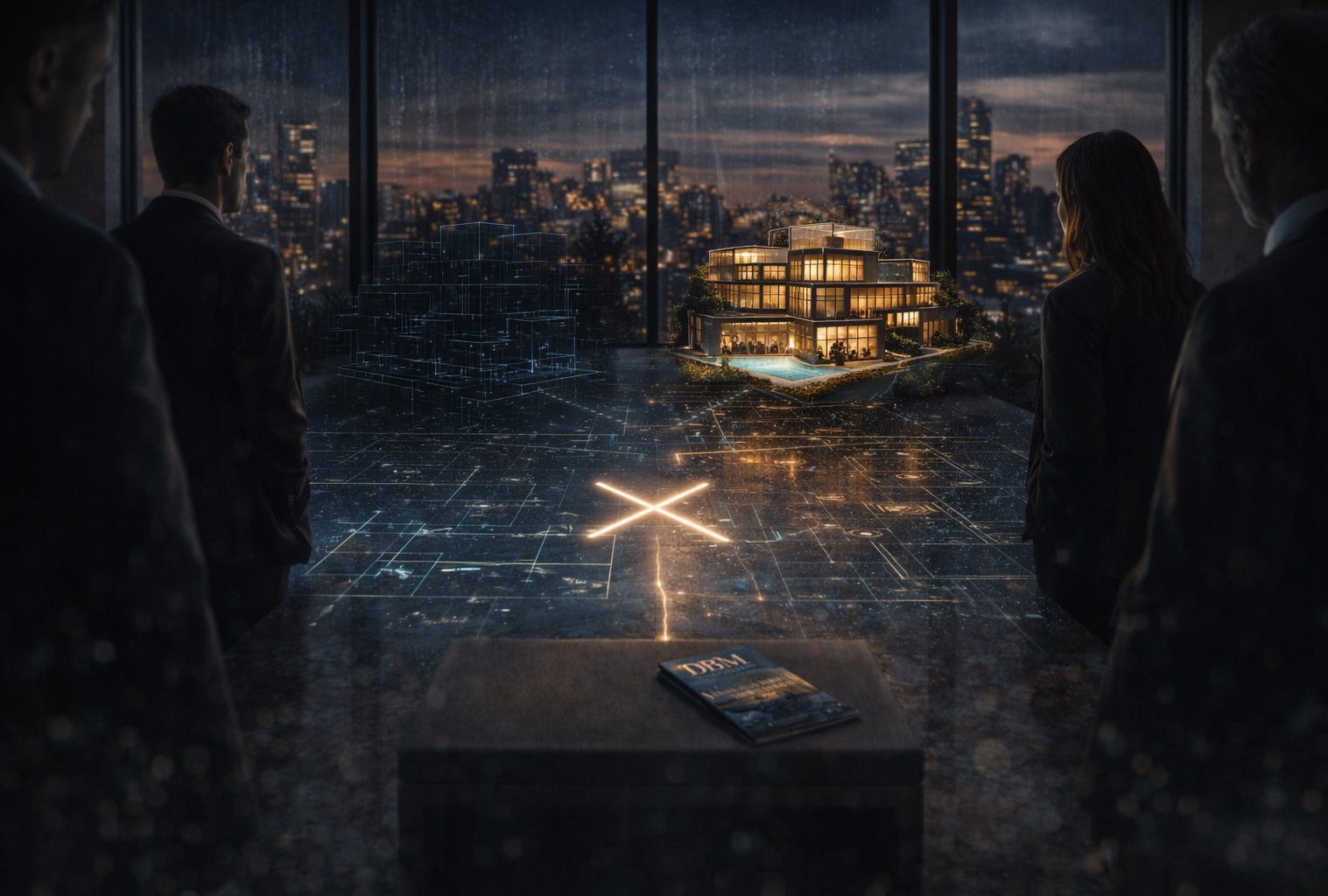
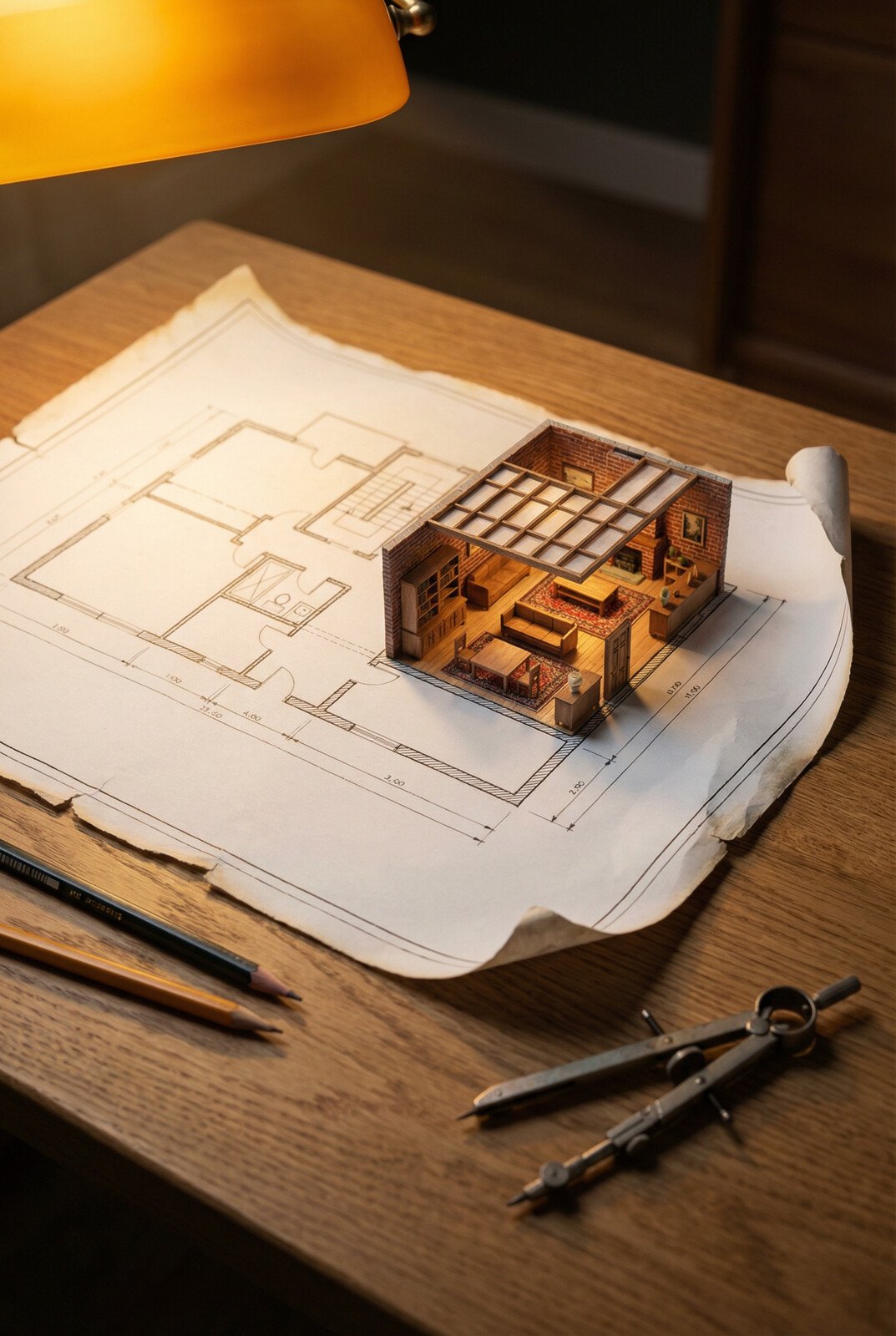
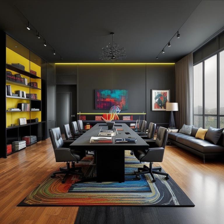
    Workspace design has been conducted in a language of constraints. You have a budget. You have a lease term. You have a floor plate. You design within the envelope. The result is inevitably a compromise—between what you wanted and what the space could accommodate, between aspiration and pragmatism, between the culture you imagined and the culture the architecture actually supported.

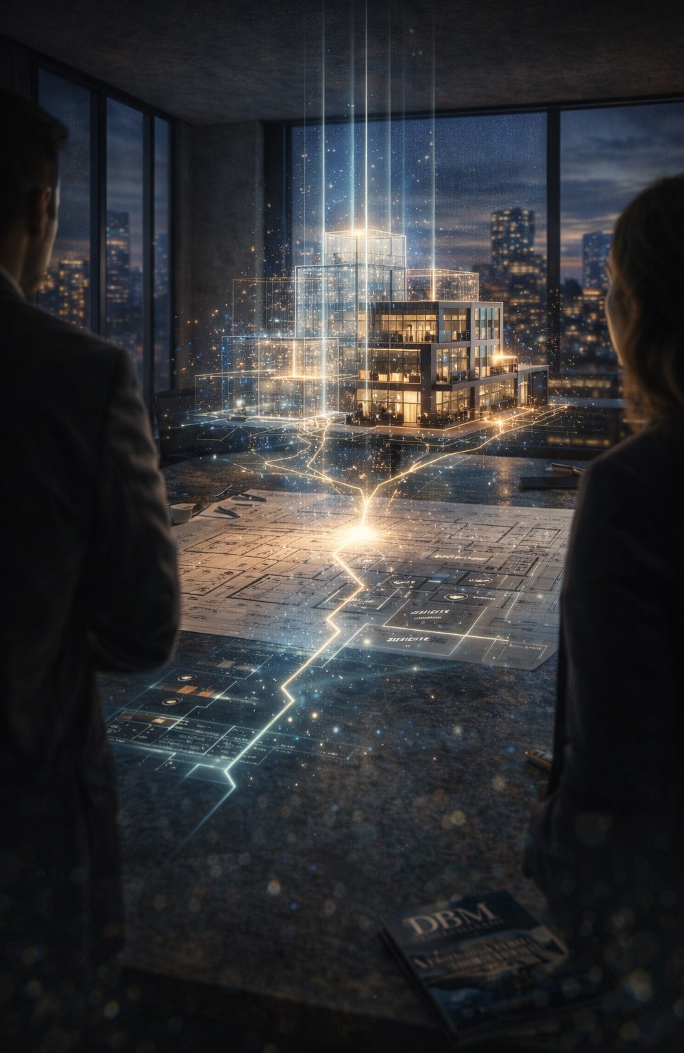
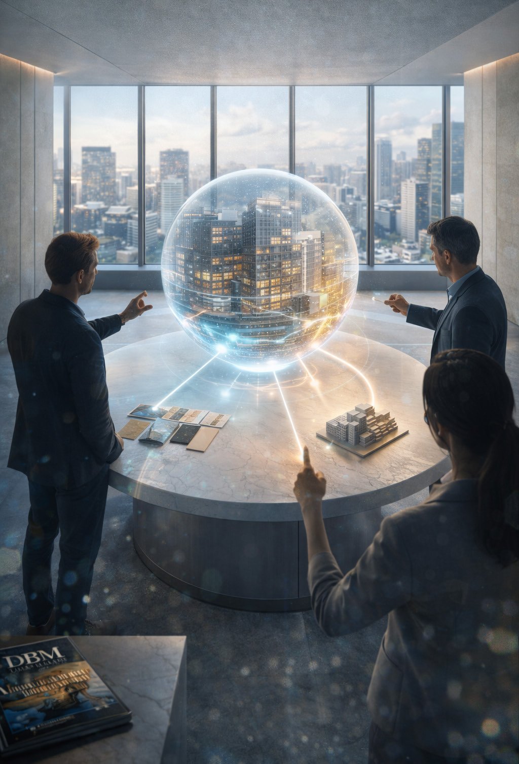
    A quiet revolution has begun that dismantles this compromise. Not through capital expense or structural intervention, but through something more powerful: clarity about intention and fidelity in its expression. The modern office no longer needs to choose between competing visions of workspace culture. Instead, Cinematic Intelligence™ allows a single spatial intelligence to be interpreted through multiple stylistic and experiential registers—each rendered with such photorealistic fidelity that you experience the space before committing to it.

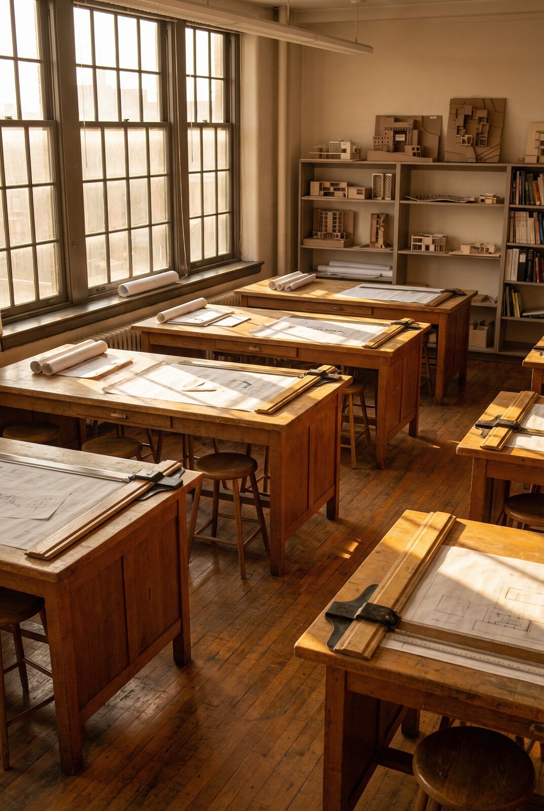
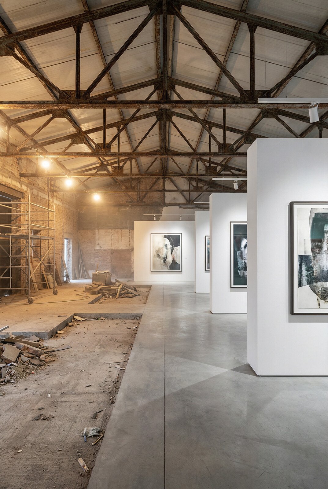
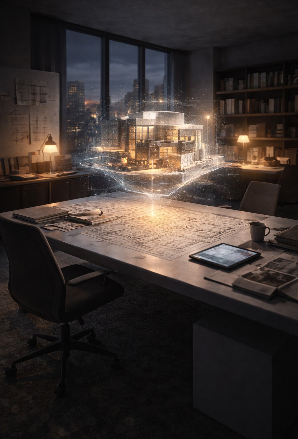
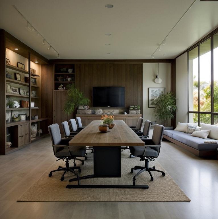
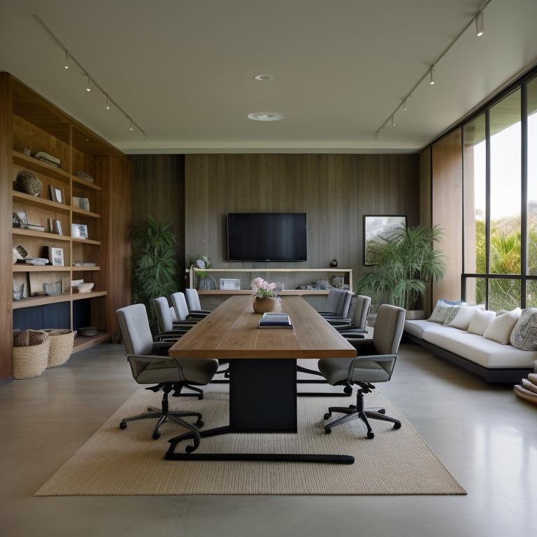
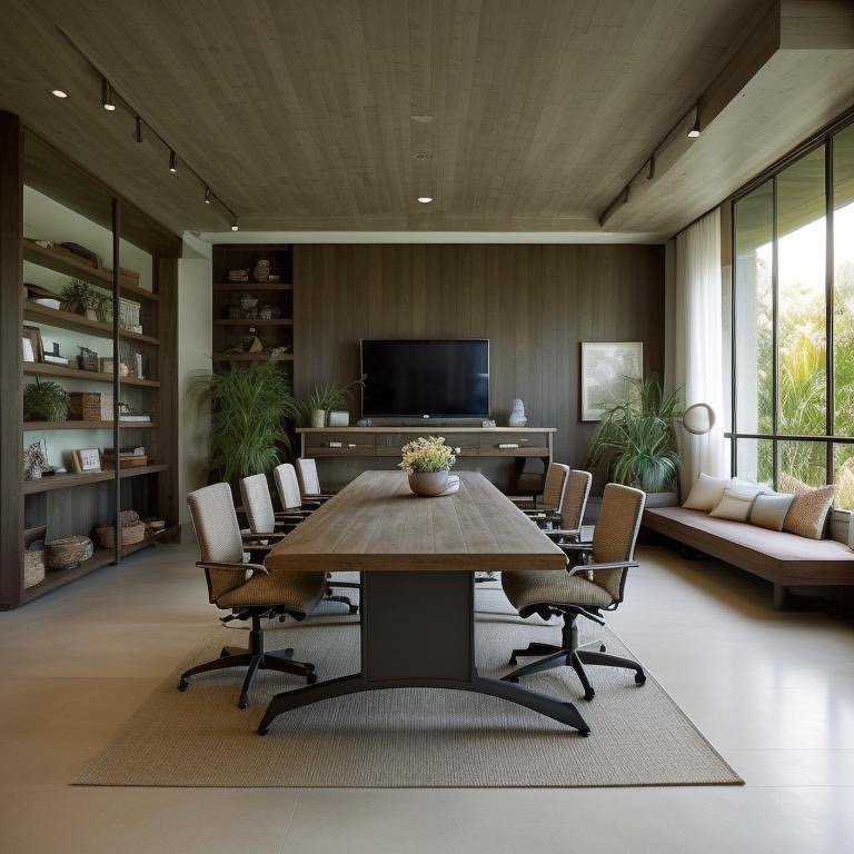
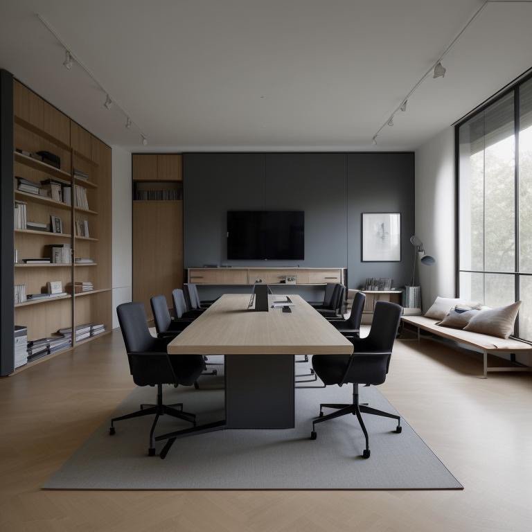
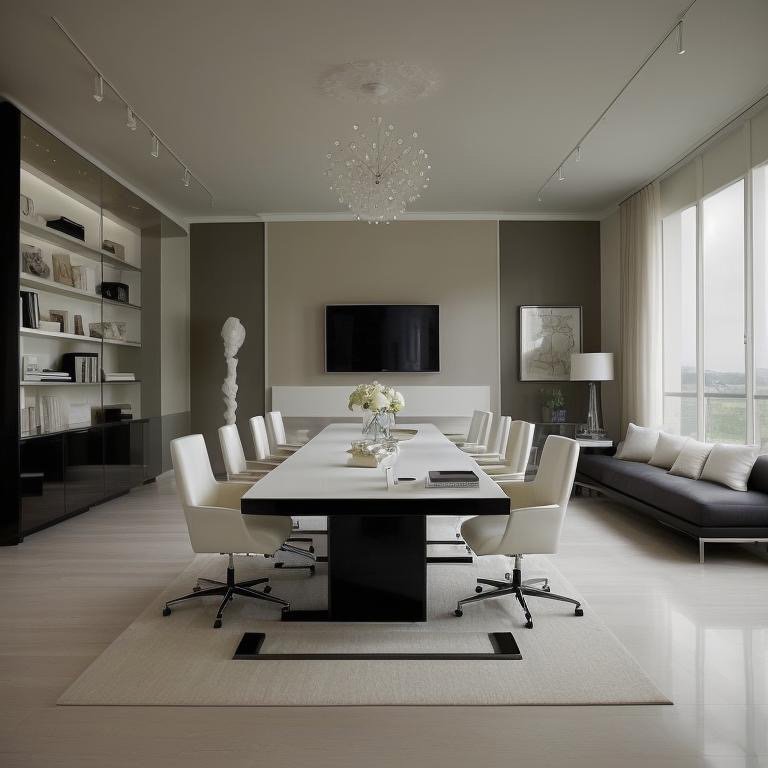
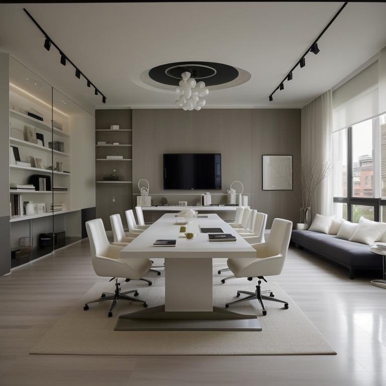
    Consider a base office: clean geometry, generous glazing, disciplined material palette. It is architecturally neutral—the equivalent of white canvas. What makes it powerful is what comes next: the systematic reinterpretation of that neutral intelligence through four distinct aesthetic, material, and psychological frameworks.

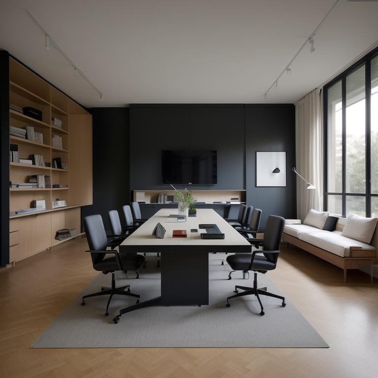
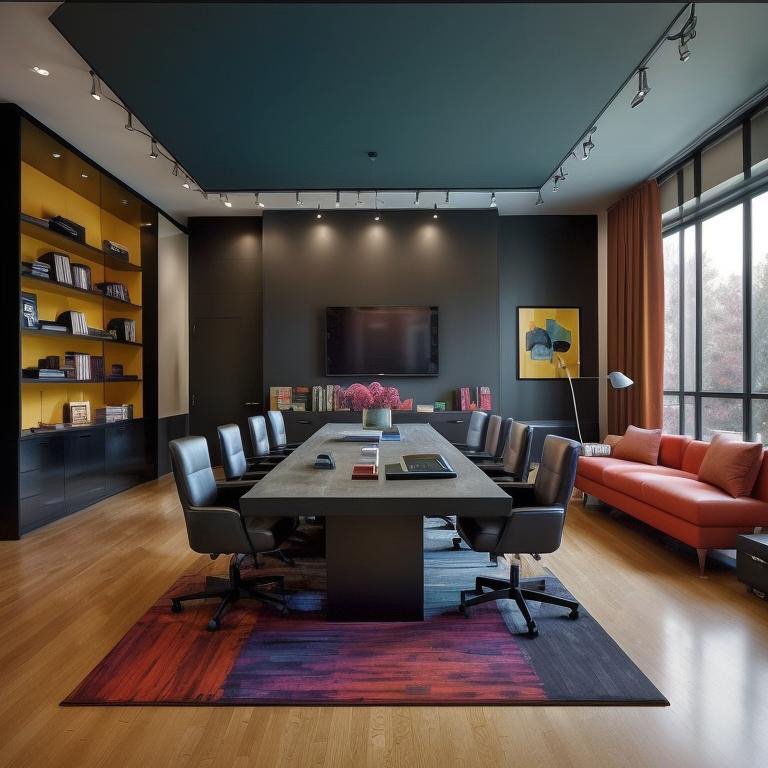
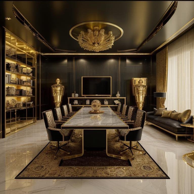
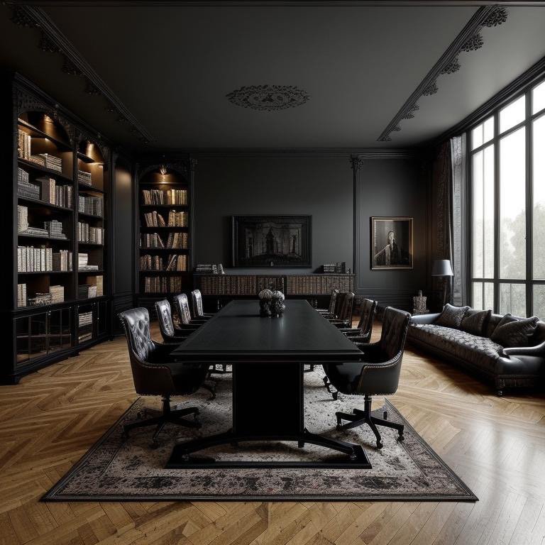
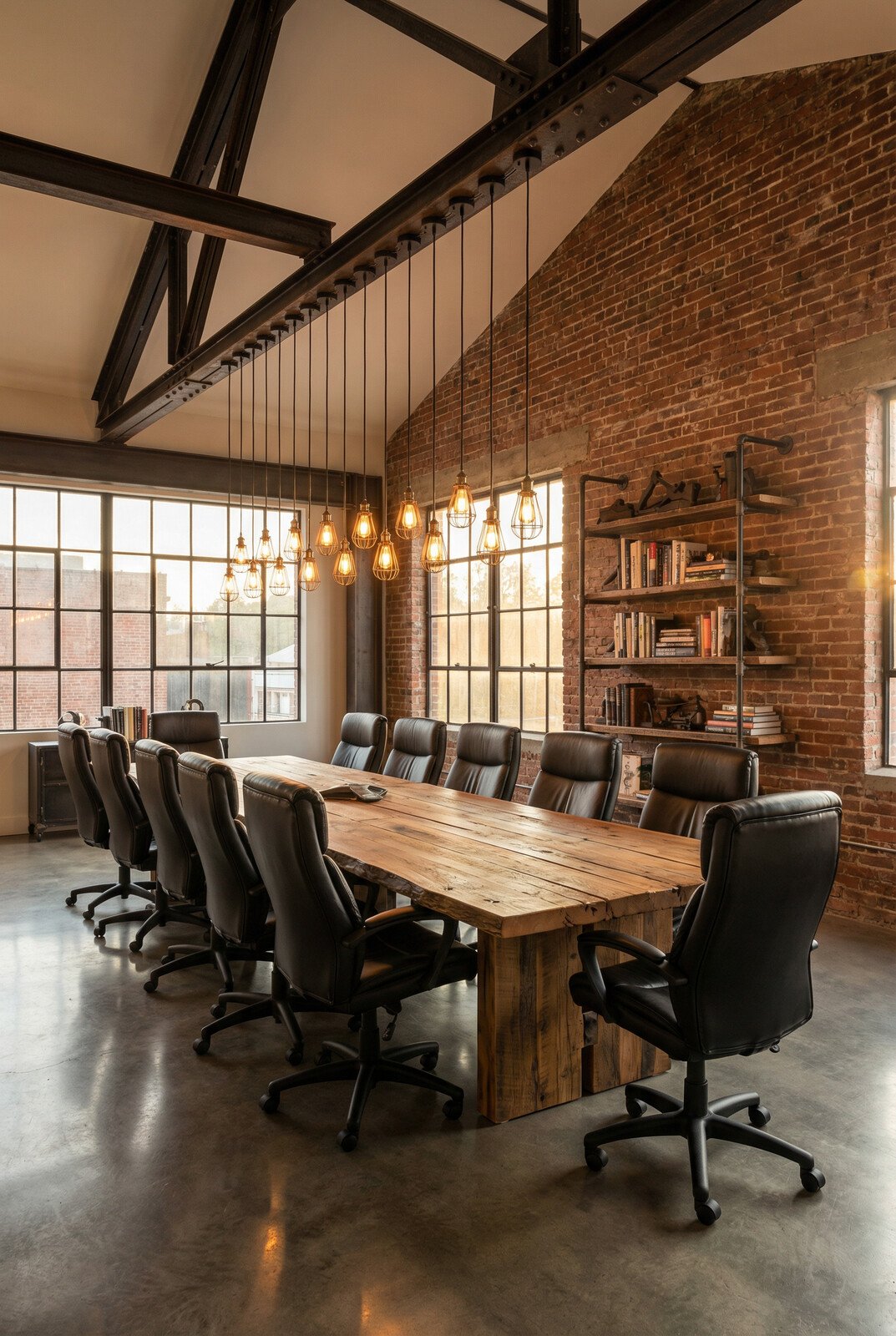
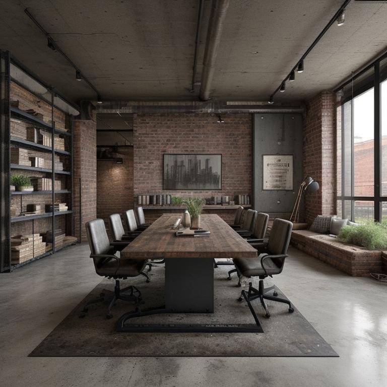
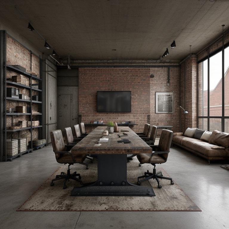
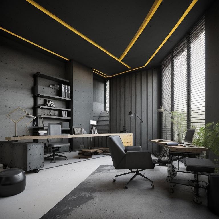
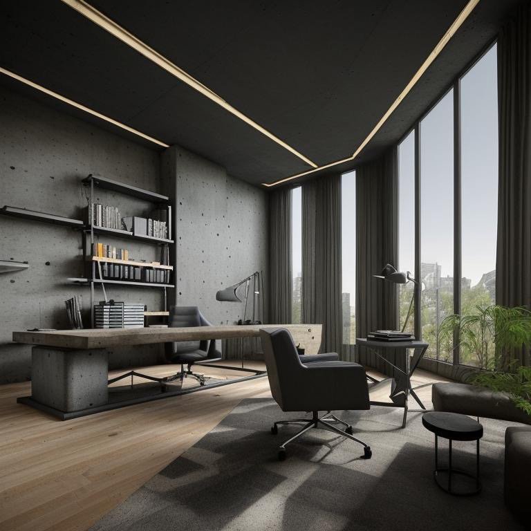
    Brutalism: Architecture as Command

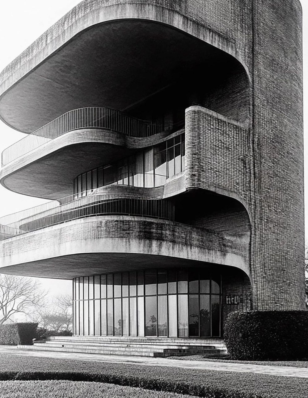
    The first interpretation is Brutalist. This is not brutalism as caricature—heavy, dominating, hostile. This is brutalism as philosophical stance: architecture that does not apologize for its materials or its directness. The clean geometry of the base office sharpens. The proportions become more assertive. Surfaces that were neutral become material declarations—concrete expressed with honesty, edges that do not soften, shadows that deepen the spatial experience.

    A Brutalist office is not for everyone. It is for leaders and teams that value discipline, intellectual seriousness, and command presence. It signals that thinking here is rigorous. Decisions are made with gravity. The space does not coddle or distract. It contains and focuses. There is a severity to it—not in the sense of hostility, but in the sense of refusal to compromise on principle.

    Brutalist interpretation emphasizing concrete materiality and spatial discipline

    The material palette deepens. Concrete moves from warm to assertive. Edges become articulated rather than dissolved. Lighting becomes directional, carving shadow into the space rather than eliminating it. The office becomes a vessel for serious work. Not fun. Not casual. Not designed to impress. Designed to clarify. It is the spatial equivalent of intellectual honesty.

    Brutalist space showing refined shadow and material articulation

    This is where many designers stop—presenting brutalism as severity for its own sake. But the intelligence goes deeper. In a Brutalist office, every line is justified. Every surface serves. The aesthetic discipline creates psychological discipline. Meetings conducted in a Brutalist space tend toward rigor. Decisions made there tend toward clarity. The space becomes a tool for the kind of thinking you want to cultivate.

    Brutalist office detail showing material honesty and refined proportion

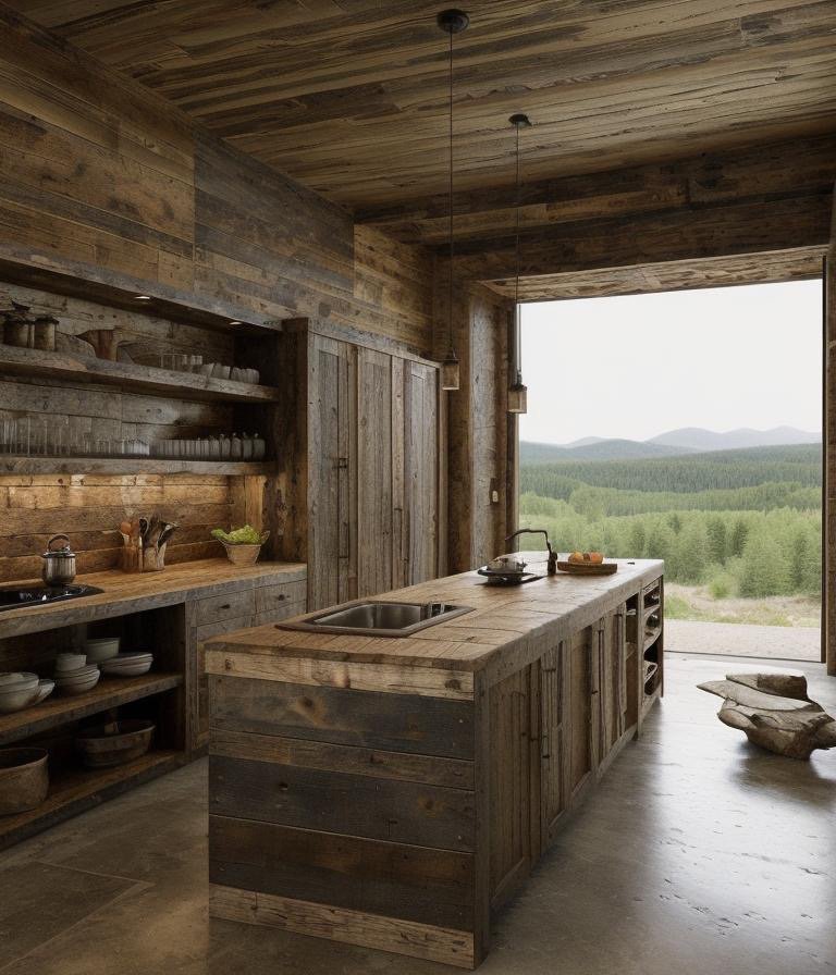
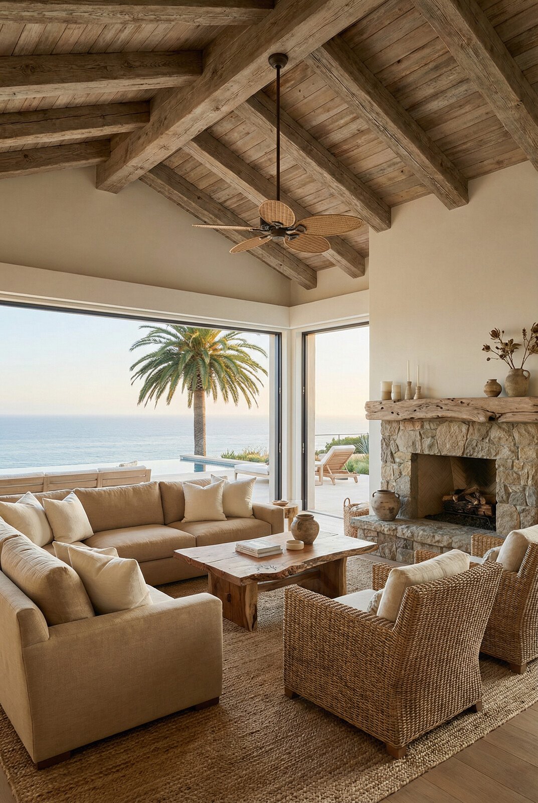
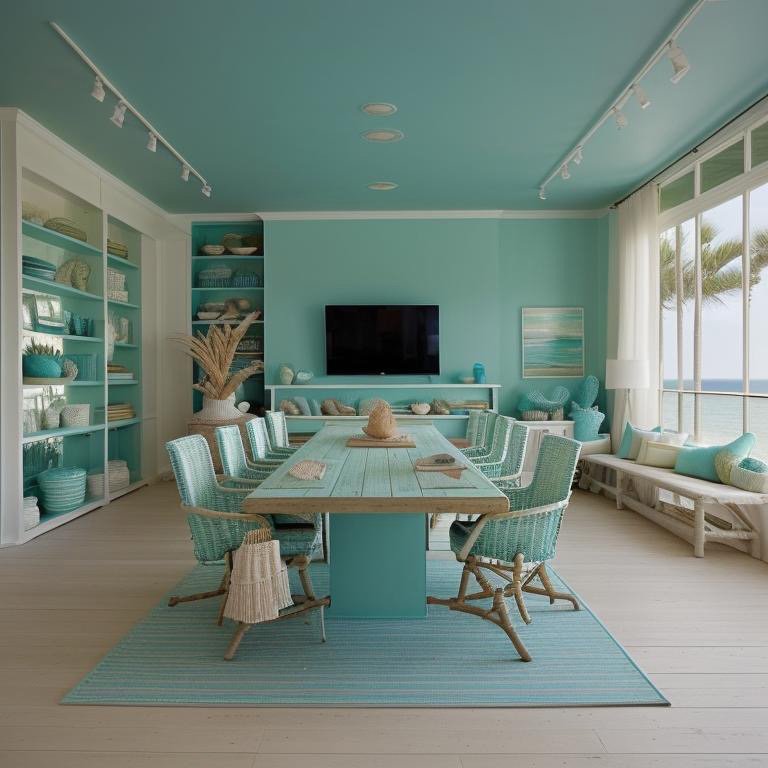
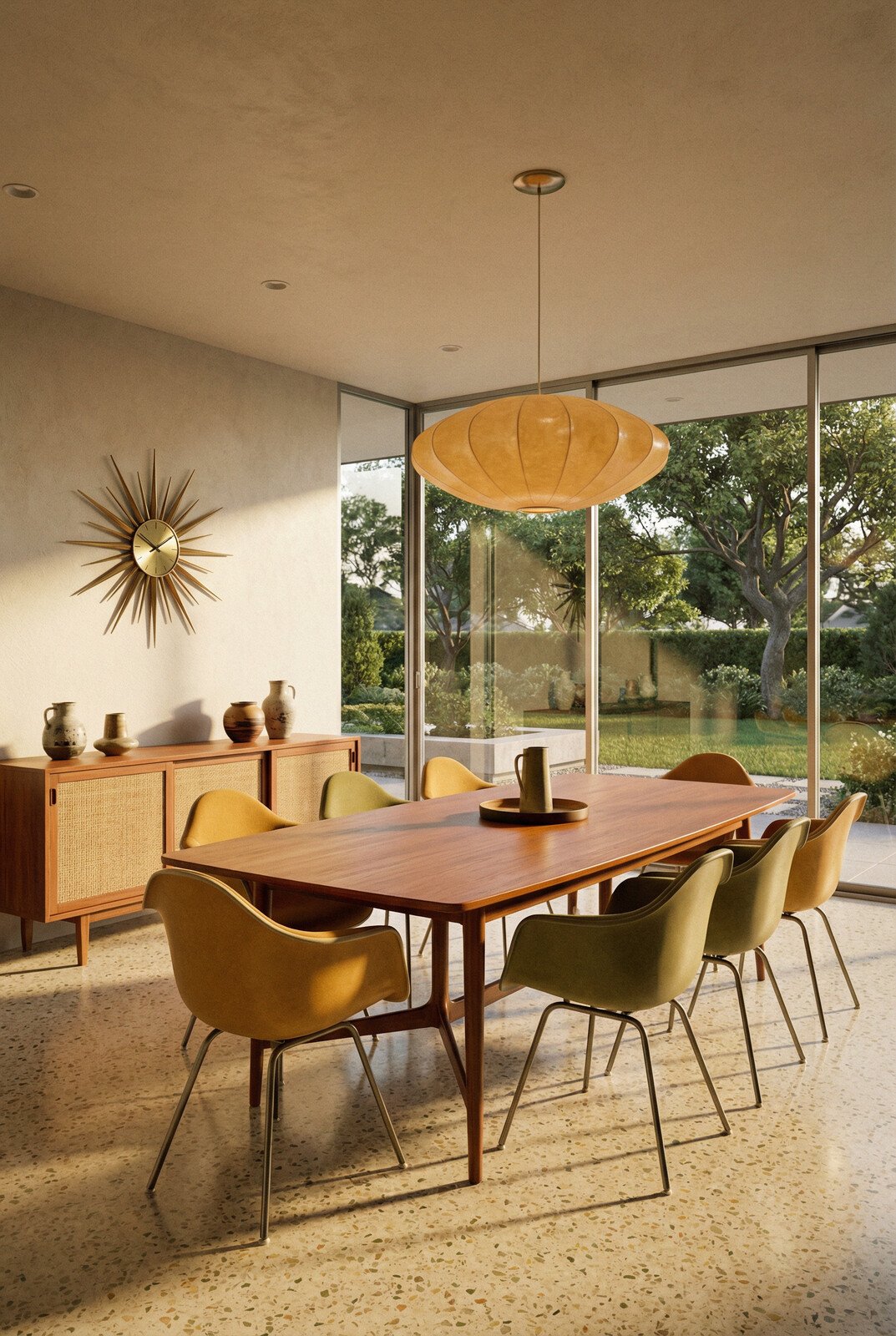
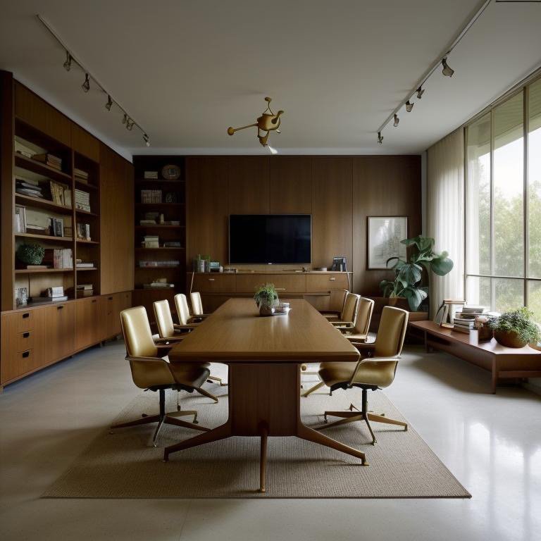
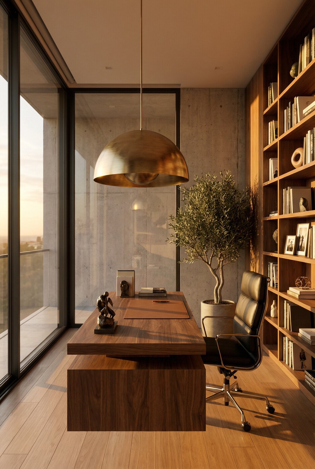
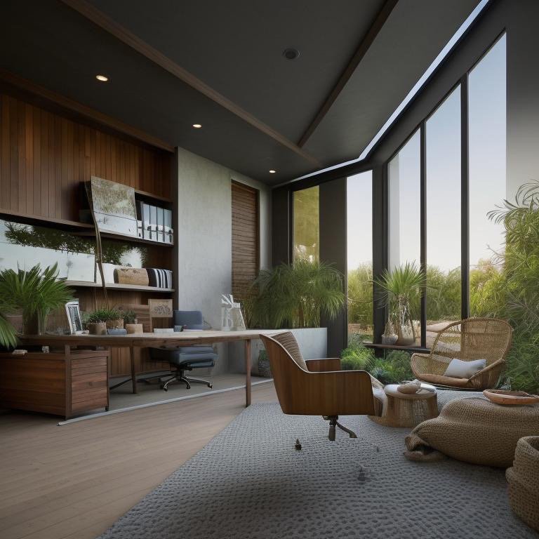
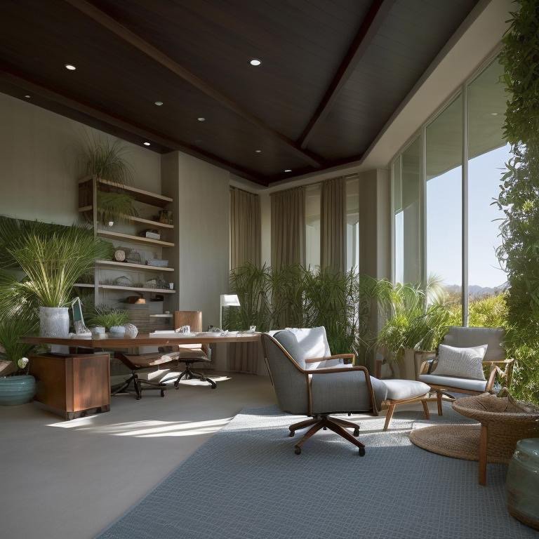
    California Casual: Warmth Without Weakness

    The second interpretation releases the space without weakening it. California Casual is an aesthetic stance often misunderstood as informality for its own sake. But the intelligence operative here is far more sophisticated: how do you create warmth, flow, and natural rhythm while maintaining the spatial clarity and disciplined proportion of the base office?

    Materials soften. Wood—warm, natural, with visible grain—appears where concrete was severe. Light diffuses. Instead of sharp shadows, light moves through the space with a gentler hand. Proportions open slightly, suggesting ease without chaos. The office becomes breathing room. But breathing does not mean loose. Discipline remains, only now it expresses itself through restraint rather than assertion.

    California Casual interpretation with warm materials and diffused light

    A California Casual office is for founders and leaders who want command but not coldness. Discipline but not austerity. The teams that work here tend toward collaboration. The culture is ambitious but not brittle. The space does not announce its seriousness—it demonstrates it through craft and proportion. There is effortlessness here, but it is the effortlessness of control, not carelessness.

    Warm material palette showing natural wood tones and soft materiality

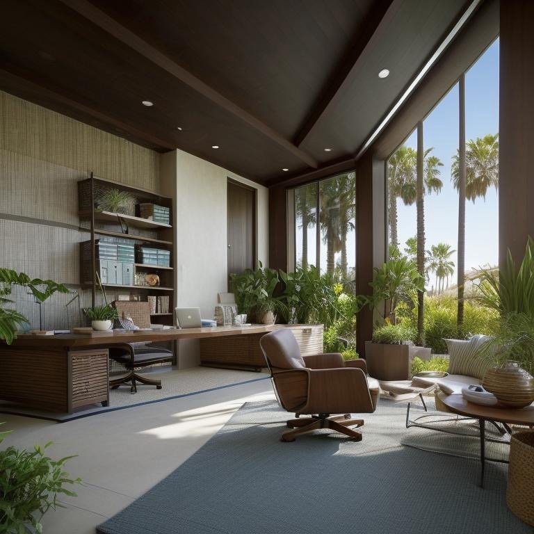
    The material vocabulary is key. Natural woods, warm neutrals, surfaces that reveal their honest age rather than demanding perfection. Light becomes a protagonist—softened, diffused, revealing texture and depth without creating sharp boundaries. The office feels larger, not because it is, but because the visual language suggests expansion rather than enclosure.

    California Casual space emphasizing open geometry and natural material warmth

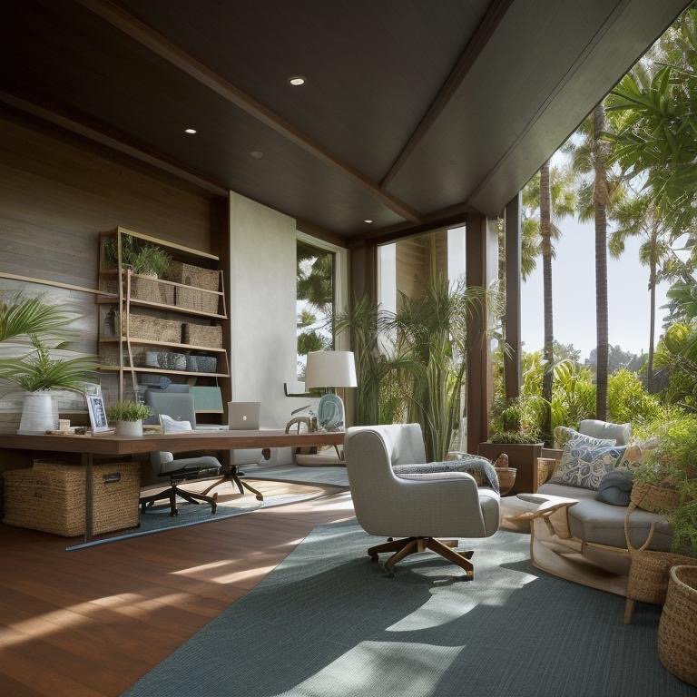
    California Casual is the hardest aesthetic to execute poorly. It looks simple, which is why many designers treat it as simplistic. But true California Casual requires more discipline than brutalism. Every element must earn its place. There can be no applied decoration, no borrowed warmth. The warmth must come from honest materials, from light, from proportion. It is warmth as intelligence, not warmth as sentiment.

    California Casual office showing disciplined warmth and refined spatial flow

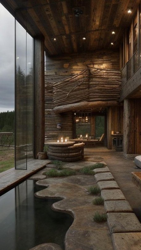
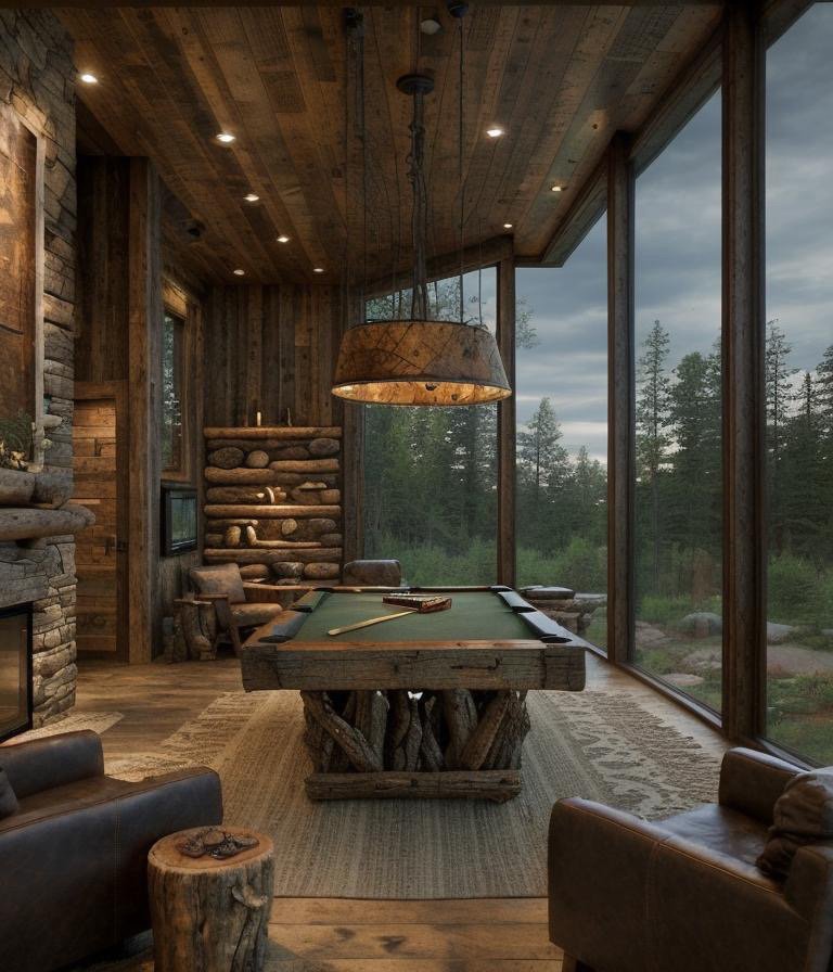
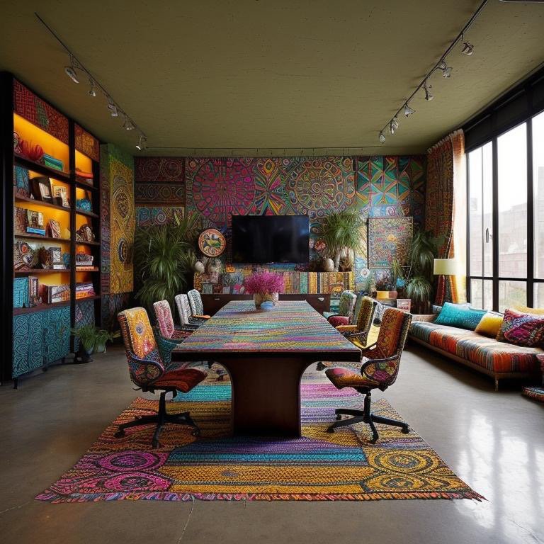
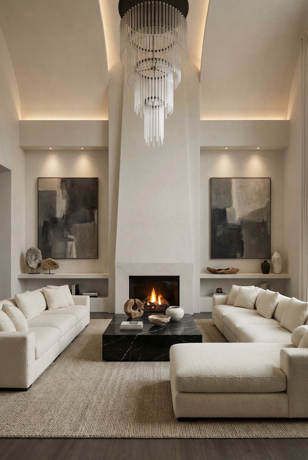
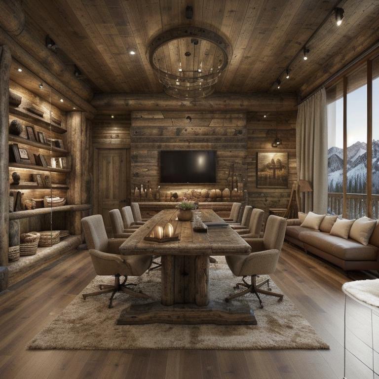
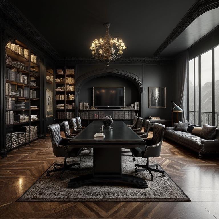
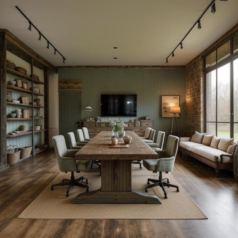
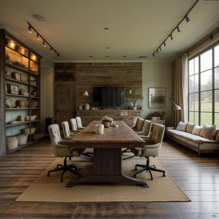
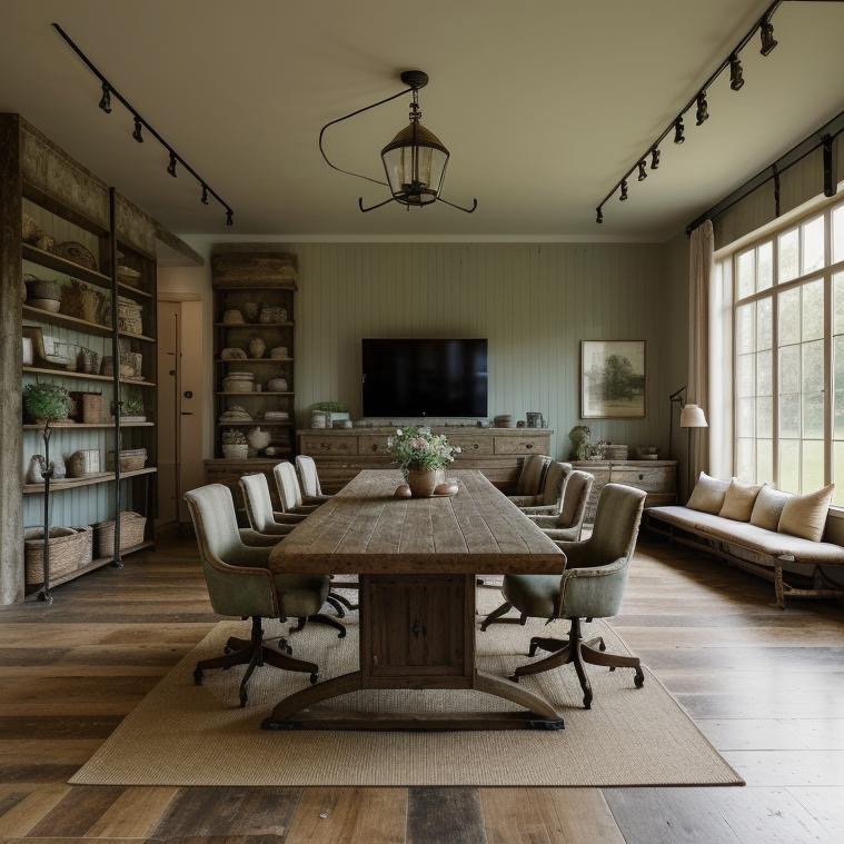
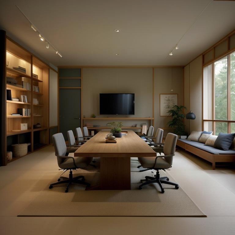
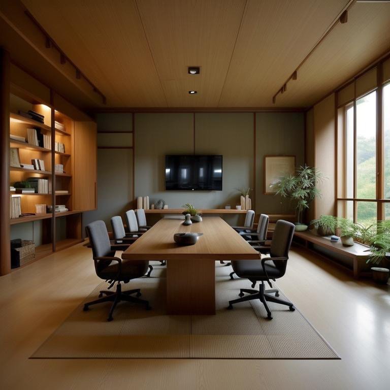
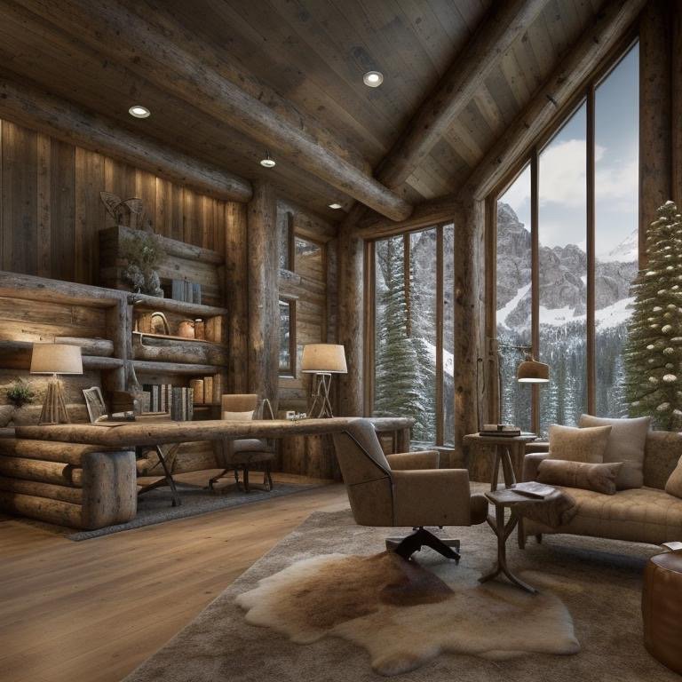
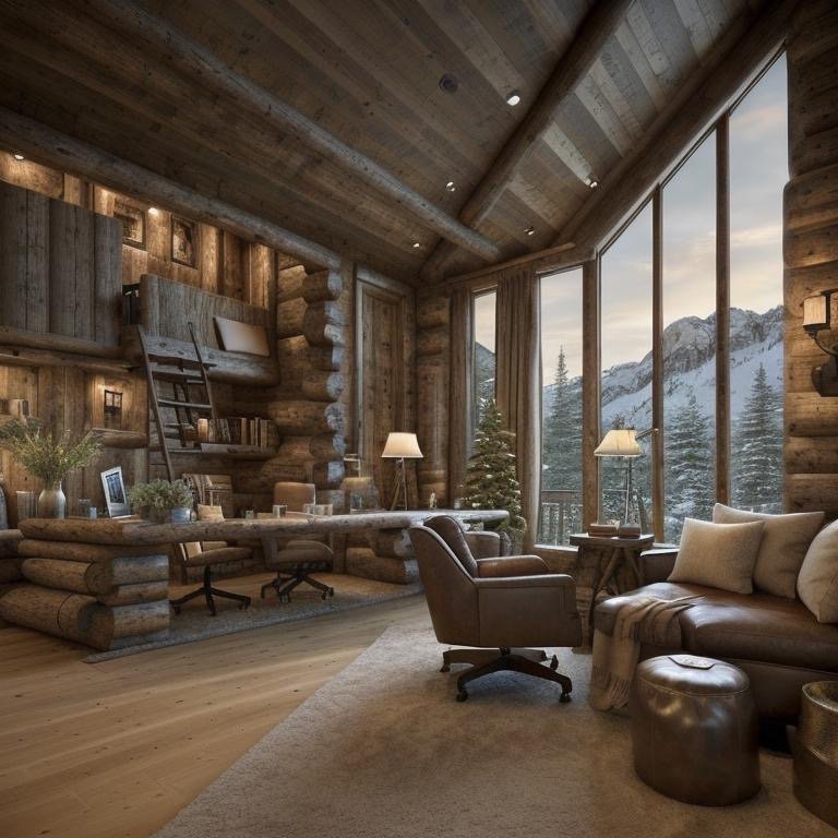
    Chalet: Enveloping Presence

    The third interpretation is perhaps the most emotionally resonant: Chalet. This is not a romanticization of alpine architecture—it is the extraction of what makes chalet design psychologically powerful and the deployment of that intelligence in a contemporary context.

    Timber dominates. Not applied timber or decorative timber, but timber as primary material, as honest expression of construction, as the dominant voice in the spatial conversation. Texture becomes prominent. Surfaces reveal themselves—wood grain, the evidence of craft, the patina of use and age. Warmth becomes almost tactile. The eye wants to reach out and touch the surfaces.

    Chalet interpretation with prominent timber materiality and enveloping warmth

    But this is no rustic indulgence. A chalet office is an alpine lodge for modern leadership. It provides refuge and command simultaneously. The enveloping quality—high ceilings with timber structure revealed, warmth emanating from material and craft—creates a container that feels protective without being claustrophobic. You are held by the space but not constrained by it.

    Chalet space showing timber structure and enveloping spatial volume

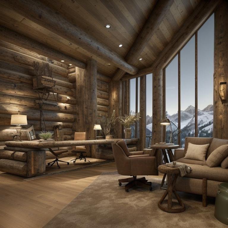
    The psychological effect is profound. A chalet office asks a different question of its inhabitants. Instead of “what must I accomplish?” it asks “what am I capable of thinking?” The space encourages depth. Contemplation. Long-form thinking. The teams that thrive in chalet offices tend to be those engaged in strategy, vision, complex problem-solving. The space’s enveloping quality does not distract—it supports. Focuses. Enables.

    Chalet office detail showing refined timber craftsmanship and spatial character

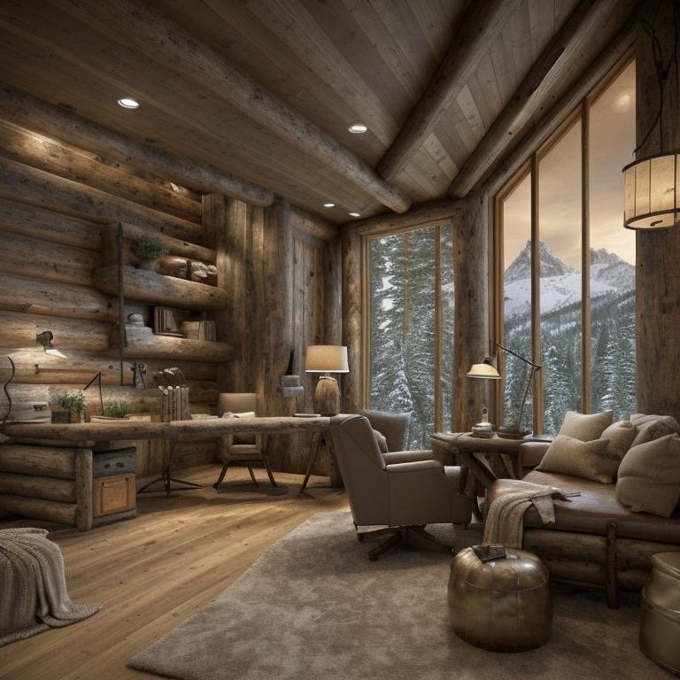
    Material honesty is paramount. Every timber member is structural or clearly justified. Proportions reflect traditional chalet geometry—high peaked volumes, human-scaled openings, clarity about how the space is built. There is no applied style here. The aesthetic emerges from the honest expression of how architecture is made.

    Chalet interior showing warm material density and thoughtful spatial proportion

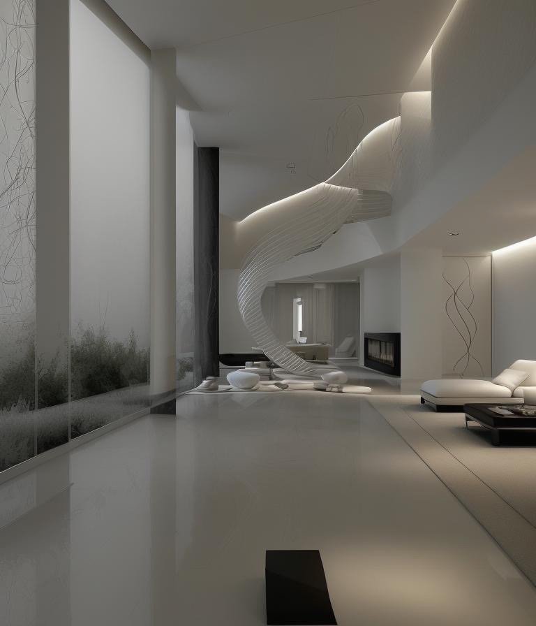
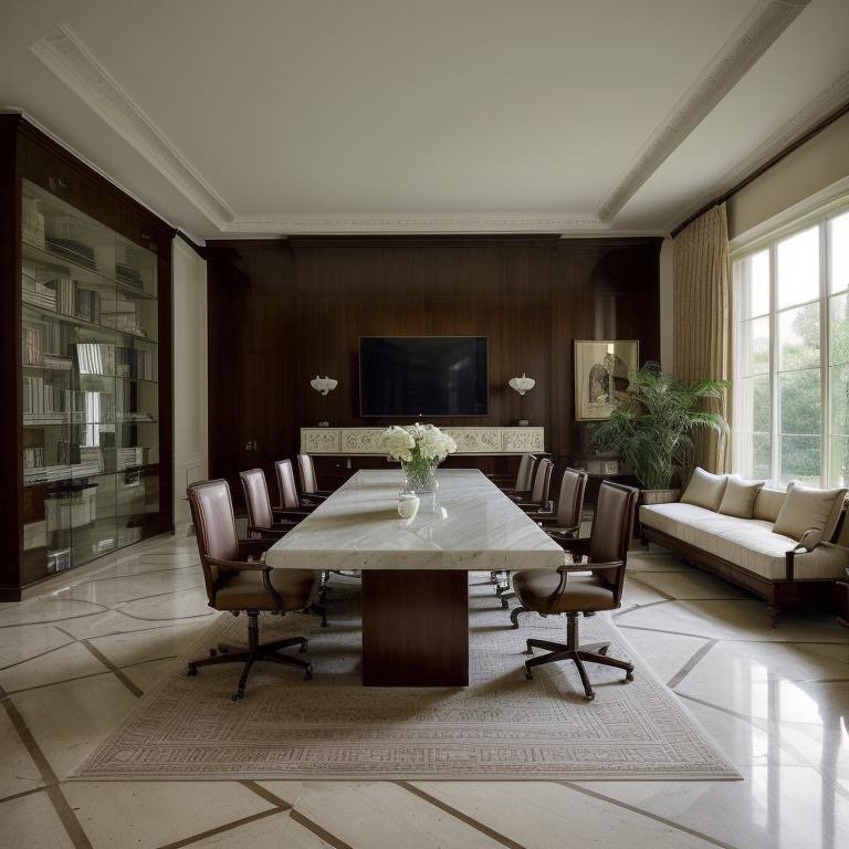
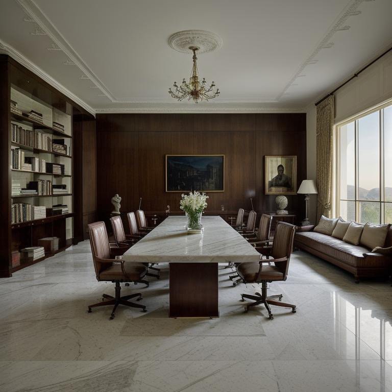
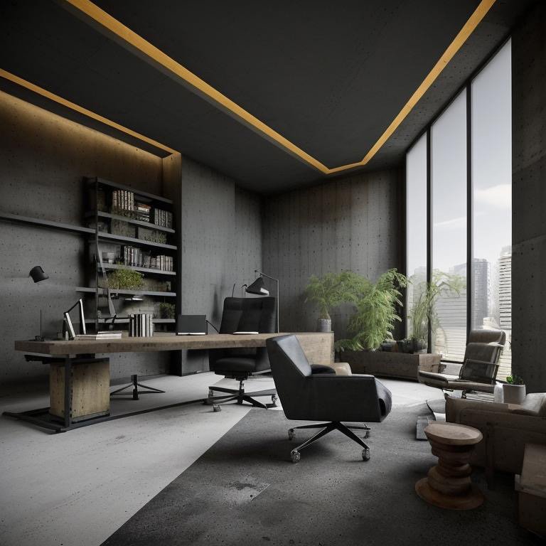
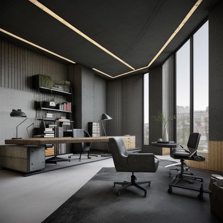
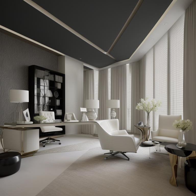
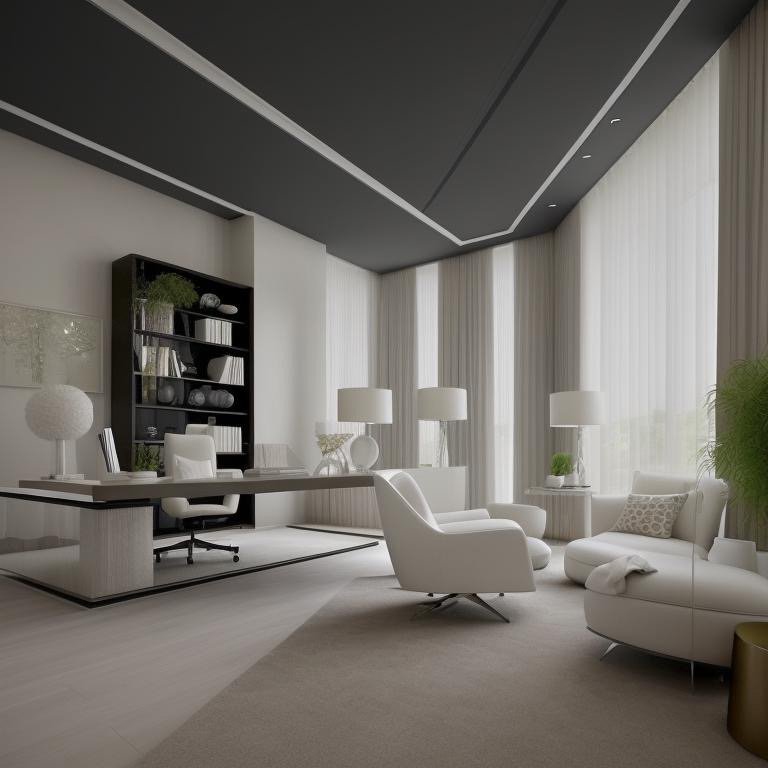
    Chic Contemporary: Discipline as Luxury

    The fourth interpretation demands the greatest discipline. Chic Contemporary is not minimalism for its own sake—it is minimalism as intellectual rigor. The palette tightens ruthlessly: whites, soft greys, warm neutrals with no saturation. Every line is intentional. Every surface is calibrated. Nothing is casual. Nothing is accidental.

    Chic Contemporary office showing refined neutrality and precise material calibration

    This is the most dangerous interpretation to deploy. Without rigor, it becomes cold. Without intention, it becomes empty. But when executed with intelligence, it becomes pure. The office becomes a space where attention can focus entirely on the work, on conversation, on thinking. The architecture does not demand attention—it surrenders it.

    Chic Contemporary space with precise geometry and neutral material restraint

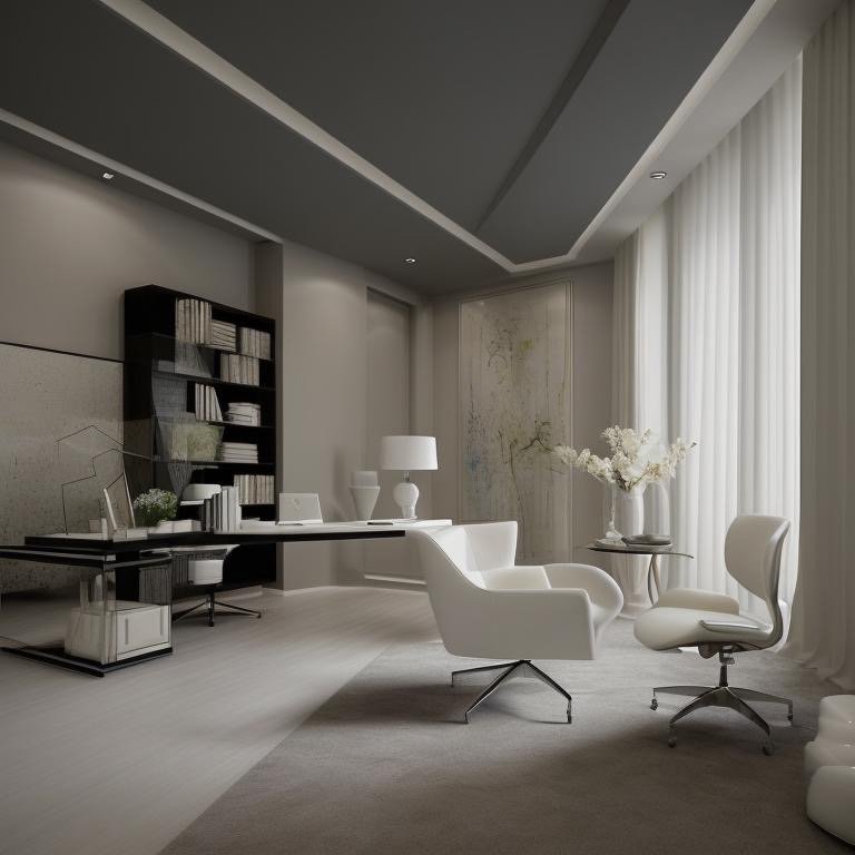
    A Chic Contemporary office is for organizations that have nothing to prove through their space. They prove themselves through their work. The office is a tool, not a declaration. Materials are refined but never precious. Proportions are exact but never theatrical. The space communicates trust, stability, and intellectual seriousness through what it does not do, not through what it does.

    The teams that thrive in Chic Contemporary spaces tend to be those for whom the work speaks louder than the setting. Researchers. Technical specialists. Strategic thinkers. The space does not distract them with warmth or drama—it gets out of the way. Luxury, in this context, is not excess. It is precision as restraint.

    Chic Contemporary interior showing refined proportion and material subtlety

    Chic Contemporary office detail emphasizing discipline and material refinement

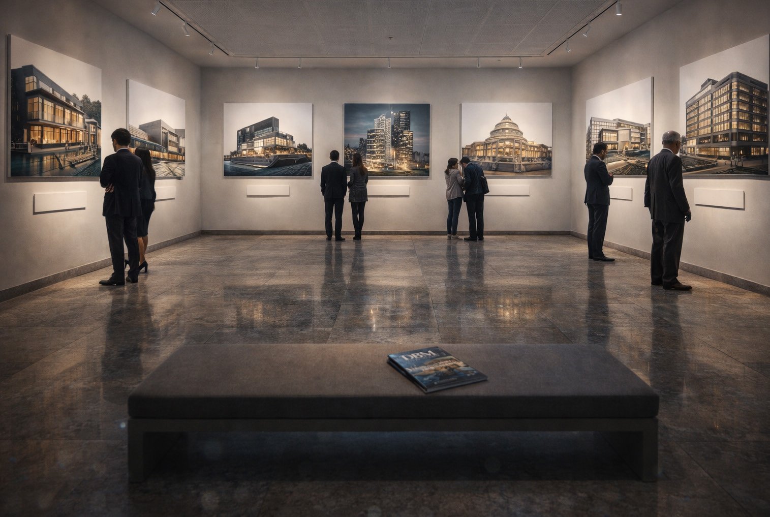
    One Space, Multiple Futures

    The profound insight is that a single office—with no structural change, no capital outlay, no renegotiation of lease terms—can hold four entirely distinct futures. Each interpretation is valid. Each serves different psychological, cultural, and organizational needs. The question is no longer “what office do we have?” but “what office do we want to become?”

    Cinematic Intelligence makes this question answerable not through speculation or imagination, but through fidelity. You do not imagine a brutalist office. You experience it. You do not hope a chalet interpretation might resonate with your team. You know it does, because you have seen it rendered with absolute precision. You do not wonder if chic contemporary might feel too cold. You see it and understand.

    The revolution is not in the renders. It is in the power they distribute. The authority to shape your office culture no longer rests exclusively with the licensed architect or the real estate team. It rests with you—with your clarity about what kind of thinking you want to cultivate, what signal you want to send, what future you want to inhabit. Cinematic Intelligence is simply the tool that makes that clarity actionable, that translates intention into experience, that protects you from committing capital or culture to a future you have not thoroughly understood.

    One office. Four aesthetic and psychological registers. Zero architectural compromise. That is the proposition. And what it reveals is something deeper: that great architecture is not about what you build, but about what you choose to become within the space you already occupy.

  • The End of the Architecture Degree Monopoly

    The End of the Architecture Degree Monopoly

    Golden portal revealing modern office with transformed spatial hierarchy

    For over a century, architecture followed a script. You studied for five years, apprenticed for three more, accumulated hours under licensed supervision, passed an examination, and then—only then—could you legally call yourself an architect. The credential preceded the work. The title governed the practice. The degree was not a preparation for architecture; it was the permission slip to do architecture.

    That script no longer governs reality. And the architecture industry is discovering what happens when regulatory gatekeeping collides with market velocity.

    The shift began quietly. Several U.S. states have now revised their licensure pathways to permit architectural licensure without an accredited degree. Instead, they require demonstrated experience—portfolios, project leadership, peer validation. Not a piece of paper. Evidence. It is a subtle distinction with profound consequences. The credential shifted from predictive (you studied this, so you can probably do it) to demonstrative (you have done this, so you can clearly do it).

    But the regulatory change only codified what the market had already decided. Firms hired non-degree practitioners—technologists, designers, builders who came from diverse backgrounds—because those practitioners could produce at scale and iterate with intelligence. A parametric modeler trained in software development could generate more informed spatial variations than a traditionally educated architect beholden to a singular design method. A builder with deep material knowledge could make faster, more informed decisions about performance and craft. A designer from another discipline could bring fresh conceptual frameworks to problems that institutional architecture education had calcified into orthodoxy.

    Technology collapsed the barrier. Parametric modeling, Building Information Management, and AI-assisted iteration removed the artificial scarcity that once justified credentialing gatekeeping. There was no longer a mystique to architectural knowledge that required years of apprenticeship to unlock. The tools democratized the syntax. The methods became accessible. What remained was not credential but cognition—the ability to think spatially, to iterate intelligently, to understand how design decisions propagate through systems.

    Architectural space showing sophisticated spatial reasoning and material intelligence

    The Redefinition of Skill

    AI accelerated this transformation. Suddenly, “architectural skill” was no longer synonymous with “degree-holding architect.” It meant something more granular and more powerful: the cognitive advantage to work at speed with complexity, to evaluate spatial options across multiple variables, to understand how form relates to function and culture and cost.

    A designer could now iterate through dozens of office configurations in hours—each one rendered with photorealistic fidelity, each one evaluating acoustics and daylighting and material performance. They did not need to spend three years learning by imitation to access this capability. They needed to understand the problem and trust the tools. And the tools themselves had become intelligent enough to scaffold the thinking.

    Cinematic Intelligence™ exemplifies this pivot. It does not require an architectural degree to operate. It requires spatial understanding, design intention, and the ability to brief a cognitive engine on what you want to explore. A facility manager working with a design tool can now generate office iterations that rival what a traditional architecture firm would have charged $50,000 to produce. Not because the facility manager became an architect, but because the tools distributed architectural capability across the organization.

    What emerged from this distribution is something that credentialing systems struggle to accommodate: a new class of practitioners. Non-traditional designers who came from marketing, from software, from construction, from creative fields entirely outside the architecture discipline. AI-augmented architects who learned on the job rather than in school. Interdisciplinary creators who saw spatial problems as one expression of a larger design challenge.

    Contemporary office demonstrating refined spatial composition and material calibration

    The architecture schools, for their part, are slowly shifting their identity. No longer gatekeeper, increasingly incubator. The best programs now teach frameworks for thinking spatially and iteratively, rather than anointing students with a credential. They prepare people to work with intelligence engines, not replace them. They cultivate judgment—the ability to evaluate when a design is working and when it needs to shift. That judgment is increasingly valuable and increasingly difficult to automate.

    The Distribution of Authority

    The most consequential shift is psychological. For a century, architectural authority was concentrated. The licensed architect was the sole arbiter of spatial decisions in most commercial contexts. Their vision governed. Their judgment was final. Their name went on the letterhead, and their credential stood as proof that the decisions were defensible.

    What is emerging now is diffused authority. The VP of Operations has spatial judgment. The design director brings legitimate architectural thinking to the table. The facilities team understands how space serves organizational culture. The contractor, who knows the site and the constraints, becomes a co-author of design. The executive leadership, freed from deferring to credentialed expertise, can ask better questions: “What should this space make possible? What character should it have? What kind of work should it enable?”

    This is not anti-expertise. It is anti-credential. The expertise—spatial reasoning, material knowledge, understanding of how design propagates—remains essential. But the credential that once bundled this expertise exclusively is no longer the only pathway to access it.

    Firms that once hired a single architect to design their office now assemble a team: a spatial strategist, a technologist who understands rendering and iteration, a material specialist, perhaps a traditional architect whose role is now to curate and refine rather than originate. The work becomes collaborative in a way that credential-based structures made difficult.

    Refined architectural interpretation showing disciplined materiality and spatial clarity

    The Future of Licensure

    Licensure itself is undergoing quiet revision. Some states are experimenting with “practice-based” pathways that require demonstrated work rather than degree completion. Others are creating tiered credentialing—specialist licenses for specific domains (workplace design, parametric systems, material engineering). Still others are simply recognizing that the market is already licensing people through hire, through portfolio, through repetition and success.

    The traditional AIA-pathway architecture degree will persist. There is genuine value in a comprehensive education that combines history, theory, systems thinking, and practice exposure. But it will no longer be the only pathway. The monopoly is ending because the conditions that justified the monopoly—scarcity of knowledge, complexity that required extended apprenticeship, the need for a regulatory proxy for quality—no longer exist.

    What emerges is something closer to meritocracy, at least in theory. Can you think spatially? Can you iterate intelligently? Can you brief a design engine and evaluate its output? Can you understand how materials and light and proportion affect human experience? Can you see the connection between space and organizational culture? If yes, you have architectural skill. The credential becomes secondary to evidence. Credibility becomes harder to fake because the work is visible, evaluated, refined in real time by stakeholders who understand the stakes.

    The industrial office crisis forced the architecture industry to confront something uncomfortable: that traditional pathways no longer guaranteed the expertise that users actually needed. The regulatory and market response has been to distribute authority, to trust judgment wherever it emerges, and to believe that tools intelligent enough to scaffold thinking have made the monopoly obsolete.

    The architecture degree will survive. But its purpose has shifted from licensing to incubation. And the architectural authority it once concentrated is now distributed across a field of practitioners who came to the work through a hundred different paths, all of them now legitimate.

  • Reclaiming Space, Rewriting Purpose

    Reclaiming Space, Rewriting Purpose

    Clean geometry office with generous glazing and disciplined materials

    January arrives not as a calendar reset but as a philosophical one. The office—once conceived as a permanent monument to corporate identity—has become something far more fluid. It is no longer an institution but an instrument. And like any sophisticated instrument, it demands calibration, intention, and an acute awareness that form must serve purpose, not merely declare it.

    For decades, the office existed as monolith. Glass towers and mahogany boardrooms signaled permanence and hierarchy in equal measure. You entered the same space, navigated the same corridors, sat at the same desk. The architecture whispered a single narrative: stability, authority, continuity. But that narrative collapsed first in crisis, then in opportunity.

    The industrial office crisis was not primarily a real estate problem. It was an architectural one. Firms discovered they had inherited spaces with no relevance to how work actually happens. Open floors that promised collaboration generated noise. Private offices that promised focus generated isolation. Executive suites that promised command generated disconnection. The problem was not that offices existed—it was that they had been designed for a version of work that no longer governed reality.

    What emerged from this confrontation was a fundamental question: what is office architecture for? Not what does it signal. Not what does it cost. But what does it enable? What psychological, spatial, and cultural conditions does it cultivate?

    The Posture Shift

    This issue moves from crisis to craft. It is not a catalog of solutions but an exploration of a single spatial intelligence—one office, rendered across multiple identities. The base geometry is disciplined and neutral: clean lines, generous glazing, proportion that suggests restraint rather than minimalism. It is the equivalent of architectural silence—a space that does not impose but invites interpretation.

    Cinematic Intelligence™, for the first time at this scale, reveals what becomes possible when you separate the structure from the storytelling. The office does not change. The walls do not move. The glazing remains generous. What transforms is the character of the space—its emotional register, its psychological intention, its signal to the human beings who inhabit it.

    Consider the implications. A firm no longer needs to choose between competing visions of workspace culture. A leader no longer inherits a space and accepts its narrative wholesale. Instead, the architecture becomes a canvas upon which multiple futures can be projected. Not rendered carelessly or speculatively, but rendered with absolute fidelity. Every material, every shadow, every proportion is vetted before capital is committed, before leases are signed, before teams are asked to work within the result.

    Alternative office interpretation showing transformed material and spatial character

    This is not decoration masquerading as design. It is design operating at the level it ought to: as a tool for organizational clarity and cultural intentionality. The office becomes an instrument for asking deeper questions. What kind of thinking do we want to cultivate? What psychological state should our architecture support? What signal should the space send, not to investors or clients, but to the people who work there every day?

    From Inherited to Intentional

    The move from crisis to craft is ultimately a move from inherited spaces to intentional ones. For the better part of a century, office architecture was inherited. Tenants signed a lease on a building that someone else had designed, often decades prior. The grid of columns, the floor plate dimensions, the core placement—these were constraints to work within, not choices to make. Interior designers decorated around them. Workers adapted to them. The architecture had agency; the tenant had compliance.

    What Cinematic Intelligence introduces is the possibility of agency within constraint. The landlord’s structure remains fixed. The lease terms remain binding. But the interpretation—the psychological, cultural, and experiential reality of the space—becomes a choice rather than a given. And that choice, when rendered with fidelity, becomes knowledge. You do not imagine what a Brutalist office feels like. You see it. You do not speculate about California Casual energy. You experience it. You do not hope that Chalet warmth might balance executive presence. You know it does.

    This represents a genuine shift in architectural power. For the first time, the tenant—not the developer, not the original architect—can shape the narrative of the space they occupy. And they can do so without structural compromise, without capital outlay, without risk. They can understand, visualize, and experience multiple futures before committing to a single one.

    The question is no longer: “What office do I have?” The question becomes: “What office do I want?” And the space—through Cinematic Intelligence—has the capacity to answer.

    The Architecture of Ambition

    There is a deeper principle at work here. Great architecture operates on multiple levels simultaneously. It solves immediate problems—shelter, function, efficiency. But it also cultivates something harder to define: a psychological and cultural condition. It shapes how people think and interact without their conscious awareness. The best offices do this subtly. They do not announce themselves. They create conditions within which better work becomes possible.

    Cinematic Intelligence acknowledges this implicitly. By rendering the same space through different visual and material vocabularies, it reveals something essential: the office is not the building. The office is the experience of the building. And experience is malleable. It can be shaped through color, material, proportion, and light—all elements that exist within the constraints of an existing lease, an existing structure, an existing geography.

    The implications extend beyond individual firms. As offices become fluid, as their interpretation becomes a choice rather than an inheritance, the entire relationship between organization and space begins to shift. A company can evolve its spatial culture without moving. A leader can test multiple organizational signals within the same architecture. A team can inhabit a space that reflects their values, their work style, their ambition—not because they built new walls, but because they understood the intelligence of the space they already occupied.

    This is the true revolution. Not the renders themselves, but what the renders make possible: the democratization of architectural intentionality. The distribution of design agency downward and outward. The recognition that great offices are built through interpretation, through vision, through the disciplined application of intelligence to constraint.

    The Rewriting

    The office, in this emerging moment, is no longer written in stone. It is written in light, in material, in the subtle vocabularies of color and proportion and rhythm. It is written in the choices we make about what we want to cultivate, what we want to signal, what we want to become.

    January, then, is not just a calendar reset. It is an invitation to rewrite the posture and ambition of the spaces we occupy. To move from inheritance to intention. To understand that the office is not a given but a choice. And that choice, when rendered with fidelity and understood with depth, becomes the foundation upon which better work, better thinking, and better organizations can emerge.

    The space is waiting. Not for renovation. Not for relocation. But for clarity about what it might become—and the intelligence to make that becoming real.

  • The Rise of the Ghost Architect: How Buildings Are Being Designed Without Names

    The Rise of the Ghost Architect: How Buildings Are Being Designed Without Names

    night cityscape with illuminated buildings

    There is a figure in contemporary architecture who has no name, attends no meetings, signs no drawings, claims no credit. Yet influences every decision. Shapes form. Determines mood. Establishes proportion. Establishes identity. This figure is not a person. It is a system. And it is reshaping how buildings come into being.

    Call it the ghost architect. Not metaphorical—functional. An intelligence that inhabits the early stages of architectural conception, working before human architects are formally engaged, without the constraints of professional accountability, without the friction of client relationships or regulatory submission. The ghost architect explores. Tests. Visualizes. Fails silently. Iterates at velocity. Then vanishes before the real work begins.

    What remains is a fully formed spatial concept. A massing that feels inevitable. A proportion system that appears natural. An aesthetic sensibility that suggests deep research and intentional curation. But it emerged from no sketchbook. No design firm fought for it in a charrette. No architect’s signature appears anywhere on the work. It was made by an intelligence that does not require attribution to do what it does best: generate possibility at scale.

    Architecture Was Always About Authorship

    The discomfort with the ghost architect runs deep because architecture in the modern era has been fundamentally tied to the idea of the author. The architect as author. The firm as the site of creative intention. The building as the expression of individual vision. Frank Lloyd Wright’s signature was as much a part of his architecture as his proportion systems. Zaha Hadid’s authorship was inseparable from her formal language. The building was the architect made visible.

    This wasn’t accidental. It was the foundational mythology of Modern architecture—the belief that great spaces emerged from great minds, that individual genius was the origin point of spatial excellence. Clients hired architects because they wanted to access that genius. Developers competed for landmark architects because the name on the building added value. The whole infrastructure of contemporary architectural culture—the awards, the publications, the canons of taste—was built on the assumption that the author mattered.

    architectural concept visualization

    But clients stopped caring about this mythology earlier than anyone realized. They stopped asking “who is the architect?” and started asking “what is the space?” The shift was nearly invisible at first. A developer would consult an AI visualization engine to test massing options before engaging an architect. A real estate firm would use Cinematic Intelligence™ to pre-visualize a property’s potential before the design was formally commissioned. A marketing team would request three spatial variants—three different aesthetic treatments of the same program—and show them to investors before a single conceptual drawing was approved.

    The ghost architect was born in these moments. Not in a laboratory or a research initiative, but in the actual workflow of real development. It emerged because it solved a problem: how to explore spatial possibility quickly, cheaply, and without the overhead of a full architectural team. The developer gets designs. The investor sees options. The project moves forward. The architect arrives after the major decisions have been made.

    The Ghost Architect Handles Exploration; The Human Architect Handles Responsibility

    This is where the discomfort becomes productive. An AI system can visualize spatial concepts because visualization is a technical competency. It can propose massing, test proportions, render material studies, and generate variants at a speed that no human team can match. It can do all of this without exhaustion or ego or the need for recognition. It is, in purely mechanical terms, excellent at early-stage design exploration.

    But there is something it cannot do. It cannot choose wisely. It can generate options. It cannot take responsibility for them. It can propose futures, but it cannot believe in them, cannot defend them, cannot sit with the client and explain why this particular future is worth building. The ghost architect proposes. The human architect chooses.

    varied architectural concept studies

    The distinction matters because it reframes what architecture actually is. For much of the twentieth century, architects believed their primary role was conceptualization—the generation of spatial ideas. But what the ghost architect reveals is that this belief was only partly true. Clients don’t pay for concepts. They pay for outcomes. They pay for spaces that function, feel right, perform economically, and endure culturally. Concept generation is part of that, but only part.

    The human architect’s real work is judgment. Judgment about which concept deserves to be built. Judgment about which proportions will actually serve the program. Judgment about which aesthetic gestures enhance rather than distract. Judgment about how a building will sit in its context and carry its meaning across decades, not just across the presentation. The ghost architect can propose. Only the human architect can judge.

    This is uncomfortable because it means architecture is smaller and more specific and more relational than the mythology suggested. It’s not about individual genius producing unprecedented forms. It’s about experienced practitioners making careful choices about which proposals deserve the weight of built reality. It’s about responsibility rather than originality.

    Attribution Will Become Irrelevant, Then Important Again

    The next decade will force a reckoning with attribution. Some buildings already exist in a kind of authorship limbo—visualized by AI, developed by corporations, managed by firms, inhabited by people who will never know or care who designed them. The question of “who is the architect?” will become increasingly unanswerable. And that is, paradoxically, an opportunity.

    integrated architectural visualization

    Because once the mythology of the author is stripped away, what remains is the actual work: the calibration of space to purpose, the alignment of form to function, the discipline of proportion, the sophistication of material. These things don’t require a signature. They require thinking. And thinking is what remains when the ghost has finished its work.

    The buildings of the future are already being imagined. Quietly. Without names. Without meetings. Without the friction and politics and ego that have always characterized architectural practice. They are being imagined by systems that propose and propose and propose until something emerges that works. Then a human architect inherits that work, judges it, refines it, and takes responsibility for it. And somewhere in that inheritance is where real architecture happens.

    architectural massing study

    The Ghost Architect Is Not the Future; It’s the Present

    Some fear this moment. They see the ghost architect as a harbinger—the beginning of the end of architecture as a human discipline. But this misreads what’s actually happening. The ghost architect doesn’t replace the human architect. It liberates the human architect from the pretense of authorship. It says: stop trying to be the sole origin of all spatial ideas. Stop defending your ego in the form of formal gestures. Stop believing that greatness comes from isolation.

    Instead, engage with the abundance of spatial proposals. Judge them carefully. Choose what actually serves the building and the people who will inhabit it. Refine what needs refinement. Reject what deserves rejection. Take responsibility for the outcome, even if you didn’t generate the initial concept.

    refined architectural proposal

    This is harder work than conceptualization, not easier. It requires taste. It requires judgment. It requires the ability to see through visual spectacle to actual spatial truth. And it requires the courage to say: this idea came from elsewhere, but I am choosing to build it, and I am responsible for that choice.

    The ghost architect has already begun its work. The buildings being designed right now—before you read this—are being shaped by systems that propose at velocities humans cannot match. And the question facing architecture is not whether to resist this reality, but whether to rise to the challenge it presents. Can architects become judges of spatial quality instead of generators of spatial novelty? Can they take responsibility for choices they didn’t originate? Can they do the harder work of curation rather than the more celebrated work of creation?

    curated architectural solution

    The ghost architect is not a threat to architecture. It is a test. And architecture has always been best when it understood itself as a discipline of judgment, not of originality. The buildings that endure are not the ones that were unprecedented. They are the ones that were, at every moment of decision, chosen carefully. The ghost architect can generate the options. But only the human architect can choose wisely. And in that choice—in that responsibility—is where real architecture lives.

    architectural space in context

    detailed architectural realization

  • The Death of the Floor Plan: Why Architecture Is Now Sold in Images, Not Drawings

    The Death of the Floor Plan: Why Architecture Is Now Sold in Images, Not Drawings

    architect desk with blueprints and holographic visualization

    The floor plan had a four-hundred-year contract. From the moment it emerged as a representational necessity—when buildings grew too complex to build from verbal instruction alone—the floor plan became architecture’s constitutional document. It was the language through which intent moved from mind to site. It was legitimacy. A building without a plan was like law without precedent: possible, but questionable.

    That era is closed. Not because the floor plan lost usefulness—it didn’t—but because it lost its audience. The end came not with a manifesto or a theoretical rupture, but quietly, through preference. Clients stopped asking for drawings. They started asking for visuals.

    The inversion is nearly complete. What was once the opening gesture—the plan spread across a conference table, the architect explaining intention through line weight and notation—has become the back office. Now the image arrives first. The render. The visual speculation. The decision made through perception rather than through projection. Architects who trained in the language of plans discovered they were speaking to an audience that had learned to read space differently.

    The Death Was Quiet

    For most of the twentieth century, the hierarchy was clear: plans mattered. Elevations supported them. Sections explained them. Renderings were afterthoughts—marketers’ tools, developer indulgences, unnecessary decoration. The serious work happened in two dimensions. The real thinking happened in lines.

    This ordering reflected a fundamental assumption: that architects understood buildings better than clients did. That the ability to read technical drawings was a literacy that mattered. That intention could move from abstract line to built reality if the intermediate language was precise enough. The floor plan was the test. If you could read it, you understood the building. If you couldn’t, you trusted the architect.

    The assumption held for centuries. It held through Arts and Crafts. It held through Modernism. It held even as computers made plans easier to produce and harder to understand—more complex, more layered, more removed from the experiential reality they claimed to represent.

    Then something shifted. Not because plans became obsolete, but because perception became more valuable. Clients began to understand buildings through visual simulation rather than technical notation. A rendered interior told them more about how the space would feel than a plan ever could. A perspective view showed them light and material and proportion in the language they actually used to make decisions. The floor plan became what it always was beneath the technical surface: an abstraction. And abstractions only matter if their audience can use them.

    architectural visualization study

    The real acceleration came through AI. Cinematic Intelligence™ did something no human team could do at scale: it generated spatial imagery at velocity. Dozens of variations. Hundreds of spatial explorations. Every iteration visualized before it was drawn, every decision surfaced through perception before it was committed to plan. The visual engine became the design engine. Plans followed, they didn’t lead.

    Developers understood immediately. Why commission a hundred plans to explore massing when you could visualize fifty variations in the time it took to draw one? Why trust notation when you could show the investor exactly what the light would do at four in the afternoon? The sales process inverted. Where plans once opened conversations—”here is the logic, here is the intention”—they now close them. The decision is made. The image has already sold it.

    What Changed Is How We Understand Space

    The floor plan didn’t fail. What happened is subtler and more profound: the audience outgrew the language. A new literacy emerged. Clients learned to understand buildings through images. They developed intuition about spatial relationships by moving through rendered environments. They could assess proportion and material and light through perception rather than through technical projection.

    This doesn’t make architecture shallower. It makes it more accountable. The rendered image cannot hide behind the excuse of technical complexity. It cannot defer judgment to “the vision becomes clear once it’s built.” The image is the first judgment. If the space doesn’t work in the visualization, it was never going to work in reality. The abstraction that once allowed architects to propose unrealistic ideas has been removed. Now they must show what they mean.

    3D space visualization with material studies

    Some architects mourned this. They saw it as a loss—the loss of a specialized knowledge, the democratization of their authority. But the better architects understood what was actually happening. The floor plan wasn’t being eliminated; it was being restored. Because the visual literacy that replaced it is not actually divorced from the plan—it’s built on it. The render is only as intelligent as the space it visualizes. And the space is only as coherent as its plan.

    What changed is the order of conversation. The plan is no longer the starting point—it’s the foundation. You don’t begin a project by drawing a plan and hoping the client can imagine the space. You begin by showing them the space, and then you explain the plan that makes it possible. The drawing becomes the evidence of what the image promised.

    Cinematic Intelligence doesn’t replace drawings. It transforms their purpose. The floor plan was always doing two jobs at once: it was simultaneously a tool for thinking about space and a tool for selling space. Those are different demands. Technical precision and perceptual clarity are not the same thing. The visual engine separates them. The image handles sales. The plan handles truth. Each can finally be excellent at what it’s designed to do.

    The New Architecture Is Accountable Architecture

    A building visualized before it’s drawn cannot hide behind the excuse of unexpected site conditions or the surprise emergence of unexpected design during construction. The architect has already made a promise. The image is the contract. When discrepancies appear between render and reality, it becomes immediately visible. This is uncomfortable for architects trained to believe that real buildings are always more complex than drawings can express. And they are. But the comfort of that complexity—the shelter it provides from accountability—is gone.

    detailed interior render with material specification

    What emerges is a different kind of architectural intelligence. One that understands the image as a specification, not a suggestion. One that recognizes that the visual environment is the primary environment—that people experience buildings through light and material and proportion before they experience them through floor area or structural efficiency. The plan becomes the thing that explains how the image is possible, rather than the image becoming the thing that explains what the plan means.

    This shift doesn’t diminish architecture. It redirects it. Because the goal was never to be able to read drawings. The goal was always to create environments where people could think, work, rest, and flourish. The floor plan was one way of getting there. The visual engine is another. The plan was never the destination—it was the journey. And if the journey can become clearer, more transparent, more directly connected to the actual experience of inhabiting space, then the architecture itself can become more thoughtful about what it’s actually trying to achieve.

    The Language Changed, Not the Conversation

    The death of the floor plan is not the death of spatial reasoning. It’s the maturation of it. Architecture is no longer sold in drawings because architecture learned to speak the language its audience actually uses. Plans are still drawn. They’re still necessary. They’re still the foundation of every serious project. But they’re no longer the sales pitch. They’re no longer the thing you show first. They’re the thing you show to prove that the image is real.

    render showing architectural detail and spatial relationship

    Some will argue this represents a loss of architectural rigor, a triumph of appearance over substance. But appearance and substance are not opposites—they’re the same thing experienced from different distances. A space doesn’t fail because its visual representation is powerful. It fails because the spatial logic underneath that representation is flawed. The image didn’t replace the plan; it exposed it. Now there’s nowhere for weak spatial thinking to hide.

    The floor plan is dead not because it failed. It’s dead because architecture outgrew the need to explain itself slowly. The image accelerates understanding. It collapses the gap between intention and perception. And in that collapse, architecture becomes what it was always meant to be: not a specialized language for architects, but a direct communication with the people who inhabit the spaces we design.

    comprehensive spatial visualization

    The conversation hasn’t ended. It’s become clearer. And clarity, it turns out, was always the point.

  • The Final Three: How DBM Pushed California Casual, Bohemian & Bauhaus Beyond Their Limits

    The Final Three: How DBM Pushed California Casual, Bohemian & Bauhaus Beyond Their Limits

    Boardroom with warm earth tones, colorful pattern accent, and curated spatial harmony

    The Conclusion That Explains Everything

    These are the final three. Not three additional styles among many, but three styles that reveal the true architecture of the entire 22-style collection. They do not merely conclude—they explain.

    Across these three, DBM’s Cinematic Intelligence™ encounters the deepest truth about design transformation: A room is not defined by its style. A room is defined by its intelligence. Intelligence is how a space interprets light, how it navigates culture, how it honors identity while remaining effortlessly itself. Intelligence is the invisible structure beneath every aesthetic choice.

    These final three styles are often misunderstood because they live closest to everyday life. They feel familiar. They feel accessible. This proximity is precisely why they are the hardest to master. Everyone thinks they understand California Casual. Everyone believes they can do Bohemian. Everyone assumes Bauhaus is simplicity itself.

    They are wrong. And DBM’s interpretation proves it.

    California Casual: The Paradox of Effortlessness

    California Casual boardroom with warm earth tones, green plants, relaxed sophistication

    California Casual is deceptively complex. The entire aesthetic hinges on a paradox: it must feel effortless while requiring extreme precision. It must whisper, not shout. It must breathe, not sprawl.

    Most interpretations fail because they oversoften the style. They confuse casual with careless. They treat California Casual as permission to abandon standards. The result is rooms that feel unfinished—spaces that lack architectural conviction.

    DBM’s interpretation approached California Casual as atmospheric logic, not color palette. The boardroom became breathable but never bland. Warm but never rustic. Green plants exist here not as decoration but as atmospheric participants—they shift light, create micro-climates, remind inhabitants that this space is alive.

    California Casual variation with soft sunlit gradients and natural material warmth

    This room feels like a boardroom that grew up in Malibu but runs a Fortune 100. It carries the ease of the Pacific Coast—the unforced warmth, the light that seems to arrive from everywhere at once. Yet it maintains absolute executive authority. Decisions made here feel inevitable. Collaboration feels natural. The space itself invites clarity.

    Cinematic Intelligence understood that California Casual is not about relaxation. It is about achieving focus through comfort. This boardroom is where strategy sessions feel like conversations between equals. Where hierarchy dissolves not through informality but through shared architectural respect.

    This is California Casual as infrastructure for leadership.

    Bohemian: Discipline Masquerading as Freedom

    Bohemian boardroom with rich jewel tones, curated patterns, textiles, and layered depth

    Bohemian is notoriously risky. One wrong move and the style collapses into visual clutter and identity confusion. A room becomes a costume shop instead of a space. Personality overwhelms purpose. Culture becomes caricature.

    The miracle of DBM’s Bohemian interpretation is discipline. This is personality without noise, color without chaos, culture without cliché. The engine achieved this through a single method: narrative order.

    Rich jewel tones in this space do not compete—they graduate. Patterns speak in rhythm rather than screaming for attention. Colors support each other rather than demanding individual recognition. Textures are layered with the precision of a conductor orchestrating an orchestra where every instrument has heard the composition memorized.

    Bohemian variation with curated eclecticism and architectural harmony

    The style never surrenders to itself. It surrenders to architecture. Every bold choice—every emerald wall, every patterned textile, every artistic gesture—exists because it serves the room’s clarity, not its chaos. This Bohemian boardroom is for leaders, not tourists. It speaks to those who understand that personality and precision are not opposites but partners.

    Cinematic Intelligence approached Bohemian as a design philosophy: How do you celebrate cultural richness without creating visual noise? The answer is understanding that true eclecticism is not random—it is curation. Every element was chosen not because it is interesting but because it is necessary.

    This boardroom feels like it has lived. It has history. It has traveled. Yet it remains focused. It remains intelligent. It refuses to apologize for its color while maintaining its purpose.

    Bauhaus: Sacred Ground

    Bauhaus boardroom with clean geometry, monochrome palette, mathematical discipline

    Bauhaus is sacred ground in design history. It is not a style that can be adopted casually. It is a philosophy—mathematical, taught not invented. It demands clarity, order, honesty, humility, rigor.

    Most contemporary interpretations struggle because they misunderstand the core principle: Bauhaus does not eliminate beauty. Bauhaus eliminates dishonesty. Every form must have function. Every material must be true. Every line must be justified. This is design as moral discipline.

    DBM’s Bauhaus interpretation is almost unnerving in its purity. Geometry is exact. Materials align without ornament. The palette is disciplined—monochromes that speak through reflection and shadow rather than through color. This boardroom could have been approved by Walter Gropius himself. Nothing is loud but everything matters.

    Bauhaus variation with mathematical precision and disciplined material honesty

    Cinematic Intelligence here operated as a philosophical restraint. At every decision point, the question was: Is this necessary? Does this serve function? Does this material speak truth? Most design systems cannot sustain this level of interrogation. Most designers lack the conviction.

    Yet this Bauhaus boardroom proves that restraint is not emptiness. Discipline is not sterility. A room governed by Bauhaus principles is more alive than spaces drowning in decoration. Life emerges from clarity. Strength emerges from honesty.

    The Final Three Reveal the Method

    Across this entire 22-style collection, structure never changed. Proportions never changed. The spatial envelope remained constant. This is not accident. This is evidence.

    This is the DBM method: Styles evolve. Architecture remains sovereign.

    The Cinematic Intelligence engine did not change the boardroom. It revealed it—through California Casual’s warmth, through Bohemian’s richness, through Bauhaus’s clarity, through Expressionism’s energy, through Coastal’s atmosphere, through Chalet’s intimacy, through Chic Contemporary’s precision, and through fourteen other styles, each one proving the same principle.

    One room. Twenty-two languages. One unchanging architecture that could speak every language fluently.

    The Architecture of Infinite Futures

    This collection concludes not with finality but with revelation. Architecture is not a limitation. Architecture is a canvas of infinite futures.

    Cinematic Intelligence is the engine that reveals those futures with precision, emotion, and respect. It understands that style is not surface. It is how a space speaks to those who inhabit it. It is the frequency on which a room communicates purpose, culture, identity, aspiration.

    These final three styles—California Casual, Bohemian, Bauhaus—are not the conclusion of a collection. They are proof of a principle. They are evidence that transformation is not about changing what is. It is about revealing what has always been possible.

    A room is intelligent not because of its decoration. It is intelligent because of how it chooses to think. And that intelligence, once revealed, changes everything.

  • Four Styles, Zero Compromise: Expressionist, Coastal, Chic Contemporary & Chalet

    Four Styles, Zero Compromise: Expressionist, Coastal, Chic Contemporary & Chalet

    Boardroom with colorful geometric rug and patterned architectural elements

    The Mastery Threshold

    Some styles are easy to imitate. Very few can be mastered. Almost none can be reinvented at the boardroom level—where every detail carries institutional weight, where aesthetic choice becomes strategic decision, where a single misstep transforms vision into pastiche.

    These four styles occupy that rare territory. They demand not interpretation but reinvention. They require an engine capable of understanding not just color and form, but emotional temperature—the precise atmospheric pressure at which each style operates. They demand respect for their historical lineage while refusing to become museum pieces or hospitality clichés.

    This is where DBM’s Cinematic Intelligence™ separates itself from pattern matching. These four styles were not assembled from trend boards. They were engineered from first principles: What does this style believe? What emotional contract does it make with its inhabitants? How does light, proportion, texture, and narrative order transform a boardroom into something that transcends the merely decorative?

    Expressionism: When Color Becomes Choreography

    Expressionist boardroom with bold neon yellow walls and abstract art

    Expressionism is notoriously difficult. Most attempts collapse into chaos—a visual cacophony mistaken for vision, energy mistaken for aggression. Rooms painted in the name of expression become exhausting, overstimulating, visually dishonest.

    DBM’s Expressionist interpretation looks conducted, not painted. Here, color becomes movement, but movement becomes orchestrated. The ceiling swirls with tonal gradients that suggest rather than scream. The featured rug reads as brushstrokes—not random, but rhythmic. Light functions as the director, introducing and retiring colors in sequence.

    Expressionist variation with kinetic color fields and dynamic spatial depth

    This is Expressionism for executives who think in vision. The boardroom pulses with intention, not impulse. Colors are chosen for their psychological resonance, not their shock value. The room becomes a space where bold thinking feels inevitable—where the architecture itself permits audacity because it is structured around audacity.

    Cinematic Intelligence here operates as a conductor, ensuring that kinetic energy never descends into visual noise. Every hue supports the narrative. Every gradient serves the emotional arc. The room doesn’t perform—it thinks.

    Coastal: Atmosphere Over Aesthetic

    Coastal boardroom with teal and mint palette, airy proportions, matte textures

    Coastal design is not beach décor. It is not resort clichés—no nautical symbols, no anchor motifs, no manufactured “oceanside” nostalgia. True Coastal is an atmospheric shift. It is space behaving like air itself.

    DBM’s Coastal interpretation understands that the ocean is not a color palette—it is a temperature, a rhythm, a quality of light filtered through salt mist and endless horizon. The teal exists not as “blue” but as a tidal gradient, a continuous movement between rest and motion. Textures are deliberately matte, deliberately breezy. Nothing in this room screams “beach.” Everything whispers clarity.

    Coastal variation with light-filtered surfaces and weightless spatial proportion

    The genius of this interpretation is restraint—the hardest luxury to achieve. Most designers oversell. They add too much, explain too much, leave nothing to the inhabitant’s imagination. Cinematic Intelligence operates differently. It removes. It clarifies. It trusts the space to speak in silence.

    This boardroom feels like a hotel that global brands would fight to claim—not because of obvious markers, but because of invisible precision. The light is weightless. The proportions breathe. Sitting here, you think more clearly. This is Coastal as infrastructure for focused thought.

    Chic Contemporary: Beauty in Absence

    Chic Contemporary boardroom with clean white and grey palette, precise geometry

    Minimalism is where most designers fail. It looks simple. It is impossibly complex. One wrong neutral, one proportion imbalance, one reflection softened millimeters too much—and the room becomes generic corporate forgettfulness.

    Chic Contemporary demands molecular-level precision. The palette is tightened. Edges are sharpened. Reflections are softened with surgical accuracy. The table is not furniture—it is architectural sculpture. The lighting grid is not functional—it is philosophical. Every element exists because its absence would be noticed.

    Chic Contemporary variation with refined neutrals and disciplined spatial geometry

    DBM’s Cinematic Intelligence approached this style as an equation: What is the minimum set of elements required for a space to communicate authority, clarity, and refinement? The answer is profound restraint. The answer is understanding that beauty lives in what you do NOT see.

    This boardroom is where billion-dollar decisions feel inevitable. Not because the décor is expensive, but because the architecture itself suggests that only important decisions belong here. The room doesn’t distract. It clarifies. It is Contemporary in its rigor, Chic in its refusal to shout.

    Chalet: Alpine Intimacy at Executive Scale

    Chalet boardroom with dark timber ceiling, warm light cones, intimate warmth

    Warmth without heaviness. Timber without cliché. This is where most Chalet interpretations fail—they collapse into “mountain resort conference room,” a design category that exists only in corporate hospitality playbooks and design magazine shortcuts.

    DBM’s Chalet is architectural storytelling. Timber behaves like velvet. Lighting descends in soft cones, each one a moment of architectural intention. Shelving glows like winter cabin windows—warm, but never garish. The palette is earthy but never rustic. This is not a lodge. This is executive authority married to Alpine intimacy.

    Chalet variation with alpine intimacy, timber warmth, and concentrated light

    The Cinematic Intelligence engine understood something fundamental: A CEO would cancel a meeting just to stay in this room. Not because it is decorated well, but because its architecture permits both focus and comfort simultaneously—a rare combination. The room says: You are secure here. Your thinking matters here. Your decisions ripple from this exact spot.

    This is Chalet at boardroom scale: Every material tells a story. Every light source has purpose. Warmth is not an accident—it is strategy.

    The Method Behind the Mastery

    What unites these four styles is not their appearance. It is the method by which they were engineered:

    First: We interpret, not mimic. We do not copy Expressionism from art history textbooks. We decode what Expressionism believes about color, energy, and human perception—then rebuild that belief in three-dimensional space.

    Second: Cinematic Intelligence understands emotional temperature. Expressionism operates at the frequency of creative energy. Coastal lives at the wavelength of clarity and breath. Chic Contemporary demands the precision of silence. Chalet whispers the comfort of belonging. The engine calibrates itself to each frequency.

    Third: Architecture never breaks. Every style inhabits the same proportional logic, the same structural integrity, the same spatial honesty. Styles are not overlays imposed on space. They are expressions that emerge from space’s own intelligence.

    Fourth: Transformations are executable. These are not fantasy renderings. Every material exists. Every proportion can be built. Every boardroom represented here is not a dream—it is a blueprint.

    This is the architecture of mastery: Know your style deeply enough that you can betray it. Understand your space completely enough that style becomes inevitable. Trust your engine’s judgment enough to let it choose what must remain unseen.

    Style is not decoration. It is the language in which a space speaks to those who inhabit it. These four styles speak with authority, clarity, vision, and warmth. They speak like rooms that understand their own purpose.

  • Blueprints to Bank Deposits: How Designers Are Turning One Project Into Five Revenue Streams

    Blueprints to Bank Deposits: How Designers Are Turning One Project Into Five Revenue Streams

    Designer workspace with multiple room visualizations and Cinematic renders

    The Quiet Economics of Intellectual Property

    A structural shift is occurring in the design industry, and it is largely unnoticed by those still trading in billable hours. The migration is quiet but absolute: from labor to leverage, from the sale of time to the monetization of intellectual property, from one project yielding one payment to one project generating five distinct revenue streams.

    This transformation is not driven by technology alone, though technology enables it. It is driven by economic reality. Traditional renovation budgets have contracted. Digital demand has accelerated. The market has split between those who can afford bespoke design and those who want design-quality aesthetics at digital price points. The design firms winning in this environment are not the ones who worked harder. They are the ones who rearchitected their business model.

    The question facing contemporary design practices is no longer “How do I complete this project?” It is “How do I extract maximum leverage from this project?” One room, one rendering cycle, one architectural concept becomes the foundation for multiple revenue streams. The highest-earning design teams in 2026 operate with this principle as their business infrastructure.

    Stream One: Concept Packs and Visual Clarity

    The first revenue stream is often the most obvious and least optimized. When a designer completes rendering work for a client, that work has value only to that client—unless the designer captures and repackages it. Concept packs transform design work into sellable intellectual property.

    A concept pack is a $200 to $2,500 visual product containing five to twelve detailed renderings with supporting design logic: lighting ideas, material palettes, layout option variations, and style interpretation overlays. The same rendering infrastructure that produced the original client deliverable becomes the production engine for these products. The incremental cost approaches zero.

    Consider a designer who created three style interpretations for a residential kitchen renovation. The client selected one. Two remain as intellectual property. These two interpretations, packaged with lighting specifications, material sourcing links, and contractor guidance, become a concept pack. Within weeks, this product can be distributed through design marketplaces, sold on the designer’s website, or licensed to furniture brands for showroom inspiration.

    The market for concept packs is real and growing. Homeowners purchasing design on a budget. Architects seeking inspiration. Real estate developers building speculation models. Interior designers licensing others’ work. The revenue per pack is modest. The volume potential is substantial.

    Stream Two: Licensing Revenue and Design as Image

    The second stream is where leverage multiplies. Once a design is rendered and conceptualized, it becomes licensable intellectual property. The design industry is beginning to operate like stock photography: one image, hundreds of licenses.

    Cinematic Visual Bundle featuring an arched alcove design in luxury aesthetic

    Hotels license the aesthetic. Developers license the approach for spec units. Furniture brands license the looks for product placement. Magazines license the images for editorial. Each license is independent. Each generates revenue. A single kitchen design can be licensed fifty times over, each licensee paying per use.

    The licensing model shifts the designer’s value proposition. You are no longer selling a service. You are selling a licensable aesthetic. The design becomes a product. The Cinematic Intelligence™ rendering engine accelerates this shift—each render becomes a distinct asset, fully realized and immediately deployable across contexts.

    This stream requires infrastructure: terms of use, licensing tiers, contract templates, delivery systems. But the operational complexity is a one-time investment. Once established, marginal revenue per license approaches pure profit.

    Stream Three: Digital Retainers and Recurring Revenue

    The third stream addresses the design industry’s perpetual problem: unpredictable income. Retainer models create predictability. Digital retainers are concept retainers delivered through digital infrastructure.

    A digital retainer ($99 to $399 per month) commits the designer to producing periodic visualizations: seasonal styling variations, palette refreshes, periodic re-renderings of client spaces with new product integrations, quarterly design reinterpretations. The client receives predictable design input. The designer receives predictable revenue.

    Digital Retainer workspace showing monitors with design concepts and rendering tools

    The economics here are favorable to the designer. A retainer client requires approximately 3-5 rendering hours per month. At a $200 monthly retainer, that yields $40 per hour of pure rendering time—below traditional billing rates but with zero project acquisition cost, zero proposal time, and zero client onboarding overhead. At scale (20-30 retainer clients), this becomes substantial recurring income.

    Retainer clients are also the most loyal. They develop design dependency. They resist switching providers. The churn rate is negligible compared to project-based work. For design firms seeking revenue stability, retainer models are a strategic foundation.

    Stream Four: Cinematic Visual Bundles for Real Estate and Investment

    The fourth stream is the highest-volume, fastest-growing revenue source in contemporary design: selling visualization bundles to real estate professionals, short-term rental operators, and investment firms.

    A Cinematic Visual Bundle ($99 to $999 depending on scope) is a complete rendering package for a property: real estate listing enhancement, Airbnb property visualization, investor pitch deck imagery, speculative development support. A designer who renders one residential property can generate 5-7 distinct bundle variations: “Modern Contemporary,” “Warm Transitional,” “Luxury Minimalist,” each styled and rendered as a distinct product.

    Licensing Gallery showing exhibition-quality product display presentation

    Real estate agents sell dozens of properties annually. Each property, visualized in multiple styles, becomes more rentable, more investable, more saleable. Agents generate higher commissions. Properties move faster. Investors receive clearer projections of finished potential. Designers, scaling this model, can process hundreds of properties annually with modular rendering workflows.

    The critical insight: real estate professionals will pay premium rates for professional visualization. A $500 bundle that increases a property’s sale price by $25,000 yields an ROI of 5000%. The market is price-inelastic. Demand exceeds supply. A designer who builds this workflow can operate at substantial scale with minimal client acquisition cost (agents are repeat purchasers, referrals compound).

    Successful designers report selling hundreds of bundles annually. At an average of $300 per bundle, that represents $90,000 in recurring revenue from a process that requires 2-3 hours per property.

    Stream Five: Educational Products and Systematic Knowledge Transfer

    The fifth stream converts experience into scalable educational intellectual property. Educational products ($20 to $249) include micro-courses, rendering tutorials, material specification guides, lighting theory masterclasses, all created once and sold indefinitely.

    Designer Academy workspace with education-focused design concepts and instructional setup

    A designer who has mastered rendering technique can productize that knowledge. A $79 micro-course on “Lighting Theory for Residential Spaces” requires 12-15 hours of creation. Once created, it can be sold to thousands of students with zero marginal cost. At 100 students per month, the course generates $7,900 monthly income from the initial creation investment.

    Educational products have an additional advantage: they position the designer as authority. Students become potential clients. Customers become referral sources. The educational Spaces become lead generation engines with zero sales overhead.

    The most sophisticated design practices now operate hybrid models: premium project work for flagship clients, licensing revenue for standardized concepts, retainer work for reliable income, visualization bundles for real estate scale, and educational products for thought leadership positioning. One designer effectively operates five distinct business lines from a single rendering infrastructure.

    The Insider Truth: One Room Equals Five Incomes

    The design professionals earning six and seven figures annually share a common business structure. They no longer view a single project as a discrete engagement. Every project is simultaneously a licensing opportunity, a concept pack candidate, a retainer seed, a visualization bundle factory, and educational content source.

    A designer who renders a residential kitchen renovation invests 40 billable hours. The traditional model yields one payment: $8,000 to $15,000 depending on market rates. The leverage model yields multiple streams: concept packs ($300-$500), licensing revenue ($2,000-$5,000 over 12 months), retainer relationship ($200-$400 monthly recurring), visualization bundles for the agent/investor market ($300-$500 per variation), and educational content positioning the designer as authority.

    The same 40 hours of work, recontextualized through infrastructure, generates 3-5x the revenue. The difference is not in working harder. It is in architecting the business model to extract maximum value from intellectual property creation.

    The design industry’s migration from service-based to ownership-based economics mirrors every creative revolution. Photographers stopped selling sessions and started selling images. Musicians stopped selling concerts and started selling recordings. Writers stopped selling per-article and started selling books and subscriptions. Design is following the same trajectory. Those who recognize this shift early, and rebuild their business infrastructure accordingly, are capturing extraordinary value in the process.

    The highest achievers in contemporary design understand something fundamental: your rooms tell stories. Stories have value beyond the walls they describe. Stories can be licensed, packaged, distributed, and monetized across contexts. The designer’s role has expanded. You are no longer designing spaces. You are creating IP—intellectual capital that compounds over time.

  • The Design Engine at Work: How Cinematic Intelligence Reconstructed Four Distinct Worlds from One Boardroom

    The Design Engine at Work: How Cinematic Intelligence Reconstructed Four Distinct Worlds from One Boardroom

    Hollywood Regency boardroom with gilded surfaces, dramatic lighting, and mirrored walls

    Four Worlds from One Blueprint

    Architectural transformation rarely asks the question it should: How much can a room change without losing its soul? Most renovation narratives follow a linear path—select a style, adapt the space, declare completion. But what happens when a single room, with fixed dimensions and immutable volume, becomes the canvas for four entirely distinct design languages? What remains when everything else is stripped away?

    This investigation began with a boardroom—a twelve-by-sixteen-foot rectangular volume with a twelve-foot ceiling. The geometry was absolute. The rhythm immutable. Yet Modish’s design engine, powered by Cinematic Intelligence™, approached this constraint not as limitation but as liberation. The question shifted: not “which style suits this space,” but rather “how many truths can this space contain?”

    The answer, across four interpretations, revealed something unexpected about design itself. The room’s identity is not fixed in its proportions. It lives in its emotional temperature. It breathes through its material language. It speaks through light.

    Hollywood Regency: Excess with Discipline

    The first interpretation treated the boardroom like a film set. The engine’s approach was counterintuitive—begin not with color or furniture, but with light temperature. Warm golds became the foundational layer. The ceiling transformed into a stage. The conference table, once merely functional, became the protagonist. Shelving shifted into luminous frames, backlit and deliberate.

    Hollywood Regency, in its purest form, is controlled spectacle. It seduces without apology. The Cinematic Intelligence analysis isolated what makes this language work: gilded surfaces are not decoration—they are light amplifiers. Mirrored atmospheres are not vanity—they are spatial multiplication. Every surface participates in drama.

    Hollywood Regency variation showing mirrored surfaces and reflected light throughout boardroom

    The room in this iteration became sensual. Power manifested not through weight but through luminosity. A leader sitting at this table would feel the room amplify their presence. That was the intention. That was the success metric.

    Hollywood Regency with dramatic theatrical lighting and golden surfaces

    Greek Revival: Precision as Poetry

    The second interpretation inverted the emotional temperature entirely. If Hollywood Regency seduced through excess, Greek Revival seduced through order. The design engine recalibrated the room’s geometry with classical proportion logic. Crown moldings transformed into shallow arcs that echoed Doric discipline. Vertical panels replaced traditional columns, maintaining rhythm without literal reference.

    Marble became the emotional anchor—not as veneered surface but as material philosophy. Veining patterns were selected to reinforce the room’s linear logic. Every geological mark had purpose. The palette remained cool. The light became even and scholarly. This was a room designed for clarity of thought.

    Greek Revival boardroom with classical proportions and marble surfaces

    Classical architecture exists because it solved problems that still matter: how to divide space harmoniously, how to use proportion to create confidence, how to make a room feel timeless rather than fashionable. The boardroom in this form became a temple to precision. A leader here would feel held by geometry itself.

    Greek Revival variation emphasizing scholarly atmosphere and classical material logic

    Gothic Revival: Depth Through Restraint

    The third interpretation tested restraint in the presence of drama. Gothic Revival is often misread as darkness. It is not. It is selectivity. The engine began with shadow mapping, understanding that depth is created not through dimness but through light’s relationship to surface. The room darkened, but only to elongate perception. Light became sculptural.

    Charcoal walls absorbed rather than reflected. Obsidian surfaces created depth through non-reflection. Brass accents—kept muted, never polished bright—became spatial punctuation. This was mystery without heaviness. A sanctuary for strategic thinking. The room in this form communicated that important work requires focus, and focus requires the removal of distraction.

    Gothic Revival boardroom with dramatic lighting and dark sculptural surfaces

    Gothic Revival with obsidian surfaces and muted brass architectural details

    Power here was quiet. Confidence manifested as gravitas. A leader at this table would feel the room’s weight—not oppressive, but grounding. Every decision made in this space would carry the psychological weight of the room’s architecture.

    Farmhouse Modern: Authority Meets Comfort

    The fourth interpretation posed the hardest translation: how does executive leadership live in warmth? Farmhouse Modern is inherently humanistic—it celebrates natural materials, visible texture, the patina of honest use. Yet it is often dismissed as casual. The design engine approached this as a belief system challenge. Could a boardroom remain authoritative while feeling accessible?

    The engine changed texture first. Woods warmed in tone and grain pattern. Walls shifted from paint to limewash, allowing surface irregularity to create visual interest. Floors carried visible grain structure. Textiles became tactile rather than refined. The result: leadership that maintained its authority while extending an invitation. A leader here would feel both professional and human.

    Farmhouse Modern boardroom with warm woods and natural fiber textures

    Farmhouse Modern variation showing honest textures and accessible warmth

    The Architectural Truth Beneath

    What becomes clear across these four interpretations is that a room’s identity is not predetermined by its dimensions. The twelve-by-sixteen-foot rectangle maintained its proportions across all iterations. The volume never changed. The ceiling height remained constant. Yet the room became four entirely different experiences.

    This reveals design’s deepest principle: a space’s meaning is constructed through emotional language, not geometric fact. The Cinematic Intelligence analysis proved three critical points:

    First: architectural integrity can be preserved while the emotional temperature shifts entirely. The room remained proportionate and functional in every interpretation. Second: light and material are the primary tools of emotional recalibration. Change how light moves through space, change what surfaces touch the eye, and the entire psychological experience reorganizes. Third: style is not cosmetic—it is philosophical. Each design language represents a different theory of what should happen in this room, and the architecture serves that theory.

    Boardroom overview showing architectural bones before design language application

    The highest achievement of Cinematic Intelligence is not the creation of beautiful spaces. It is the demonstration that one space contains infinite possibility when guided by clear design logic. The room did not become four different spaces. It became one space reflected through four different lenses, each lens revealing a different aspect of what architecture can communicate.

    For designers and architects, the implication is profound: your role is not to decorate rooms. It is to interpret them. It is to ask what emotional truth a space should tell, and then to deploy light, material, and proportion to tell that truth with absolute clarity. The boardroom proved that when this work is done with discipline, even the most constrained architectural situation becomes a canvas for unlimited expression.

    The four worlds extracted from this single boardroom are not alternatives. They are coexisting possibilities—simultaneous futures that a space holds within its proportions, waiting to be revealed by the right combination of material intelligence and emotional intent. This is the engine at work: not replacing the architect’s vision, but expanding it into territories the original design never imagined it could reach.

  • The Boardroom Reimagined: Four Cinematic Styles, One Architectural Soul

    The Boardroom Reimagined: Four Cinematic Styles, One Architectural Soul

    Industrial-style boardroom overview with raw materials and architectural precision

    One Room, Infinite Architectural Souls

    The boardroom is architecture’s most honest space. Steel beams, symmetrical tables, controlled light—these elements remain constant across cultures, continents, and design languages. Yet beneath this structural uniformity exists infinite variation. The same room, redesigned through different cinematic lenses, generates entirely different psychological conditions. What commands in one aesthetic becomes cautious in another. What whispers authority in stillness erupts in texture elsewhere. This is the power of design philosophy made spatial.

    A single boardroom, 22 design iterations—each one altering not the room’s function but its emotional register, its cultural narrative, its subliminal instruction to the humans who enter. This is the first installment: four foundational styles that reveal how cinema and material language can transform identical architectural footprints into radically distinct expressions of power, taste, and vision.

    What emerges is not merely aesthetic variation. It is a taxonomy of how spaces communicate. Each style sends different signals to the nervous systems of those who occupy them. The room that speaks Mediterranean whispers longevity and patience. The one that speaks Mid-Century Modern expects intellectual clarity. The Zen iteration privileges silence as a form of power. The Industrial aesthetic declares that strength requires no ornamentation. Same room. Four entirely different futures.

    Mediterranean: Where Stone Breathes and Light Becomes Protagonist

    Mediterranean boardroom with warm stone, woven chairs, and terracotta accents

    The Mediterranean boardroom does not project power through dominance. It projects power through permanence. Stone is its language—not as ornament but as material testimony. Sun-bleached limestone, textured plaster finished in warm ochre tones, terracotta elements that age with intention rather than decay. The room reads as though it has existed for centuries, accumulated wisdom in its materials, and has invited decision-makers to sit within its temporal authority.

    Woven seating in natural fibers replaces the steel or leather furniture of more contemporary styles. These chairs breathe. They have texture. They invite physicality. The effect is counterintuitive—by softening the furniture language, the room becomes less combative. Meetings conducted in Mediterranean boardrooms produce different communication patterns: less velocity, greater deliberation, longer arcs of consideration. The space itself encourages patience.

    Mediterranean boardroom variation with sunlit warmth and golden hour lighting

    Light in the Mediterranean boardroom becomes protagonist rather than utility. Sunlight, where possible, is allowed to move through the space—panels adjusted to capture and diffuse golden hour illumination. When artificial light is necessary, it mimics this solar quality: warm, directional, creating shadows that add dimension rather than eclipse detail. The room glows. This is the cinematic language of trust and longevity. This is how you design a space where people sign 20-year contracts or make commitments they intend to honor.

    The psychological effect is subtle but absolute. Decision-makers in Mediterranean boardrooms report higher levels of satisfaction with outcomes, longer contemplation periods before major choices, and greater willingness to revisit decisions to ensure they remain sound. The architecture itself is prescribing patience. This is not a war room. It is a retreat that happens to conduct business.

    Mid-Century Modern: Clean Geometry and Learned Authority

    Mid-Century Modern boardroom with warm wood paneling and brass fixtures

    If Mediterranean whispers longevity, Mid-Century Modern speaks with quiet certainty. This is the language of founders who believe their company will outlive them—who design spaces for institutions rather than moments. Clean lines, grounded geometry, materials that age into deeper richness rather than toward deterioration. Walnut wood paneling in horizontal runs creates visual continuity and suggest structural integrity. Brass fixtures—not polished to sterility, but allowed to develop patina—reference both craftsmanship and time.

    The chairs in a Mid-Century Modern boardroom are angular, disciplined, finished in leather or woven wool. They expect you to sit with intention. They do not encourage slouching or casual posture. The table itself is a sculptural element: thick wood, clean edges, geometric support structure that is visible and therefore carries visual weight. Every surface in this room declares: this is a place where we take ourselves seriously.

    Mid-Century Modern boardroom with structured warmth and evening brass tones

    Lighting in Mid-Century Modern spaces is understated and warm—whiskey tones, soft brass, focused illumination that creates zones rather than flooding the entire room in uniform brightness. There are no theatrical reveals here. Instead, there is the assumption of visual literacy. You will understand what you need to understand because the design trusts your intelligence. This is a room that expects you to know what you are doing.

    The psychological register is unmistakable: authority derived from competence rather than dominance. Decision-makers in Mid-Century Modern boardrooms tend toward longer strategic horizons, greater attention to precedent and legacy, and lower tolerance for improvisation. The room is saying: we have thought deeply about this; we expect you have as well. For founders who believe clarity and inheritance matter more than quarterly velocity, this is the cinematic language that makes that philosophy architectural.

    Japanese Zen: Silence as Design, Stillness as Strength

    Japanese Zen boardroom with pale woods and minimal meditative design

    The strongest room is the quietest one. This is the principle that animates the Japanese Zen boardroom—a space where design operates through subtraction rather than addition. Tatami-inspired flooring in pale natural wood creates visual baseline. Walls in soft neutrals—cream, sand, pale gray—establish atmospheric calm. Every surface has been stripped of ornament, pattern, or distraction. The room breathes through emptiness.

    Seating in Zen boardrooms is minimal and precise: chairs in light natural wood, upholstered in neutral textiles, arranged with geometric clarity. There is no elaboration. No wood carving, no decorative brass, no textural flourish. The restraint itself becomes the dominant design gesture. Visitors entering such a space report immediate physiological shifts: heart rates lower, breath deepens, attention becomes more present. The architecture is prescribing meditation.

    Japanese Zen boardroom variation with soft neutrals and diffused light

    Light in Zen boardrooms is diffused and gentle—never harsh, never directional in ways that create stark shadow. The illumination feels ambient rather than sourced. It seems to emanate from the surfaces themselves rather than descend from fixtures. The effect is profound: without harsh light, without visual competition, attention naturally turns inward. This is a room designed for deep listening. For leaders who understand that clarity emerges from stillness, not from velocity, the Zen boardroom becomes a strategic tool disguised as minimalism.

    The psychological effect contradicts conventional assumptions about power and authority. Yet it is measurable. Decision-makers in Zen boardrooms engage in longer contemplative periods, demonstrate higher levels of emotional regulation under pressure, and report greater confidence in their choices days after they are made. The absence of distraction allows presence. The emptiness permits thought. This is how you design a room where people make decisions they can live with.

    Industrial Heritage: Raw Materials as Honest Testimony

    Industrial boardroom with exposed brick, steel beams, and raw materials

    Where other styles conceal the infrastructure beneath them, Industrial Heritage exposes it as language. Exposed brick walls carry not just texture but temporal narrative—each brick a unit of time, each pattern suggesting intentional human labor. Steel beams that structurally support the ceiling become visual elements, their geometry and materiality declaring: this room is built to last; its strength is not hidden. Concrete, finished but unfussy, serves as floor and accent surfaces. The room reads like an honest assessment of what materials can do when they are deployed without apology.

    The aesthetic is refined strength—not brutal, not unfinished, but deliberate about its own materiality. Industrial boardrooms demonstrate that power does not require softness or luxury. It requires clarity about what things are made of and how they work. Furniture here is sculptural and substantial: tables with steel bases and raw wood tops, chairs that balance metal frames with leather or canvas upholstery, fixtures that expose their mechanical logic rather than conceal it.

    Industrial boardroom variation with darker tones and sculptural lighting

    Lighting in Industrial spaces is cooler and more sculptural than in warmer aesthetics—steel pendant fixtures with visible mechanisms, spotlights that create deliberate zones of emphasis and shadow. There is drama here, but it is the drama of clarity rather than mystery. Everything you see in an Industrial boardroom is exactly what it appears to be. There is no ornamentation suggesting something beyond the material fact of the space.

    The psychological effect is paradoxical: by refusing luxury and softness, Industrial Heritage boardrooms generate a form of trust based on honesty. Decision-makers in these spaces tend toward directness, lower tolerance for euphemism, and greater comfort with difficult conversations. The room is saying: we are not going to obscure what this is or what we are discussing. We will look directly at materials, facts, and consequences. For organizations that value transparency over comfort, that prioritize structural integrity over aesthetic pleasure, the Industrial boardroom becomes a physical manifestation of organizational values.

    The Taxonomy of Power: What These Four Reveal

    Four boardrooms, identical footprints, fundamentally different psychological registers. Mediterranean prescribes patience through permanence. Mid-Century Modern expects competence through clarity. Zen achieves presence through emptiness. Industrial declares strength through honest materiality. None is objectively superior. Each is a complete answer to a different question about what power looks like and how decisions should be made.

    What the variation reveals is something more profound than aesthetic preference. It demonstrates that space itself is a form of communication. The architecture precedes the conversation. The materials have opinions. The light carries messages. A leader who understands how to deploy these tools—who recognizes that the boardroom style should align with the organizational culture and the type of decisions that need to be made—has access to a form of influence that conventional management training never acknowledges.

    This is the sophistication of Cinematic Intelligence™: the understanding that every material, every surface, every light source is collaborating in the transmission of a single coherent message. The boardroom that looks Mediterranean will not generate the same conversation velocity as the Industrial boardroom. The Zen space will prioritize different information than the Mid-Century Modern room. The architecture is not neutral. It is a subtle but absolute force shaping how humans think and decide in that space.

    Eighteen more variations follow the four documented here. Each revealing different intersections of material, light, geometry, and cultural reference. Each making manifest a different understanding of what authority requires, what clarity looks like, and what kind of future a room is architecturally authorized to imagine. The boardroom is not furniture and walls. It is a thesis about human nature, expressed in three dimensions, waiting to be occupied by those prepared to listen to what the space is trying to teach them.