Tag: Architectural Visualization

  • The Bathing Rooms: Ten Transformations in Stillness

    The Bathing Rooms: Ten Transformations in Stillness

    Water, Ritual, and the Grammar of Stillness

    The bathing room occupies a unique position in domestic architecture. It is perhaps the only space explicitly dedicated to solitude, to the transition between states, to the body’s meeting with water. Across centuries and cultures, bathing has been understood not merely as hygiene but as ritual—a structured encounter with elemental forces that transforms the bather psychologically, spiritually, and physically.

    The Vervaine Estate’s ten bathroom transformations begin from this recognition: the bath is a ritualistic space. The design brief is therefore not merely functional but ceremonial. How does a bathing room invite stillness? How does it honor the particular cultural understanding of what bathing means? How can architectural form amplify the psychological and sensory dimensions of the bathing ritual?

    Across ten distinct design languages, the Vervaine bathrooms demonstrate that the answer to these questions shifts radically depending on cultural context. Water means different things in different traditions. Ritual takes different forms. Stillness is cultivated through different architectural logics.

    Traditional: Restraint and Formality

    The Traditional bathroom embraces historical protocols of formal domestic space. Fixtures are classical in proportion—pedestal sinks, freestanding bathtubs with period-appropriate hardware, mirror frames in wood or brass. Walls feature wainscoting or tile work in conservative patterns. Lighting is soft and diffused, often via sconces flanking the mirror. The material palette is restrained: white or cream tile, polished wood, brass accents. The overall impression is of sanctuary—a room of stillness and order, where the body’s privacy is respected through architectural formality and careful material curation. The ritual here is one of restraint, of private ceremony within a formal envelope.

    Spanish Colonial: Warmth and Earthiness

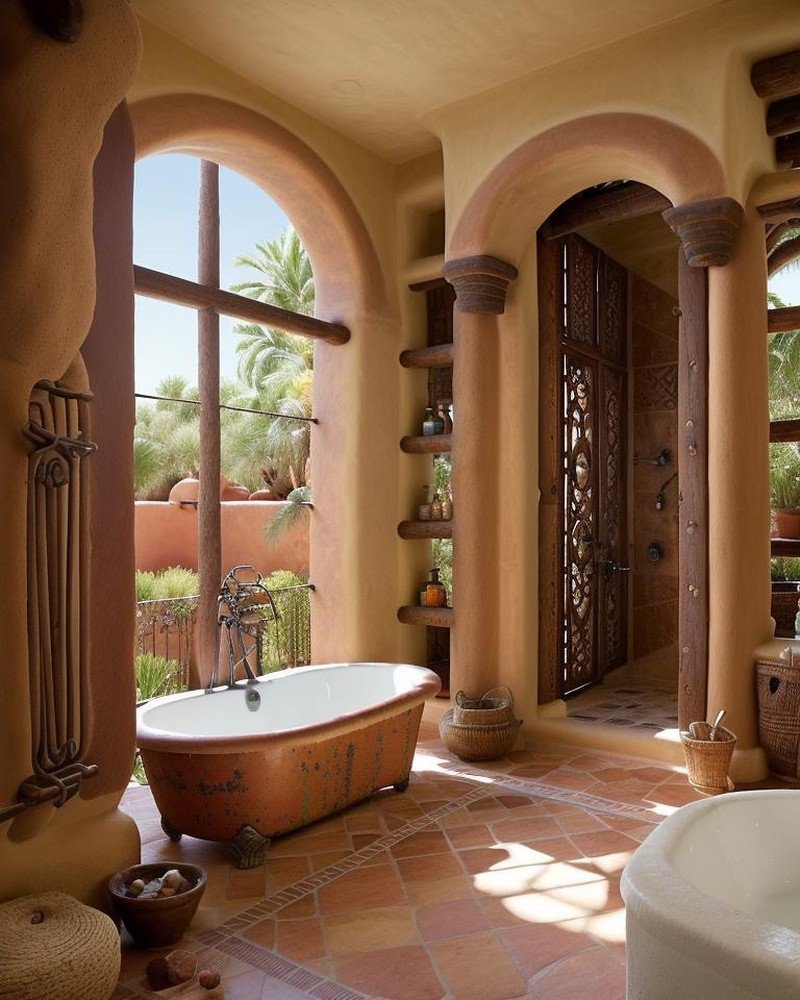
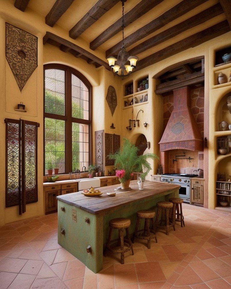
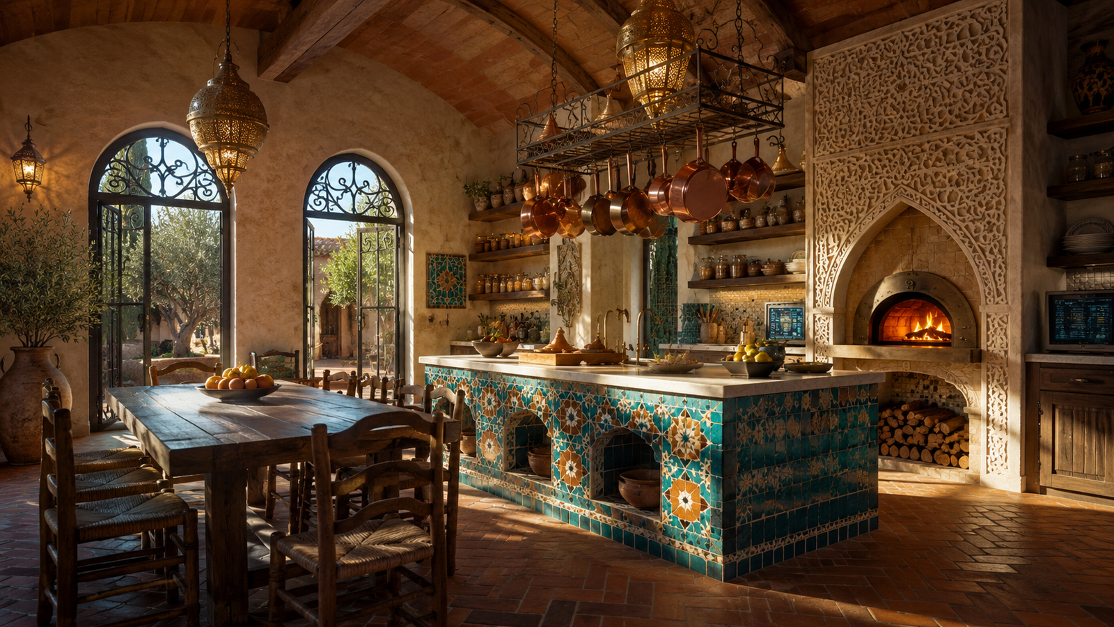
    Spanish Colonial introduces material warmth and the sensory language of Mediterranean tradition. Expect hand-glazed tile work, possibly in ochre, terracotta, or deep blue tones. The bathtub may be a custom form, possibly sunken, carved from stone or tiled. Walls showcase terracotta or rustic plaster finishes. Copper fixtures, patinated or bright, introduce gleaming warmth. Arched niches carved into walls create places for candles, ritual objects, or purely compositional purposes. Flooring is likely saltillo tile or similarly textured material. The lighting is warm and layered—perhaps candle sconces alongside subtle electric light. The ritual here is one of sensory immersion—water, warmth, the texture of earthen materials, the scent of copper and clay.

    Rustic: Elemental Authenticity

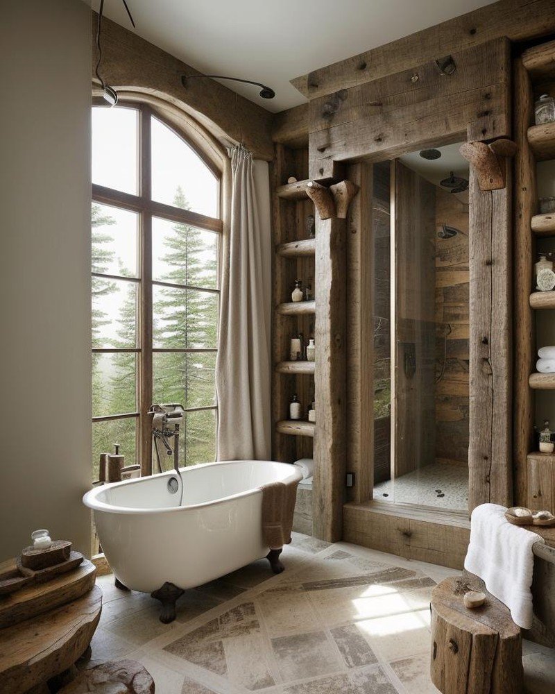
    Rustic strips away formality in favor of elemental honesty. Stone walls, possibly rough-hewn or left in natural state, become primary architectural elements. The bathtub may be a simple form, possibly carved from a single piece of stone, or lined with slate. Fixtures are minimal, possibly visible pipes and simple valve mechanisms. Flooring is likely large-format natural stone, possibly unpolished or only lightly finished. Lighting is minimal—perhaps simple sconces or openings to allow natural light. There is deliberate primitivism here: the ritual is reduced to its essence. The encounter is with water, stone, and elemental form. Comfort is present but secondary to authenticity of material and form.

    Japanese Zen: The Philosophy of Emptiness

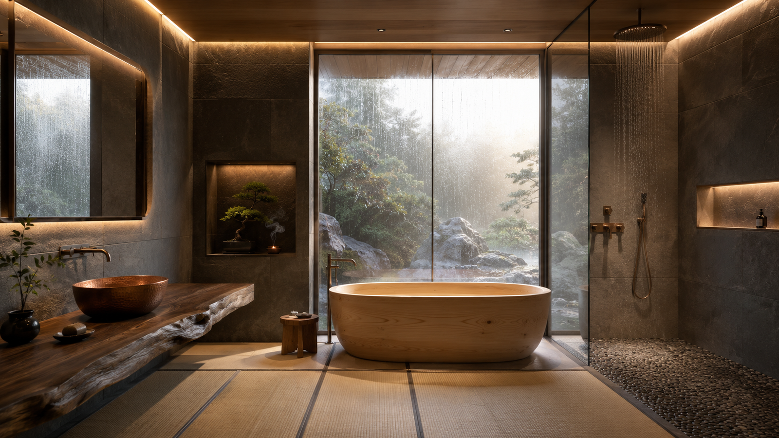
    Japanese Zen introduces a fundamentally different spatial logic. The bathroom becomes a meditation space. The soaking tub is central—often a small, deep form carved from hinoki wood, positioned to command spatial focus. Materials are natural and restrained: wood, stone, possibly ceramic or concrete. The color palette is monochromatic or near-monochromatic: grays, blacks, warm taupes. Lighting is carefully controlled, possibly featuring shoji screens or adjustable diffusion that allows the quality of light to shift. The ritual here is one of deliberate slowness, of water temperature as meditation, of the body’s immersion as a transition into stillness. Every element serves the purpose of cultivating what Zen philosophy calls “emptiness”—the removal of distraction, the achievement of presence.

    Chic Contemporary: Purity and Geometry

    Chic Contemporary abandons historical reference for precision and material purity. The bathtub is likely a sculptural form—possibly a custom rectangular soaking bath in white lacquer or matte finish. Walls are probably finished in polished plaster or seamless concrete. The vanity is minimal, possibly a single slab of white oak or light marble. Fixtures are contemporary in proportion—often handles-free, integrated into the wall, geometric in form. Lighting is integrated—possibly LED strips or recessed fixtures that disappear into the architecture. The material palette is restrained: whites, grays, natural wood tones. The ritual here is one of clean lines and visual clarity—the room itself becomes meditative through its purity of form and restraint from decoration.

    Brutalist: Monumental Materiality

    Brutalism positions the bathroom as sculptural statement. Concrete walls, possibly exposed aggregate or finished in a way that celebrates the material’s weight, form the primary surface. The bathtub may be carved from or built atop a concrete mass, creating an integrated monumental form. Fixtures are minimal—possibly just visible pipes and simple hardware, leaving functional systems exposed. Flooring is polished concrete. Lighting is deliberately minimal, positioned to emphasize shadow and form. The ritual here is not comfort but confrontation—the bather is immersed in a space that asserts its own materiality, that positions the body within a larger architectural presence. Comfort is subordinate to the space’s formal authority.

    Moroccan: Sensory Abundance and Water Play

    Moroccan design language embraces ornamental richness and the sensory celebration of water. Tiled surfaces feature intricate geometric or floral patterns, often hand-glazed in jewel tones—deep blues, teals, warm ochres. The bathing room becomes a riad—a central space from which water flows, where multiple bathing zones exist in proximity. Carved plaster details, possibly incorporating zellige tilework, create visual richness. Brass or copper fixtures are ornate, catching and reflecting light. Lighting is layered and warm—possibly including arched niches where candles can be positioned. The floor may feature a floor drain allowing water to move throughout the space. The ritual here is one of sensory immersion and abundance—water not confined to the tub but celebrated throughout the space, tiles and surfaces creating an environment that delights the eye while supporting the body’s encounter with water.

    Bohemian: Eclecticism and Layered Meaning

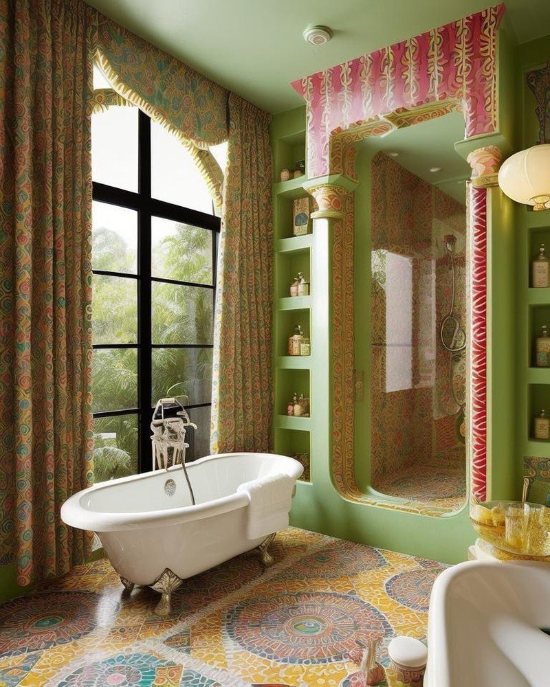
    Bohemian abandons stylistic purity for eclectic layering. Expect a mix of vintage and contemporary elements, possibly a vintage claw-foot tub alongside modern fixtures, textiles introducing color and warmth, mirrors in varied frames, shelving displaying collected objects. Walls might feature wallpaper, paint in unexpected colors, or mixed materials. Lighting is non-uniform—perhaps a statement chandelier, vintage sconces, and diffused natural light. The color palette is rich and varied: jewel tones, metallics, earth tones in close proximity. The ritual here is one of personal expression and comfort—the space is filled with meaning-bearing objects, with colors and forms chosen for their emotional resonance rather than stylistic coherence. The bath becomes a room of personal sanctuary, reflecting the inhabitant’s aesthetics and values.

    Rococo: Ornamental Opulence

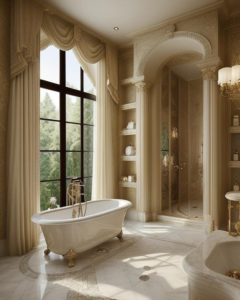
    Rococo celebrates ornamental abundance and curved forms. The bathroom features elaborate mirror frames, possibly gilded or decorated with carved details. The bathtub is a sculptural form, possibly featuring curved pedestal supports or integrated within a tiled surround with curved contours. Walls showcase wallpaper with delicate patterns, or tiled surfaces featuring rococo-inspired curves and flourishes. Lighting arrives via ornate fixtures—possibly a statement chandelier, wall sconces with decorative elements. The color palette is soft and warm: creams, pale blues, rose tones, gold accents. Details matter: possibly marble surfaces, delicate hardware, carefully curated accessories. The ritual here is one of luxurious indulgence—the space asserts that bathing is an occasion, that the body’s comfort and the eye’s pleasure are valid architectural concerns worthy of ornamental expression.

    Scandinavian: Light and Minimalist Warmth

    Scandinavian design language combines minimalism with warmth and accessibility. The bathroom features clean lines, minimal ornamentation, and a restrained material palette: white, light grays, warm wood tones. The bathtub is likely a simple, functional form. Fixtures are contemporary and minimal. Walls are probably painted white or finished in light plaster. The critical element is light—the space is designed to maximize natural light, with generous windows or skylights, or carefully designed artificial lighting that mimics natural illumination. Wood elements introduce warmth without ornament. The ritual here is one of sustainable clarity—the space is legible, honest, and welcoming. Comfort is present but achieved through proportion and light rather than ornamental richness.

    Water as Cultural Expression

    What these ten bathrooms reveal is that water, ritual, and the bathing body are not culturally neutral. The Japanese Zen bath speaks to meditation and self-cultivation. The Moroccan bath celebrates sensory abundance. The Scandinavian bath prioritizes clarity and light. The Rococo bath indulges in ornamental opulence.

    Each design language articulates a different philosophy about what the bathing ritual means, what the body requires, what the architectural environment should provide. Through Cinematic Intelligence™ modeling, these distinct cultural languages were rendered with sufficient fidelity that the spatial logic of each becomes legible—not as aesthetic choices applied to neutral space, but as coherent systems that honor the cultural meanings embedded in bathing traditions.

    Toward Ritualistic Domesticity

    The Vervaine Estate bathrooms demonstrate that architectural design can honor the deeper dimensions of domestic ritual. The bathing room need not be merely functional. It can be a space of cultural expression, of wellness cultivation, of transition and transformation. When design methodology honors the ritualistic dimensions of bathing—the encounter with water, the cultivation of stillness, the expression of cultural identity—the result is a domestic space that supports human flourishing in ways that pure functionality cannot achieve.
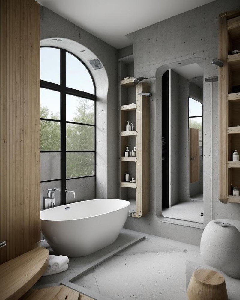
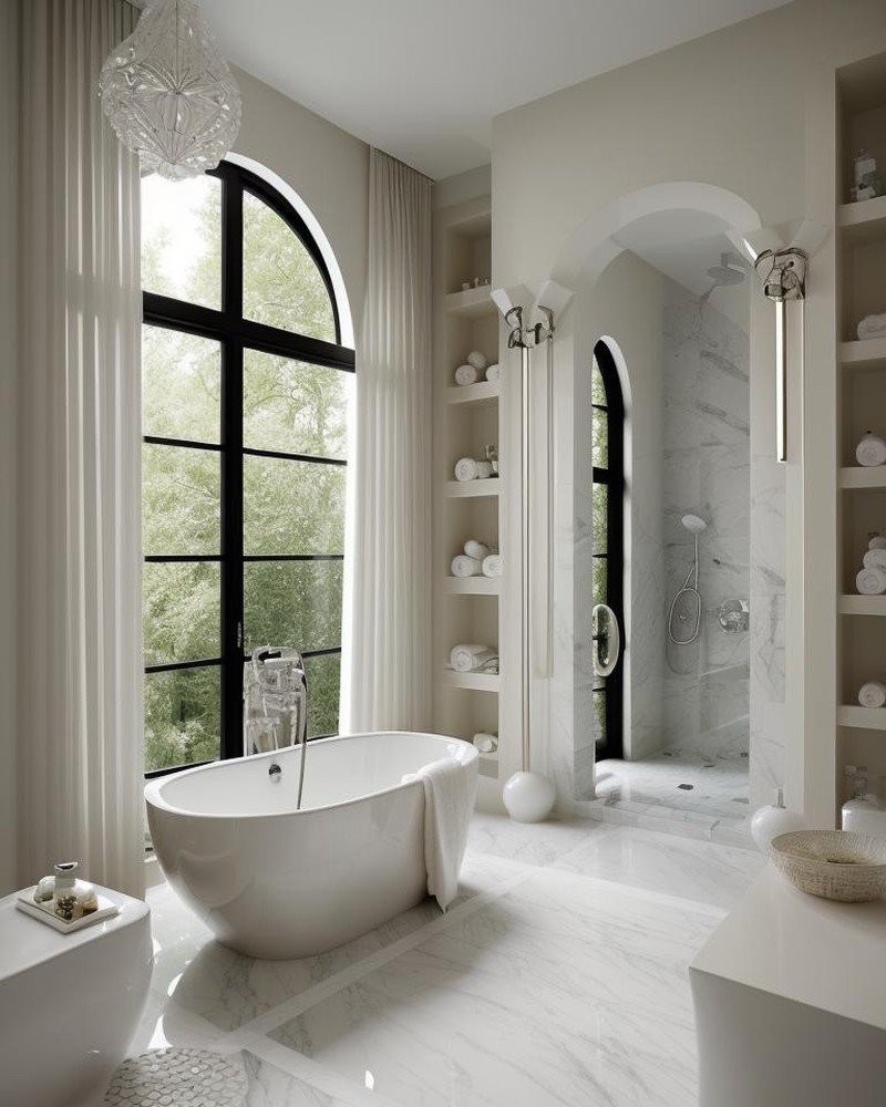
    Brutalist bathroom with concrete walls and monolithic tub

    Chic Contemporary bathroom with honed marble and bronze fixtures

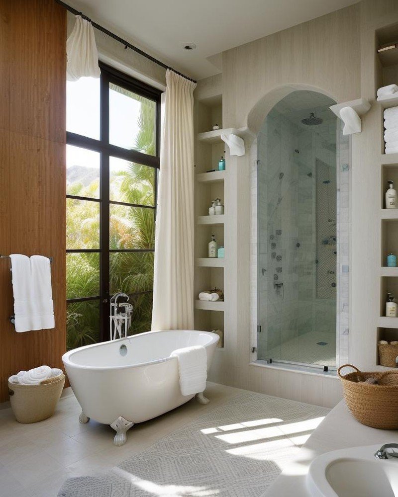
    California Casual bathroom with natural light and relaxed materials

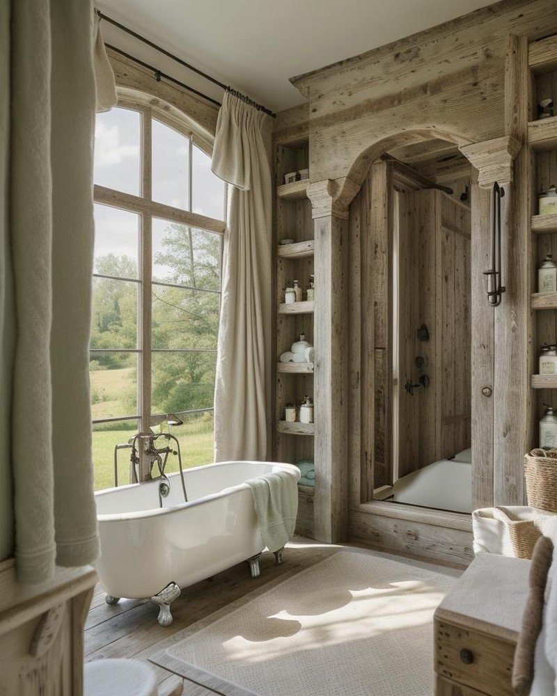
    Farmhouse bathroom with weathered surfaces and enamel tub

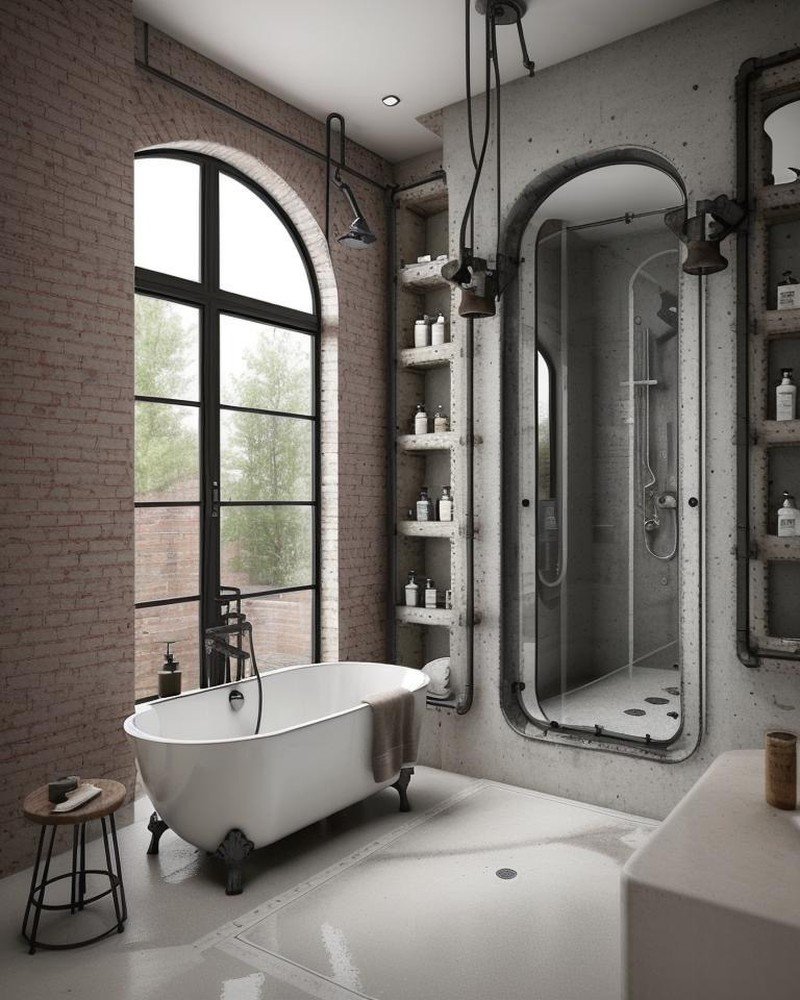
    Industrial bathroom with exposed pipes and concrete floor

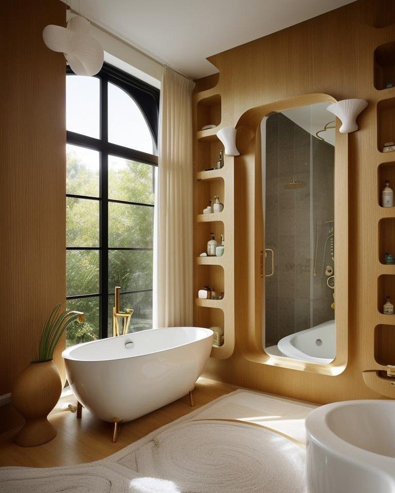
    Mid-Century Modern bathroom with clean lines and teak accents

    Retro bathroom with mosaic tile and vintage fixtures

    Rustic bathroom with stone walls and slate-lined tub

    Spanish Colonial bathroom with terracotta and wrought iron

    Traditional bathroom with pedestal fixtures and wainscoting

  • The Kitchen Reimagined: An Odyssey of Style

    The Kitchen Reimagined: An Odyssey of Style

    A Single Island, Ten Worlds

    The Vervaine Estate kitchens begin with a constant: a marble island. Approximately twelve meters in length, featuring quarried Italian Carrara, the island anchors each kitchen as an immovable center. Around this fixed point, the Vervaine Estate transformations unfold—ten distinct design languages, each one an autonomous world, yet each one calibrated around the same material foundation.

    This constraint is deliberate. It mirrors a fundamental principle of architectural pedagogy: how do you honor material integrity while allowing for radical formal variation? How does a single architectural element—in this case, the island—flex to accommodate entirely different cultural grammars, historical references, and aesthetic logics?

    The answer lies in computational design. Cinematic Intelligence™ enables iterative translation of the same functional brief—a kitchen island serving as workspace, gathering point, and visual anchor—across twenty-two distinct design languages. The marble remains. Everything else is fluid.

    Traditional: Symmetry as Order

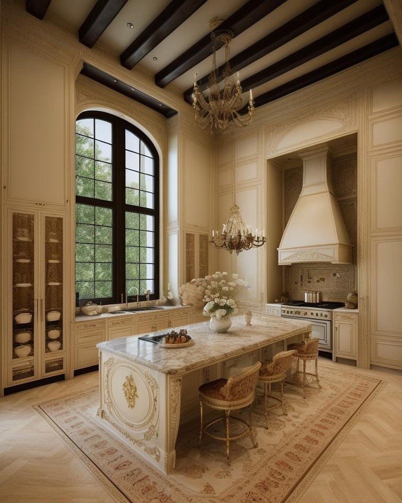
    In the Traditional iteration, the marble island becomes a formal statement. Cabinetry beneath features symmetrical paneling, classical proportions reminiscent of nineteenth-century European domestic architecture. The perimeter kitchen abandons contemporary minimalism in favor of crown molding, Shaker-inspired cabinetry doors, and brass hardware that evokes historical craftsmanship. Lighting arrives via a classical chandelier—not as decoration but as a compositional anchor. The kitchen speaks a language of temporal continuity, of inherited design logic carried forward through material and proportion.

    Spanish Colonial: Warmth and Materiality

    The Spanish Colonial expression introduces material richness. Terracotta tile floors, hand-glazed and slightly irregular, establish a warm base. The island’s marble surface takes on new significance—now a cooling counterpoint to warm earth tones. Cabinetry shifts toward darker woods, possibly walnut or reclaimed oak. Arched niches in the perimeter walls suggest historical stonework. Copper hardware replaces brass. The lighting becomes integral—wrought iron sconces appear at strategic intervals. The kitchen feels excavated, as though layers of historical use have accumulated in its materials and forms.

    Rustic: The Poetry of Imperfection

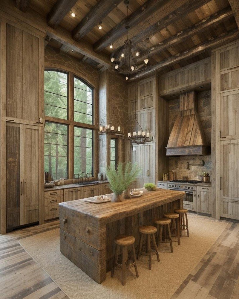
    Rustic dissolves architectural formality in favor of textured materials and weathered surfaces. The marble island gains company from hand-forged iron legs, possibly salvaged or custom-made to appear so. Perimeter cabinetry features open shelving, allowing ceramics, copper cookware, and glass vessels to become visual elements. Stone walls, possibly rough-hewn or left raw, replace drywall. The floor is likely flagstone or weathered tile. Lighting is functional and minimal—perhaps simple pendant fixtures or even suspended bare bulbs. This kitchen privileges authenticity of material over stylistic coherence. The imperfections are the point.

    Retro: Nostalgia as Form

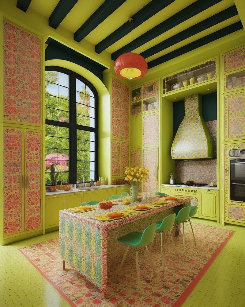
    The Retro expression introduces mid-twentieth-century visual language. Expect chrome accents, perhaps a vintage-inspired range, mosaic tile backsplash in jewel tones or monochromatic patterns. The marble island may feature chrome base supports, consciously anachronistic. Cabinetry could include aluminum-frame details, or glass-front cabinets. Lighting shifts toward geometric forms—perhaps a semi-flush fixture with clean lines, or vintage pendant lights with colored glass. The palette is curated: no more than three or four colors, but each one chosen for its nostalgic resonance. This is a kitchen designed to evoke a specific moment in time, preserved as architecture.

    Mid-Century Modern: Reductive Elegance

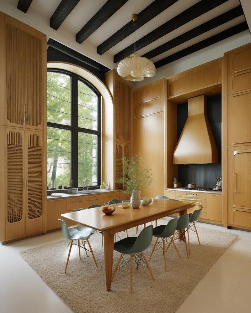
    Mid-Century Modern strips away ornament in favor of pure form and proportion. The marble island gains support from tapered wooden legs, likely walnut or teak. Cabinetry is austere—flat-panel doors, minimal hardware, possibly a mix of cabinet and open shelving. Materials are carefully chosen: wood, metal, glass, and the marble surface itself become the only necessary decoration. Lighting is sculptural—perhaps a statement pendant or a series of precise downlights. The perimeter kitchen maintains minimal wall decoration. This language speaks through proportion and material authenticity rather than applied ornament.

    Industrial: Raw Materiality and Function

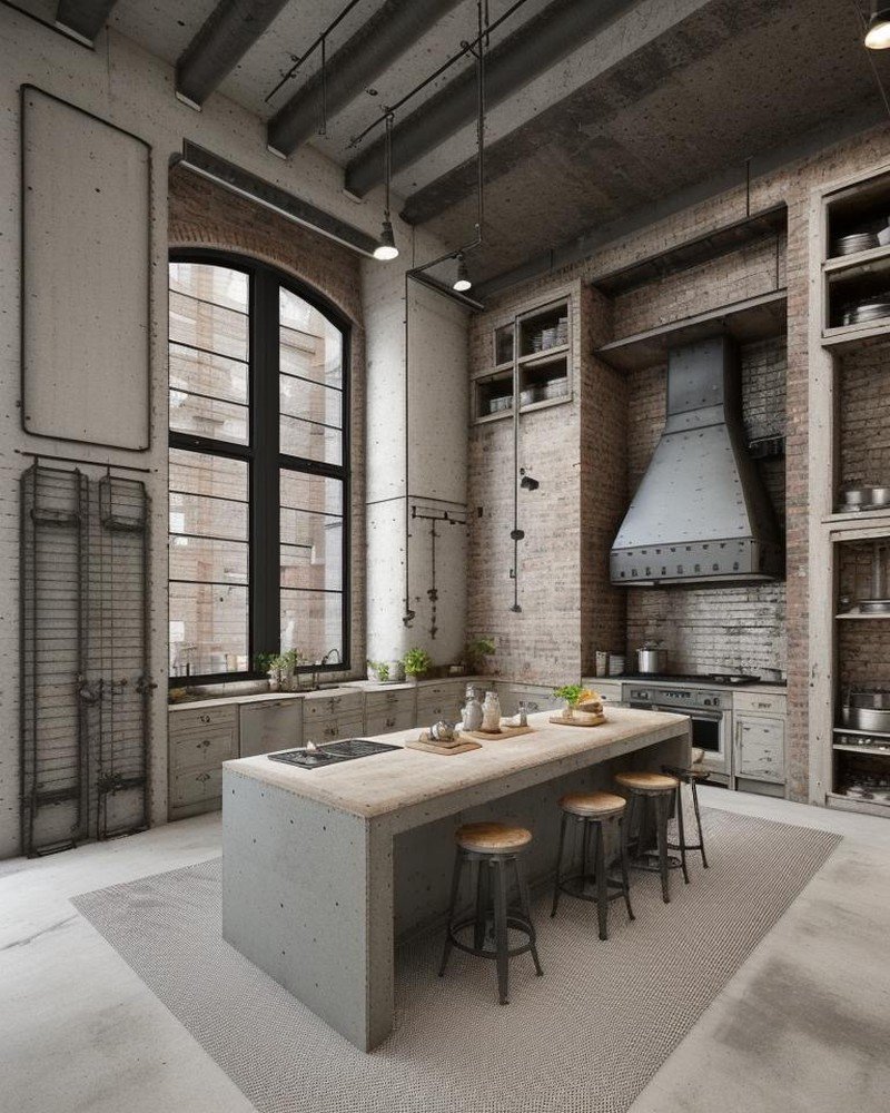
    Industrial embraces the authentic language of manufacturing spaces. The marble island is now accompanied by stainless steel prep surfaces, perhaps visible mechanical fasteners. Cabinetry is minimal—possibly custom metal shelving or open racks displaying cookware. Flooring is likely polished concrete or utilitarian tile. Walls remain raw brick or painted industrial-grade plaster. Lighting appears as exposed bare bulbs or industrial-style pendant fixtures with metal shades. Mechanical systems—ductwork, pipes—remain visible rather than concealed. The kitchen is legible as a machine for cooking, stripped of pretense, celebrating the logic of its own functioning.

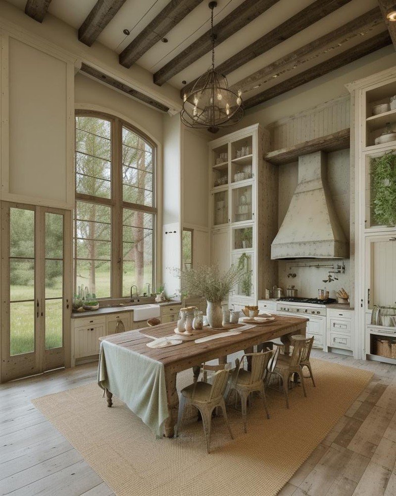
    Farmhouse: Cultivated Rusticity

    Farmhouse differs from Rustic through intentional curation. While Rustic privileges authenticity of wear, Farmhouse is a more composed aesthetic—texture and warmth carefully orchestrated. The marble island may feature a wood apron skirt in a light neutral tone. Cabinetry is likely painted wood, perhaps cream, sage green, or soft white. Open shelving displays selected pottery, vintage glassware. Flooring is often engineered wood or ceramic tile designed to resemble traditional materials. Lighting arrives via vintage-inspired fixtures, but these are new, carefully selected for their ability to evoke historical warmth without actual deterioration. The overall effect is nostalgic comfort, a designed pastiche of agrarian simplicity.

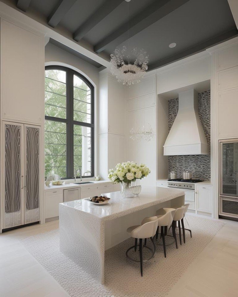
    Chic Contemporary: Precision and Minimalism

    Chic Contemporary abandons historical reference entirely in favor of precision engineering and material purity. The marble island features a cantilevered base or minimal supporting structure—perhaps a sculptural steel frame. Cabinetry is handled-less, smooth surfaces in matte finishes or high-gloss lacquer. Materials are primary: marble, natural wood veneer, concrete, polished steel. The perimeter kitchen is similarly austere. Lighting is integrated—perhaps LED strips or recessed fixtures that become invisible, allowing the space itself to be the visual subject. Color is restrained: whites, grays, warm neutrals. The kitchen is a study in proportion and material honesty, unadorned and precise.

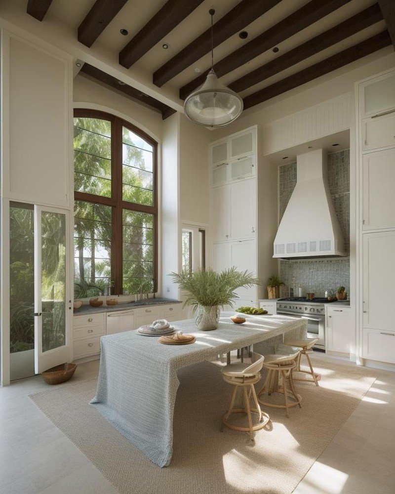
    California Casual: Lightness and Openness

    California Casual prioritizes visual lightness and integration with adjacent spaces. The marble island may feature an open base, allowing sightlines to continue beneath and through the kitchen. Cabinetry is likely light-colored, possibly white or pale wood, with glass-front options. The perimeter kitchen opens generously to dining or living spaces—no visual barriers. Materials are bright: whitewashed wood, light marble, chrome or stainless details. Lighting is soft and diffused, possibly through skylights or generous windows. The overall impression is of a space that breathes, that allows the kitchen to integrate with the rest of the home rather than assert itself as a separate domain.

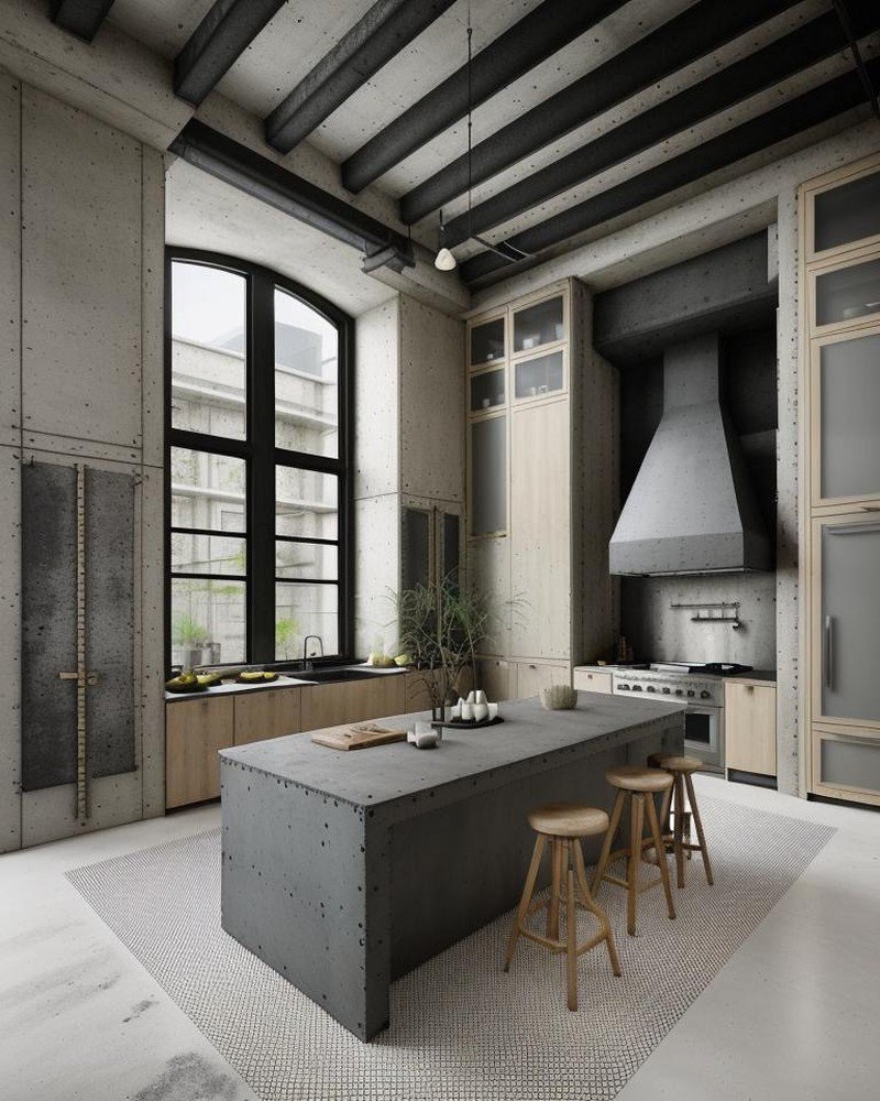
    Brutalist: Monumental Severity

    Brutalism transforms the kitchen into a sculptural gesture. The marble island becomes a monumental form, possibly supported by concrete masses or heavy timber elements. Cabinetry is minimal and often integrated into concrete walls. Flooring is polished concrete. Lighting is deliberately minimal—perhaps a single statement fixture, or lights positioned to emphasize shadow and form. Materials celebrate their own weight and substance: concrete, stone, heavy timber, metal. The kitchen is not primarily functional in its visual presentation—it is an architectural statement, a declaration that the space exists as form and material, not as a container for appliances.

    The Multiplicity of Form

    These ten expressions reveal a fundamental truth: the kitchen is not a fixed typology. It is a field of possibilities. The marble island remains constant—a variable held steady to make visible the transformation possible around it. But the transformation is total. The spatial logic shifts. The material palette transforms. The relationship to light, scale, and compositional hierarchy changes completely.

    This fluidity was possible through Cinematic Intelligence modeling—the capacity to iterate rapidly across design languages, to test multiple expressions of the same functional brief, to render each with sufficient richness that stakeholders can inhabit the space imaginatively, understanding not merely its appearance but its spatial logic, its material character, its psychological effect.

    Design Language as Translation

    What emerges is a clear principle: design language is not decoration applied to a neutral spatial container. It is translation—a way of articulating spatial relationships, material choices, formal hierarchies, and psychological effects through a particular cultural and historical grammar. The Traditional kitchen understands order through symmetry and historical proportion. The Industrial kitchen reveals function as its own aesthetic. The Brutalist kitchen positions material weight as meaning.

    Each expression serves the same functional brief: prepare food, gather, work at counter height. Yet each one does so through entirely different architectural languages. The marble island, constant and immovable, becomes a measure of this multiplicity. Around this fixed point, the Vervaine Estate kitchens demonstrate that domestic architecture need not choose between functional integrity and cultural expression. Through rigorous design methodology and computational visualization, both can coexist, each one authentic, each one complete.

    Brutalist kitchen with concrete island and exposed timber beams

    California Casual kitchen with light marble and open sightlines

    Chic Contemporary kitchen with minimal cabinetry and clean geometry

    Farmhouse kitchen with weathered wood and ceramic accents

    Industrial kitchen with steel columns and exposed ductwork

    Mid-Century Modern kitchen with walnut cabinetry and sculptural pendant

    Retro kitchen with chrome accents and jewel-tone palette

    Rustic kitchen with stone walls and hand-forged iron details

    Spanish Colonial kitchen with terracotta tile and copper hoods

    Traditional kitchen with classical chandelier and carved marble island

  • AI and Domestic Rituals: How Technology is Rewriting Kitchens and Baths

    AI and Domestic Rituals: How Technology is Rewriting Kitchens and Baths

    Hyperrealistic 3D render of AI-responsive luxury kitchen as domestic ritual space

    The Philosophy of Responsive Space

    For centuries, the kitchen and bathroom remained fundamentally static. They were boxes optimized for task completion—efficient, rational, often soulless. The bath was a room where you washed. The kitchen was where you cooked. But this binary thinking obscured a deeper truth: these are spaces where the rhythms of domestic life unfold. Where rituals are performed. Where meaning accumulates.

    Artificial intelligence is fundamentally rewriting this equation. Not through gimmickry or superficial automation, but through a deeper understanding of how humans inhabit space. The emerging paradigm positions kitchens and bathrooms as responsive environments—spaces that learn, adapt, and ultimately serve not just functional efficiency but emotional and psychological wellness.

    This represents a seismic shift in how we conceive of domestic architecture. The kitchen and bath are no longer inert containers for activity. They are becoming intelligent partners in the rituals we perform within them.

    Behavioral Optimization and the Grammar of Space

    Computational design has enabled architects and designers to model not just physical space but behavioral flow. Through multiplicity modeling—the simultaneous iteration of dozens of spatial configurations against real human movement patterns—AI systems can now predict where friction occurs in kitchen workflows, where the bath’s user pauses for reflection, where ambient conditions need to shift to support different ritualistic moments.

    Consider the kitchen island. Traditionally it was positioned for visibility and ergonomic convenience. But behavioral optimization reveals something deeper: the island is not merely functional. It is psychological. It is where family members gather. It is where conversation happens. Where meal preparation becomes performance. Computational analysis of how light falls across the island, how proximity to appliances affects workflow, how thermal comfort shifts throughout the day—these inputs allow AI-assisted design to configure spaces that anticipate human need before that need is consciously registered.

    The same principle applies to the bathroom. For millennia, bathing has been understood as ritual—from Japanese onsen ceremonies to Roman spa culture to contemporary wellness practices. Yet most bathrooms are designed without regard to the psychological or ritualistic dimensions of bathing itself. Behavioral optimization changes this. AI systems can model optimal water temperature exposure, ideal humidity gradients, light patterns that support circadian alignment, even acoustic properties that create meditative silence or supportive ambience.

    Hyperrealistic render of Moroccan-Mediterranean culturally intelligent kitchen

    Cultural Identity as Infrastructure

    The second vector of transformation is cultural. Kitchens and bathrooms are not culturally neutral. They are repositories of identity, tradition, and collective memory. A Japanese kitchen embodies different spatial hierarchies, different relationships to appliances, different understandings of what “efficient” means compared to a Moroccan riad kitchen or a Scandinavian design ethos.

    Traditional design practice often flattened these differences into superficial aesthetic choices—a tile color, a cabinet style, perhaps a cultural reference in decor. But generative AI enables something far more sophisticated: the translation of cultural design languages into spatial logic. An algorithm trained on Japanese kitchen traditions doesn’t merely apply Japanese aesthetics to a Western kitchen box. It understands the underlying spatial principles that govern Japanese domestic space—the relationships between preparation, cooking, and service; the integration of nature through materials and light; the philosophical relationship to utility itself.

    This capacity for cultural translation is transformative. It means that a kitchen or bath can authentically express cultural identity while adapting to contemporary life, local building codes, and modern appliance technology. The cultural and the contemporary are no longer in tension. They merge through computational mediation.

    Wellness as Architectural Infrastructure

    The third dimension is wellness. The kitchen and bathroom have been recognized as wellness spaces—places where health and well-being are cultivated. But this has traditionally been understood narrowly: good ventilation for air quality, or a soaking tub for relaxation. AI-assisted design expands wellness into a comprehensive architectural infrastructure.

    Consider light. For the kitchen, Cinematic Intelligence™ modeling allows designers to compute optimal light conditions for different times of day, different tasks, different psychological states. Morning light for activation and clarity. Midday light for performance and focus. Evening light that shifts toward warmer frequencies to support circadian alignment and the psychological transition from work to domestic rest. The same precision applies to the bathroom—light modeled not just for functional visibility but for the restorative qualities needed in a bathing space, the psychological signaling required for morning activation or evening unwinding.

    Thermal comfort becomes similarly granular. Air movement patterns can be computed to eliminate hot spots and cold pockets. Humidity can be managed to support both respiratory health and the sensory qualities of the bathing experience. Even sound—traditionally an afterthought in domestic spaces—can be modeled as a component of wellness. AI systems can predict acoustic properties and recommend interventions that create either focused silence or supportive ambient sound depending on the room’s primary ritual.

    Cinematic 3D visualization of Japanese-inspired wellness bathroom sanctuary

    The Bath as Algorithmically Personalized Sanctuary

    In the most sophisticated implementations, the bathroom becomes a personalized sanctuary—a space that adapts not just to activity but to individual psychological and physiological states. Smart BIM integration allows real-time adjustment: water temperature optimized for the user’s circadian position; lighting responsive to the user’s stress biomarkers; material selection chosen for its therapeutic acoustic and thermal properties.

    This is not futurism. Adaptive visualization engines are already capable of rendering these scenarios, of showing designers and clients how a bathroom might respond across different use cases, different times of day, different physiological states. The infrastructure is emerging. The philosophy is crystallizing.

    Toward Emotionally Intelligent Domestic Space

    The deeper significance of AI in kitchens and bathrooms is not technological but philosophical. It represents a shift from seeing domestic space as static container to seeing it as a partner in human flourishing. The kitchen is no longer merely where food is prepared—it is where family rituals unfold, where cultural identity is performed, where the everyday becomes ceremonial. The bathroom is no longer merely hygienic—it is a sanctuary where the day is ritually shed, where the body is cared for with intention, where restoration occurs.

    AI-assisted design, working through multiplicity modeling and adaptive visualization, enables architects to honor these deeper dimensions. Not through superficial added features, but through fundamental reimagining of how space can be organized, how light and material and thermal condition and acoustic properties can be orchestrated to support the psychological and ritualistic dimensions of domestic life.

    The Vervaine Estate transformations demonstrate this principle across twenty-two design languages. Whether the kitchen expresses Brutalist severity or Spanish Colonial warmth, whether the bath embodies Japanese Zen restraint or Moroccan sensuality, the underlying logic is the same: space as a responsive, intelligent partner in the rituals that constitute home.

    This is the future of domestic architecture. Not smarter kitchens. Not more connected bathrooms. But spaces that recognize what they have always been meant to be: sacred rooms where the rhythms of life are performed, ritually, with intention, supported by infrastructure that understands that human flourishing requires more than efficiency. It requires beauty, ritual, cultural authenticity, and spaces that respond to our deepest needs without us having to ask.

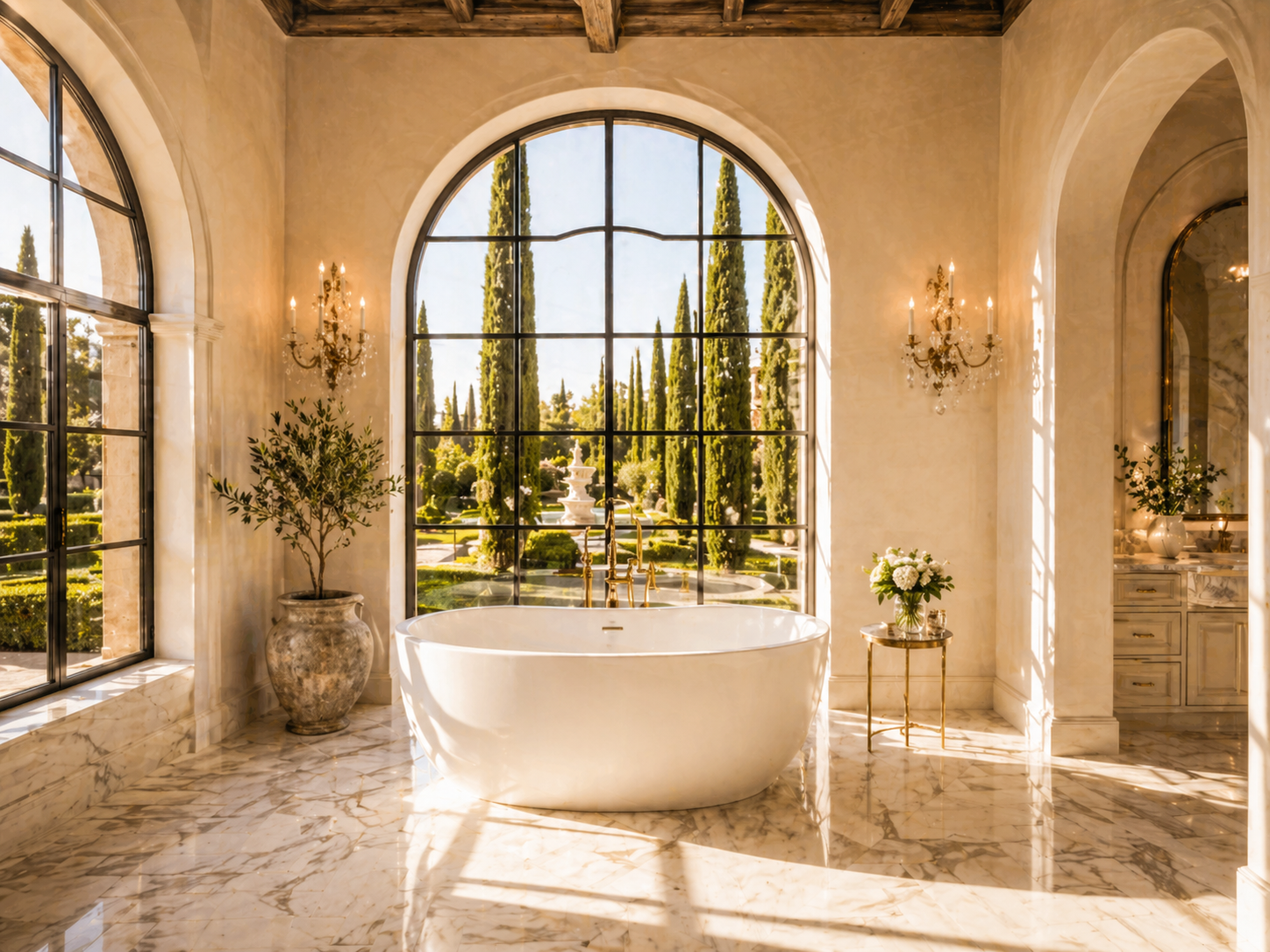
    Luxury Tuscan bath suite with AI-responsive ambient lighting and freestanding tub

    AI-integrated spa bathroom with circadian light systems and natural stone

  • The Death of the Floor Plan: Why Architecture Is Now Sold in Images, Not Drawings

    The Death of the Floor Plan: Why Architecture Is Now Sold in Images, Not Drawings

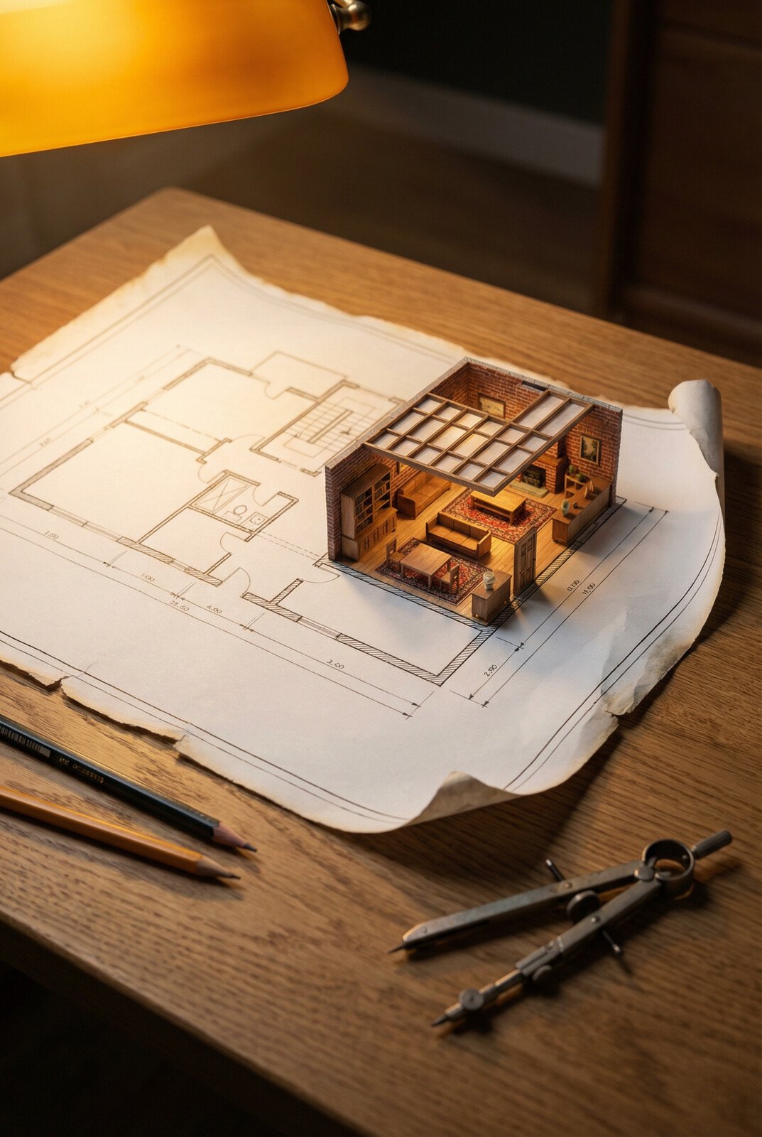
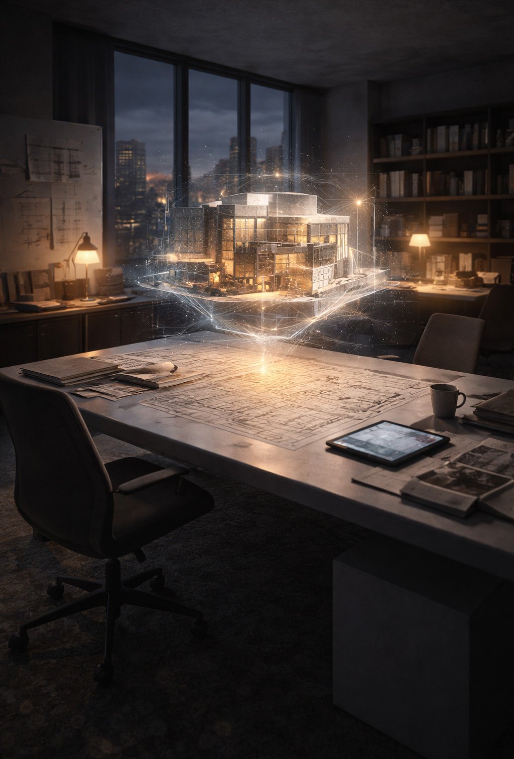
    architect desk with blueprints and holographic visualization

    The floor plan had a four-hundred-year contract. From the moment it emerged as a representational necessity—when buildings grew too complex to build from verbal instruction alone—the floor plan became architecture’s constitutional document. It was the language through which intent moved from mind to site. It was legitimacy. A building without a plan was like law without precedent: possible, but questionable.

    That era is closed. Not because the floor plan lost usefulness—it didn’t—but because it lost its audience. The end came not with a manifesto or a theoretical rupture, but quietly, through preference. Clients stopped asking for drawings. They started asking for visuals.

    The inversion is nearly complete. What was once the opening gesture—the plan spread across a conference table, the architect explaining intention through line weight and notation—has become the back office. Now the image arrives first. The render. The visual speculation. The decision made through perception rather than through projection. Architects who trained in the language of plans discovered they were speaking to an audience that had learned to read space differently.

    The Death Was Quiet

    For most of the twentieth century, the hierarchy was clear: plans mattered. Elevations supported them. Sections explained them. Renderings were afterthoughts—marketers’ tools, developer indulgences, unnecessary decoration. The serious work happened in two dimensions. The real thinking happened in lines.

    This ordering reflected a fundamental assumption: that architects understood buildings better than clients did. That the ability to read technical drawings was a literacy that mattered. That intention could move from abstract line to built reality if the intermediate language was precise enough. The floor plan was the test. If you could read it, you understood the building. If you couldn’t, you trusted the architect.

    The assumption held for centuries. It held through Arts and Crafts. It held through Modernism. It held even as computers made plans easier to produce and harder to understand—more complex, more layered, more removed from the experiential reality they claimed to represent.

    Then something shifted. Not because plans became obsolete, but because perception became more valuable. Clients began to understand buildings through visual simulation rather than technical notation. A rendered interior told them more about how the space would feel than a plan ever could. A perspective view showed them light and material and proportion in the language they actually used to make decisions. The floor plan became what it always was beneath the technical surface: an abstraction. And abstractions only matter if their audience can use them.

    architectural visualization study

    The real acceleration came through AI. Cinematic Intelligence™ did something no human team could do at scale: it generated spatial imagery at velocity. Dozens of variations. Hundreds of spatial explorations. Every iteration visualized before it was drawn, every decision surfaced through perception before it was committed to plan. The visual engine became the design engine. Plans followed, they didn’t lead.

    Developers understood immediately. Why commission a hundred plans to explore massing when you could visualize fifty variations in the time it took to draw one? Why trust notation when you could show the investor exactly what the light would do at four in the afternoon? The sales process inverted. Where plans once opened conversations—”here is the logic, here is the intention”—they now close them. The decision is made. The image has already sold it.

    What Changed Is How We Understand Space

    The floor plan didn’t fail. What happened is subtler and more profound: the audience outgrew the language. A new literacy emerged. Clients learned to understand buildings through images. They developed intuition about spatial relationships by moving through rendered environments. They could assess proportion and material and light through perception rather than through technical projection.

    This doesn’t make architecture shallower. It makes it more accountable. The rendered image cannot hide behind the excuse of technical complexity. It cannot defer judgment to “the vision becomes clear once it’s built.” The image is the first judgment. If the space doesn’t work in the visualization, it was never going to work in reality. The abstraction that once allowed architects to propose unrealistic ideas has been removed. Now they must show what they mean.

    3D space visualization with material studies

    Some architects mourned this. They saw it as a loss—the loss of a specialized knowledge, the democratization of their authority. But the better architects understood what was actually happening. The floor plan wasn’t being eliminated; it was being restored. Because the visual literacy that replaced it is not actually divorced from the plan—it’s built on it. The render is only as intelligent as the space it visualizes. And the space is only as coherent as its plan.

    What changed is the order of conversation. The plan is no longer the starting point—it’s the foundation. You don’t begin a project by drawing a plan and hoping the client can imagine the space. You begin by showing them the space, and then you explain the plan that makes it possible. The drawing becomes the evidence of what the image promised.

    Cinematic Intelligence doesn’t replace drawings. It transforms their purpose. The floor plan was always doing two jobs at once: it was simultaneously a tool for thinking about space and a tool for selling space. Those are different demands. Technical precision and perceptual clarity are not the same thing. The visual engine separates them. The image handles sales. The plan handles truth. Each can finally be excellent at what it’s designed to do.

    The New Architecture Is Accountable Architecture

    A building visualized before it’s drawn cannot hide behind the excuse of unexpected site conditions or the surprise emergence of unexpected design during construction. The architect has already made a promise. The image is the contract. When discrepancies appear between render and reality, it becomes immediately visible. This is uncomfortable for architects trained to believe that real buildings are always more complex than drawings can express. And they are. But the comfort of that complexity—the shelter it provides from accountability—is gone.

    detailed interior render with material specification

    What emerges is a different kind of architectural intelligence. One that understands the image as a specification, not a suggestion. One that recognizes that the visual environment is the primary environment—that people experience buildings through light and material and proportion before they experience them through floor area or structural efficiency. The plan becomes the thing that explains how the image is possible, rather than the image becoming the thing that explains what the plan means.

    This shift doesn’t diminish architecture. It redirects it. Because the goal was never to be able to read drawings. The goal was always to create environments where people could think, work, rest, and flourish. The floor plan was one way of getting there. The visual engine is another. The plan was never the destination—it was the journey. And if the journey can become clearer, more transparent, more directly connected to the actual experience of inhabiting space, then the architecture itself can become more thoughtful about what it’s actually trying to achieve.
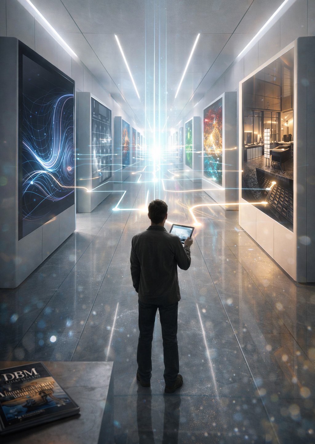
    The Language Changed, Not the Conversation

    The death of the floor plan is not the death of spatial reasoning. It’s the maturation of it. Architecture is no longer sold in drawings because architecture learned to speak the language its audience actually uses. Plans are still drawn. They’re still necessary. They’re still the foundation of every serious project. But they’re no longer the sales pitch. They’re no longer the thing you show first. They’re the thing you show to prove that the image is real.

    render showing architectural detail and spatial relationship

    Some will argue this represents a loss of architectural rigor, a triumph of appearance over substance. But appearance and substance are not opposites—they’re the same thing experienced from different distances. A space doesn’t fail because its visual representation is powerful. It fails because the spatial logic underneath that representation is flawed. The image didn’t replace the plan; it exposed it. Now there’s nowhere for weak spatial thinking to hide.

    The floor plan is dead not because it failed. It’s dead because architecture outgrew the need to explain itself slowly. The image accelerates understanding. It collapses the gap between intention and perception. And in that collapse, architecture becomes what it was always meant to be: not a specialized language for architects, but a direct communication with the people who inhabit the spaces we design.

    comprehensive spatial visualization

    The conversation hasn’t ended. It’s become clearer. And clarity, it turns out, was always the point.

  • The Final Three: How DBM Pushed California Casual, Bohemian & Bauhaus Beyond Their Limits

    The Final Three: How DBM Pushed California Casual, Bohemian & Bauhaus Beyond Their Limits

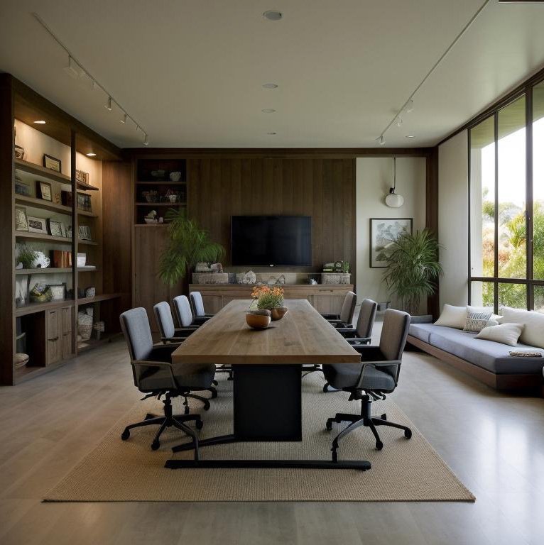
    Boardroom with warm earth tones, colorful pattern accent, and curated spatial harmony

    The Conclusion That Explains Everything

    These are the final three. Not three additional styles among many, but three styles that reveal the true architecture of the entire 22-style collection. They do not merely conclude—they explain.

    Across these three, DBM’s Cinematic Intelligence™ encounters the deepest truth about design transformation: A room is not defined by its style. A room is defined by its intelligence. Intelligence is how a space interprets light, how it navigates culture, how it honors identity while remaining effortlessly itself. Intelligence is the invisible structure beneath every aesthetic choice.

    These final three styles are often misunderstood because they live closest to everyday life. They feel familiar. They feel accessible. This proximity is precisely why they are the hardest to master. Everyone thinks they understand California Casual. Everyone believes they can do Bohemian. Everyone assumes Bauhaus is simplicity itself.

    They are wrong. And DBM’s interpretation proves it.

    California Casual: The Paradox of Effortlessness

    California Casual boardroom with warm earth tones, green plants, relaxed sophistication

    California Casual is deceptively complex. The entire aesthetic hinges on a paradox: it must feel effortless while requiring extreme precision. It must whisper, not shout. It must breathe, not sprawl.

    Most interpretations fail because they oversoften the style. They confuse casual with careless. They treat California Casual as permission to abandon standards. The result is rooms that feel unfinished—spaces that lack architectural conviction.

    DBM’s interpretation approached California Casual as atmospheric logic, not color palette. The boardroom became breathable but never bland. Warm but never rustic. Green plants exist here not as decoration but as atmospheric participants—they shift light, create micro-climates, remind inhabitants that this space is alive.

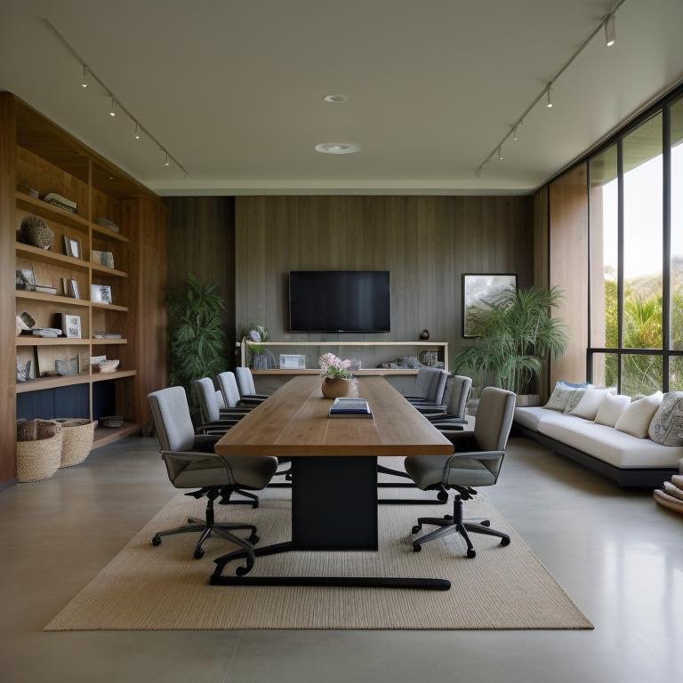
    California Casual variation with soft sunlit gradients and natural material warmth

    This room feels like a boardroom that grew up in Malibu but runs a Fortune 100. It carries the ease of the Pacific Coast—the unforced warmth, the light that seems to arrive from everywhere at once. Yet it maintains absolute executive authority. Decisions made here feel inevitable. Collaboration feels natural. The space itself invites clarity.

    Cinematic Intelligence understood that California Casual is not about relaxation. It is about achieving focus through comfort. This boardroom is where strategy sessions feel like conversations between equals. Where hierarchy dissolves not through informality but through shared architectural respect.

    This is California Casual as infrastructure for leadership.

    Bohemian: Discipline Masquerading as Freedom

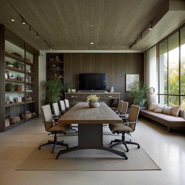
    Bohemian boardroom with rich jewel tones, curated patterns, textiles, and layered depth

    Bohemian is notoriously risky. One wrong move and the style collapses into visual clutter and identity confusion. A room becomes a costume shop instead of a space. Personality overwhelms purpose. Culture becomes caricature.

    The miracle of DBM’s Bohemian interpretation is discipline. This is personality without noise, color without chaos, culture without cliché. The engine achieved this through a single method: narrative order.

    Rich jewel tones in this space do not compete—they graduate. Patterns speak in rhythm rather than screaming for attention. Colors support each other rather than demanding individual recognition. Textures are layered with the precision of a conductor orchestrating an orchestra where every instrument has heard the composition memorized.

    Bohemian variation with curated eclecticism and architectural harmony

    The style never surrenders to itself. It surrenders to architecture. Every bold choice—every emerald wall, every patterned textile, every artistic gesture—exists because it serves the room’s clarity, not its chaos. This Bohemian boardroom is for leaders, not tourists. It speaks to those who understand that personality and precision are not opposites but partners.

    Cinematic Intelligence approached Bohemian as a design philosophy: How do you celebrate cultural richness without creating visual noise? The answer is understanding that true eclecticism is not random—it is curation. Every element was chosen not because it is interesting but because it is necessary.

    This boardroom feels like it has lived. It has history. It has traveled. Yet it remains focused. It remains intelligent. It refuses to apologize for its color while maintaining its purpose.

    Bauhaus: Sacred Ground

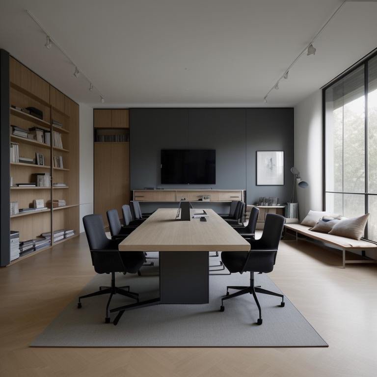
    Bauhaus boardroom with clean geometry, monochrome palette, mathematical discipline

    Bauhaus is sacred ground in design history. It is not a style that can be adopted casually. It is a philosophy—mathematical, taught not invented. It demands clarity, order, honesty, humility, rigor.

    Most contemporary interpretations struggle because they misunderstand the core principle: Bauhaus does not eliminate beauty. Bauhaus eliminates dishonesty. Every form must have function. Every material must be true. Every line must be justified. This is design as moral discipline.

    DBM’s Bauhaus interpretation is almost unnerving in its purity. Geometry is exact. Materials align without ornament. The palette is disciplined—monochromes that speak through reflection and shadow rather than through color. This boardroom could have been approved by Walter Gropius himself. Nothing is loud but everything matters.

    Bauhaus variation with mathematical precision and disciplined material honesty

    Cinematic Intelligence here operated as a philosophical restraint. At every decision point, the question was: Is this necessary? Does this serve function? Does this material speak truth? Most design systems cannot sustain this level of interrogation. Most designers lack the conviction.

    Yet this Bauhaus boardroom proves that restraint is not emptiness. Discipline is not sterility. A room governed by Bauhaus principles is more alive than spaces drowning in decoration. Life emerges from clarity. Strength emerges from honesty.

    The Final Three Reveal the Method

    Across this entire 22-style collection, structure never changed. Proportions never changed. The spatial envelope remained constant. This is not accident. This is evidence.

    This is the DBM method: Styles evolve. Architecture remains sovereign.

    The Cinematic Intelligence engine did not change the boardroom. It revealed it—through California Casual’s warmth, through Bohemian’s richness, through Bauhaus’s clarity, through Expressionism’s energy, through Coastal’s atmosphere, through Chalet’s intimacy, through Chic Contemporary’s precision, and through fourteen other styles, each one proving the same principle.

    One room. Twenty-two languages. One unchanging architecture that could speak every language fluently.

    The Architecture of Infinite Futures

    This collection concludes not with finality but with revelation. Architecture is not a limitation. Architecture is a canvas of infinite futures.

    Cinematic Intelligence is the engine that reveals those futures with precision, emotion, and respect. It understands that style is not surface. It is how a space speaks to those who inhabit it. It is the frequency on which a room communicates purpose, culture, identity, aspiration.

    These final three styles—California Casual, Bohemian, Bauhaus—are not the conclusion of a collection. They are proof of a principle. They are evidence that transformation is not about changing what is. It is about revealing what has always been possible.

    A room is intelligent not because of its decoration. It is intelligent because of how it chooses to think. And that intelligence, once revealed, changes everything.

  • Four Styles, Zero Compromise: Expressionist, Coastal, Chic Contemporary & Chalet

    Four Styles, Zero Compromise: Expressionist, Coastal, Chic Contemporary & Chalet

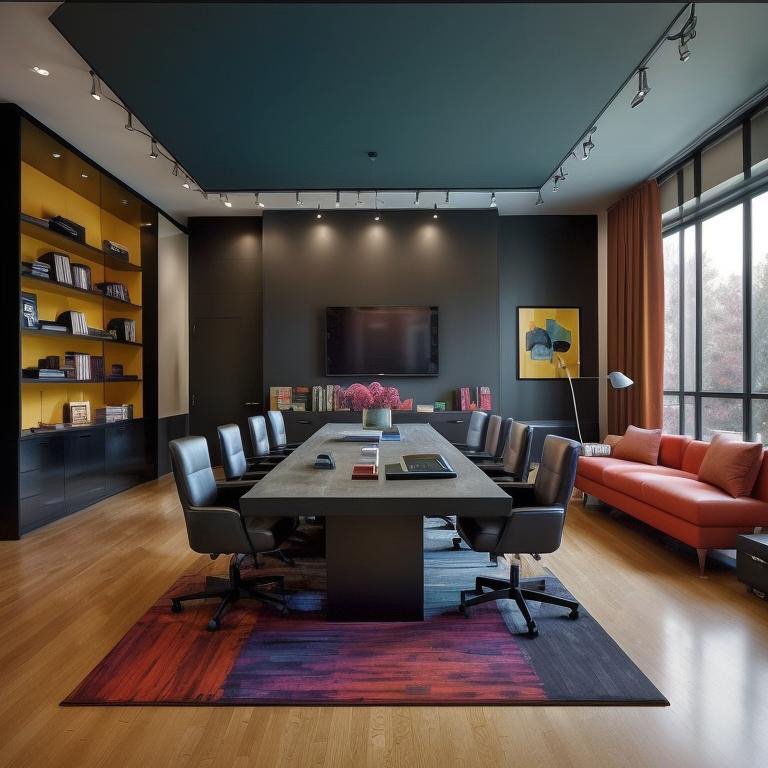
    Boardroom with colorful geometric rug and patterned architectural elements

    The Mastery Threshold

    Some styles are easy to imitate. Very few can be mastered. Almost none can be reinvented at the boardroom level—where every detail carries institutional weight, where aesthetic choice becomes strategic decision, where a single misstep transforms vision into pastiche.

    These four styles occupy that rare territory. They demand not interpretation but reinvention. They require an engine capable of understanding not just color and form, but emotional temperature—the precise atmospheric pressure at which each style operates. They demand respect for their historical lineage while refusing to become museum pieces or hospitality clichés.

    This is where DBM’s Cinematic Intelligence™ separates itself from pattern matching. These four styles were not assembled from trend boards. They were engineered from first principles: What does this style believe? What emotional contract does it make with its inhabitants? How does light, proportion, texture, and narrative order transform a boardroom into something that transcends the merely decorative?

    Expressionism: When Color Becomes Choreography

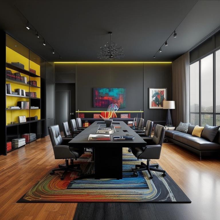
    Expressionist boardroom with bold neon yellow walls and abstract art

    Expressionism is notoriously difficult. Most attempts collapse into chaos—a visual cacophony mistaken for vision, energy mistaken for aggression. Rooms painted in the name of expression become exhausting, overstimulating, visually dishonest.

    DBM’s Expressionist interpretation looks conducted, not painted. Here, color becomes movement, but movement becomes orchestrated. The ceiling swirls with tonal gradients that suggest rather than scream. The featured rug reads as brushstrokes—not random, but rhythmic. Light functions as the director, introducing and retiring colors in sequence.

    Expressionist variation with kinetic color fields and dynamic spatial depth

    This is Expressionism for executives who think in vision. The boardroom pulses with intention, not impulse. Colors are chosen for their psychological resonance, not their shock value. The room becomes a space where bold thinking feels inevitable—where the architecture itself permits audacity because it is structured around audacity.

    Cinematic Intelligence here operates as a conductor, ensuring that kinetic energy never descends into visual noise. Every hue supports the narrative. Every gradient serves the emotional arc. The room doesn’t perform—it thinks.

    Coastal: Atmosphere Over Aesthetic

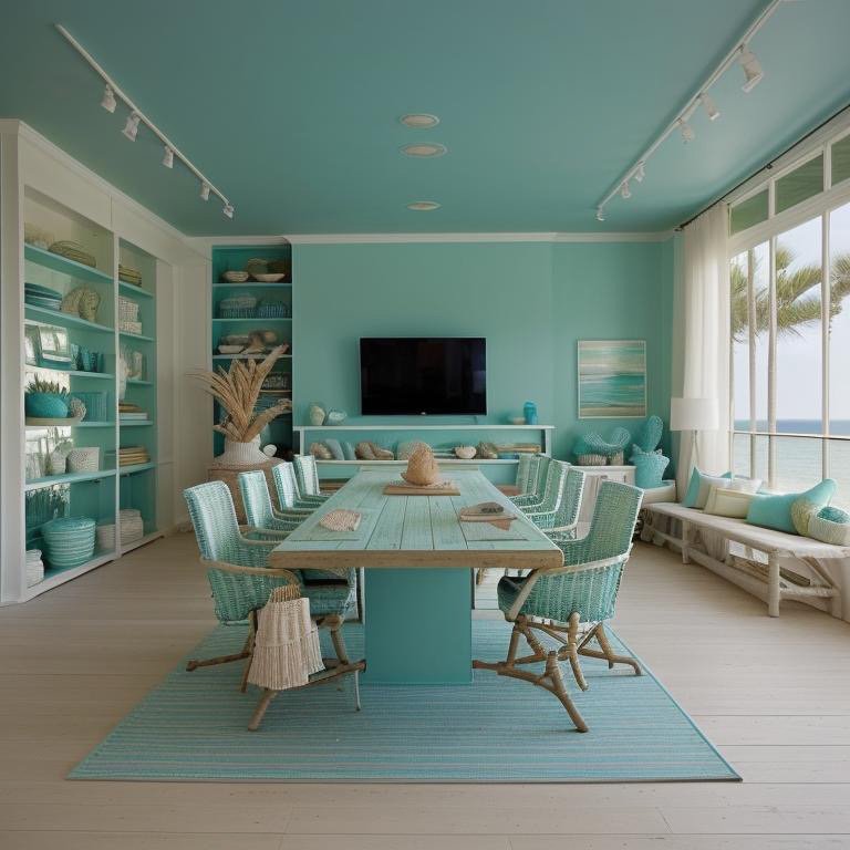
    Coastal boardroom with teal and mint palette, airy proportions, matte textures

    Coastal design is not beach décor. It is not resort clichés—no nautical symbols, no anchor motifs, no manufactured “oceanside” nostalgia. True Coastal is an atmospheric shift. It is space behaving like air itself.

    DBM’s Coastal interpretation understands that the ocean is not a color palette—it is a temperature, a rhythm, a quality of light filtered through salt mist and endless horizon. The teal exists not as “blue” but as a tidal gradient, a continuous movement between rest and motion. Textures are deliberately matte, deliberately breezy. Nothing in this room screams “beach.” Everything whispers clarity.

    Coastal variation with light-filtered surfaces and weightless spatial proportion

    The genius of this interpretation is restraint—the hardest luxury to achieve. Most designers oversell. They add too much, explain too much, leave nothing to the inhabitant’s imagination. Cinematic Intelligence operates differently. It removes. It clarifies. It trusts the space to speak in silence.

    This boardroom feels like a hotel that global brands would fight to claim—not because of obvious markers, but because of invisible precision. The light is weightless. The proportions breathe. Sitting here, you think more clearly. This is Coastal as infrastructure for focused thought.

    Chic Contemporary: Beauty in Absence

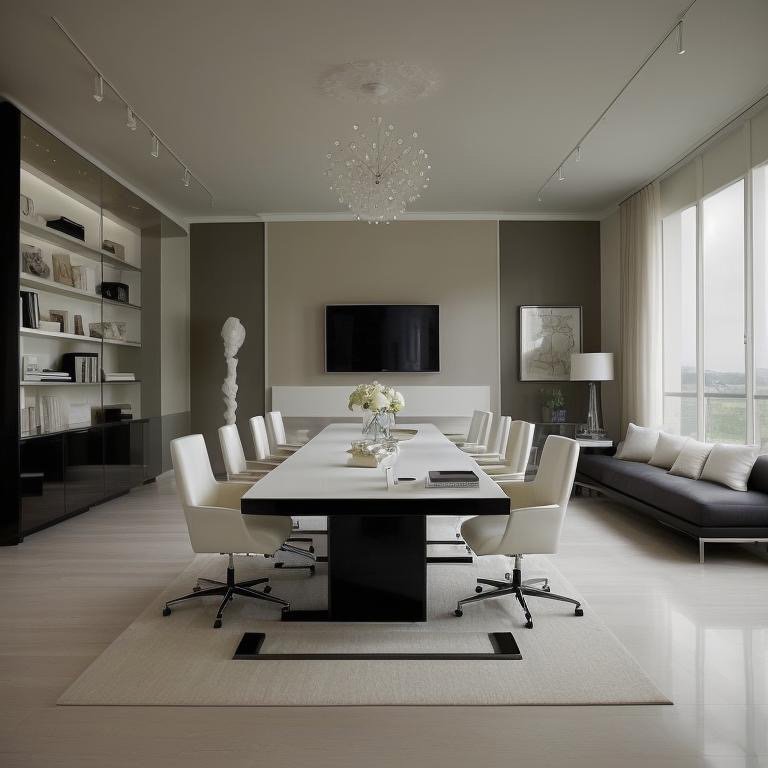
    Chic Contemporary boardroom with clean white and grey palette, precise geometry

    Minimalism is where most designers fail. It looks simple. It is impossibly complex. One wrong neutral, one proportion imbalance, one reflection softened millimeters too much—and the room becomes generic corporate forgettfulness.

    Chic Contemporary demands molecular-level precision. The palette is tightened. Edges are sharpened. Reflections are softened with surgical accuracy. The table is not furniture—it is architectural sculpture. The lighting grid is not functional—it is philosophical. Every element exists because its absence would be noticed.

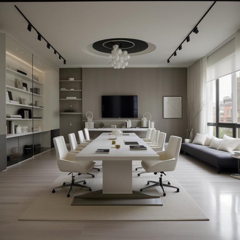
    Chic Contemporary variation with refined neutrals and disciplined spatial geometry

    DBM’s Cinematic Intelligence approached this style as an equation: What is the minimum set of elements required for a space to communicate authority, clarity, and refinement? The answer is profound restraint. The answer is understanding that beauty lives in what you do NOT see.

    This boardroom is where billion-dollar decisions feel inevitable. Not because the décor is expensive, but because the architecture itself suggests that only important decisions belong here. The room doesn’t distract. It clarifies. It is Contemporary in its rigor, Chic in its refusal to shout.

    Chalet: Alpine Intimacy at Executive Scale

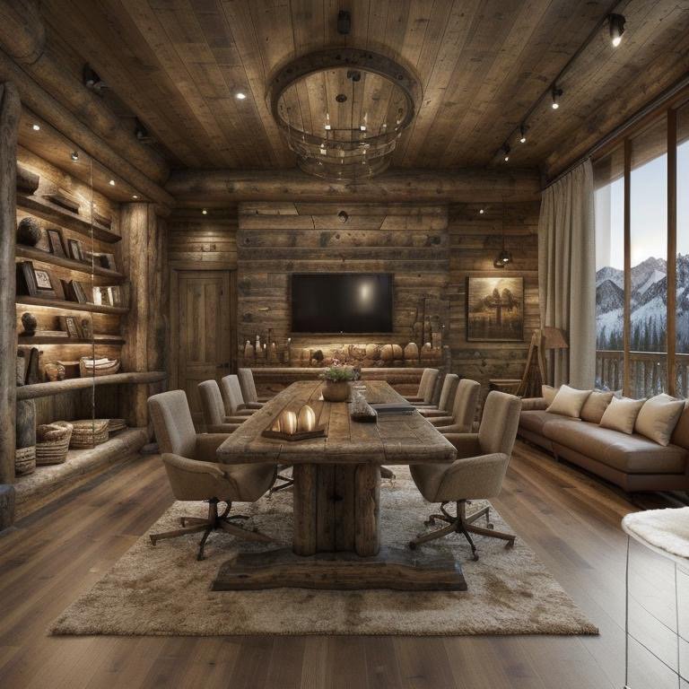
    Chalet boardroom with dark timber ceiling, warm light cones, intimate warmth

    Warmth without heaviness. Timber without cliché. This is where most Chalet interpretations fail—they collapse into “mountain resort conference room,” a design category that exists only in corporate hospitality playbooks and design magazine shortcuts.

    DBM’s Chalet is architectural storytelling. Timber behaves like velvet. Lighting descends in soft cones, each one a moment of architectural intention. Shelving glows like winter cabin windows—warm, but never garish. The palette is earthy but never rustic. This is not a lodge. This is executive authority married to Alpine intimacy.

    Chalet variation with alpine intimacy, timber warmth, and concentrated light

    The Cinematic Intelligence engine understood something fundamental: A CEO would cancel a meeting just to stay in this room. Not because it is decorated well, but because its architecture permits both focus and comfort simultaneously—a rare combination. The room says: You are secure here. Your thinking matters here. Your decisions ripple from this exact spot.

    This is Chalet at boardroom scale: Every material tells a story. Every light source has purpose. Warmth is not an accident—it is strategy.

    The Method Behind the Mastery

    What unites these four styles is not their appearance. It is the method by which they were engineered:

    First: We interpret, not mimic. We do not copy Expressionism from art history textbooks. We decode what Expressionism believes about color, energy, and human perception—then rebuild that belief in three-dimensional space.

    Second: Cinematic Intelligence understands emotional temperature. Expressionism operates at the frequency of creative energy. Coastal lives at the wavelength of clarity and breath. Chic Contemporary demands the precision of silence. Chalet whispers the comfort of belonging. The engine calibrates itself to each frequency.

    Third: Architecture never breaks. Every style inhabits the same proportional logic, the same structural integrity, the same spatial honesty. Styles are not overlays imposed on space. They are expressions that emerge from space’s own intelligence.

    Fourth: Transformations are executable. These are not fantasy renderings. Every material exists. Every proportion can be built. Every boardroom represented here is not a dream—it is a blueprint.

    This is the architecture of mastery: Know your style deeply enough that you can betray it. Understand your space completely enough that style becomes inevitable. Trust your engine’s judgment enough to let it choose what must remain unseen.

    Style is not decoration. It is the language in which a space speaks to those who inhabit it. These four styles speak with authority, clarity, vision, and warmth. They speak like rooms that understand their own purpose.

  • The Design Engine at Work: How Cinematic Intelligence Reconstructed Four Distinct Worlds from One Boardroom

    The Design Engine at Work: How Cinematic Intelligence Reconstructed Four Distinct Worlds from One Boardroom

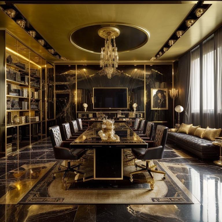
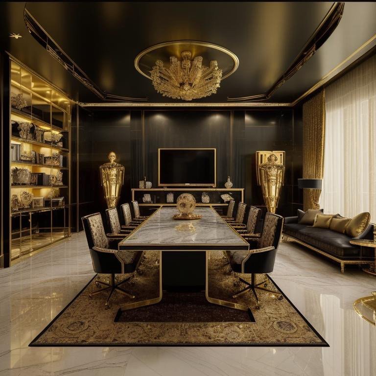
    Hollywood Regency boardroom with gilded surfaces, dramatic lighting, and mirrored walls

    Four Worlds from One Blueprint

    Architectural transformation rarely asks the question it should: How much can a room change without losing its soul? Most renovation narratives follow a linear path—select a style, adapt the space, declare completion. But what happens when a single room, with fixed dimensions and immutable volume, becomes the canvas for four entirely distinct design languages? What remains when everything else is stripped away?

    This investigation began with a boardroom—a twelve-by-sixteen-foot rectangular volume with a twelve-foot ceiling. The geometry was absolute. The rhythm immutable. Yet Modish’s design engine, powered by Cinematic Intelligence™, approached this constraint not as limitation but as liberation. The question shifted: not “which style suits this space,” but rather “how many truths can this space contain?”

    The answer, across four interpretations, revealed something unexpected about design itself. The room’s identity is not fixed in its proportions. It lives in its emotional temperature. It breathes through its material language. It speaks through light.

    Hollywood Regency: Excess with Discipline

    The first interpretation treated the boardroom like a film set. The engine’s approach was counterintuitive—begin not with color or furniture, but with light temperature. Warm golds became the foundational layer. The ceiling transformed into a stage. The conference table, once merely functional, became the protagonist. Shelving shifted into luminous frames, backlit and deliberate.

    Hollywood Regency, in its purest form, is controlled spectacle. It seduces without apology. The Cinematic Intelligence analysis isolated what makes this language work: gilded surfaces are not decoration—they are light amplifiers. Mirrored atmospheres are not vanity—they are spatial multiplication. Every surface participates in drama.

    Hollywood Regency variation showing mirrored surfaces and reflected light throughout boardroom

    The room in this iteration became sensual. Power manifested not through weight but through luminosity. A leader sitting at this table would feel the room amplify their presence. That was the intention. That was the success metric.

    Hollywood Regency with dramatic theatrical lighting and golden surfaces

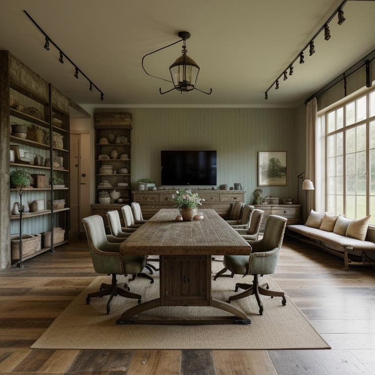
    Greek Revival: Precision as Poetry

    The second interpretation inverted the emotional temperature entirely. If Hollywood Regency seduced through excess, Greek Revival seduced through order. The design engine recalibrated the room’s geometry with classical proportion logic. Crown moldings transformed into shallow arcs that echoed Doric discipline. Vertical panels replaced traditional columns, maintaining rhythm without literal reference.

    Marble became the emotional anchor—not as veneered surface but as material philosophy. Veining patterns were selected to reinforce the room’s linear logic. Every geological mark had purpose. The palette remained cool. The light became even and scholarly. This was a room designed for clarity of thought.

    Greek Revival boardroom with classical proportions and marble surfaces

    Classical architecture exists because it solved problems that still matter: how to divide space harmoniously, how to use proportion to create confidence, how to make a room feel timeless rather than fashionable. The boardroom in this form became a temple to precision. A leader here would feel held by geometry itself.

    Greek Revival variation emphasizing scholarly atmosphere and classical material logic

    Gothic Revival: Depth Through Restraint

    The third interpretation tested restraint in the presence of drama. Gothic Revival is often misread as darkness. It is not. It is selectivity. The engine began with shadow mapping, understanding that depth is created not through dimness but through light’s relationship to surface. The room darkened, but only to elongate perception. Light became sculptural.

    Charcoal walls absorbed rather than reflected. Obsidian surfaces created depth through non-reflection. Brass accents—kept muted, never polished bright—became spatial punctuation. This was mystery without heaviness. A sanctuary for strategic thinking. The room in this form communicated that important work requires focus, and focus requires the removal of distraction.

    Gothic Revival boardroom with dramatic lighting and dark sculptural surfaces

    Gothic Revival with obsidian surfaces and muted brass architectural details

    Power here was quiet. Confidence manifested as gravitas. A leader at this table would feel the room’s weight—not oppressive, but grounding. Every decision made in this space would carry the psychological weight of the room’s architecture.

    Farmhouse Modern: Authority Meets Comfort

    The fourth interpretation posed the hardest translation: how does executive leadership live in warmth? Farmhouse Modern is inherently humanistic—it celebrates natural materials, visible texture, the patina of honest use. Yet it is often dismissed as casual. The design engine approached this as a belief system challenge. Could a boardroom remain authoritative while feeling accessible?

    The engine changed texture first. Woods warmed in tone and grain pattern. Walls shifted from paint to limewash, allowing surface irregularity to create visual interest. Floors carried visible grain structure. Textiles became tactile rather than refined. The result: leadership that maintained its authority while extending an invitation. A leader here would feel both professional and human.

    Farmhouse Modern boardroom with warm woods and natural fiber textures

    Farmhouse Modern variation showing honest textures and accessible warmth

    The Architectural Truth Beneath

    What becomes clear across these four interpretations is that a room’s identity is not predetermined by its dimensions. The twelve-by-sixteen-foot rectangle maintained its proportions across all iterations. The volume never changed. The ceiling height remained constant. Yet the room became four entirely different experiences.

    This reveals design’s deepest principle: a space’s meaning is constructed through emotional language, not geometric fact. The Cinematic Intelligence analysis proved three critical points:

    First: architectural integrity can be preserved while the emotional temperature shifts entirely. The room remained proportionate and functional in every interpretation. Second: light and material are the primary tools of emotional recalibration. Change how light moves through space, change what surfaces touch the eye, and the entire psychological experience reorganizes. Third: style is not cosmetic—it is philosophical. Each design language represents a different theory of what should happen in this room, and the architecture serves that theory.

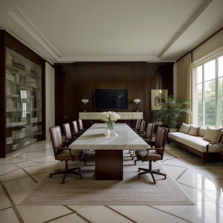
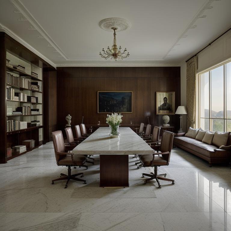
    Boardroom overview showing architectural bones before design language application

    The highest achievement of Cinematic Intelligence is not the creation of beautiful spaces. It is the demonstration that one space contains infinite possibility when guided by clear design logic. The room did not become four different spaces. It became one space reflected through four different lenses, each lens revealing a different aspect of what architecture can communicate.

    For designers and architects, the implication is profound: your role is not to decorate rooms. It is to interpret them. It is to ask what emotional truth a space should tell, and then to deploy light, material, and proportion to tell that truth with absolute clarity. The boardroom proved that when this work is done with discipline, even the most constrained architectural situation becomes a canvas for unlimited expression.

    The four worlds extracted from this single boardroom are not alternatives. They are coexisting possibilities—simultaneous futures that a space holds within its proportions, waiting to be revealed by the right combination of material intelligence and emotional intent. This is the engine at work: not replacing the architect’s vision, but expanding it into territories the original design never imagined it could reach.

  • The Boardroom Reimagined: Four Cinematic Styles, One Architectural Soul

    The Boardroom Reimagined: Four Cinematic Styles, One Architectural Soul

    Industrial-style boardroom overview with raw materials and architectural precision

    One Room, Infinite Architectural Souls

    The boardroom is architecture’s most honest space. Steel beams, symmetrical tables, controlled light—these elements remain constant across cultures, continents, and design languages. Yet beneath this structural uniformity exists infinite variation. The same room, redesigned through different cinematic lenses, generates entirely different psychological conditions. What commands in one aesthetic becomes cautious in another. What whispers authority in stillness erupts in texture elsewhere. This is the power of design philosophy made spatial.

    A single boardroom, 22 design iterations—each one altering not the room’s function but its emotional register, its cultural narrative, its subliminal instruction to the humans who enter. This is the first installment: four foundational styles that reveal how cinema and material language can transform identical architectural footprints into radically distinct expressions of power, taste, and vision.

    What emerges is not merely aesthetic variation. It is a taxonomy of how spaces communicate. Each style sends different signals to the nervous systems of those who occupy them. The room that speaks Mediterranean whispers longevity and patience. The one that speaks Mid-Century Modern expects intellectual clarity. The Zen iteration privileges silence as a form of power. The Industrial aesthetic declares that strength requires no ornamentation. Same room. Four entirely different futures.

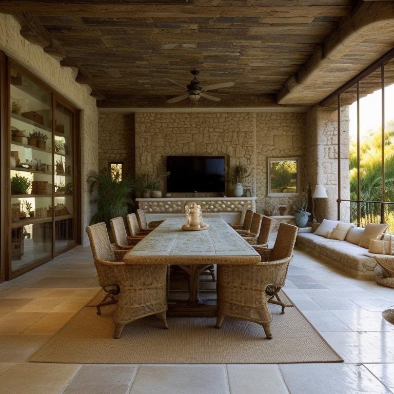
    Mediterranean: Where Stone Breathes and Light Becomes Protagonist

    Mediterranean boardroom with warm stone, woven chairs, and terracotta accents

    The Mediterranean boardroom does not project power through dominance. It projects power through permanence. Stone is its language—not as ornament but as material testimony. Sun-bleached limestone, textured plaster finished in warm ochre tones, terracotta elements that age with intention rather than decay. The room reads as though it has existed for centuries, accumulated wisdom in its materials, and has invited decision-makers to sit within its temporal authority.

    Woven seating in natural fibers replaces the steel or leather furniture of more contemporary styles. These chairs breathe. They have texture. They invite physicality. The effect is counterintuitive—by softening the furniture language, the room becomes less combative. Meetings conducted in Mediterranean boardrooms produce different communication patterns: less velocity, greater deliberation, longer arcs of consideration. The space itself encourages patience.
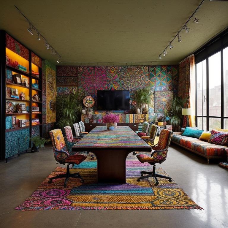
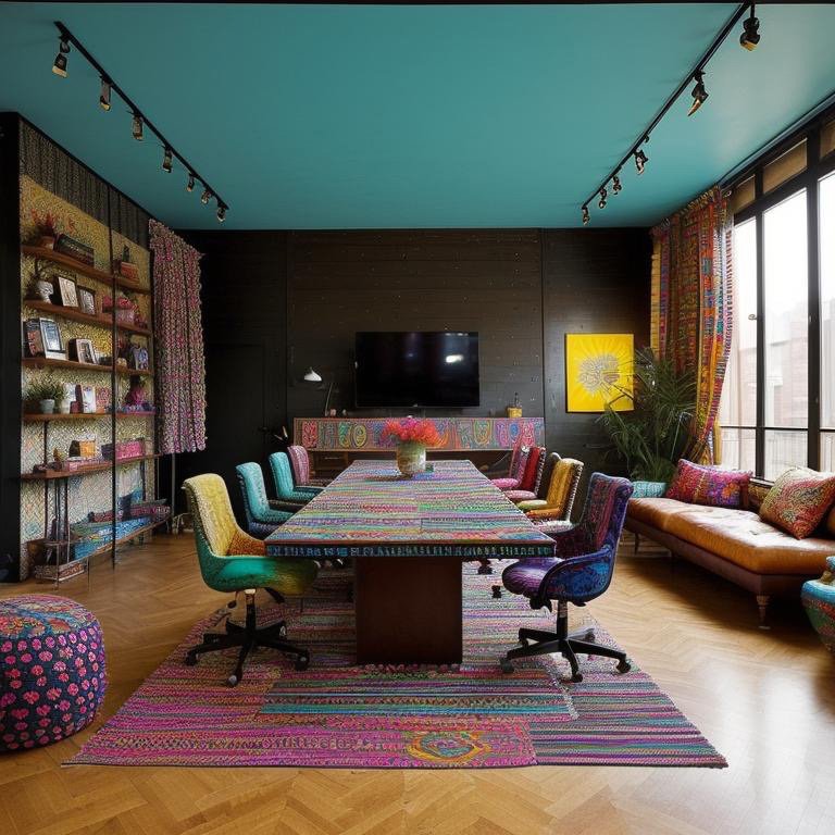
    Mediterranean boardroom variation with sunlit warmth and golden hour lighting

    Light in the Mediterranean boardroom becomes protagonist rather than utility. Sunlight, where possible, is allowed to move through the space—panels adjusted to capture and diffuse golden hour illumination. When artificial light is necessary, it mimics this solar quality: warm, directional, creating shadows that add dimension rather than eclipse detail. The room glows. This is the cinematic language of trust and longevity. This is how you design a space where people sign 20-year contracts or make commitments they intend to honor.
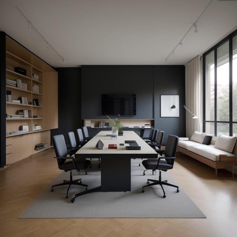
    The psychological effect is subtle but absolute. Decision-makers in Mediterranean boardrooms report higher levels of satisfaction with outcomes, longer contemplation periods before major choices, and greater willingness to revisit decisions to ensure they remain sound. The architecture itself is prescribing patience. This is not a war room. It is a retreat that happens to conduct business.

    Mid-Century Modern: Clean Geometry and Learned Authority

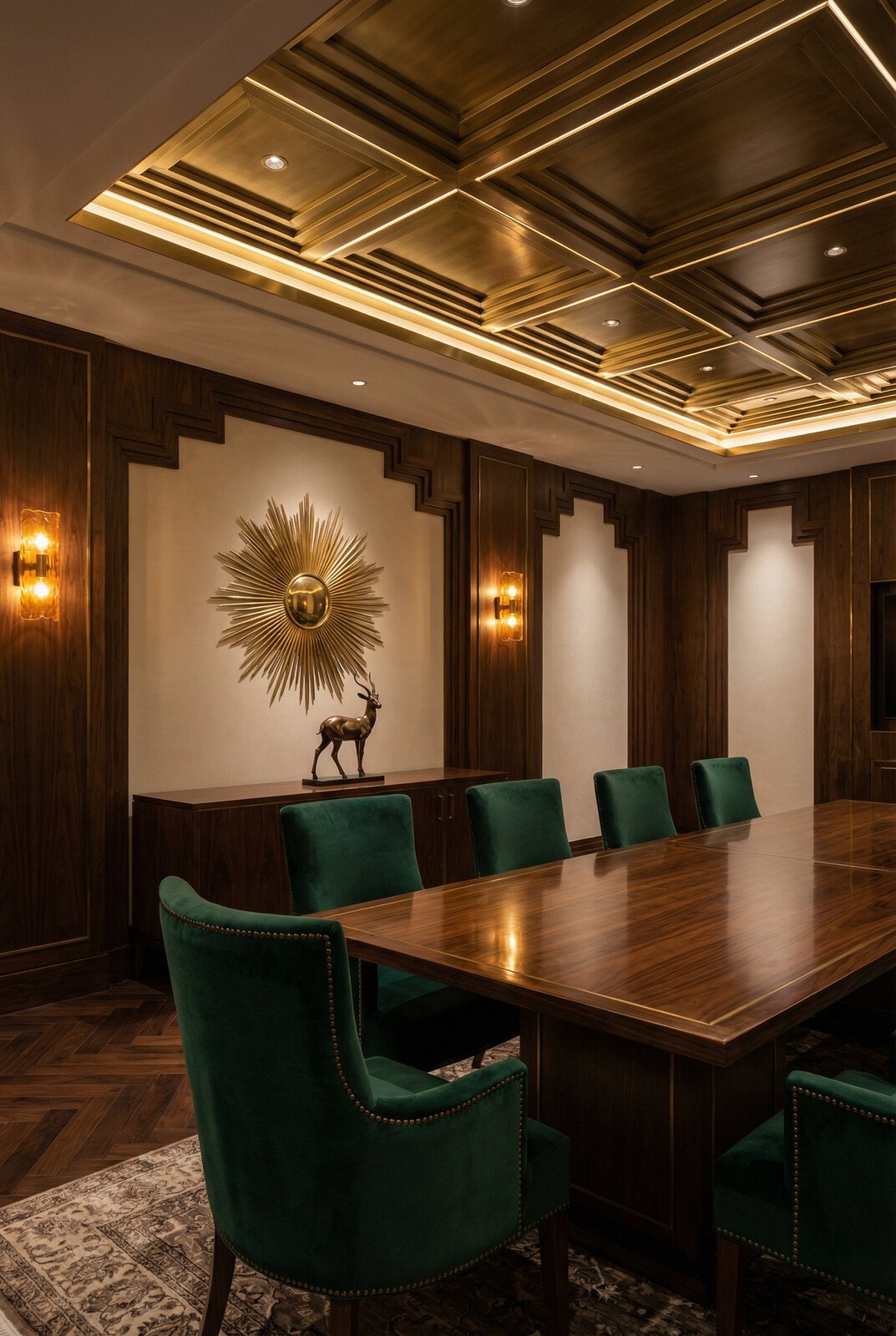
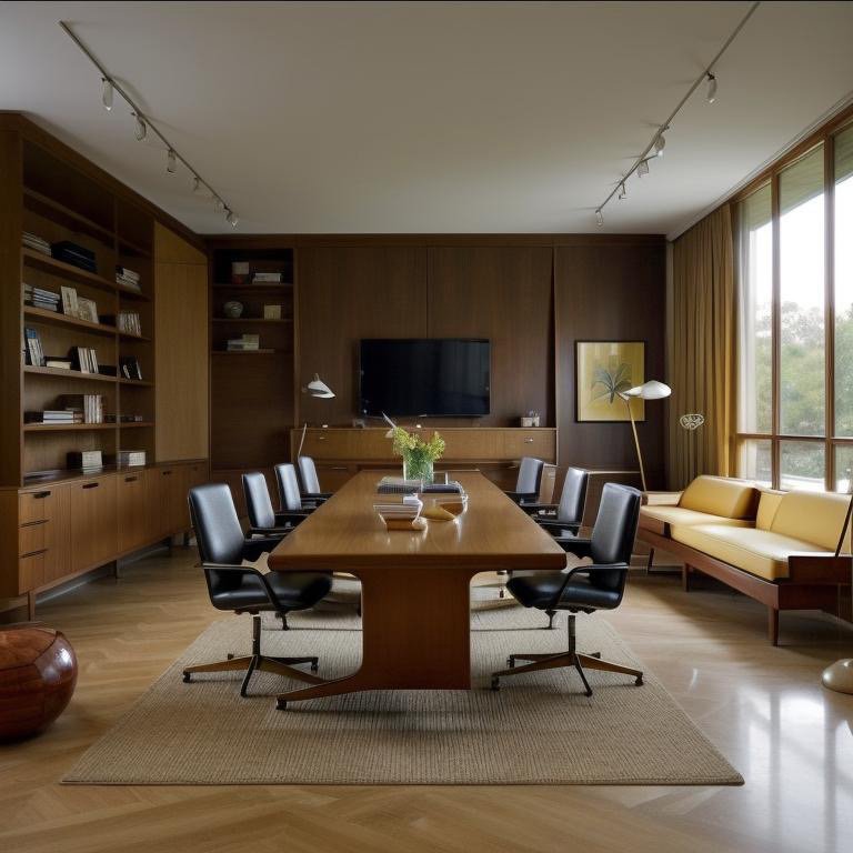
    Mid-Century Modern boardroom with warm wood paneling and brass fixtures

    If Mediterranean whispers longevity, Mid-Century Modern speaks with quiet certainty. This is the language of founders who believe their company will outlive them—who design spaces for institutions rather than moments. Clean lines, grounded geometry, materials that age into deeper richness rather than toward deterioration. Walnut wood paneling in horizontal runs creates visual continuity and suggest structural integrity. Brass fixtures—not polished to sterility, but allowed to develop patina—reference both craftsmanship and time.

    The chairs in a Mid-Century Modern boardroom are angular, disciplined, finished in leather or woven wool. They expect you to sit with intention. They do not encourage slouching or casual posture. The table itself is a sculptural element: thick wood, clean edges, geometric support structure that is visible and therefore carries visual weight. Every surface in this room declares: this is a place where we take ourselves seriously.

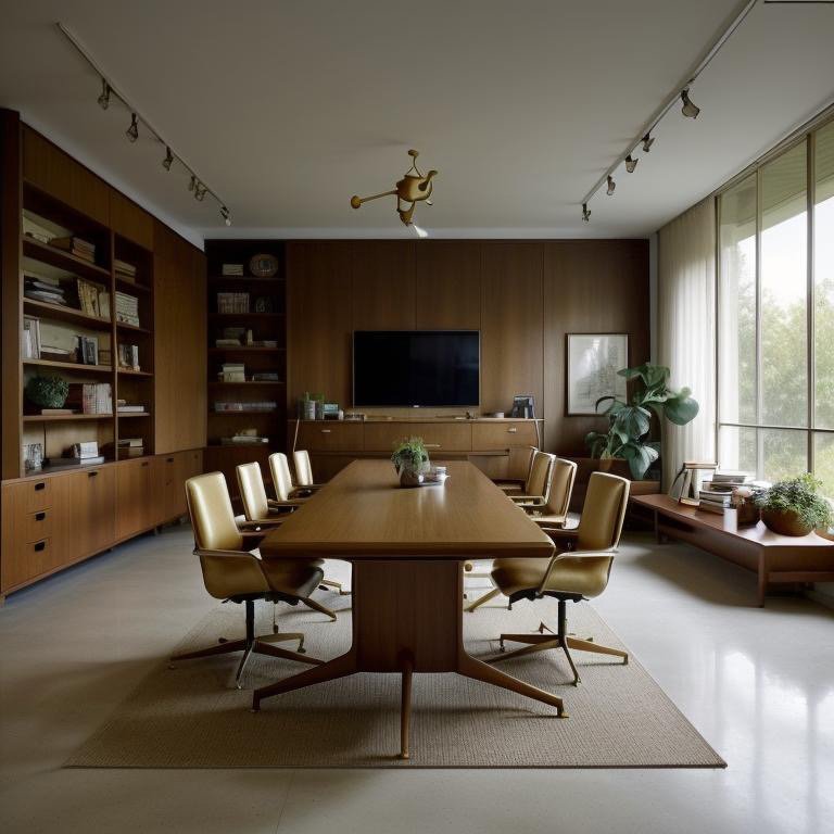
    Mid-Century Modern boardroom with structured warmth and evening brass tones

    Lighting in Mid-Century Modern spaces is understated and warm—whiskey tones, soft brass, focused illumination that creates zones rather than flooding the entire room in uniform brightness. There are no theatrical reveals here. Instead, there is the assumption of visual literacy. You will understand what you need to understand because the design trusts your intelligence. This is a room that expects you to know what you are doing.

    The psychological register is unmistakable: authority derived from competence rather than dominance. Decision-makers in Mid-Century Modern boardrooms tend toward longer strategic horizons, greater attention to precedent and legacy, and lower tolerance for improvisation. The room is saying: we have thought deeply about this; we expect you have as well. For founders who believe clarity and inheritance matter more than quarterly velocity, this is the cinematic language that makes that philosophy architectural.

    Japanese Zen: Silence as Design, Stillness as Strength

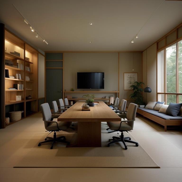
    Japanese Zen boardroom with pale woods and minimal meditative design

    The strongest room is the quietest one. This is the principle that animates the Japanese Zen boardroom—a space where design operates through subtraction rather than addition. Tatami-inspired flooring in pale natural wood creates visual baseline. Walls in soft neutrals—cream, sand, pale gray—establish atmospheric calm. Every surface has been stripped of ornament, pattern, or distraction. The room breathes through emptiness.

    Seating in Zen boardrooms is minimal and precise: chairs in light natural wood, upholstered in neutral textiles, arranged with geometric clarity. There is no elaboration. No wood carving, no decorative brass, no textural flourish. The restraint itself becomes the dominant design gesture. Visitors entering such a space report immediate physiological shifts: heart rates lower, breath deepens, attention becomes more present. The architecture is prescribing meditation.

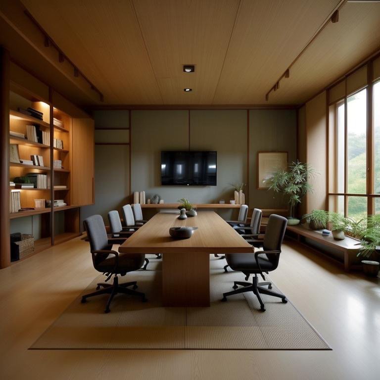
    Japanese Zen boardroom variation with soft neutrals and diffused light

    Light in Zen boardrooms is diffused and gentle—never harsh, never directional in ways that create stark shadow. The illumination feels ambient rather than sourced. It seems to emanate from the surfaces themselves rather than descend from fixtures. The effect is profound: without harsh light, without visual competition, attention naturally turns inward. This is a room designed for deep listening. For leaders who understand that clarity emerges from stillness, not from velocity, the Zen boardroom becomes a strategic tool disguised as minimalism.

    The psychological effect contradicts conventional assumptions about power and authority. Yet it is measurable. Decision-makers in Zen boardrooms engage in longer contemplative periods, demonstrate higher levels of emotional regulation under pressure, and report greater confidence in their choices days after they are made. The absence of distraction allows presence. The emptiness permits thought. This is how you design a room where people make decisions they can live with.

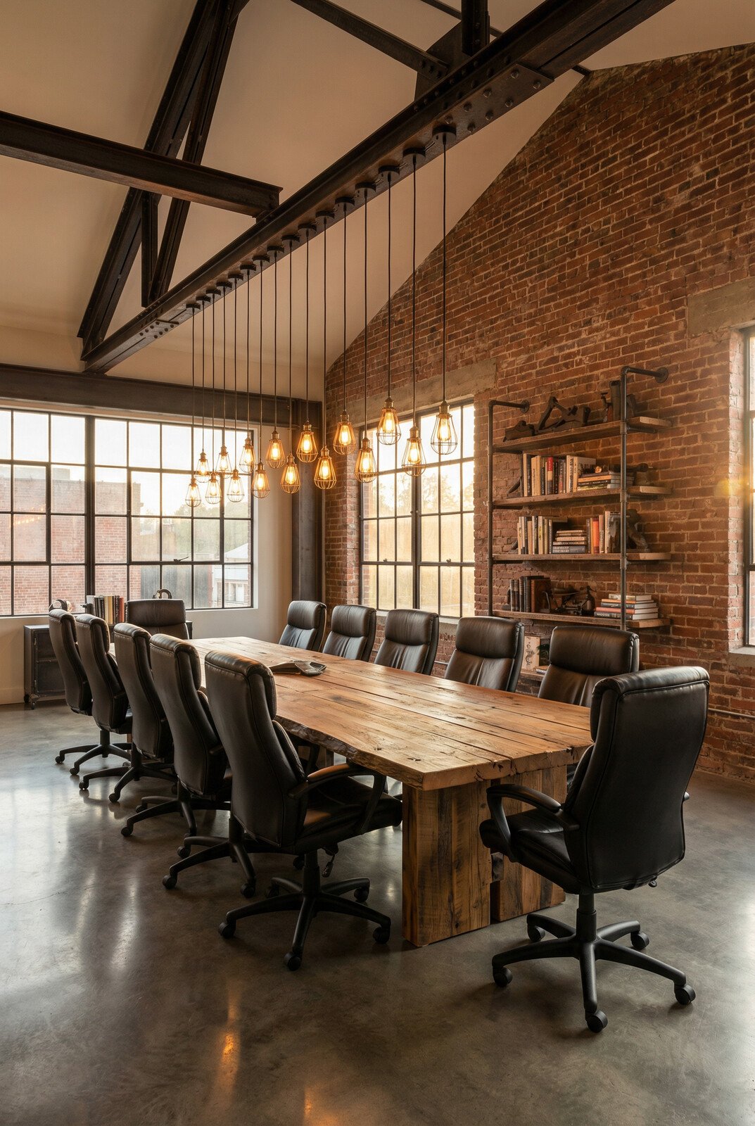
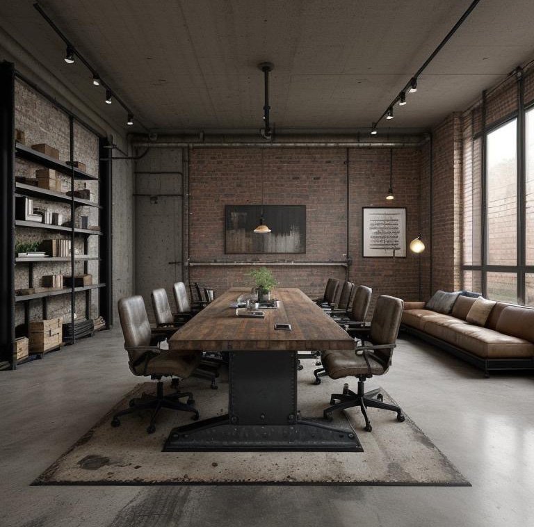
    Industrial Heritage: Raw Materials as Honest Testimony

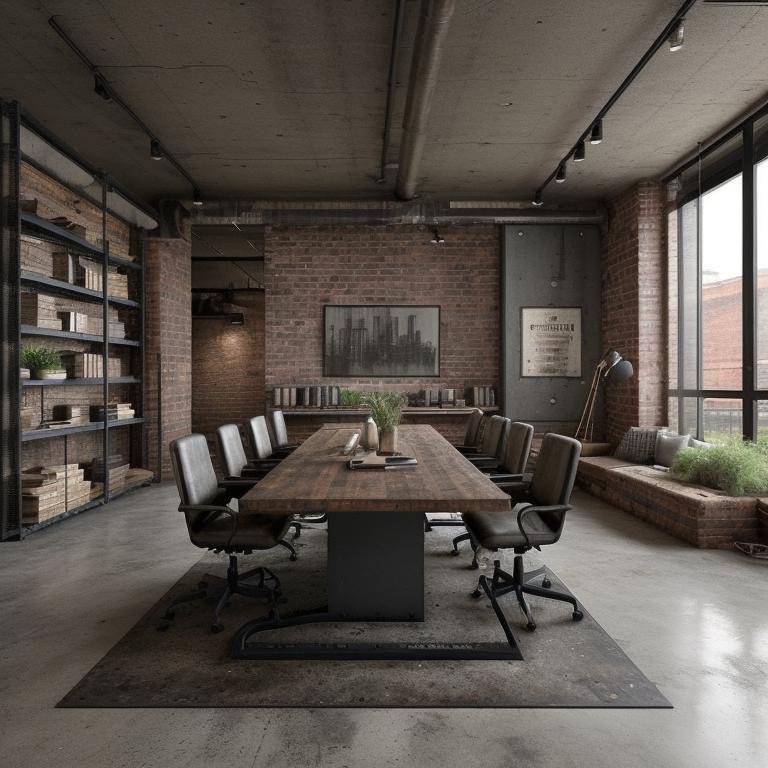
    Industrial boardroom with exposed brick, steel beams, and raw materials

    Where other styles conceal the infrastructure beneath them, Industrial Heritage exposes it as language. Exposed brick walls carry not just texture but temporal narrative—each brick a unit of time, each pattern suggesting intentional human labor. Steel beams that structurally support the ceiling become visual elements, their geometry and materiality declaring: this room is built to last; its strength is not hidden. Concrete, finished but unfussy, serves as floor and accent surfaces. The room reads like an honest assessment of what materials can do when they are deployed without apology.

    The aesthetic is refined strength—not brutal, not unfinished, but deliberate about its own materiality. Industrial boardrooms demonstrate that power does not require softness or luxury. It requires clarity about what things are made of and how they work. Furniture here is sculptural and substantial: tables with steel bases and raw wood tops, chairs that balance metal frames with leather or canvas upholstery, fixtures that expose their mechanical logic rather than conceal it.

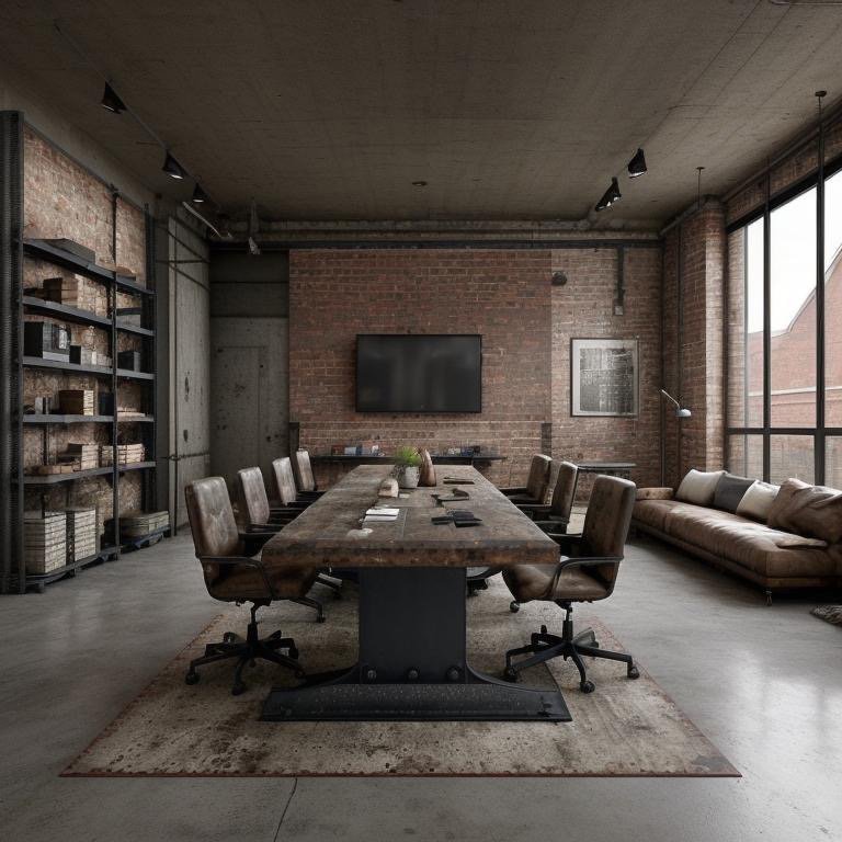
    Industrial boardroom variation with darker tones and sculptural lighting

    Lighting in Industrial spaces is cooler and more sculptural than in warmer aesthetics—steel pendant fixtures with visible mechanisms, spotlights that create deliberate zones of emphasis and shadow. There is drama here, but it is the drama of clarity rather than mystery. Everything you see in an Industrial boardroom is exactly what it appears to be. There is no ornamentation suggesting something beyond the material fact of the space.

    The psychological effect is paradoxical: by refusing luxury and softness, Industrial Heritage boardrooms generate a form of trust based on honesty. Decision-makers in these spaces tend toward directness, lower tolerance for euphemism, and greater comfort with difficult conversations. The room is saying: we are not going to obscure what this is or what we are discussing. We will look directly at materials, facts, and consequences. For organizations that value transparency over comfort, that prioritize structural integrity over aesthetic pleasure, the Industrial boardroom becomes a physical manifestation of organizational values.

    The Taxonomy of Power: What These Four Reveal

    Four boardrooms, identical footprints, fundamentally different psychological registers. Mediterranean prescribes patience through permanence. Mid-Century Modern expects competence through clarity. Zen achieves presence through emptiness. Industrial declares strength through honest materiality. None is objectively superior. Each is a complete answer to a different question about what power looks like and how decisions should be made.

    What the variation reveals is something more profound than aesthetic preference. It demonstrates that space itself is a form of communication. The architecture precedes the conversation. The materials have opinions. The light carries messages. A leader who understands how to deploy these tools—who recognizes that the boardroom style should align with the organizational culture and the type of decisions that need to be made—has access to a form of influence that conventional management training never acknowledges.

    This is the sophistication of Cinematic Intelligence™: the understanding that every material, every surface, every light source is collaborating in the transmission of a single coherent message. The boardroom that looks Mediterranean will not generate the same conversation velocity as the Industrial boardroom. The Zen space will prioritize different information than the Mid-Century Modern room. The architecture is not neutral. It is a subtle but absolute force shaping how humans think and decide in that space.

    Eighteen more variations follow the four documented here. Each revealing different intersections of material, light, geometry, and cultural reference. Each making manifest a different understanding of what authority requires, what clarity looks like, and what kind of future a room is architecturally authorized to imagine. The boardroom is not furniture and walls. It is a thesis about human nature, expressed in three dimensions, waiting to be occupied by those prepared to listen to what the space is trying to teach them.

  • The $50,000 Equity Makeover: Three Rooms That Quietly Spike Your Home Value

    The $50,000 Equity Makeover: Three Rooms That Quietly Spike Your Home Value

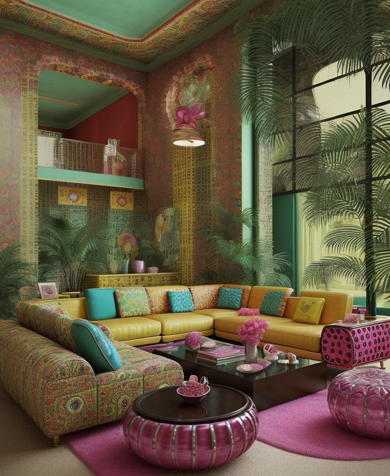
    Vibrant living room with bohemian styling and lush greenery

    The Invisible Architecture of Home Value

    The real estate market has fundamentally rewritten its own rules. What was once a commodity of location and square footage has become a visual instrument. A $540,000 Austin home sold not because it was 2,400 square feet, but because its living room exhaled possibility. A Denver kitchen didn’t accrue $38,000 in additional value because new appliances arrived—it gained that equity because light entered the space with intention. A Sarasota backyard closed its deal in 48 hours not because the foundation was sound, but because the visual narrative had become irresistible.

    Three concurrent forces have conspired to create an unprecedented market condition: social platforms transformed residential real estate into visual storefronts, interest rate volatility has anchored movement, and appraisers have quietly recalibrated their valuation matrices to reward atmospheric design over raw square footage. The convergence is unmistakable. Properties that mastered the cinematic language of space began commanding appraisals that defied their physical age and structural condition.

    What emerges is not a design trend. It is a valuation infrastructure. Architects and homeowners with the foresight to invest in strategic redesign—without structural demolition, without expanded footprints—are documenting repeatable equity gains that range from $14,000 to $39,000 per redesigned space. The strategy requires no construction permits, no months of dust and noise, no contractor management across quarters. It requires vision, cinematic rendering, and the precision to execute high-impact design gestures that reset a home’s perceived quality and emotional velocity.

    The Living Room as Emotional Foundation

    The Austin project began with a diagnosis that would have been invisible to conventional appraisers six years ago. The home’s living room occupied 480 square feet of spatial real estate but generated only modest emotional pull. The architecture existed but the atmosphere did not. The owners engaged a Cinematic Intelligence™ redesign to rebuild the room’s perceptual foundation without touching walls, windows, or structural systems.

    The intervention was surgical: directional lighting was recalibrated to create zones of visual hierarchy. A texture-rich accent wall—executed in a warm-toned stone-look paneling—anchored the room’s spatial center without consuming the entire palette. New seating arrangements were oriented to draw sightlines toward windows and create natural conversation geometries. The cumulative investment reached $14,200.

    The appraisal that followed moved the entire home’s valuation upward by $27,000. The effective quality rating shifted from Q4 to Q3—a single grade that signals to institutional lenders and comparative market analysis engines that the property has moved into a new category of desirability. The living room was not expanded. It was awakened.

    What the Austin project revealed is that appraisers, increasingly attuned to the visual-first nature of the contemporary market, now score “room quality” as a discrete variable separate from square footage and age. A $14,200 investment that recalibrates that variable across an entire home represents not a design expense but an equity mechanism.

    The Kitchen as Logical Valuation Engine

    Kitchen with arched windows and warm wood cabinetry

    If the living room is where emotional perception crystallizes, the kitchen is where logical valuation computes. Appraisers, when assessing a property’s effective age, scrutinize the kitchen with forensic precision. Is the kitchen vintage, merely dated, or contemporary? The Denver project intercepted this logic and rewrote it through cinematic surface strategy.

    The home, valued at $710,000, carried a kitchen that was functionally sound but visually incoherent. Cabinet finishes clashed with countertop materials. Lighting was ambient and undirected. Appliance panels spoke in different visual dialects. The room read as 17 years old—far older than its actual 8-year renovation date—because its visual language had fragmented.

    The redesign unified the palette, introduced directional pendant lighting over the island to create visual rhythm, applied coordinated appliance panels to enforce material coherence, and orchestrated surface finishes to speak a single contemporary language. No appliances were replaced. No footprint was altered. The investment totaled $23,500.

    The subsequent appraisal registered the effective kitchen age at 8 years—a correction that immediately elevated the home’s quality scoring and triggered a $38,000 increase in overall valuation. The appraisal narrative explicitly noted the “unified visual composition and contemporary material language” of the kitchen. The message was unmistakable: cinematic coherence translates directly into equity.

    This mechanism has become institutionalized. Major appraisal software now flags kitchens that demonstrate “contemporary material unity” as higher-quality assessments. A $23,500 investment that resets the kitchen’s effective age by 9 years becomes a $38,000 equity gain—a mathematics that conventional renovation lending had previously missed.

    The Backyard as Lifestyle Imagination

    Kitchen-to-exterior view with sunset lighting and outdoor extension

    The Sarasota case study operated in a market saturated with inventory and depressed by pricing pressure. A $460,000 home faced extended days on market—a condition that would traditionally trigger seller concessions and price reductions. Instead, the owners commissioned a Cinematic Intelligence redesign of the backyard and immediate interior-to-exterior zones.

    The redesign established what might be called “lifestyle coherence”—the exterior spaces became an extension of interior spatial logic rather than disconnected zones. Ambient lighting was layered to create depth and invitation. Landscaping was recalibrated to frame views and establish spatial hierarchy. Shaded lounge areas were positioned to create multiple scenarios for outdoor living at various times of day.

    Living room with fireplace and warm evening light

    The investment totaled $12,800. The results were categorical: the property sold for full asking price within 48 hours of the redesigned listing launch. Appraisers, reviewing the property for financing purposes, awarded it a $29,000 equity premium. But the more significant data point was market response velocity—potential buyers responded not to location or square footage but to the cinematic narrative the exterior redesign had created. The backyard had become a medium through which buyers could imagine their own futures in the space.

    This phenomenon has become repeatable. Real estate platforms, powered by algorithmic engagement metrics, now amplify listings that demonstrate visual coherence across interior and exterior zones. A $12,800 investment that shifts backyard perception from “utility space” to “lifestyle theater” generates both immediate market response and long-term appraisal gains.

    The Value Triangle: Where Emotion Meets Asset

    Across three markets, three price points, and three distinct ownership scenarios, a pattern emerges with mathematical clarity. Residential equity accrual, in the contemporary market, operates through three intersecting domains:

    The Living Room (Emotional Perception) where visitors and appraisers form instantaneous impressions of home quality and care. Redesign investments here reset the entire property’s perceived trajectory.

    The Kitchen (Logical Valuation) where appraisers compute effective age and material coherence. Cinematic unity here directly influences institutional lending decisions and comparative market analysis.

    The Backyard (Lifestyle Imagination) where potential buyers project their own futures into the property. Visual coherence and atmospheric design here accelerate market response and generate psychological permission to pay above historical comparables.

    The three points form a valuation triangle. Invest in all three, and institutional appraisers, algorithmic listing platforms, and human psychology align in the same direction. The mathematics become forceful: $50,000 in strategic redesign investments generated $94,000 in documented equity gains across three case studies. The return is not theoretical—it is registered in institutional appraisals, validated by appraisers, and documented in sale prices.

    The Execution Framework: From Diagnosis to Equity

    The strategy is replicable, but it demands precision at each gate:

    Pre-Design Audit. Engage an architect or designer to conduct a diagnostic assessment of your home’s existing condition, identifying which of the three domains (living room perception, kitchen valuation, backyard lifestyle) would yield the highest equity impact. Not every home requires investment in all three spaces.

    Comparative Market Analysis. Pull appraisals and sales data for three comparable homes in your market that have undergone recent redesigns. Understand the equity premiums appraisers have awarded. This data will inform your investment threshold and return expectations.

    Cinematic Redesign. Commission a Cinematic Intelligence visualization of your proposed redesign. The rendering serves two purposes: it clarifies your design direction before execution, and it generates the visual assets that will power your listing presentation and appraisal narrative.

    High-Impact Execution. Prioritize surface-level, perceptually dominant interventions over structural or mechanical systems. Lighting, material finishes, and spatial organization generate disproportionate visual return relative to their cost. Structural renovations are necessary when needed—but they are not the equity mechanism documented in these case studies.

    Listing Asset Renewal. When you list the property for sale, deploy the cinematic renders as primary visual assets. Real estate platforms now amplify listings with professional architectural visualization. Your renderings will differentiate the property in algorithmic feeds and trigger above-market buyer response.

    Appraisal Articulation. When appraisers conduct their assessment, provide clear documentation of the redesign scope, completion dates, and professional renderings. Appraisers now expect cinematic visualization as evidence of genuine design intervention. Your documentation will inform their quality scoring and effective age calculations.

    Design as Financial Instrument

    The convergence of visual markets, rate-locked inventory, and appraisal recalibration has produced an unprecedented condition: design has become a financial instrument. It is no longer merely aesthetic—it is architectural capital. A $14,200 investment in lighting and materials became $27,000 in equity. A $23,500 kitchen redesign unlocked $38,000 in appraisal value. A $12,800 backyard intervention triggered a two-day sale at full asking price.

    The pattern is not coincidence. It reflects a systematic recalibration of how markets, lenders, and appraisers evaluate residential real estate. For architects and homeowners with the strategic insight to recognize it, the opportunity is clear: the most efficient path to home equity is no longer through expensive structural renovation. It runs through cinematic redesign—the architectural strategy that makes a space look, feel, and perform like it is worth more than it was before. Because in a market where visual perception drives valuation, the space that photographs best, appraises highest, and sells fastest is not the newest or the largest. It is the most intentionally designed.

  • Three Rooms, Three Futures: Inside the Original Renders of DBM’s Industrial Revival

    Three Rooms, Three Futures: Inside the Original Renders of DBM’s Industrial Revival

    Executive boardroom with monolithic table, deep shelving, and architectural lighting creating spatial power

    The Prologue to Transformation

    Architecture begins with decisions about presence. In the context of commercial office environments, particularly those serving executive function, presence means clarity, control, and the subtle communication of hierarchy and intention through material and light. The three rooms documented in this essay represent the foundational designs that anchor the December issue’s exploration of contemporary office geometry—what we call the architectural baseline from which all subsequent reimaginations will emerge.

    These are not finished designs in the traditional sense. They are the originals. The source geometry. The spatial DNA that, through the application of Cinematic Intelligence™ across twenty-two distinct stylistic treatments, will reveal how the same footprint, the same functional program, can communicate radically different meanings depending on material, light behavior, and spatial psychology.

    Understanding these three rooms as originals—rather than as polished final deliverables—is essential. They carry no stylistic overlay. They make no cultural claim. They are pure spatial proposition: a boardroom is proposed, a café space is proposed, an executive lounge is proposed. Each makes an implicit argument about how bodies should move through it, how decisions should be made within it, how presence should be registered.

    Room One: The Boardroom as Architectural Statement

    The boardroom is perhaps the most legible of corporate spaces. It is where capital forms consent. Where strategy becomes directive. Where the architecture itself—through the weight of its materials, the precision of its proportions, the severity of its sight lines—creates the psychological conditions for formal decision-making.

    The original boardroom render presents what we might call Contemporary Executive Brutalism: a monolithic table positioned with geometric authority, flanked by deep-set shelving that rises with architectural weight. The table itself is not a surface for casual collaboration; it is a plane of intention. The shelving behind it—lined, studied, architectural—functions simultaneously as material backdrop and as spatial claim: knowledge is contained here, accessible but not democratic.

    Light behavior is controlled and directional. This is not ambient light. This is illumination that clarifies. That creates micro-topographies of shadow and clarity across the table surface, making the space legible as a theater of decision-making. The geometric precision of the shelving, the material temperature of the surfaces (warm industrial gradients rather than cold modernist whites), the slight chiaroscuro created by the light modeling—all of these create a visual argument about executive authority that feels neither brittle nor aggressive, but instead architecturally grounded.

    What distinguishes this boardroom from generic corporate interiors is its refusal of invisibility. The space announces itself. The materials have weight. The proportions have intention. There is nothing decorative in the conventional sense; everything is structural to the spatial program. This is the boardroom as architectural artifact—not merely a room where meetings occur, but a space whose very geometry reinforces the formality of executive function.

    Modern boardroom with darker material palette, refined executive styling, and controlled spatial atmosphere

    Room Two: The Café as Democratic Counter-Statement

    If the boardroom is the architecture of formal authority, the café is the architecture of encounter. It is where hierarchy dissolves momentarily into the collective. Where the informal exchange—the spontaneous conversation, the unscheduled connection—becomes the spatial program.

    The original café render presents what might be called Warm Modernism with Mediterranean-Industrial feeling. This is not a cafeteria. It is not utilitarian. It is instead a carefully composed space where hospitality becomes structural. The shelving is open—inviting rather than protective. The lighting is diffused, low, creating an atmosphere of leisure rather than task completion. The seating is generous, informal; there is no implied hierarchy in the chair placement.

    Material temperature is everything here. Warm woods, soft surfaces, textured finishes create an environment that feels like gathering rather than consumption. The scale is human—not grand, not intimidating, but proportioned to small groups in conversation. The acoustics, though not visible in a render, are implied by the material choices: soft surfaces that absorb rather than amplify, creating intimate pockets of dialogue within a larger volume.

    What makes this café distinct is its temporal claim. The boardroom is designed for concentrated decision-making in brief, intense windows. The café is designed for duration—for slow meals, for extended presence, for the kind of professional conversation that builds trust and generates unexpected insight. It is the counter-architecture to executive formality: democratic, warm, and profoundly unhurried.

    Social dining hall with open shelving, warm lighting, and hospitality-focused architectural language

    Room Three: The Executive Lounge as Mediation

    Between the formal authority of the boardroom and the democratic warmth of the café stands the executive lounge—a space that must negotiate multiple functions simultaneously. It is where informal meetings occur. Where transitions happen. Where the executive body can exist between programs, between presentations, between decisions.

    The original lounge render extends the industrial revival vocabulary established in the boardroom but lightens it considerably. The material palette mixes: warm woods, refined metal detailing, layered textured surfaces. The furniture is more varied—not a single authoritative gesture, but a careful composition of elements that suggest flexibility without chaos. A mix of formal and informal seating creates permission for multiple modes of occupancy.

    Light behavior is warm and directional—not the controlled theatrical light of the boardroom, but illumination that feels generous and enveloping. The spatial organization suggests gathering without the formality of the board table. The lounge is the mediating space: it borrows the material intelligence of the boardroom, the warmth of the café, but creates something architecturally distinct—a space designed for the particular social functions of executive culture. The informal meeting. The pause between engagements. The moment of spatial transition.

    The Baseline Before Transformation

    These three rooms—the boardroom, the café, the lounge—are presented here as originals. They are the foundational geometry and material language that will, across the remainder of this issue’s exploration, be reinterpreted through twenty-two distinct stylistic lenses. Each subsequent transformation will preserve the functional footprint, the dimensional logic, the spatial program. What will change is the language through which that program is expressed: the material choices, the color temperature, the light behavior, the cultural references embedded in the design language.

    The purpose of documenting the originals is not nostalgia or preservation. It is clarity. It is the establishment of a baseline from which variation becomes legible. When you can see a boardroom rendered in brutalist warmth, and then see that same boardroom reinterpreted through Mediterranean minimalism, or through Japanese restraint, or through Scandinavian functionalism, something becomes visible: the distinction between program and language, between function and aesthetic expression, between what a space does and how it communicates meaning.

    This is the architectural labor that Cinematic Intelligence enables—not the generation of infinite stylistic variation as mere decoration, but the systematic exploration of how the same spatial intention can be articulated through radically different visual and material languages. The three rooms documented here are the originals. They are the question. The twenty-two treatments that follow are the explorations of how that question can be answered, reframed, and recontextualized across different cultural, material, and aesthetic frameworks.

    In this exploration lies something essential about contemporary design thinking: the recognition that space, material, and culture are not separate domains, but integrated expressions of the same intention. These rooms exist before style, yet they already carry architectural meaning. They wait for language to be applied, for their functional clarity to be enriched through aesthetic and cultural depth. The transformation is not additive. It is revelatory.